This article is brought to you by Datawrapper, a data visualization tool for creating charts, maps, and tables. Learn more.
Why not to use two axes, and what to use instead
The case against dual axis charts


Tl;dr: We believe that charts with two different y-axes make it hard for most people to intuitively make right statements about two data series. We recommend two alternatives strongly: using two charts instead of one and using indexed charts.
From time to time we get an email asking if it’s possible in our data visualization tool Datawrapper to create charts with two different y-axes (also called double Y charts, dual axis charts, dual-scale data charts or superimposed charts). It is not – and we won’t add it any time soon. We’re sorry if that makes our user’s life harder, but we agree with the many chart experts[1] who make cases against dual axis charts. We hope you’ll hear us out.
We will first look at situations when people want to use dual axis charts, then we explain their problems, and afterward we’ll look at four alternatives:
Why people use dual axis charts
Why do people use dual axis charts? We looked around and found that most people used them to show…
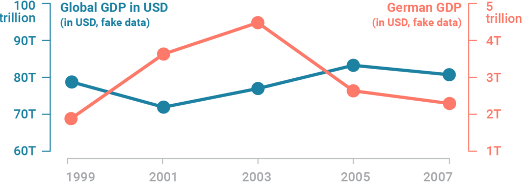
1 …two data series with the same measure, but different magnitudes, e.g. the global GDP on one axis and the GDP of Germany on the other one:
2 …two data series that show the relative and the absolute values of something, e.g. the GDP per capita on one axis and the absolute GDP on the other one:

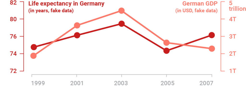
3 …two data series for totally different values, e.g. the GDP of a country on one axis and the life expectancy of that country on the other one:
4 …one data series, but the y-axis shows different scales, e.g. the values in Fahrenheit on one axis and in Celsius on the other one:
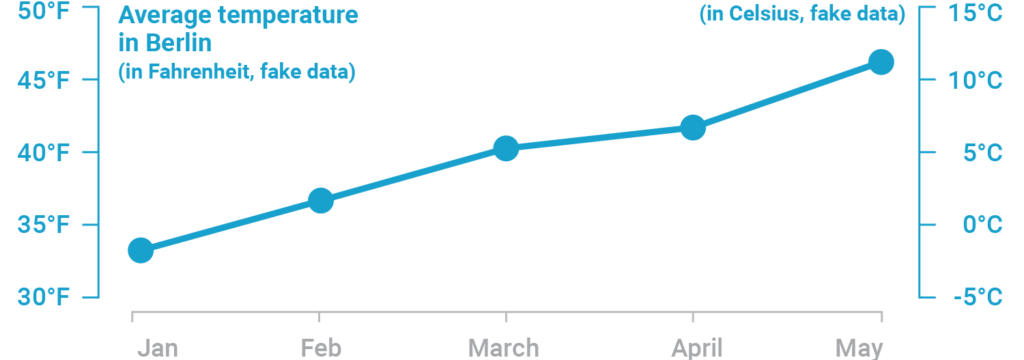
As you can see, dual axis charts are often used to show two different data series with a different magnitude (=number range) and/or measure (GDP, life expectancy, etc). Often, their goal is to compare two trends with each other. Giving readers the possibility to do so makes a lot of sense – but there are some reasons why a dual axis chart is not the way to go. In fact, of these four use cases, we think that only the last dual axis chart can be used without any doubt, since it only uses the second Y-axis to show an alternative scale and not a second data series.
Let’s have a look at the problems with dual axis charts before thinking about alternatives:
The problems with dual axis charts
Here’s the problem in a nutshell: The scales of dual axis charts are arbitrary and can therefore (deliberately) mislead readers about the relationship between the two data series.
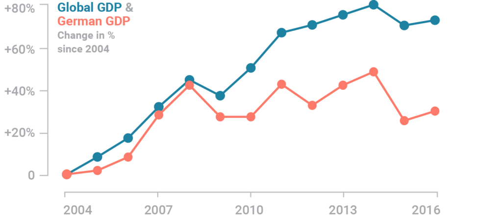
Let’s use some real Worldbank data for the German GDP and the global GDP between 2004 and 2016 to explain that:
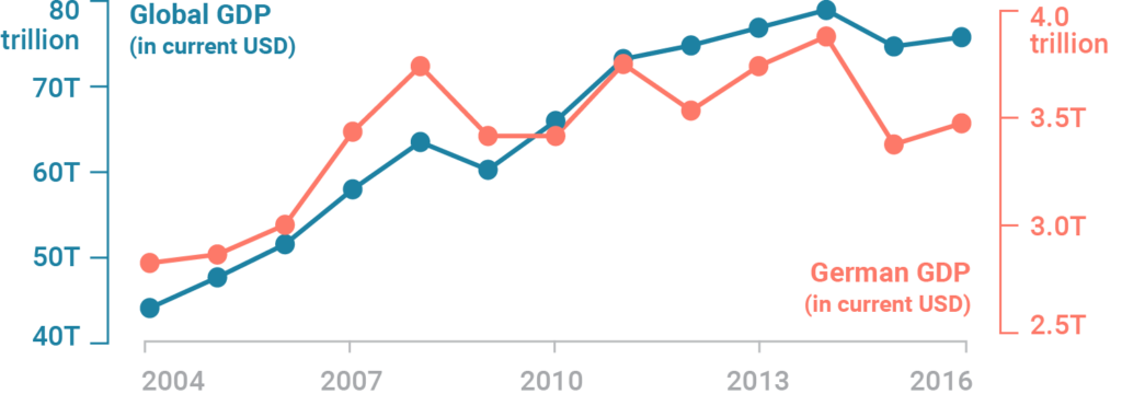
This chart has two different y-axes: The left axis shows the global GDP with a range from $40 to $80 trillion. The right axis shows the German GDP with a range between $2.5 and $4 trillion. The measure (US-Dollar) is the same, but we have a wildly different magnitude. A second axis sounds like a good solution – but there are three problems we have with them:
Zero baselines at different heights can mislead
The proportions of the two scales are often different from each other in dual axis charts. If the left axis would go down to zero, the chart would be twice as long. If the right axis would go down to zero, the chart would be almost three times as long. This is how both axes look like when we extend them to zero:
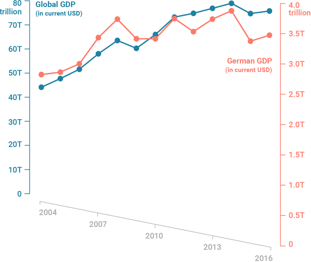
So while the chart looks like the German GDP and the global GDP go up at roughly the same rate (at least until 2014), they don’t. The global GDP increased by 80% until 2014; the GDP of Germany by 40%.
Most readers are used to line charts with just one scale. So when they see a line chart with two scales, their intuition goes into the normal “that’s how I read a line chart”-mode: “Oh, two lines, cool, same rate, interesting”. Readers actively need to remind themselves that these two lines have less of a relationship than they’re used to seeing in a line chart.
So how small is the relationship between these two lines? Let’s go crazy. Nothing really matters, right? We can make all kinds of statements with our two data sets if we just tweak the scales a little bit:
But that’s a problem we can solve, isn’t it? We can just set the zero baseline to the same height. Except:
Even zero baselines at the same height can mislead
This is how the chart looks like with the same baseline. (Meaning, if we extended both y-axes to zero, they would have the same height.) In the best case, our readers will now think: “Seems like the global GDP increased more than the German GDP”. Yes! Success! Except, in the worst case, our readers will think: “In the first years, the German GDP was higher than the global GDP. And then in 2011, the two GDP’s were the same:”
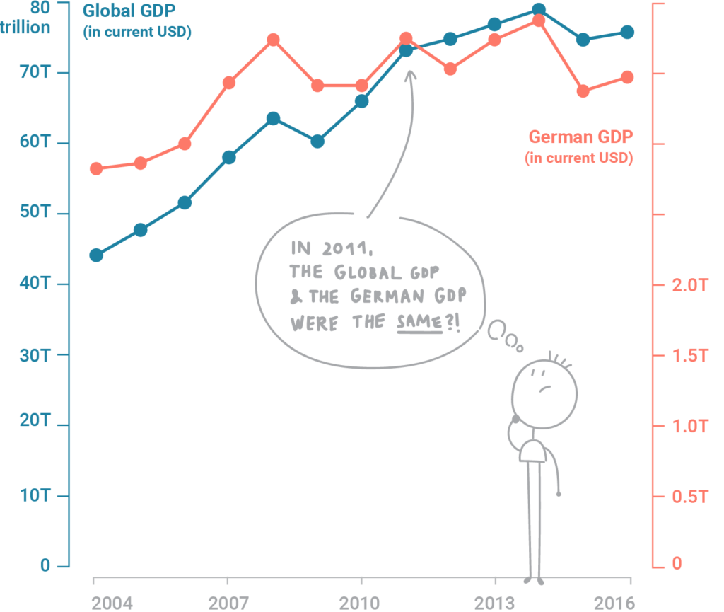
Why would anyone think that? Because humans have a tendency to set things in relation if they’re close-by, and this relationship becomes a huge part of the meaning they see in things. Data points and data series are not an exception to this rule. We automatically compare lines and points with each other; and it’s hard to remember that different scales are involved. If things look close-by on a chart, it’s hard to constantly remember that actually, they are miles apart.
They’re just hard to read
“Ha,” you might say, “readers just need to look closer. I stared at this chart for a minute and I figured everything out.” Well, good for you. But most of our readers don’t like to do math in their heads. (Which is ok: Our job is to do the math for them.)
A study from 2011 backs up that claim. Petra Isenberg, Anastasia Bezerianos, Pierre Dragicevic and Jean-Daniel Fekete showed 15 people four different charts that all showed values in different magnitudes, and observed how well these people could read the charts. One of them was a chart with a dual axis, which the researchers call “superimposed chart”. That’s what they found out:
We found across the board that the superimposed chart performed poorly both in terms of accuracy and time. Participants’ feedback from the questionnaire was also clearly against the superimposed chart and it was ranked lowest by all but one participant. Participants called it very confusing and demanding too much concentration or reflection to decipher the non-monotonic and discontinuous nature of the two scales.
– A Study on Dual-Scale Data Charts
The researchers go on and recommend to avoid dual axis charts altogether. We agree. We tried to show here that the danger of dual axis charts is that they’re not intuitive. Chart designers have the freedom to manipulate axes as they wish, which can lead to first visual impressions which are way off what the data actually says.
Alternatives
However, there’s hope! There are alternatives. Here we will present four of them: Creating two charts, indexed charts, labeling and connected scatterplots.
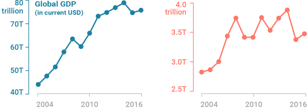
Solution 1: Side-by-side charts
If the problem is that the two lines create meaning because they’re so close together, let’s separate them! The first solution is to create two different charts with our two data series, also called side-by-side-charts. The advantage is that – like with a dual axis chart – side-by-side charts don’t care how much the numbers differ: We can create two different axes for two different charts. The disadvantage is that two charts might need more space than one chart.
Solution 2: Indexed charts
If we want to keep both data series in one chart, we can create an indexed chart. That’s a chart that doesn’t tell us anything about absolute numbers, but shows the relative change of our data series over time: By what percentage a variable increased or decreased over time. Labeling or tooltips can bring back information about the absolute numbers. And one can even show more than two data series in the same chart, as happened in this chart by my co-worker Gregor, who compares the growth and decline of several cryptocurrencies with each other.
This approach works only for data series with a similar rate of change, though. Cole Nussbaumer Knaflic makes that point really well in one of her articles: If one of data series changes by +10000% and the other one by just +5%, the latter line will almost be invisible.
Solution 3: Prioritizing & labeling
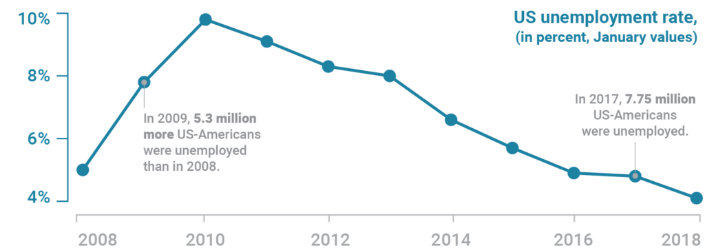
The third idea to prevent a dual axis is to just show one line: the more important data series of the two. We can then use chart annotations to add information about the data we leave out (the other data series). That’s also a recommendation by Cole Nussbaumer Knaflic, although she called it “not exactly the eloquent solution I was imagining”. Indeed, this solution won’t work well for most data (including ours), but can be a great alternative for dual axis charts that present absolute and relative numbers of the same measure. For example, the following chart shows the unemployment rate in the US, but gives information about the absolute numbers in form of annotations:
Solution 4: Connected Scatterplot
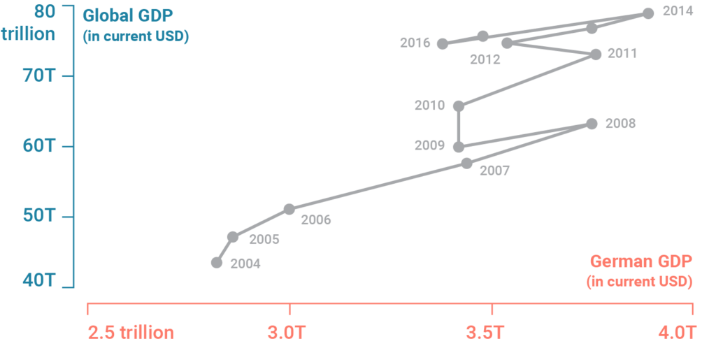
Here it gets fancy: A connected scatterplot keeps one variable on the y-axis – but instead of time, it places the second variable on the x-axis. Suddenly, time doesn’t move from left to right, but wiggles through space. It’s really unintuitive,[2] but also lots of fun. Stephanie Evergreen recommends it as an alternative to a dual axis chart in one of her articles. In our case, a connected scatterplot might be overkill; but we’ve seen cases in which they are the best chart type for showing an insight.
Of the four alternatives we show here, the first two will be useful in most cases. Let us know if we missed anything! We hope we could make our concerns understandable and show some ways how you can visualise your data even without a dual axis chart.
Here are articles by smart people who have opinions about using dual axis charts:
Dual-Scaled Axes in Graphs Are They Ever the Best Solution? by Stephen Few. Looks first at column charts, then at line charts with dual axes and concludes that he “cannot think of a situation that warrants them in light of other, better solutions.”
Two Alternatives to Using a Second Y-Axis by Stephanie Evergreen. Explains two alternatives to a second Y-axis, two side-by-side graphs and a connected scatterplot.
Be gone, dual y-axis! by Cole Nussbaumer Knaflic. Shows a case when indexed charts as an alternative for dual axis charts fail, and suggests a labeled chart instead.
Hadley Wickham’s arguments against dual axis charts on StackOverflow. Gives four arguments why it’s not possible to create dual axis charts with his charting library ggplot2.
Dual axes time series plots may be ok sometimes after all by
Peter Ellis. Makes arguments against side-by-side charts, indexed charts, and connected scatterplots, and explains Do’s and Don’ts of creating dual axis charts. ↩︎Note that both the dual axis chart and the connected scatterplots are not intuitive, but differently so: The dual axis chart promises the reader to be easily decipherable, since it looks like the common line-chart that readers have seen so often and learned how to read. Quickly glancing at a dual axis chart for a second can plant misleading statements in a reader’s mind. Glancing at a connected scatterplot, on the other side, just ends in a confused face and the realisation “I need to take my time to understand this chart”. It’s not intuitive, but it also doesn’t lead to intuitive (and wrong) insights. ↩︎


Comments