

How to match data with VLOOKUP in Excel & Google Sheets
October 20th, 2021
6 min
This article is brought to you by Datawrapper, a data visualization tool for creating charts, maps, and tables. Learn more.
From the long format to the wide format
This article is written for people with very little experience in working with data.
Pivot tables are tables in your Excel/Google Sheets/LibreOffice etc. that you can create to summarize data from your original table. You can calculate averages, counts, max/min values or sums for numbers in a group. For example, if your original table has the salary of each person in each country, you could use a pivot table to calculate the average salary in each country (the country is your group)[1].
Besides doing all the summarising, pivot tables are excellent to get your data from the long format into a wide format. And that’s what I’ll explain in this article. Scroll down to part 3 if you just want to know how it’s done:
We will use pivot tables to create the following Datawrapper chart out of data that I found at Our World in Data. You can create charts like the one below for free at datawrapper.de.
To play around with this chart, hover over it and click on “Edit this chart” in its top right corner.
Let’s start:
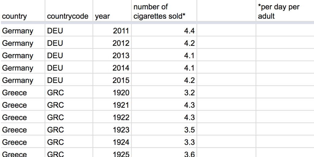
Every time we download something from the World Bank, Our World in Data and some other sources, it comes in this format:
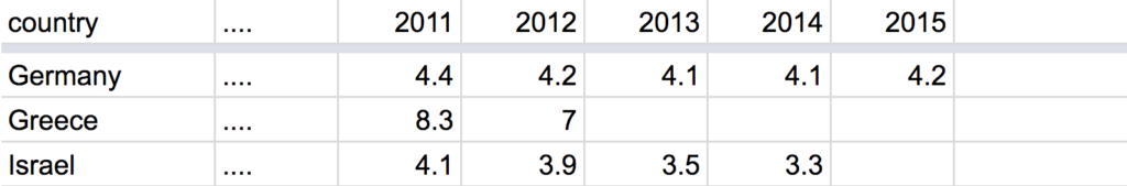
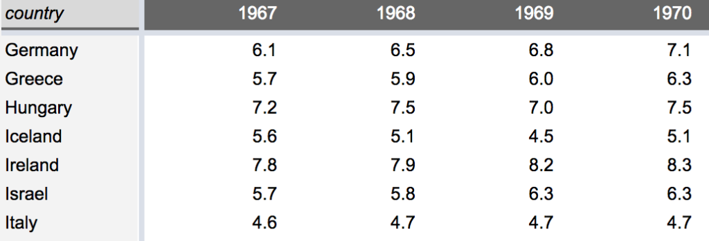
Ugh, that’s not ideal, is it? What we actually need to create a line chart in Datawrapper (and many other charting tools) is this table format:
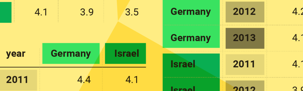
Let’s add some colors, to see the difference in these tables better. (The two tables on the right are the same, just with switched columns and rows.) All three tables show exactly the same information:
What many data sources give us:
What we need to create a chart:
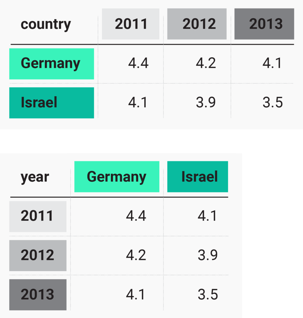
Fun fact: The table on the left is pretty long. Each value sits in an own row. This table format is called the long format , or narrow format, or tall format, or stacked data, or tidy data.
In the tables on the right are always multiple values in a row, which makes them pretty wide (especially if you have many years or countries): This table format is called the wide format, or unstacked data.
I used to hate long formats. They didn’t make it easier for me to create data visualisations in tools like Adobe Illustrator or Datawrapper, which all require the wide format. But there’s a reason why you will find so much data in suuuuper long tables: Long format tables allow you to add as many variables as you want. What does that mean? Well, the wide format allows exactly two variables (some call it dimension, too): Country (rows) and years (columns). Or country and gender. Or country and age group. Or gender and age group. But imagine we want to show the number of sold cigarettes for each country in each year for each gender in each age group. The long format is our hero for situations like this:
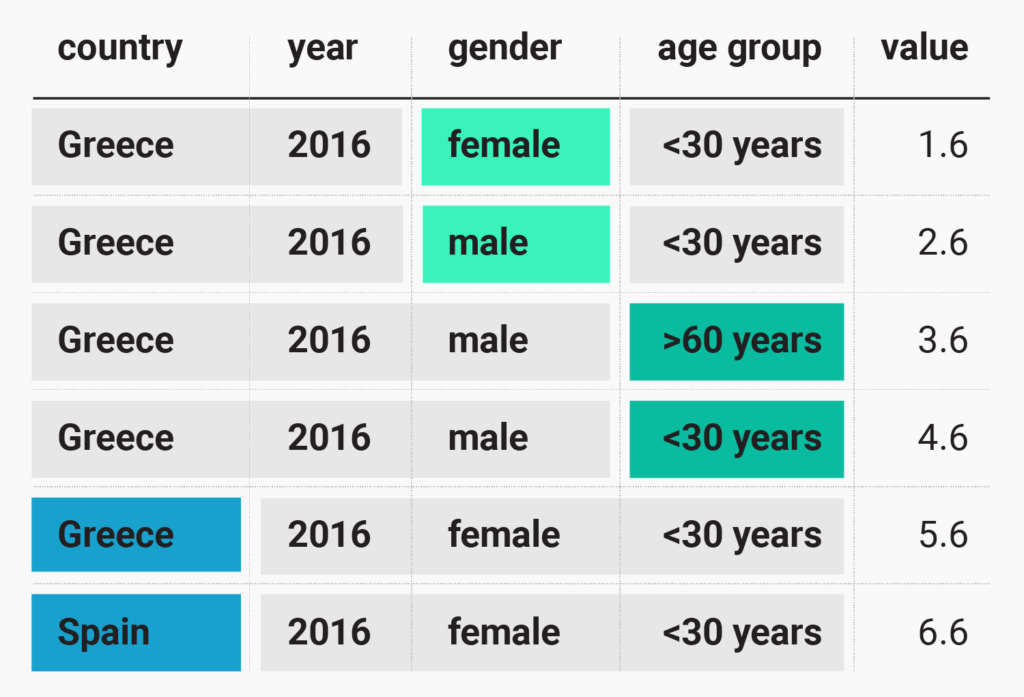
“That looks pretty wide”, you say? Yes, but this table still has only one value per row. Again, that’s how you recognize a long format: There is only one value per row. And look at this beauty. The difference between the 1st and 2nd row is just in the gender. In the 3rd and the 4th row, the age group is different and between the 5th and the 6th row, it’s the country. We have four variables here (country, year, gender, age group). Imagine forcing that into a wide format:😱.
Now that we know why long formats are neat, we want to destroy them. We want to bring the data in the wide format with just two variables. For a line chart, that’s a reasonable idea: It’s only able to show two variables anyway. In our line chart up there, the structure is the following:
So here’s where we finally meet the pivot table: our tool of choice to quickly get from long to wide.
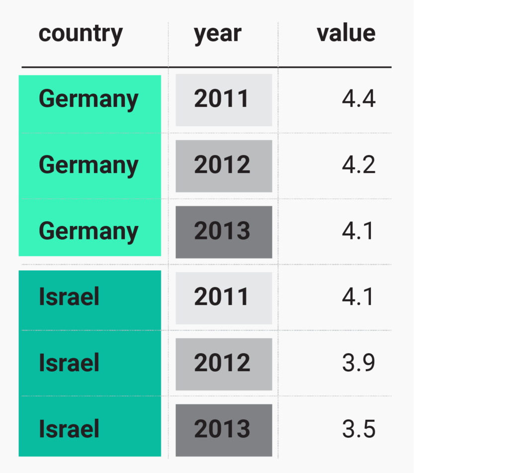
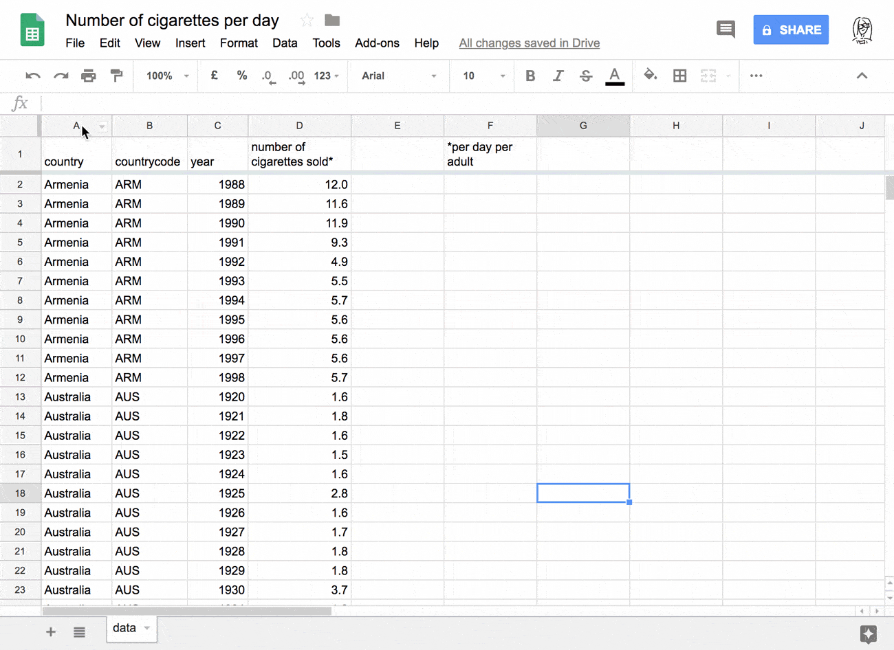
Almost every spreadsheet software like Excel, LibreOffice or Google Sheets has the option to create pivot tables. The following GIF shows how to create pivot tables in Google Sheets. Note how we first need to select the data we want to include in the pivot table. After clicking “Pivot Table” in the “Data” menu, Google Sheets creates a new tab. There, we can choose our variables (“country” and “year”) and our values (“number of cigarettes sold”).[2].
That’s how the data looks like at the end. In this format, Datawrapper will handle the data well:
Ok, there’s a catch: We still need to transpose the data before Datawrapper can turn it into a line chart; meaning, we need to switch rows with columns. Right now, we have the countries in the rows and the years in the columns. Datawrapper wants us to have it the other way round. To achieve that, we could create a slightly different pivot table, in which we put years in the rows and countries in the columns. Or we could simply click on “Transpose the data” in step 2 or step 3 in Datawrapper.
I recorded a video with the whole process. You can watch me silently downloading the data from an Our World in Data article, importing it to Google Sheets, renaming columns headers, changing the format with the help of pivot tables, filtering the data, copying it in Datawrapper, transposing the data there and cleaning it up, in four minutes:
I hope that this information help you to create charts with data from many sources. Are things still unclear? Should I explain something in more detail? Did I get it all wrong? Let me know in a Twitter DM or at lisa@datawrapper.de.
If you know R: Pivot Tables are the dplyr of Excel. (Or dplyr is the Pivot table of R; as you prefer.)↩︎
Make sure to summarize the values by sum, which is often the default. Since every country-year-pair has just one number, the sum of that number will be the same as the number itself.↩︎


Comments