

French people are losing confidence in the Paris Olympics
March 28th, 2024
3 min
This article is brought to you by Datawrapper, a data visualization tool for creating charts, maps, and tables. Learn more.
Hi, this is Lisa again, responsible for the blog at Datawrapper. In the past two weeks, you might have seen my charts on polls for the upcoming federal election in Germany on September 26.
One big (although not big enough) topic in the election campaigns of all potential successors of Angela Merkel is the climate crisis. The chancellor candidate of the Greens, Annalena Baerbock, emphasized that in this election, Germans are choosing “the last government that can still actively have an impact on the climate crisis.”
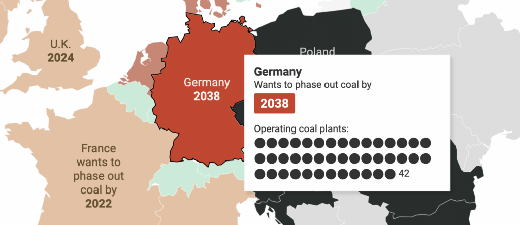
A big part of that impact is reducing the burning of fossil fuels (coal, gas, and oil) for energy production. Germany has 42 coal plants, the most in the EU. Last summer, the German government decided to close all of them by 2038. It sounds ambitious — but 73% of Germans would like to see coal phased out more quickly. When comparing Germany with other big European countries (Italy, Spain, the United Kingdom, and France), that sentiment seems reasonable. They all want to be coal-free before 2038:
Note that this table only shows OECD and EU countries. China has over 1000 coal plants and wants to add more; so do India, Vietnam, and Indonesia.
And all these numbers show just coal plants. Coal consumption has been falling in many countries for years — while oil and gas consumption is still growing. Our World in Data gives a good overview (with lots of nice charts!).
So it's not enough to close coal plants. A study published in Nature two weeks ago finds that by 2050, 60% of the remaining oil and gas reserves and 90% of coal reserves need to stay in the ground to meet the 1.5 °C carbon budget. "Not a single G20 country is in line with the Paris Agreement on climate," CNN headlined yesterday; not even the countries that appear so green on the map and in the table above. Closing coal plants is just one piece of the puzzle.
A map is great to see spatial patterns, a table is great to show more than one number in an overview – so I wanted to show the data with both. I chose the same colors to make clear that they belong together.
One of the biggest decisions was probably to remove the entire footer of the map to make the combination of map and table almost look like one visualization. That said, not showing the source is a bad idea when sharing the map on its own, e.g. in the River – so here, I added a duplicate of the original map that includes a footer.
For the map tooltips, I uploaded an extra column with the black dots for each coal plant, styled the years with CSS and used an if/else statement to change their background colors. You can learn these tricks and other ones in the Academy article "How to customize tooltips".
If you want to learn more about coal, I recommend the report "No new coal by 2021" (PDF) by E3G that just came out and which the table and map above are based on; and the report "Boom and Bust" by the Global Energy Monitor and other NGOs. We'll see you next week!


Comments