This article is brought to you by Datawrapper, a data visualization tool for creating charts, maps, and tables. Learn more.
The oldest U.S. Senate to date, but not the least representative

Hey, it’s Lisa – writer here at Datawrapper. This week, let’s look at some U.S. Congress data…and then let’s take it as an excuse to play around with math.
On Monday, Nathan Yau made us aware of a neat visualization by wcd.fyi showing which share of U.S. Senators belongs to which generation:
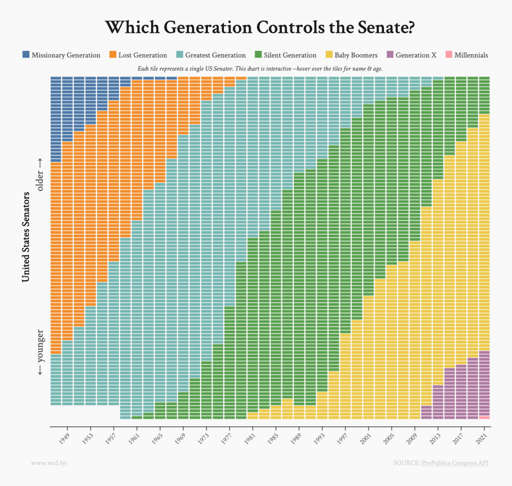
Below the visualization, they wrote: “Of course, it would be trivial to calculate and plot mean/median ages for each congress, but, c’mon, isn’t it more fun to explore the data this way?”
“Hmmmm,” I thought, after doing exactly that, “is it, though?” I had the big urge to do the un-fun thing. Here’s the median age of U.S. Senators since 1947:
The median is almost the same as the mean here (here’s a refresher on the difference). Senators were on average around 56 years old in 1947 and 63 years old in 2021. That’s true for both Republicans and Democrats to an almost uncanny extend.
Here’s another view on the same data:
Yes, U.S. Senators are getting older. Bloomberg asks us to “Please, Let’s Elect Some Younger U.S. Senators”, the Guardian comments “America has become a gerontocracy. We must change that.”, and Vox calls “very old politicians” a “political problem”.
But maybe it’s not that bad – or not as bad as it looks like in the two charts above. So far, we answered the question: “Are U.S. Senators getting older?”. Maybe the more important question is: “How well are U.S. Senators representing the U.S. population?”
How to calculate how well the Senate reflects the U.S. population
A person named JLaw tried to answer this question on his blog, as a response to wcd.fyi’s visualization. With R, JLaw cleaned up and analyzed census and congress data until he found out: “While this is the oldest Senate we’ve ever had, it’s not the most non-representative to the U.S. Population as the population has gotten older too.”
But how did he calculate that? With the mean absolute difference – “because it’s simple and the results are pretty similar to other methods I tried”.
Here’s how to calculate the mean absolute difference
1. Find out the share of Senators and the share of the U.S. population in one age bracket in one year. Do that only for age 30 or older, because you can’t become a senator (anymore) if you’re younger than that.
2. Calculate the difference between the two shares in that age bracket in absolute numbers. So, first, subtract the one share from the other (e.g., 8%-20%=-12%), then make the number positive (12%).
3. Do the same for all the other age brackets in the same year, then calculate the average of these differences.
Here’s a table showing step 1 to 3 for the year 1947 in our data:
And there we got our final value for 1947: 0.058!
You’ll find it in the orange line in the line chart below.
Repeat the process for all years to get the mean absolute distance for all congresses.
This way, JLaw found out that “The three most representative years are 1971, 1979, and 1973, while the least representative years are 1989, 1993, and 1991.”
Here are the years 1971, 1989, and 2019 that he shows in his article, too:
And I was like: “I don’t see it?” The age brackets in 2019 look less evenly distributed than in the supposedly worst year 1989. And 1989 looks better than 1971? Yes, there are fewer 30-40-year-old Senators (read: zero), but the share of older U.S. citizens seems to be almost perfectly represented by more senior U.S. senators.
I did some thinking. And then it hit me: I should probably try to calculate the absolute mean difference not between the age bracket shares (30-35, 35-40, etc.), but between the share of Senators and the population below the age of 30, 35, 40, 45, etc. For example, in 1947, 90% of the population but 78% of U.S. Senators were younger than 70 (and older than 30). Here’s the line chart I got out of that calculation, compared with JLaw’s values:
You can see that other congresses become the best (1979) and worst (2009) representation of the U.S. population when it comes to age. Here they are:
To my eyes, this makes more sense. The share of Senators in the different age brackets looks far more like the share of the U.S. population in 1979 than in 2009. And the representation is indeed better in 2019 than in 2009: The share of young U.S.-Americans shrank between 2009 and 2019 while the share of U.S. Senators younger than 55 remained the same. And the share of both 60+ Senators and Americans grew the same, by five percentage points.
So yes, JLaw was right. While this is the oldest Senate we’ve ever had, it’s not the most non-representative.
A huge thanks to JLaw who went through all that trouble preparing the data and sharing it with the world. This article wouldn’t have been possible without him. Do you know of an even better way to check how representative the Senate is? As always, I’m happy to hear your thoughts on Twitter or in the comments below. We’ll see you next week!


Comments