

French people are losing confidence in the Paris Olympics
March 28th, 2024
3 min
This article is brought to you by Datawrapper, a data visualization tool for creating charts, maps, and tables. Learn more.
This is Hans, a software engineer at Datawrapper, and the person who works a lot on our locator map feature. For this week’s edition of the Weekly Chart, I made an animated locator map.
A few days ago, I came across a tweet by data visualization designer Olivia Vane about animated waterlines – or as we call them at Datawrapper: vignettes. As a mapmaker who also has a background in animation, I was immediately intrigued by their aesthetics.
So I tried to animate our locator maps vignettes using Datawrapper.
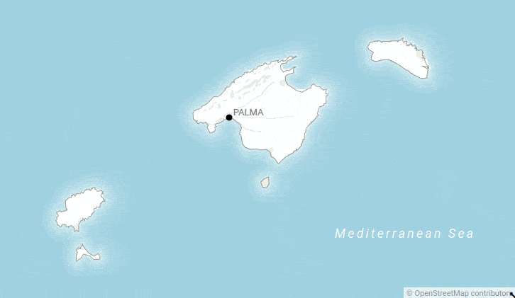
Here is another take on the animated vignettes:
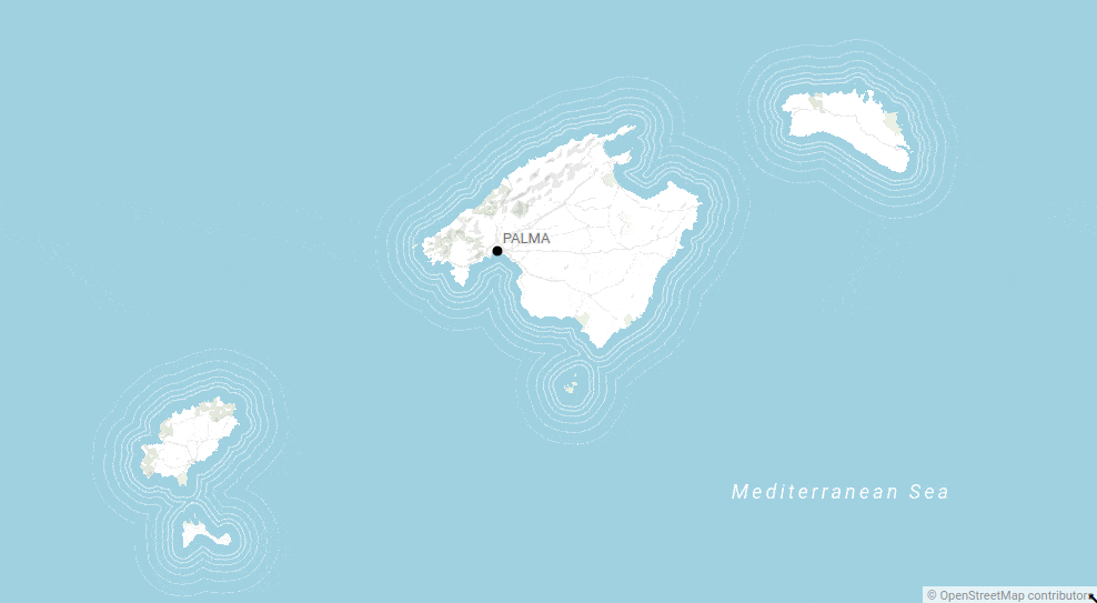
If you want to know more about showing water in maps and how to animate it, have a look at Olivia’s Observable notbook.
First, I created the vignettes (here we explain how that works). I experimented with creating several vignettes with different opacity and widths. For each animation frame, I took a screenshot which I later stitched together using the command line tool ImageMagick, like so:
convert -fuzz 1% -delay 20 -layers Optimize -loop 0 *.png vignettes.gifThis ImageMagick command will create a GIF called vignettes.gif out of all the png files in the folder you are in.
Although Datwrapper is not an animation tool, I was quite pleased with the results. Making screenshots is a bit of a pain. But the ease of creating vignettes in our tool made up for it.
That’s it from me for this week! Do let me know if you have feedback, suggestions, or questions: I am looking forward to hearing from you at Twitter. We’ll see you next week!


Comments