New: Small multiple column charts in Datawrapper
February 18th, 2025
6 min
Datawrapper lets you show your data as beautiful charts, maps or tables with a few clicks. Find out more about all the available visualization types.
Our mission is to help everyone communicate with data - from newsrooms to global enterprises, non-profits or public service.
We want to enable everyone to create beautiful charts, maps, and tables. New to data visualization? Or do you have specific questions about us? You'll find all the answers here.
Data vis best practices, news, and examples
250+ articles that explain how to use Datawrapper
Answers to common questions
An exchange place for Datawrapper visualizations
Attend and watch how to use Datawrapper best
Learn about available positions on our team
Our latest small and big improvements
Build your integration with Datawrapper's API
Get in touch with us – we're happy to help
This article is brought to you by Datawrapper, a data visualization tool for creating charts, maps, and tables. Learn more.

Annotations are one of the most important elements you can add to your chart or map: They can help to add additional information, make your chart easier to understand, or can just be a simple way to point readers to the most important data points.
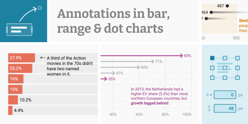
Today we’re excited to announce that we’re adding text annotations and range & line highlights to eight more chart types: Bar charts, stacked bars, grouped bars, split bars, and bullet bars, as well as dot plots, range plots, and arrow plots.
The annotations in our bar charts come with everything you’re used to from annotations in our chart types:
You can learn more about Datawrapper annotations in this Academy article.
We want to give you the best possible annotation experience — and that means designing with the chart type in mind. In bar charts, data always comes in rows that can be grouped and resorted. Our bar chart annotations are built for just that.
First, each annotation is tied to a specific row. That means that if you change your bars’ thickness or even reorder them entirely, the annotation will still point to the same data:
While you can manually assign annotations to bars, you don’t have to: Just drag the annotation around like you’re used to, and Datawrapper will identify which bar you want to annotate:
With this update, range and line highlights are coming to our bar charts and range/arrow/dot plots. They’re a great way to point out a threshold value or a certain date or timespan.
If you’ve chosen to group the data in your chart, you can create range and line highlights that repeat across all groups (or “panels”) , or stick to just one:
You can also repeat highlights in the panels of a split bar chart. Try it out by hovering over one of the charts on this page and clicking Edit this chart.
Annotations for bar charts, stacked bars, grouped bars, split bars, bullet bars, dot plots, range plots, and arrow plots are available starting today for all our users, including on the free plan. We hope you’ll be able to create just the charts you need with this new feature.
Do you have questions or feedback? Get in touch with us at support@datawrapper.de. As always, we’re looking forward to hearing from you.
Comments