

The world could be your oyster, but it depends on your passport
October 10th, 2024
4 min
This article is brought to you by Datawrapper, a data visualization tool for creating charts, maps, and tables. Learn more.
Insurgencies and civil resistance compared
Hi, I’m Edurne (Eddie), writer & support intern here at Datawrapper and aspiring data journalist. Today’s Weekly Chart is about a question I’ve frequently asked myself in the last few years: can civil resistance foster social change and revolution?
Between 2017 and 2019, I had the opportunity to work as a foreign correspondent in Kenya, Japan, and Spain. It was not always easy, but I was lucky to learn many interesting things along the way. I was also constantly on the ‘wire’, reading stories from many countries and learning about their past, culture, and daily lives.
Even before that, while I was studying journalism, I found myself reading and writing a lot about protests, like the Umbrella Movement in Hong Kong or the Yellow Vests (Gilets Jaunes) movement in France. The images from the Arab spring in 2010 stuck with me the most. And it’s not a coincidence that I read about protests so much: the last few decades have seen an increase in campaigns.
But not all protests are the same: There are violent and peaceful ones. I was wondering: Which of them are successful? To find out, I used data from The Non-violent and Violent Campaigns and Outcomes (NAVCO) project by Harvard University, the first of its kind to collect systematic data on violent insurgencies and non-violent civil resistance around the world:
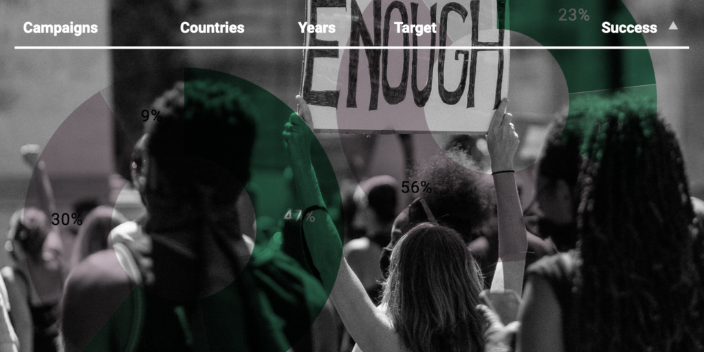
NAVCO gathered data on 622 campaigns between 1900 and 2019. As we can see in the chart, in this time, half of the 321 non-violent campaigns succeeded, while only a quarter of their 301 violent counterparts did. 56% of violent campaigns failed, compared to 30% of non-violent ones.
Erica Chenoweth, a researcher on violence and co-author of the NAVCO Data Project, found even more evidence that non-violent protests are more successful: “Countries in which there were nonviolent campaigns were about 10 times likelier to transition to democracies within a five-year period compared to countries in which there were violent campaigns – whether the campaigns succeeded or failed”, she explained to The Harvard Gazette.
You can search through all the 622 campaigns that the NAVCO data set contains here:
Because it’s a data set collected by hand instead of measured, it’s important to understand the decisions behind it better.
Launched by Harvard University, the NAVCO Data Project covers different aspects of civil resistance and insurgencies through time. For this article, I decided to analyze the 4th iteration of the project: the NAVCO 1.3 data set, released on March 17 of this year.
While making statements like “non-violent campaigns are more successful”, we need to bear in mind that this data set might not include all campaigns, suffering a so-called underreporting bias. The authors of the NAVCO data set also note in their codebook that the included non-violent campaigns are biased toward success: the large, mature campaigns are most commonly reported. Some non-violent campaigns are crushed in their infancy (and therefore fail) and are not included in this data set.
This bias has, however, been mitigated by looking only at major campaigns with at least 1,000 people participating in the protest. The dataset also only includes protests with a maximalist objective, such as bringing down a government. Despite not being perfect, the NAVCO Data Project is still a reference for many researchers and journalists to analyze the effects of both violent and non-violent protests in global politics.
One thing I like about data visualization (although it can be daunting) is the amount of trial and error that it requires to come up with the right chart type. The table I finally created was not close to my first idea (at the beginning I wanted to create a scatterplot or even a map!), which shows that visualization can be really rich in variety as well!
Before looking at the data set, I started with a blank piece of paper and wrote down my initial questions. I believe this step comes from my journalistic background: I treat data sets as interviewees. The main question – are non-violent protests more or less successful than violent ones? – was easily answered with a pivot table in Google Sheets.
The main work needed to be done on the Datawrapper table. To help readers navigate this big amount of data, I opted for the use of emojis in the “Success” column. Now you just need a glance to know how the campaign ended. I also decided to bring ongoing campaigns to the front of the table, since those are the insurgencies and protests that are happening at the moment and people have likely been reading about them in the last few years. Finally, I decided to highlight the non-violent campaigns that ended up in success.
If you’d like to learn more about protests or recreate any of the charts above, have a look at the following sources:
And that’s all for this week! I hope you enjoyed my first article here at Datawrapper. I would love to hear your thoughts on how to spark a revolution! Do you support any political movement? Is there any civil resistance group that you are particularly interested in? Leave a comment below or send me an email at edurne@datawrapper.de. See you next Thursday!


Comments