

New: Small multiple column charts in Datawrapper
February 18th, 2025
6 min
This article is brought to you by Datawrapper, a data visualization tool for creating charts, maps, and tables. Learn more.
At Datawrapper, we’re constantly striving to help you create better data visualizations. A big part of that? Making it faster and easier to understand your data. That’s why we’re excited to announce our newest feature: Starting today, you can add automatic value labels to your line charts with just a few clicks.
Line charts are the go-to choice when you want to show developments over time. One quick glance, and your readers will understand trends, shifts, and patterns.
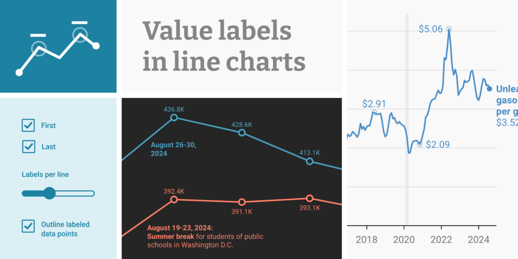
To also let them instantly understand the scale and underlying data points, our new value labels are ideal. They’ll reveal the exact values, are visible in static charts, don’t need to be placed by hand, and automatically adjust for mobile view. Value labels join the other options you have in Datawrapper line charts to help readers understand your data: grid lines, tooltips, and annotations.
In smaller data sets, it’s possible to label every data point by increasing the number of value labels per line. That’s useful if the middle values really matter to your audience, or tooltips aren’t an option:
Note how this chart has an unusual clean look: Thanks to the value labels, there’s no need for vertical axis labels (and a grid) anymore.
For larger data sets, expect some Datawrapper magic: as you increase the number of labels, they will automatically be placed at the most interesting data points, such as peaks and troughs:
Sometimes, the story of your line chart just hinges on the change between the first and last value. That’s why you can show labels for both or one of them – for all or just a few of your lines:
To create beautiful, legible labels, Datawrapper does the heavy lifting for you: The new value labels won't overlap each other or your lines. That’s also true on mobile – so that your chart always looks well-designed and tidy, no matter its width.
To let you refine the design, the value labels feature also comes with the following options:
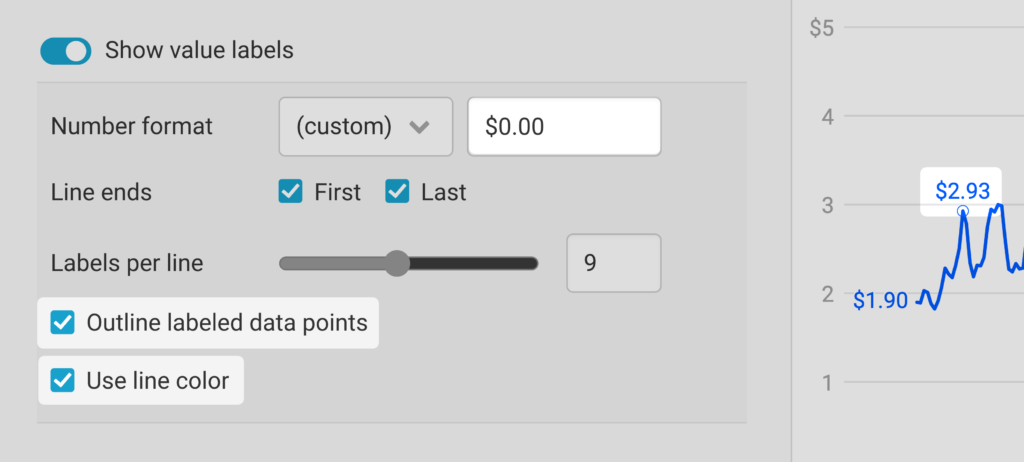
For customers of our Custom and Enterprise plan, the default styling for these labels can be adjusted as part of the Custom theme.
To try out the new value labels, create a line chart, and turn on Show value labels in the Refine tab of Step 3: Visualize. You can also hover over the charts in this article (on desktop) and click Edit this chart to jump in. Questions? Get in touch with us at support@datawrapper.de. We’re always happy to hear from you.


Comments