

French people are losing confidence in the Paris Olympics
March 28th, 2024
3 min
This article is brought to you by Datawrapper, a data visualization tool for creating charts, maps, and tables. Learn more.
Hi, this is Lisa! I’m responsible for the communications at Datawrapper and have been fairly busy writing a book about colors in data vis in the past months. Today: background colors.
Once you become more confident with colors, colorful backgrounds can seem like an exciting idea. They can make your chart feel more designed — and they are huge brand identifiers. If I see a chart with a pink background ⬤ anywhere on the internet, I immediately know it’s from the Financial Times.
But backgrounds come with drawbacks. If they’re very colorful, they can distract from your data — and you’ll have fewer choices when it comes to the actual colors for your chart elements.
I was curious: Which colors do data vis designers use for their visualizations (if they use any at all)? Let’s have a look. Here’s a scatterplot that shows which background colors a few big and well-known organizations use for all of their charts.
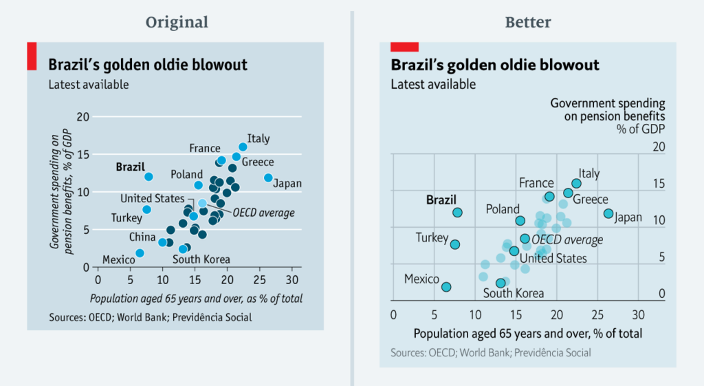
This chart doesn't tell us anything about the hue (is the background yellow? blue? green?), but only about saturation (on the y-axis) and lightness (on the x-axis). We can see, for example, that The Economist has a background color now ⬤ that's brighter and less saturated than before ⬤. The difference becomes more obvious when we give the background colors more space. Here's an image from visual journalist Sarah Leo's wonderful article "Mistakes, we've drawn a few":
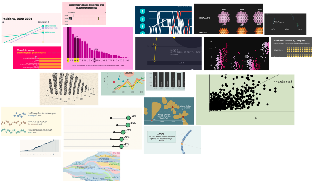
Let's fill the scatter plot with a few more data visualizations. I wanted to include visualizations from more and less advanced people in data visualization — so besides award winners and professional organizations, I also added data visualizations that got submitted to platforms that focus on learning within a community. Here they are:
With these 100 new data points, our scatter plots looks like this:
Ok, let's unpack that.
First, we can see that most visualizations use very bright backgrounds. And some visualizations use fairly dark colors. But very few use colors that are somewhere in between. Not a single visualization from the advanced organizations had a medium-bright color as its background. That's because it's hard to find good colors to go on top of them: They would need to be either very dark or very bright to have a good lightness contrast to the background.
Something else we see: Most background colors are not very saturated. The reason is similar: It's hard to find colors that go with a very colorful background. In most cases, you want the background to recede, not to scream "look at me!".
Apropos of "recede": During my research, I noticed that people who are still learning about data visualization tend to make the background pure black (#000000). More advanced people, on the other hand, soften their dark backgrounds by making them dark gray. These dark grays still looks black. But they're less intense, and a bit more sophisticated.
If we zoom in on the bright backgrounds, we'll get another insight:
Most of the visualizations — especially from advanced data vis designers — use a warm background color like yellow or orange. The Economist visualizations with their blue backgrounds are actually an outlier.
So we can conclude: Your background color should be desaturated, and either very bright or very dark. If you want to be sure, use a warm, very bright, desaturated background color.
I hope you enjoyed this little exploration of data vis background colors! If you're wondering why I didn't use the more common HSV or HSL color spaces instead of that weird OKLCH one, head over to my daily book updates for a charty explanation. We'll see you next week!


Comments