This article is brought to you by Datawrapper, a data visualization tool for creating charts, maps, and tables. Learn more.
What Questions to Ask When Creating Charts
The Attempt of a Data Vis Workflow
The process of creating a data visualisation can be messy: Finding data sources, sketching out a chart form, figuring out how to download data, analysing the data, trying out a chart type, bringing the data in a different format to try another chart type, researching more data, finding that the data doesn’t fit to my article, deciding against the chart altogether – it’s all very much entangled.
There have been many attempts to categorize this data vis pipeline. Some are more focused on data, some more on design or computation; some go further in their definition of “data vis” and some are more narrow:

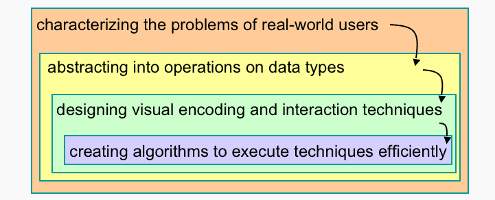


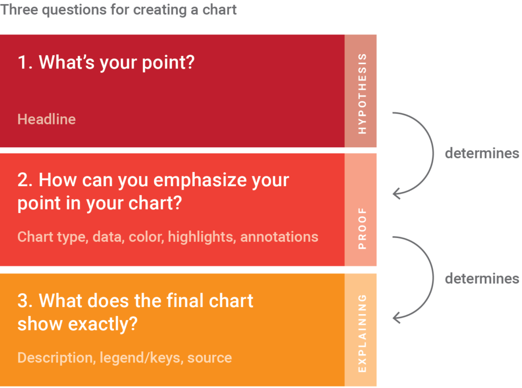
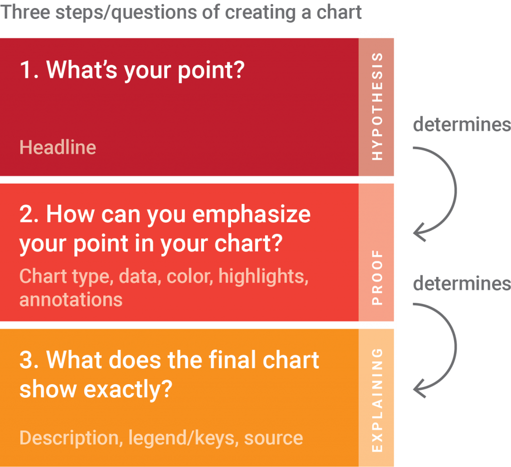
Here is my attempt. Whenever I create a chart, I find myself in one of three distinctly divided steps. They are so dependent on each other that I try to keep them in the right order. (E.g., when I decide that the first step should be different, I need to alter the 2nd and the 3rd step massively.) In this article, I will explain these three steps and which chart elements are necessary for each step. I’ll use an example to do so.
Our example chart
Let’s assume we write an article about the success of the iPhone and what it meant for Apple. Maybe we write a bit about the history of the iPhone; maybe we have a quote of an insider saying that Apple would be a different company without the iPhone. And maybe we say: “Hey, let’s have a chart in there that shows when and how the iPhone took off”. Excellent idea. So we build this.
Hover over the example chart below and click on “Edit this chart” in the top-right corner to open Datawrapper and play around with the settings of this chart in a new browser tab. You need to be on your computer for this. The button won’t appear on your smartphone or tablet.
That’s a pretty dull looking line chart. It does visualize the data we want to visualize: This chart tells us how many iPhones Apple sold per year. But it doesn’t tell us anything else: Why should we care? What’s interesting about this? Let’s see if we can fix that. To do so, we need to go one step back:
1. What’s your point?
When making charts, I can get in one of the following two kinds of moods. The first one is me all excited about the many exciting bits I find in the data and the many potential visualization forms I can think of. The other mood is me being devastated because I can’t think of any form for my visualization. The data seems un-visualizable.
In both cases, I quickly feel stuck. Either torn between all the pretty charts I could make. Or feeling like I have no options at all.
Luckily, when that happens, I’ve always had a smart colleague who asks: “Lisa, what do you actually want to show?” This question just works for me. It always stops my old thought process and makes me think freshly: Indeed, what is it that I want to show? Why am I creating this chart in the first place? Why is it in this article? What role will it play in the text? What is interesting about the chart? What’s the most critical piece of information I want to communicate with it? What is the one thing I want people to keep in mind after reading my chart?
We have a very powerful element in the chart where the answer to this questions can go:
Write a good headline
Headlines are our hypotheses. Here we promise our readers what they’ll see once they look at the chart. That has multiple advantages: Readers will save time because they’ll immediately know what they should pay attention to when looking at the chart. They will also remember the central statement of the chart better if it’s written out.
Good examples for chart headlines in the wild are “Cuts would hit New York, California the hardest” from the Washington Post and “It’s Not Your Imagination. Summers Are Getting Hotter.” from the New York Times; as well as “Game of Thrones has more warm hues than cool ones” from Vox. All of these headlines tell me what point the chart below it will make.
So what do we want to show with our iPhone chart? Let’s see. A good question to ask is: What is our article about? It’s about the iPhone being really successful for Apple and how Apple changed because of the iPhone. So wait, what makes the subject/object of our article (the iPhone) so special? Because the iPhone is the most successful product Apple built. Aha! That’s interesting indeed. Maybe that’s what our graphic should show. So that’s going to be our headline:
Once we’ve decided what we want to show, we can make decisions about how to show it the readers:
2. How can you emphasize your point in your chart?
If the headline is our hypothesis, the chart is the proof for this hypothesis. Here, readers can see for themselves. They can check if our headline statement makes sense and can discover more insights besides it.
Showing the point you want in your chart comes in two parts. The first step is to choose a chart type for your data. That’s a crucial decision. Indeed, it’s so crucial that I decided to dedicate an entire article to it in the future. In the article you’re reading right now, I want to focus on the second part of the process: Making sure you communicate your statement best once you decided on the chart form. We will look at three possibilities: Adding data, highlighting data with color, and annotating.
Add (comparison) data
If you don’t actually have the data for your chart yet, this is the moment where you need to go out and hunt for it – always with the hypothesis in mind that you want to prove. Often, you’ll come home without success, because your hypothesis was wrong. Then you need to go back to step 1 and check if there’s a story at all, and which story it can be.
We are lucky: We already know that our hypothesis is right and that the iPhone has been indeed the most successful Apple product in the last ten years. But our spreadsheet work is not done yet. It’s time to add data for comparison.
Comparisons are what makes data vis into data vis. I mean, sure, you can go ahead and visualize one number. But only when we compare our data with the situation…
- ten years ago
- in your own country
- of other industries
- in other states
- with a global average
- with the outliers
- etc.
…we set the data into perspective and make it relatable to the reader.
“What should I compare it to?” is really one of the most crucial questions in data visualisation. And the answers depends on the point we want to make with our chart (from step 1). We already compare the iPhone sales of one year with them of all the years between 2003 and 2014, so that’s neat. If my goal is to show the competition between Apple and Samsung, I should add some Samsung sales numbers in there. If my goal is to show how iPhone returns went up or down over the years, I should add iPhone returns in the graphic. We already figured out our goal is to show that the iPhone was the most successful Apple product, so we definitely should compare it with other Apple products:
Only when we see the iPhone sales in comparison with other Apple products, we can understand what a success it has been. Only then we have proven our hypothesis from step 1.
Highlight with colors
Colors are your best tool to quickly lead the reader’s eye to the critical elements on your chart. It’s your spotlight: “Look there.”
But there’s another reason to think about colors a bit longer: Especially if you have tons of comparison data in your chart, using colors well is key for a clean look. I recommend grey for the job. Grey is the most important color in data vis.
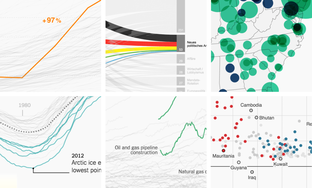
We, too, have comparison data in our chart, and we, too, should make use of grey. We added the iPad and the iPod sales numbers to let readers compare it with the iPhone numbers – but the iPhone numbers should still be the star of the show. So we want to make sure that it sticks out (in red), while we move the rest of the data to the background of our reader’s attention (in grey):
Annotate & highlight elements
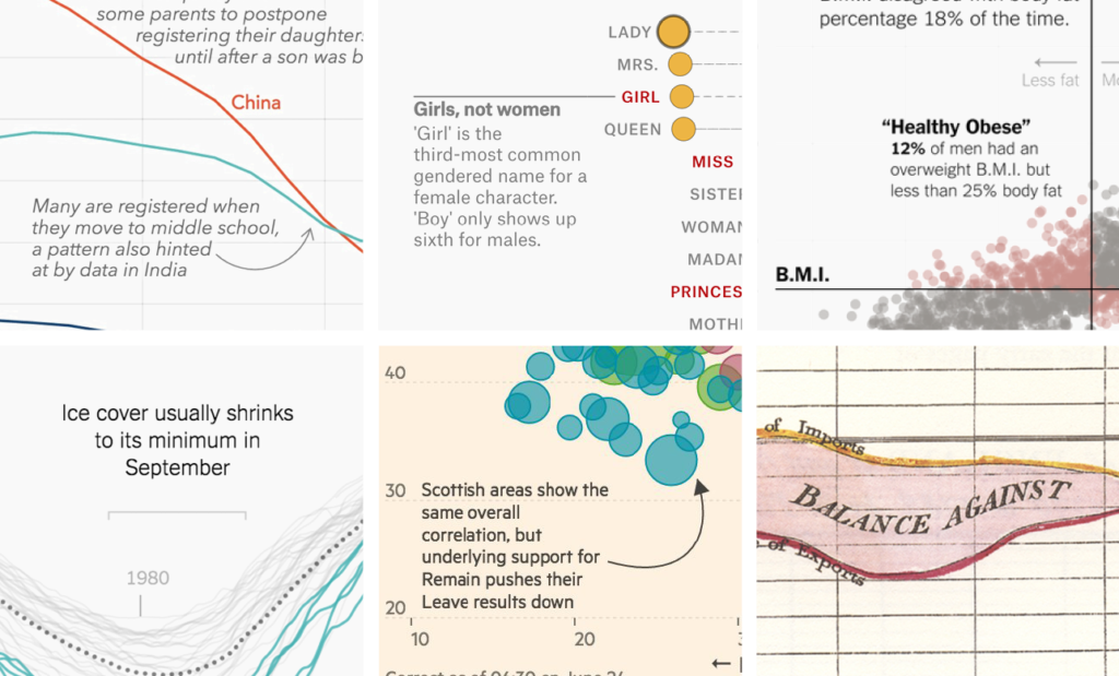
Annotations and highlights like ranges, arrows, contours (e.g., around a city border on a map) are another way to lead the reader’s eye to the parts on our chart that support the point we want to make. But compared to colors, annotations are also great for giving readers extra bits of information: Information which goes beyond our central statement and which the chart can’t explain (e.g., all questions that start with “why”).
In the case of our iPhone chart, we can tell the reader more about the months in which the iPhone slowly overtook the iPod (and highlight them with a grey range):
Our chart looks pretty finished! But we’re not completely done yet: There’s one essential last part that we should get to once all our visual elements are in place.
3. What does the final chart show exactly?
In step 1, we told the readers what we would show them. In step 2, we showed them. Now, in step 3, we tell them what we showed them: We’ll explain to our readers what they see on our chart.
Write precise descriptions
It’s easy to lose sight of the importance of good descriptions after working on a chart for hours or weeks. We need to be aware that our readers didn’t come along on our whole data exploration and visualization process. Our readers see this chart for the first time and have no idea what’s going on. So let’s tell them. We’ll choose “Worldwide sales of selected Apple products in million, by fiscal quarter, 2000 to 2014” for our chart.
Writing descriptions is a bit more complicated than it seems: Is it ok to leave out that these are fiscal quarters? Yes, but it’s also a great way to let the reader know where the data comes from (“Ah, fiscal quarters! Fiscal reports! I see!”). Is it ok to leave out that we’re talking about Apple products since everyone knows which company produces the iPhone and iPad? No, because we can’t assume that everyone knows (except when we’re writing for an Apple-focused magazine). How about skipping the “selected”? I’d rather not, since writing that these are “selected” products points every reader to the fact that our chart doesn’t show every single Apple product there is. But is it ok to leave out that the data is from 2000 to 2014, since the x-axis shows that as well? Yes, but it’s also a great way to remind readers of the time frame. That’s especially needed since we only have data until 2014, not until the current year – and we want to make sure that our readers don’t miss that.
Add legends/keys
Similar to the descriptions, keys are crucial for the reader’s understanding of what’s going on in the chart. Every visual element that represents data needs to be labeled somehow. The closer the label sits to the element, the better: We want to save our readers’ time and energy and therefore don’t want them to travel far distances with the eye.
Add a source. Seriously. Add it.
The source is for the chart what the chart is for the hypothesis: Proof. Ok, I’m not sure if this analogy is still helpful. But you know what’s helpful? Sources are helpful. Add them, please. For transparency. And so that your reader can go along and make a better chart than you did, with the same data.
We made it! This is our final chart, including description, legend and source:
You also made it to the end of this long article about my chart creation process. Yes, I admit it, I cheated a bit: I didn’t talk about the data research, clean up and analysis part at all. It’s part of my step 2 (“How can you emphasize the your point in your chart?”). Actually, if you look at Ben Fry’s data vis process at the top of this article, you’ll find that all of his steps are part of my step 2. In my opinion, everything that happens in step 2 (and it’s a lot) is so interconnected that it’s hard to draw clear boundaries. But all this data analysis, trying our chart forms etc. is depended on the point you want to make (step 1); and after doing it, you definitely always need to explain your chart (step 3).
What do you think of this article? Does this workflow make sense to you? How would you improve the iPhone chart? Also, if I forgot an interesting data vis workflow / pipeline / process / however-you-want-to-call-it, let me know! I’d love to add it to the top of the article.
Want to recreate the chart? When you go to datawrapper.de and click on “Make a chart”, you land on a page where you can choose example datasets. I chose the first one: “How the iPhone shaped Apple”. Or hover over any of the charts above and click “Edit this chart” to arrive directly in the chart creation process.


Comments