

New: Automatically label data points in line charts
September 18th, 2024
3 min
This article is brought to you by Datawrapper, a data visualization tool for creating charts, maps, and tables. Learn more.
Today we’re extending the Datawrapper map collection with our first three population cartograms: of US states, the world, and German states. To use these three maps do the following:
Population cartograms don’t let you fill political areas with colors like the choropleth maps we’ve featured in Datawrapper to date, but areas that represent the population of these political areas.
In this article, we will explain the problems with geographical maps and how cartograms can solve them, but also point out their shortcomings:
The size of countries on geographical maps represents…well, the size of these countries in real life. The bigger a country on our map, the more space on planet earth it takes up. However, most of the time we want to tell stories about people, not geographical areas. We want to know: “How many people are affected?”, not “How much area is affected?”
That wouldn’t be a problem if area and population would correlate well; if exactly 50 people lived per every land square kilometer. But people tend to not like living in the Sahara and the south pole so much, and people tend to gather together in cities. In Monaco, 20 thousand people live per one square kilometer. In Greenland, one person can call eight square kilometers their home, on average.
Why is it important to think about this problem? Because the attention of readers is automatically drawn to big areas, like Russia or Canada. On the other hand, small but super populated areas like Bangladesh or Hong Kong are so tiny that readers can’t see them on a map until they zoom in.
The consequence? Geographical maps can give us a distorted impression of the data; a false worldview. “This world map looks mostly green, so things are good for most people”, we might think subconsciously; while ignoring all these smaller areas that suggest that things might not be so good for billions of people.
That’s why we decided to include population cartograms in the Datawrapper map collection. Instead of representing the geographical size, the country size represents the number of people who live in the country. That does give us a more honest view of the data we want to show. But there’s one crucial problem:
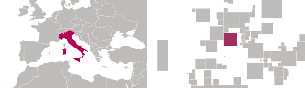
Cartograms are really, really slow to read. Over the years, we learned how to quickly recognize countries based on their position (e.g. Nepal, between China and India), their size (e.g. Russia) and their shape (e.g. Italy).
On cartograms, none of these tricks work anymore. The relative position of countries to other countries is often distorted (“Nepal is east of India? “):
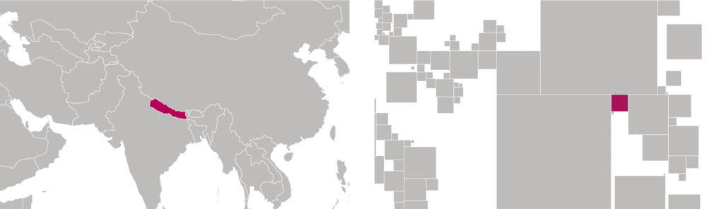
The size of countries is way smaller than we’re used to (“There’s just a big hole where Russia used to be. Which of these squares is Russia?”):
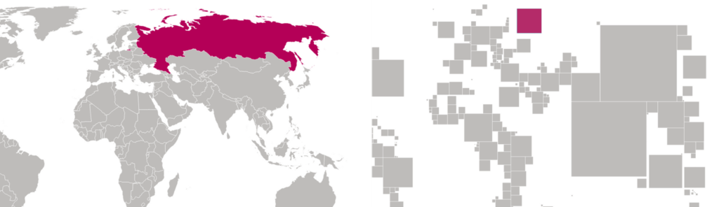
And the shape of every country is just…well, square:
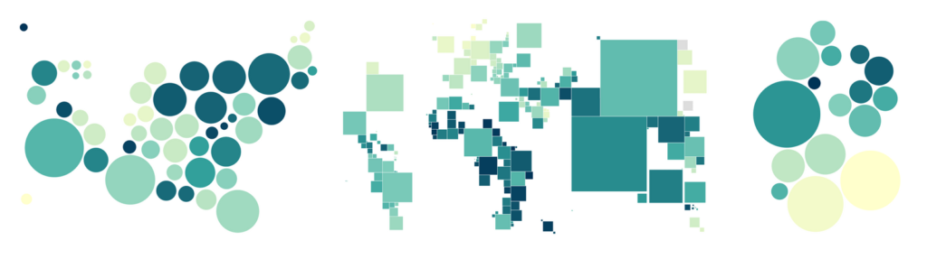
But surely there must be a map that combines the honesty of cartograms with the readability of physical maps? Well, people definitely tried; there is not just one kind of cartogram[1]. Here are three more cartogram types that you probably see most often, including the “Dorling map”[2] that we introduced today.

The maps are taken from Benjamin Hennig, Guardian, Buzzfeed and Datawrapper. The bubbles are filled subjectively.
We can see that each cartogram is a compromise: The more recognizable the position or shape of a country is, the harder it becomes to compare their sizes with each other. Both the contiguous map and the grid cartogram are also not 100% accurate when it comes to representing the population through size[3].
So which one of these two flawed map types should you use for your data about people? The geographical map that’s quickly readable but doesn’t tell us anything about the number of affected people? Or the cartogram, that’s great with the latter one but slow to read?
It depends. As always, there is no perfect data visualization, just well-considered priorities. If the geographical pattern in your data is more visible on a geographical map, do choose that one. If your story is not so much about specific states or countries (and their position in relation to other countries) but should just give a general overview of how many people are affected in which part of the country/world, use the cartogram.
If you do use a cartogram, make sure to explain to your readers what they’re seeing. At first, they won’t see a map – just circles or squares. So consider placing the name of the country you’re showing in the title (“Unemployment rate in German states”), consider placing labels at zoom level 1, and make the name of the state or country in the tooltip a bit more prominent.
For now, we’ve created Dorling maps for you – but we’re open to extending our cartogram collection in the future and to explore other types of cartograms. We want to understand which specific cartogram types and/or countries/regions you would love to see in the Datawrapper tool – so do get in touch with us on Twitter
or write to me at lisa@datawrapper.de.
Do you want to read more about cartograms, their advantages, and shortcomings? There was a lot written about it in 2016 thanks to Brexit and the US election. Have a look at
Here’s a great paper by Sabrina Nusrat and Stephen Kobourov, that compares different cartogram types and their shortcomings with each other (PDF). ↩︎
Invented by Danny Dorling, a social geographer from Oxford, England. He wrote tons of books and started worldmapper.org, which features contiguous world cartograms about hundreds of different topics. ↩︎
The reasons for this missing accuracy is different for the two kinds of maps. Grid cartograms are actually accurate if one tile in the grid represents e.g. one electoral voter – that’s why we saw them so often in the US election year 2016. However, if we want to pack thousands of citizens in one tile, accuracy goes down. One tile will represent the number of citizens of the smallest state or country. The number of tiles for the other regions often gets determined by how many times this smallest-tile-number fits in the number of citizens of the other regions. This can only be an approximation, though. The more tiles we choose for the smallest region, the more accurate the map becomes – but here again we need to make a compromise between usefulness and accuracy.
Find more information about the problem with the accuracy of contiguous maps in the last paragraph on this website. ↩︎


Comments