Watch the recordings of Unwrapped, our conference
August 12th, 2024
5 min
Datawrapper lets you show your data as beautiful charts, maps or tables with a few clicks. Find out more about all the available visualization types.
Our mission is to help everyone communicate with data - from newsrooms to global enterprises, non-profits or public service.
We want to enable everyone to create beautiful charts, maps, and tables. New to data visualization? Or do you have specific questions about us? You'll find all the answers here.
Data vis best practices, news, and examples
250+ articles that explain how to use Datawrapper
Answers to common questions
An exchange place for Datawrapper visualizations
Attend and watch how to use Datawrapper best
Learn about available positions on our team
Our latest small and big improvements
Build your integration with Datawrapper's API
Get in touch with us – we're happy to help

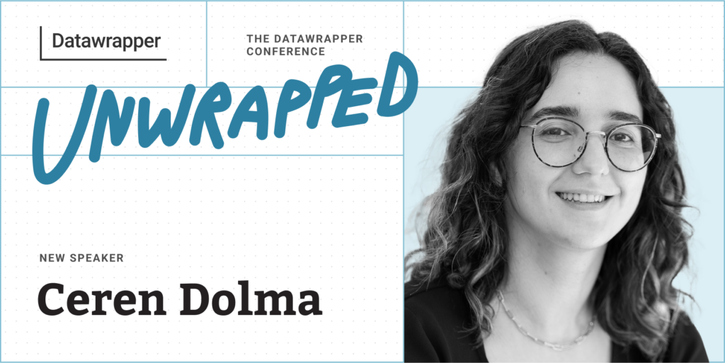
We’re excited to announce that freelancer Ceren Dolma will speak at our Unwrapped conference about “Visualizing ‘Place’ with Datawrapper.” If you’re curious about our locator map feature, watching this talk is a great place to start.
Ceren Dolma is a self-employed cartographer and a data visualization designer. Transitioning from a full-time consultancy role to being a freelancer, she is constantly working on learning new tools and stretching those tools’ capabilities to meet her projects’ needs. She is a Datawrapper beginner and has begun using its cartographic features as a part of her 30-Day Map Challenge contributions in 2022 and 2023.
Time to ask her some questions:
When we look at a map to navigate ourselves from point A to point B, we all see the same visual. However, our experiences differ. When I wanted to create a counter-cartographic visualization of my own experience of navigating Belfast as a young immigrant woman, I came across many tools that Datawrapper offers or works in conjunction with to customize and fine-tune visualizations. In this talk, I will walk through the process of creating “I want to go to the American Bar, but… public transit fails me” using custom JSONs and annotations. My hope for this talk is to leave you curious to explore Datawrapper’s functionalities to tell your own experiences of place, and maybe even bring it to newsrooms, workplaces, or research groups.
Initially I started using Datawrapper out of personal curiosity to explore its mapmaking capabilities. Fairly quickly, I also started to use it as a data visualization tool because you can get clean and professional-looking visualizations really quickly, and there are very few barriers to entry. Nowadays, whether for a personal project or a work-related one, quite often I will start by throwing in my data into Datawrapper and exploring what it looks like with preliminary visualizations. Sometimes I finish everything right there, without further tweaking and refining.
Other times, when I might want to have more control, I might move it to other tools like R and Adobe Illustrator, though those tools have higher barriers to entry.
Typically, my aim when creating data visualizations is to tell a story or get a point across. Because of that aim I always ask myself how the choices I am making support my intended message. This becomes an anchor when I'm deciding what type of chart to use, how many variables to include, how to visualize each of those variables, and more.
Another consideration I keep coming back to is the audience. How can I make sure, to the best of my ability, that the audience received my intended message? This becomes especially relevant when deciding whether to use more traditional approaches or experiment with different visualization techniques, or how much explanatory text is needed in order to assist the viewer.
My favorite Datawrapper feature is the ability to interact with and edit data during the upload process. Especially when working with global spatial data at a country level, it's common to have missing data from some countries, or the name of the country will be spelled slightly differently based on your data sources. Datawrapper is great at highlighting data that doesn’t match the countries in their basemaps and allows you to edit it right there at that moment instead of having to go back and edit the source data.
We're looking forward to Ceren's talk at Unwrapped! Until then, you can find more about her on LinkedIn , X, and her website. To sign up for Unwrapped and hear Ceren and other great speakers, visit our conference website.
Comments