


New: Automatically label data points in line charts
September 18th, 2024
3 min
This article is brought to you by Datawrapper, a data visualization tool for creating charts, maps, and tables. Learn more.
We are delighted to announce a significant update to our choropleth and symbol maps. The list of improvements includes new color scale options, more flexible legends, and simplified tooltip editing. In short, designing Datawrapper maps was never this easy.
It’s simpler for you. And the maps look and behave better, too.
Here’s what we changed:
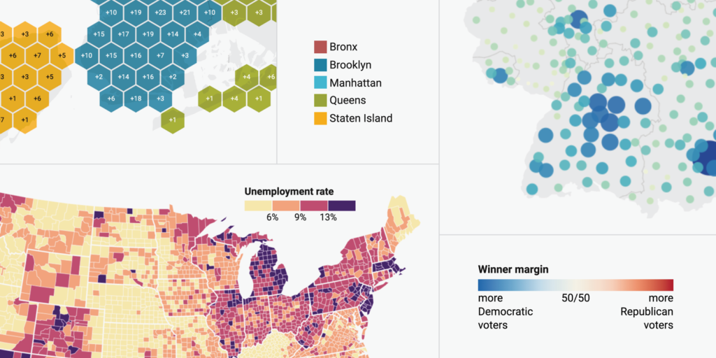
There are two kinds of color scales – those where every value is assigned a color on a color gradient (continuous color scales), and those where all values within a range get the same color (stepped or discrete color scales). Since day one, you could use our choropleth maps to create continuous color scales – but using stepped color scales required a workaround.
Not anymore. Creating stepped color scales is now easier than ever. To learn more about the new feature, check out our Academy article “How to customize stepped color scales”.

Our new interface lets you change the number of steps, the colors, or the labels with just a few clicks.
You can now create exactly the color legend you need – be it gradients, ranges, or rules. Also new: You can rename and reorder items of categorical color legends directly in the Visualize step.
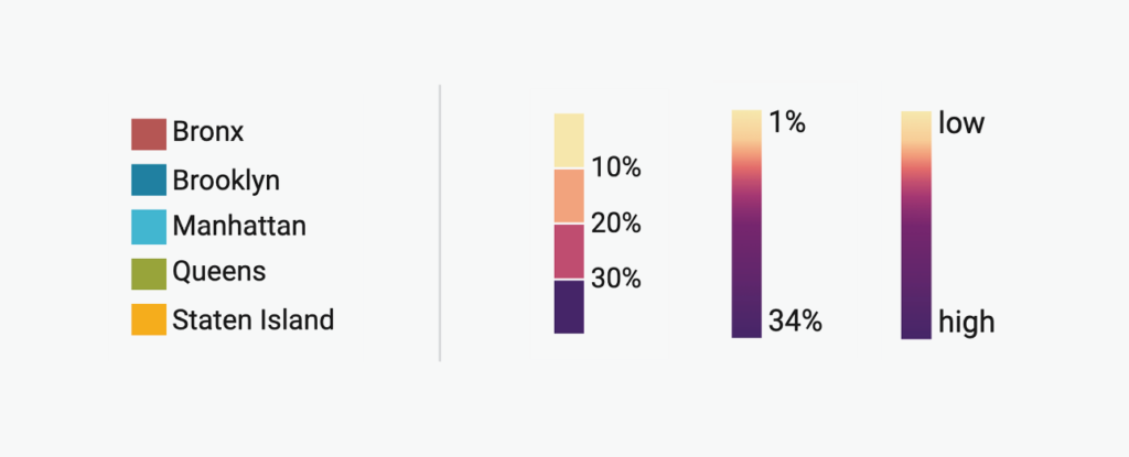
Examples of color legends now possible with Datawrapper. All legends can also be rotated to a horizontal position.
And you can place your legend freely: If it overlaps important regions, move it above or below the map. Or choose an empty corner of your map and use our new offset and padding feature to find a good spot:
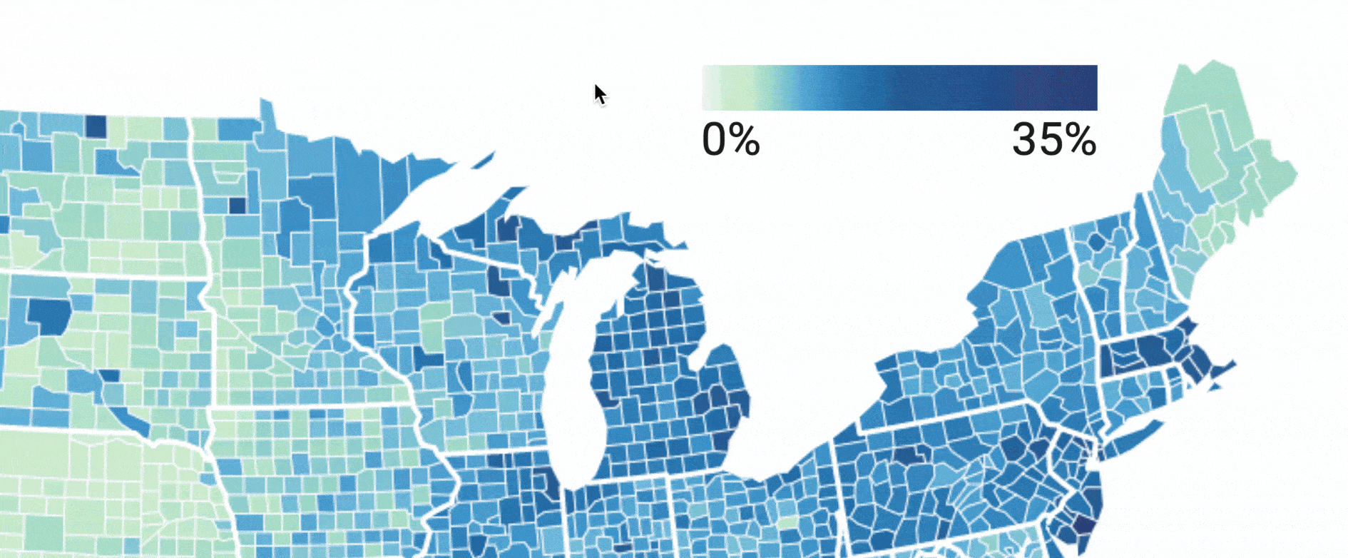
Another feature you’ll probably enjoy: If you (or your reader) hover over these nice-looking legends, you can now see the corresponding areas on the map – and the other way around. Just “Enable highlighting on hover”. Try it out on the map above.
To learn more about our new color legend and positioning options, visit our Academy article “How to customize your map legend”.
It’s now easier for you to create the tooltips you need. The first change: The tooltip editor and the map now sit side-by-side. This allows you to see the tooltips while you’re editing them.
The second change: We’re now using the same Excel-like syntax in tooltips as we do in our computed columns. So instead of writing e.g. Math.round(), you can use ROUND(). Find a list of all possible helper functions on Github.
And there’s a third change: We added a little dropdown menu next to the column name to make it easier to format numbers and dates:
Especially our grouped symbol tooltips benefit from that: Just use the new dropdown menu to get the number of symbols or a list of them in your tooltip. Learn more about grouped symbol tooltips in this Academy article.
And yes, you can still use HTML for 100% flexibility (and little bar charts). Get inspired for what you can do with our tooltips in this Academy article.
“Reader-friendly” means: We made the zoom buttons bigger and, therefore, easier to tap on mobile devices. We also moved the zoom option to the bottom right corner and added a button to reset the original view once you have zoomed in.

On the left: the old zoom buttons. Right: Our new zoom buttons, zoomed out and zoomed in with “reset view” button.
You will notice that big maps – like U.S. county maps or maps with lots of symbols – will now render faster than before. That’s because we switched from SVG to Canvas for our map-rendering. We’re now also pre-projecting your maps on our servers instead of doing so on your reader’s device. Both improvements speed up the map rendering considerably.
And no worries: You can still export your maps as a PDF or SVG if you’re on a Custom or Enterprise plan.
This blog post would become too long if we explained every updated map feature in detail. So here’s what else is new:

We are super excited to share this big update with you and hope it helps you build even better maps. If you have any questions, feedback, or hints, get in touch with us at support@datawrapper.de. We’re always happy to hear from you.


Comments