This article is brought to you by Datawrapper, a data visualization tool for creating charts, maps, and tables. Learn more.
How many composers have I listened to?

Hi, I’m Guillermina, a product specialist at Datawrapper. I host Datawrapper’s public webinars to help you get the most out of the tool! I also like scatterplots, so in today’s Weekly Chart I’ll recreate one of the first data vis pieces I ever ran into using a scatterplot.
I was in my early twenties when I found a timeline my dad had made by hand when he was 20 years old. The timeline shows the most important classical music composers from 1650 to 1960. As the classical music aficionado he was and still is, he started making this timeline after asking himself how old Schubert was when Beethoven died. He then wanted to know which other composers had been each other’s contemporaries. He got all the information he needed from an encyclopedia (think: there was no Wikipedia or Google in the 1970s) and organized it visually in the form of a timeline.
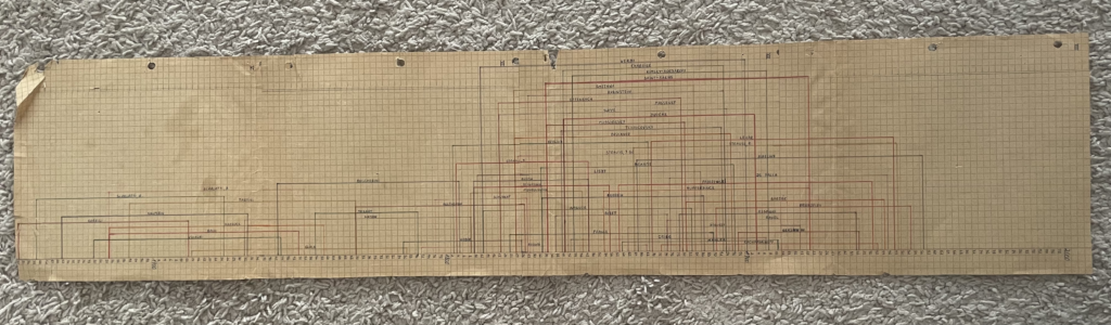

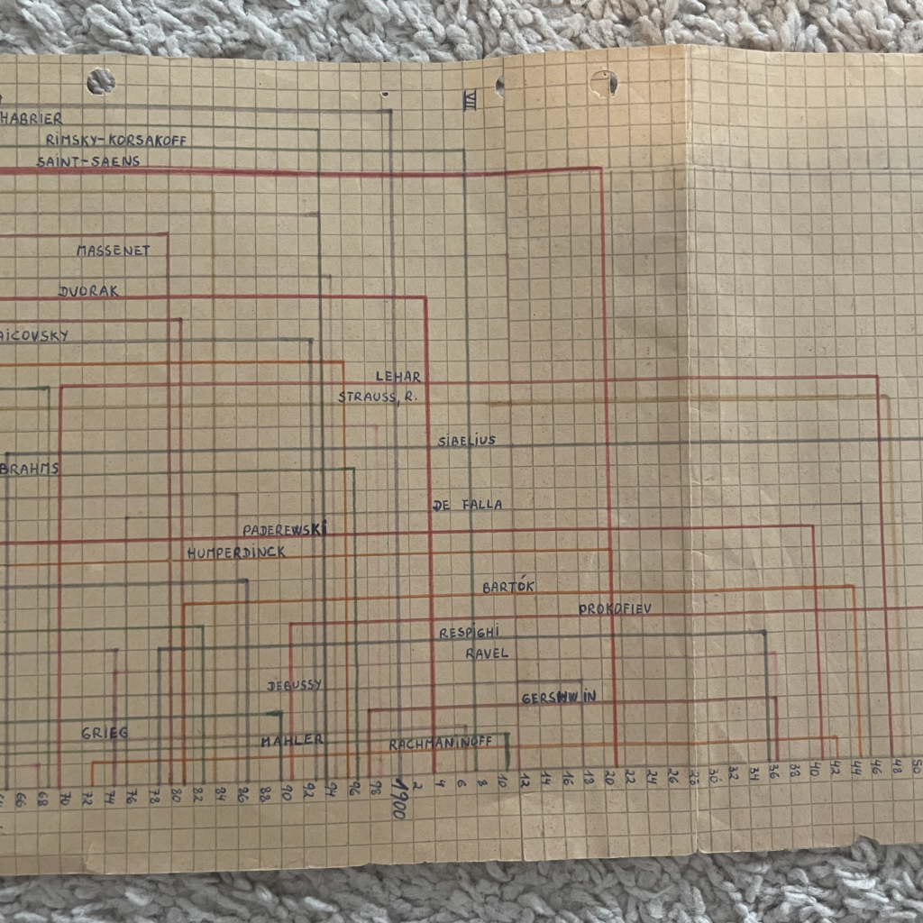
I liked this piece of data vis so much that I hung it on a corkboard I had in my bedroom. As I started getting into data visualization, I told myself that one day I would remake it, maybe adding some other composers, and post it online. The Weekly Chart series felt like the perfect opportunity to make this happen and to dig deeper into how well I know the composers my dad decided to include.
Recreating the timeline
I have always been fascinated by how versatile Datawrapper scatterplots can be. Because they give you full control over the position and color of the elements, they let you create many sorts of visualizations that go beyond the typical scatterplot itself. I’ve seen some Datawrapper users really pushing the boundaries and using them in unexpected and creative ways. You can see some of these examples here; my favorite one is Lisa’s periodic table.
In this case, I decided to use the scatterplot to create a vertical timeline. Why vertical and not horizontal? It’s not the 1970s anymore, and vertical timelines usually display better on narrower screen sizes. If you are interested in learning more about how to turn scatterplots into timelines, you may find this tutorial useful.
Because scatterplots can be very adaptable, I took my dad’s timeline a little bit further and annotated the visualization to add more information and context. I highlighted the different musical periods to help readers situate themselves better in time. I also customized the tooltips so that when you hover over the data points, you can access more information about each composer, including a Spotify link to listen to one of their compositions. I also used color in my favor to add an extra layer of data to the chart: I divided the composers into those I have listened to and those I haven’t. To my surprise, of the 56 composers in the timeline, I hadn’t listened to 25%. Of those, 50% I didn’t even know their names.
If you are interested in listening to all the composers in the timeline, I created a Spotify playlist of their works. The pieces are sorted by the composer’s birth year in ascending order, so as you listen to the playlist you’ll travel in time from the Baroque period through to the modern era. (I want to thank Juan Raso Llarás for helping me put this list together and making the calls on what pieces to add for each composer.)
That’s it for my Weekly Chart! Now let’s sit back, relax, and enjoy some of the most beautiful classical pieces ever written. Next Thursday, our developer Jakub will create a Weekly Chart. We’ll see you then.


Comments