

New: Automatically label data points in line charts
September 18th, 2024
3 min
This article is brought to you by Datawrapper, a data visualization tool for creating charts, maps, and tables. Learn more.
We added a color blindness simulator that automatically flags problematic colors
Picking colors for charts and maps is already a tricky task. But making sure that your graphic is also colorblind-friendly can be a real challenge. Of course, there are a lot of tools that can help chart creators, but more often than not we’re just too lazy to do the extra checking, or we forget about our color blind audience entirely.
Why is this a problem?
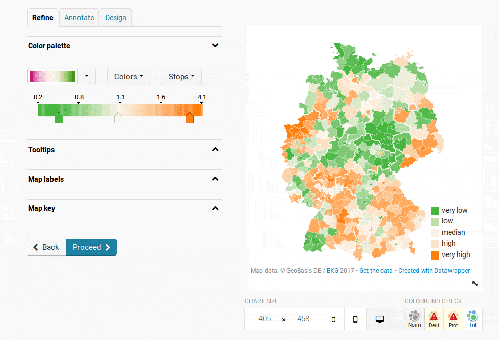
Just look at this map below. If you’re not color blind, you see a nice green-yellow-red color palette as shown on the left. But to someone who is color blind, the same map looks like it’s all one color.
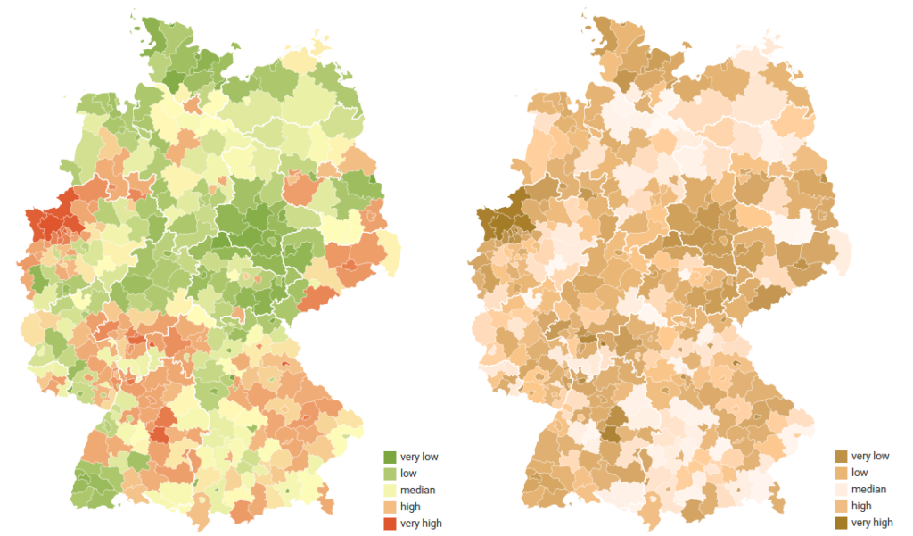
Left: the map under normal vision, Right: how the map looks for a color blind person (red-green blindness).
That’s why today we added two new features to Datawrapper. The first is an integrated simulator for three types of color blindness: Deuteranopia, Protanopia and Tritanopia. Now you don’t need to install additional tools and remember to use them: the color check is just one three clicks away.
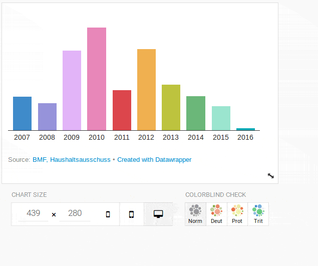
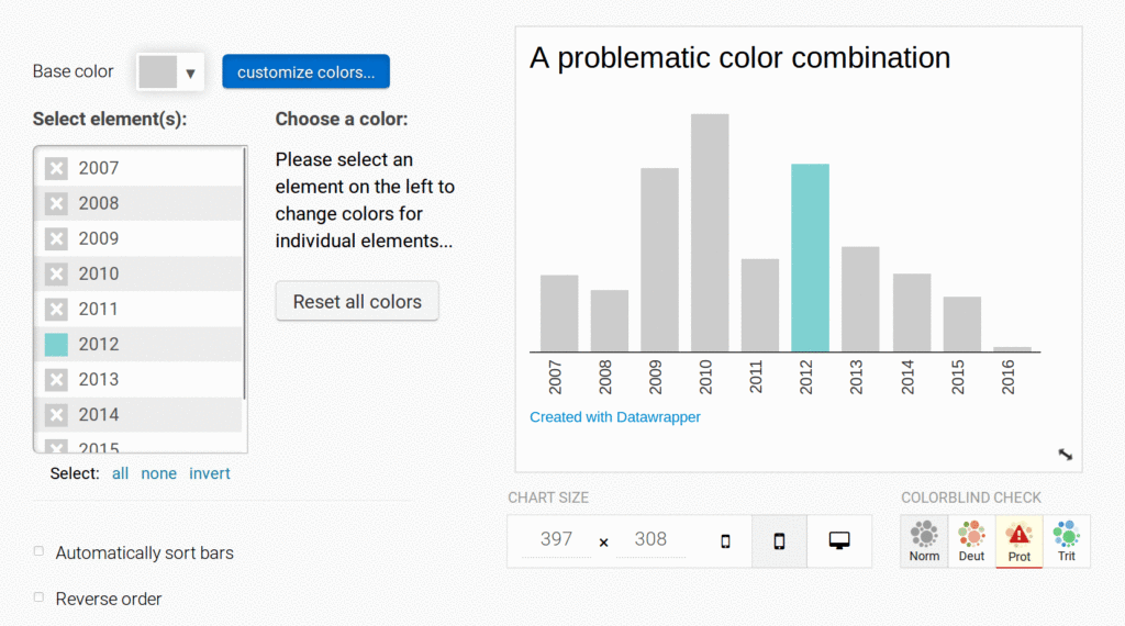
But of course we know how busy everyone is, and that’s what where the second feature comes in. Datawrapper will automatically check the colors in your charts and maps, so you don’t have to. When it detects that there is a problem you’ll see a friendly little warning sign below your chart:
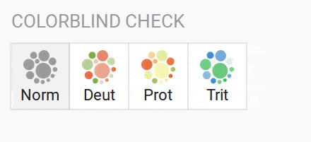
Clicking on the highlighted button will then show you a simulation of how the colors (roughly) look like for someone affected by that type of color blindness.
The super short answer is, make sure the colors vary enough in brightness. You’ll see what colors need to be fixed in the colorblind simulation.
Problematic colors are usually equally bright combinations of red and green, orange and green, yellow and pink or blue and green. Another common problem is putting either of these colors against a gray of the same brighness.
Again, the fix is to simply make one of the colors darker or brighter.
For maps with diverging color palettes it won’t be enough to make one of the ends of the gradient darker. You will need to avoid red-green, orange-green, blue-green and yellow-pink gradients altogether.
The good news is that there are a lot of other combinations that work just fine. In the next animation you can see how we just moved the green a little bit towards blue until the problem was fixed.
The short explanation is that Datawrapper is just doing the same thing a human would do to detect problematic colors: look at each pair of colors used in the chart to find those that are easily distinguishable in the normal view but hard to distinguish in the color blindness simulation.
If you want to find out more about this, I’ll soon write a more technical blog post about the algorithm and add the link here.
For this blog post I checked the last ~1200 charts and maps that were published with Datawrapper and found that about 9 percent of them used colors that are problematic for readers with color blindness. The rate is even higher for certain chart types: according to my test run about 1 out of 3 stacked column charts is using problematic colors.
Color blindness might not affect a lot of people, but few people would disagree that it’s worth caring about it. After all, tweaking colors in a chart is simple – the hardest part is to remember to check your colors each and every time. My hope is that the automatic color check will improve the color blind friendliness in the future.


Comments