
What to consider when creating small multiple line charts
February 7th, 2024
8 min
This article is brought to you by Datawrapper, a data visualization tool for creating charts, maps, and tables. Learn more.
Part 2 of a three-part series on colorblindness
Choosing colors for your visualizations is hard, choosing colorblind-safe colors is harder. This article tries to help. It includes ideas to design colorblind-safe data visualizations. Half of the options have little to do with color: We’ll talk about labels, hover effects, symbols, shapes, and patterns.
Using these ideas in your next chart or map can make all your readers happy: They simply aim at making it more likely that readers can tell apart differently colored elements. Most of the advice here will make your charts easier to read. Not just for people with a color vision deficiency, or the older ones, or the ones that read your chart in low light – for everyone.
This article is part of a three-part series on colorblindness:
The first article – published last Wednesday – is about why you should care about your vision-deficient readers, and what’s the difference between colorweakness and colorblindness. It also explains in detail which color combinations are tricky to distinguish for your colorblind readers.
That’s the article you’re currently reading! It covers a lot, so here’s an index of everything you can use to make your charts and maps decipherable for colorblind readers:
1. Blue (and orange)
2. Different lightness
3. Colorblind-safe color palettes
4. Fewer colors
5. Colorblind simulators
6. Symbols
7. Shapes
8. Position & shapes
9. Patterns
10. Different line widths and dashes
11. Direct labels
12. Highlights through interaction
13. Ask colorblind people
In the third article, you’ll hear from then colorblind data visualization enthusiasts themselves, like our Datawrapper CEO David. You’ll learn if/how they perceive their colorblindness as an inconvenience in daily life and when reading (or designing!) charts and maps. I already included a few of their statements in this week’s article.
Let’s start!
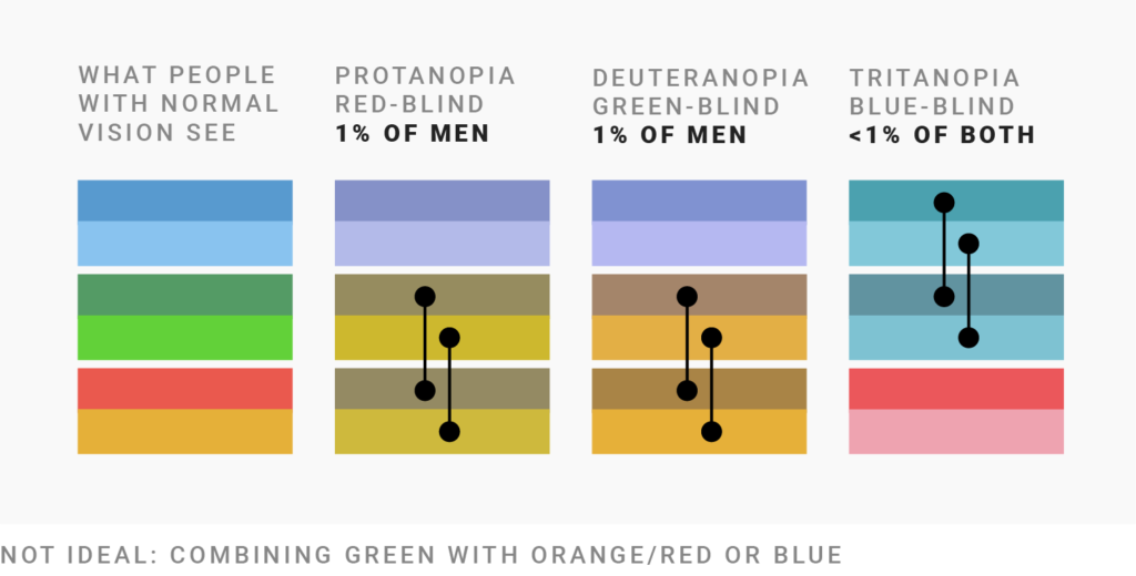
If you’re a fan of green, here is bad news: In a chart that you want to be readable by colorblind people, you can neither combine green with orange/red nor with blue of the same lightness:
Here’s another view on the same dilemma, this time with the color wheels we met last time:
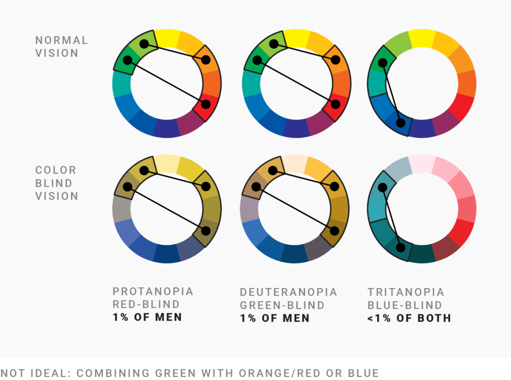
Note that the color that looks the most the same for people with normal vision and readers with red-/green-blindness (the most common types of colorblindness) is blue. “Blue is the safest hue.” If you want red- and green-blind readers to perceive color as you do, choose blue.
If you do need multiple colors, the safest choice is to mix blue ⬤ with orange or red ⬤/⬤:
You might wonder: “Complimentary colors like blue and orange? Is this necessary?” Well, it does help. Red-green blind software developer Peter Cardwell-Gardner tells me: “It may be tempting to choose colors near each other (e.g. blue/purple) as they can give your overall image a visually appealing cohesive look. But choosing to do so will completely torpedo my ability to understand your chart.”
But there’s a way to choose nearby colors anyway:
You can use any colors you like as long as they vary by lightness. “Get it right in black & white,” lots of data vis teachers have told their students over the years. The idea: If you print your data visualization with a black/white printer and it’s still readable, any colorblind person will be able to read it, too.
That’s why these three color combinations and many more work:
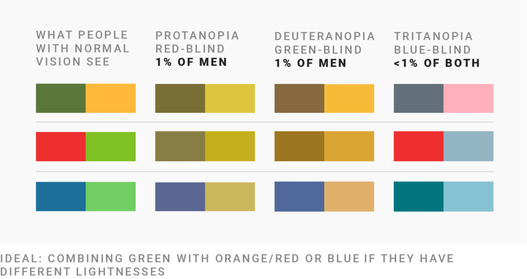
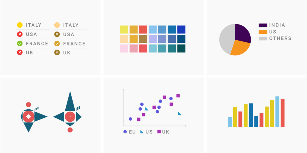
So you can indicate good and bad with ⬤ and ⬤ and colorblind readers will be able to tell them apart. Just be aware that for them, red and green won’t look like an indicator for something good and bad, but like a darker olive/orange and a lighter one.
“Get it right in black and white” is also the reason why bringing yellow into your color mix works well for colorblind people. Compare these colors ⬤⬤⬤⬤ and their brightness ⬤⬤⬤⬤: Yellow is so light that it contrasts well with most other “primary” colors.
It’s also the reason why this text is barely visible to colorblind readers. For red-blind readers, it just looks like this text, not like a vibrant red.
Now that we know about the safe colors blue and orange and about varying lightness, we can create whole palettes.
Masataka Okabe and Kei Ito propose the following colorblind-safe palette, which I found referenced many times online:
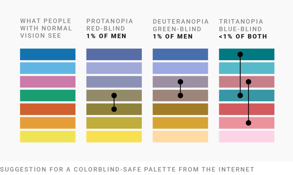
It does come with a few colors that colorblind readers might not be able to tell apart according to Viz Palette, especially if they’re used for fine lines, like ⬤ and ⬤, or ⬤ and ⬤. I indicated them with connected circles.
I also don’t recommend the use of green ⬤ and pink ⬤ if you’re using red or blue, too – as soon as you start changing these colors, you’re getting dangerously close to what red-/green-blind people perceive as red and blue.
Here’s my attempt at creating a colorblind palette. I reduced the palette to the classic cold and warm colors:
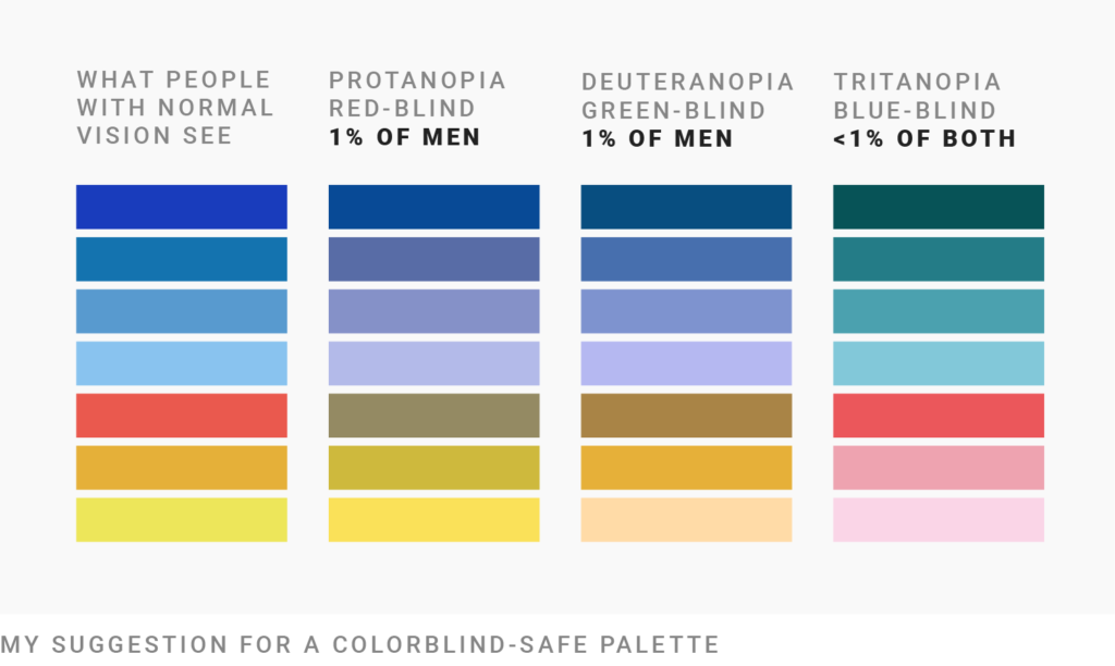
The colors of this palette are optimized to…
Here’s an example of what the colors will look like in a chart:
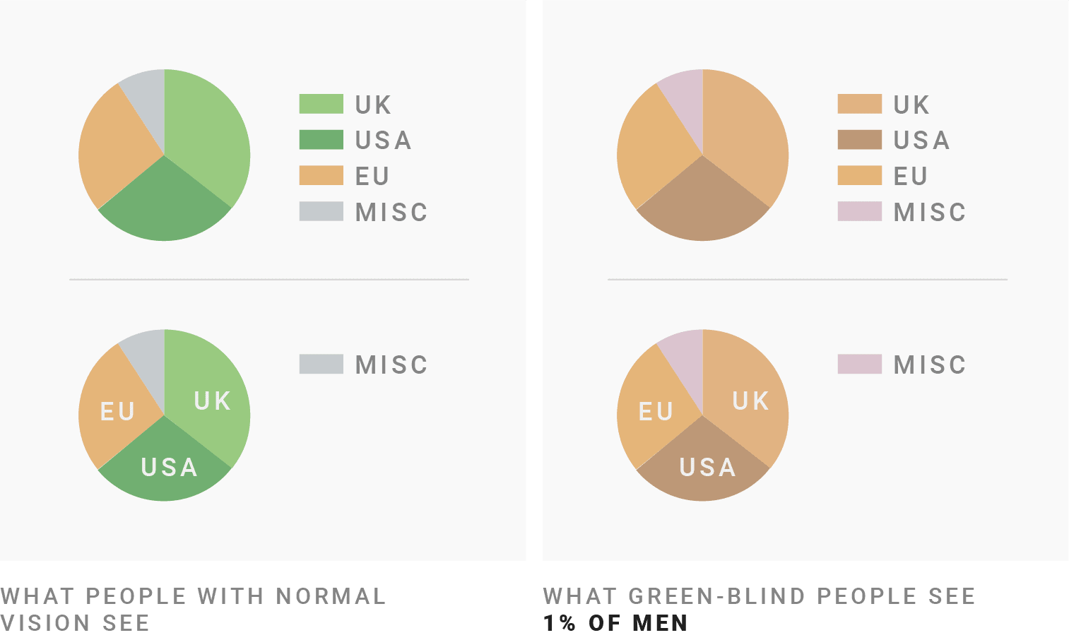
A nice side effect of using only red/orange and blue colors is that it’s easy to predict what red- and green-blind readers will see. It’s hard to keep in mind that ⬤ looks like ⬤ and ⬤ looks like ⬤ to green-blind people. It’s easier to remember that ⬤ looks like ⬤ and ⬤ looks like ⬤.
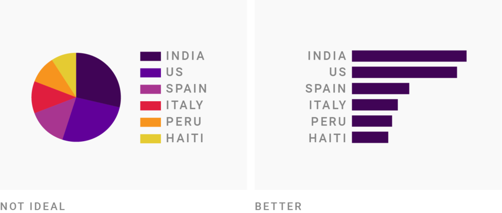
But maybe there’s no need to worry about designing five, six, or seven colorblind-safe colors. Maybe you don’t need that many colors anyway:
The more colors you use, the harder it will be to tell them apart – that’s true for all your readers, but more likely for your colorblind ones. Green-blind data analyst Lee Durbin tells me: “If I see lots of colors being used in a chart (say, more than 3 or 4) I tend to tune out if other visual indicators like annotations aren’t being used.”
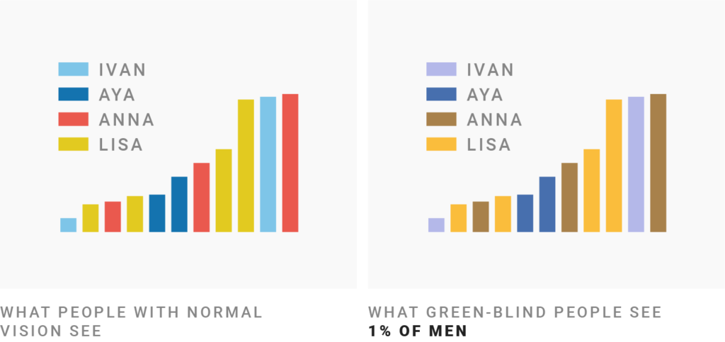
To not make Lee and others tune out, choose a chart type that relies less on colors and instead labels your data directly, like bar charts:
You can also color only the most important values to reduce colors. Ask yourself: What’s most important about your data? What are the one or two insights that your readers should take away?
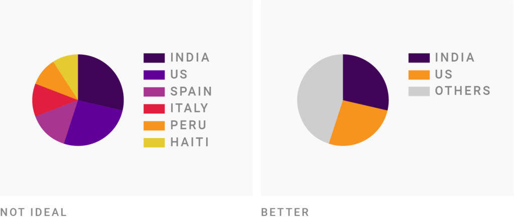
Make sure these most important values stand out and are distinguishable by all your readers, including colorblind ones. Then tone down the other ones or group them.
If you want to choose your own colors and check if colorblind readers will be able to distinguish between your colors, test them. There are lots of free and helpful tools out there; here are just a few examples. You can simulate all three types of colorblindness in all of them:
If you’re using Datawrapper, you don’t need to install anything. Our tool automatically warns you when you’re using colors that are hard to tell apart for colorblind people, like so:

You can learn more about this feature in our announcement blog post.
But don’t rely on these simulators too much. Peter again: “Most of these ‘this is how colorblind people see things’ previews aren’t 100% correct. They can give you an impression, but that’s it. Everyone is different. The only bulletproof solution is to encode your data with a second visual variable: position, shape, patterns.”
Let’s look at options to do so:
If you can’t “get it right in black and white” – e.g. because you need to use the brand colors of your company – don’t rely on the colors alone to communicate your data. Consider using symbols in tables, shapes in scatterplots, patterns in maps, and dotted lines in line charts.
Let’s focus on symbols first. To show colorblind readers that something is good or bad, double-encode with symbols like ✔️:
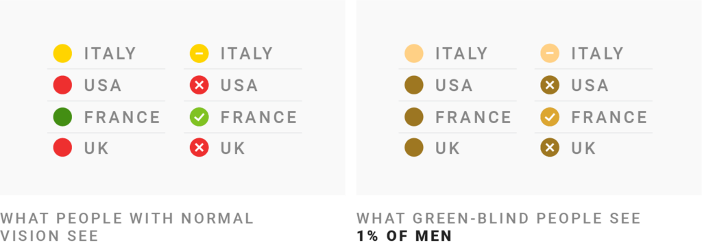
In the table above, I didn’t just add symbols but also changed the green from ⬤ to a lighter ⬤. As a result, all three colors now vary by lightness. This makes it easier for green- and red-blind people to skim this table.
If you’re using a chart type like scatterplots, consider using different shapes instead of just a circle. Rectangles, triangles, crosses, and stars are popular choices.
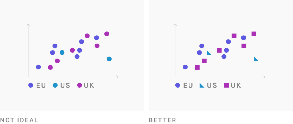
Unfortunately, using all these different shapes quickly looks like confetti. Limit yourself to three or four to avoid that.
To encode lots of variables with only a few shapes, you can combine them with a fixed position and create so-called “glyphs”. They’re little markers consisting of a few elements which size, color, and/or form depend on the data:
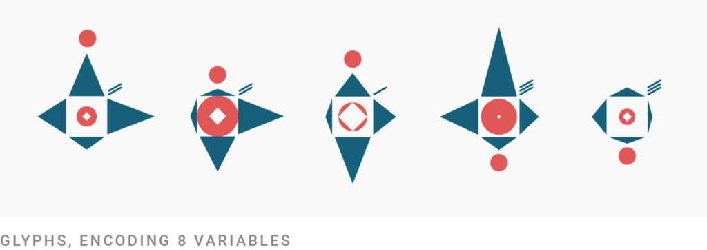
Glyphs are made out of shapes, but are readable because of the always same position of these shapes: The glyph above has two circles ⬤, but one is in the middle and the other is not. That makes it easy to understand that they encode different data. And it enables you to use the same shapes multiple times.
Colorblind readers can decipher glyphs, but doing so will take every reader’s time: Glyphs are nothing for the “quick glance” overview. They’re a slow read.
Using patterns well is hard, but getting it right can be worth it. Here’s a map that’s unreadable to red-blind readers:
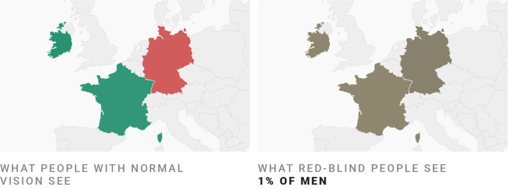
Adding a pattern solves this. We can still keep the same colors, but now all readers will see the difference between France and Germany:
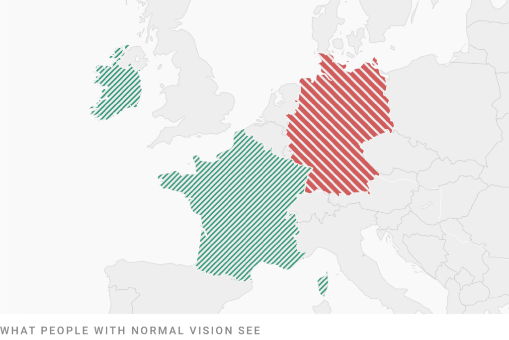
Be careful when combining hues and patterns: The pattern will change how bright or dark the colors will be perceived. In the example above, the thin white lines make the green look brighter.
If you must bring similarly bright colors in a line chart, use different line widths and dashes to set them apart. I did so for this chart from the Datawrapper River:
The Gold line ⬤ and the Bitcoin line ⬤ can be easily confused where they overlap in March. To avoid that confusion, I dotted the Gold line. I could have also made one of these lines think and the other one thin.
Both ways increase the chances that (colorblind) readers will make sense of the data. Here’s how the chart looked like before the line was dotted:

Let’s look at two more options to make your visualization more readable for colorblind people, labels and interactivity:
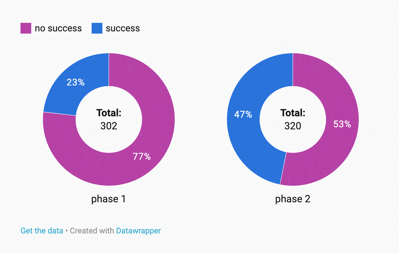
Color keys are a problem to decipher for colorblind people – so try to get rid of them altogether. In chart types like line, area, or pie charts, label directly instead:
While all tips so far enable your colorblind readers to read your visualizations more quickly, this one especially saves every one of your readers lots of time. Win-win!
If you’re visualizing data for the web, hover effects can help your colorblind readers to read the data:
Here the colors ⬤ and ⬤ both appear as ⬤ to a red-blind person. But once they interact with the chart and hover over a donut slice, they can still understand which one shows which data.
Helpful hover effects can be:
You can find the same effect in the line chart in the “Different line widths and dashes” section above – hover over a line and the other one will fade out.
Last but not least: Ask the people you’re designing for if they can decipher your chart or map.
You don’t know anyone who’s colorblind? Ask your coworkers. Ask your friends. Ask around on your favorite social network if somebody who’s colorblind has five minutes to spare. Ask around in a colorblind forum or Facebook group. Still no luck? If it’s not time-sensitive, email me at lisa@datawrapper.de and I’ll forward your question to a colorblind person.
*Thanks to Peter Cardwell-Gardner, Lee Durbin, Aaron Ghitelman, Kevin Lee Elder, and Rob Morton, who wrote to me after I published the first part of the series and whose advice went directly into this article. You’ll hear more from them and others in part 3: “What’s it like to be colorblind”. Click here to read it.
If there’s something I should mention in this article or something I got wrong, please let me know at lisa@datawrapper.de or in the comments below. I’m looking forward to hearing from you!
Comments