
Remind readers of the colors in your data visualization
October 11th, 2023
12 min
This article is brought to you by Datawrapper, a data visualization tool for creating charts, maps, and tables. Learn more.
Part 3 of a three-part series on colorblindness

When we data vis designers with normal vision consider colorblindness, it’s often an afterthought or an unchecked box on an accessibility checklist we got from a client.
For colorblind people, it’s their life. A life that comes with issues, surprises, and a special view. “Magical”, “horrible”, “frustration and exasperation”, “revelation” are just some of the words that were dropped when I asked ten people about their experiences as a colorblind person. That’s what this article is about: To give you somebody to think about when you do set that ✔️ on the accessibility checklist.
This article is the last part of a three-part series on colorblindness:
The first article, published two weeks ago, explains the difference between colorweakness and colorblindness and which color combinations are tricky to distinguish for your colorblind readers.
The second article, published last Tuesday, explains what you can do to make your charts and maps decipherable for colorblind readers – from varying lightness to using patterns, symbols or direct labels.
This is the article you’re currently reading! It starts with experiences from ten colorblind people. Afterward you’ll hear from three people in detail, two cartographers and our Datawrapper CEO:
1. Experiences of ten people
2. Asking Wesley Jones (cartographer)
3. Asking Mark Harrower (cartographer & designer)
4. Asking David Kokkelink (Datawrapper CEO)
Let’s begin:
When I announced the first article of the series on Twitter, I asked colorblind people to get in touch with me. And quite a few people did! I’m very thankful that I can share their experiences here:
The different types of colorblindness neatly match the stats: Most of the people I asked are green-blind, which is the most common type of colorblindness. Colorblindness is also very rare among women, and indeed, only men responded to my tweet. Luckily, my coworker Edurne connected me to her female green-blind friend and she agreed to answer my questions, too – thanks, Edurne!
The first question I asked these ten people is how their colorblindness is an inconvenience in daily life. The answers differed a lot. From “colorblindness doesn’t impact my day-to-day life” (Aaron) to “it’s a daily inconvenience” (Graeme) to “being colorblind is horrible” (Rob), the people I asked seem to relate differently to their (probably differently strong) problem.
When is it a burden? Here are some of the answers I heard:
That said, most people explained that they often don’t know that and when they have a problem: “Maybe I perceive colours differently more often than I’m aware of, but it’s hard to know,” Lee told me. And Edurne’s friend explains: “I assume I perceive colors differently often than I think. I mostly become aware of it when someone calls out the name of colors I see. It’s like a weird Aha! moment.”
So how inconvenient is colorblindness when it comes to reading data visualization? Here, too, the opinions differ, from “almost all data viz has poor colors” (Kevin), “90% of data visualizations that rely on colour are difficult or impossible to interpret” (Graeme) and “1 of 3 color-based data visualizations probably cause problems for me” (Aaron) to “professional data vis designers in reputable organisations like the New York Times do very well” (Peter).
And so differ the emotions when colorblind people see a readable or unreadable data visualization: “I jump a little for joy when I see a visualisation with enough differences in its colors,” Rob tells me. And Aaron explains what happens if that’s not the case: “The first reaction is always frustration and exasperation. It’s worse in quarantine where I don’t just have coworkers I can ask to explain the graphics for me.” “When looking at visualizations, I tend to take my time,” Edurne’s friend tells me. “When I so so with other people and they are much quicker in grasping the meaning – that can be frustrating.”
So let’s hear from designers themselves. What follows are three interviews with green-blind people: two with cartographers – Wesley Jones and Mark Harrower – and one with the CEO of Datawrapper, David Kokkelink, who has also seen and created many charts in his life.
You’ll find that they all bring different experiences and thought-provoking views to the table. I’m very happy to be able to share them with you.
I added colors ⬤⬤⬤ as Wesley, Mark and David see them.
After publishing the first part of the series, cartographer John Nelson got in touch with me. If he could make me happy with introducing me to two of his green-blind colleagues at ESRI, Wesley Jones and Mark Harrower? Of course he could!
We’ll start with Wesley:
I didn’t know I was colourblind until grade 11. I liked doing those Ishihara tests, but thought they were useless because in some you couldn’t see the number.
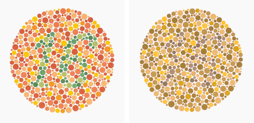
Ishihara test, named after its designer Shinobu Ishihara, as normal-vision people see it (left) and as Wesley sees it (right).
I told my friend that, and he looked at the book and said there is a number in every one! I remember looking at the tests the next few days, shocked I couldn’t see the numbers. I think my story is somewhat common – that many colourblind people don’t know they are colourblind until much older.
I don’t see it as an inconvenience in the big picture. I see it as a gift, because I get to see the world differently. The world looks magically colourful to me, I can’t imagine what it looks like to someone with normal vision.
But it’s still is a bit of an issue at times. Some of the flashing street lights (with only one bulb) sort of look like they could be flashing red or yellow, so I have to really concentrate when I see those. I also happen to like board games, and it is remarkable how many use colours that are hard for me to tell apart. The more important the thing, the more significant the inconvenience.
However, it can’t be that big of an inconvenience, because I didn’t know I was colourblind for the first 17 years of my life. Generally, my kids and I get a big kick out of it when I colour something a little odd.
This tends to be fairly often. Maybe because colour is used as an identifier in the visualization, one notices being colourblind more often when looking at data visualizations.
This is especially true if a legend is used. I have a really hard time looking at that small legend item and matching it to the chart. I have no problem asking for help, but many data visualizations are difficult to interpret on my own. Generally, the difficultly is not in the entire visualization, but between a couple of categories.
I don’t have an issue creating maps or visualizations – because I can only see what I can see. However, I am aware that I might be choosing unintended colours. The truer the colour needs to be to reality, the more I make sure I have someone look over my colour choices.
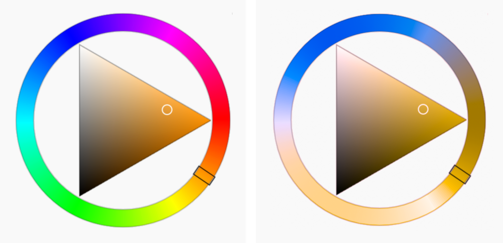
A HLS color wheel as normal-vision people see it (left) and as Wesley sees it (right). “I rely heavily upon colour wheels like this – and I like this design the best as it is the most intuitive and useful for me.”
Occasionally, people tell me certain colours are similar, and I have to make adjustments – it is sometimes hard for me to believe because the ones they pick out look the most different to me.
Someone once told me that my maps have a slightly different look to them, but that helps make them a little unique. I really try to pay attention to the colours I am picking on the colour wheel.
However, I recently found out that when I am designing (maps or drawing) that my blues tend to have a slight purple slant to them. My blue water is often a bluey-purple water.
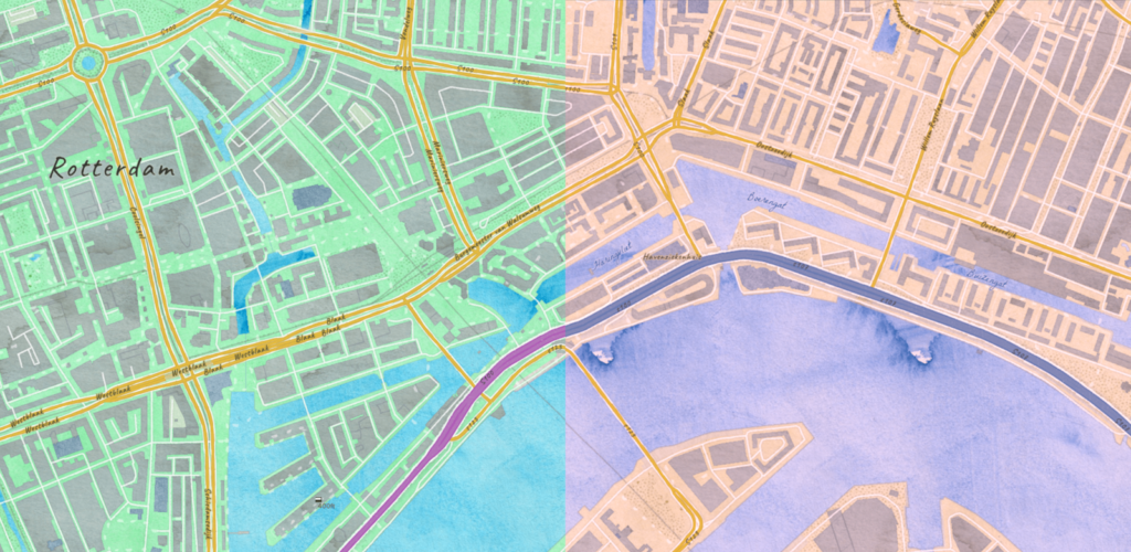
A watercolour Map designed by Wesley, as normal-vision people see it (left) and as Wesley sees it (right). “I had to change the water a couple of times because it sometimes went too purple.”
Also, green often slips into skin-tones when I am drawing. I am still not sure how that happens so often. [Note from Lisa: Light green ⬤ and a light skin tone ⬤ both look like ⬤ to Wesley.]
I want people to keep using all the colours available to them (I can only imagine how fantastic the whole spectrum is), but my advice would be to consider the importance of your message. If it is important or you want everyone to see it, consider that a segment of the population may not be able to see it if you haven’t checked it for colourblindness.
Like Wesley, Mark is a cartographer at ESRI. He’s been designing maps and graphics for decades. He’s also green-blind – and has lots of opinions. In this interview, Mark explains which color schemes work for maps and which ones don’t (“80% of Colorbrewer”), why data viz got less readable for colorblind people over time (“45 shades of peach”), and how Enchroma glasses have changed his view (“I get it now”):
I think my colorblindness affects my work in four ways:
Esri’s Newspaper basemap, as seen by normal-vision people (left) and as seen by Mark (right).
I only ever use single hue color ramps (like light red to dark red ⬤⬤⬤⬤⬤) since I can easily see differences in lightness and so can others. Most multi-hue color ramps are too subtle for me to use on choropleth maps, including about 80% of the ones in Colorbrewer. They just look identical to me.
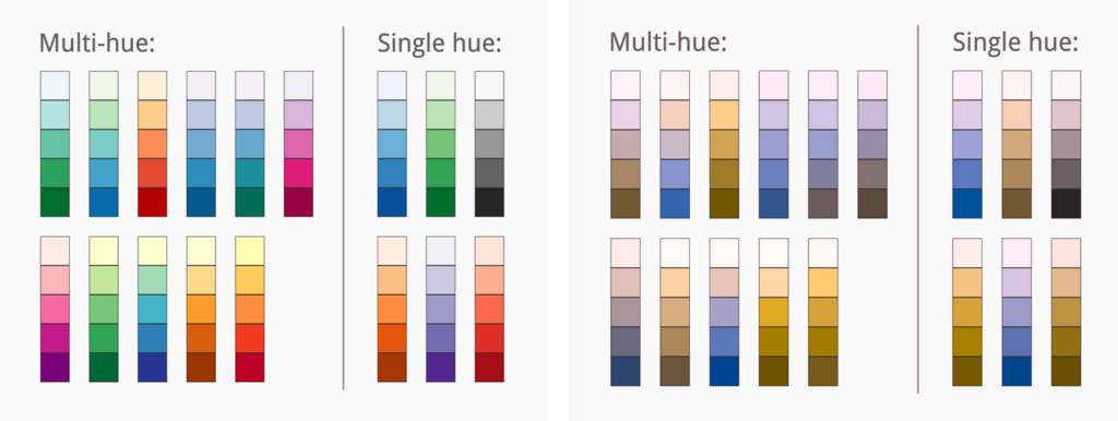
Mark’s view of the multi-hue and single-hue sequential color schemes on Colorbrewer
If I do use multiple color ramps, they’ll be yellow-blue ramps ⬤⬤⬤⬤⬤ or the viridis ramps:
Viridis color schemes, as seen by normal-vision people

Viridis color schemes, as seen by Mark
I would say things have gotten worse with data visualizations. We now have the double whammy of
As designers, we spend way more time designing our stuff than our audience will spend reading it. Often they’re only marginally interested in our work; they’ll just “glance” at it (as the New York Times and others have learned from their metrics).
Colorblindness is a good surrogate for such an audience. Making sure it works in 1-3 seconds “at a glance, as I scroll past in my newsfeed” is analogous to making it work for folks with bad color vision, or folks who can’t see fine details and small fonts. “Keep it simple and obvious”, works for both vision issues and semi-disinterested audiences.
My advice is always the same: Stop so highly favoriting just one of Bertin’s visual variables (hue) to distinguish differences in kind. Better yet, double-up with other visual variables to do the heavy lifting (combine both shape and hue, or hue and lightness, or…). That is just better design, less error-prone – not just for us colorblind individuals. I always tell my students: Print in greyscale? Still understandable? You’re bullet-proof.
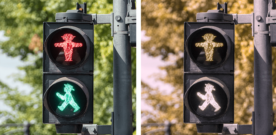
My thinking on this has been influenced by having both indoor and outdoor Enchroma glasses for the past 3 years. They’re not a fix, I still can’t pass Ishihara tests, but OMG WHAT A REVELATION. Literally life-changing to see purple and pink and peach for the first time. And the green in traffic lights! The most unexpected thing was how much more luminous and intense hues are…like safety-vest-orange. It’s ridiculous. I get it now.
David is the CEO of Datawrapper, the company I work for. That he’s also one of the 1% of men who have green-blindness (Deuteranopia) is something I didn’t know for a long time, and that most of our team never notice. I was curious if/how this affects him in his daily life and when looking at data visualizations.
I first noticed when I was about 3-4 years old, when I asked my parents why everyone said the grass was green ⬤ when it was clearly red ⬤. The next instance I remember was identifying green traffic lights as white ⬤.
Left: What people with normal vision see. Right: What David sees. Photo by Jos van Ouwerkerk, Pexels.
I got a formal diagnosis at an eye doctor that it was “green-blindness” when I was about 12-13 years old.
It is not a major problem. It makes me rather conservative with color choices for things fashion or furniture (my closet is full of black ⬤, white ◯, grey ⬤, and maybe dark blue ⬤ clothes).
One interesting side-effect of color blindness is that I can never remember what colors things are, even for colors that I should be able to distinguish. I think since my color vision is unreliable, I have sort of unconsciously trained myself to not pay any attention to color at all. Practical example: I’m sitting in my living room right now. Next to me is my bedroom. I couldn’t possibly tell you what color my bed is from memory. Probably grey or dark blue or something. I know it’s rather on the dark side, but I have no clue what color it is specifically, even though I see it daily. This is occasionally an issue when people think I just don’t care, like forgetting eye colors of girlfriends, etc.
I see data visualizations I simply can’t read from time to time, for example in this tweet that shows a map by the German Meteorological Service:
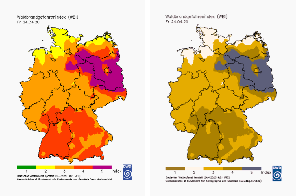
Left: What people with normal vision see. Right: What David sees. Map by the German Meteorological Service.
I’d say 90%+ of problematic instances occur when people are going for some sort of ‘traffic-light’ indicator of red ⬤ / yellow ⬤ / green ⬤.
I do think that ‘modern’ data viz practitioners get this right most of the time. The terrible examples were typically found in schoolbooks or government publications, and generally, look like they were done with Excel 95.
Mostly I don’t bother reading them – there is no way to figure it out, even if I stare at it for an hour I’m not going to be able to see anything. How long would you look at a black and white print of a chart to figure out its color?
One thing that people misunderstand is that it doesn’t really matter what colorblindness you have. I’m greenblind, so I should be able to see for example orange ⬤ and purple ⬤ and grey ⬤, but that doesn’t help you much when you don’t know if what appears purple to you actually is purple ⬤, or some shade of turquoise ⬤. You don’t know when you’re not seeing something as you should, so you have to distrust the signal as a whole.
A big thanks to David, Wesley, Mark, Edurne’s friend, Graeme, Lee, Peter, Aaron, Rob and Kevin for sharing their experiences with us! It lets me think differently about colorblindness – I can imagine it better now – and I hope it helps you, too, dear reader. If you want to find out more about life as a colorblind person, I can recommend wearecolorblind.com. And if you haven’t seen them yet, consider reading part 1 and part 2 of this series on colorblindness.
Comments