
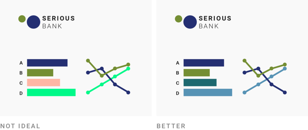
Remind readers of the colors in your data visualization
October 11th, 2023
12 min
This article is brought to you by Datawrapper, a data visualization tool for creating charts, maps, and tables. Learn more.
How to create an organizational color palette

I’ve heard you’re interested in creating a color palette as part of a data vis style guide. Maybe you decided to use a custom design theme at Datawrapper to make your charts more consistent-looking, and our support team asked you for some colors. Maybe you’re the first proper data vis designer at your organization, and want to bring order to chaos. Or maybe you want to redesign an existing palette because your requirements have changed.
This guide is very extensive — and can be a bit overwhelming. If you’re designing your very first color palette, don’t sweat. It’s simple:
Choose 3-10 different colors. These can be your logo color(s), or colors from your website (you can use or install a color picker to get their hex codes). If you still have too few colors, play around with extra colors until you get some that fit well with the ones you already have.
And that’s it. You just got a color palette that you can use for your bar charts, line charts, scatterplots, etc. Try to create some visualization with it, see how it goes. If, in a few weeks, you feel that your colors don’t work after all, just change them.
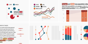
YouGov tried this approach successfully a few years ago. They created a limited color palette ⬤⬤⬤⬤⬤⬤ “just to test things out,” data journalist Graeme Bruce from YouGov told me. To their surprise, it worked better than expected: “We find we can get 90% of our simple charts done with this simple palette.” (They recently adjusted their colors after a change in branding. Now they use ⬤⬤⬤⬤⬤, and ⬤⬤ for political parties.)
If, like YouGov, you’re happy with this method, you can stop reading now.
What follows is for people who really want to get into it. Who want to end up feeling: “This is the best color palette I could have come up with.”
A Do you even need a fixed color palette for your data visualizations?
Before you start, let’s check if it makes sense.
B Four different approaches to organizational color palettes
Inspiration, examples, approaches.
01 “Let’s prepare for everything”
02 “Fewer hues, more shades” (aka “The traditional brand-ists”)
03 “More hues, fewer shades”
04 “The minimalists”
C Which colors to define
…for all kinds of data visualizations.
01 Colors for categories
02 Shades for categories
03 Colors for common categories
04 Accent colors
05 Grays for data
06 Grays for everything that’s not data
07 Sequential and diverging gradients
08 Colors for map elements
D Considerations for choosing colors
A checklist with points that might matter for your color palette.
01 How to include brand colors
02 How many colors to choose
03 Dancing around the color wheel
04 Color order and combinations
05 Self-confidence of your visualizations
06 Sentiments your colors convey
07 Cultural associations
08 Medium (print, TV, presentations, …)
09 Accessibility
10 Colors for big and small areas
11 Opacity
12 How well you can refer to the colors
13 Background color
14 Dark mode
15 Dealing with colors in older data visualizations
E How to create an organizational color palette — some ideas
The process of coming up with colors that work well
01 Find out what your organization needs
02 Collect possible colors
03 Create the color palette
04 Test your color palette with tools
05 Show your colors to users and readers
06 Document your colors
07 Improve
F Collection of data vis style guides
G Other resources
Every time I refer to another section in this guide, I’ll use an arrow like this one ➹. And if you’re new to the topic, it wouldn’t hurt to read this refresher on what words like lightness, saturation, and hue mean.
All good? All right! Let’s start:
There are lots of good reasons to set colors in your data vis style guide. Once a good color palette is decided:
“Keeping the order of colours in the palette consistent helps non-designers create basic charts in a fast-paced environment without having to spend time on yet another design decision.”
Caroline Nevitt, user experience editor at the Financial Times
“When we decided to use Datawrapper, first and foremost we were looking for uniformity and consistency in our chart styles, so even those who have limited experience creating charts could make a chart that looks like a YouGov chart.”
Graeme Bruce, YouGov business data journalist
But not having a strict color palette is an option, too. There are good reasons for it:
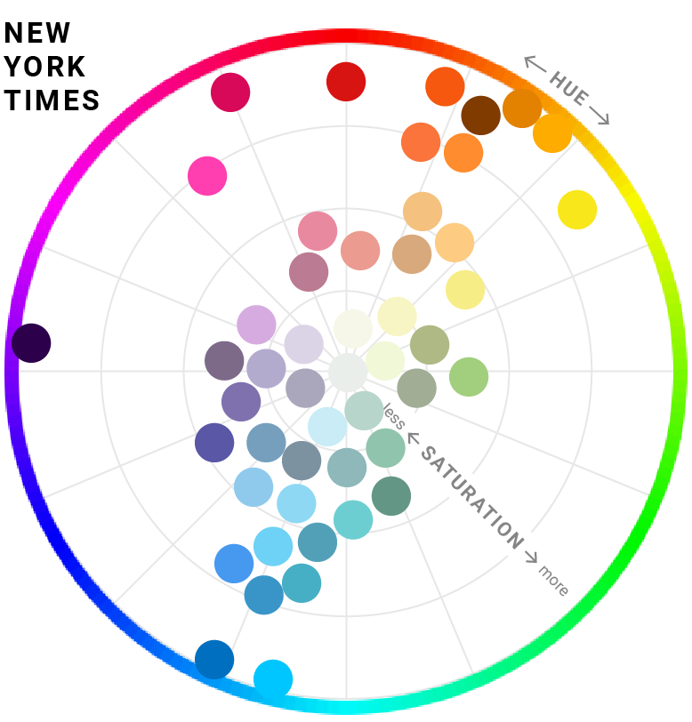
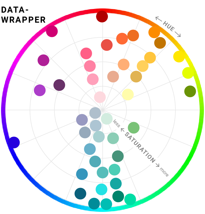
Here are the colors that a few recent New York Times and Datawrapper visualizations have used:
If you’re considering not using a fixed color palette, then it helps if:
“Let’s prepare for everything” / “Fewer hues, more shades” (aka “The traditional brand-ists”) / “More hues, fewer shades” / “The minimalists”
If you’re still reading this article, you seem to be more convinced by the arguments for than against having consistent colors. So let’s have a close look at some organizations that do have a color palette. We’ll place them into four categories, depending on their approach. Hopefully, these examples and approaches will serve as inspiration for your color palette:
The closest thing to not having a color palette at all is having a very, very flexible color palette — one that comes with colors in every corner of the color wheel, often with multiple shades for each hue. These color palettes are often created and used by big organizations that want to make sure to cover every use case — for simple charts as well as complex dashboards.
Examples are the London City style guide and the Eurostat data vis style guide (PDF):
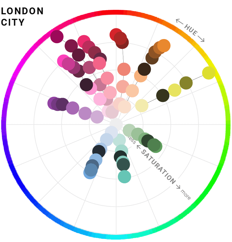
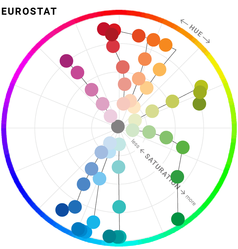
If you do create a very flexible color palette, define in which order colors should be used or which colors should be used primarily — we’ll get back to that idea further down ➹. London City is doing that. Although their palette is very broad, most of the colors used are magenta ⬤ and light blue ⬤:
The Brand-ists use only a very few selected hues. If more colors are needed, they use shades of those hues rather than add new ones.
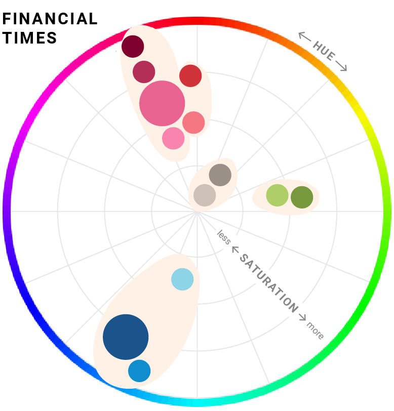
The hues are almost always defined to be used in a certain order. For example, the Financial Times (FT) always uses dark blue first, then magenta, and green only as a last resort — although it seems data visualization designers at the FT like John Burn-Murdoch are more flexible with their colors than people who use the FT’s charting tool.
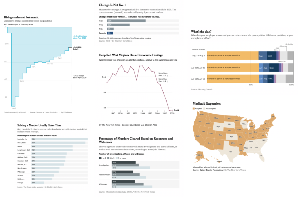
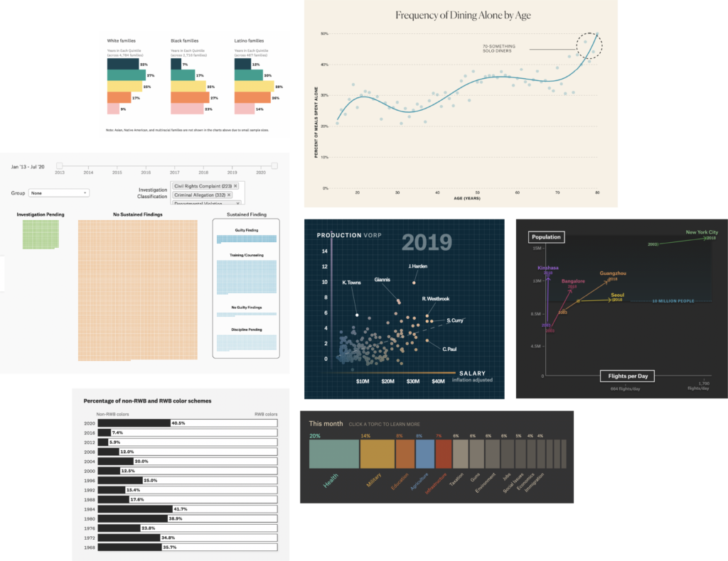
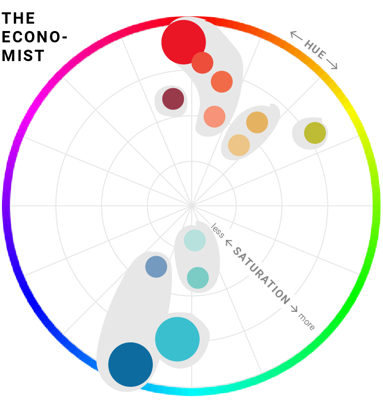
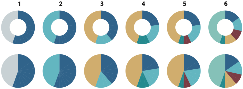
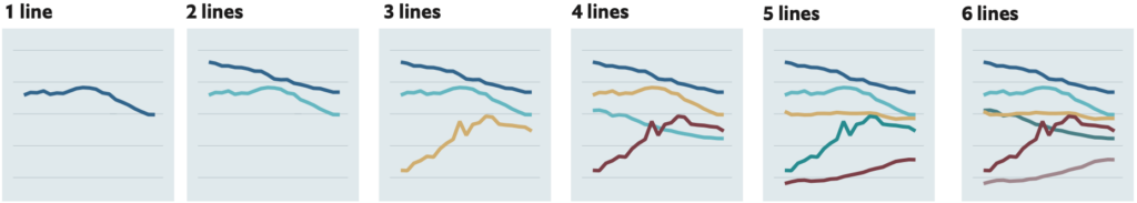
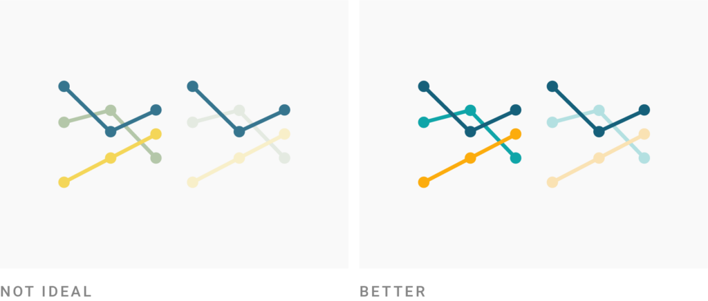
One of the newsrooms that is most consistent in its “brand-ist” approach is The Economist. Their data visualization designers use a business-y dark blue ⬤ in most of their visualizations, and combine it with turquoise ⬤ and red (a bright one ⬤ for lines and a darker one ⬤ for areas). They rarely use other hues besides these ones. Even entangled line charts (see the second image in the first row below) don’t look like confetti spaghetti, because the lines are colored in shades of only blue, red, and turquoise ⬤⬤⬤⬤⬤⬤⬤⬤⬤⬤⬤⬤⬤⬤.
Using only shades of a few hues instead of individual hues for every category comes with an advantage: Brand recognition through these colors is crazy high. It’s basically through the roof. You can’t do better. Even if you’ve never seen an Economist chart before, it’s likely you’ll recognize one the next time after seeing these 12 charts here.
Before they changed it a year ago, Pew Research had a special approach to brand-ism. Their palette looked as colorful as the “let’s prepare for everything”-ists’…
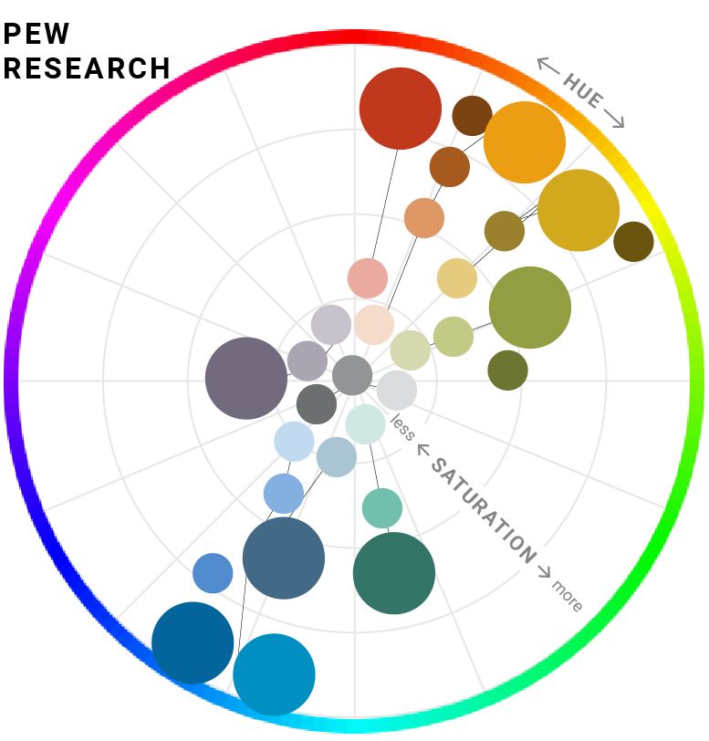
… but not every chart was allowed to simply take any of these colors. At Pew Research, every one of their research teams got its own color: orange for Science, yellow for U.S. Politics, green for Global, etc. They changed their website pewresearch.org and team structure in 2021, but before the redesign, you could really get the idea of the category colors just by clicking through the menu:

This showed in their charts, too: Each research team used a primary and secondary color (plus their respective shades) in their visualizations:
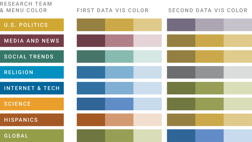
Design director at Pew Research, Peter Bell, explained to me two years ago why the palette was that limited: “Our internal guidance is that ‘while color brings life to charts, too many colors can distract from the data. The best approach is to use shades of a single hue in most charts.’ These limits take some of the guesswork out of color decisions, freeing researchers to focus on the most effective presentation of data, while still offering visual variety across our site.”
But Pew didn’t use this system consistently, even before the redesign. Charts about Republicans and Democrats always used reds ⬤⬤ and blues ⬤⬤ (example). And sometimes, a chart simply needed more categorical colors than the two available — “for instance, a line chart showing several religious traditions, or a scatterplot of countries color-coded by region of the world,” Peter explains. Also, “a given topic, like generations and age, might be studied by several research teams, usually collaboratively. So there’s not a 1:1 mapping between color and topic.” And: “After 8 years, there is some experimentation as well, trying out different combinations within the existing palette.”
The research teams had extended over time, too, making the colors inconsistent. The “Science” team grew out of the “Internet” team, so they both use the same green ⬤⬤⬤ and blue shades ⬤⬤⬤ in their charts. The menu color of the “Science” section of the website before 2021 was orange ⬤, though, while the “Internet” section was the expected blue ⬤.
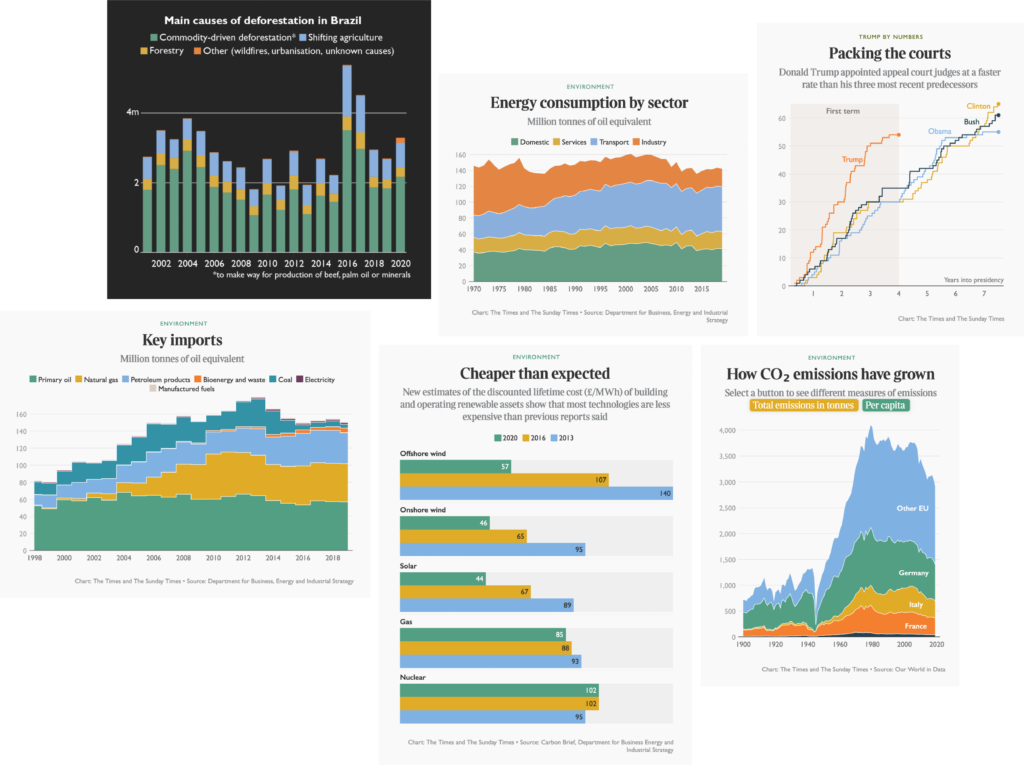
Organizations in this category define quite a few hues — a few too many to fall into the previous category with the brand-ists. The U.S. think tank New America defined at least five ⬤⬤⬤⬤⬤ and the U.K. newsroom The Times, six ⬤⬤⬤⬤⬤⬤, with the first three to four being the main colors that are used in almost all of their charts.
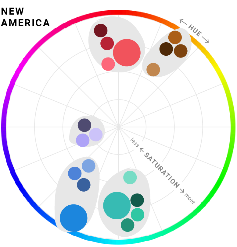
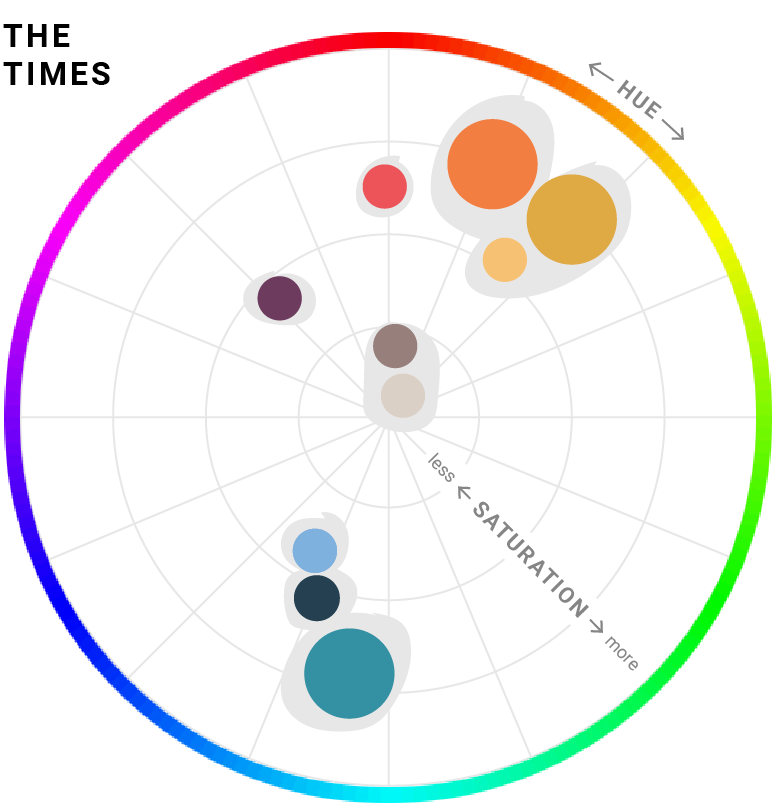
And where the brand-ists would use a few shades of the same hue for different categories, New America or The Times would more often opt for completely different hues:
That makes their visualizations look a bit more colorful than the ones by the traditional brand-ists, and also a bit less iconic. Defining so many colors can ensure higher flexibility, though. We’ll come back to the question of how many hues a color palette needs below ➹.
Some organizations are up for a challenge: They have a very, very limited color palette.
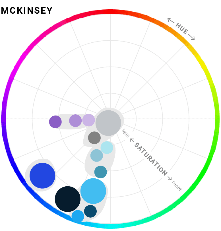
Two of them are Quartz and McKinsey.

Quartz is known for mostly simple bar charts, split bars, or line charts. There are not many Quartz scatterplots with multiple categories out there (this one by David Yanofsky is one of the exceptions), but they can make them work too, just with their pinks and blues (1, 2):
McKinsey & Company is a management consulting firm that only uses blue and neighboring hues ⬤⬤⬤⬤⬤⬤⬤⬤, even in charts with lots of categories:

Using only a small part of the color wheel or only a few hues for lots of categories can bring problems with accessibility ➹ and how well readers can refer to your colors ➹.
But it can work. If you don’t use lots of categories, a minimalist approach can be a great idea for smaller organizations, especially if they don’t need to prepare for all kinds of chart types and use cases. You might just create maps. Or bar charts. You might have an audience that won’t understand boxplots or scatterplots, so creating them is out of the question. If you’re showing four categories tops in your charts, consider a minimalist color palette.
Colors for categories / Shades for categories / Colors for common categories / Accent colors / Grays for data / Grays for everything that’s not data / Sequential and diverging gradients / Colors for map elements
After looking purely at inspiration, let’s get a bit more practical. Which colors do you need to define for a data vis style guide? See the following as a check list: some of the options might not apply to your organization.
When we talk about “organizational color palettes for data visualizations,” we mostly talk about different hues. They will be used to tell categories apart:

Coming up with these hues can be a challenge. They should be beautiful. (Visit our blog post How to pick more beautiful colors for your data visualizations for ideas on that.) But they also should be functional — meaning, easy for your readers to tell apart.
There are a few things to keep in mind when choosing distinguishable colors:
If you only keep three things in mind, these are the ones. But of course, there’s more to the topic. So much more that I moved most of it to other sections – on if and how to include your brand color(s) ➹, how many colors to choose ➹, how much to dance over the color wheel ➹, which sentiment your colors should have ➹, and how to go about creating hues ➹.
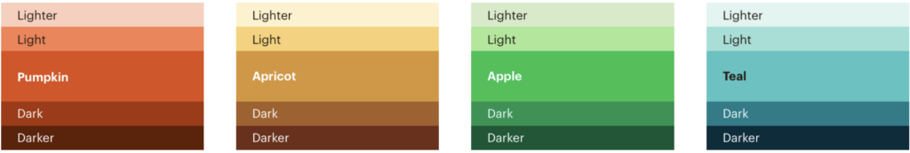
When you’re creating hues, it makes sense to immediately think about lighter and darker versions of these hues too. You’ll need these shades for less highlighted parts, to emphasize an underlying order, or to distinguish between subcategories.
Create them with a tool like the Tint and Shade Generator. If you want equally spaced lightness differences between your shades no matter the color, use a tool like the Interactive color picker comparison and increase or decrease the Lr value in equal steps (e.g., 15).
When you go darker, try to increase the saturation of your colors. You might even need to shift the hue a little bit to make them work. When you go lighter, consider decreasing the saturation.
Some of your hues (like yellow or light green) will be brighter than others (like blue and purple), so you might need a different number of steps to take them to their darkest and brightest shades:
If you find yourself visualizing the same categories again and again, it can make sense to give them a consistent color. Here are a few categories that are common for many organizations:
Certain colors often appear together, like those for political parties. If this is the case, try to avoid any visual bias and keep the visual intensity of the colors the same, e.g., ⬤⬤⬤⬤ instead of ⬤⬤⬤⬤.
You might not need just one color for each of these categories, but two or more (maybe even a whole gradient ➹). The Sunlight Foundation defined two shades of a hue for each common category, one for the main category and one for a subset: Republicans ⬤⬤, Democrats ⬤⬤, Independents ⬤⬤, Con ⬤⬤, Pro ⬤⬤ and Money ⬤⬤. Pew Research also defined shades of their colors for Republicans ⬤⬤ and Democrats ⬤⬤.

Some data vis style guides provide one or more colors that are supposed to be used for charts that only call for a single color. The designers Jon Olav Eikenes and Tomi Nurmi from the Norwegian marketplace finn.no decided to use a slight variation ⬤ of their brand blues ⬤⬤ as their “primary” chart color. It’s used for charts that just show one color (e.g., a line chart with a single line or a bar chart). Charts with more than one color will use four other colors ⬤⬤⬤⬤, and not include the blue:
“The reason we skipped the blue in >1 color charts was that it will stand out as more important,” Jon explains. “It’s so close to our brand color that users could interpret categories colored in that blue as ‘more brand-related.'”
Mailchimp provides multiple accent colors, depending on the use case. Their Apple green ⬤ is “used to convey ‘positive’ values or success,” they explain in their style guide, while their accent colors Plum ⬤ and Apricot ⬤ “represent themselves as neutral.” All of them should only be used as the sole color in charts. “If more than one color may be used to represent data, use one of the pre-defined categorical color combos.”
Gray is the most important color in data visualization. You’ll need it to show less important data, missing data, or context data. Consider defining at least one gray. And consider giving it a splash of color.
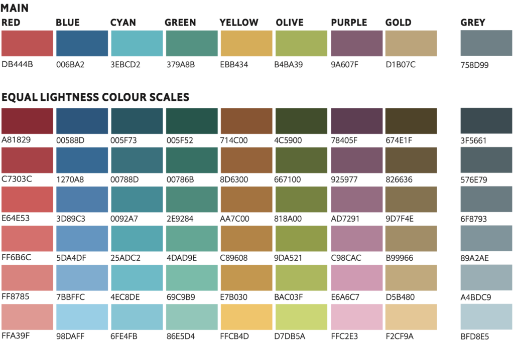
Neutral gray can quickly seem a bit cold. That’s a good look if you have a neutral to cold-ish color palette like the think tank New America ⬤⬤⬤⬤⬤⬤⬤ — they use pure grays like RGB(163, 163, 163) and RGB(214, 214, 214).
But giving your grays a bit of color can also nicely tie them together with color palettes that are especially warm or cold.
If you want to go for a warmer look, try to mix some yellow, orange, or red into your grays, especially the ones you use for data. The Economist does this, using colors like ⬤⬤⬤⬤⬤. The two grays both contain less blue than a pure gray does: RGB(135, 135, 113) and RGB(207, 209, 195).
 Part of an Economist “Graphic Detail” page from November 2018 (PDF).
The associations of warm gray can also be a reason to choose it, as it has been for designer Tomi Nurmi from finn.no. They show data from the past year in gray when comparing it with current data. “That’s why we chose a warm gray,” Tomi told me. “The sepia tone gives the gray a bit of historic feel to it.”
If you’re going for an extra-cold palette, consider adding some extra blue. McKinsey does so for its color palette ⬤⬤⬤⬤. The gray here has more blue than a pure gray: RGB(192, 197, 201), making it nicely silvery.
Make sure your grays don’t come with too much saturation. They should still be perceived as gray, not as an important category.
Have I mentioned that gray is the most important color in data visualization yet? Besides using it for less important categories, you’ll need grays for axes, gridlines, color key labels, axis ticks, axis labels, regions without data in choropleth maps, the base map in symbol maps, and less important text.
You’ll definitely need more grays than you think for all these non-data elements. And that’s ok: Unlike using too many different hues, using lots of different grays won’t make your visualization look unprofessional, cluttered, or chaotic. So don’t try to make everything the same gray. Grids need a lighter gray than axis labels. The title and description should have an even darker gray.
A lot of gray is OK. (It rhymes!) If you don’t want to think about the grays of gridlines, axis labels, etc., don’t worry — a tool like Datawrapper comes with tried and tested defaults that you can just take on.
Sequential and diverging color scales are similar to the shades you define for hues ➹. But they won’t be used to tell categories apart. You’ll use them when you’re creating visualizations where every value maps to a color on a gradient, like choropleth maps or heat maps. To make these values easier to read, your gradient should cover a wide lightness range, and maybe even have a subtle shift in hue.
Let’s look at an example. Say our color palette has two main colors: magenta and light green ⬤⬤. Our first idea might be to take these two colors and interpolate them to white. We can do this with a tool like the Chroma.js Color Palette Helper.
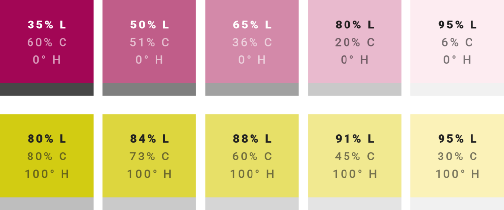
But that magenta is far darker than the green and will therefore cover a bigger lightness range: The lightness of these magenta shades ranges from 35-95% (60 percentage points), while the green shades cover only a fourth of that range, from 80-95%.
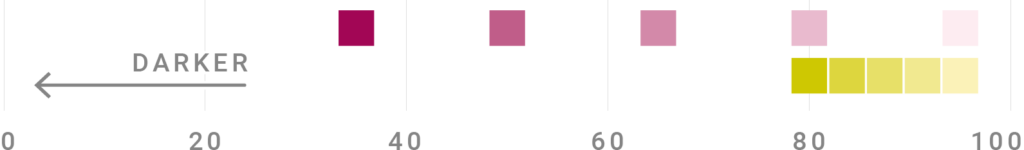
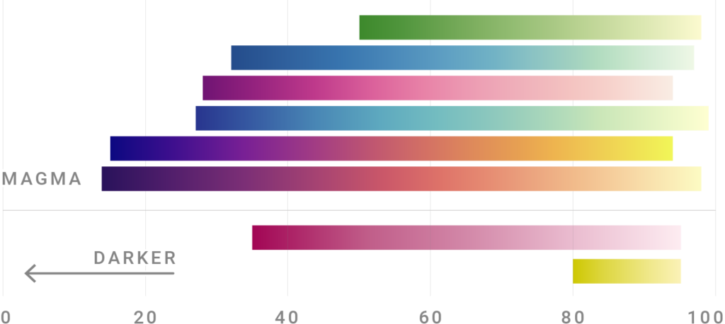
You’ll need a big lightness range for your gradients to see little differences between data points. The default Datawrapper sequential gradients cover on average 69 percentage points — the winner being Magma from the Viridis package, which ranges from 14-98% lightness:
So: We can do better. Our green gradient needs to go darker.
How dark should we go? Not too dark: We should still see some hue in there. The darker (and lighter, by the way) each color gets, the less saturated it becomes. Once it’s black, it’s 0% saturated.
But not every hue is the same. There are some hues that do better at being dark and saturated than others:
So for each of your colors, you’ll need to decide individually how dark it can be while still looking like a color, not like black.
For our yellow, let’s increase the lightness to 30% to get it to 40% saturation ⬤ and create a gradient out of that:

Including the darker yellow (olive?) definitely covers a bigger lightness range. But it’s… not really pretty. Good news, though: We can do something about that. Something that all Datawrapper default gradients do; something that will increase the reader’s abilities to tell similar-colored regions apart, *and* and that will make our map more interesting to look at: We can shift the hue. If we shift our darkest color to green (130° instead of 100° on the color wheel), the whole gradient is far more pleasant to look at:
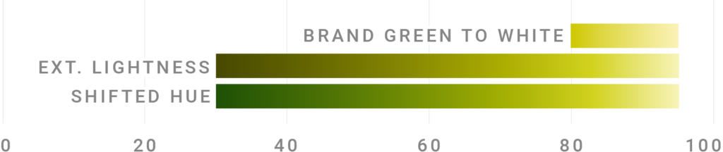
Green also can have a higher saturation when it’s dark, so we can even extend the lightness range a bit more:

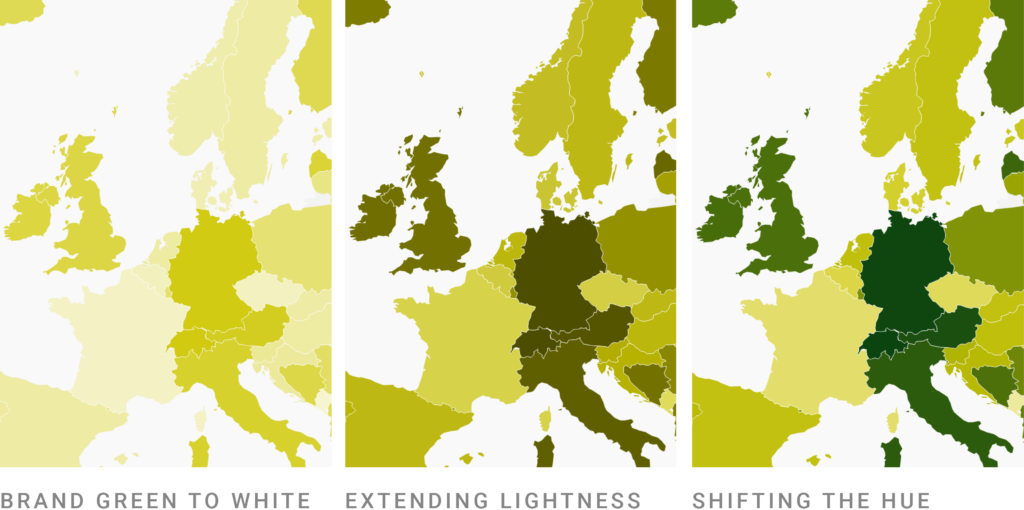
Here’s how the three versions look on a choropleth map:
Shifting the hue might not be an option for your palette — because gradients don’t play a big role, or because it’s important for better understanding your visualizations that your gradient and categorical colors have exactly the same hue. Many hues also look fine with a simple gradient from a darker version of your chosen color to white.
Besides sequential scales, you might also need diverging ones. They’re basically two sequential scales glued together on their lightest colors. You can learn more about them in our blog post, When to use sequential and when to use diverging color scales, and create them with the Chroma.js Color Palette Helper.
No matter what gradient you create, you’ll get some hex codes at the end. They don’t even need to include your original color codes, as this 2017 Economist style guide (PDF) shows:
Note that if your colors need to comply with accessibility guidelines (WCAG2), your light colors need to be fairly dark ➹.
If you’re creating locator maps, you might want to define colors for forests, meadows, water, buildings, streets, and borders.

Keep in mind that you’ll almost always want to show markers on top of this map. Light and less saturated map elements will allow for a high contrast with the dark, saturated markers you put on top — which makes those markers easier to spot.
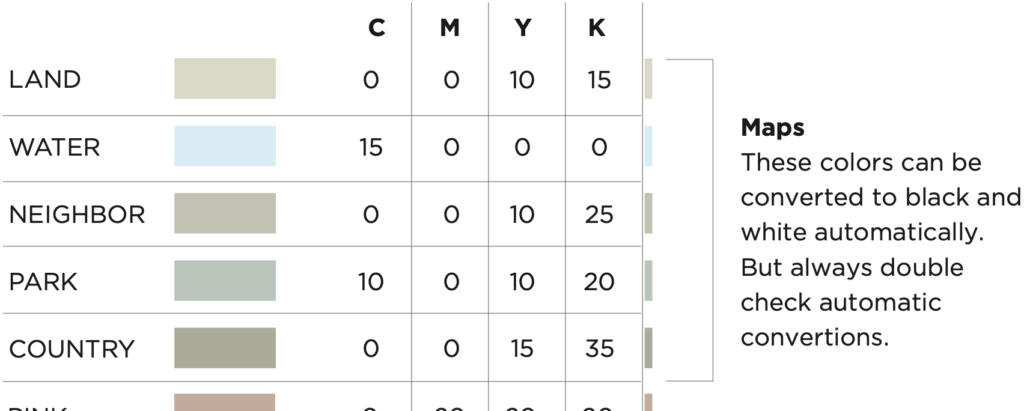
The drawback of light map elements is that it becomes harder to decipher the map itself and to see where buildings end and the park begins. They also don’t meet WCAG2 accessibility standards ➹.
How to include brand colors / How many colors to choose / Dancing around the color wheel / Color order and combinations / Self-confidence of your visualizations / Sentiments your colors convey / Cultural associations / Medium (print, TV, presentations, …) / Accessibility / Colors for big and small areas / Opacity / How well you can refer to the colors / Background color / Dark mode / Dealing with colors in older data visualizations
No matter which kind of colors you’re choosing — colors for common or unknown categories, grays, diverging or sequential color scales — there are some things that you might want to keep in mind. Or not: Half of what follows might not be relevant to your situation. I list them all so that you won’t think, “Ooooh, I should’ve probably also paid attention to this,” halfway through the process.
The first question you might ask yourself when designing an organization’s color palette is: Should I use the logo colors of my organization?
Your bosses might really like that: as they would say, using the logo colors can contribute to “high brand recognition.” People are more likely to associate your charts with your organization when they use its logo colors — and you’re “teaching” new readers what your company colors are.
But there might be problems: The logo color might evoke unwanted associations. Or it might be too bright for small areas, or too saturated for big areas.
Let’s look at how other organizations solved these problems.
A Only using the logo color for certain categories
The logo colors of American public news organization NPR are red ⬤ and blue ⬤. These two colors are strongly associated with the Republican and Democratic parties in the U.S. and therefore are less helpful for charts about other topics. And indeed, the NPR Visuals team doesn’t use these colors for their data visualizations except in reporting about these parties. For other charts and maps, they use less saturated colors in different hues: ⬤⬤⬤⬤⬤ (example 1, 2, 3, 4).

B Only using the logo color for visualizations with one category
Remember finn.no, who used their brand color only for charts that show one category ➹? Consider doing the same.
C Only using the logo color for the most important category
The U.S. immigration research and advocacy organization New American Economy has a very bright, saturated green as their logo color ⬤. They use it as part of their data visualizations, but only for the most important category — like in this article or in this one:
If multiple categories have the same importance (like in this or this article), New American Economy uses other color palettes that don’t include their vibrant green:

D Only using colors similar to the logo color
You could consider relying on shades of a limited part of the color wheel. The management consulting firm Boston Consulting Group (BCG) does that. BCG uses a dark green ⬤ in their official logo. They’re flexible, though: The logo on their website uses a darker green ⬤. In fact, BCG doesn’t seem to care much which green is used, as long it’s green — and therefore clearly different than the colors of their competitors McKinsey (blue ⬤) and Bain (red ⬤).
And while McKinsey’s visualizations all use shades of blue and purple ⬤⬤⬤⬤⬤⬤⬤⬤, and Bain’s charts use shades of red ⬤⬤⬤⬤, BCG only uses — you guessed it — greens for their visualizations (like here and here) ⬤⬤⬤⬤⬤⬤⬤⬤
Note how it matters less which category is colored in the logo color if all colors are similar to that one. If you’re visualizing a lot of similarly important categories, but must use the logo hue, using shades and similar hues can be an option.
E Adjusting the logo color
You might want to use the logo color — but once you use it in bigger areas like bar charts, it’s too saturated to look pleasant. Or your colors are too bright to use them at all. In this case, it’s ok to adjust the colors a little bit: Darken them and decrease the saturation to make them easier for the eye.
Fact checking platform Full Fact does that. Their bright logo color ⬤ is darker and less saturated in their data visualizations ⬤⬤⬤⬤, like here or here.
If your logo includes very bright colors, they might work (at least in adjusted form) as a recognizable background for your charts:
F Using colors that have a similar vibe to the logo color
If you can’t or don’t want to use the logo color(s), or if you need to extend your color palette with more colors, try to give them all the same “vibe.” If the logo and current marketing materials of your organization show dark, desaturated colors, bright and saturated colors might not be a good fit.
Let’s look at two real-world examples:
Bloomberg doesn’t seem to have a fixed color palette — but most of their colors look saturated, pure and bright: ⬤⬤⬤⬤⬤⬤ (from here), ⬤⬤⬤⬤⬤ (from here), ⬤⬤⬤⬤⬤ (from here) or ⬤⬤ (from here). I’ve looked at a lot of Bloomberg charts in my life. Every time I see a visualization that uses colors like these (and the Bloomberg font), I think, “Ah, must be from Bloomberg.” It doesn’t need to include any specific color for me to think that. The general vibe is sufficient.
The email marketing company Mailchimp uses a warm, retro look on their website, thanks to their “Cooper Light” typeface and their often desaturated, often pastel and “off” colors ⬤⬤⬤⬤⬤⬤⬤⬤. For their data visualizations, they adjusted and added some colors and shades to that palette — but they come with the same tonality ⬤⬤⬤⬤⬤.
There’s no right answer to how many hues your organization needs. Some organizations need a lot, some only a few. From an organizational standpoint, consider creating more colors for big organizations and fewer colors for smaller ones. Here’s why:
The more colors you define in a data vis style guide palette, the more flexible chart creators can be without your help. Defining lots of colors means that whoever visualizes data in your organization, for whatever purpose — simple charts, complex charts, maps, dashboards — will find enough suitable colors in your color palette. That also means that your datavis-excited coworkers come over less often to say “I need a color for X, but can’t find a good one in the palette.” If you’re part of a big, maybe global organization where these coworkers are not even in the same timezone as you are, this can be a crucial advantage. (Note that this also depends on the quality of your documentation.)
But the bigger the color palette, the more you need to train coworkers to use it well.
“It should be very hard to screw up a chart,” David Yanofsky from Quartz told me. Quartz’s charts only use pink ⬤ and blue ⬤ in different shades. “We have such a limited palette because of the range of people who make charts in our newsroom. We have reporters who can code and design custom visualizations — and reporters who can’t remember how to calculate percent change.” David wants all kinds of reporters to create charts, so his team gives them lots of defaults and limited choices. And it works: “I highly recommend having such a limited color palette as we do.“
If you’re part of a small to medium organization — where you can help coworkers with their color needs individually, or where only your team creates visualizations — consider starting with only a few colors like Quartz. You can always extend the palette later.
David is happy with the palette at Quartz: “Our limited palette works great the vast majority of the time for us. And if our colors really are too limited for what we need, our data-vis-trained people can pick additional colors.”
Kaspar Manz from the Swiss newspaper NZZ created seven categorical colors for their future visualizations ⬤⬤⬤⬤⬤⬤⬤ and has the same approach: “We tell our journalists to come to our graphics team if they run out of colors while creating a chart.”
“But I need more colors!” your coworkers might say. Consider including advice on how to reduce the number of colors in a chart, e.g., by grouping categories or using other chart types. You can find more tricks in our article 10 ways to use fewer colors in your data visualizations. Your colorblind readers will thank you too.
Amy Cesal, who has talked and written about colors in data vis style guides before, wrote about her experience with her client, the Consumer Financial Protection Bureau:
At one organization I worked for, before I created a data visualization style guide, the guidance for charts was to “use brand green.” This meant that all charts were green, no matter what data they represented: It was hard for readers to tell the difference between graphs in a report, because they all looked the same. Green.
Amy Cesal
Amy extended her client’s green-blue color palette ⬤⬤⬤⬤⬤⬤⬤⬤ and added warm colors: ⬤⬤⬤⬤⬤⬤ and another pair of blues ⬤⬤.
“But what’s the problem with all charts using the same colors? Doesn’t that make it easier to recognize the brand?” you might ask. Yes — but that’s less of a concern in a report that’s hundreds of pages long than in a social media post by a news organization. In a long PDF, charts can and should encourage people to keep reading. That works better if the next chart looks different than the chart before. Different colors are one way to achieve that.
But there are other ways. Let’s come back to McKinsey: As mentioned ➹, the management consulting firm reduced their palette radically — and hence went the opposite direction than Amy. McKinsey redesigned their old chart colors ⬤⬤⬤⬤⬤⬤⬤⬤⬤⬤ to only blues and purples ⬤⬤⬤⬤⬤⬤⬤⬤. To see the effect, compare one of their old reports (PDF) with three visualizations from this recent one.
That homogenous palette works because the visualization types are all very different from each other. The variety does not come from the colors, but from the shapes.
To increase the chances that your charts will look coherent even with a big color palette, define an order to your colors. If a chart only uses one color, which one should that be? How about two colors? Three? Four?
Eurofound does this for up to 36 colors:

The Economist does this too, in their 2017 style guide (PDF), and even defines different color orders for different chart types:
But such an order can go against the intuitive use of colors, be inappropriate, or reinforce stereotypes. If your first two colors are blue and red, you might want to use another color combination for gender data. Same with data about emotional topics like catastrophes or deaths (maybe your brand pink or green isn’t the best choice there).
To avoid such situations, you can define multiple options for one-, two-, or three-colored charts and more, as the Urban Institute does in their style guide:
Another option is to create color combinations. Mailchimp does so in their style guide. For example, here’s their “Categorical Combo 1” ⬤⬤⬤⬤⬤ and “Categorical Combo 2” ⬤⬤⬤⬤⬤.
Eurostat created mini color palettes that combine their main color ⬤ with warm and cold colors:
You might now get all excited about building an advanced system of color combinations that will work for every imaginable use case. Don’t make it too complicated, though: Your system should be still simple enough that people will want to use it.
Here are two Los Angeles Times charts, one digital, one printed:

Now compare these to the following chart and map by Bloomberg:

While the Bloomberg visualizations scream “Look! At! Me!”, the L.A. Times charts have the self-confidence of shy people standing in the corner at parties (been there, done that).
Which is ok! We give higher-saturated elements more attention, so it depends on how much of that you want your visualizations to get. Are the visualizations in your publications essential? Or are you posting your visualizations a lot on social media, where you want them to get some eyeballs? Then choose higher-contrast, higher-saturation colors.
If your visualizations are more like a “nice to have,” do the opposite. Many charts will grab attention in an article anyway because they’re so visual — using low-contrast colors might bring their importance down to the same level as the text, making the whole article or report more balanced.
The L.A. Times charts are easier to look at than the vibrant Bloomberg charts, and this can also be an important consideration for, e.g., dashboards. Jon Olav Eikenes from the marketplace finn.no knew he was creating colors for visualizations that car dealers, among others, would look at a lot every day: “Some of our users look at our charts for hours. So it was one of our early considerations that our colors should be easy on the eyes.”
Different colors fit different companies. One person I talked to in the past months told me they used a color palette that was “too boring/bland,” so they created a more “fun/engaging” one. Another person told me that they didn’t adopt a suggested color palette because it looked “too colorful.”
Your company comes with certain associations or “values” (young, old, conservative, trendy, fun, bold, reliable, honest, serious, truthful, transparent, humble, diverse) — and so do colors. It can help to ask silly questions like:
When creating colors and color palettes, take the time to ask: “Do these colors look like my organization? Do they evoke similar associations?” Ask coworkers these questions, too.

Many people have a good sense for that, especially when colors are a bad fit. According to the paper Affective Color in Visualization (PDF) by Lyn Bartram, Abhisekh Patra, and Maureen Stone, study participants attributed a more professional vibe to less saturated colors. They displayed “consistent use of higher chroma colors for Playful, Exciting, Positive and Disturbing: where Calm, Serious and to a lesser extent Trustworthy were less saturated.”
If you’re not from the same culture as your audience, test the cultural associations of your colors. Visual journalist at the BBC, Ana Lucía González, did exactly that. As she explained in a talk, cultural differences were one of the challenges when designing a COVID-19 dashboard that also works for China. Like in many of these dashboards, she and her coworkers used red to show the number of COVID-19 deaths. When the first version was presented to their Chinese coworkers, they mentioned that “red is a celebratory color in China, so that wasn’t appropriate for their audiences,” Ana recalls. “So we changed it to purple.”
Indeed, a red color in stock exchanges in Japan or China stands for gains, while greens show loses. But it’s not the same all over Asia: “Mainland Chinese were more likely to predict good outcomes when scenarios were presented in red, whereas Hong Kong participants were more likely to predict good outcomes when scenarios were presented in green,” Feng Jiang et al. reported in their study “Up or Down? How Culture and Color Affect Judgments.”
When in doubt, ask a few people from the culture you’re designing for. Their responses will be more reliable than overviews like this one.
Think about where your visualizations will appear. Websites? TV? Glossy magazines? Bad newsprint paper? Presentation slides? PDFs that your readers will print in black and white?
If your visualizations get printed professionally, then you likely will need to deal with CMYK, the most often used color model for print. You can’t print all the colors you can see on your screen — colors like ⬤⬤⬤⬤⬤ will turn into ⬤⬤⬤⬤⬤ once printed. Plus there are tricky things like color shifts and knock-outs you’ll want to take into consideration. Advice like “Use gray for text” ➹ might not apply anymore (it’s often safest to print text in black). Show professional printers or print designers your color palette and sample visualizations and get their opinions.
If your visualizations are supposed to work on the web or in presentations, keep in mind that not everybody will see the colors on a shiny new screen like you do. People might have old monitors, need to present with bad projector settings, or use browser extensions like High Contrast. (More than 600,000 people use that one.) (Maybe one of your readers does too.) All of this could lead to bright colors being brighter and dark colors being darker. Which brings us to:
You can improve the accessibility of the colors in your data visualizations by making them colorblind-friendly and by ensuring high-enough contrast between your colors. The first one will benefit ~8% of men and 0.5% of women; the second one will benefit mostly older readers, and people with high contrast settings and bad hardware. If your readers aren’t all 20-year-old women with new laptops, accessibility should be a concern for you.
Caroline Nevitt from the Financial Times told me: “Employing accessibility best practices to our charts improves the experience for all our readers.” And Jon Olav Eikenes from finn.no goes as far as saying that “accessibility was our guiding star when designing our color palette.”
Ensuring that your colors are colorblind-friendly is fairly easy. There are lots of tools out there to test that. A start in the wonderful world of making colorblind-friendly visualizations can be our article, What to consider when visualizing data for colorblind readers.
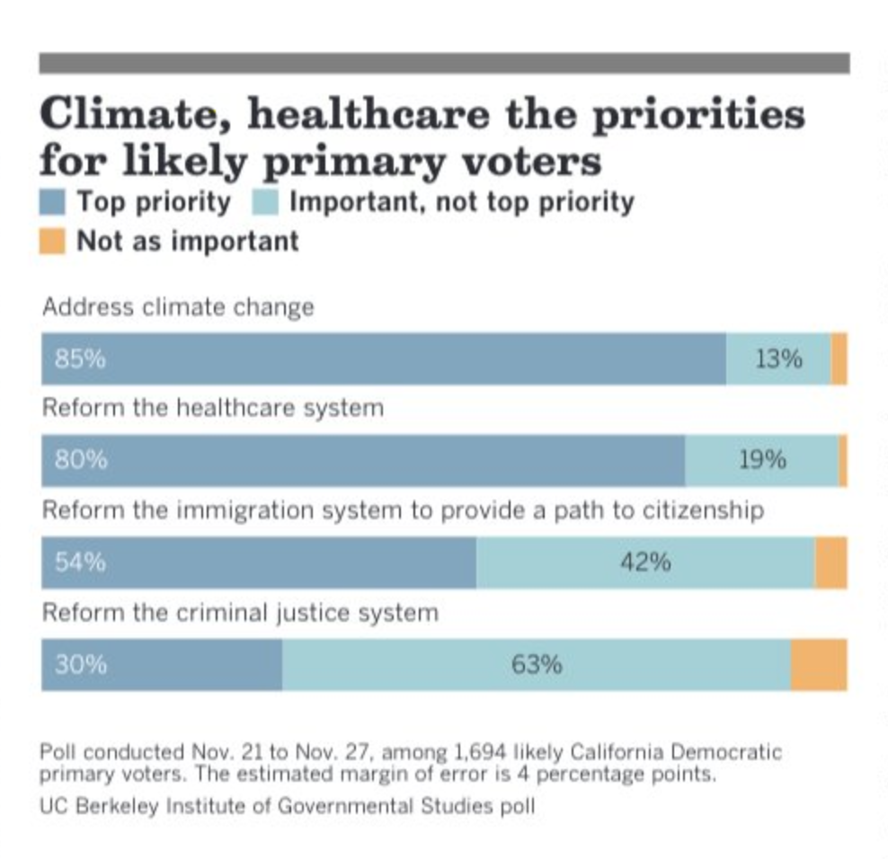
But how to ensure high-enough contrast of colors? The current Web Content Accessibility Guidelines (WCAG) don’t mention data visualizations, but state that graphic elements should “have a contrast ratio of at least 3:1 against adjacent color(s).” (Text should have a 4.5:1 ratio.) That means that bright orange or yellow become impossible against the light gray here, or even against white:
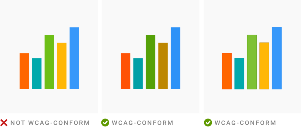
Some people solve that with darker strokes, as visible on the right.
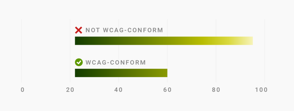
The 3:1 ratio doesn’t just have consequences for column charts. Remember the gradient ➹ we built for choropleth maps? A WCAG-compliant one would cover only half of the lightness range, making it actually harder to distinguish between areas:
What’s more: According to the WCAG, colors need to have enough contrast to any adjacent color — and often, that’s not just the background:
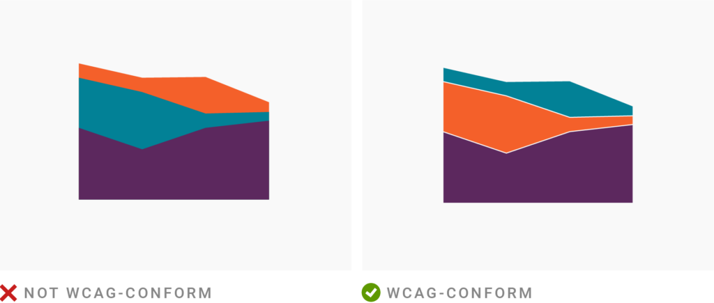
A solution I often see is to give your chart elements white outlines. Choropleth maps (like the ones from Datawrapper) do that a lot.
But fact is, if you look at the organizational color palettes in this article, and data visualizations out there in the wild, you’ll find that most don’t comply with the 3:1 rule. Our Datawrapper locator map styles ➹ certainly don’t (and designing a good-looking locator map style that does, while keeping it easy to spot markers on top, will be tricky). It’s also challenging to communicate “calm” and “trustworthy” ➹ with colors that are that dark. The WCAG were not designed with data vis in mind, its color contrast check has issues anyway, and the often-overcompensating 3:1 ratio shows that. WCAG color contrast critique Andrew Somers has said that the needed contrast depends on the size of an object ➹ and provides some guidelines.
When it comes to color contrast, every organization needs to decide how much they will or must follow the WCAG for data visualization elements. Data visualization designer and book author Jonatan Hildén told me that ”we still are in the early days of accessibility in data visualization,” and I agree. I hope we’ll have more clarity and better guidelines on color contrast in a few years. Until then, initiatives like DataViz Accessibility Advocacy and Advisory Group might help.
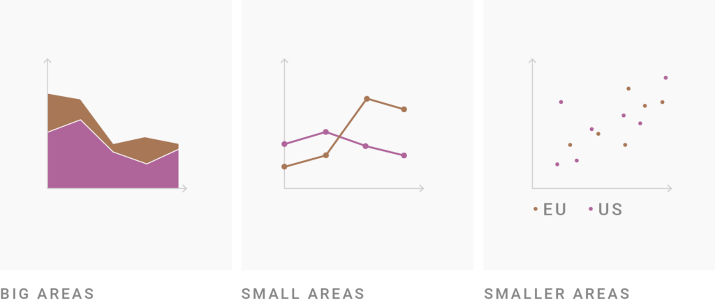
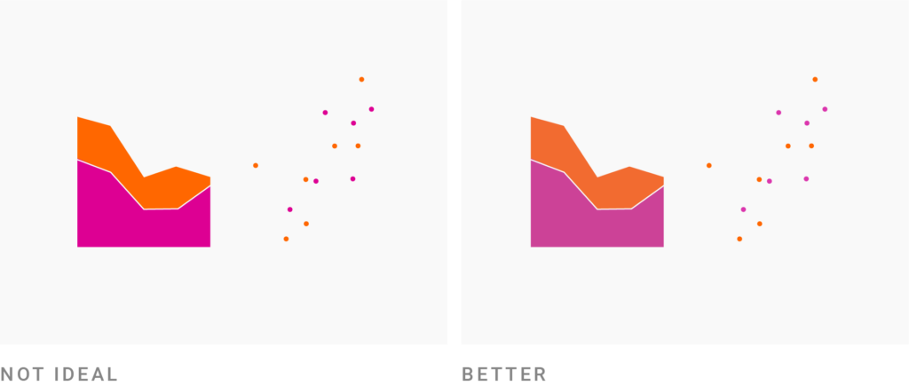
Colors are differently distinguishable depending on the size they fill. Over big areas, like in area charts, pie charts, or choropleth maps, it’s easier to tell colors apart than over small areas. Make sure your colors are easy to distinguish at every size you’ll use them.
To make it easier to tell colors apart, increase all three kinds of contrast between them:
Increasing the saturation of a few of your colors might make the difference between “not distinguishable” and “a good color palette.”
But while lines and symbols with highly saturated colors look great, the same colors over big areas can quickly look too saturated.
You have two options: Make your colors work for both small and big areas (check them with the Viz Palette “color report”) by increasing the differences in lightness and hue and/or by reducing the number of colors.
Or, define more saturated colors for small areas and less saturated colors for big ones. Oftentimes, the differences can be tiny: The reader should perceive these colors as the same.
FiveThirtyEight did this for their election forecast 2016. The colors in the bar chart at the top are less saturated than the colors in the line chart at the bottom ⬤⬤ and ⬤⬤.

 Parts of the 2016 election reporting by FiveThirtyEight
The Financial Times does the same, using ⬤ for column charts and the more saturated ⬤ for line charts. (Direct comparison: ⬤⬤.)
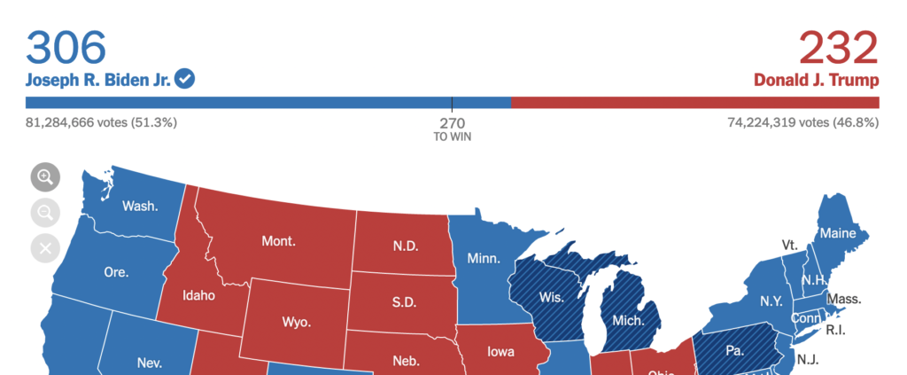
That said, lots of organizations don’t care and still use great colors. For their election forecast 2020, FiveThirtyEight switched to using just one red ⬤ and blue ⬤. Same with The New York Times: They used the same red ⬤ and blue ⬤ everywhere in their US election reporting 2020 (and the years before), be it for thick bars, states in maps, thin lines, or 13px text:
You could also go one step further like the Dallas Morning News did in their (seemingly outdated) style guide from 2005 (PDF). Bar and line charts were supposed to be filled with fairly dark colors ⬤⬤⬤⬤⬤, while creators of pie charts should “prefer to use pastel colors” ⬤⬤⬤⬤⬤. Note that not one of these pastel colors meets the accessibility guidelines ➹ of a 3:1 contrast ratio.
While defining two different colors for small and big areas is an option, it might complicate things in your charting tool — and you’ll need to document more. Think twice before you decide to go this way.
Many visualizations benefit from emphasizing only a few categories and de-emphasizing the rest. That’s often achieved by reducing their opacity. If you’re planning on doing that, test it with the colors in your color palette. You might need to make your colors more saturated and/or darker, so that they don’t vanish completely into the background once they’re de-emphasized. If you only have low-contrast colors, play around with the transparency you’re adding instead.
Even if you don’t want to de-emphasize categories, you might need to deal with overlapping elements, for example in scatterplots or symbol maps. Making your colors more transparent or using a blend mode like “multiply” can be an option there. To make it easier to recognize colors, consider giving transparent symbols an outline with 100% opacity.

Some colors are easy to refer to: Red. Blue. Orange. Yellow. Green. Purple. These are the kind of colors you want in your color palette if people in your organization will present visualizations a lot, or if you’re expecting your readers to talk about them.
As a presenter, you want to be able say, “And this orange bar here shows us…” And you want your audience to be able to ask: “Can you tell us again what the dark blue line there shows?” If there are only shades of one hue, or “greenish-yellow” and “orangy-red” and “dirty red-ish purple I guess that’s called aubergine?” in your style guide, it might give some users of your colors a hard time.
Using unnameable colors has other disadvantages, too. “If two colors are called by the same name in a language, speakers of that language will judge the two colors to be more similar and will be more likely to confuse them in memory” (emphasis mine), Jonathan Winawer et.al. write in their 2007 paper Russian blues reveal effects of language on color discrimination. Russian has no generic word for “blue,” but two words: one for light blue (goluboy) and one for dark blue (siniy). Winawer and his co-researchers showed Russian- and English-speaking study participants two blue colors and asked them which one matched a third blue:

“We found that Russian speakers were faster to discriminate two colors if they fell into different linguistic categories in Russian (one siniy and the other goluboy) than if the two colors were from the same category (both siniy or both goluboy)” (emphasis mine), the paper concludes. “English speakers tested on the identical stimuli did not show a category advantage under any condition.” This insight could be applied to chart colors that get explained with a color key above the chart. Using colors that have distinctive names might make reading a color key easier.
Background color can be a huge brand identifier: If I see a chart with a pink background ⬤ anywhere on the internet, I immediately know it’s from the Financial Times.

But a background other than white or black means that you have less choice when it comes to colors. Caroline Nevitt from the Financial Times told me: “Our pink background reduces the limits of lightness our colors can have: They always need to be darker than this already darker-than-white background. We could use a wider spectrum of colors without it.”
Also, all colors need to look in harmony with the background color. A normal gray, for example, looks off on the pink FT background. Instead, the FT decided on a beige-ish gray ⬤ for unhighlighted or missing data ➹.
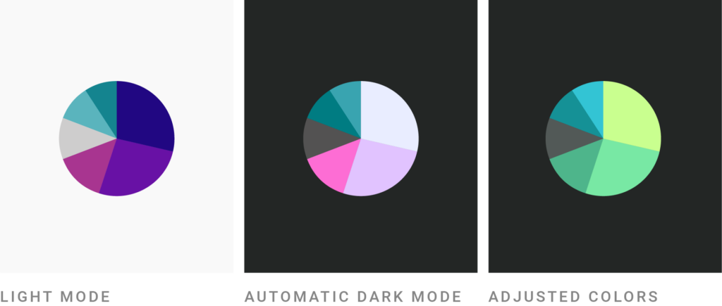
“Dark mode” can mean that all your visualizations just have a dark background. In most cases, though, you only want to show that dark background if readers opted into it (e.g., in the settings of their operating system or their browser). Your website needs to be designed for dark mode too. If both things are the case, make sure your color palette looks good in dark mode.
Automatic dark modes like the one by Datawrapper will adjust the lightness of your colors so that the contrast between the background and your chart elements is the same in both dark and light mode. Less important chart elements like an axis tick have a low contrast with the background, so they will be light gray on a light background ⬤⬤ and dark gray on a black background ⬤⬤. The elements that should stick out the most will have the highest contrast.
Automatically converting to dark mode will work better or worse depending on your colors. Most very saturated, dark colors like blue and green don’t have equally saturated equivalents if they’re very bright: A vibrant dark blue ⬤ will convert into such a desaturated color ⬤ that, although very bright on a dark background, it won’t get much attention from readers. And the other way around: An exciting bright yellow on a bright background ⬤ will turn into a brown ⬤ on a dark background that just doesn’t convey the same energy. You have two options:
You might create a style guide to bring more consistency into your organization. So how should you deal with the data visualizations your company has created before? If they’re not viewed anymore (e.g. because they are part of a presentation), or you can’t change them (because they’re printed), then you don’t need to worry about that. But depending on how many views your old reports, articles, or sites get, you might want to replace some of the colors in their data visualizations.
Graphis team lead Kaspar Manz from the Swiss newspaper Neue Zürcher Zeitung told me that he defined three “levels” of backward compatibility:

Depending on how you’re creating your visualizations, you might need to change the colors by hand or be able to replace them with a few clicks. The NZZ uses CSS variables, so they can define and adjust color-green, color-orange, etc. for Level 2 colors and color-1, color-2, etc. for Level 3 colors.
If you have a Datawrapper custom theme, you can tell us which new colors should replace which old ones (e.g. to replace a green with a green and a blue with a blue) and give us a list of visualizations that we should republish to make the new colors appear in your embedded visualizations.
If you don’t have a system in place yet to automate color replacements, it might be time to consider one. The next style guide redesign will come for sure.
Find out what your organization needs / Collect possible colors / Create the color palette / Test your color palette with tools / Show your colors to users and readers / Document your colors / Improve
We talked about what to include and what to consider while doing so — but we haven’t yet covered how to go about it. This is what this last part is about:
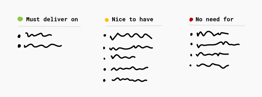
First, it makes sense to be aware of what the new color palette should deliver. I recommend writing it down and checking it from time to time in the process. Some questions that can help:
To know which kinds of colors you need to create, consider doing an audit of the last thirty to fifty data visualizations you’ve created. What role did color play in them? Did the visualizations use categorical, sequential, or divergent color scales? Do some categories get visualized again and again and need specially defined colors ➹?
In this audit, also track how many colors each visualization needed. This will let you do a mental (or actual) histogram. Don’t take the outliers into account (“We needed 15 colors in one chart and only up to seven in the other ones. So we need 15 colors in our palette!”) — creating a data vis style guide is a splendid opportunity to also improve the visualizations at your organization in general, and reducing colors is one way to do that. Scroll up to the part on “How many colors to choose” ➹ for more considerations.
It’s time for a second audit! In many cases, it makes sense to find out which colors your organizations already uses.
If you’re part of a big organization, it probably already has a document called “company style guide” or “our org’s design language” or “design system” or “brand identity” or “graphics guide” or something like that. Get a hold of it and look at the suggested colors.
If your company doesn’t have something like this (or if it’s outdated), go through any designed material your company puts out — company reports, websites, blog, illustrations, packaging, magazines. Collect the colors these materials are using. (I recommend installing a color picker or using online tools like Photopea.)
Note down the style your company is using, too. Is it businessy cold? Retro warm? Subtly pastel? Brutally neon? Is it rather in-your-face or toned down? What kind of setting does the whole company design make you think of — office building, cake shop, university library, playground, cottage? Scroll up to the parts about the self-confidence ➹ and sentiment ➹ for more considerations.
If you need more input, here are three options:
Collecting all these colors means you won’t start with a blank slate once you’re actually creating the color palette:
Here’s a word of warning: Creating a color palette can be a giant time sink. I spoke to people who tweaked their colors for months, got deep into color theory (there’s so much to know!), used three or five different color spaces, got frustrated by all these difficult-to-use color tools… it’s a rabbit hole. And it’s hard to know what helps and what doesn’t.
Of all the colors you want to define, colors for categories are the hardest to create. If you don’t have months, here are a few tricks that (I hope) can help you find them:
First, understand the importance of lightness, saturation, and hue (our article How to pick more beautiful colors for your data visualizations covers that). Design in a color space that lets you tweak these parameters — it doesn’t matter much for now if it’s HSL, HSV, HSB, or HCL. You’ll find one or more of them in any graphics software.
Understanding lightness, saturation, and hue will make choosing colors less of a “let me just randomly generate numbers and hope it’ll look good” gamble (I’m looking at you, Coolors) and more of a structured process. And it will give you the words to argue for or against colors. (“This one is too saturated compared to the others… This hue could work if we make it darker…”)
You can use your fresh knowledge on lightness, saturation, and hue to analyze the colors you got from the audit. Get a feeling for them. How bright are they? What would a more or less saturated version of each color look like?
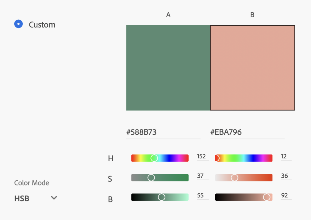
Let’s say your brand colors are these two colors: ⬤⬤. We can use a tool like Adobe Color with the color mode in the bottom left set to HSB to learn that the green is darker than the rose. We also see that both colors are not very saturated. And a look at the color wheel will tell us that they’re almost complementary colors (= on opposite sides) and that the green is closer to the blue than to the yellow side.
Lightness, saturation, and hue are all you need.
That, and trusting your eyes. If you do want to go down the rabbit hole of color spaces, choose a perceptionally uniform color space like Oklab. But for categorical colors, you don’t need fancy color spaces. You’ll see when one color pops out too much compared with the others. If not today, then tomorrow with fresh eyes. If not you, then your designer friend or coworker.
Let’s continue with our two colors ⬤⬤ and learn which colors go well together with them. Put your hex codes into hue.tools and then click through the Inspiration and Images links at the right to see how others have used your colors:
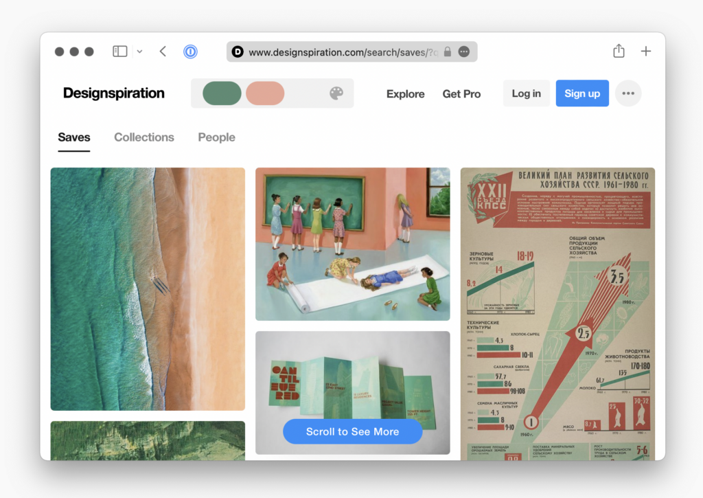
Once we’ve seen some contexts in which others use our colors, it’s time to color pick from those images:

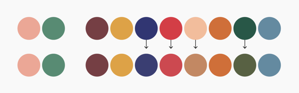
We can work with that! Now we need to:
We’ll get to a version that looks like this:
From here, we can move to the testing:
Depending on your requirements, a categorical color palette needs to check a lot of checkboxes. At the very least, it should be easy to tell apart for readers (including the colorblind ones). Good thing there’s a nice online tool called Viz Palette that checks that for you:
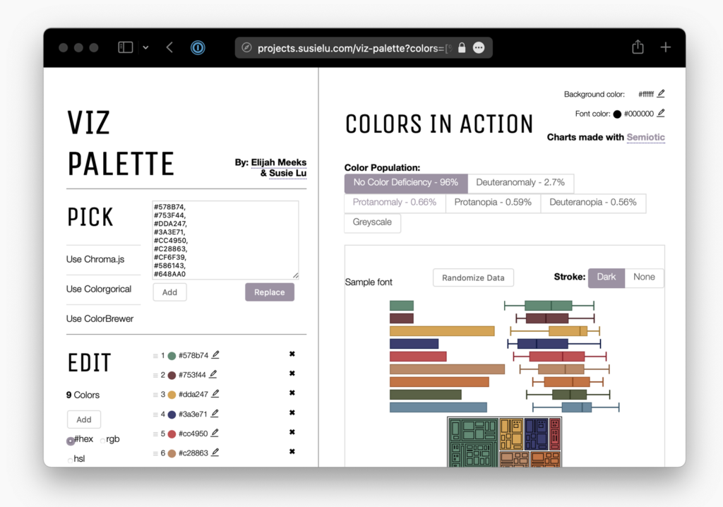
Once you load your hex codes into Viz Palette, it answers the following questions for you:
I don’t know of a better tool that checks all these things — even if you’re interested in only some of them, try it out.
Our palette looks good — but apparently, a few colors are hard to tell apart when they’re used as lines or symbols. That would be especially the case for red-blind readers:

So it’s back to tweaking the lightness, saturation, and hue. The more different in lightness and the more saturated your colors are, the easier it is to tell them apart.
And no, it’s not just you: It simply is hard to create many colors that are both beautiful and easy to tell apart even at small sizes and for all readers. Consider going back to step 1 and adjusting your requirements: Do you really need that many colors? Could limited color combinations ➹ be a solution? Could your data visualizations use ways besides color to make categories distinguishable?
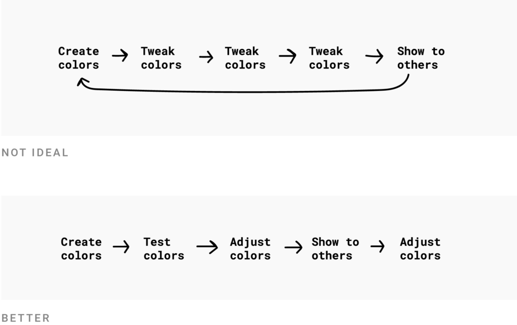
The more time you spend with your colors, the more you might get attached to them. (One of the people I interviewed told me: “I spent so much time with the color palette and researching, I feel ownership and pride about it.”) Before you fall in love with your colors because you’ve stared at them for hours, include other people in the process:
Don’t wait for weeks before including other people. Include them early and often.
A word about aesthetics: Some people might tell you that they don’t like your colors. That they look boring or bland. If you’ve done what’s suggested in step 1 (Find out what your organization needs) and step 2 (Collect possible colors), you’ll have ways to argue for your colors: “These colors communicate our company values best because …” or “We’ve seen that people had a hard time telling our old colors apart, so we had to increase the saturation …”
That said: There will always be a few people who won’t like a specific color you chose — but there are also specific colors that most people simply don’t like. “People generally like saturated blues and cyans because they like clear sky, clean water, swimming pools, and most other objects that characteristically are these colors,” Schloss and Palmer wrote in their 2010 paper Aesthetic response to color combinations: preference, harmony, and similarity (PDF). “They generally dislike dark oranges (browns) and dark yellows (olive-colors) because they dislike feces, rotting food, vomit, and many other (but not all other, consider chocolate and coffee) objects they associate with these colors.”
It helps to speak to a lot of people. This way, you can ignore the outliers (the two people out of ten who are not fans of your purple) and listen to the majority (the seven out of ten people who suggest you choose another orange).
You decided on some colors? You tested them on lots of people and charts, and you’re happy enough with them? Congrats! 🎉 It’s time to document them. Let’s look at the content and format of your documentation:
Content: Your style guide can include the following information:
Format: Before you go ahead and create a big presentation or 30-page PDF, think about which kind of document would be most useful to people.
Writing a style guide is one thing — but your coworkers should actually use these colors. Try to reduce points of friction standing between “Which colors should I use?” and “Great, I’ll use these colors.”
Make people’s lives easier with your documentation. “If [your data vis style guide] solves problems, then people will want to use it,” designer Alan Wilson explains. “Because their life is better with it than it was without it.”
To see how others have structured and designed their data vis style guides, scroll down to the list of style guides ➹.
There’s no need to create a perfect color palette (or perfect documentation!). “Perfect is the enemy of done,” as they say. Sure, there’s always room for improvement, but it doesn’t need to happen now. Ship the color palette and its documentation, then improve both whenever you get feedback. HubSpot has a good article on “keeping your design system evergreen.”
Director of data vis at the Urban Institute, Ben Chartoff, phrased it beautifully: “The data visualization style guide is a living document. As our team grows and learns, we will continue to adapt and update it, striving to make our charts more legible, more beautiful, scalable across more platforms, and accessible to all.”
After a few years, people will get bored of always the same colors. And new people will join your organization, eager to create a new color palette (like maybe you’re thinking about right now). The whole process will start again — with a hopefully even better color palette as the result.
For a list of data vis style guides, I recommend Jon Schwabish‘s collection here and this Google Sheet, started by Amy Cesal. Unfortunately, not all of the ones listed there have a section on colors for data vis. Many have a section on interface colors, and all of them have a section on data vis, but often the “colors in data vis” part is missing. The following style guides have them. If possible, I linked directly to the color section:
Thanks to every organization that put their style guide online! They were not just crucial in writing this very guide, but are also helpful to others who are creating a style guide.
This guide has been in the making for quite some time — and I’m indebted to many people who answered my questions about data vis style guides in emails, video calls, and at an Outlier unconference session that I hosted. Thanks to Caroline Nevitt, Vicky Semaski and Peter Bell, Kaspar Manz, David Yanofsky, Justin Lind, Courtney Babcock, Ben Wylie, Nick Twort, Jacque Schrag, Jonatan Hildén, Ana Lucía González, Jan Dittrich, Max Graze, Jon Olav Eikenses and Tomi Nurmi, Alle Bloom, Graeme Bruce, and many others. This article is better because of you.
Comments