

New: Combine series with different intervals in line charts
January 20th, 2025
3 min
This article is brought to you by Datawrapper, a data visualization tool for creating charts, maps, and tables. Learn more.
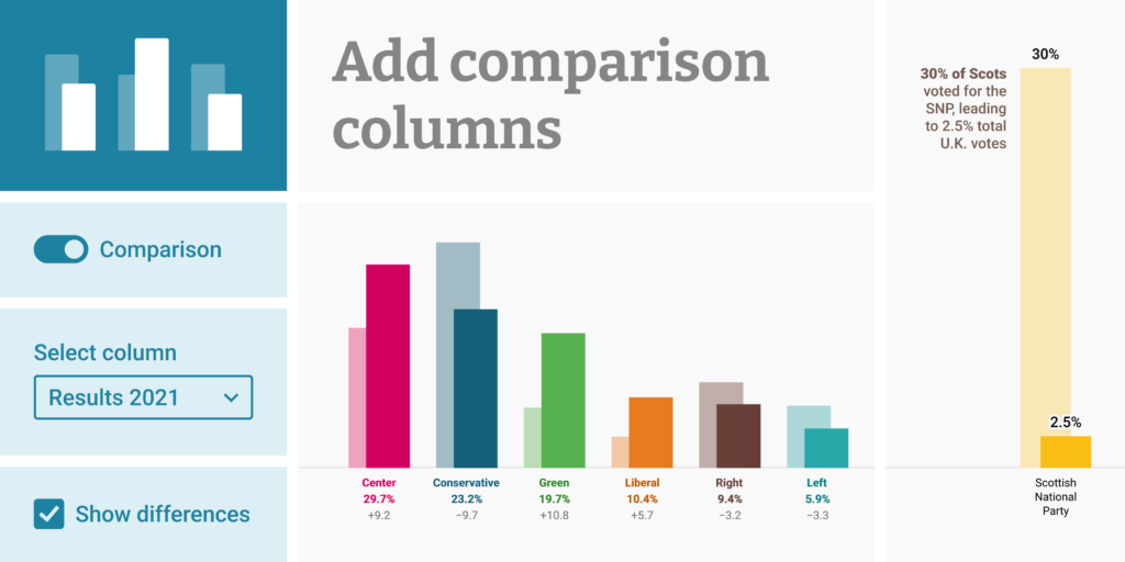
Column charts are a great choice for comparing a value across several categories. But you might find yourself wanting to enrich your column chart with more context: How did those categories fare previously? Or how does a subgroup compare?
Today we’re adding a new feature to column charts that enables your readers to get these extra insights: You can now add comparison values to your column charts, to add key background information while keeping the focus on your main numbers.
We’ve integrated this feature right into column charts — as long as you have more than one numerical column in your dataset, you’ll see the option to use that data to Show comparison columns at the bottom of the Refine tab.
With comparison columns, your main data remains in clear focus. The context data is there, but literally in the background. In addition to displaying comparison columns, you can also use new, more powerful labeling options to help your readers understand the data:
If you’re on a Custom or Enterprise plan, you can also get in touch with us to customize the styling of labels and columns.
We took our inspiration from the widespread use of comparison columns in German-language media and government organizations to show election results — as seen in these examples from Spiegel, Zeit Online, Berliner Morgenpost, the German government, and berlin.de. With a general election in Germany coming up in a few weeks, we hope it proves useful for many of our customers.
That said, this is a versatile chart type not just for election data:
Consider it any time you want to add insight and interest to a categorical column chart, without losing the focus on your main numbers.
We hope you find this addition to our column charts useful! Let us know if you have any feedback or suggestions at support@datawrapper.de. We’re looking forward to hearing from you.


Comments