

The “new normal”: Charts on how we at Datawrapper slowly return to the office
August 23rd, 2023
4 min
This article is brought to you by Datawrapper, a data visualization tool for creating charts, maps, and tables. Learn more.
The coronavirus crisis proved the importance of data communication

Here’s a big thank you to you all. To you, the hundreds of journalists, developers, designers, and communicators all over the planet who have given and still give their best to inform the public about the coronavirus and its implication.
It’s been a difficult time. Readers (you and I included) have been looking for answers. First, to “Should we be afraid?”. Now, to “Can we go back to normal?”
You, dear visualization designers, give us these answers. You’ve analyzed data, called data sources, collaborated and worked overtime. You’ve created charts, maps, and tables, set up automatic updating, highlighted countries and regions.
We’re proud that Datawrapper made this work easier for many of you.
Making it easier to create beautiful, meaningful visualizations has been Datawrapper’s mission from day one. The COVID-19 health crisis reminded us all how important such visualizations can be:
We’ve never seen as many visualization views in the history of Datawrapper as we’ve seen in the last few months. In January 2020, we counted 265 million embed views. In March and April, we counted 4.4 and 4.7 billion.
The news organization that’s responsible for the biggest share of these views is German TV news channel ntv. “Before the coronavirus, our record was around 50m embed views per month,” Christoph Wolf and Martin Morcinek from ntv tell us. “It was surreal to see that climb to 1.7 billion in March and April.”
Luckily, Datawrapper was designed to handle this load (and more). You all trusted us to show your embedded Datawrapper visualizations to every one of your new and recurring readers. And we did exactly that. There we no downtimes during the COVID-19 view surge.
Numbers – and their communication – got a whole new standing in our societies over the past few months: Many coronavirus articles that graphics team created broke all records within their publications. “The main page that the trajectory charts all sit in is now by a large margin the FT’s most viewed page ever,” John Burn-Murdoch from the Financial Times explained in a recent podcast. And one of the most distinguished data visualization researcher, Ben Shneiderman, stated: “The complexity and importance of COVID-19 has put data visualization center stage in worldwide discussions.”
And these many views have a positive impact on publications. John Burn-Murdoch again: “We are absolutely seeing people subscribe to the FT as a direct result of these pieces of work as well as all the rest of our coverage recently.”
And some of you might have also seen data visualization get a new standing within your organizations. Many told us that their graphics teams are taken more seriously now than a few months ago. Christoph Wolf and Martin Morcinek again: “Our colleagues’ view of the graphics team changed. Data visualization doesn’t get perceived as decoration anymore, but is now understood to be the starting point for stories and topics.” (Scroll down to learn how ntv’s charts look like.)
Here’s how you visualized coronavirus data with Datawrapper:
Newsrooms, independent sources, and government institutions have used Datawrapper to create collections of coronavirus visualizations. Here are three examples:
Thousands of New Yorkers have stayed up to date on the “COVID-19: Data” page of nyc.gov, that showed the latest official numbers with Datawrapper charts:
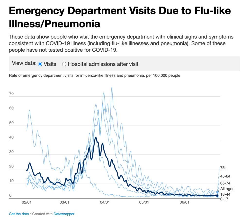
Datawrapper line chart on nyc.gov
A website that consists entirely out of Datawrapper visualizations is covidexitstrategy.org. Behind the one map and four in-depth tables are “public health & crisis experts with experience working at the White House, Department of Health & Human Services, and on the Ebola epidemic in West Africa.”
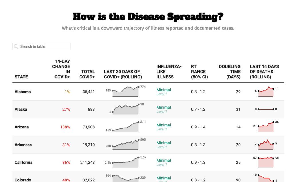
A Datawrapper table on the US-American covidexitstrategy.org
Since February 27, German ntv maintains an article in which they present and explain 15 tables, nine charts and six maps (!), all updating automatically. They also explain their Datawrapper visualizations on TV every day.
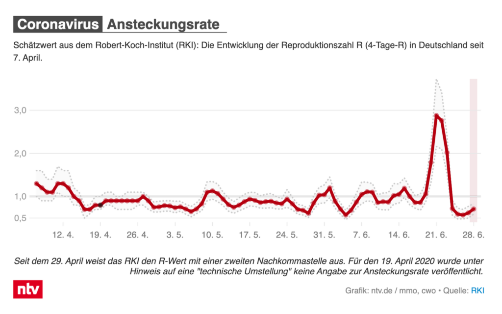
Datawrapper line chart in the ntv.de visualization collection
How did they create and maintain so many visualizations? Christoph Wolf and Martin Morcinek from ntv explain: “Over the weeks we created own data sources and style guides for the visualizations – and in general, automated as much as possible. Datawrapper made that easier with their Google Sheets connection and the API.”
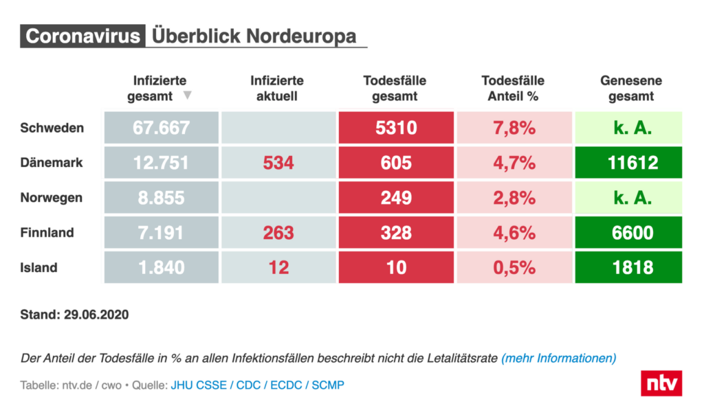
Datawrapper table in the ntv.de visualization collection
We picked these three examples from dozens of websites: US-American sites like TIME magazine and Foreign Policy, German news sites like ZDF.de, Süddeutsche Zeitung and SPIEGEL, Swiss swissinfo.ch, Danish TV 2, Brazilian Estado de Minas and many others created collections of Datawrapper charts, maps, and/or tables.
We also saw newsrooms embed Datawrapper charts, maps, and tables right on their homepages. You can still find them on the German süddeutsche.de, the Indonesian detik.com or the Swiss srf.ch.
It’s often not enough to just put all the charts on one page and let readers figure it out. Hospitalization rates, per capita numbers, logarithmic scales, inconsistent case reporting, testing – there’s been a lot to explain. These newsrooms and many more did:
The Japanese new site NewsPicks created Datawrapper tables, maps, and line charts to explain the difference between the reported COVID–19 cases and the cases per capita:
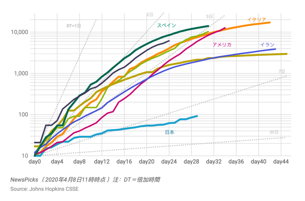
Datawrapper line chart in a NewsPicks article
The US-American news agency Associated Press used Datawrapper in many of their articles to report on the current state of the crisis, e.g. on March 21 and on June 23:

Datawrapper choropleth map in an AP article
US-American news & opinion site Vox, popular for “explanatory journalism”, focused on COVID–19 tests as the US passed the sad record of most confirmed cases in the world in May:
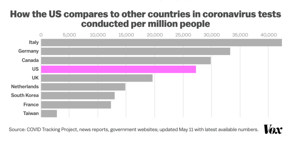
Datawrapperbar chart in a Vox article
Again, these are just some of the many examples. Swedish expressen.se, German Tagesspiegel, US-American Los Angeles Times, all the newsrooms we mentioned in the “chart colletion” section and many, many more big sites and small blogs explained coronavirus figures and visualized them with Datawrapper.
Thank you for doing the hard work of keeping the public up to date. And thank you for using Datawrapper to do so.
Edit July 9th: Thanks to everyone who reacted very positively to this article! We heard from many of you on Twitter and in emails. Here are some of our favorite tweets:
Datawrapper has been invaluable in our work too. We have several self-updating charts going that use the handy live data connector or the Python library to show the latest numbers.https://t.co/kQtvVof2xq https://t.co/2TQY5fi6El
— Roberto Rocha (@robroc) July 1, 2020
Very useful since 2014 at @prazapublica, essential at informing about this crisis 🤗
— David Lombao (@DavidLombao) July 1, 2020
Very useful since 2014 at @prazapublica, essential at informing about this crisis 🤗
— David Lombao (@DavidLombao) July 1, 2020
Thanks for highlighting the terrific work of the team in NYC! It’s been great to work with DW, and great to show people what we can do when we’re open and clear with data and have wonderful publishing tools at our fingertips.
— Matty 🍝 (@_mattio) July 1, 2020
Was hätten wir bei @rponline in #Corona-Zeiten ohne @Datawrapper gemacht? Vermutlich keine Rekordzahlen mit #DDJ-Artikeln verzeichnet, die tägliche Berichterstattung um erklärende Grafiken ergänzt oder automatisch aktualisierende Widgets für Homepage und Index-Seiten gebaut. https://t.co/7PP0vP6OvD pic.twitter.com/3mkMTuPghv
— Clemens Boisserée (@BoissereeC) July 1, 2020
#COVID-19 chart showing the power of #datavis. @datawrapper has been an essential tool for our newsroom as well, thanks to the whole team for the resources, updates & support! https://t.co/FIEYNwl6b3
— Strtman (@Strtman) July 1, 2020
How did you and your organization perceive the last few months? Let us know at hello@datawrapper.de or in the comments. And in case you’re wondering about the different designs of the visualizations in this article: Many organizations use a custom design theme that comes with a Custom plan. You can find more information about these custom design themes in our Academy.


Comments