Data Vis Dispatch, April 12

The best of last week’s big and small data visualizations

Welcome back to the 40th edition of Data Vis Dispatch! Every week, we’ll be publishing a collection of the best small and large data visualizations we find, especially from news organizations — to celebrate data journalism, data visualization, simple charts, elaborate maps, and their creators.

Recurring topics this week include war in Ukraine and the French presidential election.

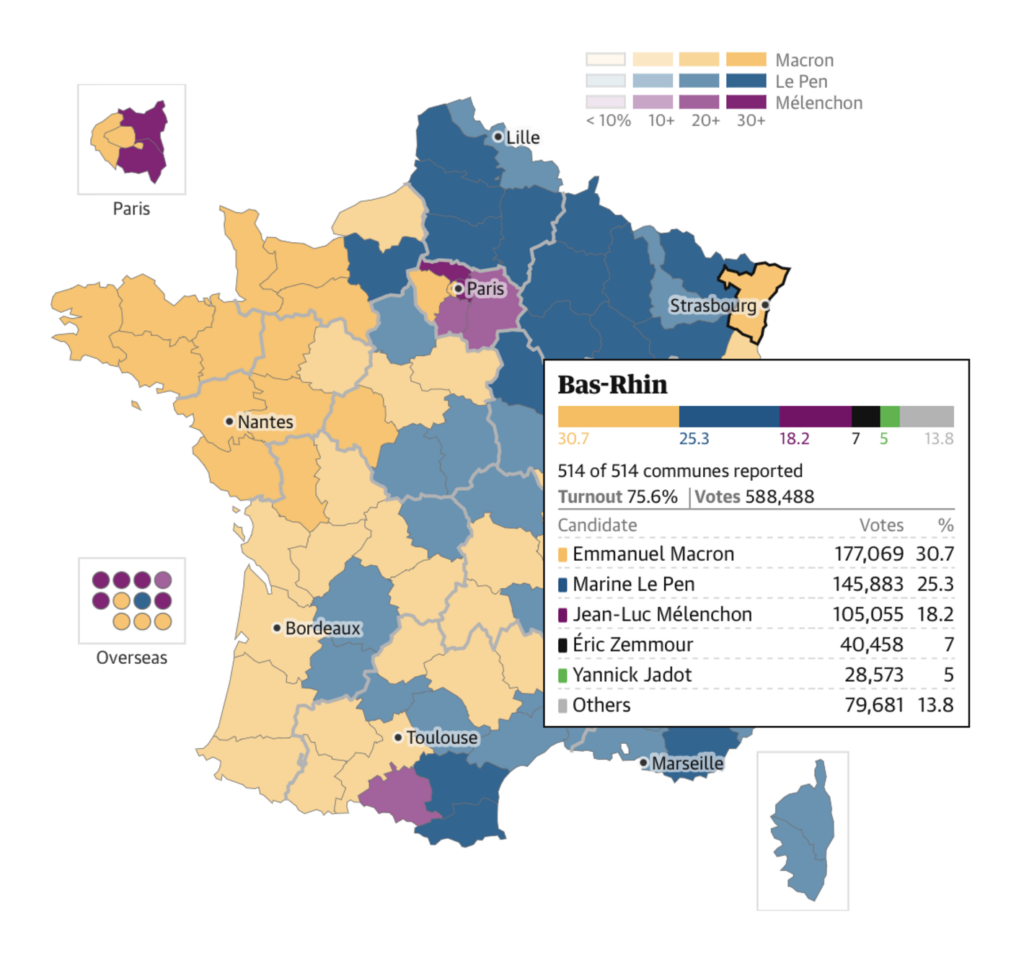
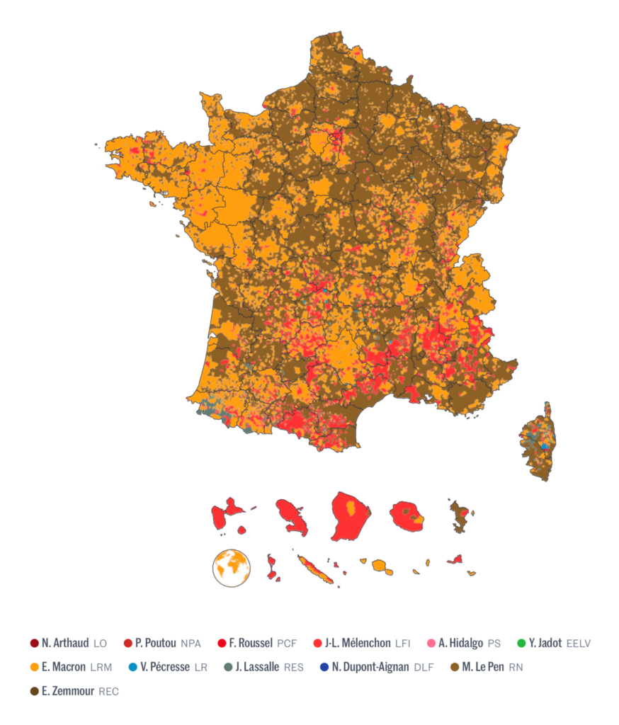
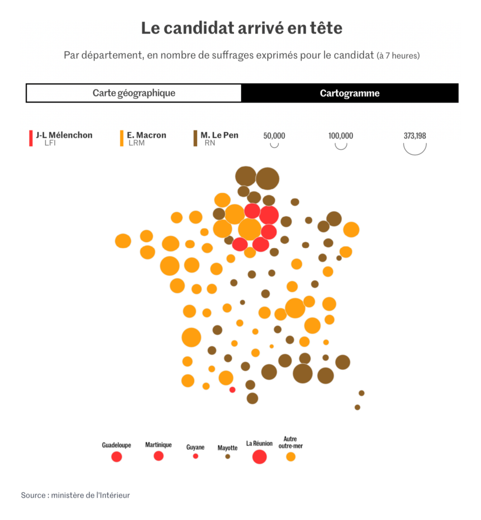
Last Sunday was the first round of the French presidential election. There were maps:

Contexte: Préparez les batailles des législatives avec notre carte interactive des 577 circonscriptions, April 7
The Guardian: French election 2022: full live results, April 10
Le Monde: La carte des résultats de la présidentielle 2022 : visualisez les votes commune par commune, April 10
Financial Times: Emmanuel Macron to face Marine Le Pen in French election run-off, April 11
Les Echos: Présidentielle : la géographie du vote au premier tour en 5 cartes, April 11
Bloomberg: Résultats en direct de l’élection française, April 10

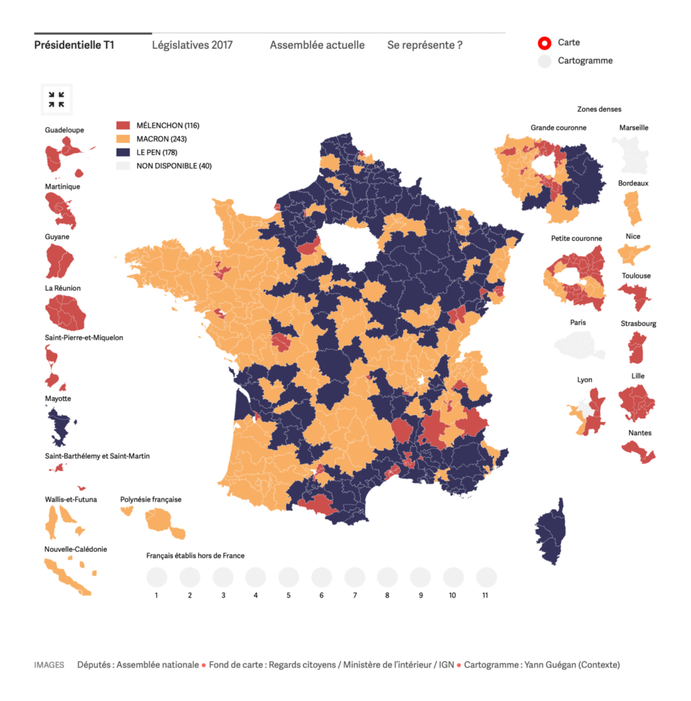
Several papers, including Le Monde, Libération, and the Süddeutsche Zeitung, used cartograms or other methods to show the number of voters in each region:

Le Monde: Résultats de l’élection présidentielle 2022 : au premier tour, la tripartition du paysage politique, April 11
Libération: Les résultats du 1er tour de la présidentielle 2022 dans votre département, région et circonscription législative, April 10
Süddeutsche Zeitung: So hat Frankreich gewählt, April 11

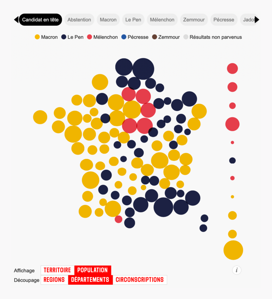
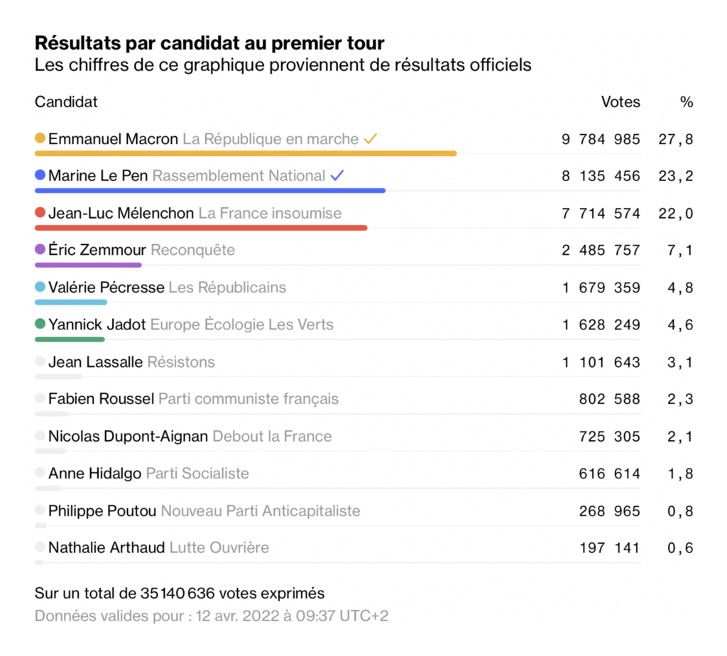
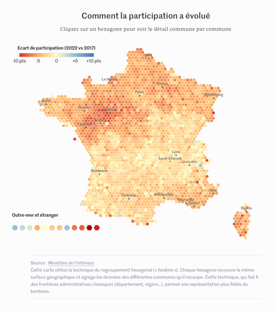
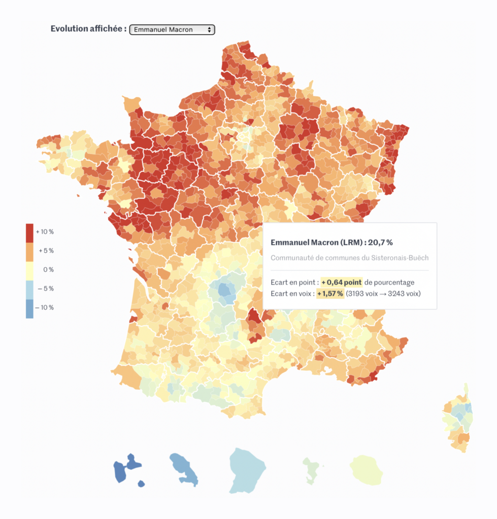
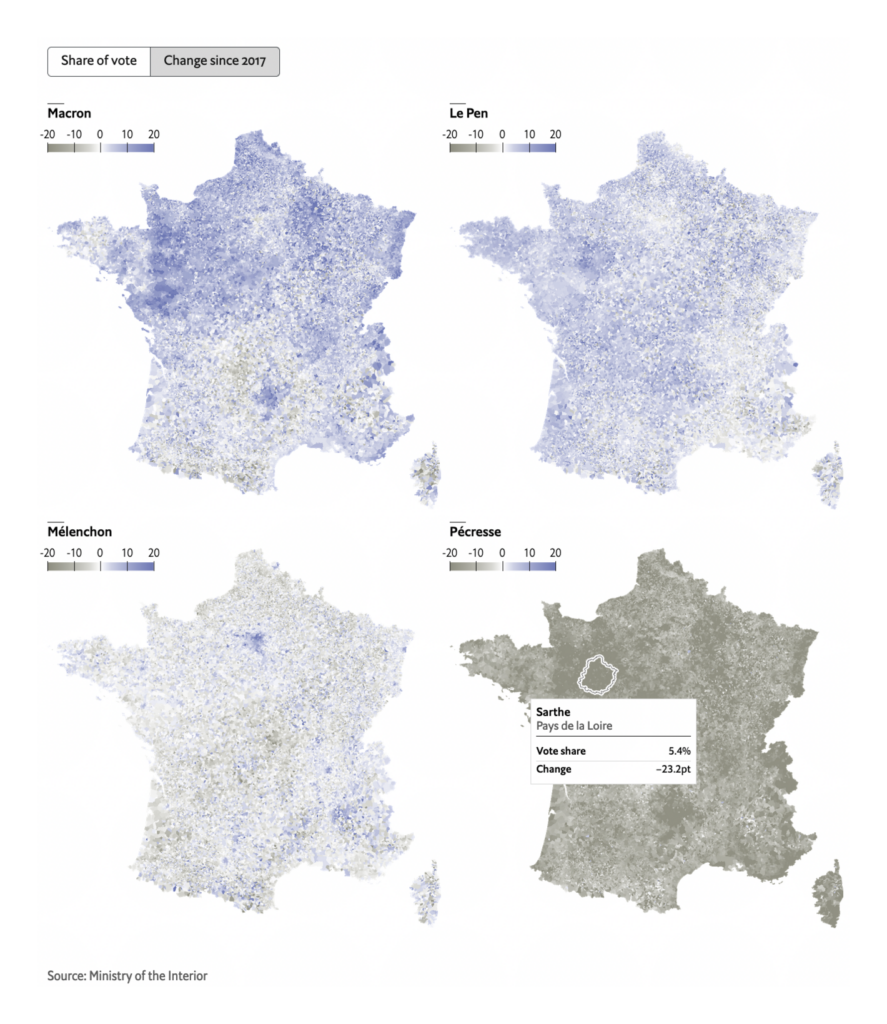
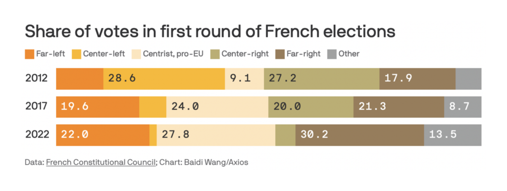
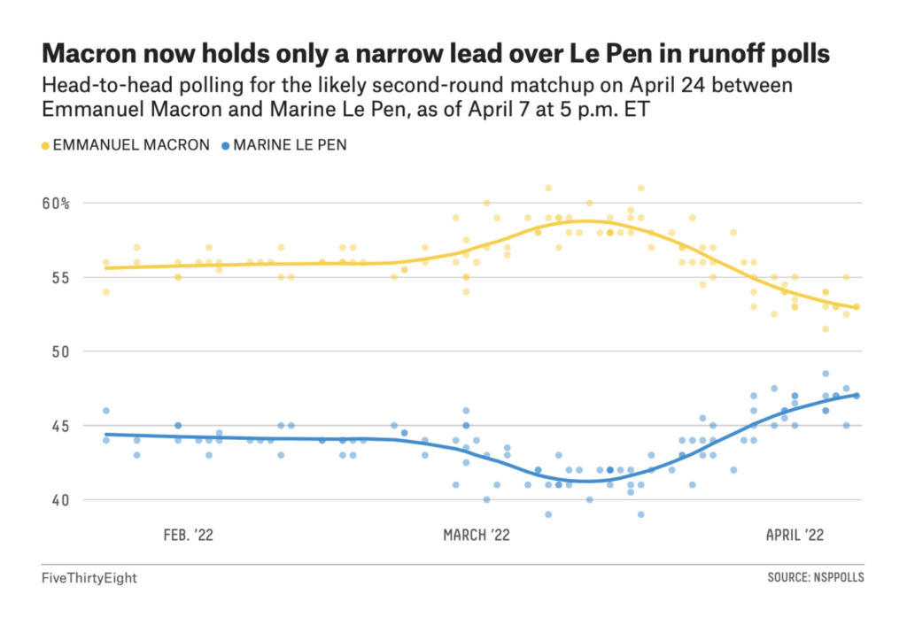
Emmanuel Macron and Marine Le Pen will advance to the second vote on April 24, in a rematch of the 2017 election. Although voter turnout was down, both candidates improved their first-round results this year:

Le Monde: Six cartes et graphiques pour comprendre l’abstention au premier tour de la présidentielle 2022, April 11
Le Monde: En cartes : visualisez la recomposition politique entre les élections présidentielles de 2017 et 2022, April 11
Le Parisien: Présidentielle : huit cartes pour tout comprendre au premier tour, April 11
The Economist: France’s presidential election: The first round in detail, April 11
Axios: Macron vs. Le Pen: The race is on, April 12

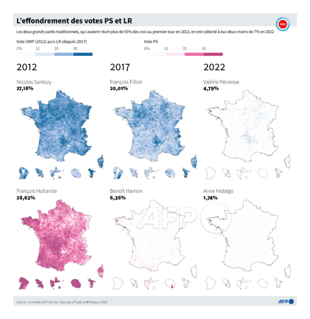
While on the other hand, France’s historical ruling parties suffered a total collapse:

Le Figaro: Présidentielle 2022 : découvrez la physionomie du vote par commune, April 10
Tupac Pointu/Agence France-Presse: “Présidentielle 2022 : l’effondrement des votes @partisocialiste et @lesRepublicains par @KAugeard et @sophie_ramis,” April 11 (Tweet)
Le Monde: Résultats de l’élection présidentielle 2022 : une nouvelle décomposition du paysage politique, April 11

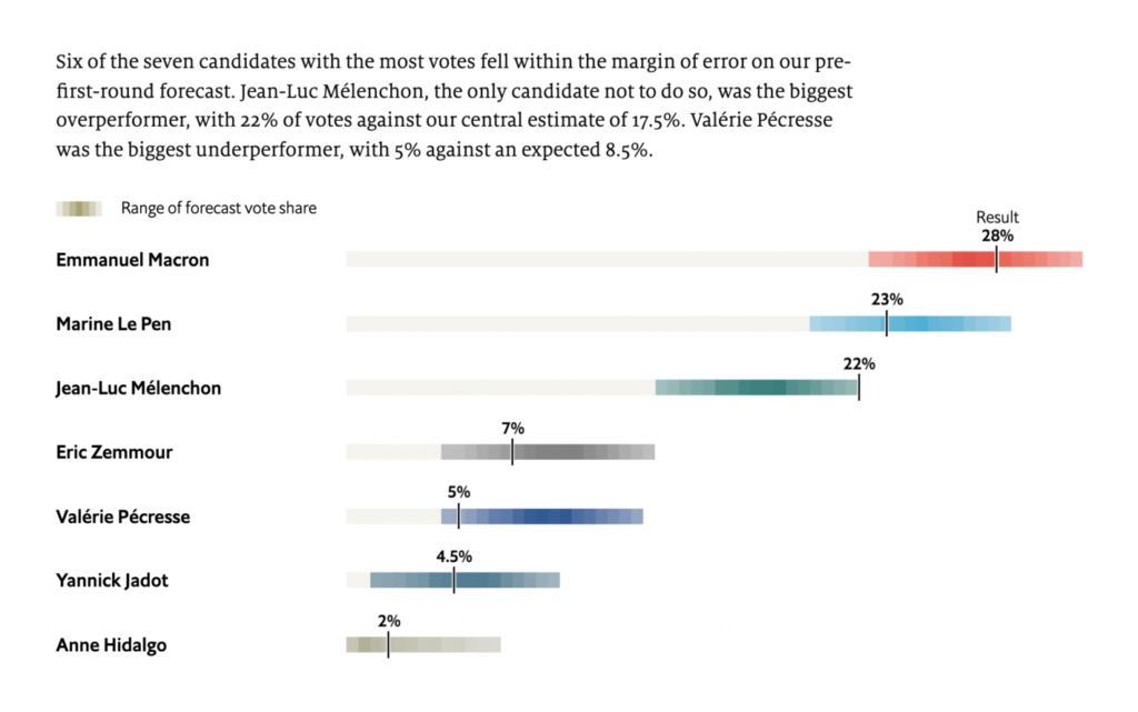
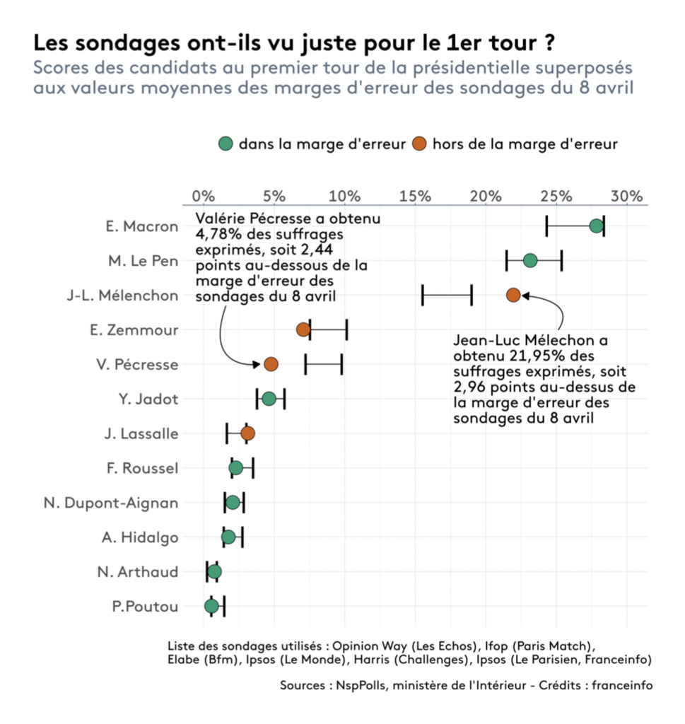
The surprise of the night was Jean-Luc Mélenchon, who overperformed his polls to finish with 22% of the vote:

The Economist: Will Emmanuel Macron win a second term?, April 11
France Info: Résultats présidentielle 2022 : pourquoi les sondages ont-ils mal évalué les intentions de vote pour Mélenchon et Pécresse ?, April 11

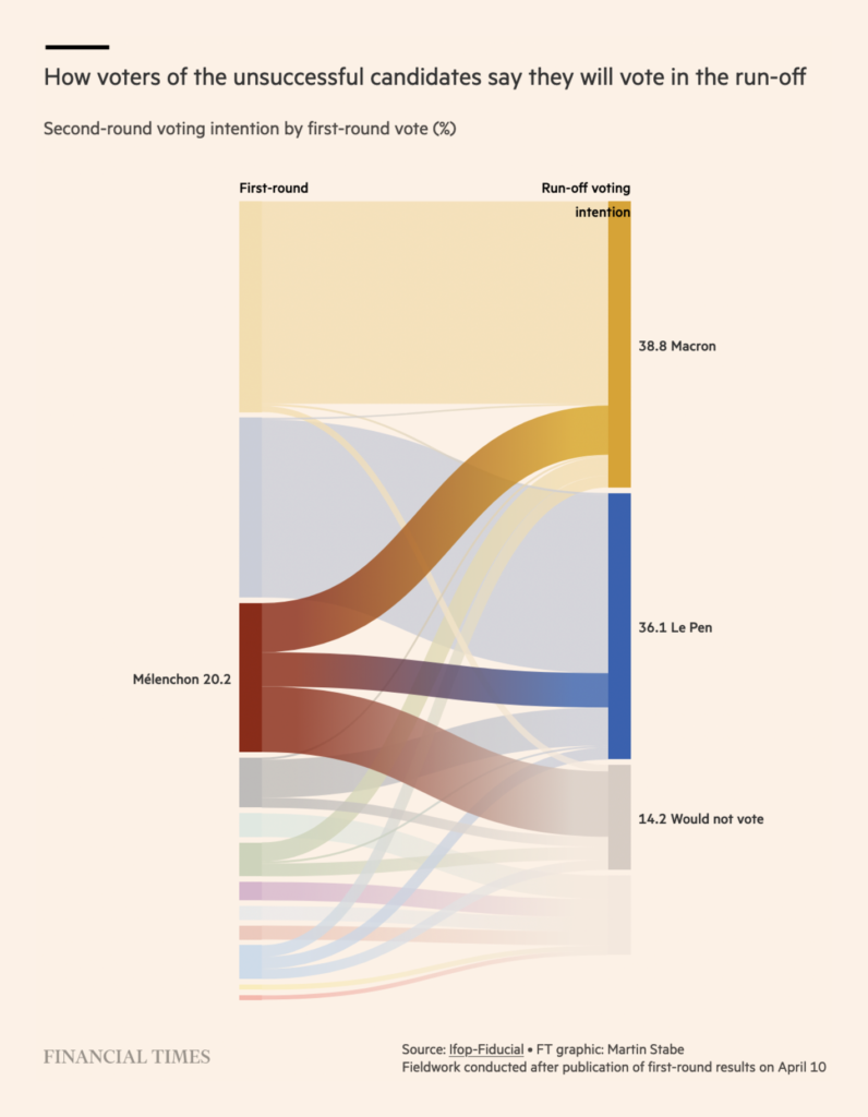
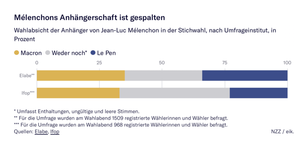
In a tight second round, Mélenchon’s voters could be decisive — though they’re divided on which candidate to support:

FiveThirtyEight: Emmanuel Macron Could Lose France’s Presidential Election, April 8
Financial Times: First round of 2022 French election in charts, April 11
Neue Zürcher Zeitung: Erste Runde der Präsidentschaftswahl in Frankreich: alle Ergebnisse in der Übersicht, April 11

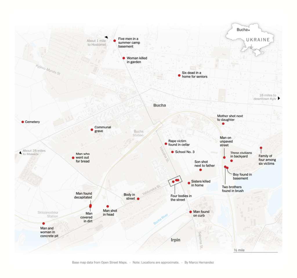
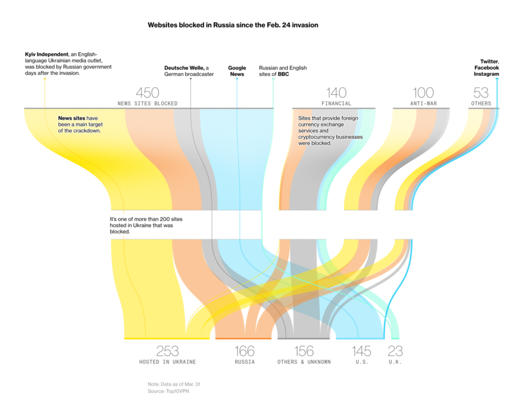
In Ukraine, meanwhile, evidence of Russian atrocities against civilians continues to grow:

The New York Times: Bucha’s Month of Terror, April 11

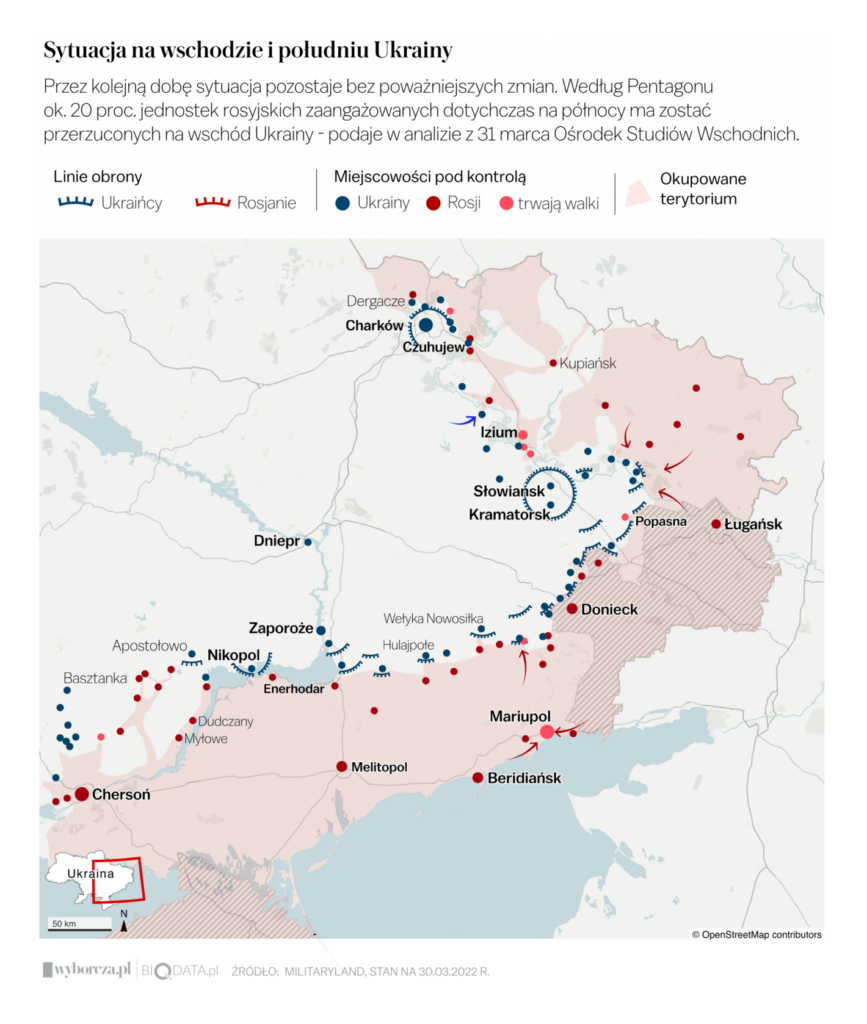
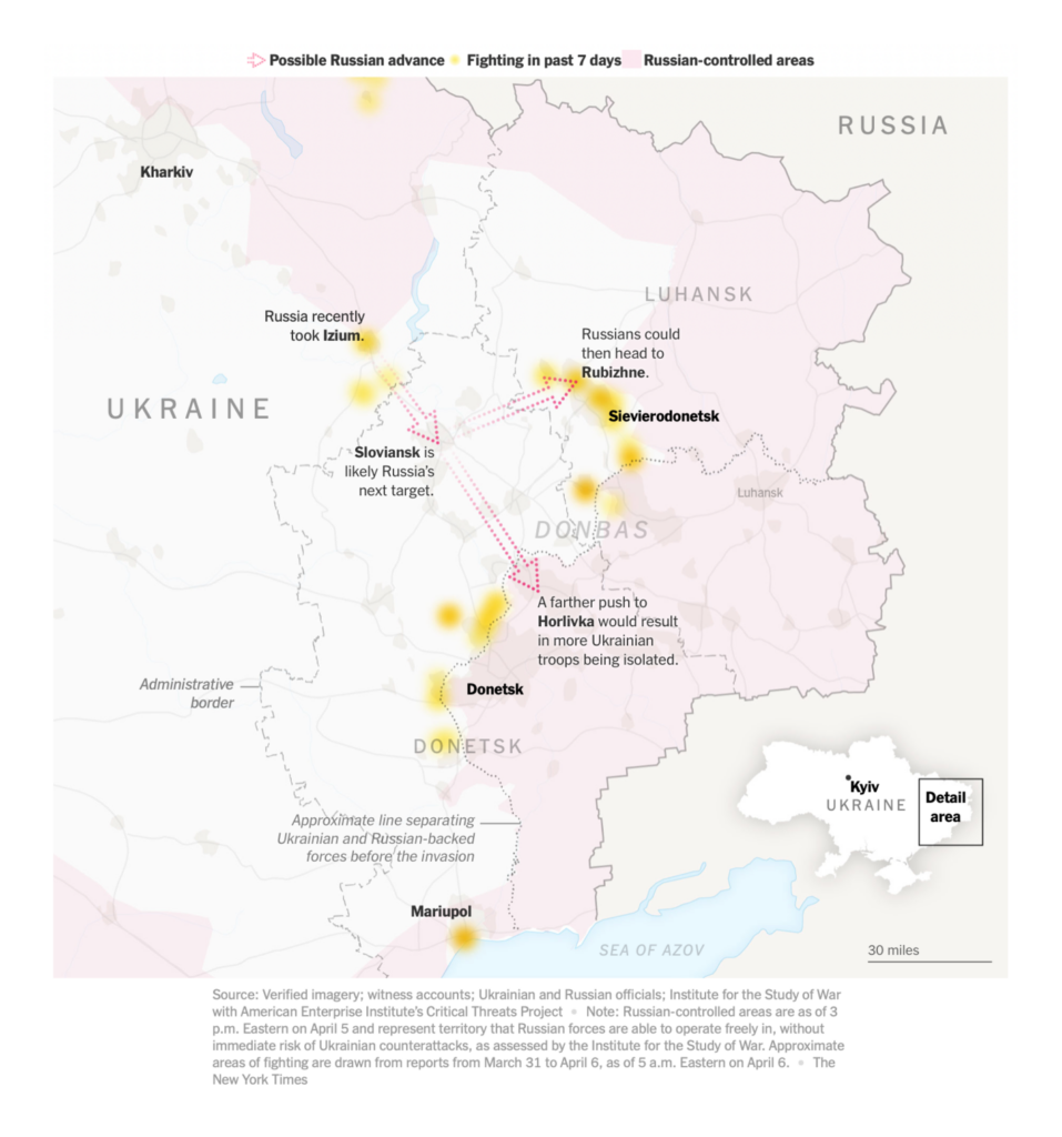
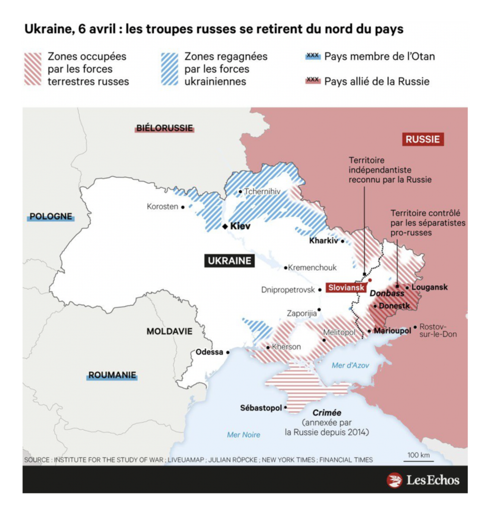
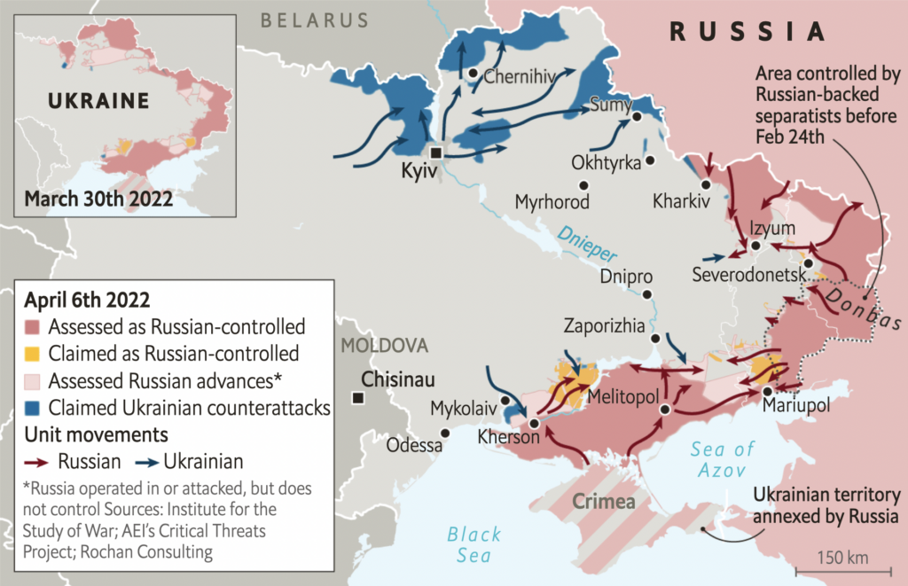
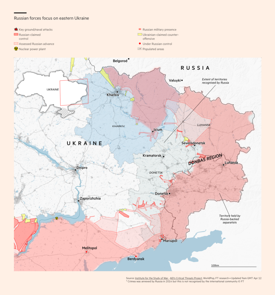
After Ukrainian forces pushed back Russian advances in the north, fighting has reconcentrated in the east of the country. Maps of the military situation are shown in chronological order:

Gazeta Wyborcza: Atak Rosji na Ukrainę, April 6
The New York Times: How Russia is refocusing for a pivotal struggle in eastern Ukraine, April 6
Les Echos: Guerre en Ukraine : les temps forts du mercredi 6 avril, April 6
The Economist: Ukraine sees a window of opportunity to push Russia back, April 8
USA Today: Satellite images show Russian convoy and build-up in eastern Ukraine near Donbas region, April 11
Financial Times: Russia’s invasion of Ukraine in maps — latest updates, April 12

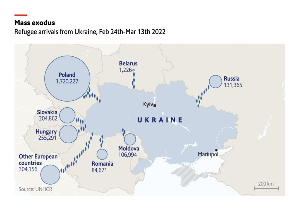
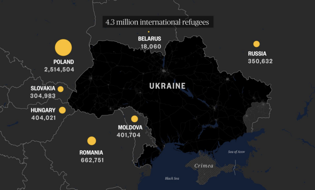
More than 11 million Ukrainians have been displaced from their homes:

The Economist: How cartographers track and map Russia’s war in Ukraine, April 8
NBC News: What an exodus of 11.4 million people looks like, April 7

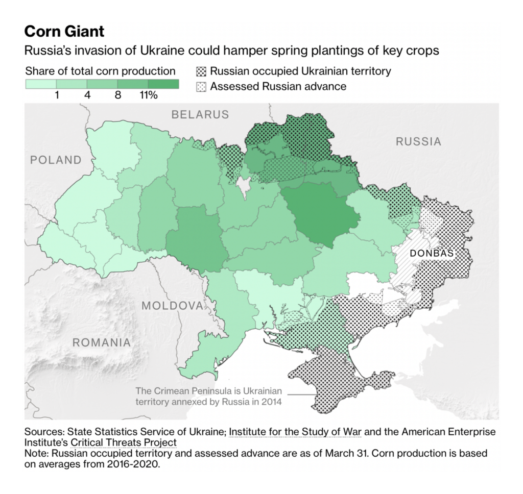
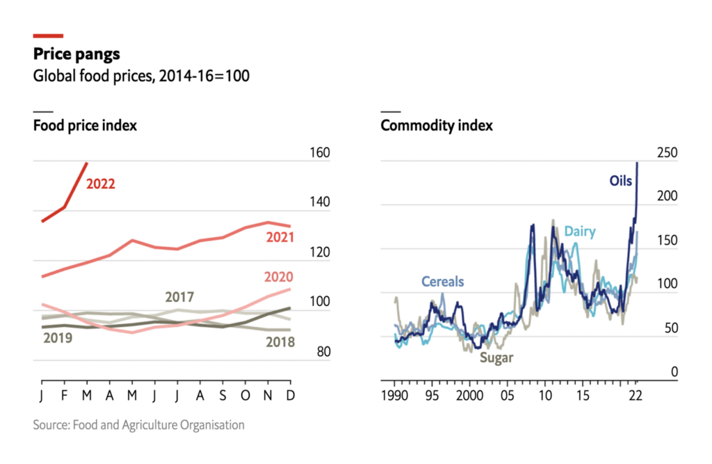
And the disruption to Ukrainian agriculture and shipping has roiled global food markets:

The Washington Post: Ukraine’s wheat harvest, which feeds the world, can’t leave the country, April 7
Bloomberg: The $120 Billion Global Grain Trade Is Being Redrawn by Russia’s War in Ukraine, April 5
The Economist: Russia’s invasion of Ukraine is causing record-high food prices, April 8

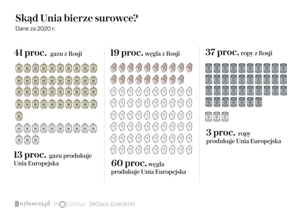
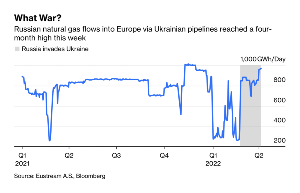
Meanwhile, the European Union can’t quit Russian energy imports:

Gazeta Wyborcza: Wymień okna na złość Putinowi. Sezon grzewczy w Polsce 2022/23 może być srogi, April 9
Bloomberg: Europe’s Hypocritical Gas Policy Isn’t Sustainable, April 6

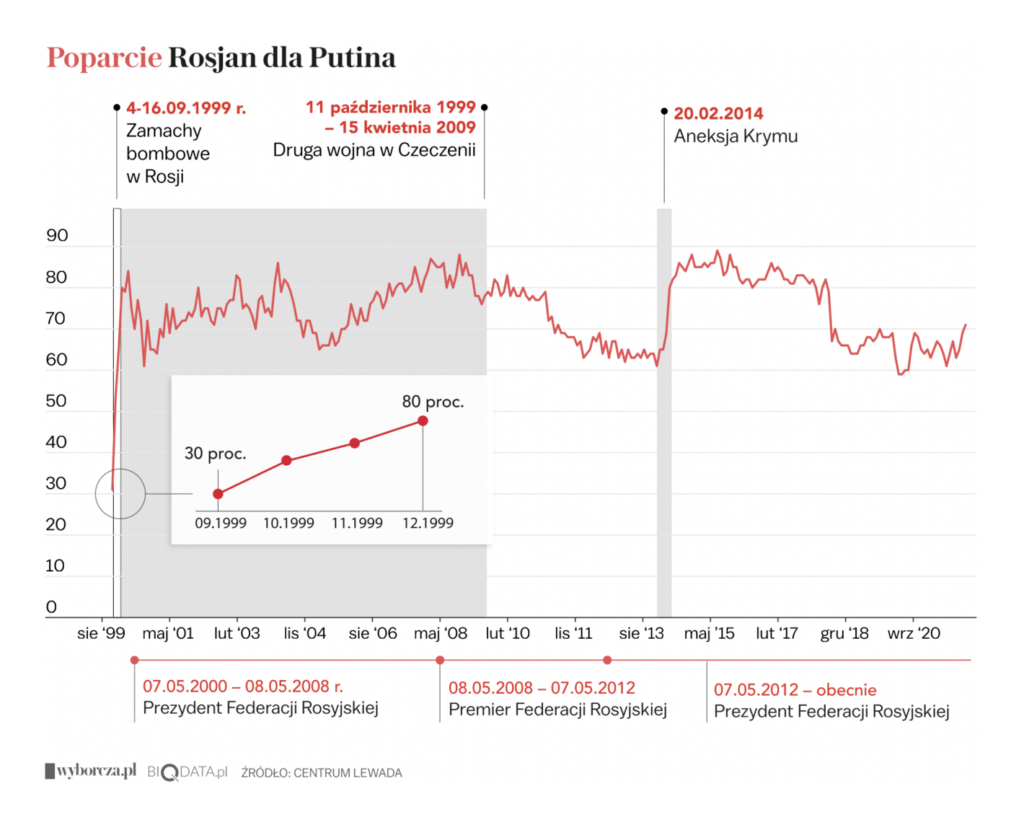
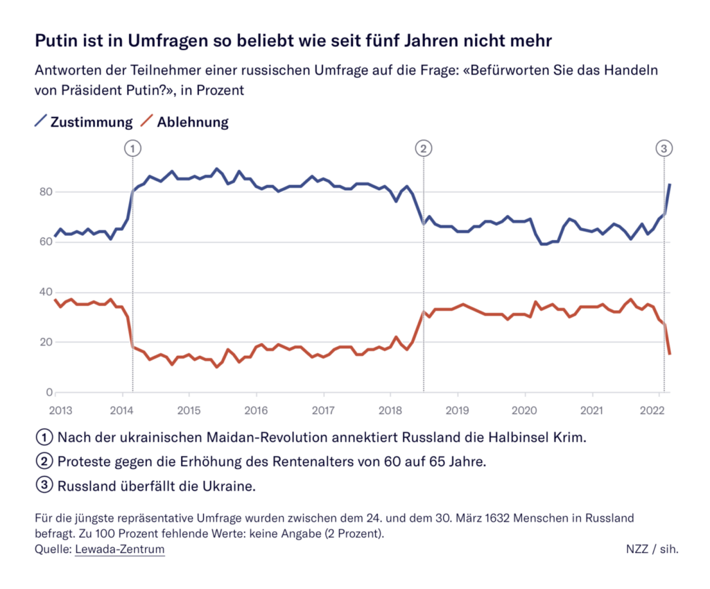
And even as ordinary Russians are enduring a political and informational crackdown, public opinion surveys show support for Putin at a four-year high:

Bloomberg: Trending Apps in Russia and Ukraine Show Shifting Priorities During War, April 8
Gazeta Wyborcza: Ofiary epoki Putina. Kilkanaście znanych i tysiące bezimiennych osób, April 11
Neue Zürcher Zeitung: Deutsche und russische Städte waren jahrzehntelang Partner – jetzt kehrt der Kalte Krieg zurück, April 4

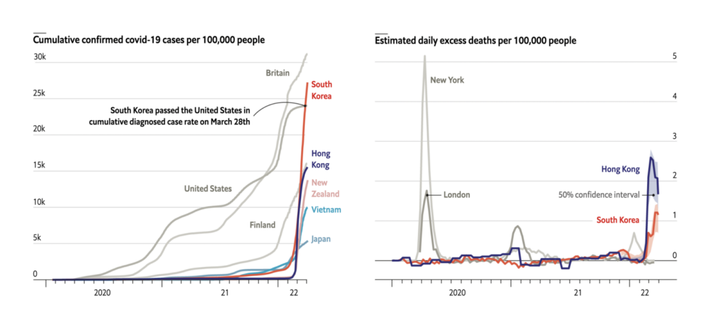
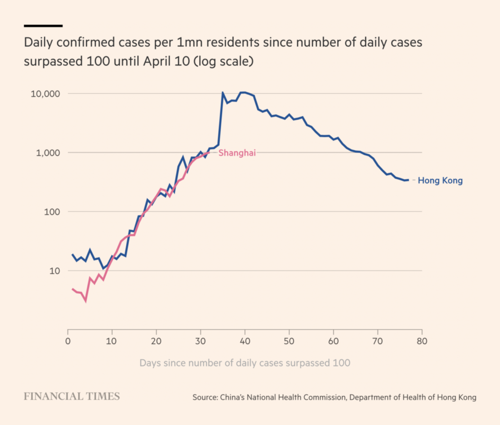
In COVID news, several deadly outbreaks in Asia are tearing through cities that had previously avoided the worst of the pandemic:

The Economist: Asia’s outbreaks show that Omicron is deadly in unvaccinated people, April 9
Financial Times: Locked-down Shanghai residents demand food as Covid hits record level, April 10

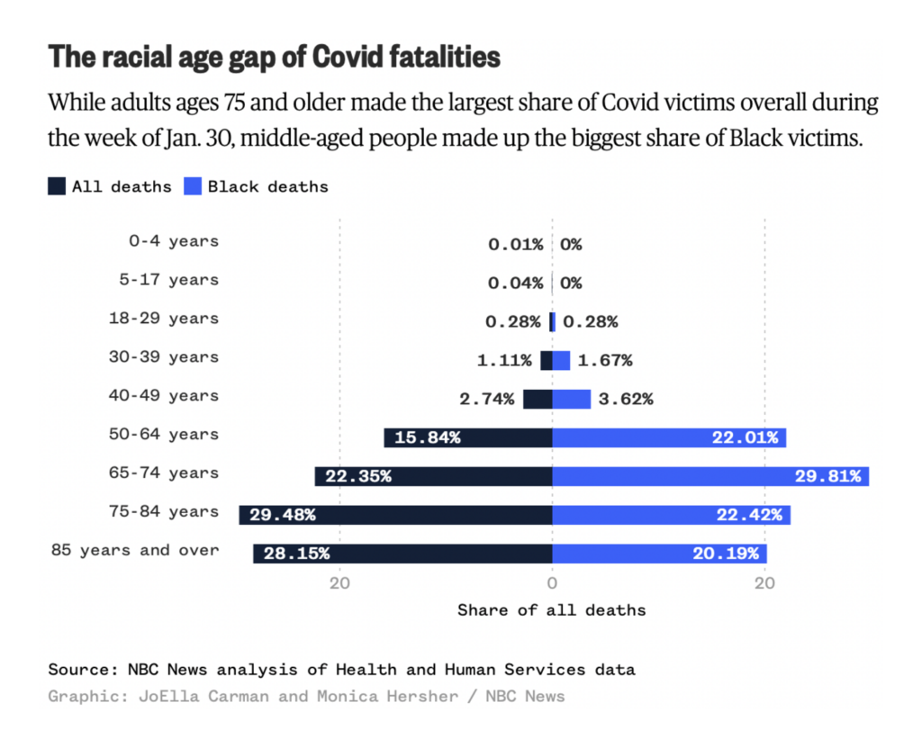
And we’re still uncovering the unequal effects of COVID — even as some parts of the economy return to pre-pandemic normal:

NBC News: Seven days, 18,000 deaths: A look at omicron’s deadliest week, April 7
Financial Times: How the world’s airlines took off again, April 9

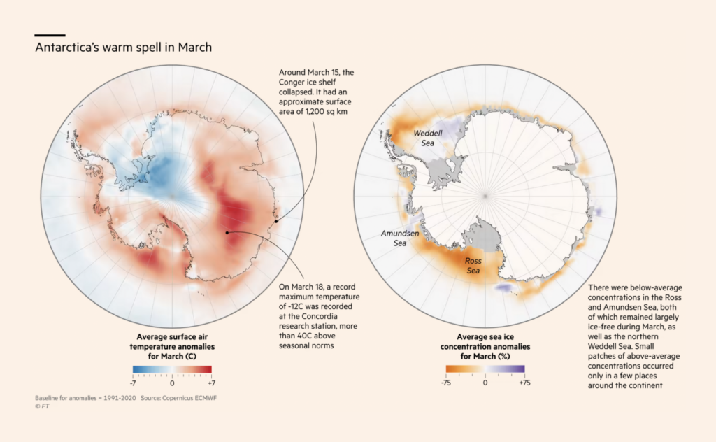
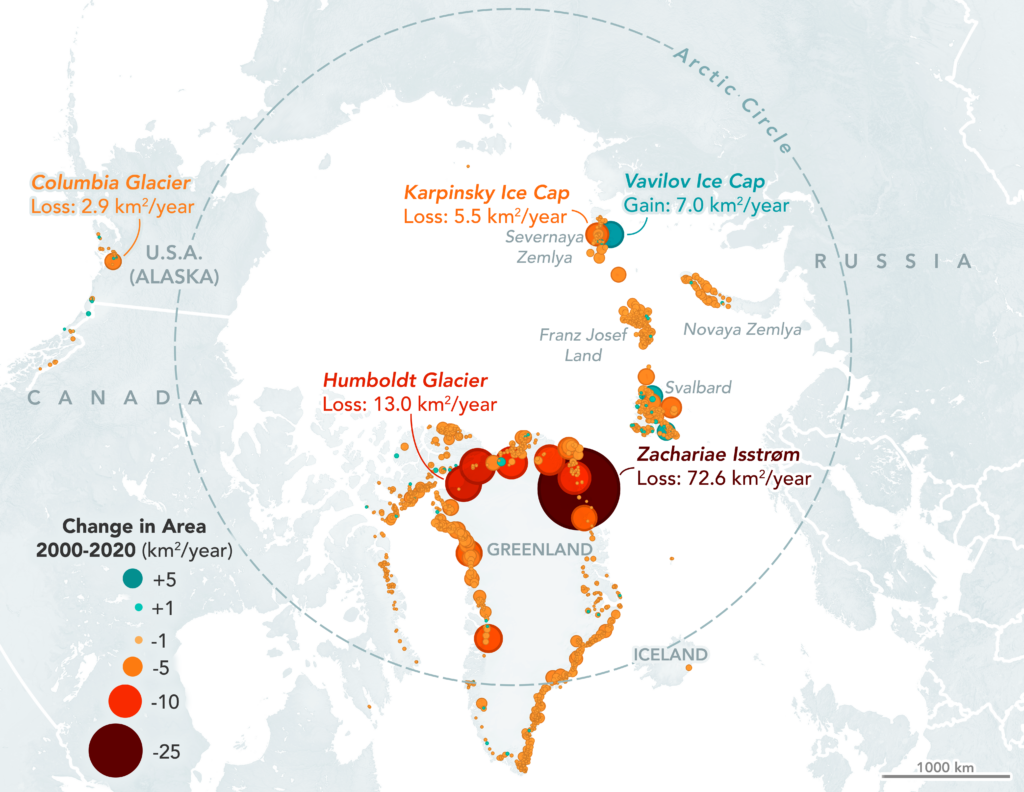
Environmental charts this week had a water theme, with melting ice at the poles and dammed rivers in California:

Financial Times: Climate graphic of the week: Polar regions experience extremes as world warms, April 7
NASA: Northern Glaciers are Retreating from the Water, April 8
The Los Angeles Times: California salmon are at risk of extinction. A plan to save them stirs hope and controversy, April 7

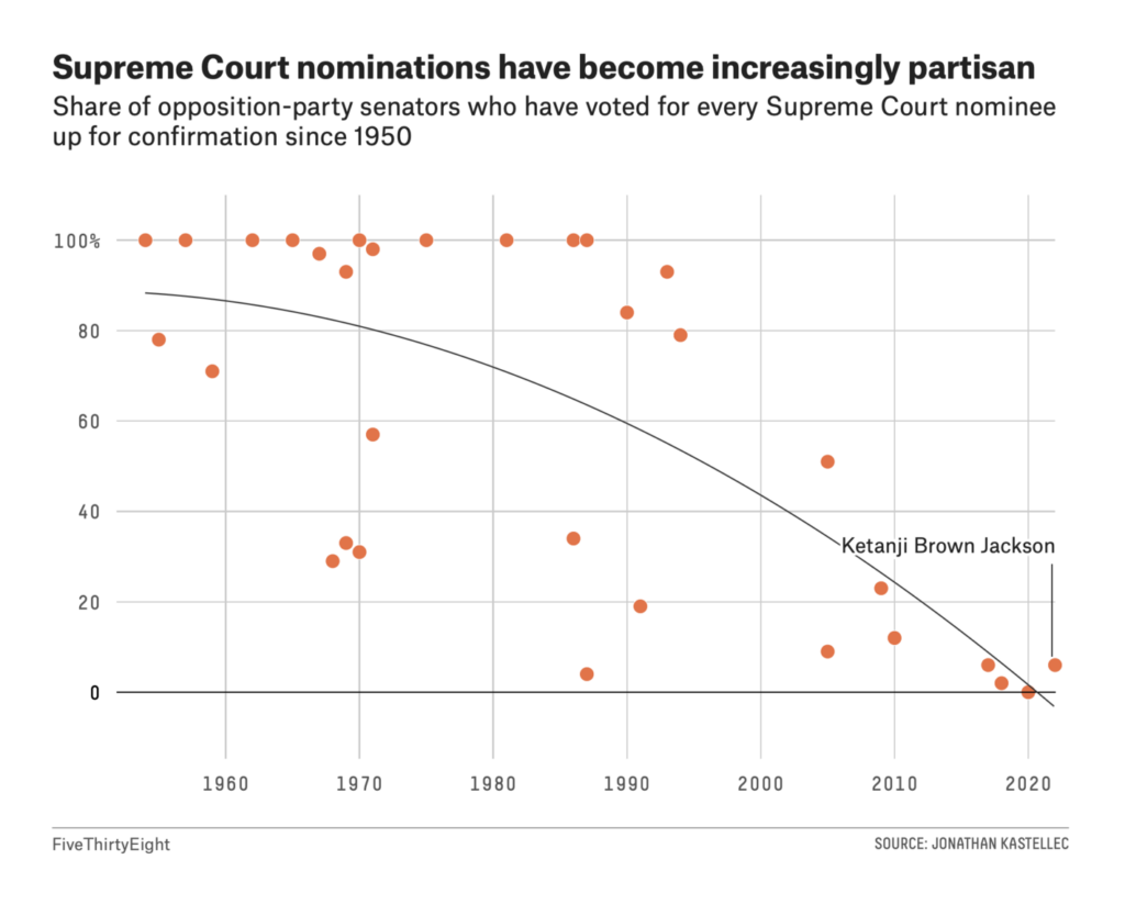
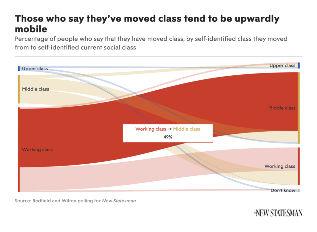
Other topics included partisanship towards the U.S. Supreme Court, class attitudes in the U.K., and the dynamics of rent in Madrid:

FiveThirtyEight: The Culture Wars Couldn’t Stop Ketanji Brown Jackson’s Confirmation, April 7
The New Statesman: Britain is falling harder for the myth of Molly-Mae meritocracy, April 7
Our World in Data: At what age do people experience depression for the first time?, April 7
El Confidencial: Barrio Salamanca, April 11

What else we found interesting

The New York Times: 9 Ways To Imagine Jeff Bezos’ Wealth, April 7
SBS News: 도시의 숲이 : 나에게 미치는 영향은?, April 7
Politico: The FDA’s Food Failure, April 8
La Nación: Pequeña guía de mariposas y plantas nativas de Buenos Aires, April 8
Le Monde: « Quetzalcoatlus » : Géant des airs, April 5

The Sigma Awards announced 12 winners of their 2022 data journalism competition.

Applications are open for…


Help us make this dispatch better! We’d love to hear which newsletters, blogs, or social media accounts we need to follow to learn about interesting projects, especially from less-covered parts of the world (Asia, South America, Africa). Write us at hello@datawrapper.de or leave a comment below.

Comments