Data Vis Dispatch, April 16

The best of last week’s big and small data visualizations

Welcome back to the 138th edition of Data Vis Dispatch! Every week, we’ll be publishing a collection of the best small and large data visualizations we find, especially from news organizations — to celebrate data journalism, data visualization, simple charts, elaborate maps, and their creators.

Recurring topics this week are abortion, U.S. elite universities and animals.

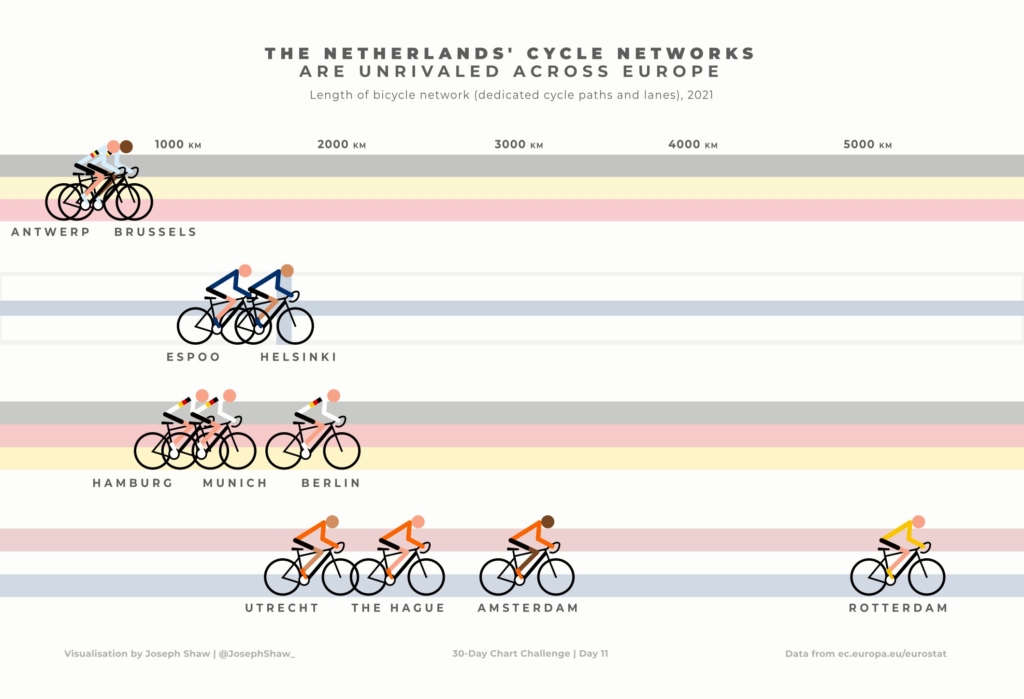
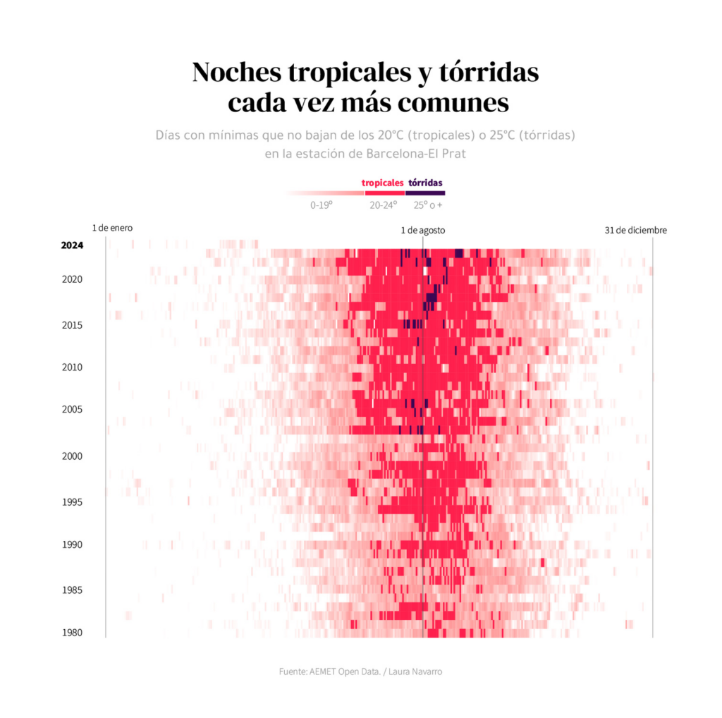
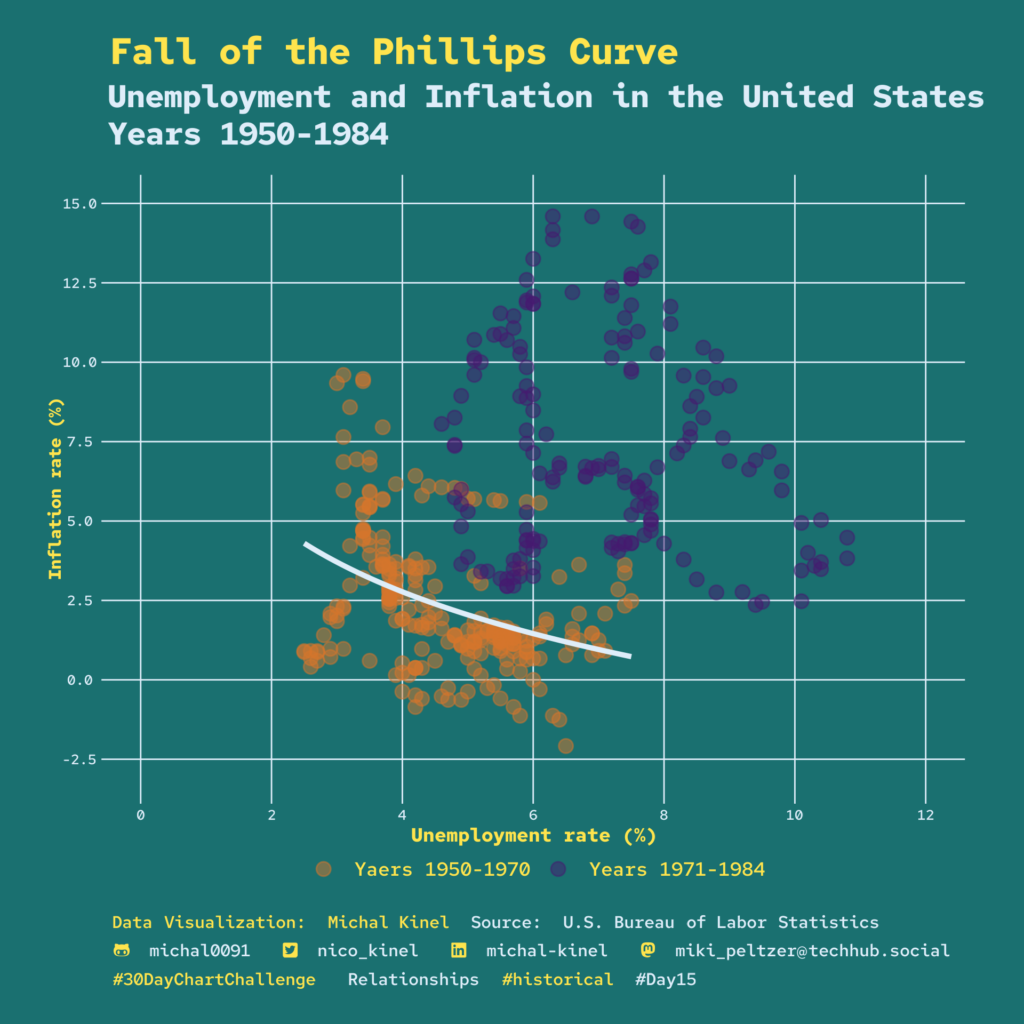
It’s week two of the #30DayChartChallenge. Here are some examples of what creative minds have done with topics ranging from #mobile-friendly to #historical:

Joe Shaw: “Day 11 of the #30DayChartChallenge – Mobile-friendly: The Netherlands’ cycle networks are unrivaled across Europe,” April 12 (Tweet)
Laura Navarro: “¿Cómo han aumentado las noches #tropicales y #tórridas? En los ochenta, en la estación de Barcelona-El Prat se registraban unas 20 noches tropicales al año. El año pasado fueron 86, y en 2022, 104 #30DayChartChallenge día 14, heatmap en #rstats,” April 14 (Tweet)
Miki :rstats:: “#Day15 of the #30DayChartChallenge, #historical Fall of the Phillips Curve: Unemployment and Inflation in the United States Years 1950-1984,” April 15 (Mastodon Post)

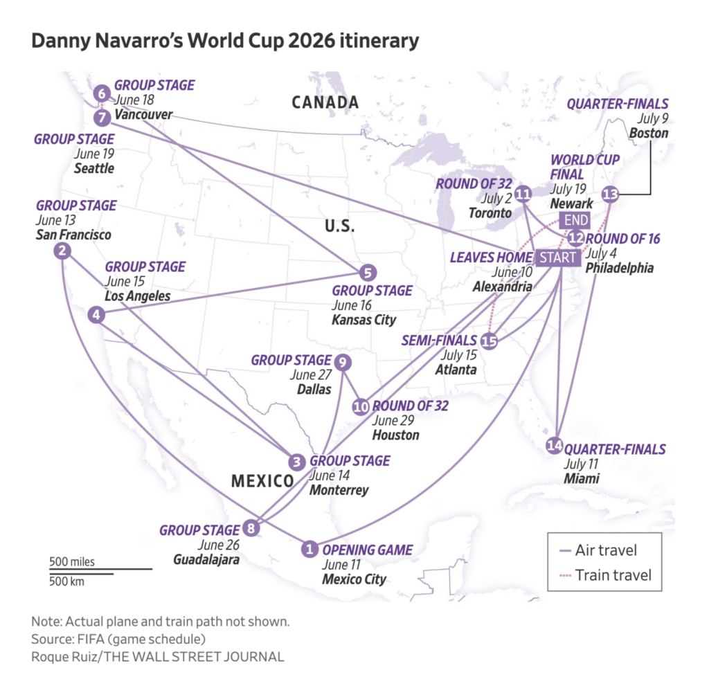
This week, two data visualizations follow the life of one person — or thousands of kids:

Diario Sur: La rica heredera que se convirtió en terrorista: la rocambolesca odisea de Patty Hearst, April 15
The Pudding: This is a teenager, April 9 (Accompanying article)

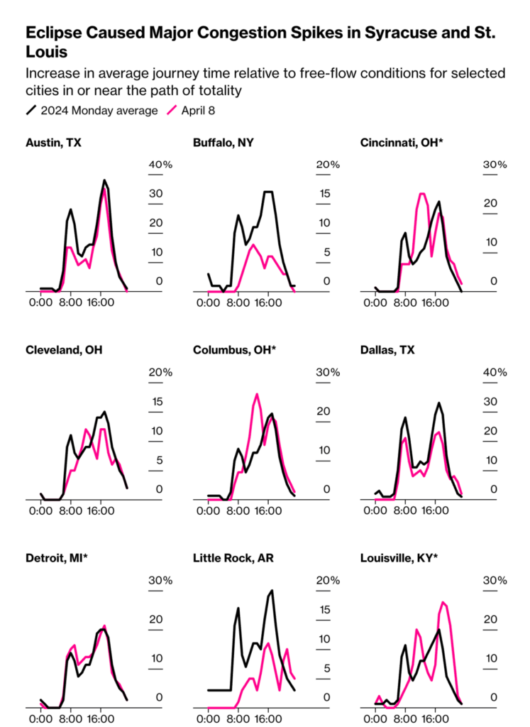
The solar eclipse occurred on April 8, but its impact on visualizations is still being felt. Traffic in the path of totality was a major focus. Here’s a quick tip that made us smile today: type “Solar Eclipse 2024” into the Google search bar:

Bloomberg: These US Cities Benefited Most From Solar Eclipse Tourism, April 11
The New York Times: See Maps of Where Eclipse Seekers Flocked and the Traffic That Followed, April 10

Iran has attacked Israeli territory. This week’s maps show how the attack took place and where Iranian drones are exported:

The Wall Street Journal: Biden Urges Caution as Israel Weighs Response to Iran, April 14
Bloomberg: Iran’s Better, Stealthier Drones Are Remaking Global Warfare, April 9

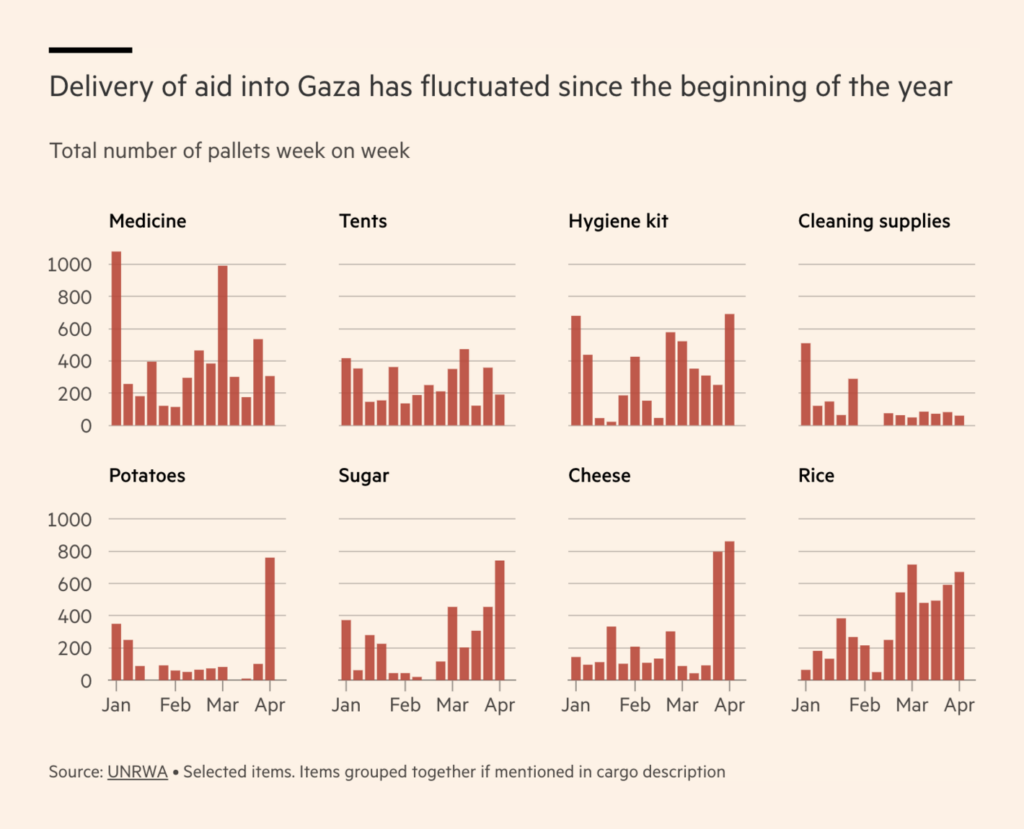
There is still a food shortage in Gaza. The amount of aid is fluctuating:

Financial Times: Tonnes of food is stuck on Gaza’s border while the enclave nears famine, April 9

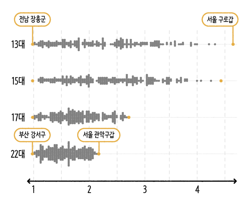
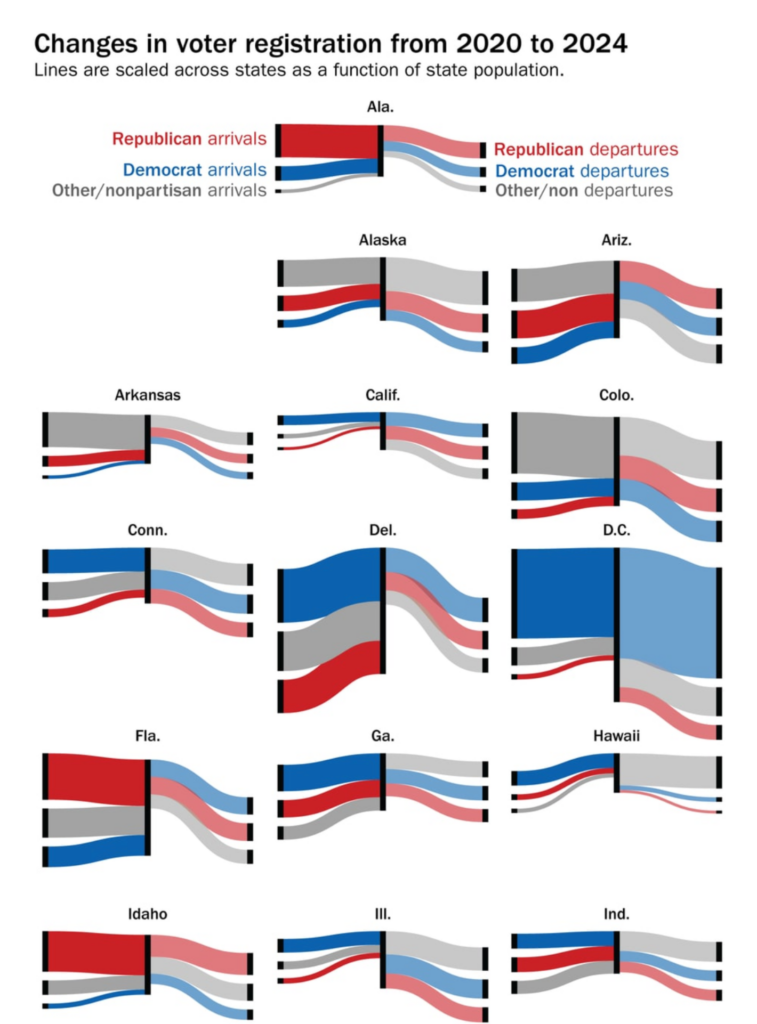
From South Korea to the U.S., this week’s visualizations depicted voters:

SBS News: 국회의원 300명에서 UP? DOWN?, April 11
The Washington Post: Where 2024 voters moved since 2020 — and how they registered, April 11

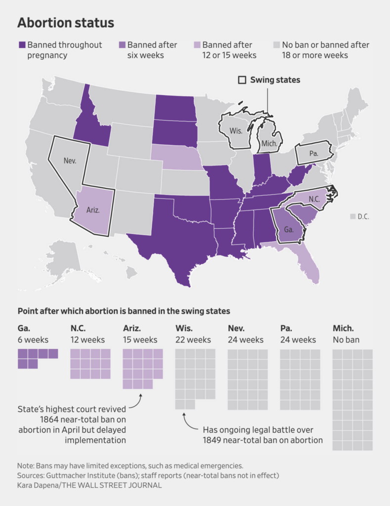
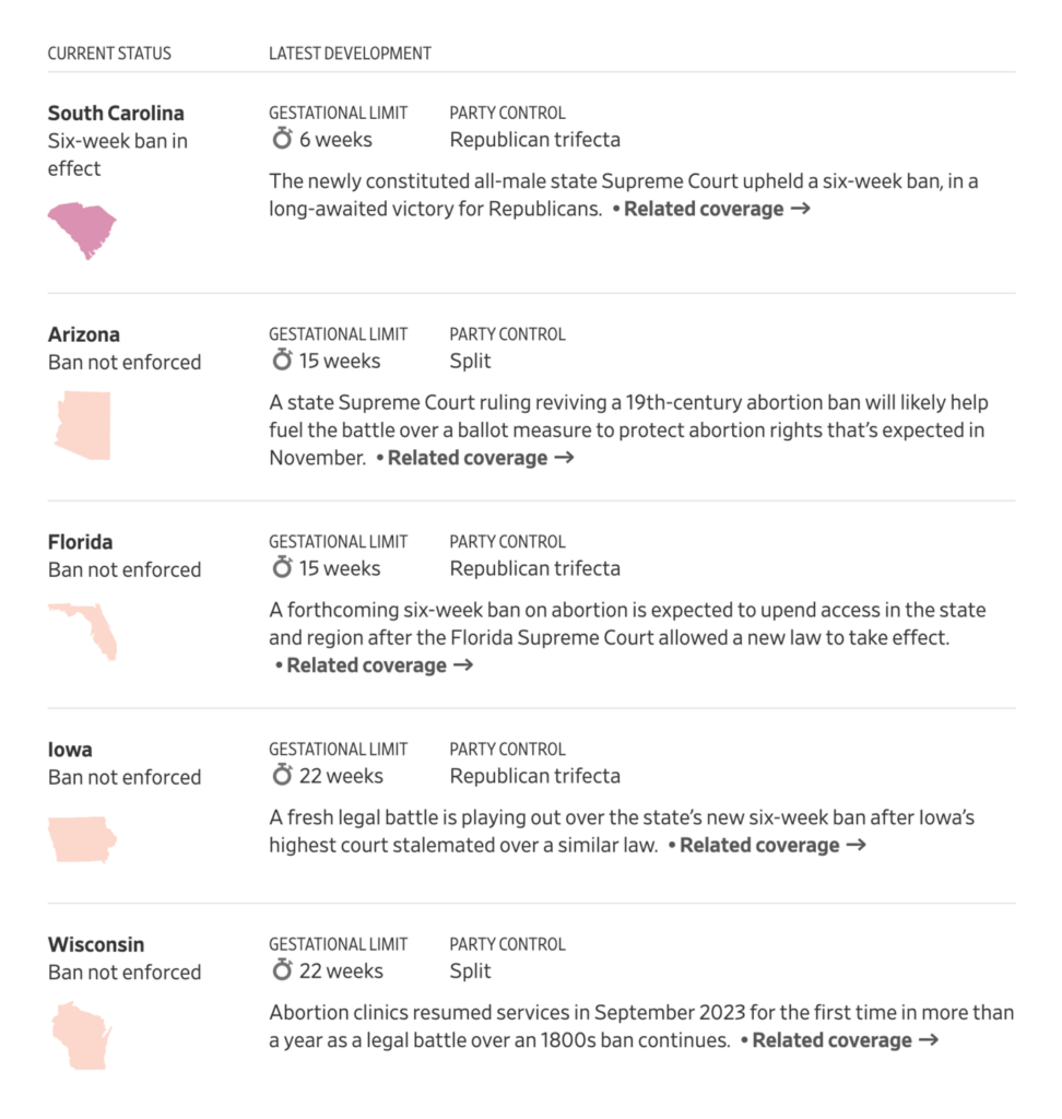
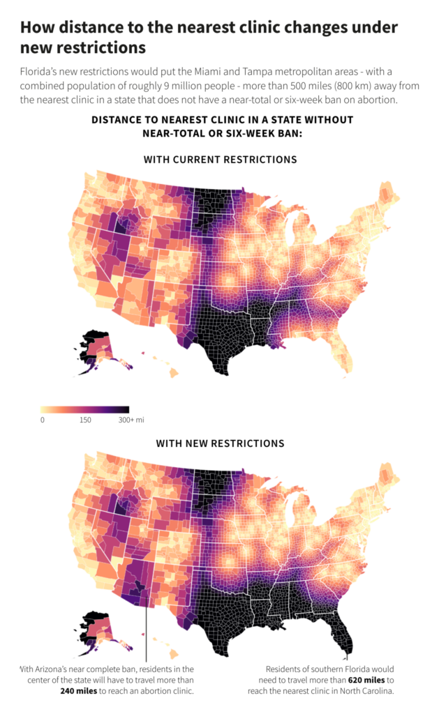
Several visualizations of the state of abortion in the U.S. appeared after the Arizona Supreme Court revived a 19th-century abortion ban:

The Washington Post: States where abortion is legal, banned or under threat, April 9
The Wall Street Journal: Trump Risks Losing Suburban Women Over Abortion, April 12
The Wall Street Journal: A State-by-State Guide to Abortion Access in the U.S., April 9
Reuters: How new rulings restrict abortion access, April 11

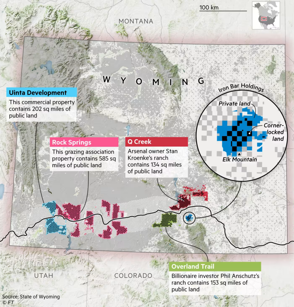
We stay on the American continent and focus on certain strips of land: Wyoming’s checkerboard borders and the Darién Gap, a migration highway:

Financial Times: Battle for the American West, April 13
Financial Times: The migrant highway that could sway the US election, April 10

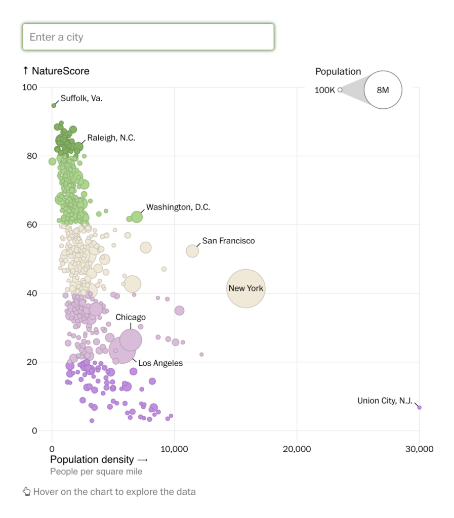
If you live in the U.S., have you ever wondered how good your access to nature is? The Washington Post delivered the answer:

The Washington Post: Mapping America’s access to nature, neighborhood by neighborhood, April 10

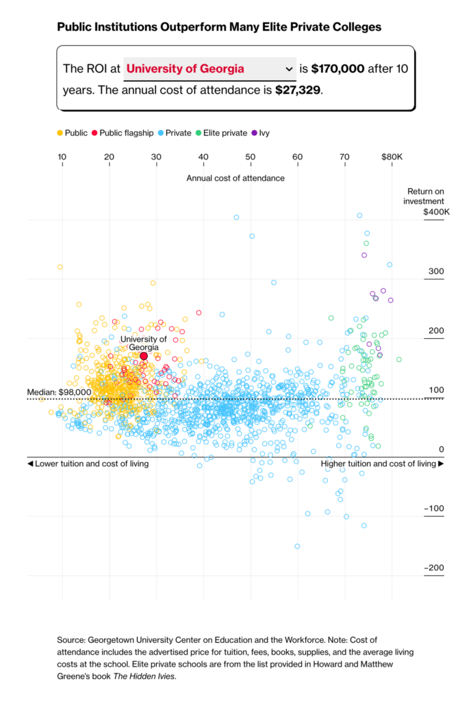
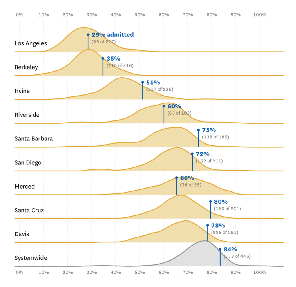
This week, U.S. (elite) universities have earned themselves a cluster of their own:

Bloomberg: If You Didn’t Get Into Harvard, a Public School Is the Better Investment, April 11
San Francisco Chronicle: “Here are UC acceptance rates for California community college transfer students to UCLA, Berkeley and other UC campuses in 2023,” April 15 (Tweet, Article)

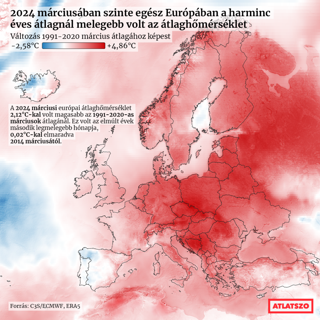
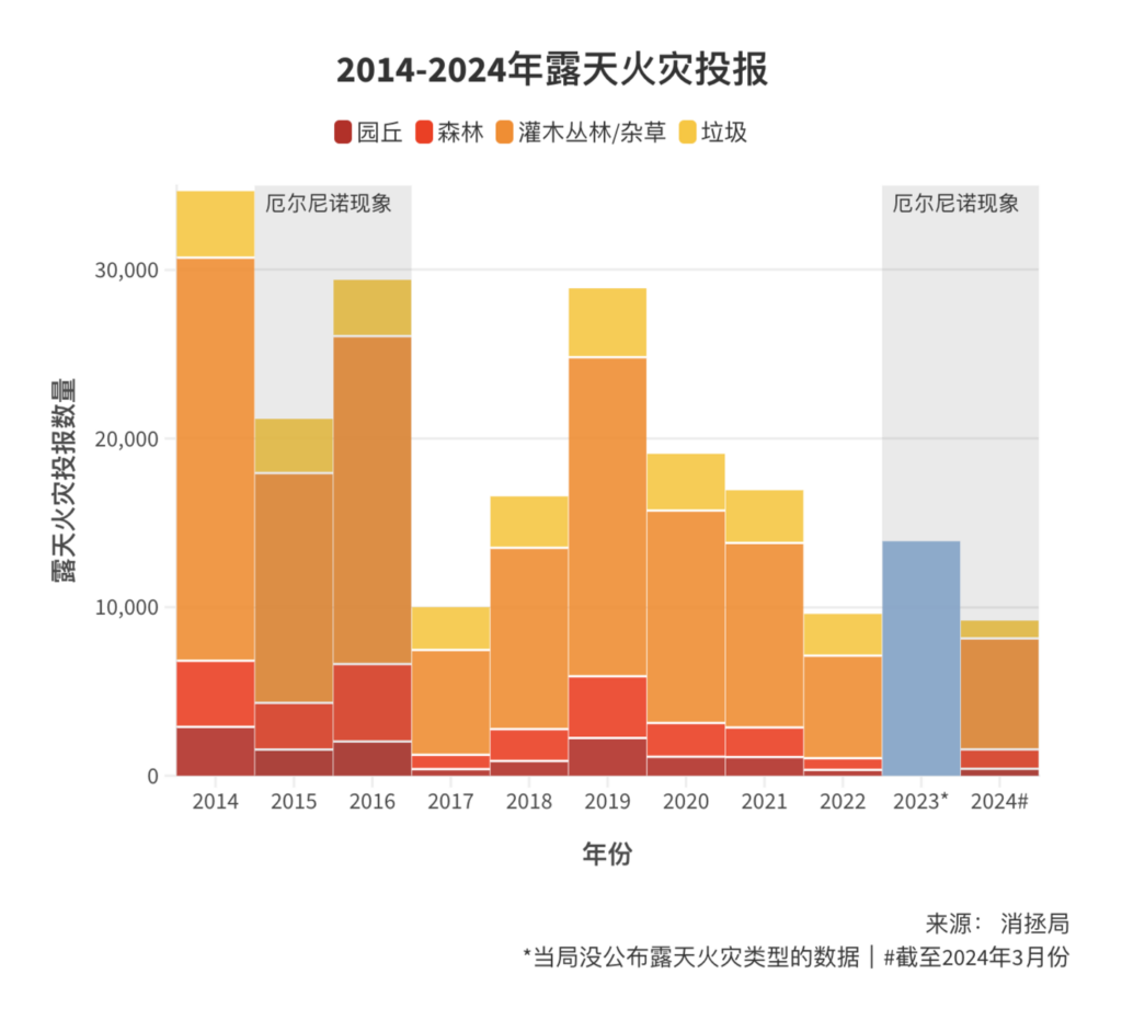
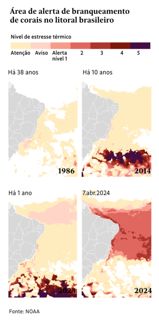
High temperatures and their impact on the environment have dominated climate visualizations around the world:

Átlátszó: Áprilisban is folytatódik a felmelegedés, sorra dőlnek meg a napi melegrekordok, April 15
图懂天下: 今年2月露天火灾激增六倍!为何我们需要担心, April 15
Folha de S.Paulo: Branqueamento de corais da costa brasileira é detectado por pesquisadores; veja antes e depois, April 12

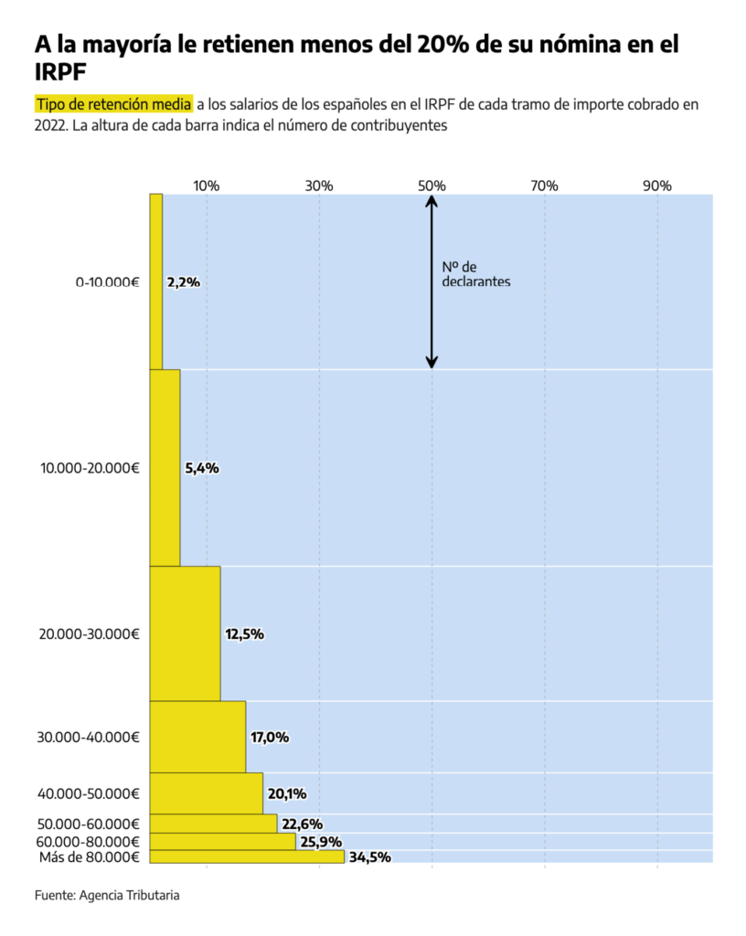
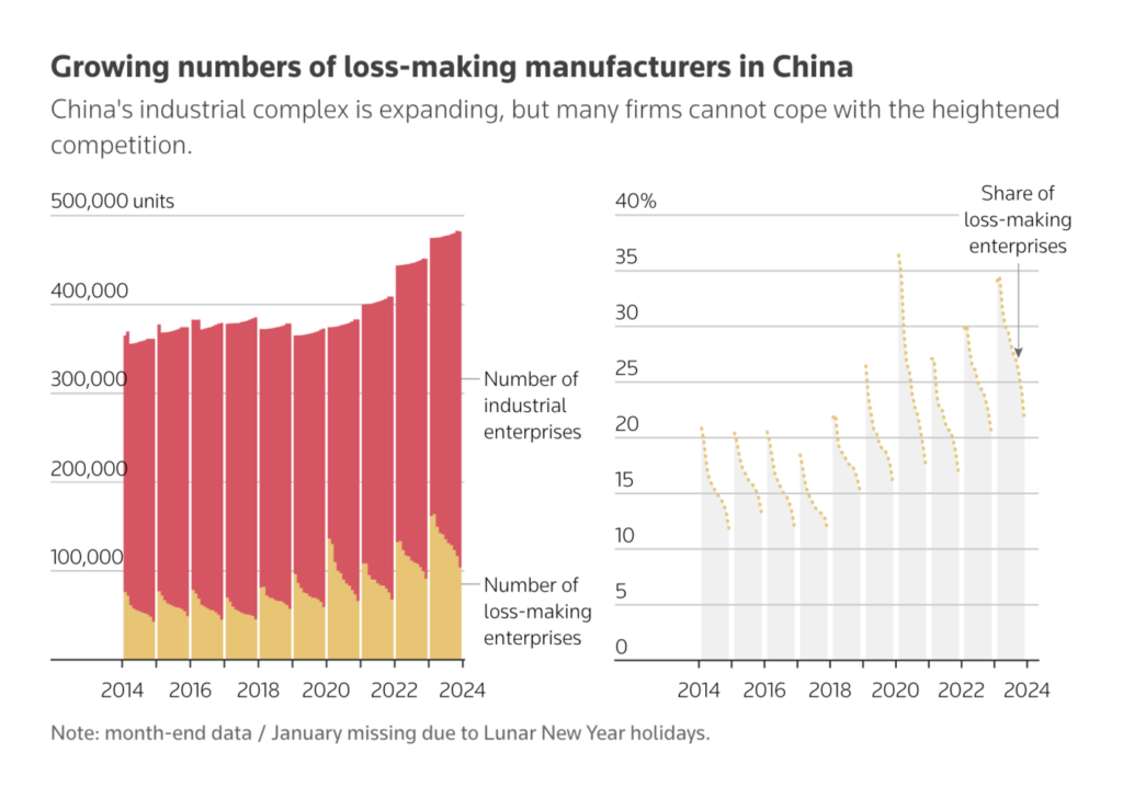
This week’s economic visualizations include taxes in Spain and China’s growing number of money-losing manufacturers:

elDiario.es: Por qué es falso que te quiten la mitad de tu sueldo en la declaración de la renta: así funciona el IRPF, April 12
Reuters: What overcapacity?, April 11

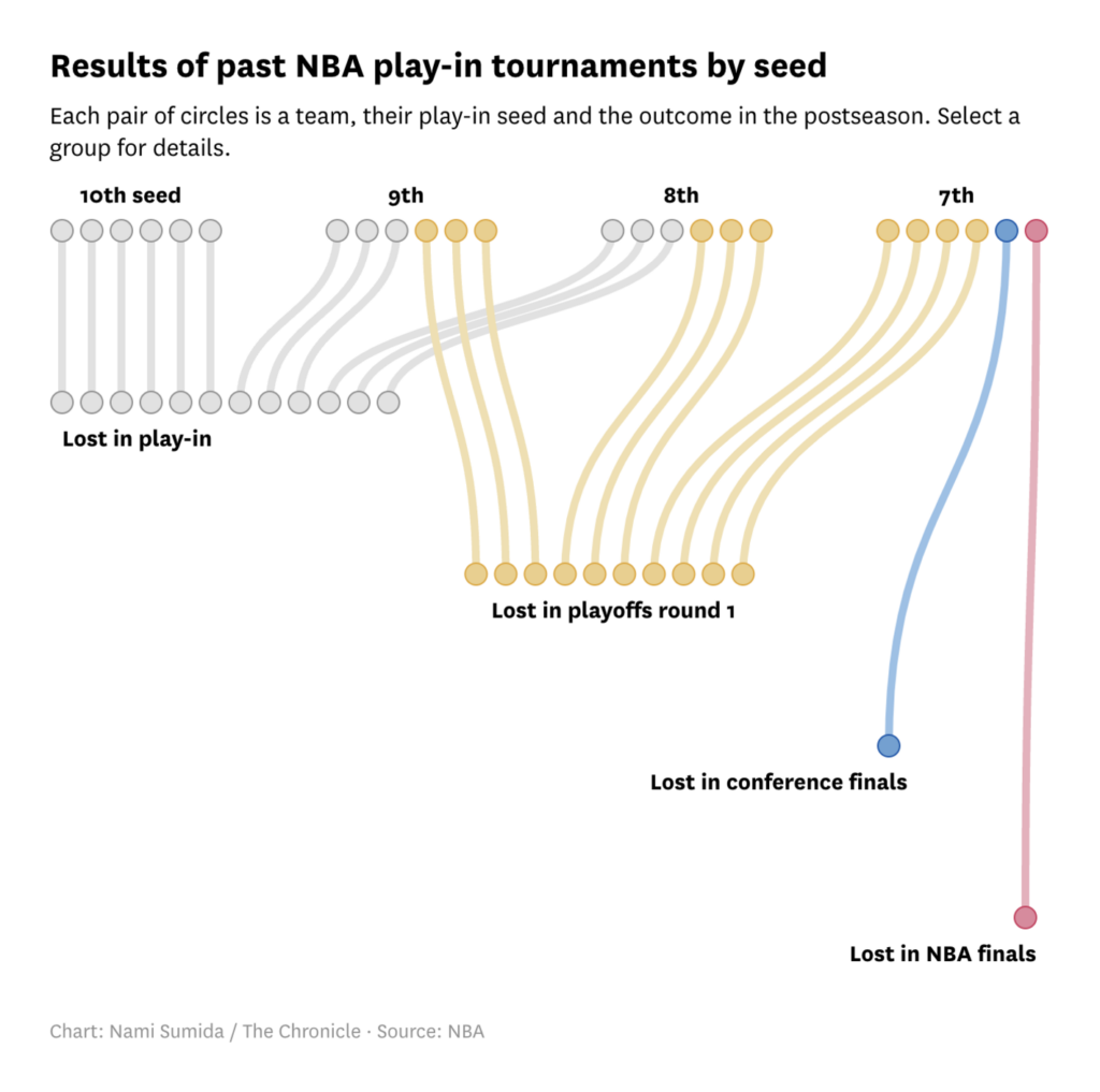
The winners of this week’s sports hit rotation are basketball and soccer:

San Francisco Chronicle: Chart shows how play-in seeds have fared and why Warriors don’t want to be 10th, April 12
The Wall Street Journal: The Superfans in Extreme Prep Mode for an Event Two Years Away, April 11

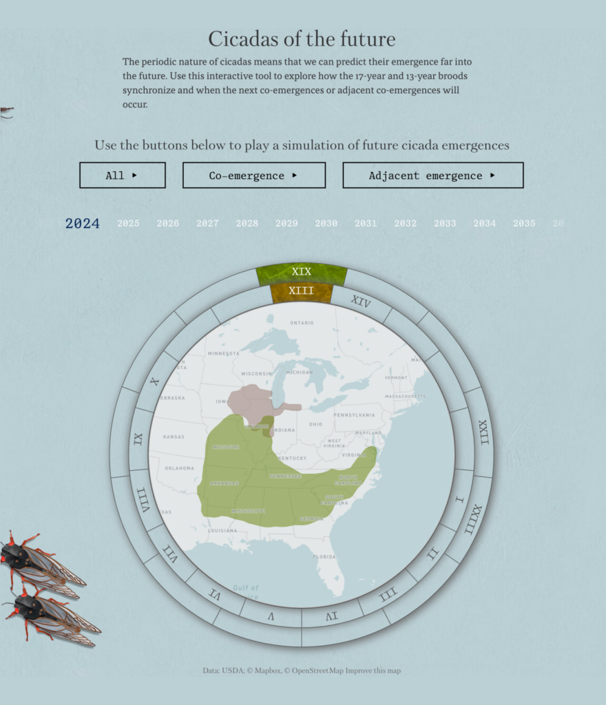
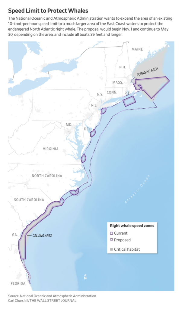
From tiny cicadas to giant whales:

Axios: Is 2024 the Cicadapocalypse or a Cicadapalooza?, April 11 Entertaining Visuals
The Wall Street Journal: A Boat Speed Limit Is Pitting Yacht Owners Against Whale Lovers, April 13

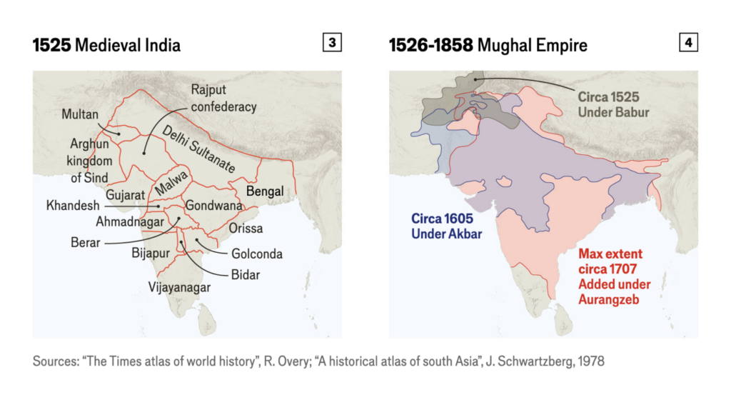
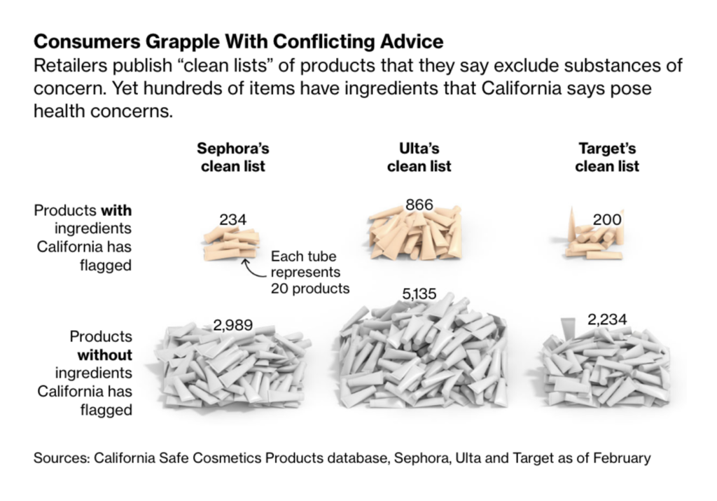
We close this Dispatch with a short map story from India, produced by The Economist, and the burning question: “How safe is my scented shampoo?”:

The Economist: A short history of India in eight maps, April 12
Bloomberg: How Safe Is Your Scented Shampoo? Finding Out Can Be Hard, April 12

What else we found interesting

South China Morning Post: How the coronavirus is changing cities, April 10
The Washington Post: Choose your dream economy, and see how it compares to reality, April 9

Applications are open for…


Help us make this dispatch better! We’d love to hear which newsletters, blogs, or social media accounts we need to follow to learn about interesting projects, especially from less-covered parts of the world (Asia, South America, Africa). Write us at hello@datawrapper.de or leave a comment below.

Want the Dispatch in your inbox every Tuesday? Sign up for our Blog Update newsletter!

Comments