This article is brought to you by Datawrapper, a data visualization tool for creating charts, maps, and tables. Learn more.
Data Vis Dispatch, April 18
The best of last week’s big and small data visualizations

Welcome back to the 90th edition of Data Vis Dispatch! Every week, we’ll be publishing a collection of the best small and large data visualizations we find, especially from news organizations — to celebrate data journalism, data visualization, simple charts, elaborate maps, and their creators.
Recurring topics this week include wildlife, agriculture, and energy transitions.
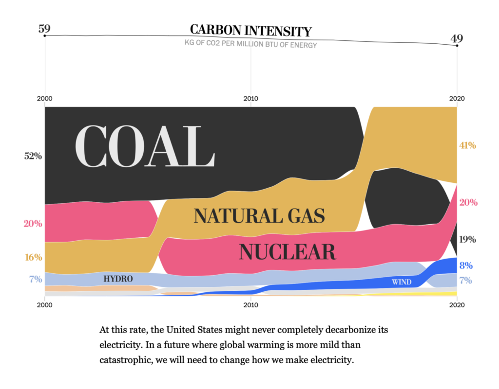
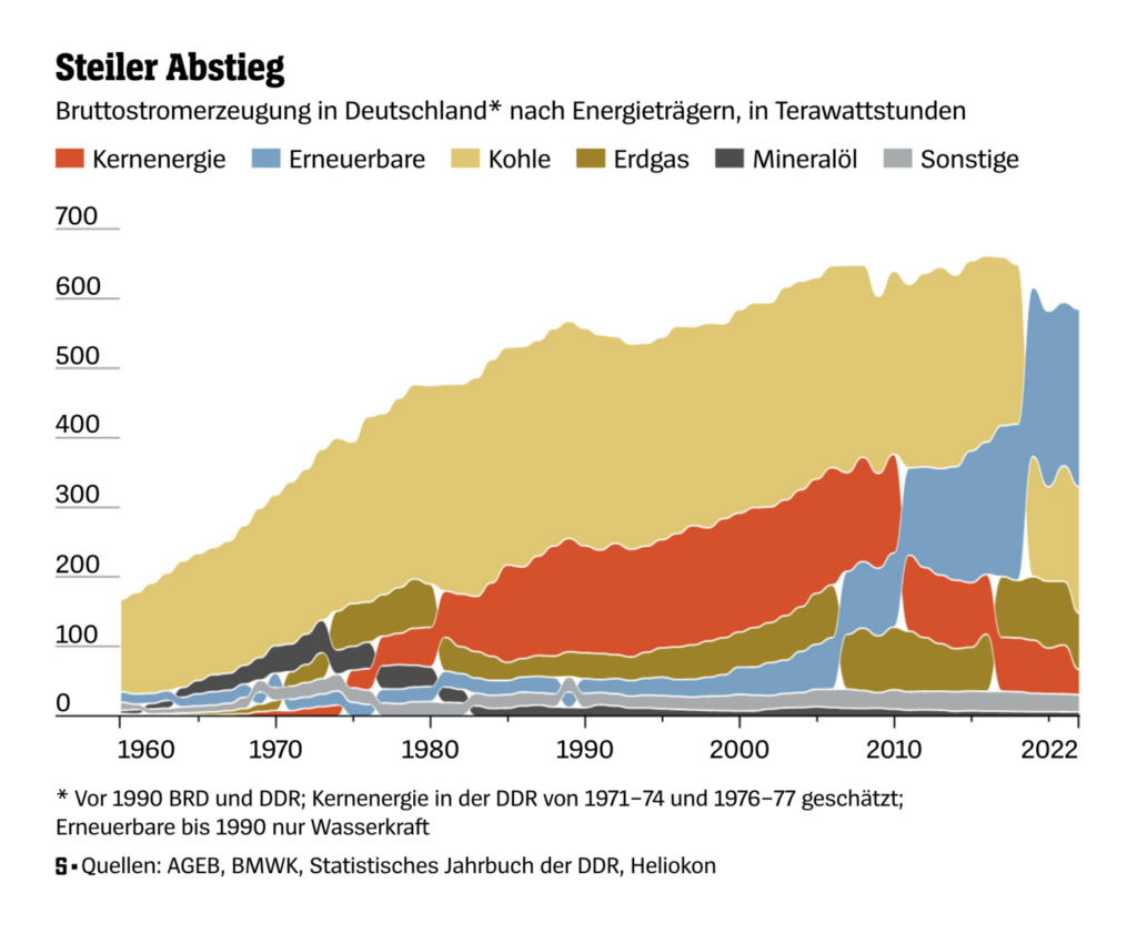
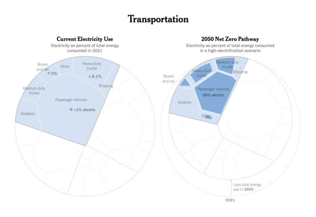
Energy transitions were in the news this week, as Germany shuts down its last nuclear power plants and the U.S. plans for an electrified future:
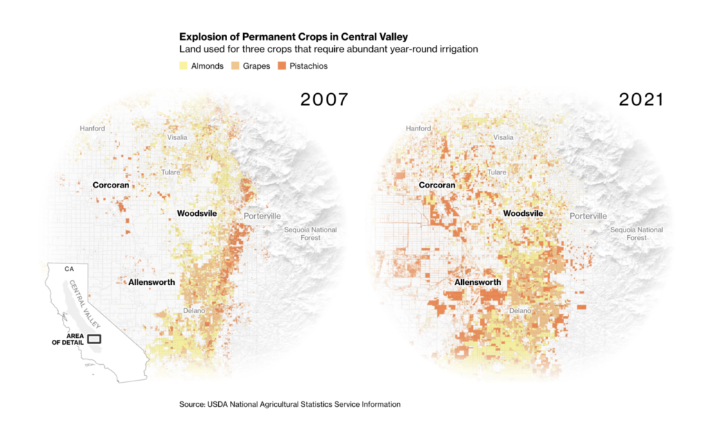
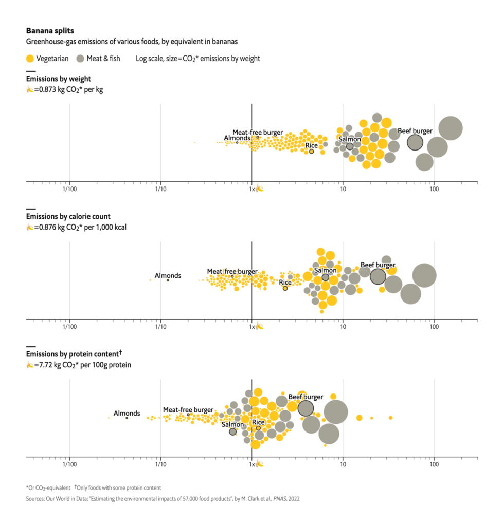
Food and agriculture shared this week’s climate spotlight:
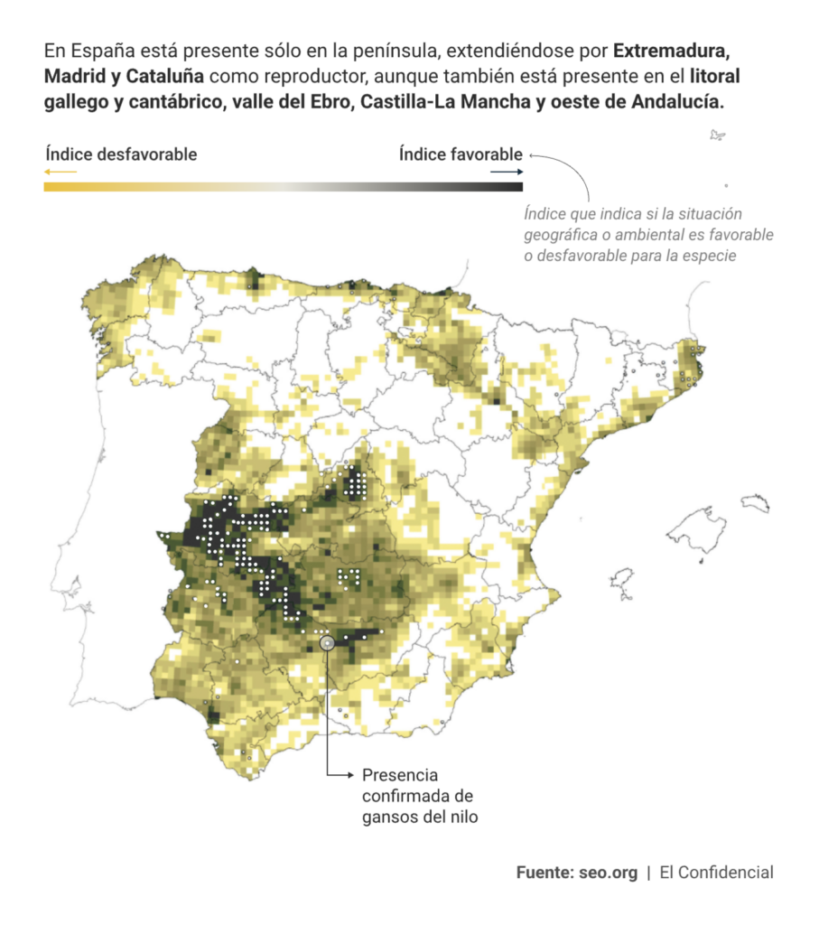
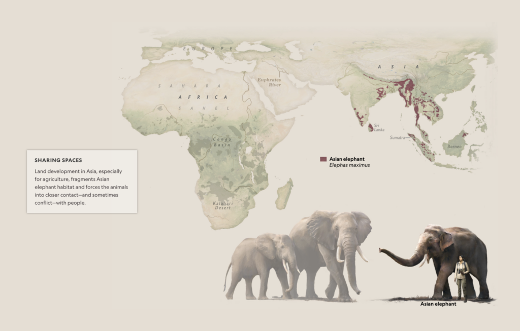
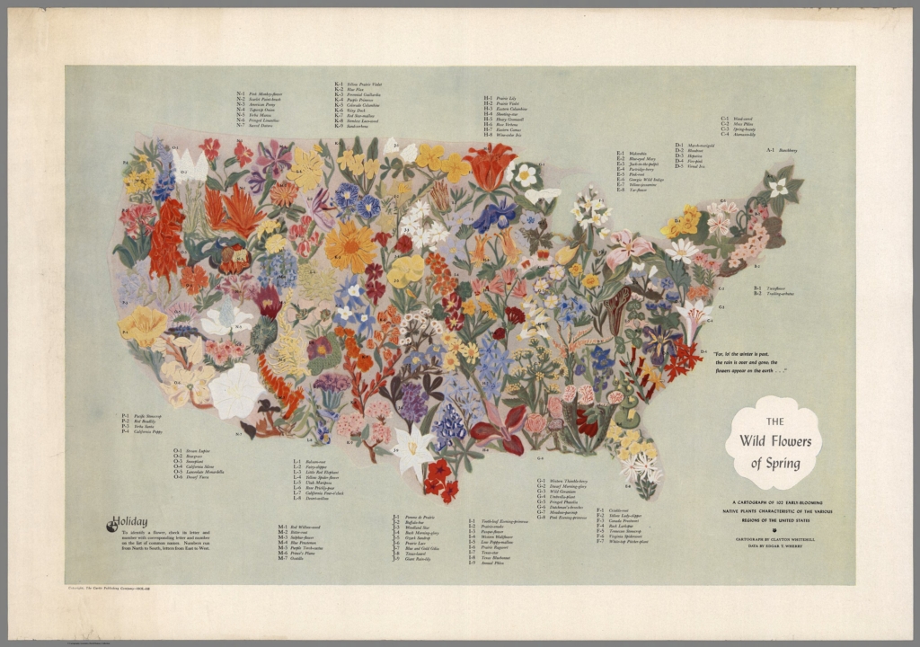
We also saw maps of animal habitats:
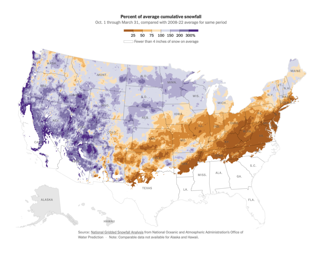
And, as spring arrives, a look back at a winter of abnormal snowfall:
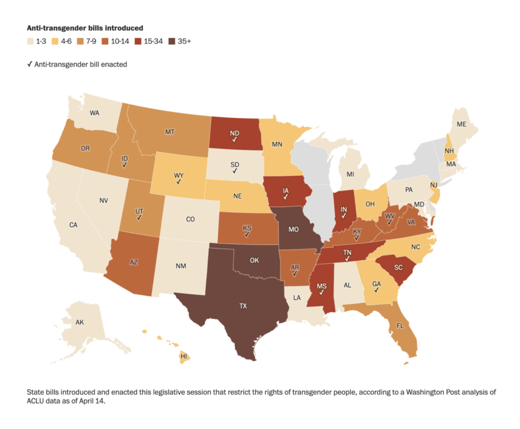
Political themes included the timeline of America’s debt ceiling crisis and the geography of France’s pension protests:
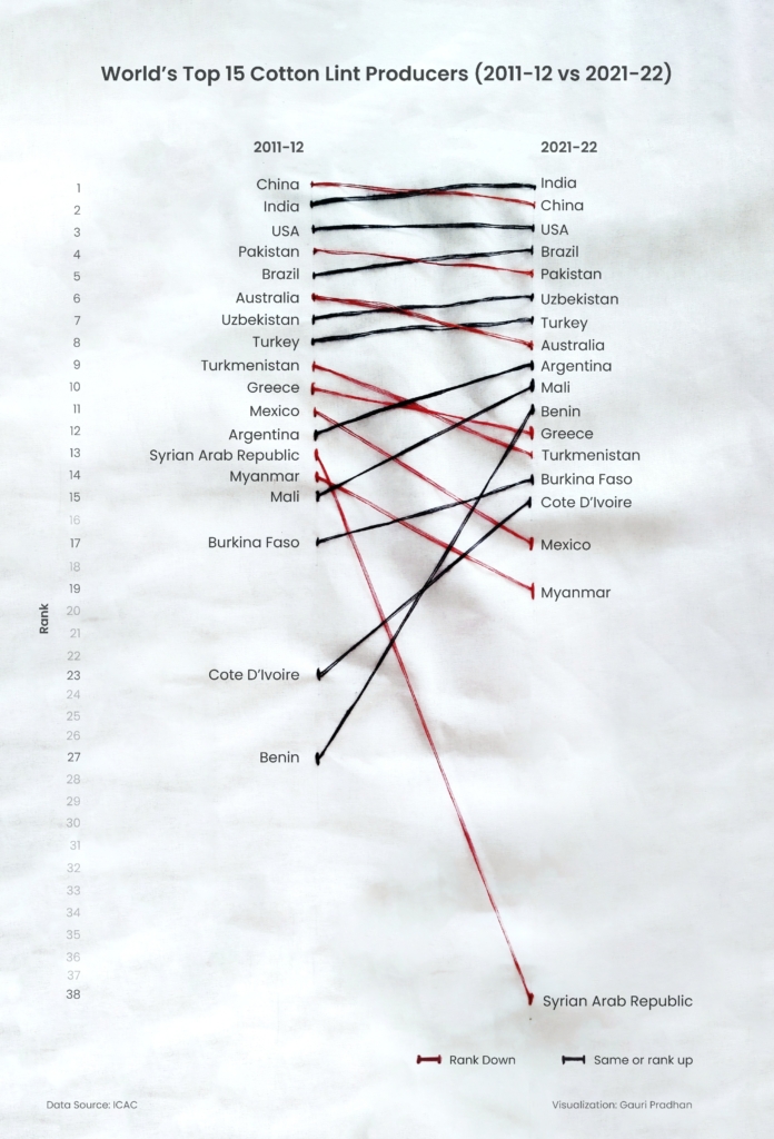
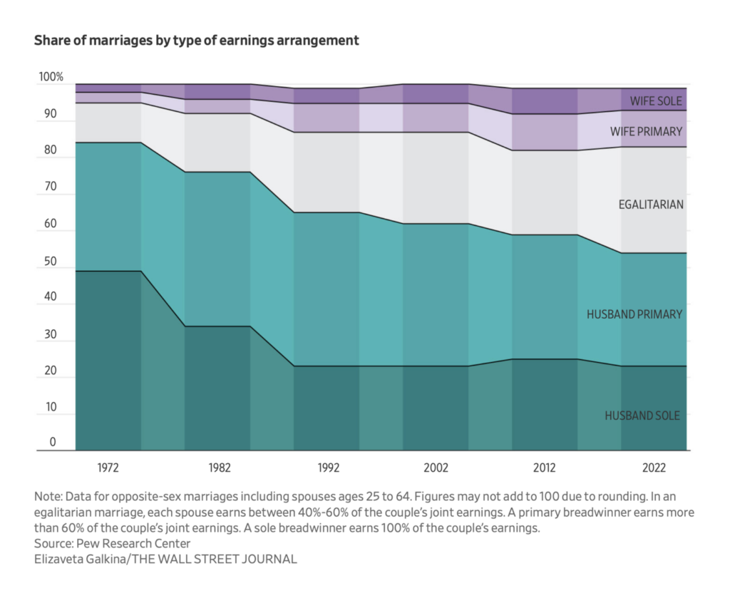
Other charts covered everything from cotton production (in cotton thread!) to the changing economics of marriage:
What else we found interesting

Applications are open for…
- A data journalist at DC Thomson
- An infographic designer at the South China Morning Post
- Two video journalists at Le Temps
Help us make this dispatch better! We’d love to hear which newsletters, blogs, or social media accounts we need to follow to learn about interesting projects, especially from less-covered parts of the world (Asia, South America, Africa). Write us at hello@datawrapper.de or leave a comment below.
Want the Dispatch in your inbox every Tuesday? Sign up for our Blog Update newsletter!


Comments