This article is brought to you by Datawrapper, a data visualization tool for creating charts, maps, and tables. Learn more.
Data Vis Dispatch, April 19
The best of last week’s big and small data visualizations

Welcome back to the 41st edition of Data Vis Dispatch! Every week, we’ll be publishing a collection of the best small and large data visualizations we find, especially from news organizations — to celebrate data journalism, data visualization, simple charts, elaborate maps, and their creators.
Recurring topics this week include war in Ukraine, natural gas in the European Union, and billionaires in the United States.
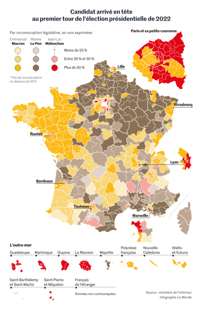
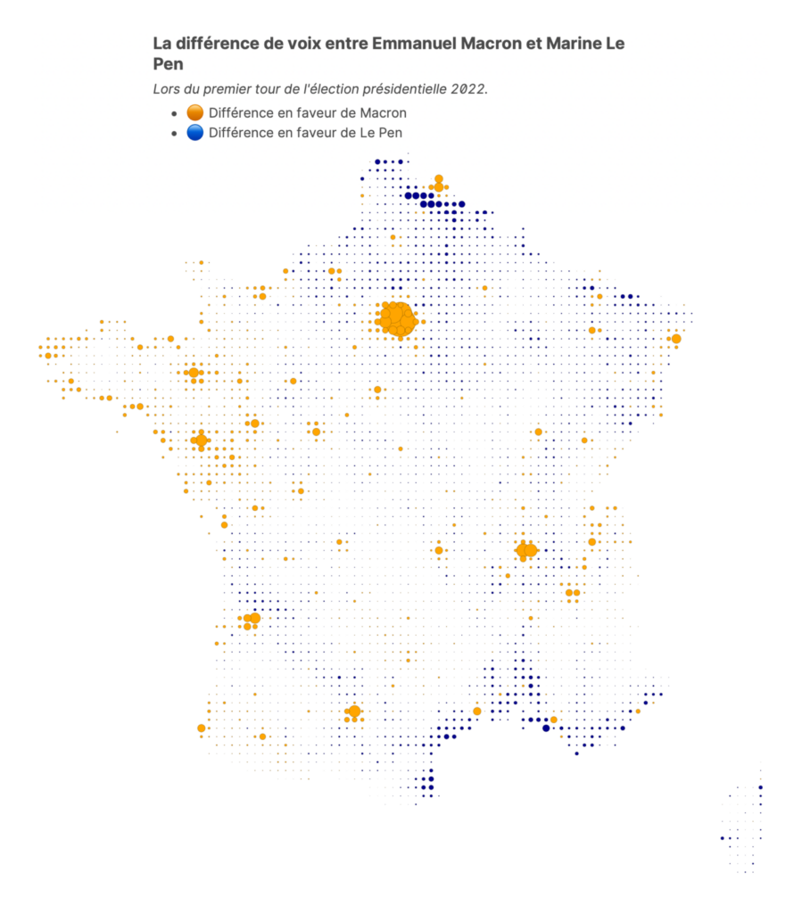
This week brought more maps of the presidential results in France:
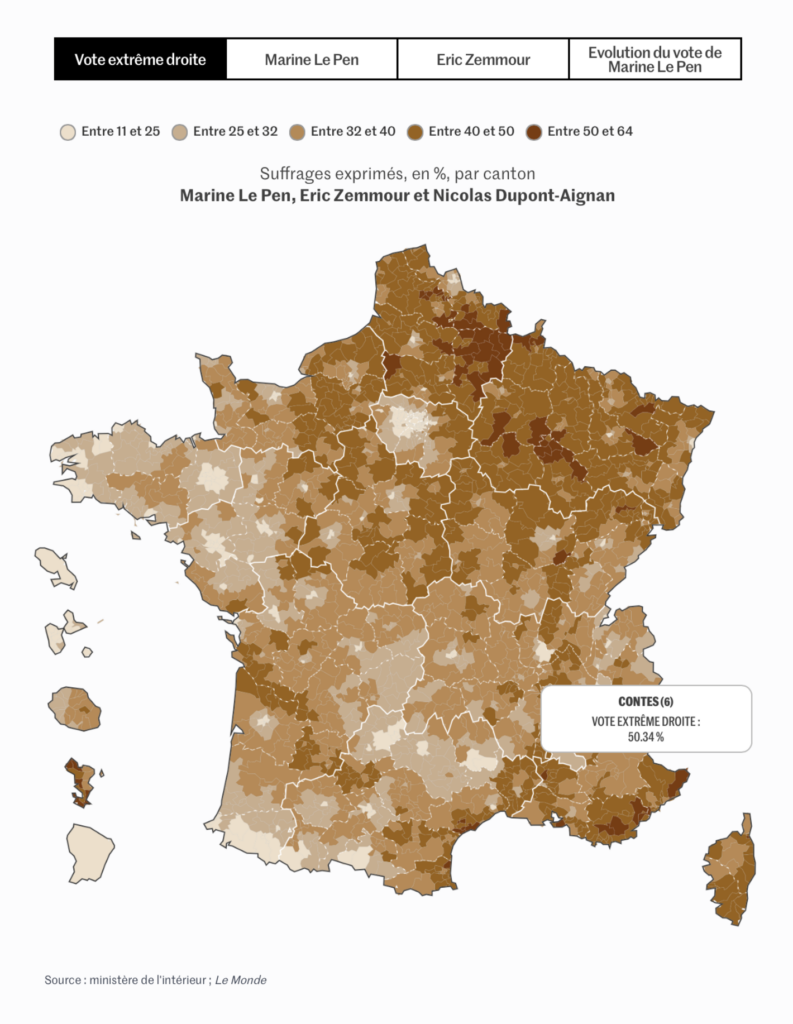
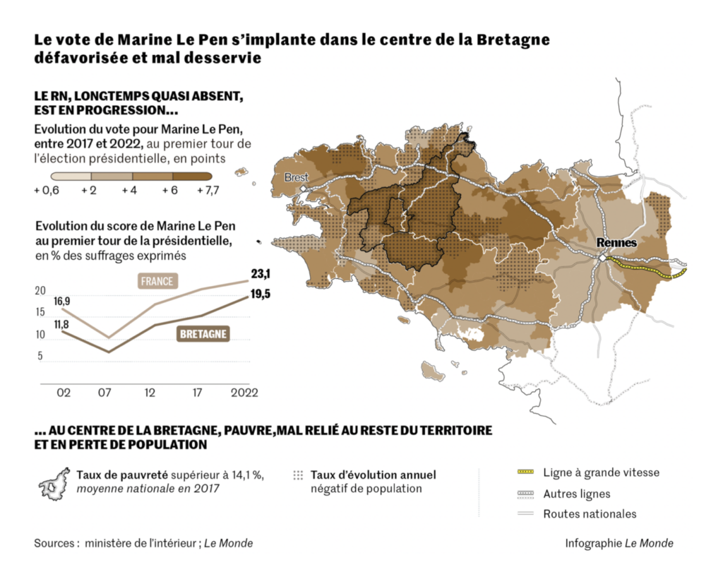
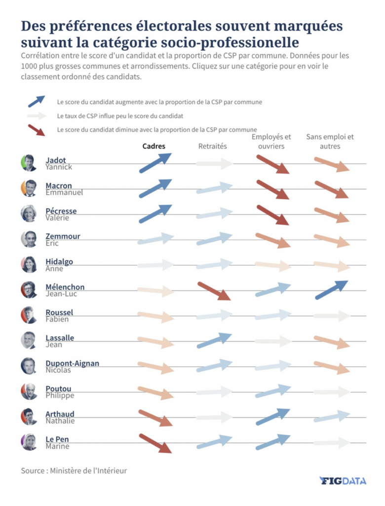
With the first-round vote in, there was time for some deeper analysis — first, of the growing success of far-right candidates:
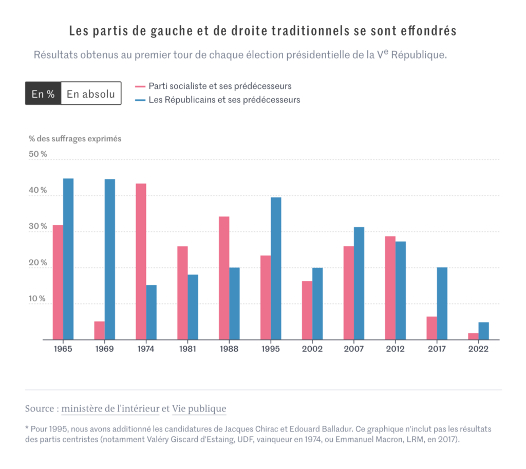
And second, of the dismal results for France’s traditional major parties:

Looking ahead to the runoff vote this Sunday, Les Echos and Le Monde both offered interactive tools to explore how other candidates’ supporters might split between Macron and Le Pen:
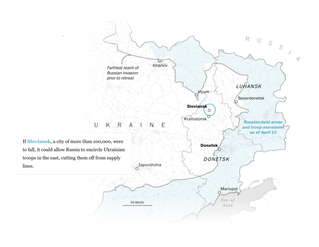
Meanwhile, Russia is renewing its attack on eastern Ukraine:

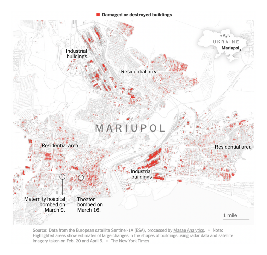
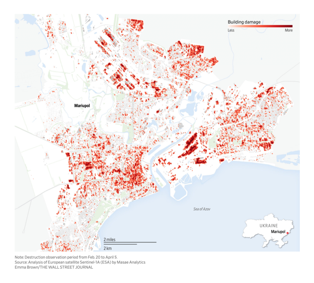
Although Ukrainian troops in Mariupol are still holding out after over a month of siege, the news from the city is bleak:

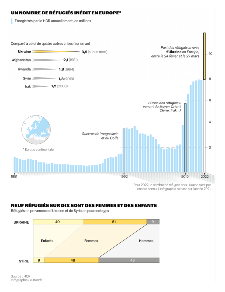
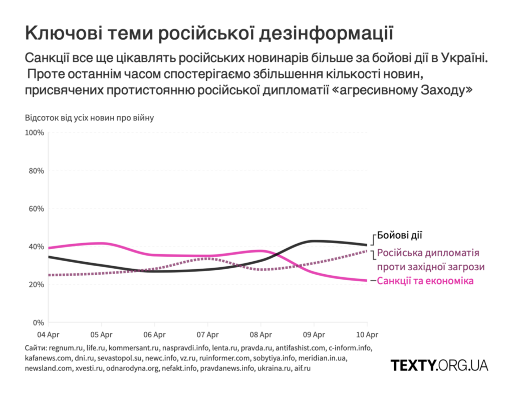
Millions of Ukrainians are displaced internally and abroad, while Russian media still barely acknowledges the war:
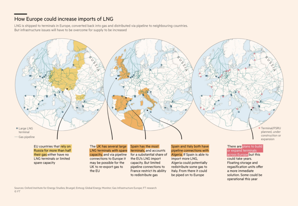
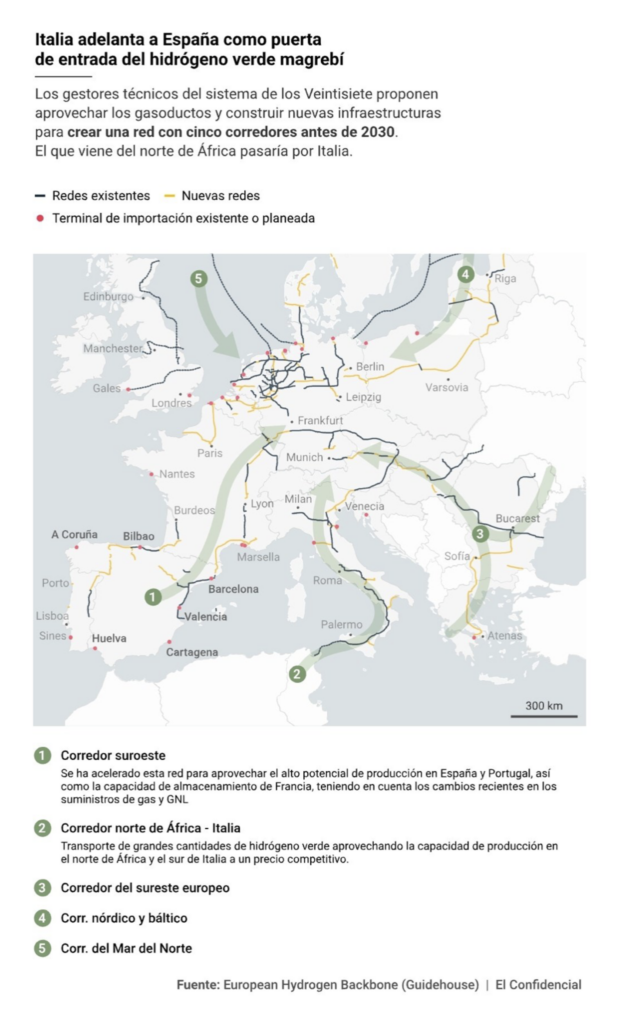
Europe is looking to liquid natural gas as an alternative to Russian imports:
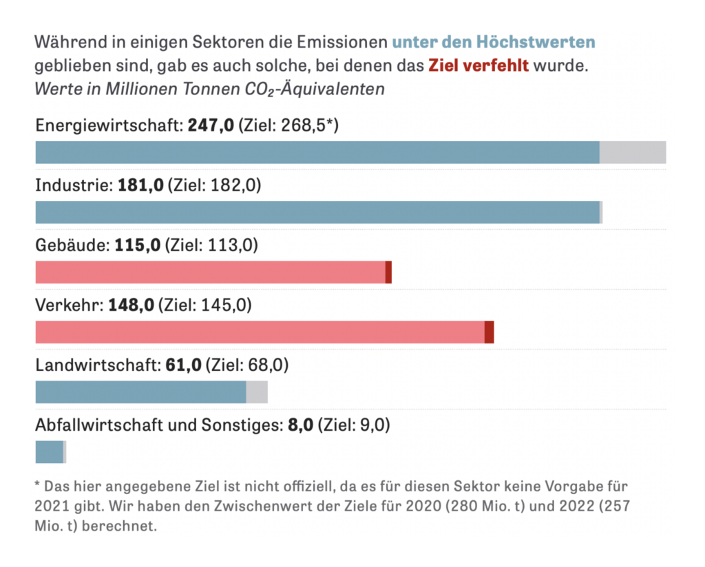
Even as key sectors miss their targets to lower emissions:
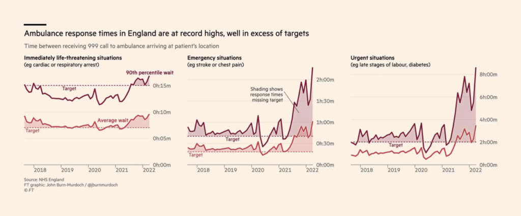
After two years of COVID, the treatment backlog is overwhelming England’s healthcare system:
A breakout topic of the week — the richest Americans and where their money goes:


And two neat rank charts took us through a century of Northern Irish politics on the one hand, and intergenerational social media usage on the other:

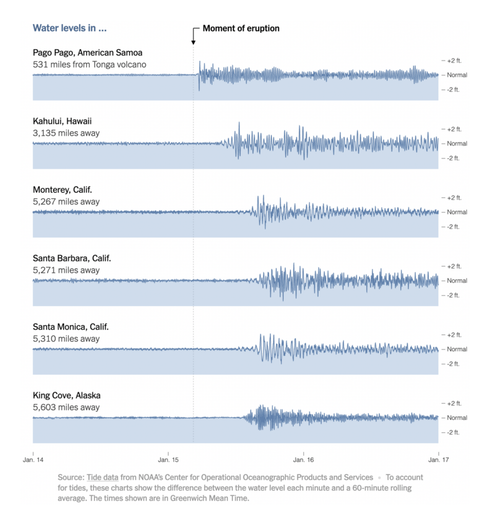
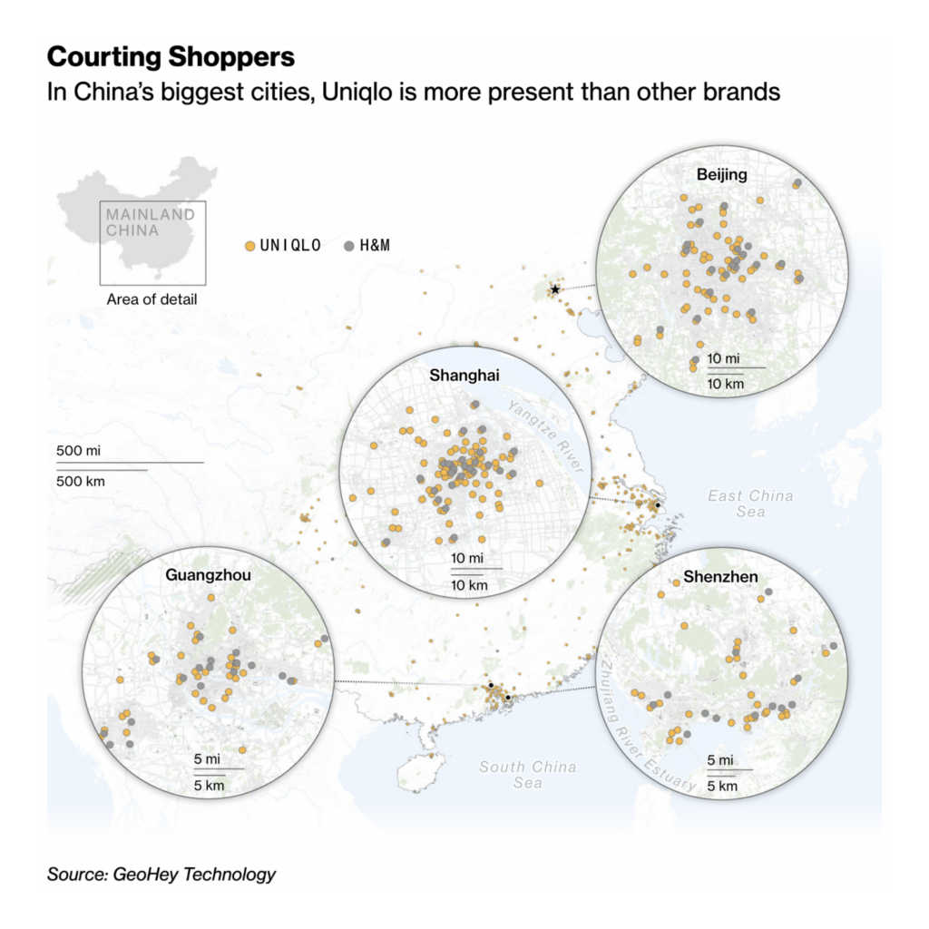
Other visualizations covered everything from high tides after Tonga’s volcanic eruption to the rise of Uniqlo in China:

What else we found interesting
Applications are open for…
- A head of product and design at Our World in Data.
- A graphics editor at National Geographic.
- A graphics developer and a graphics reporter at USA Today.
- An interactive news intern at Politico.
- A senior data visualization developer and a customer success and support specialist at Datawrapper!
Help us make this dispatch better! We’d love to hear which newsletters, blogs, or social media accounts we need to follow to learn about interesting projects, especially from less-covered parts of the world (Asia, South America, Africa). Write us at hello@datawrapper.de or leave a comment below.


Comments