This article is brought to you by Datawrapper, a data visualization tool for creating charts, maps, and tables. Learn more.
Data Vis Dispatch, April 2
The best of last week’s big and small data visualizations

Welcome back to the 136th edition of Data Vis Dispatch! Every week, we’ll be publishing a collection of the best small and large data visualizations we find, especially from news organizations — to celebrate data journalism, data visualization, simple charts, elaborate maps, and their creators.
Recurring topics this week include abortion, saving islands, and a container ship destroying a bridge:
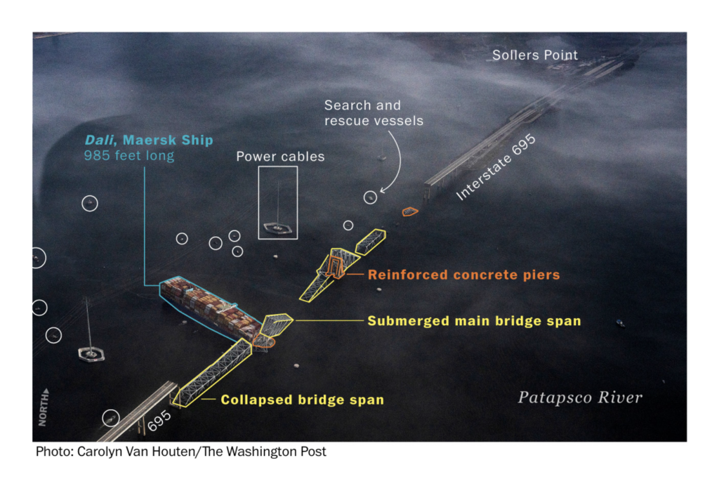
On March 26, the Francis Scott Key Bridge over the Patapsco River in Baltimore collapsed after a container ship struck one of its piers. We found several maps and satellite image visualizations of this event:

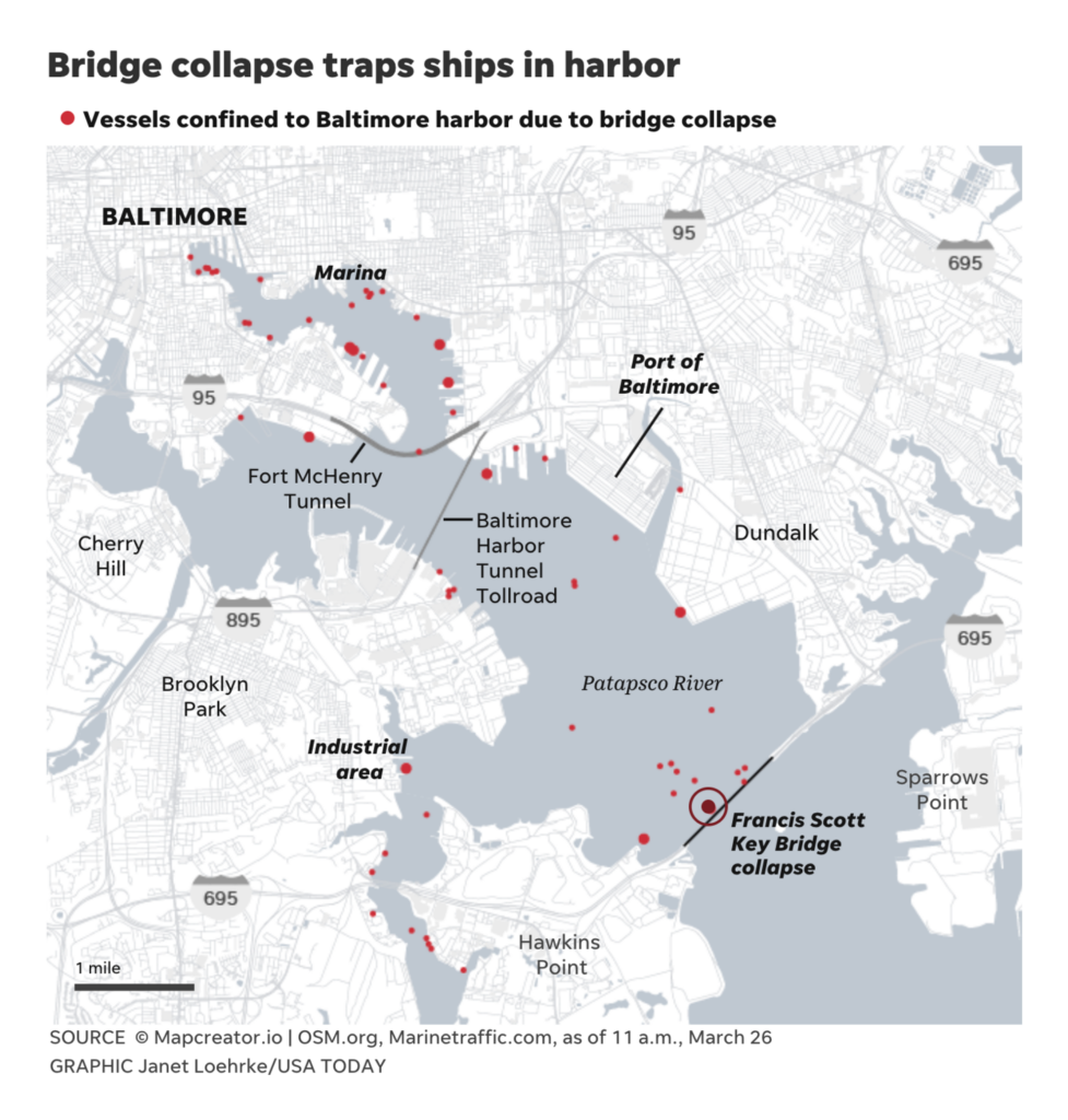
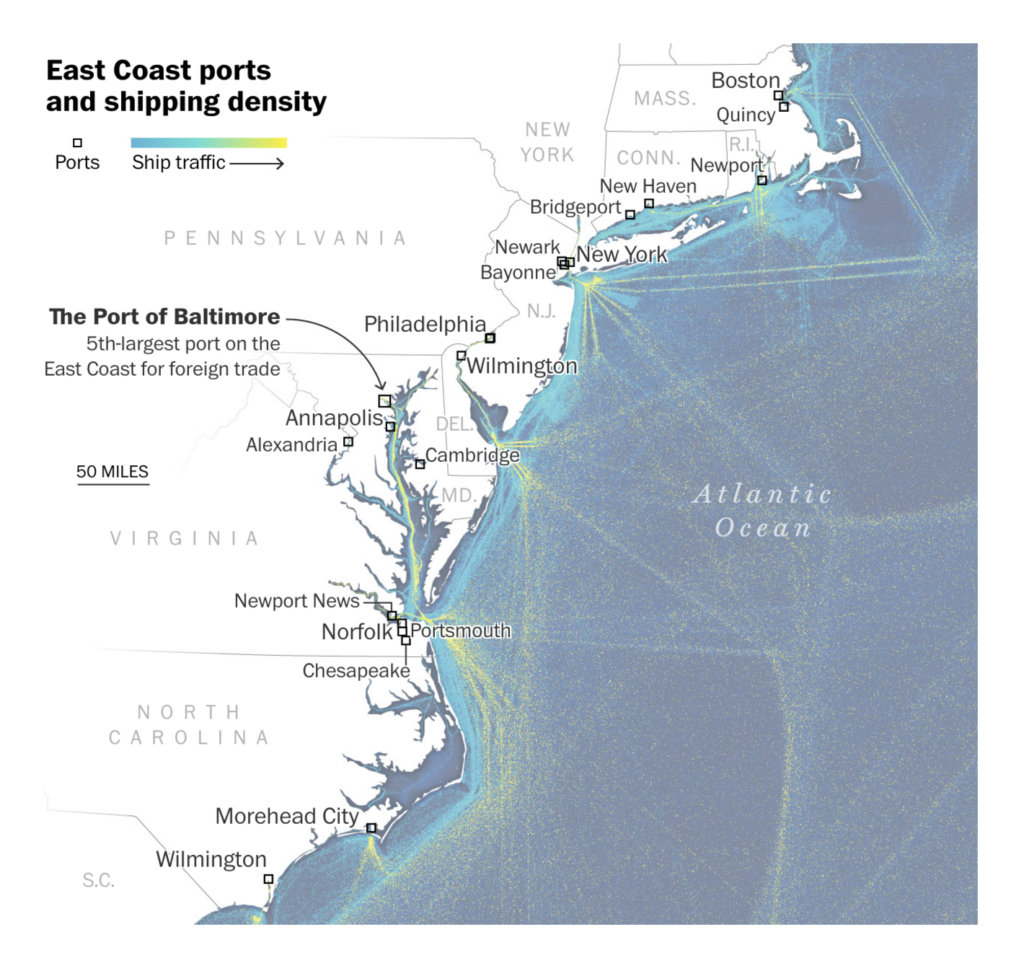
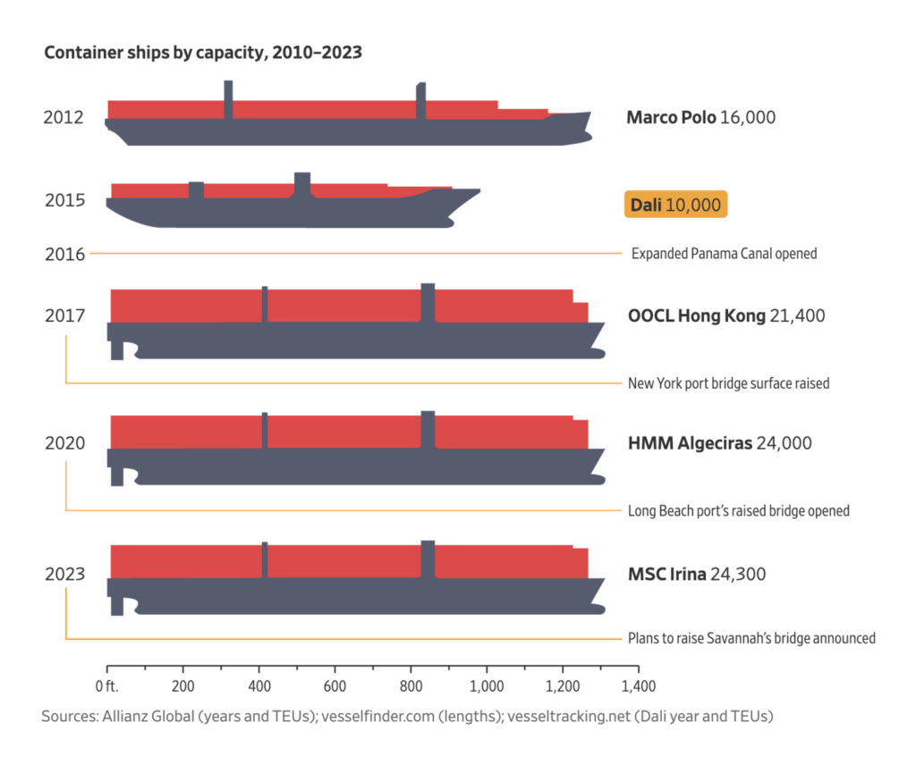
Presumably, this event has led to other visualizations about ships:
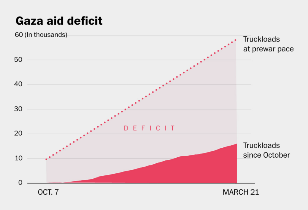
Let’s shift our focus from a single event to long-term conflicts. This week’s visualizations on Gaza focused on the aid deficit and hunger:
The U.S. veto of the UN Security Council resolution calling for a cease-fire in Gaza prompted Le Monde reporters to look at U.S. vetoes in the Council over time:
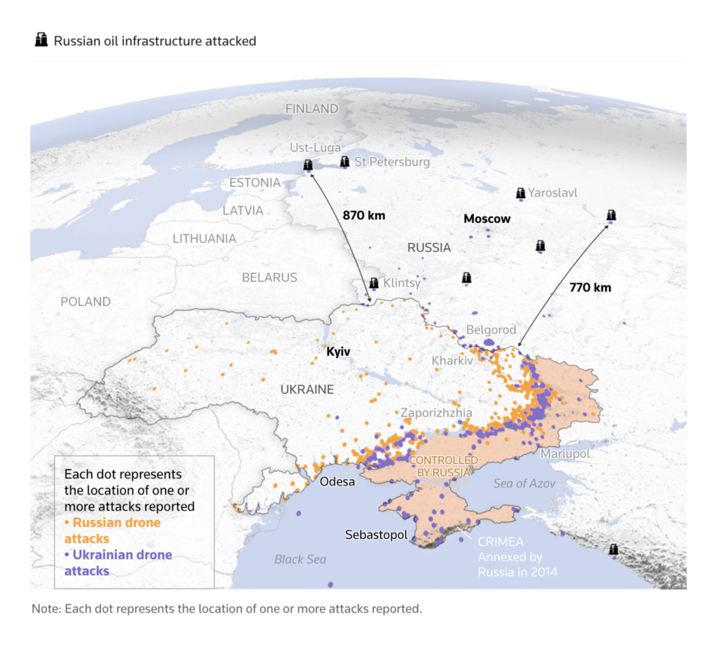
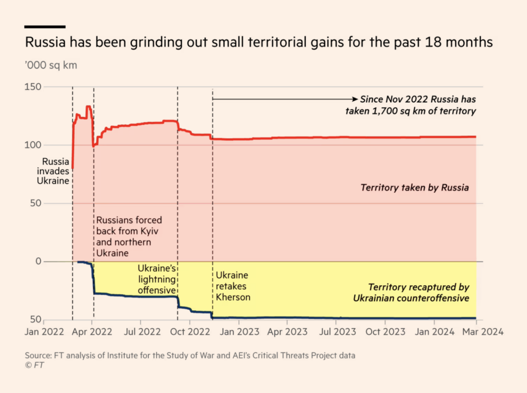
2,000 km north of Gaza, drone strikes and the grinding out of small territorial gains characterize the war activities between Russia and Ukraine:
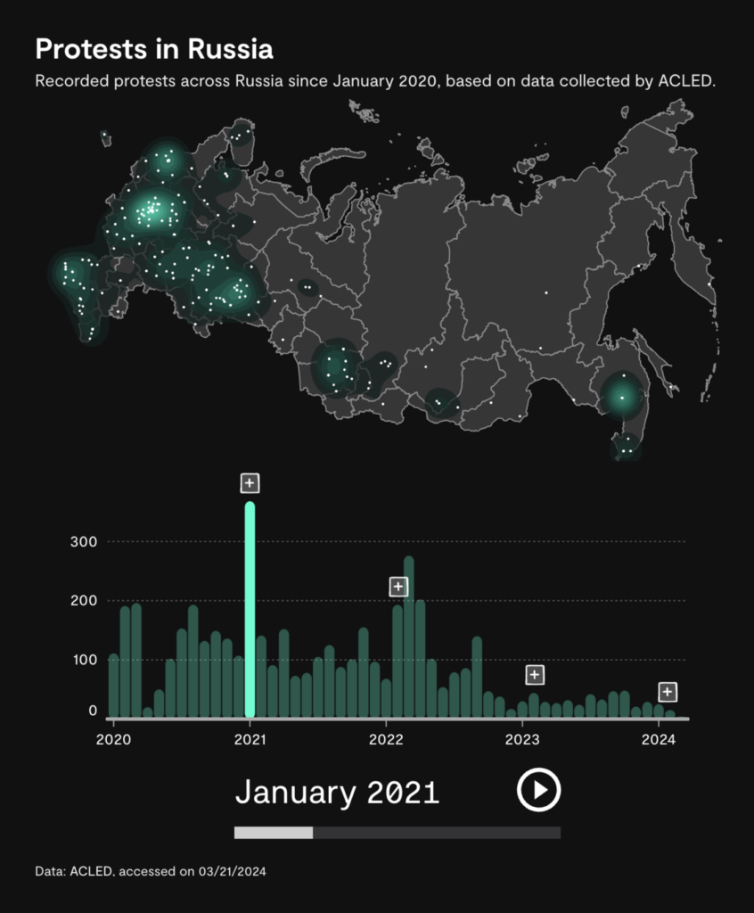
Protests are part of our political landscape around the world, including Russia. Here’s how they are changing:
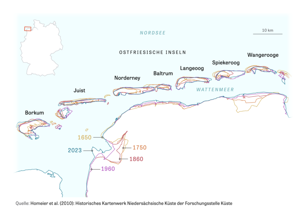
Our next cluster is about humans trying to stop nature — or poison it:
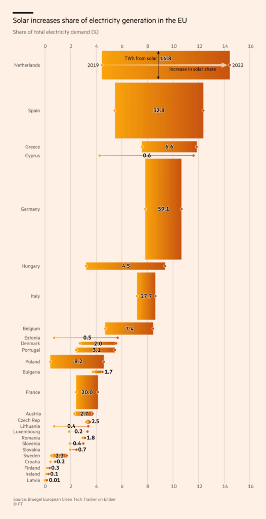
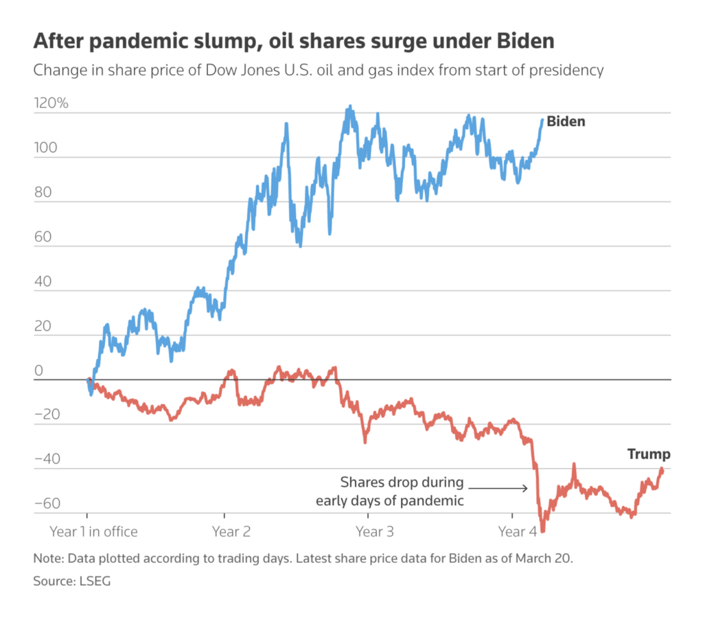
This week’s energy visualizations examine the increasing share of solar power in the EU and the increasing share of oil in the U.S.:
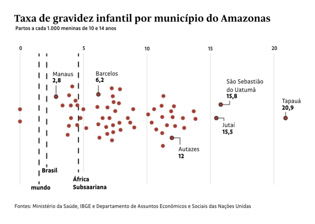
Abortion rights and child pregnancy tell a sad story about the oppression of women:

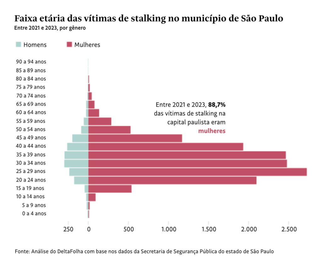
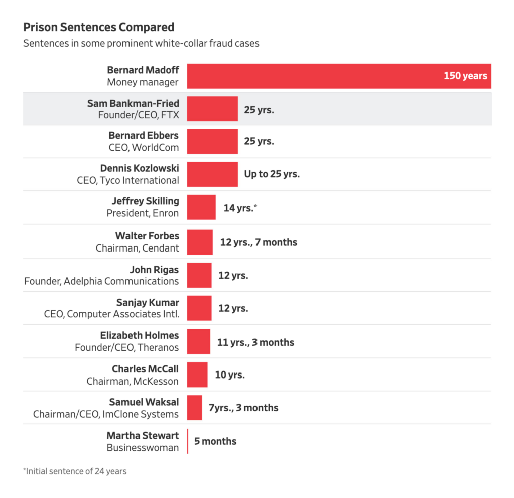
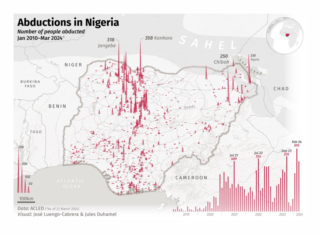
As Folha de S.Paulo shows, women are also much more likely to be stalked than men. Further in the cluster of crime, we have prison sentences in the U.S., kidnappings in Nigeria, and deadly police chases:

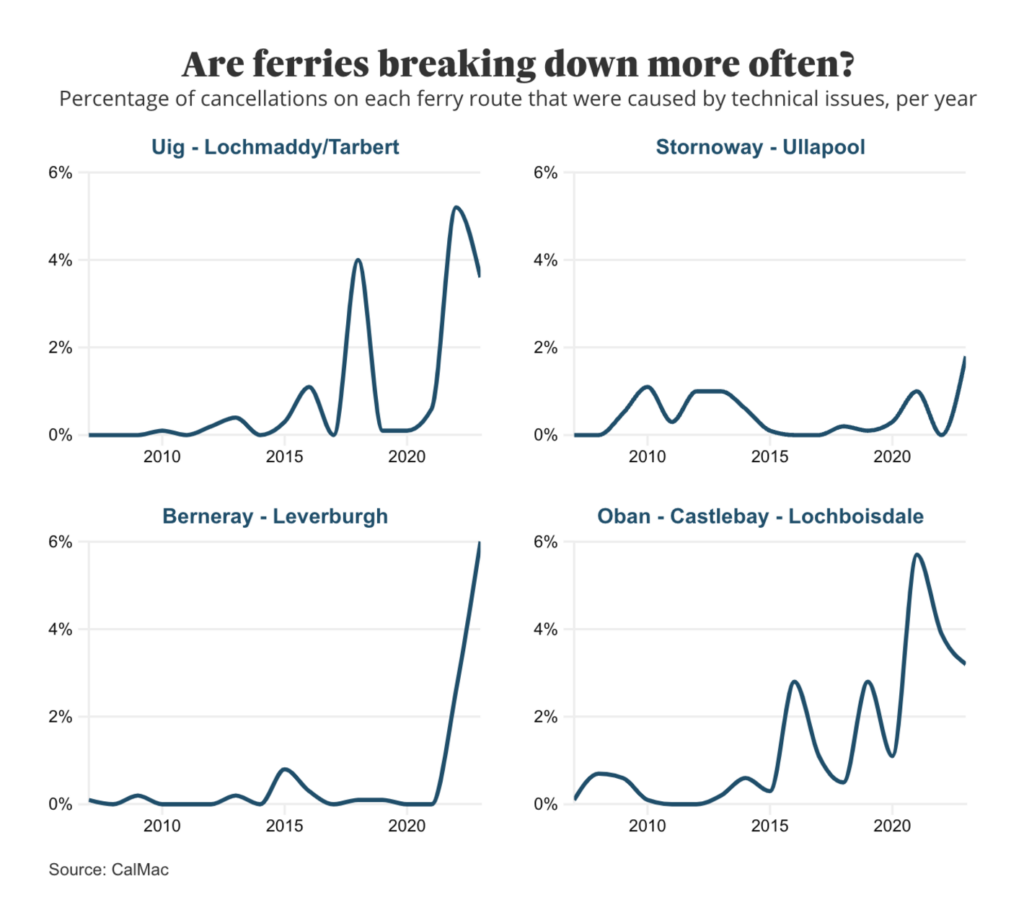
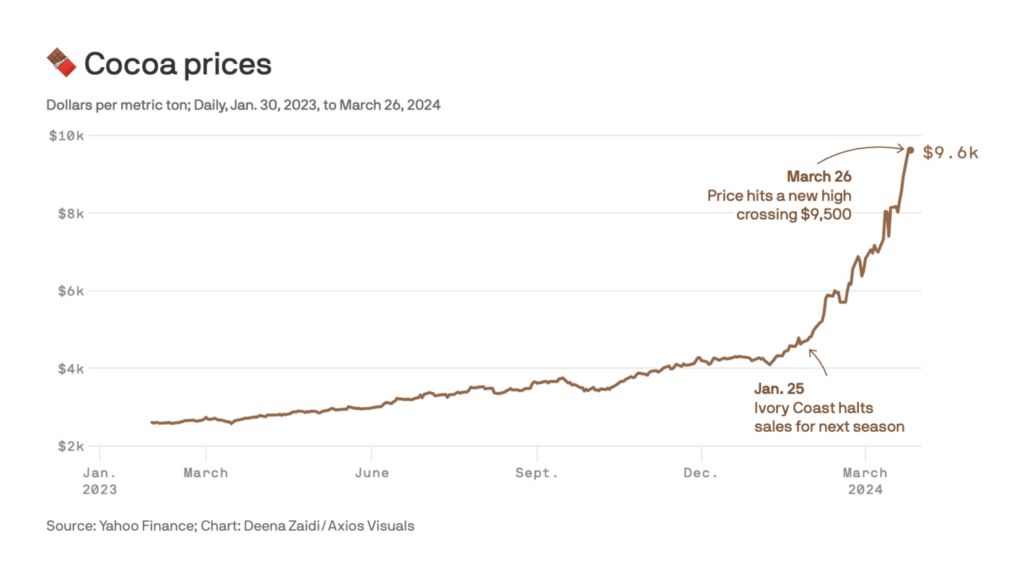
What better way to show a rapid rise than with a line chart? Another week where we pay tribute to this simple but effective chart type:

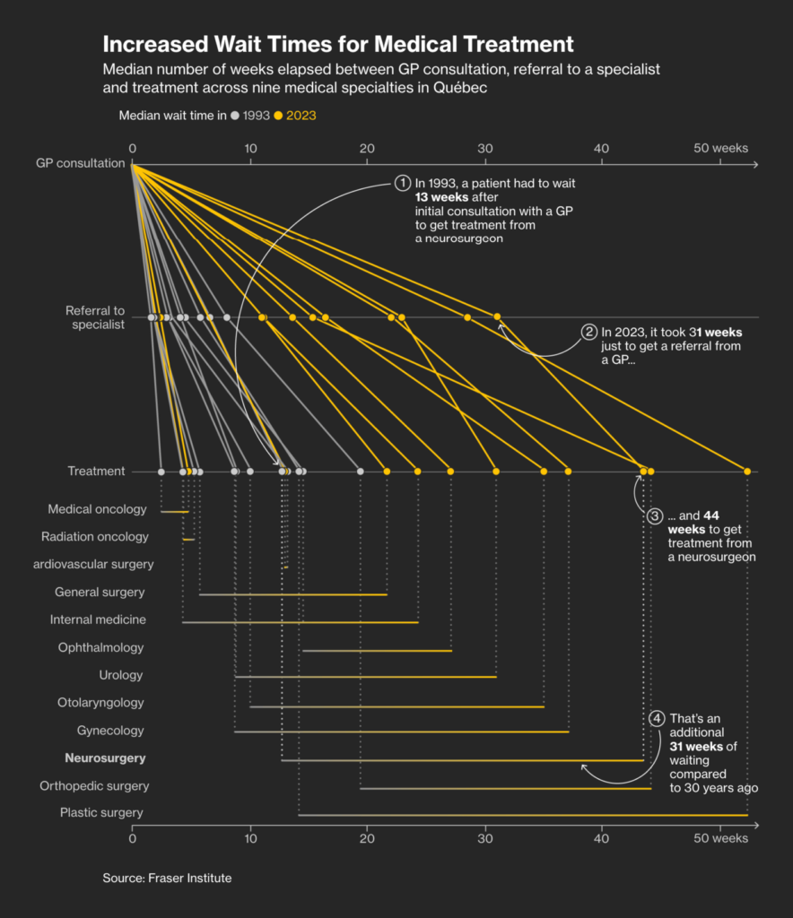
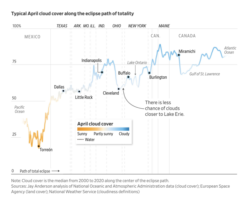
Let’s close this week with two beautiful visualizations from Bloomberg about medical treatment in Canada and global interest rates. Oh, and one about the solar eclipse — again:
What else we found interesting
Help us make this dispatch better! We’d love to hear which newsletters, blogs, or social media accounts we need to follow to learn about interesting projects, especially from less-covered parts of the world (Asia, South America, Africa). Write us at hello@datawrapper.de or leave a comment below.
Want the Dispatch in your inbox every Tuesday? Sign up for our Blog Update newsletter!


Comments