Data Vis Dispatch, April 23

The best of last week’s big and small data visualizations

Welcome back to the 139th edition of Data Vis Dispatch! Every week, we’ll be publishing a collection of the best small and large data visualizations we find, especially from news organizations — to celebrate data journalism, data visualization, simple charts, elaborate maps, and their creators.

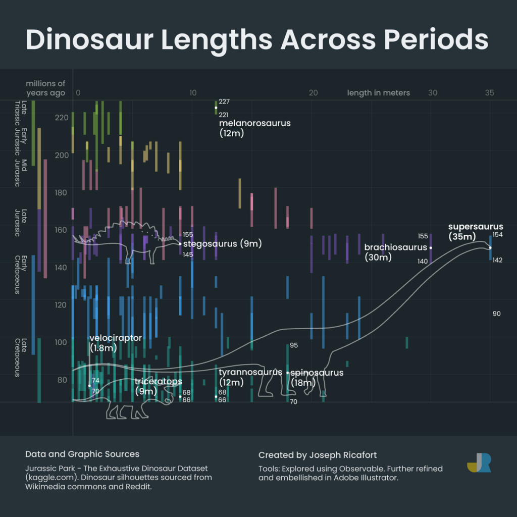
Recurring topics this week include include donkeys, dinosaurs, and cables.

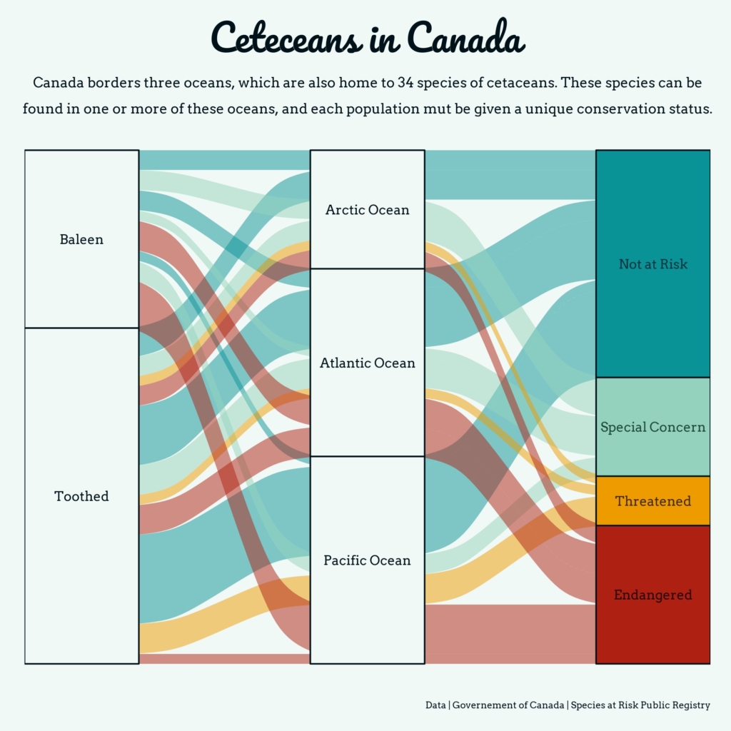
We’re already into the third week of April, which makes this the third showcase of charts from the #30DayChartChallenge:

Alexandra Mayette: “#30DayChartChallenge Day 17: networks I wanted to try for a long time an alluvial plot with #ggalluvial and I thought today would be a good practice, with one of my favourite topic,” April 18 (Tweet)
Joseph Ricafort: “Day 19: Dinosaurs of #30DayChartChallenge Here’s a chart of #dinosaurs comparing their lengths, across periods of time when they existed. I’m no big fan of dinos but of their great great grand descendants, #chickens, I am,” April 20 (Tweet)
Joe Shaw: “Day 19 of the #30DayChartChallenge – Dinosaurs: Biden and Trump are the two oldest US Presidents,” April 21 (Tweet)

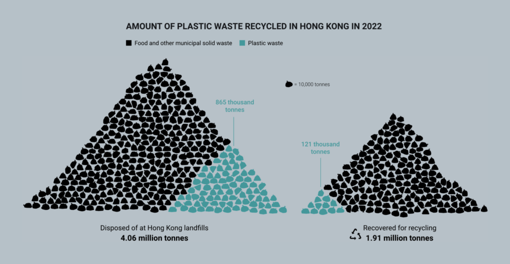
A special day this week: Earth Day, April 22. This year’s theme is ending plastic pollution:

South China Morning Post: Plastic unfantastic: what’s banned in Hong Kong’s war on waste, April 19 Lots of great charts
Our World in Data: Investments in waste management are key to ending plastic pollution, April 22

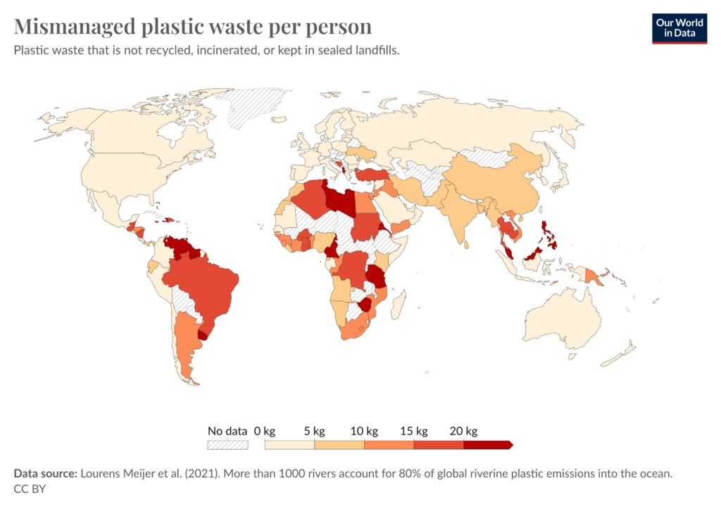
Earth Day was a catalyst for other environmental visualizations:

Julia Han Janicki: “As it’s #EarthDay today I decided to repost our new user-driven #ClimateChange story. Here are my stripes showing yearly temp anomaly under the very high emissions scenario until I’ll be 100, you can download yours too,” April 23 (Tweet, Website)
SBS News: 그들의 ‘깨끗하나 더러운 비밀’…탄소 배출은 정말로 줄었을까요?, April 18

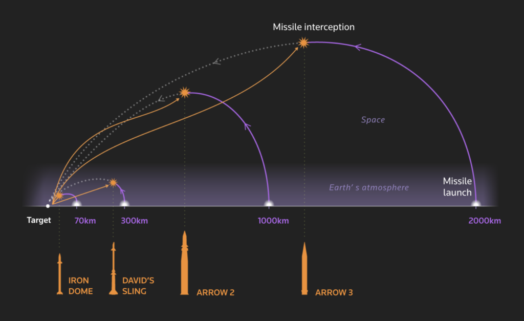
On April 13, Iran launched a drone attack on Israel, which Israel responded to. Visualizations about the ongoing wars in the Middle East therefore focused this week on Israel’s defenses and relations with Iran, as well its mass destruction of the Gaza Strip:

Reuters: Israel’s Iron Dome, April 18
Le Figaro: Conflit Iran-Israël : comprendre la riposte de Tsahal en carte, April 20
Bloomberg: A Detailed Map Shows How Airstrikes and Refugees Reshaped Rafah, April 16

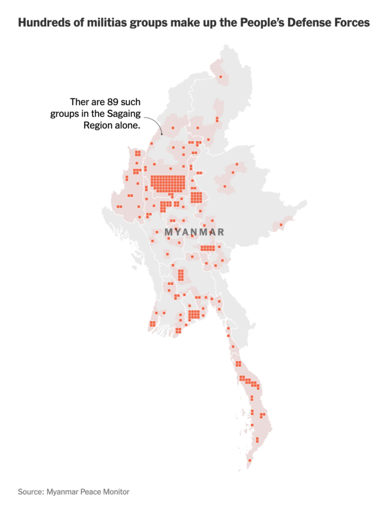
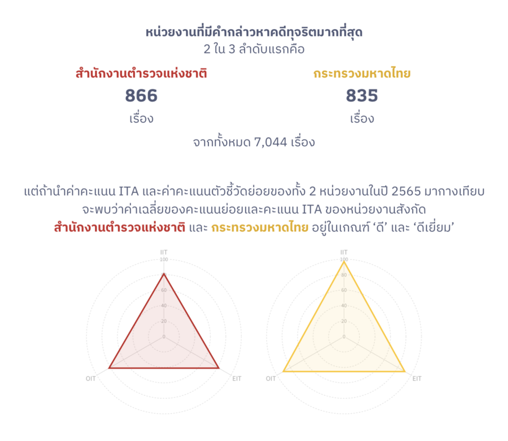
Other visualizations about conflicts include militias in Myanmar and government corruption in Thailand:

The New York Times: What’s Happening In Myanmar’s Civil War?, April 20
WeVis: NACC Check: ตรวจคอร์รัปชั้นแล้ว ตรวจความโปร่งใสอยู่ ตรวจ ‘ป.ป.ช.’ ต่อ, April 18

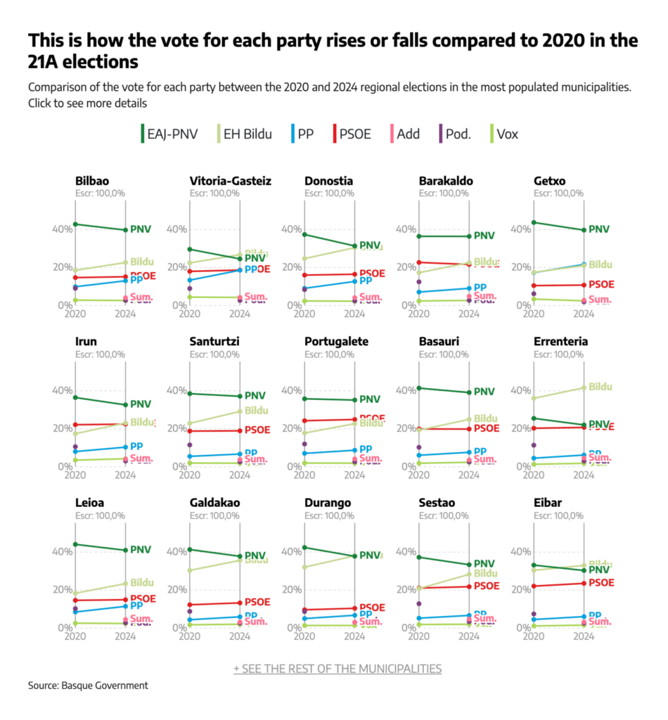
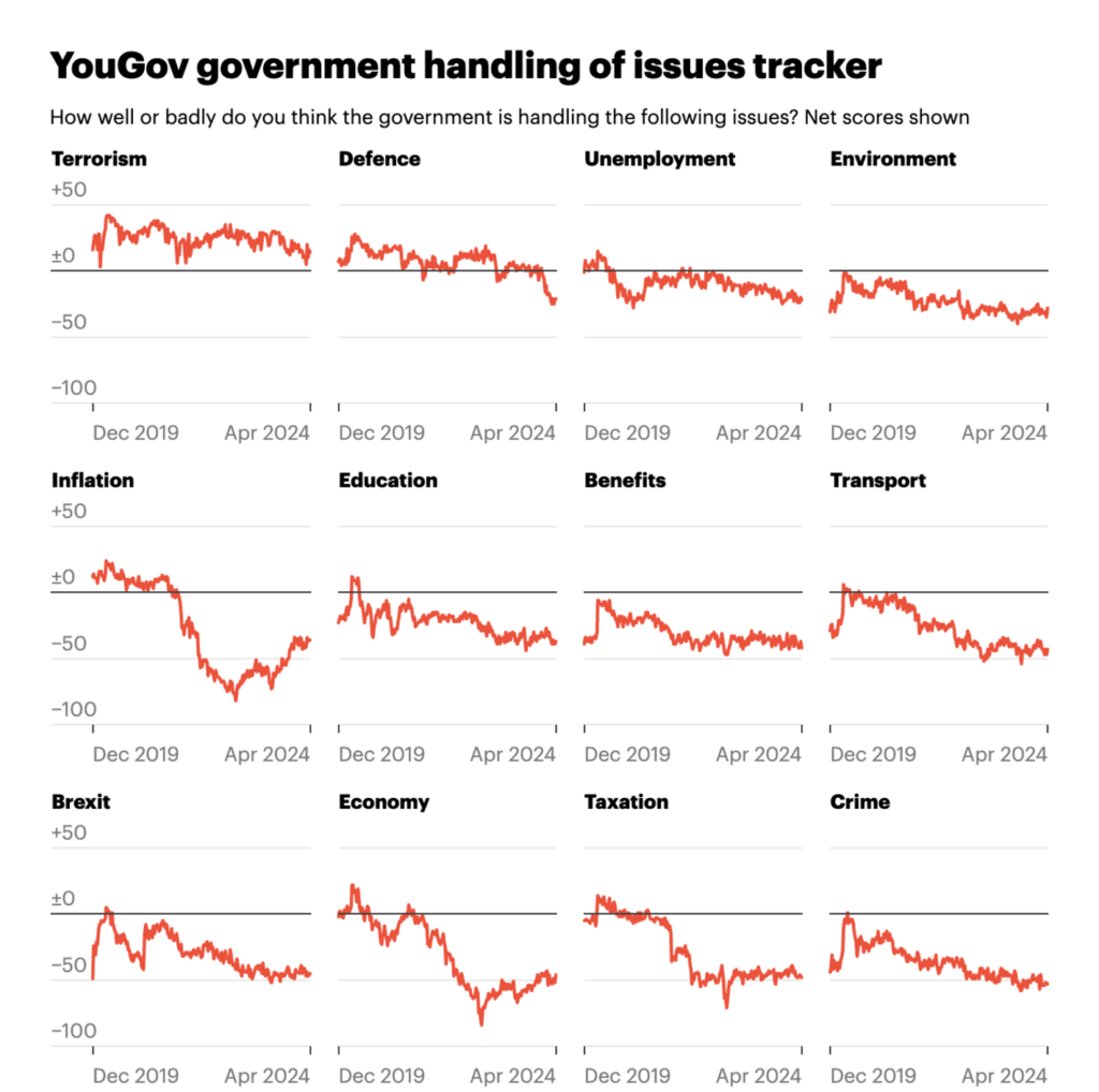
Small multiple lines showed us election results in the Basque Country and the growing political dissatisfaction of British people:

elDiario.es: The results of the 21A elections in Euskadi, municipality by municipality, April 21
YouGov: Political tracker roundup: April 2024, April 17
The Guardian: Labour are ahead in the polls, but have they won hearts and minds? These charts suggest not, April 22

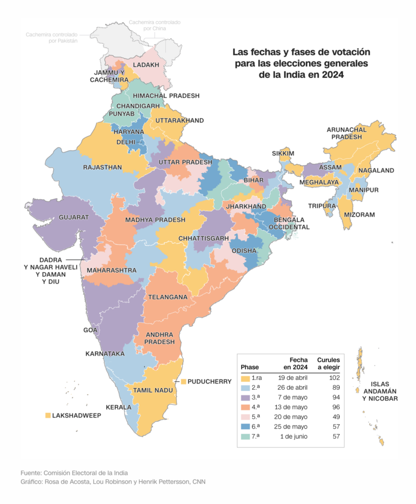
Speaking of elections: Indian citizens began voting in the world’s biggest election this Friday:

CNN en Español: Elecciones generales en la India: lo que hay que saber sobre las mayores elecciones del mundo, April 19

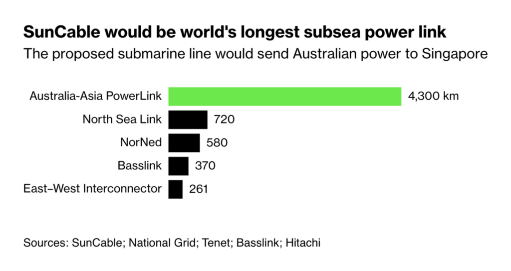
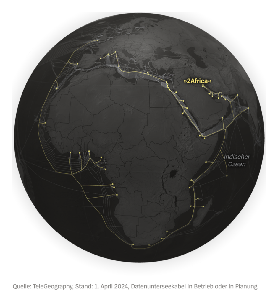
Energy and data both travel through underwater cables:

Bloomberg: A Software Billionaire Is Betting Big on a Wild Climate Fix, April 16
Der Spiegel: Hier ist die Weltwirtschaft verwundbar, April 16

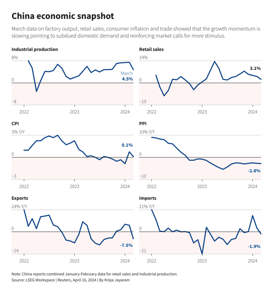
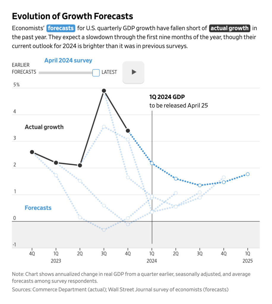
Economic data and line charts are always great combination:

Reuters: China’s economy grew faster than expected in the March quarter, April 16
The Wall Street Journal: Where Are Growth, Inflation and Interest Rates Headed? We Asked the Economists, April 17

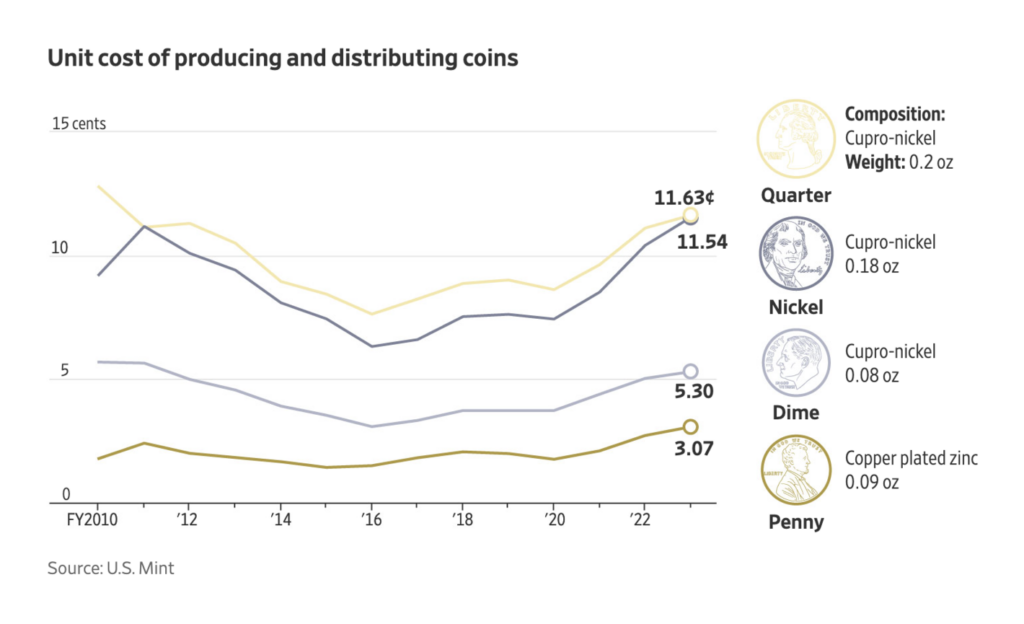
Have you ever wondered how much money money costs? These visualizations will answer that question:

The Wall Street Journal: Americans Throw Away Up to $68 Million in Coins a Year. Here Is Where It All Ends Up, April 17
Bloomberg: Bitcoin ATMs Flood Black, Latino Areas, Charging Fees up to 22%, April 17

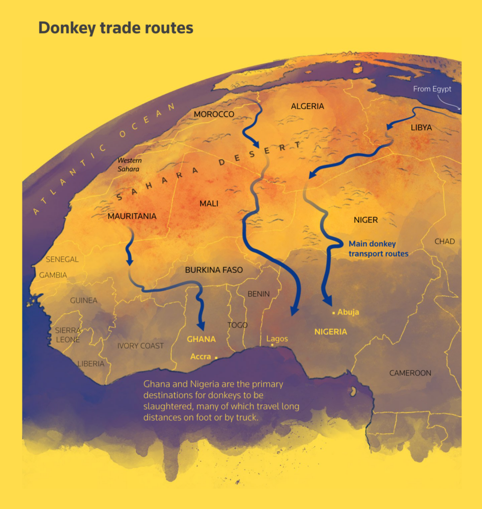
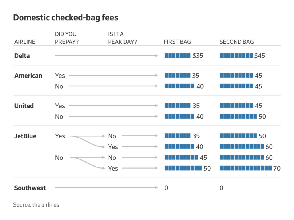
Finally, we have donkey trade, luggage prices, and the dangerous roads of the U.S.:

Reuters: How China’s demand for donkey hide is devastating African communities, April 16 Lots of great charts
The Wall Street Journal: You Can’t Just Book Your Flight and Ignore the Bag Fees Anymore, April 22
Financial Times: Why are American roads so dangerous?, April 19

What else we found interesting

SPAIN arts & culture ON!: Spanish Graphics in the U.S., April 19 Digital Collection
Daniel Shiffman: “I finished the thing”, April 20 (Tweet, Website)

Applications are open for…


Help us make this dispatch better! We’d love to hear which newsletters, blogs, or social media accounts we need to follow to learn about interesting projects, especially from less-covered parts of the world (Asia, South America, Africa). Write us at hello@datawrapper.de or leave a comment below.

Want the Dispatch in your inbox every Tuesday? Sign up for our Blog Update newsletter!

Comments