This article is brought to you by Datawrapper, a data visualization tool for creating charts, maps, and tables. Learn more.
Data Vis Dispatch, April 5
The best of last week’s big and small data visualizations

Welcome back to the 39th edition of Data Vis Dispatch! Every week, we’ll be publishing a collection of the best small and large data visualizations we find, especially from news organizations — to celebrate data journalism, data visualization, simple charts, elaborate maps, and their creators.
Recurring topics this week include housing, consumer waste, and war in Ukraine.
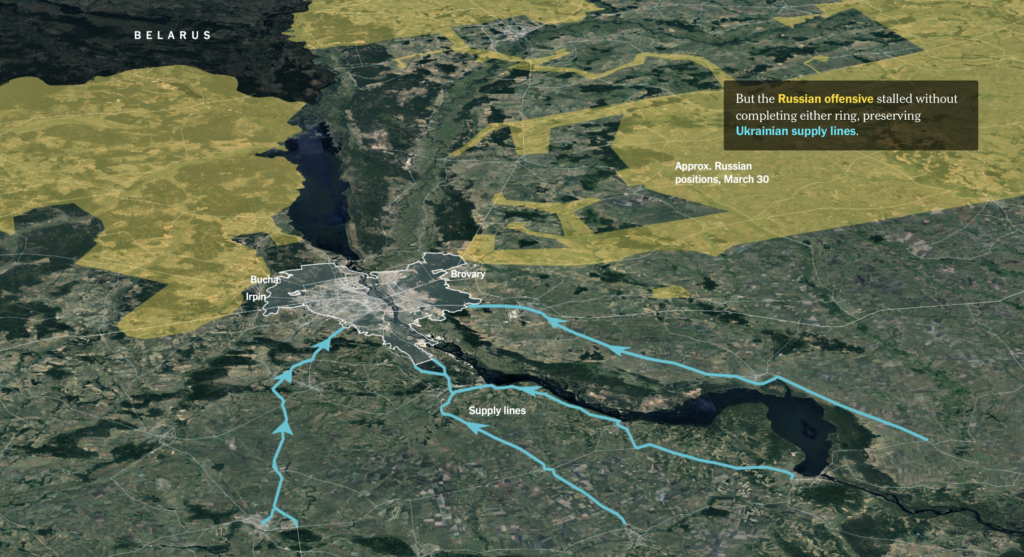
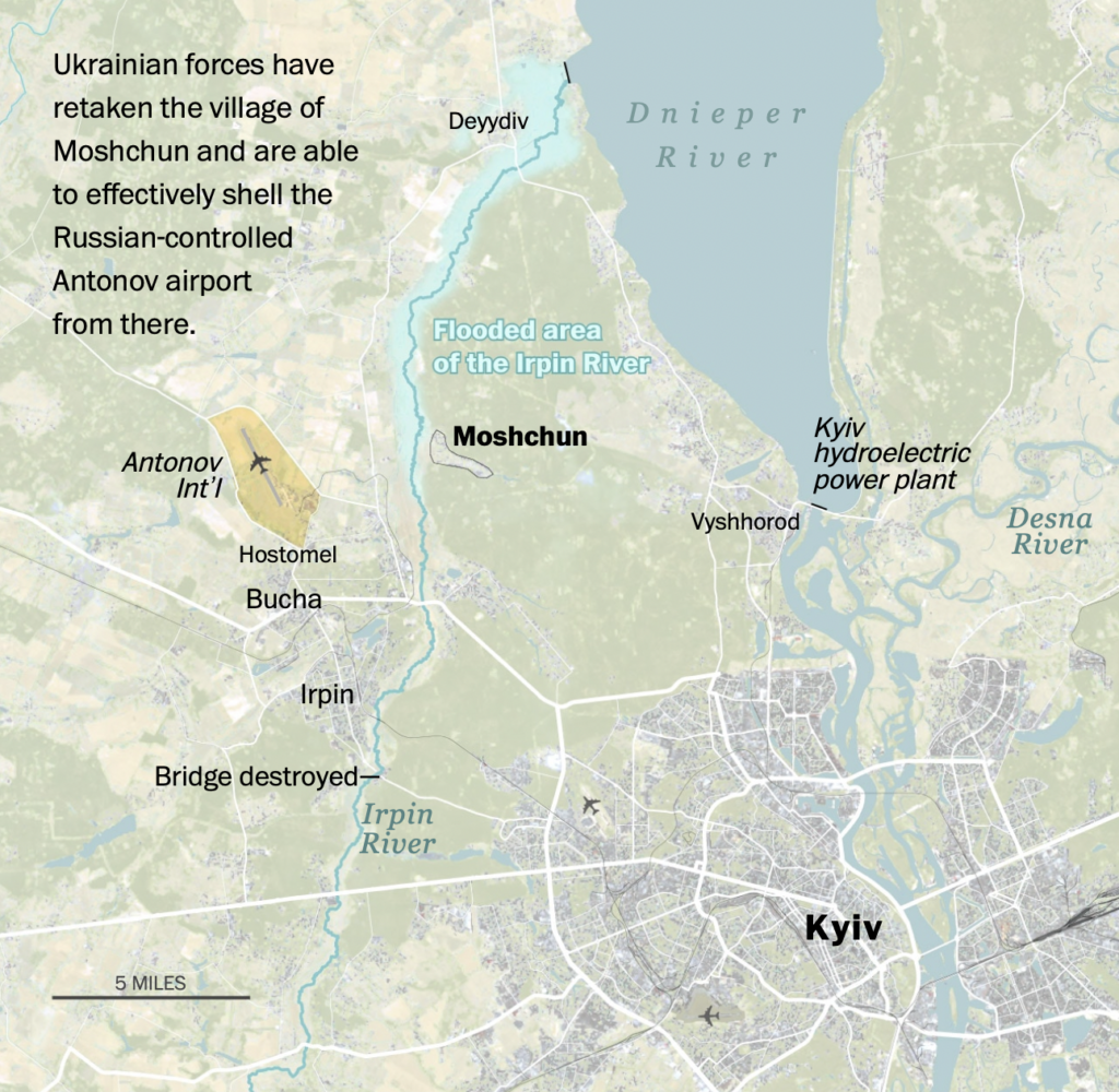
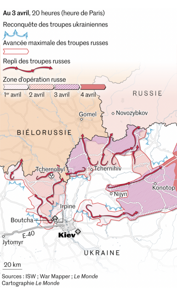
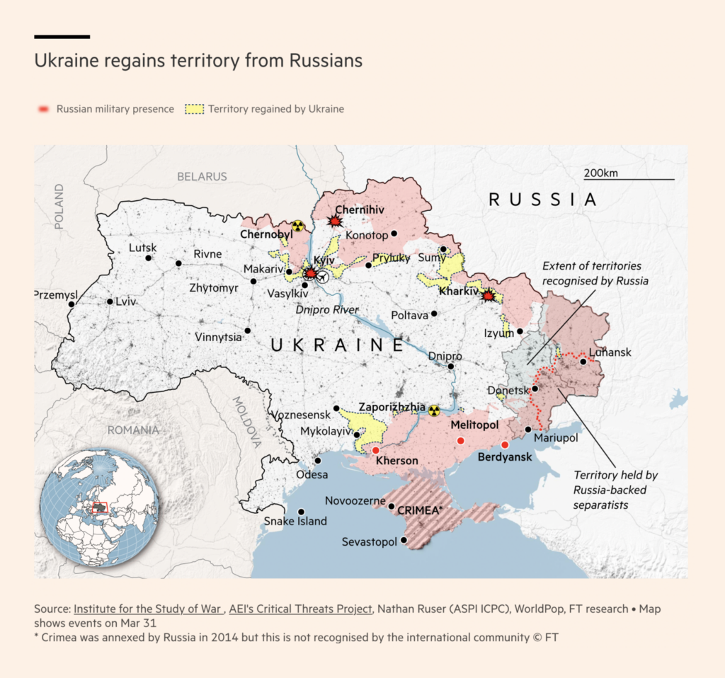
The war in Ukraine continues. This week, several maps focused on Russian troops’ retreat from the Kyiv region:
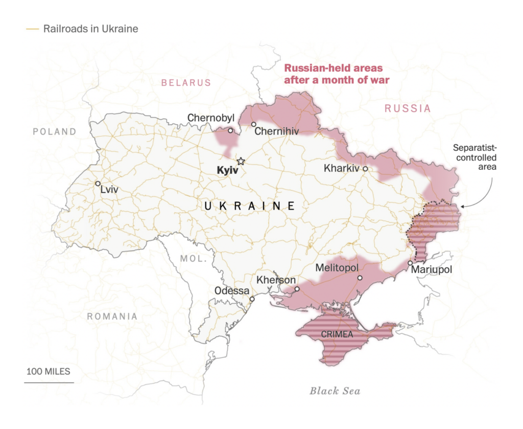
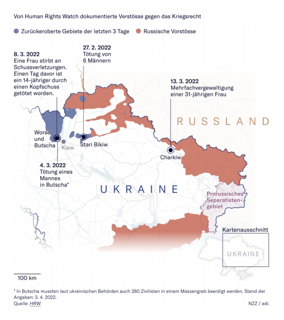
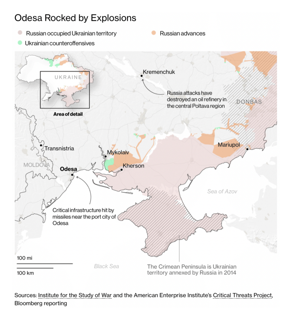
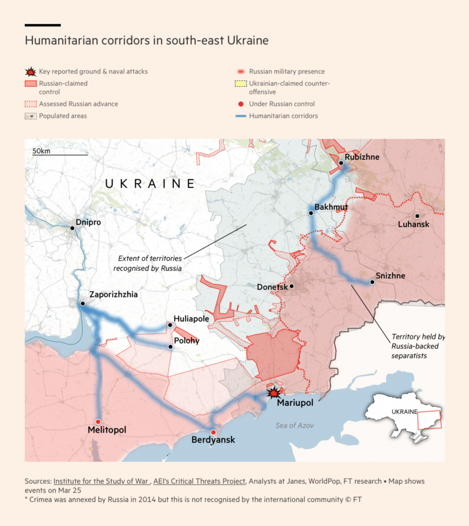
Other maps of the military situation are shown here in chronological order:
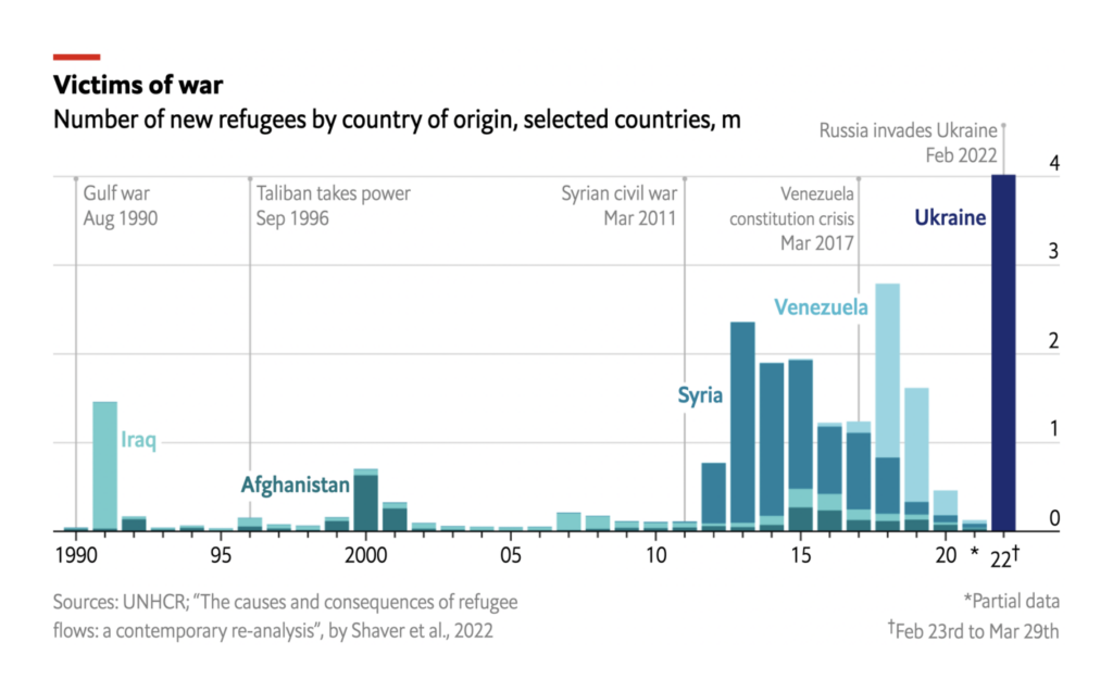
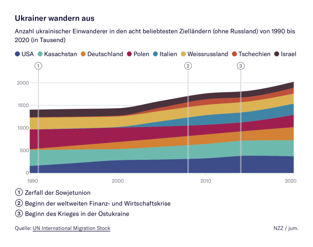
Meanwhile, 4 million Ukrainians have fled the country as refugees and over 7 million are internally displaced:
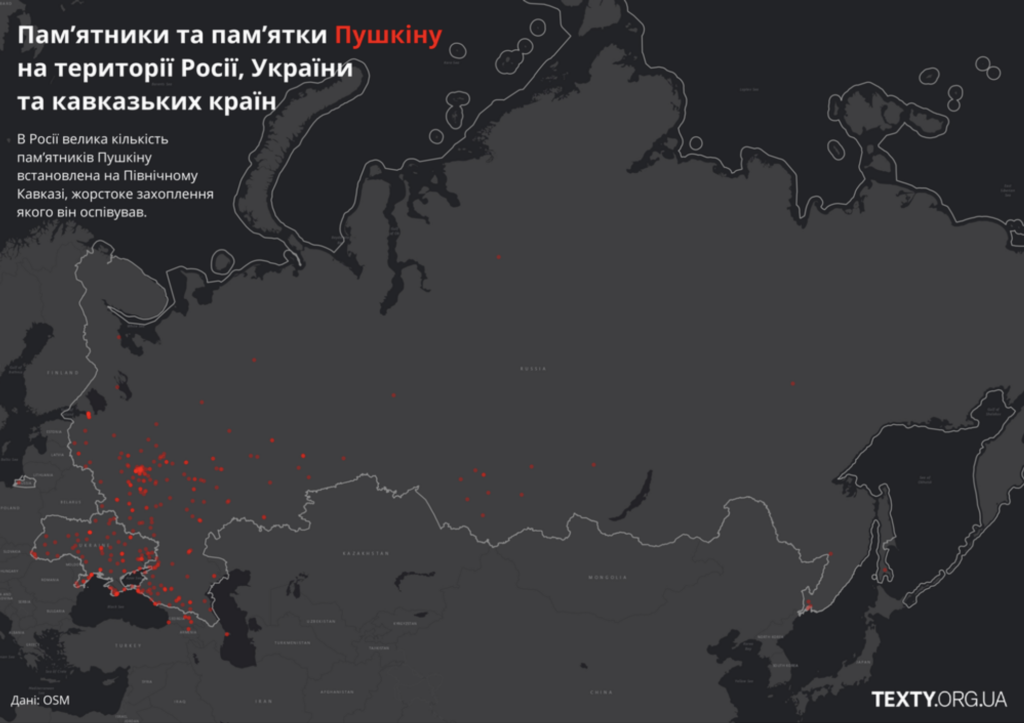
Some visualizations looked at cultural responses to the war, both in Ukraine and abroad:
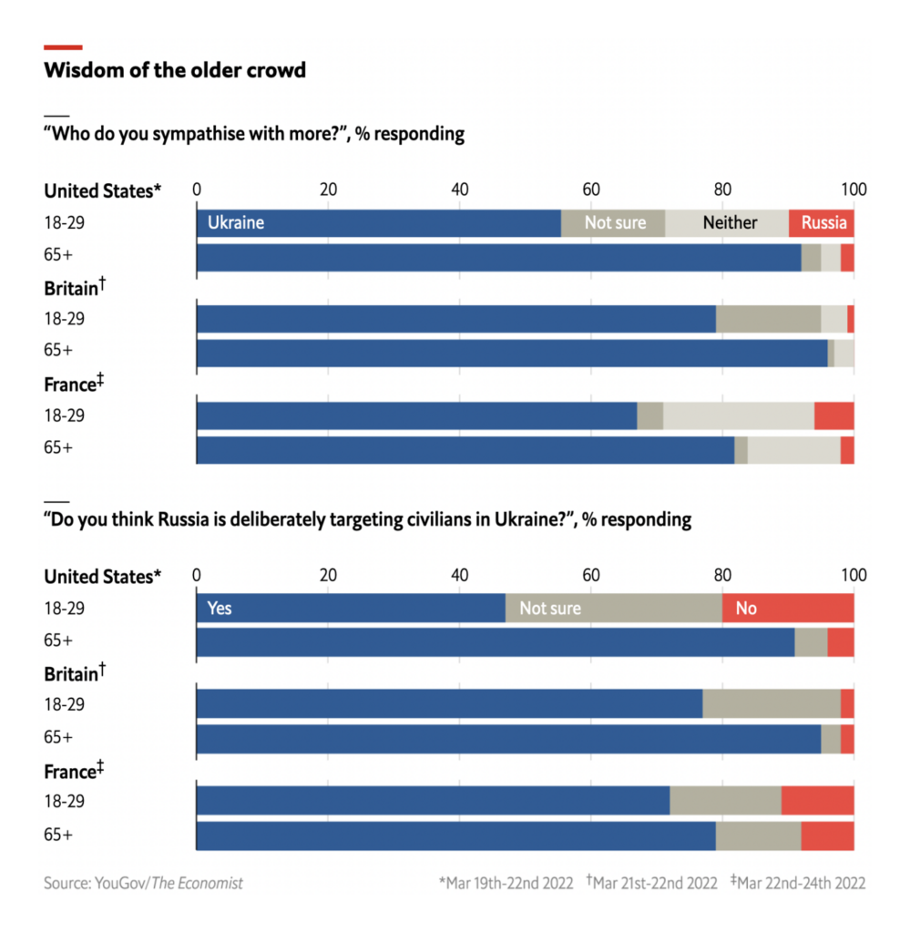
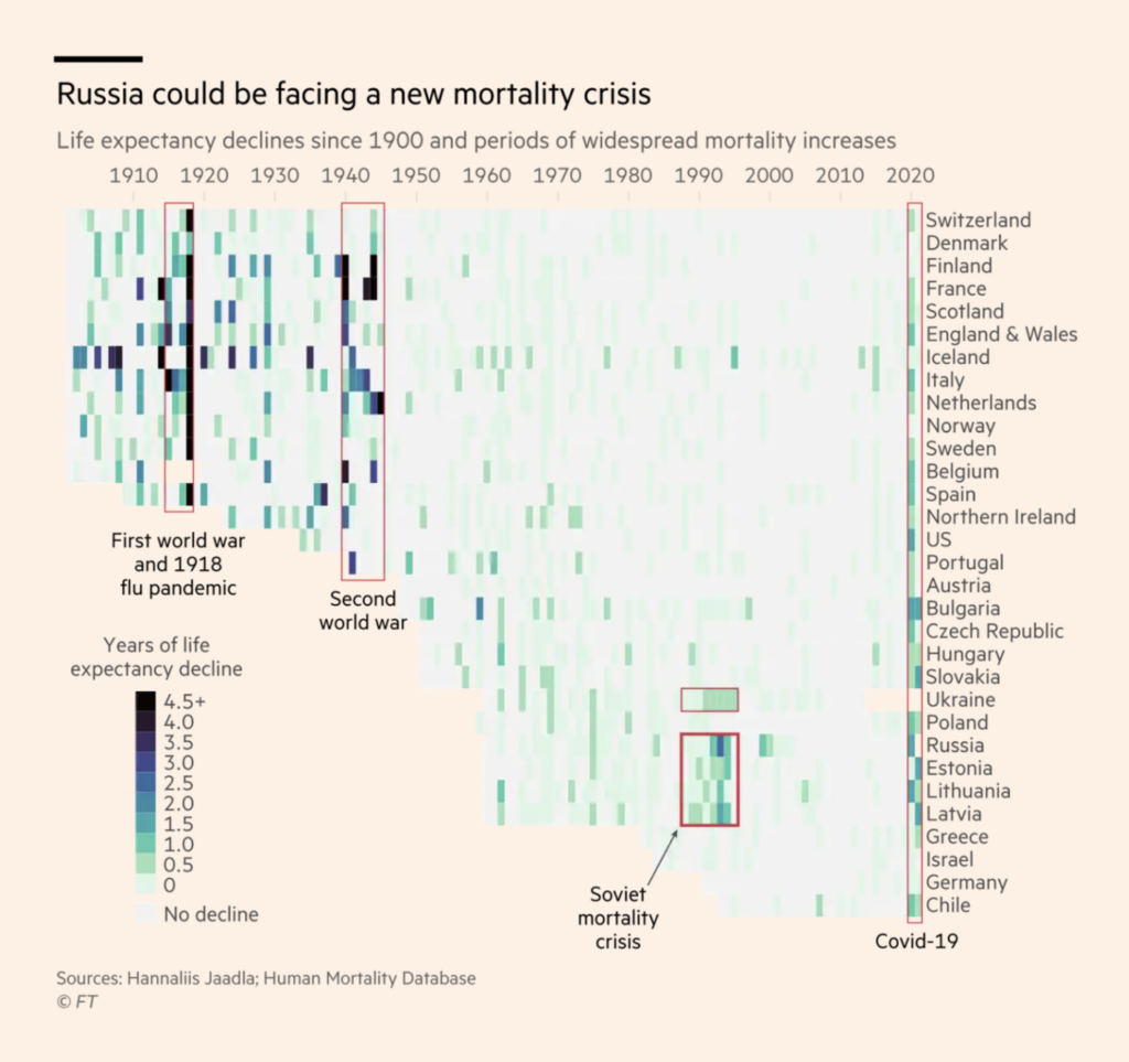
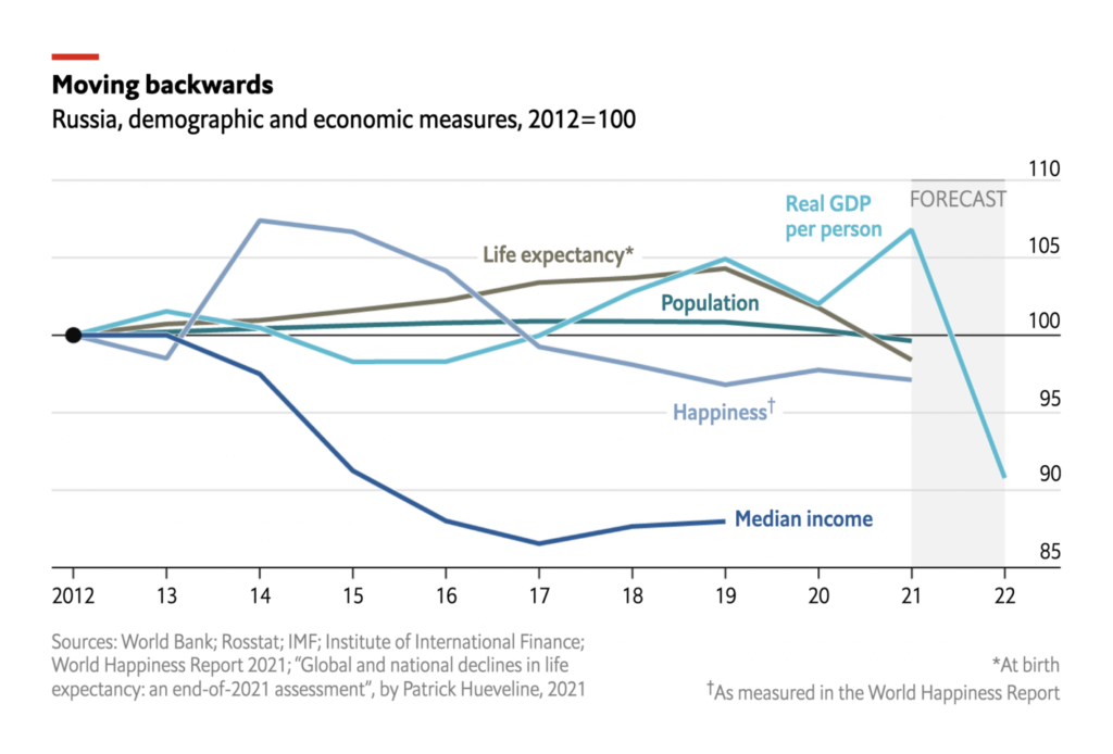
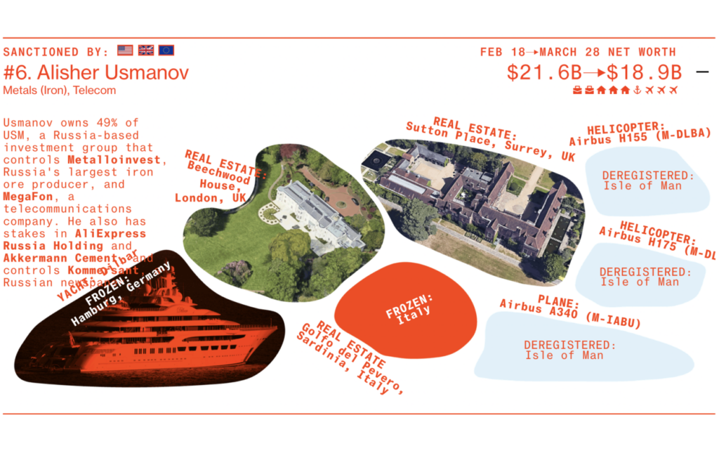
And these charts tried to predict the war’s effect on Russian society:
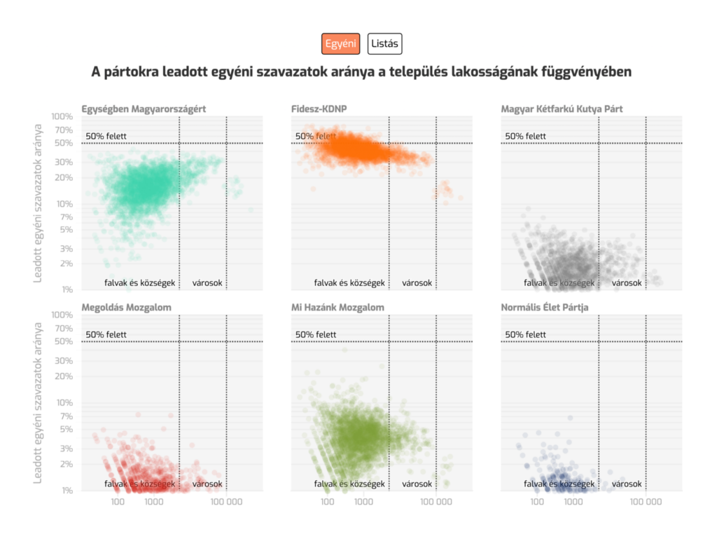
In Hungary, the ruling Fidesz party won another landslide victory, in part thanks to a biased parliamentary map:
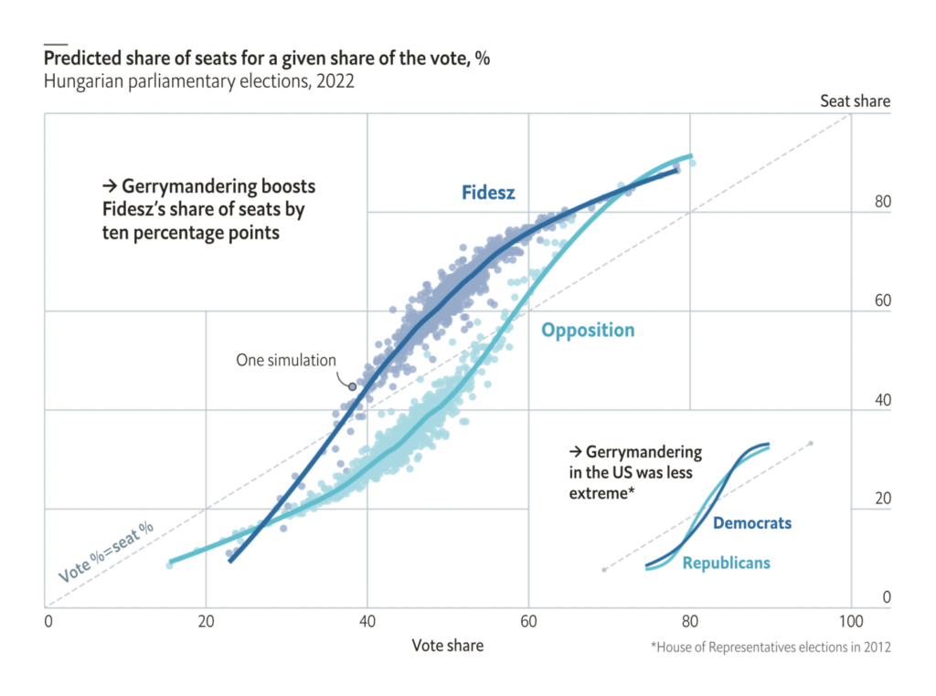
Meanwhile, in the U.S., the current round of congressional gerrymandering may actually result in a less biased map overall:


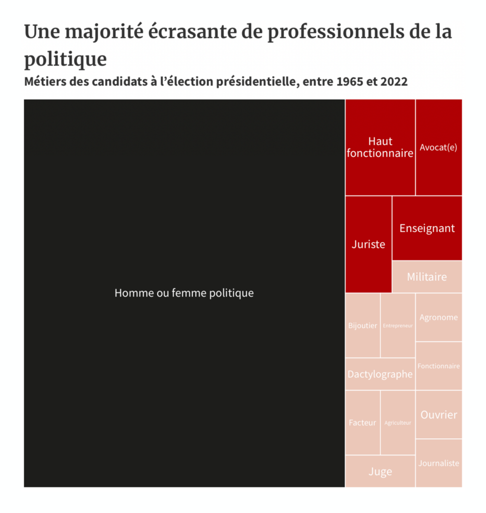
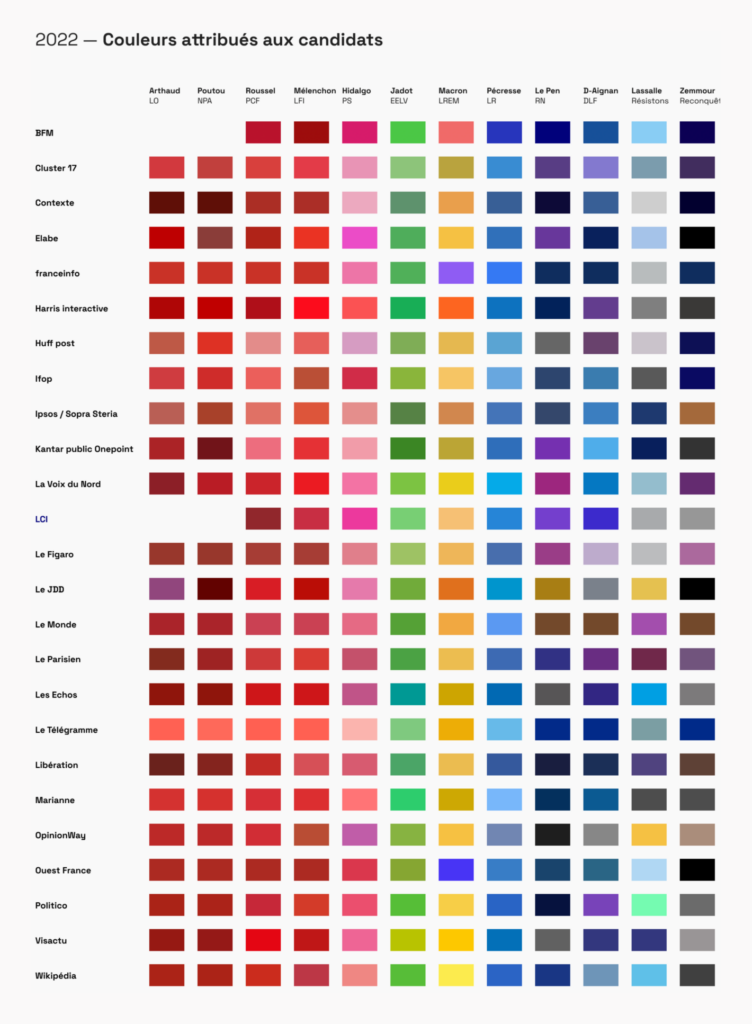
Other political topics included the careers of French presidential candidates and budget earmarks in the U.S.:

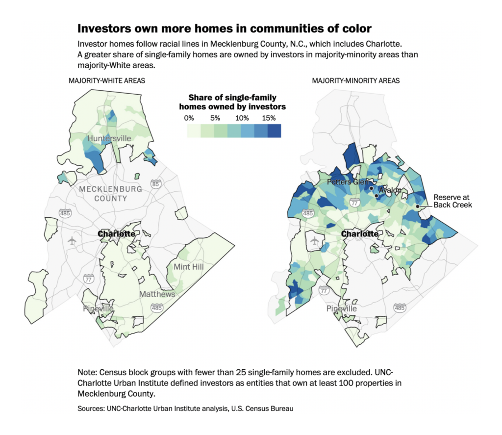
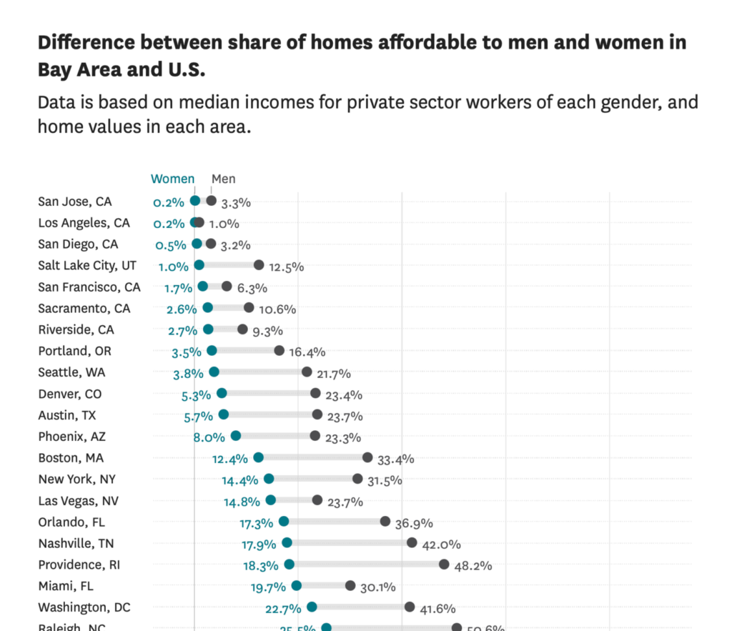
Housing got the spotlight this week, with maps of architectural history in Milwaukee and corporate landlords in Charlotte, and a chart on gender inequality in San Francisco:

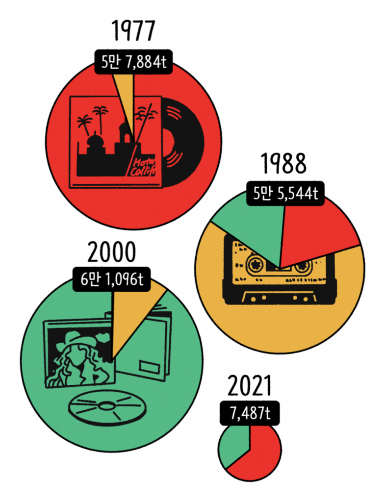
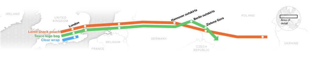
These charts looked at consumer waste from two unusual perspectives — music storage formats and recycled snack bags:
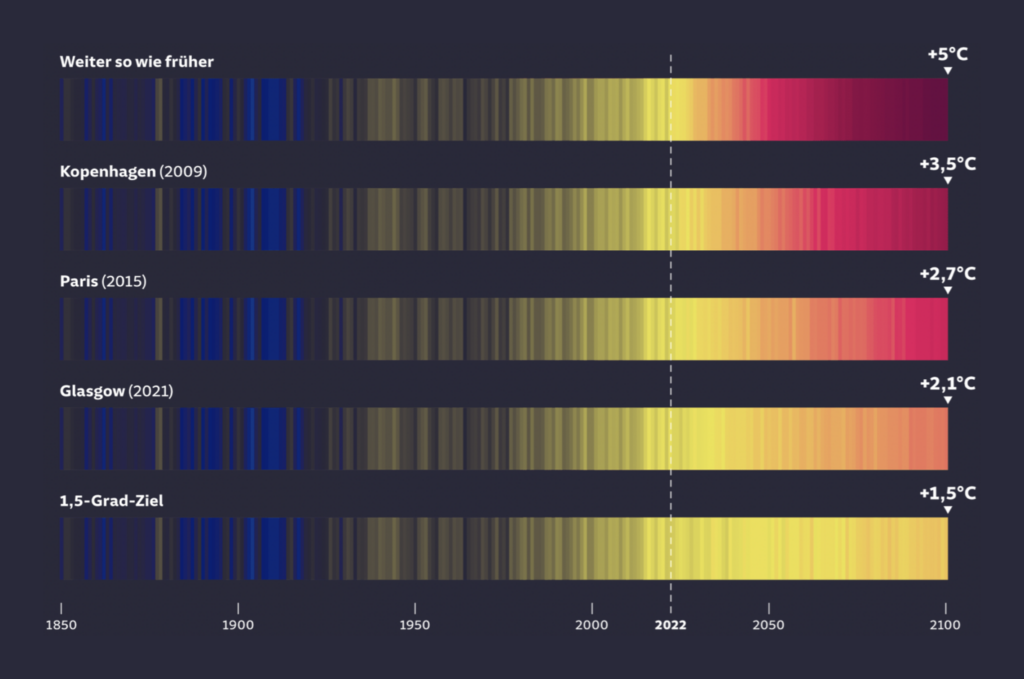
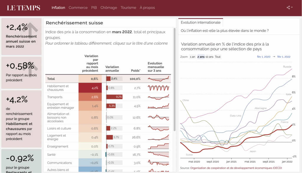
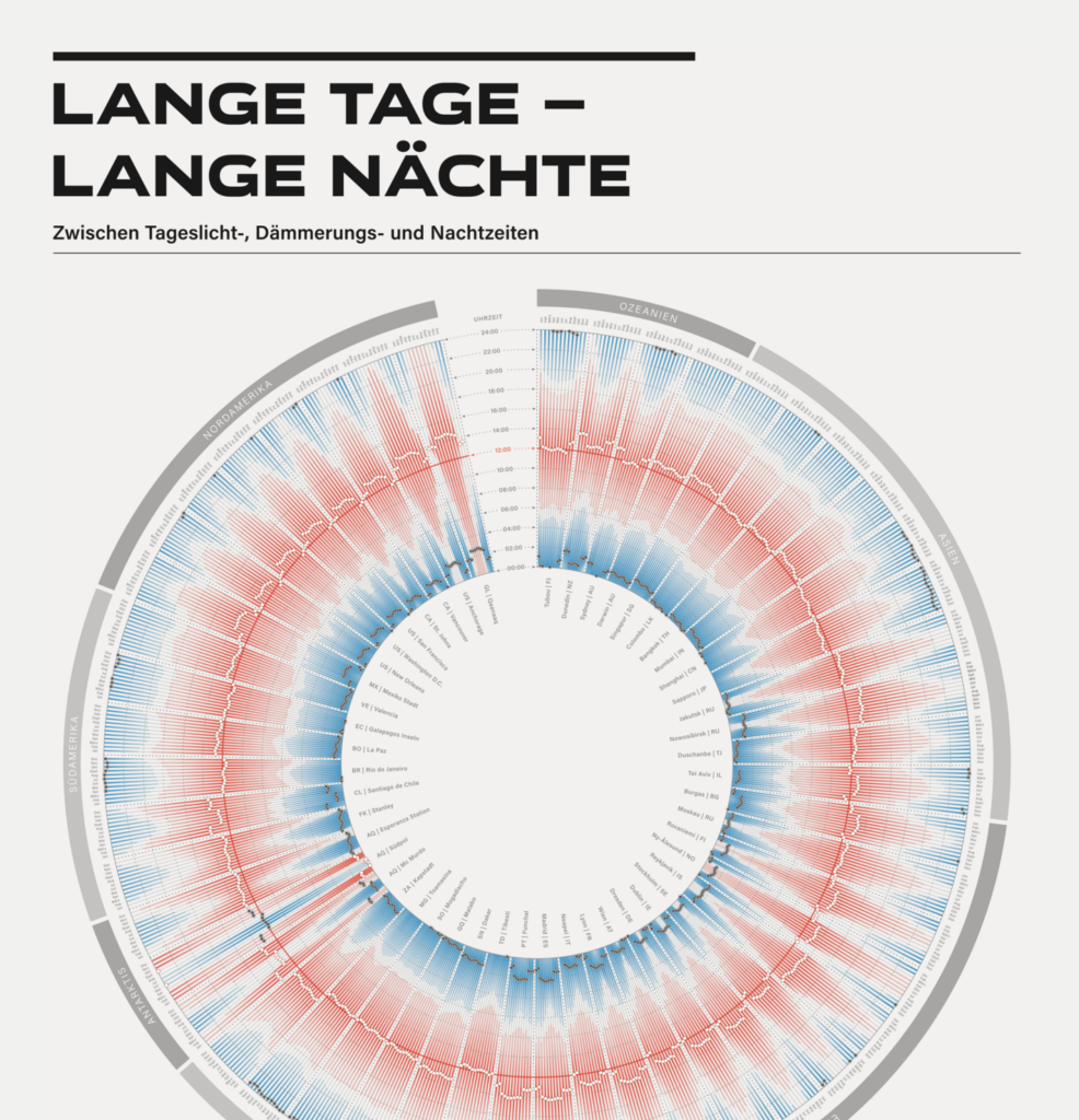
And typical energy and climate topics got some attention as well:

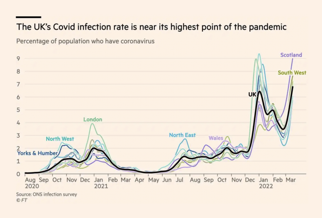
COVID rates are nearing an all-time high in the U.K. — and fully vaccinated people in Switzerland now have a case rate as high as the unvaccinated:

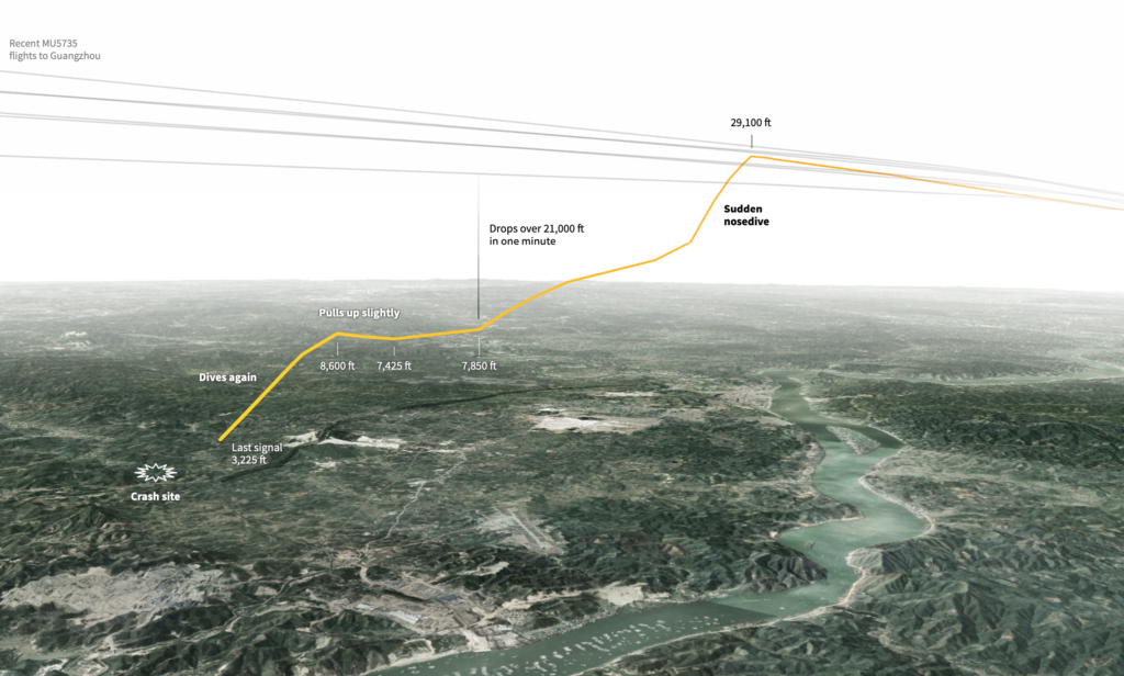
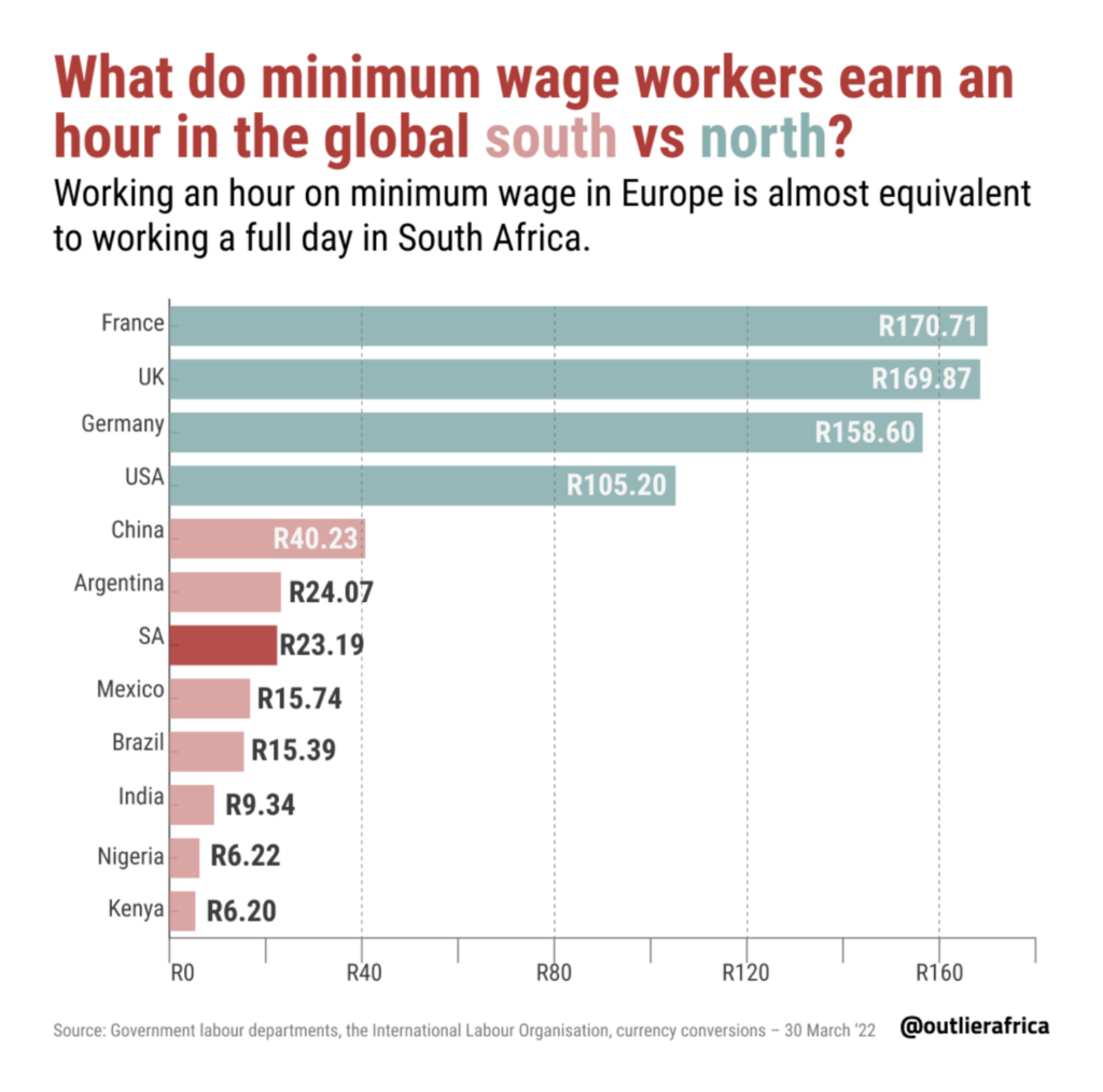
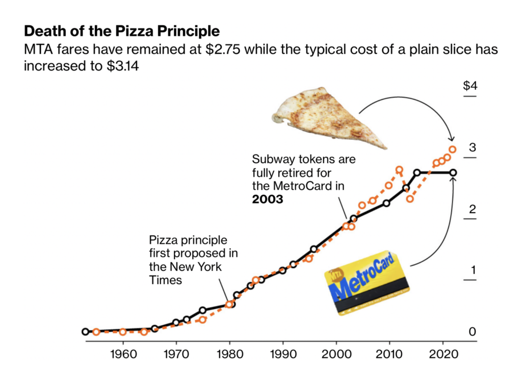
Other maps and charts looked at everything from a plane crash in China to minimum wage in the Global South to the cost of a slice of pizza in New York:
What else we found interesting


The Data Visualization Society has launched a calendar for events in data visualization.
Applications are open for…
- The Stern Bryan Fellowship for British journalists at the Washington Post
- Two graphics assignment editors and a graphics reporter at the Washington Post
- A design intern at Kontinentalist
Help us make this dispatch better! We’d love to hear which newsletters, blogs, or social media accounts we need to follow to learn about interesting projects, especially from less-covered parts of the world (Asia, South America, Africa). Write us at hello@datawrapper.de or leave a comment below.


Comments