We want to enable everyone to create beautiful charts, maps, and tables. New to data visualization? Or do you have specific questions about us? You'll find all the answers here.
The best of last week’s big and small data visualizations
Vivien Serve
Welcome back to the 137th edition of Data Vis Dispatch! Every week, we’ll be publishing a collection of the best small and large data visualizations we find, especially from news organizations — to celebrate data journalism, data visualization, simple charts, elaborate maps, and their creators.
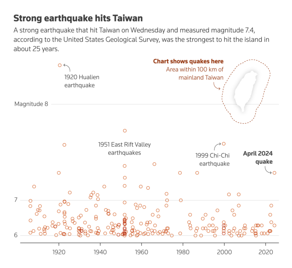
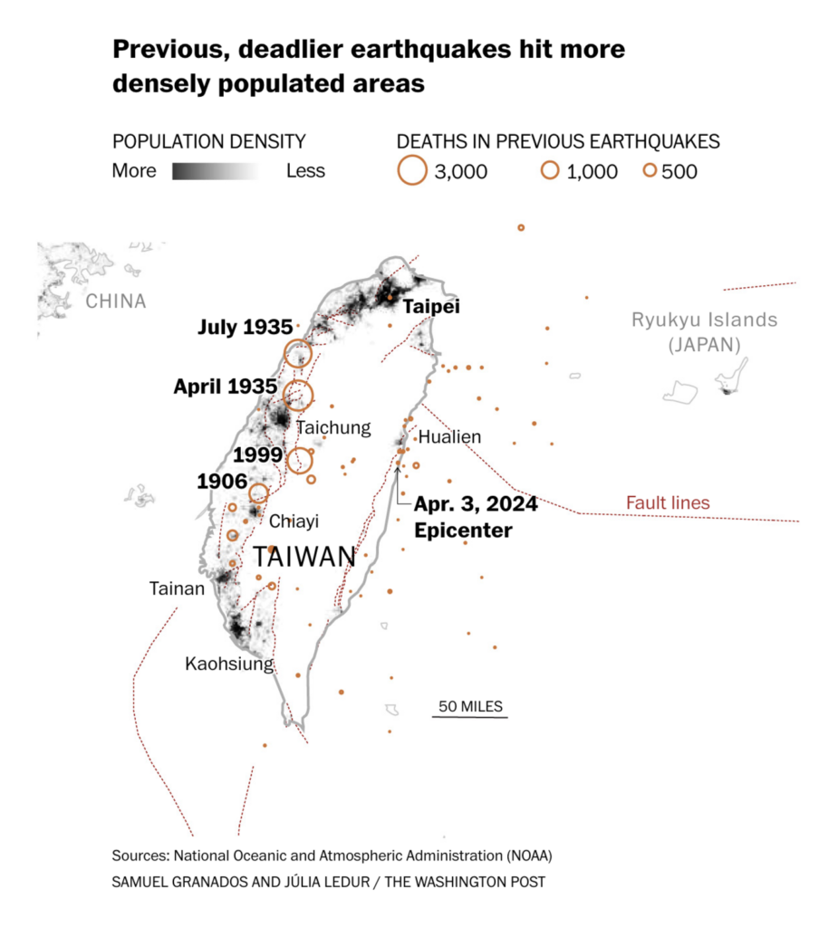
Recurring topics this week include the earthquake in Taiwan, Canada, and the start of the #30DayChartChallenge.
It’s April, so the #30DayChartChallenge has begun! Here are some of our favorite pieces from this week:
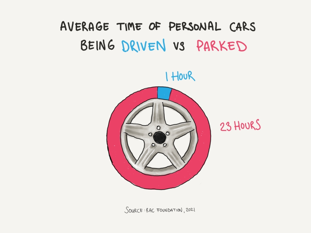
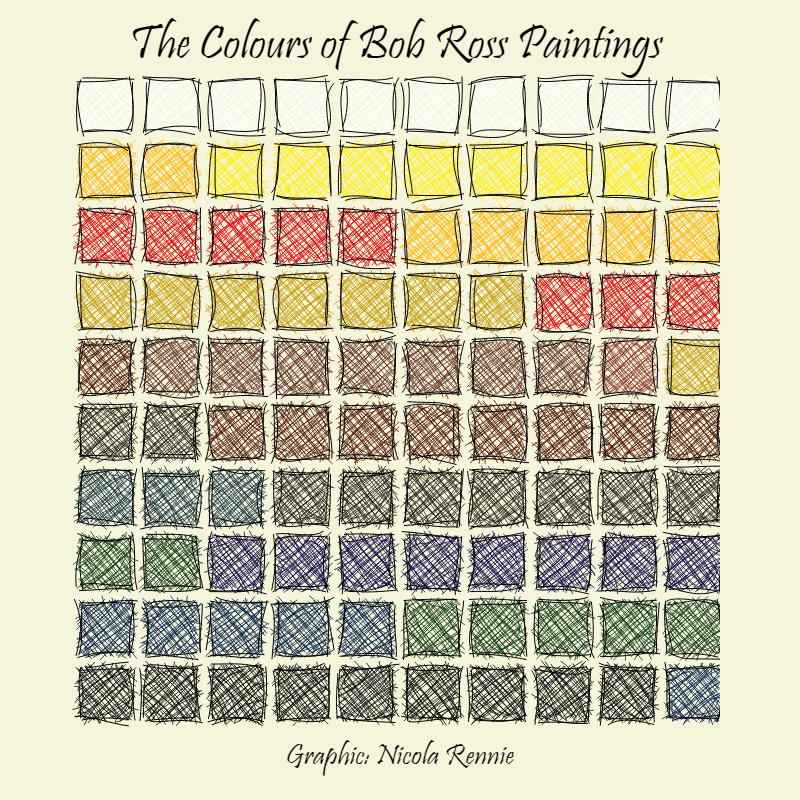
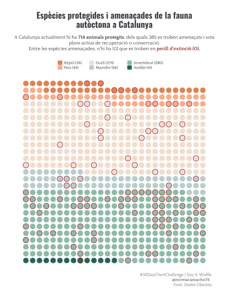
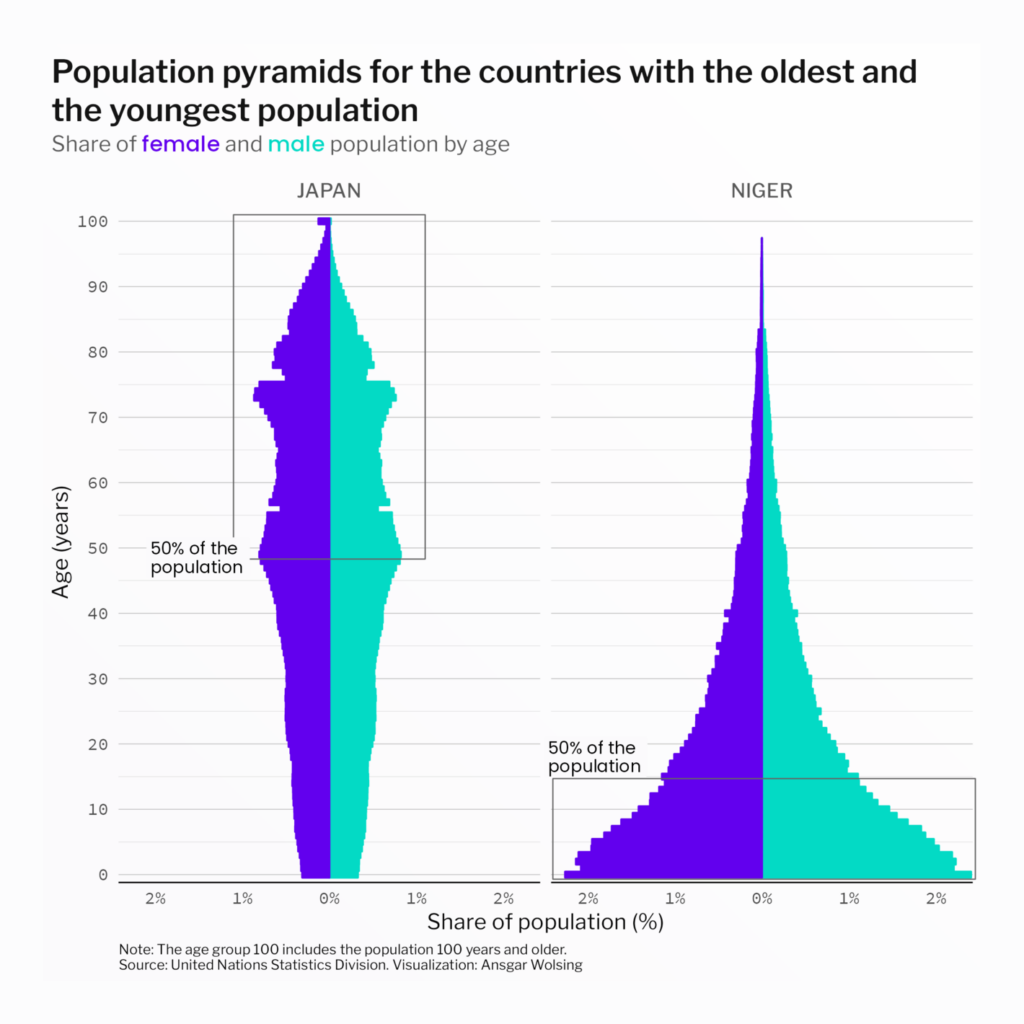
Lisa Hornung: “Another doodle for #30daychartchallenge Day3 – Makeover. The average car or van in England is driven just 4% of the time – or 1 of 24 hours. Original chart + stat comes from a RAC Foundation report called ‘Standing still,'” April 7 (Mastodon)Nicola Rennie: “For the “Waffle” prompt on Day 4 of the #30DayChartChallenge, I revisited a data set on Bob Ross painting colours – and made a waffle chart with a hand-drawn effect using {roughsf}!” April 4 (Mastodon)Mireira: “#30DayChartChallenge #Day4: Waffle Espècies protegides i amenaçades de la fauna autòctona a #Catalunya,” April 4 (Tweet)Ansgar Wolsing: “Population pyramids for the country with the oldest (Japan) and the youngest population (Niger ). In Japan, half of the population is 49 years and older, while half of the population in Niger is 15 years or younger. #30DayChartChallenge | #Day5 | Diverging #rstats,” April 5 (Tweet)
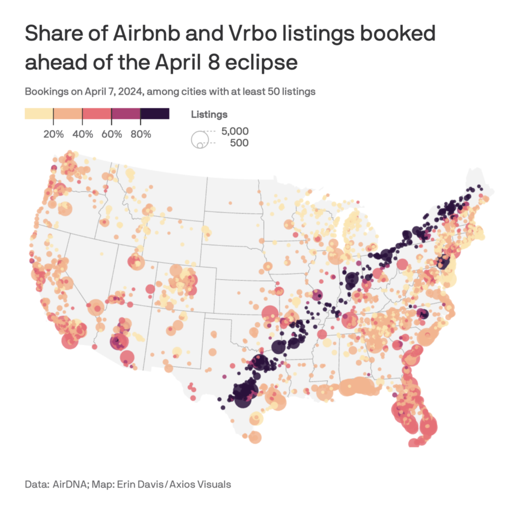
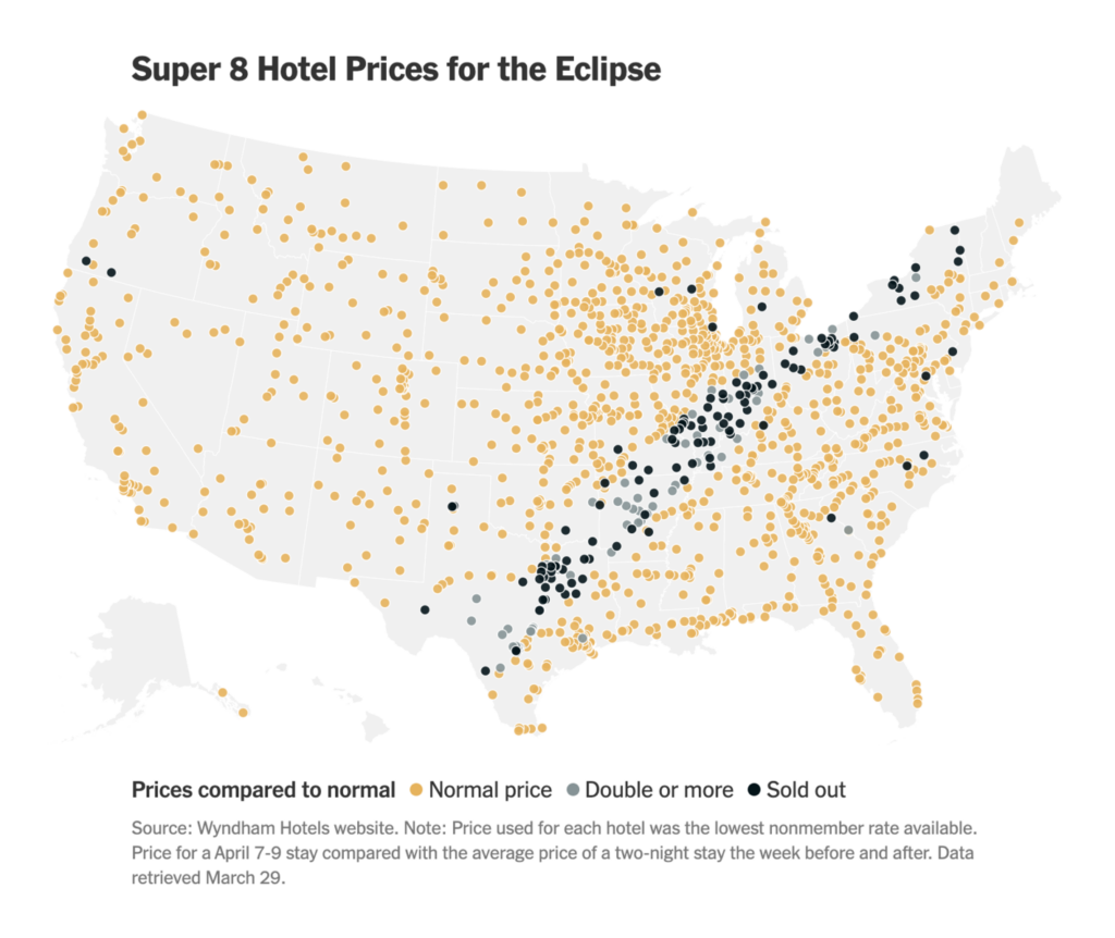
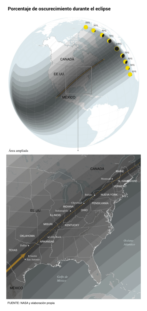
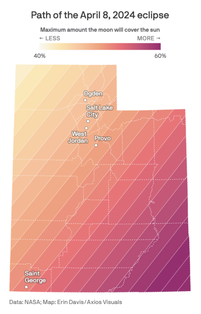
The other special event of the week: Monday’s solar eclipse over North America. Many people traveled to the path of totality:
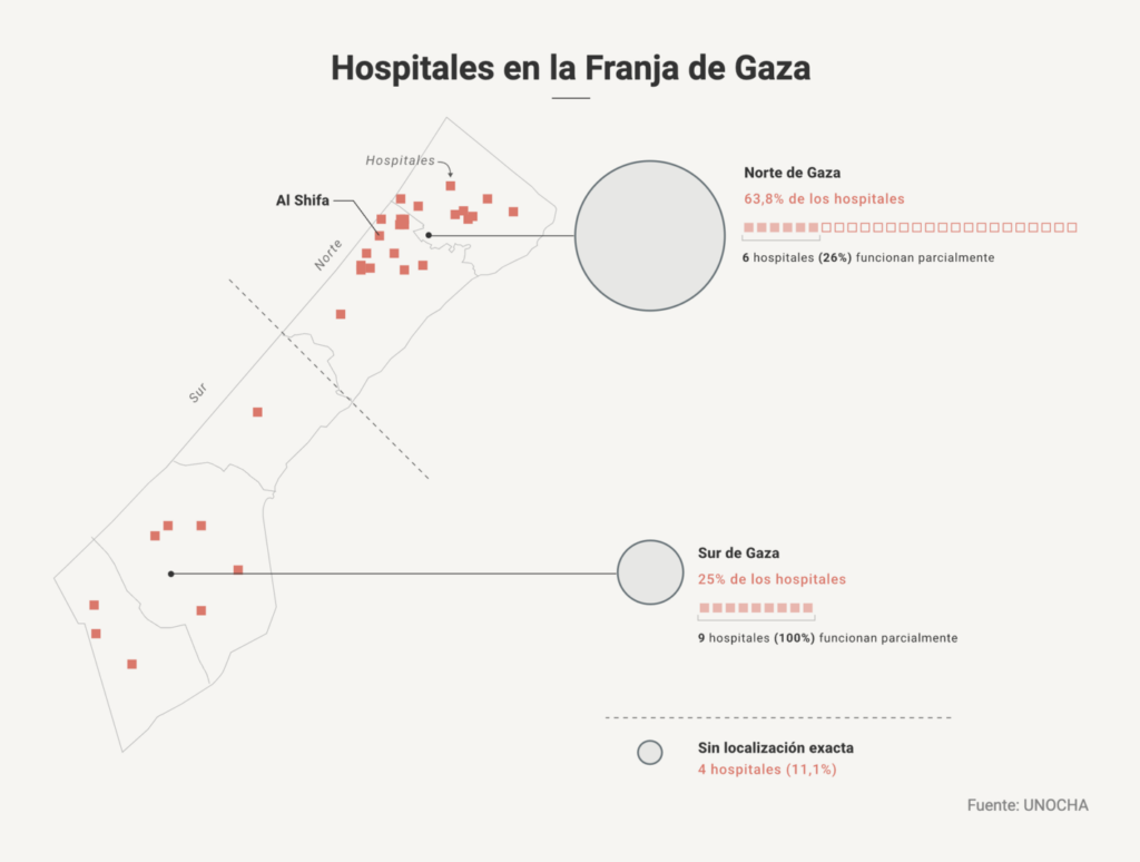
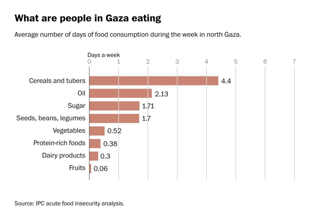
And we continue with news from Gaza, where Israeli attacks have damaged nearly 100 hospitals and hundreds of thousands are suffering from starvation-level hunger:
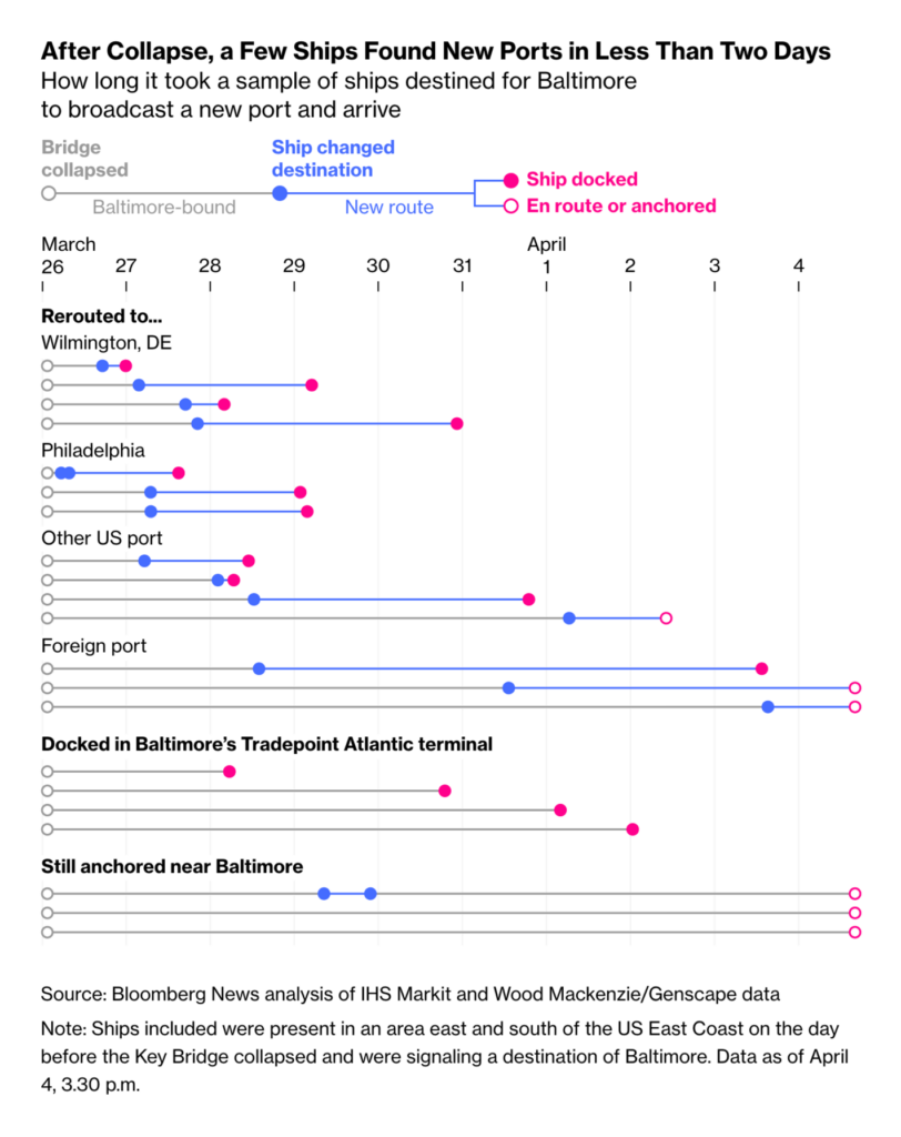
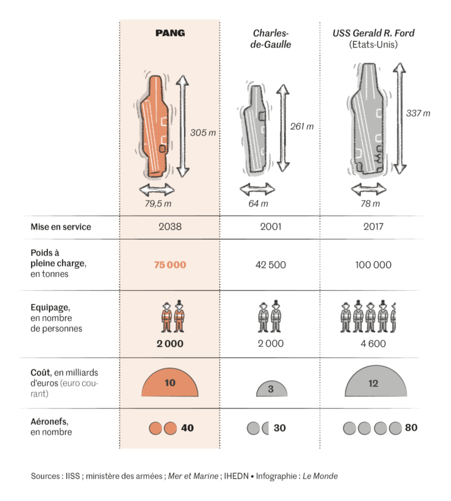
After last week’s collision in Baltimore, ships were still very much in the news, from the search for alternative ports to the construction of giant aircraft carriers:
Help us make this dispatch better! We’d love to hear which newsletters, blogs, or social media accounts we need to follow to learn about interesting projects, especially from less-covered parts of the world (Asia, South America, Africa). Write us at hello@datawrapper.de or leave a comment below.
(she/her) is a working student on Datawrapper’s Communications team. She creates the Data Vis Dispatch to keep data visualization enthusiasts up to date on exciting new projects. When she’s not working, she studies interface design, and when she’s not studying, she’s planning a festival stage or soldering light installations. Vivien lives in Potsdam.


Comments