This article is brought to you by Datawrapper, a data visualization tool for creating charts, maps, and tables. Learn more.
Data Vis Dispatch, August 10
The best of last week’s big and small data visualizations
Welcome back to the eighth edition of Data Vis Dispatch! Every week, we’ll be publishing a collection of the best small and large data visualizations we find, especially from news organizations — to celebrate data journalism, data visualization, simple charts, elaborate maps, and their creators.
This week’s major recurring topic was the report of the Intergovernmental Panel on Climate Change, with additional focus on COVID-19 and the end of the Tokyo Olympics.
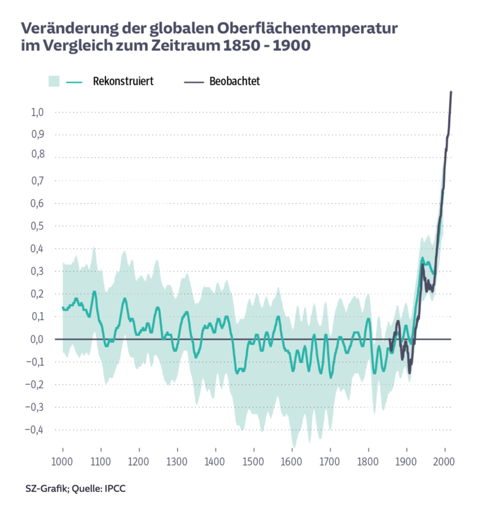
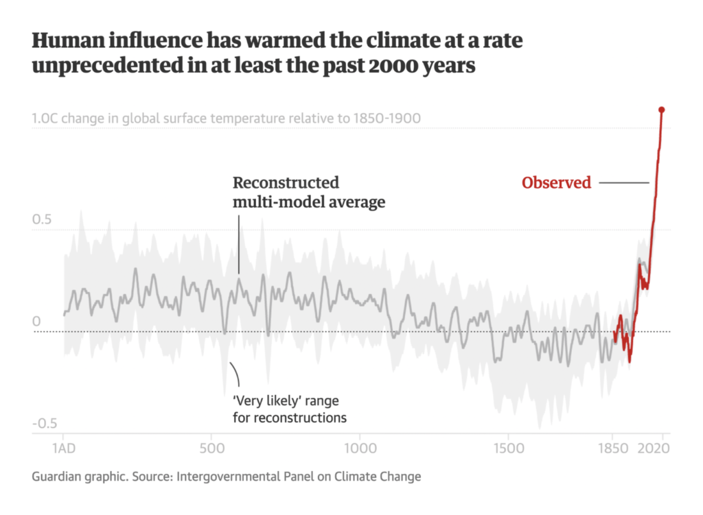
This Monday, August 9, the Intergovernmental Panel on Climate Change released their sixth assessment report on the present and future of the climate crisis. The data is stark and alarming, and journalists in the past 48 hours have shown us plenty of ways to look at it. Under human influence, Earth’s climate has already warmed by 1°C:
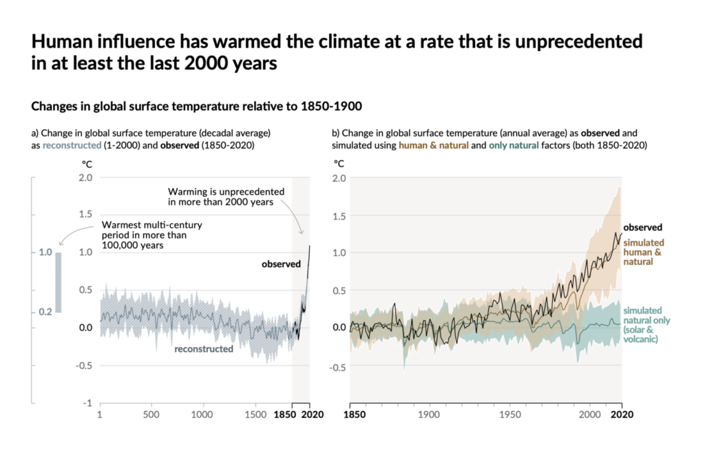
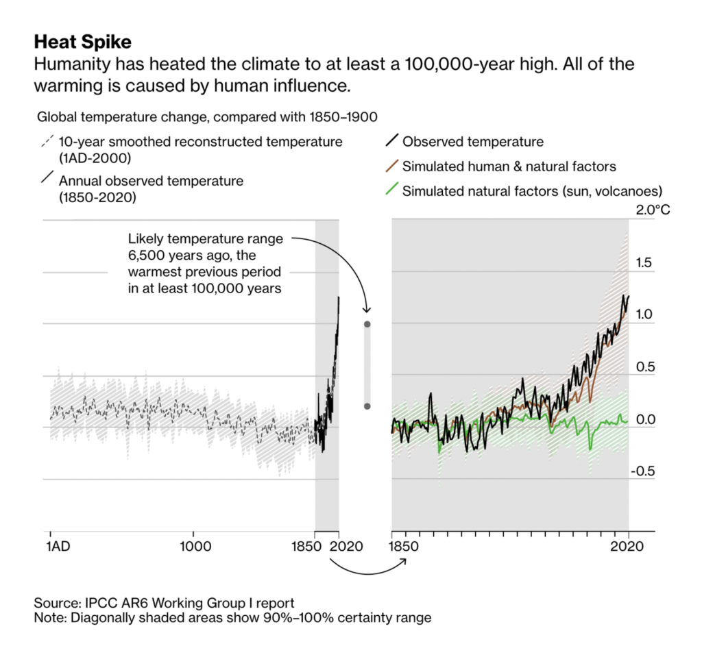
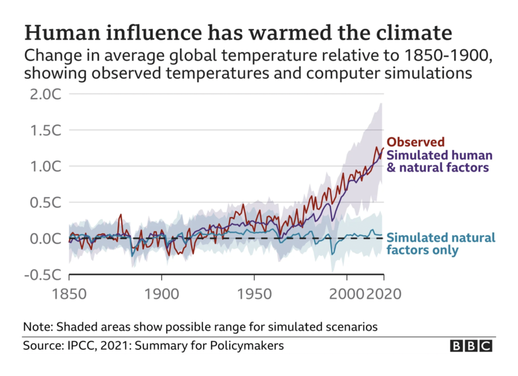
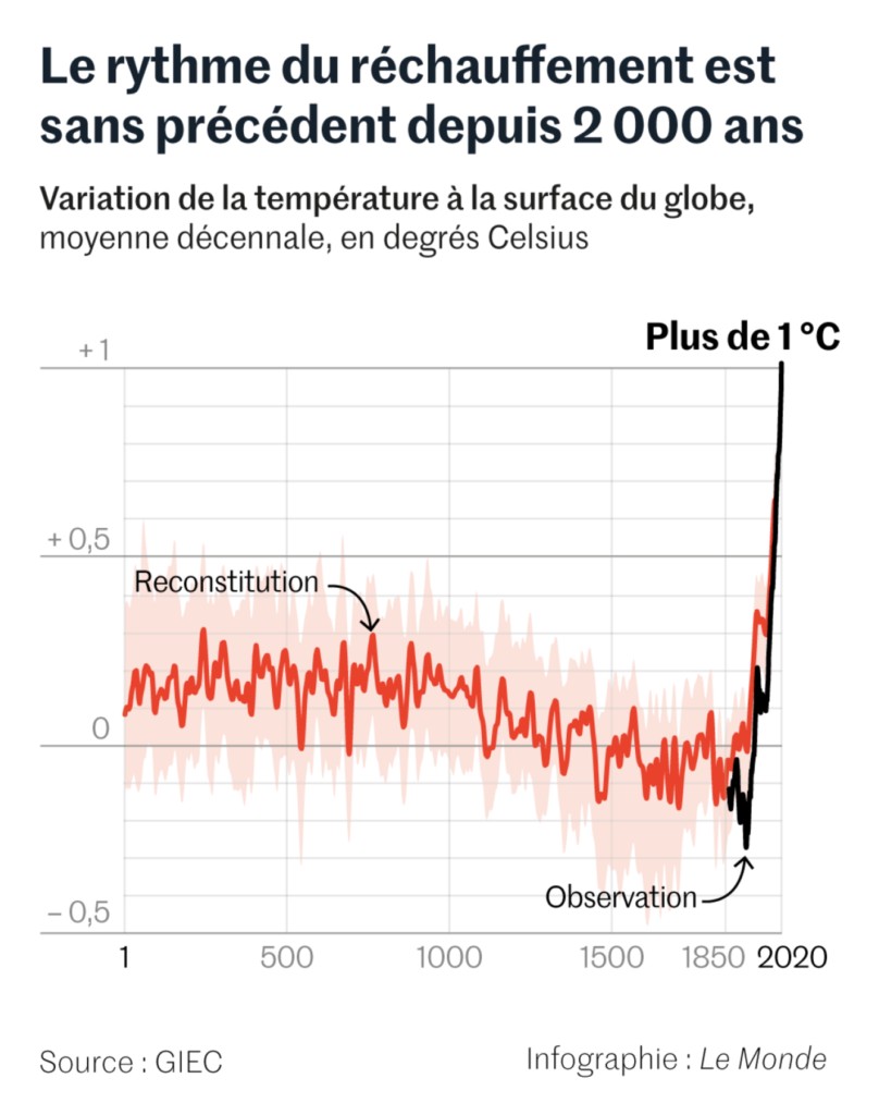
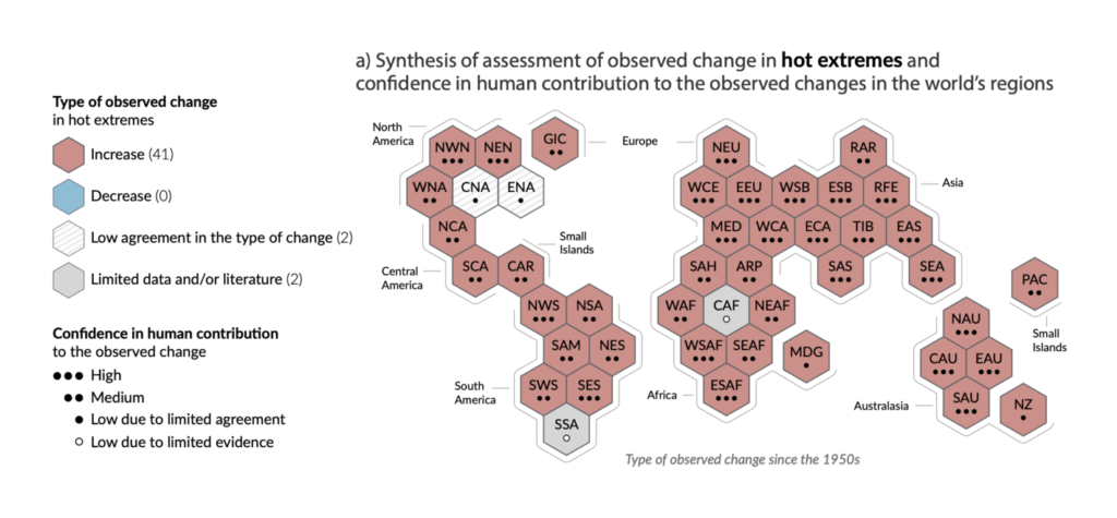
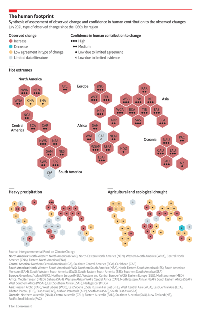
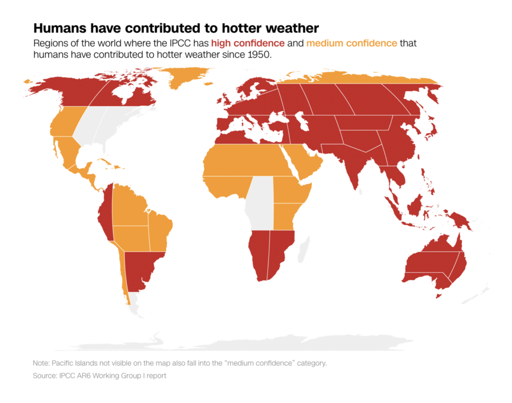
Almost every region of the world is already experiencing a human-caused increase in extreme heat:
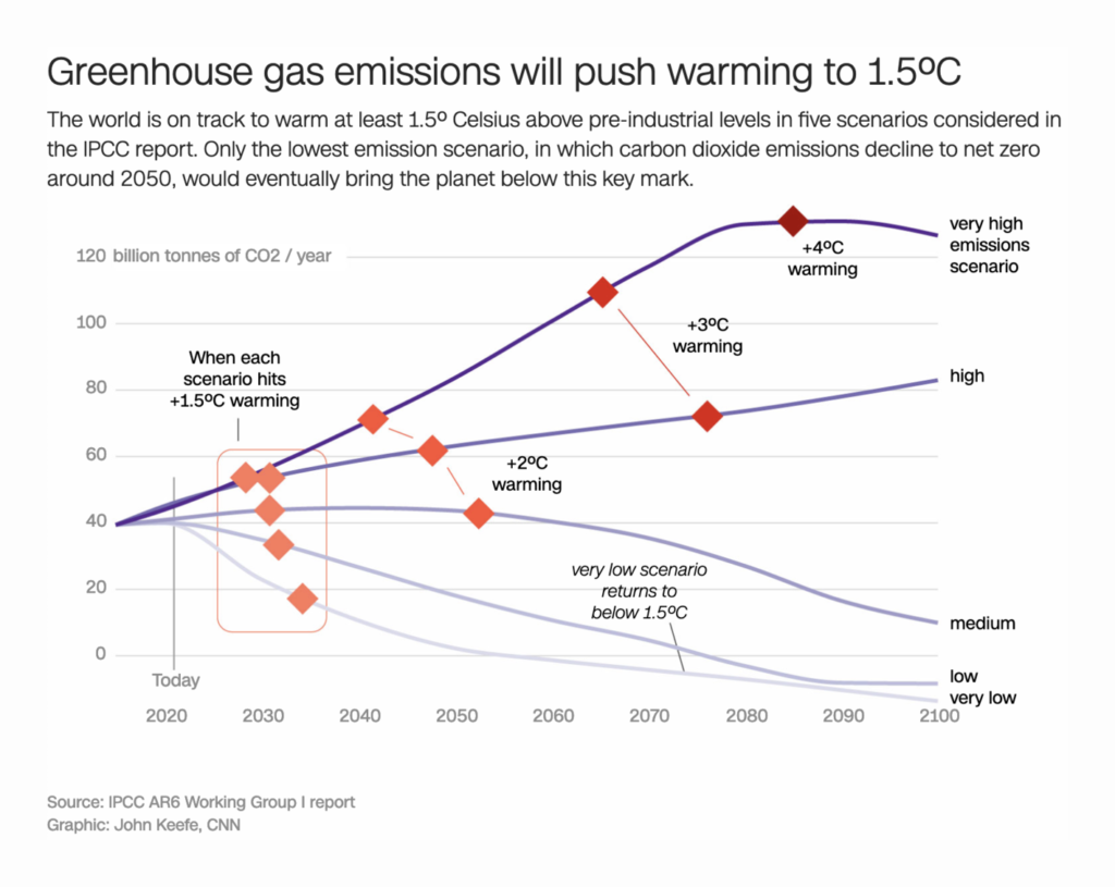
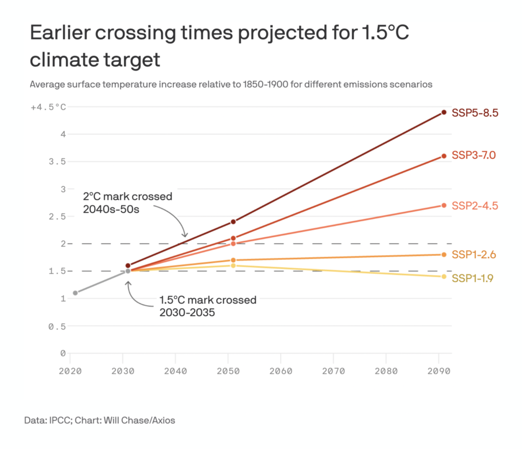
And only immediate, profound cuts in emissions will prevent a future of even more catastrophic warming:
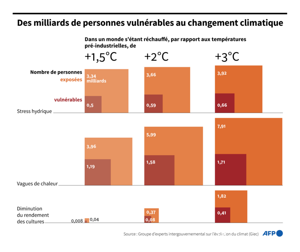
Billions of human lives, as well as the future of every ecosystem on Earth, are at stake:
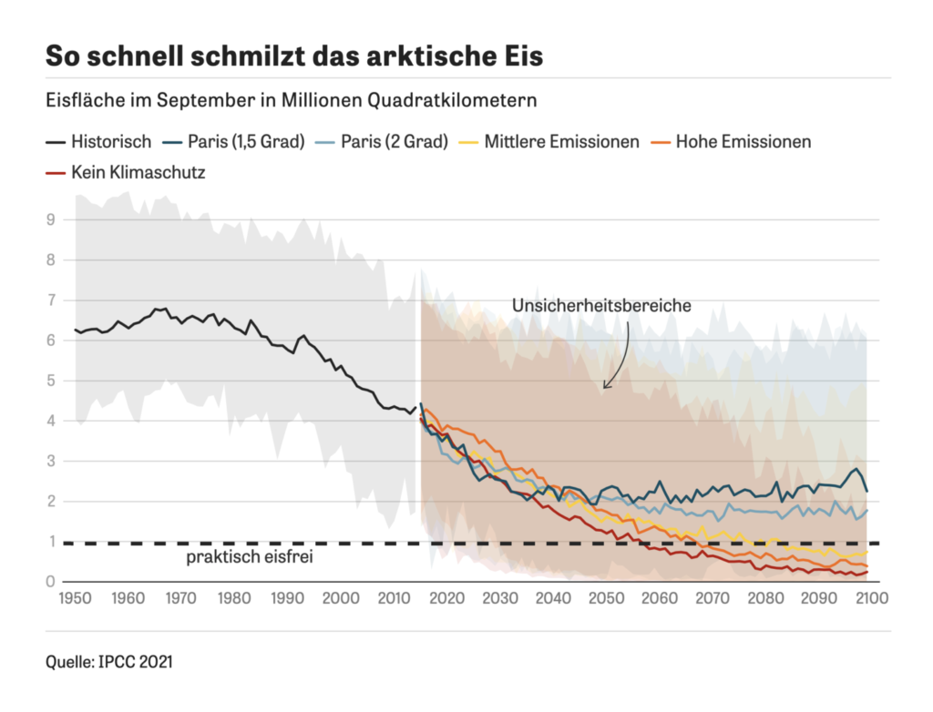
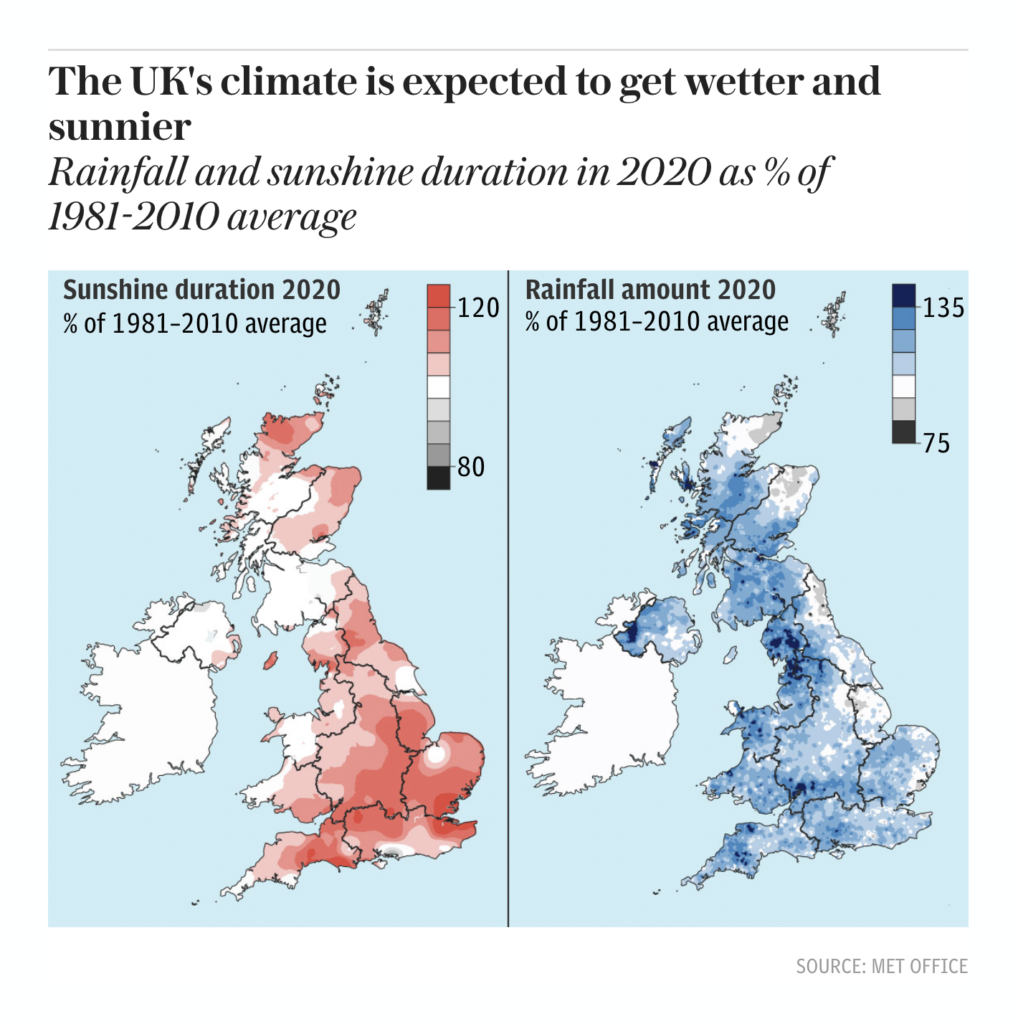
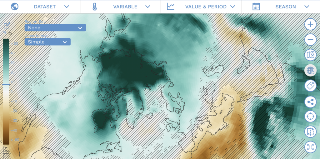
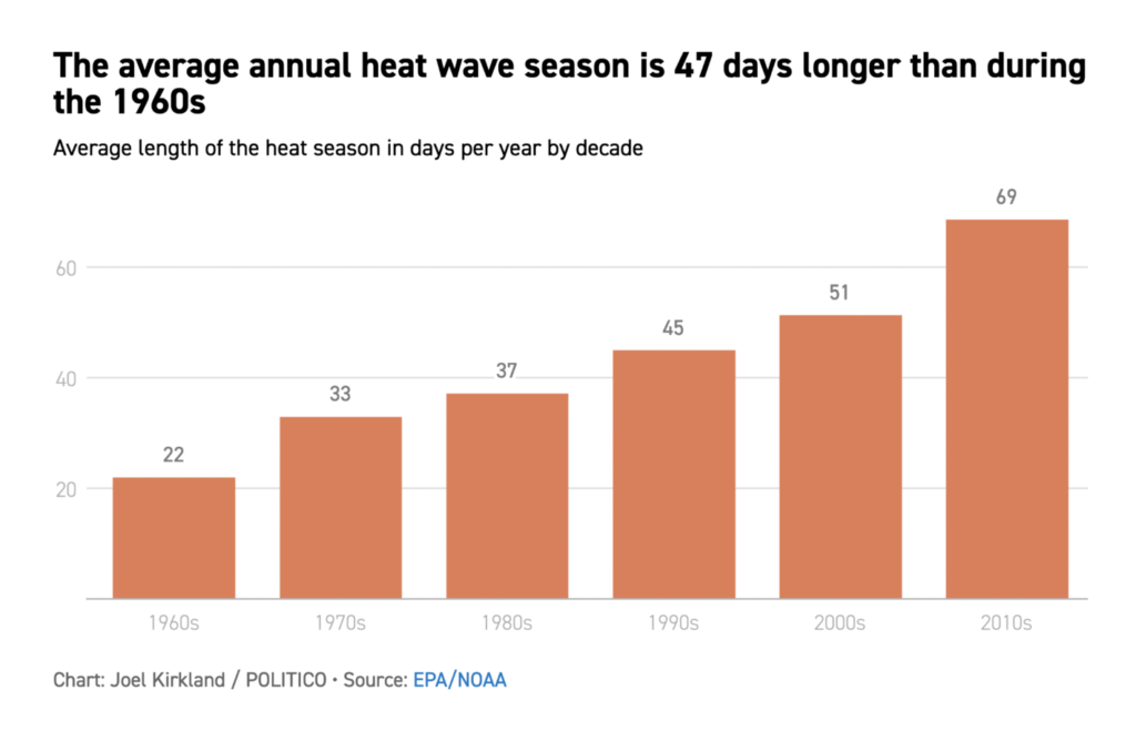
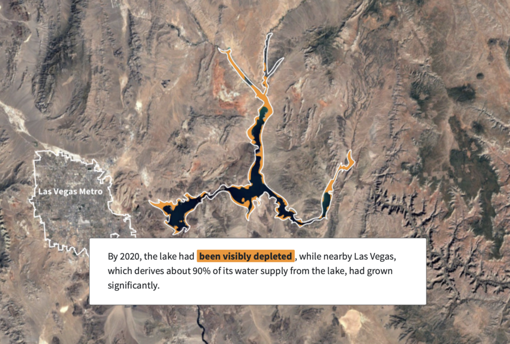
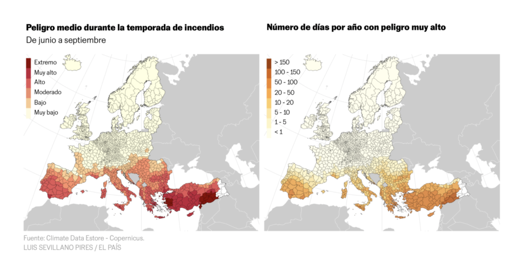
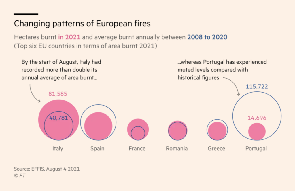
But we didn’t have to wait for the IPCC report to see the climate crisis playing out. We’re in the middle of a summer of extreme heat, drought, and wildfire:
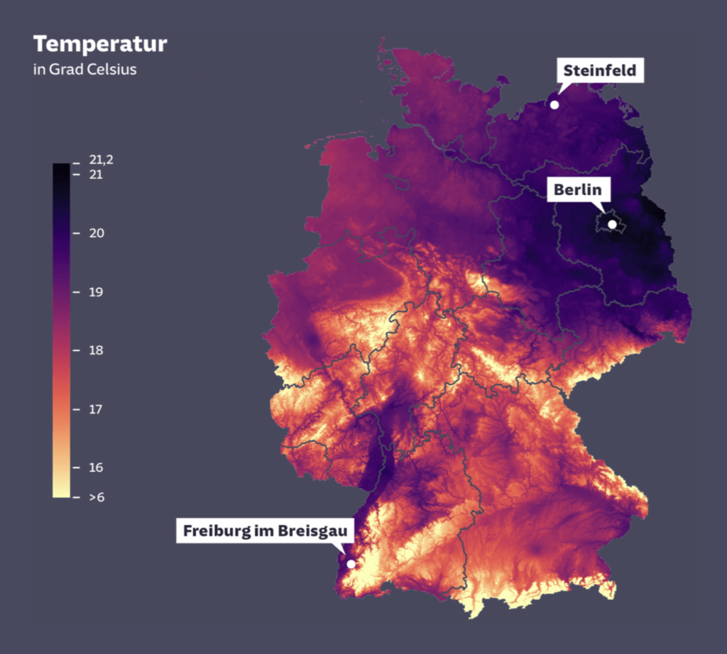
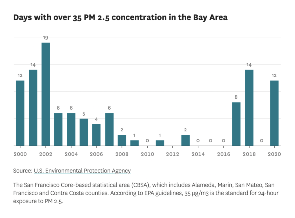
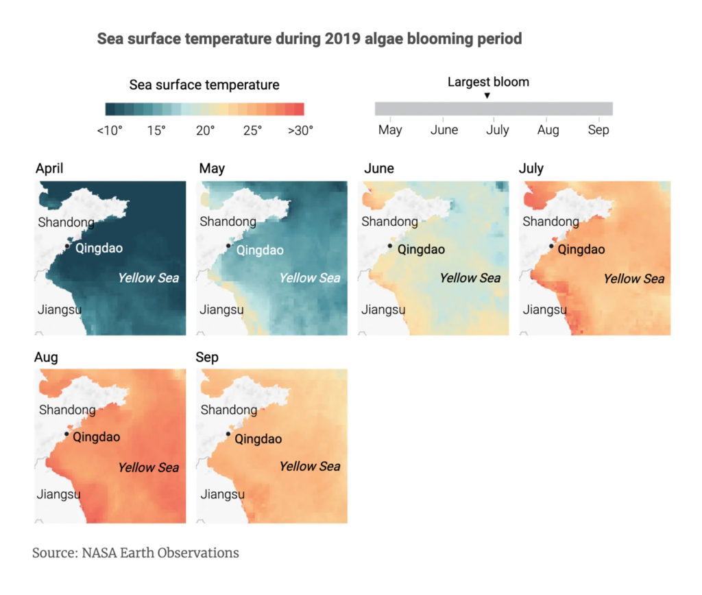
And we know that fossil-fuel emissions are the cause — and that too little has been done with that knowledge:
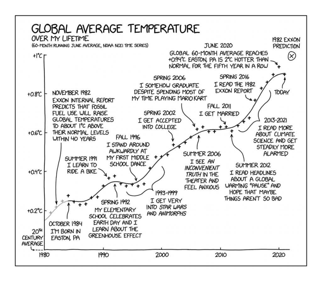
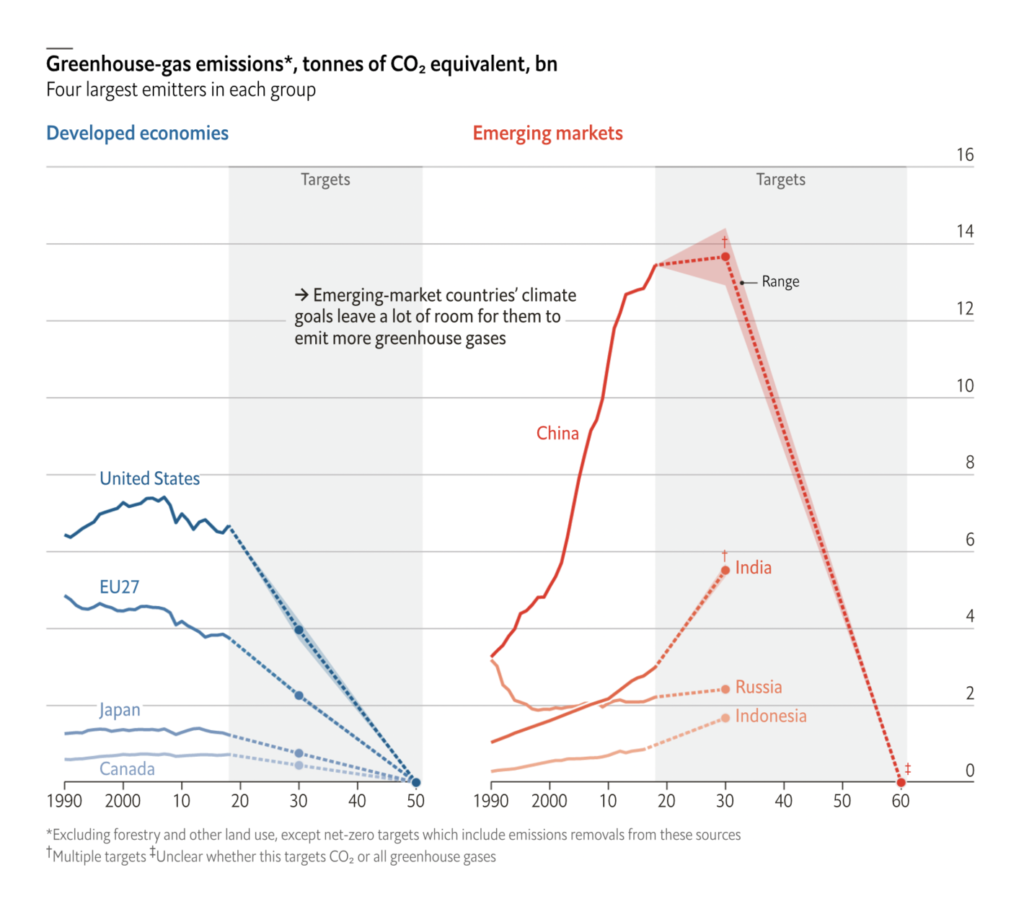
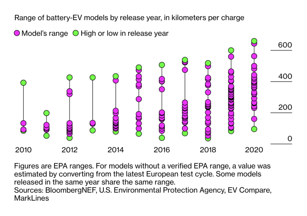
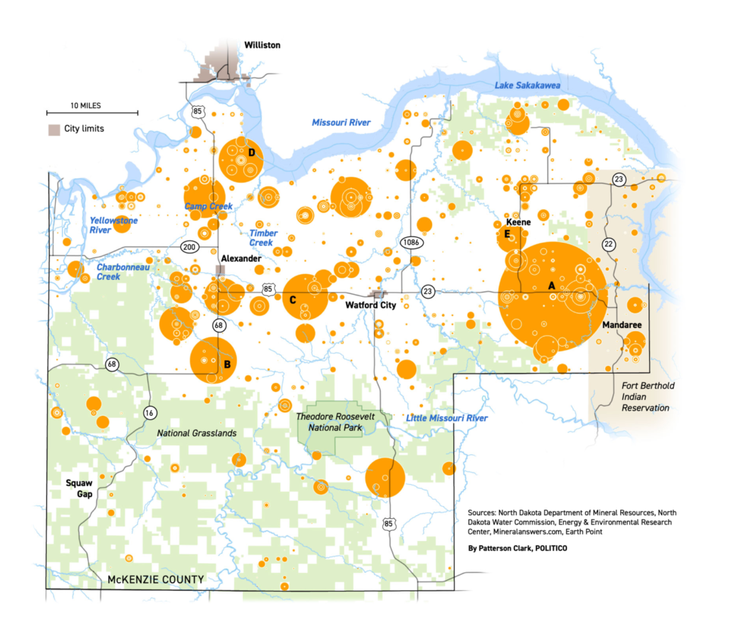
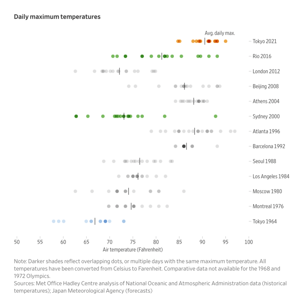
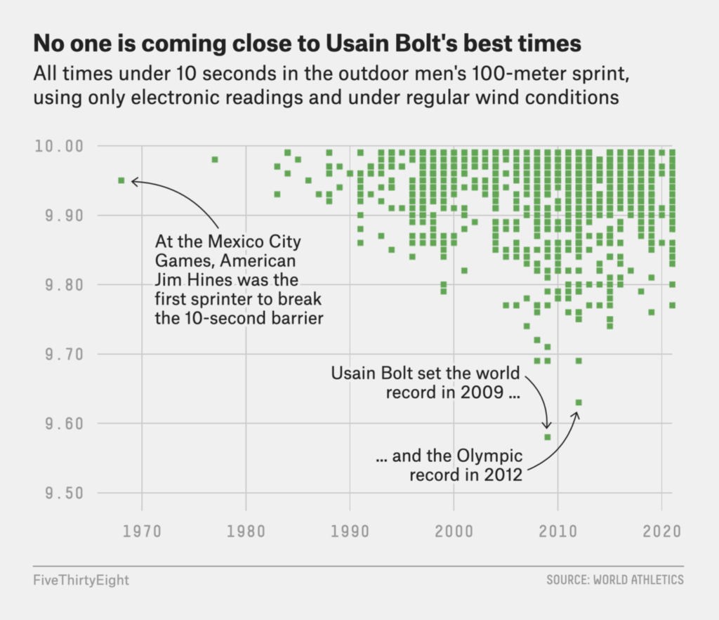
Summer heat was a challenge at the Tokyo Olympics, which finished this weekend. Records were broken (or not) and medals were counted:
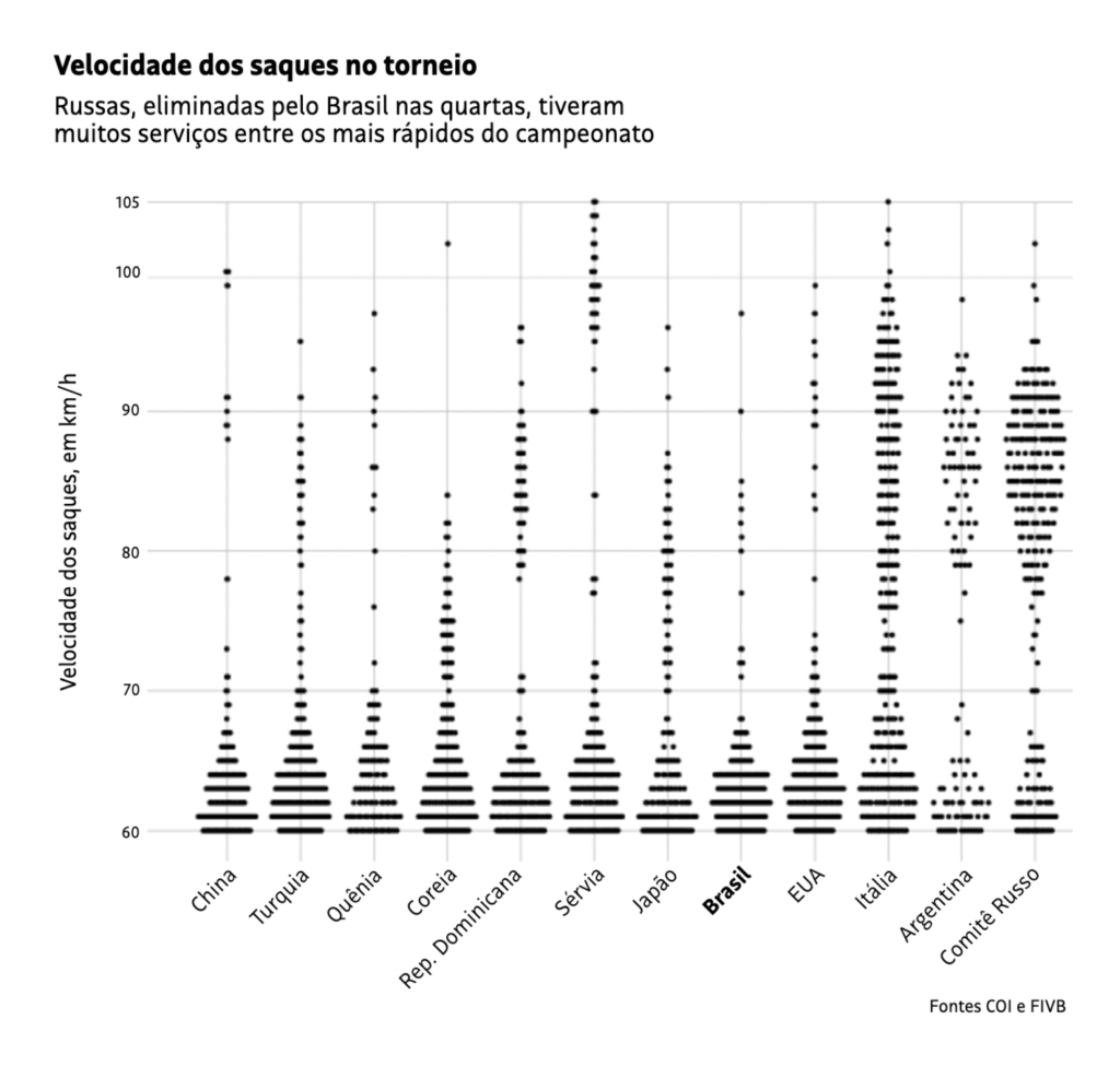
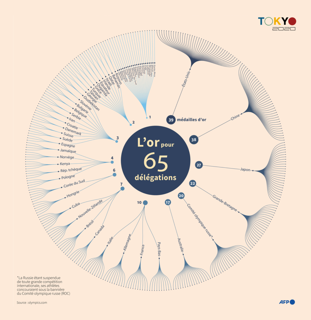
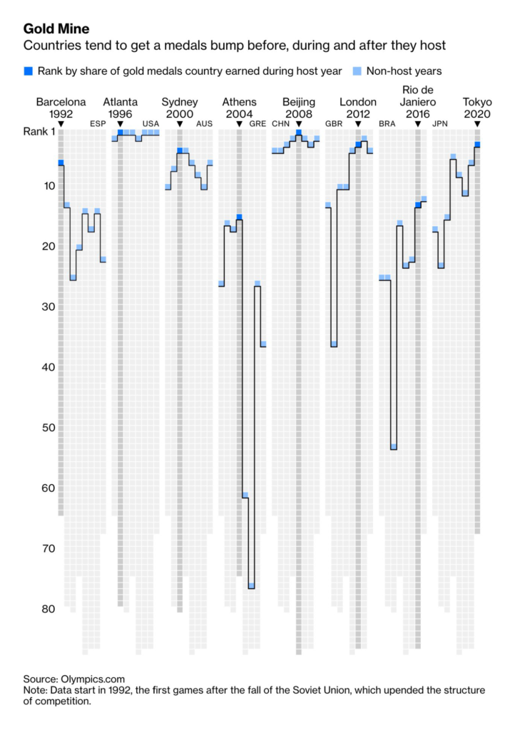
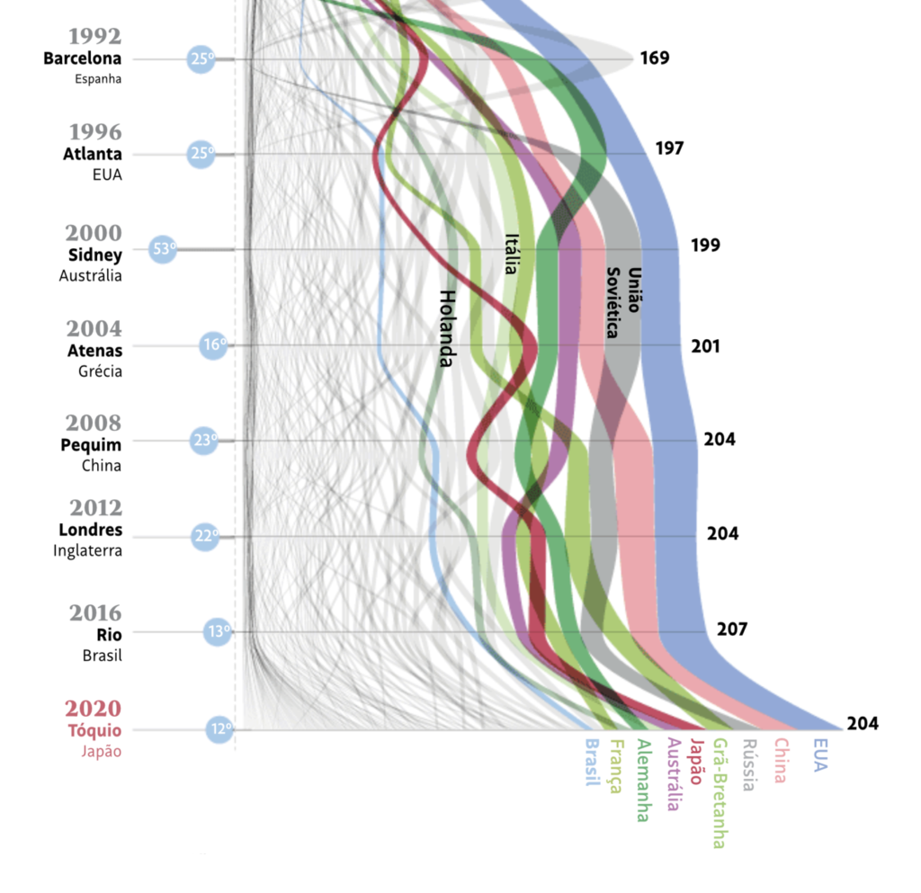
This week’s maps explored everything from race and zoning to swimming pools:
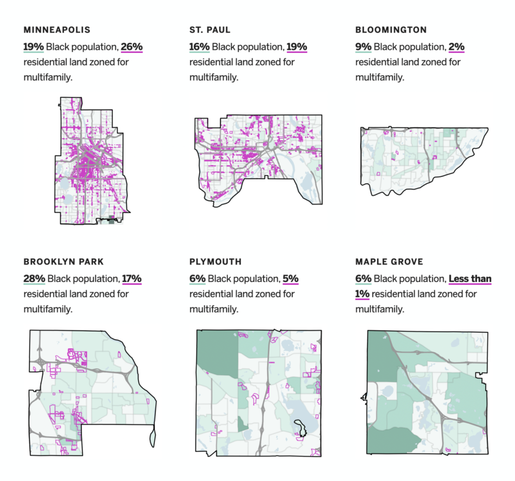
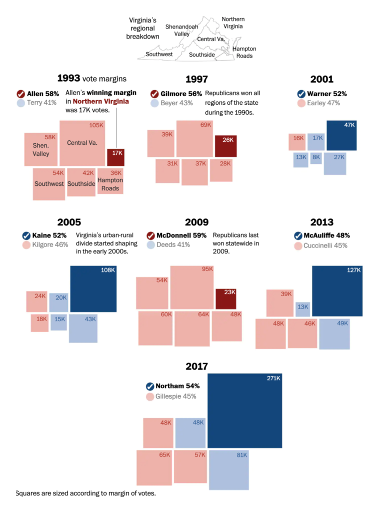
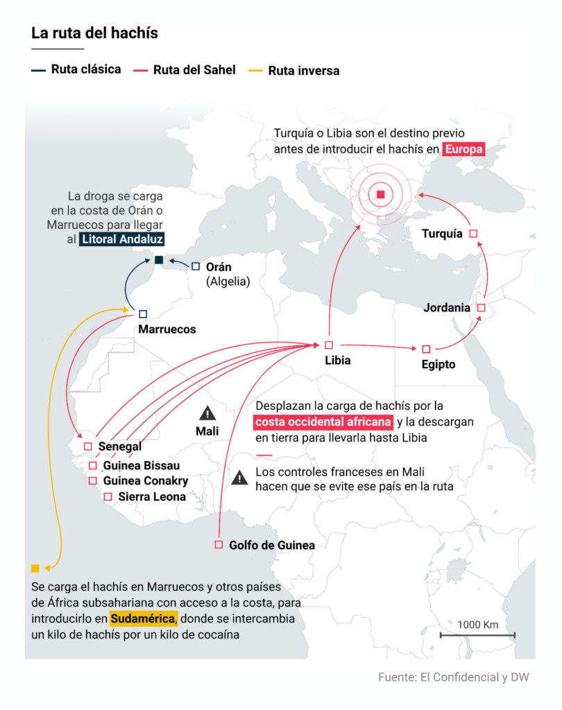
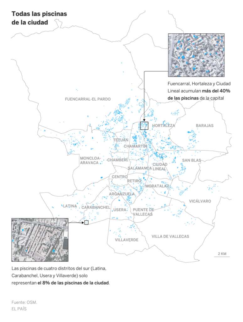
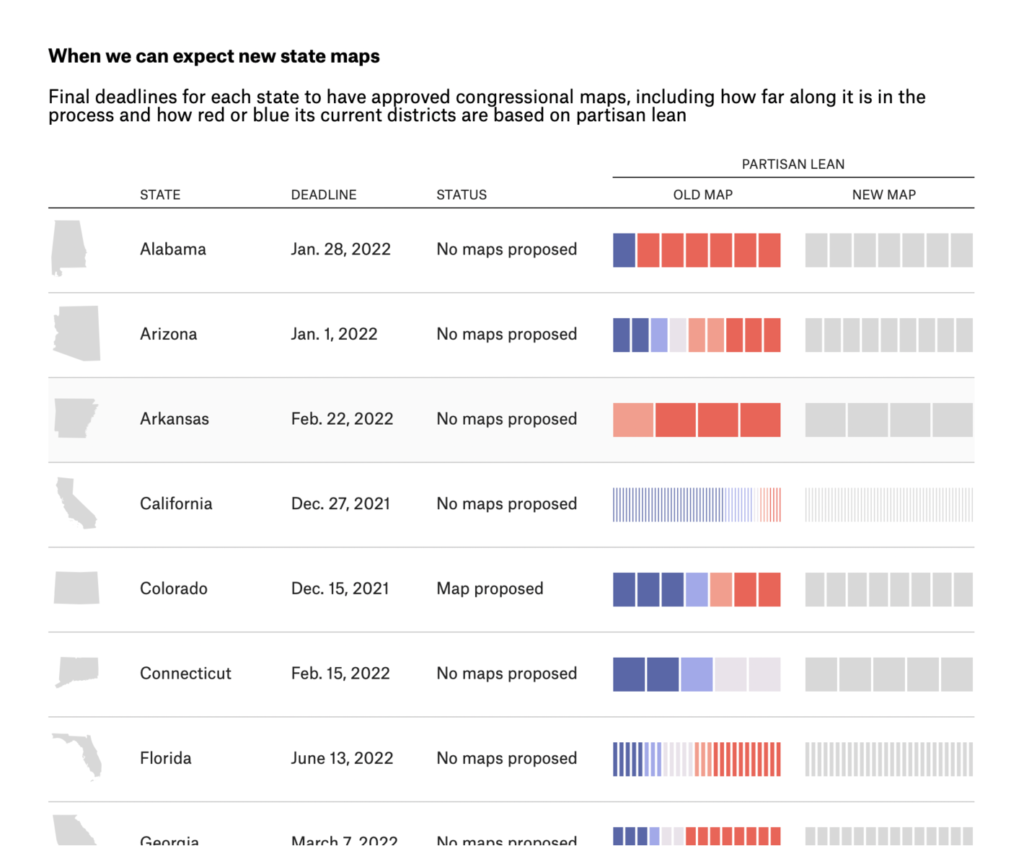
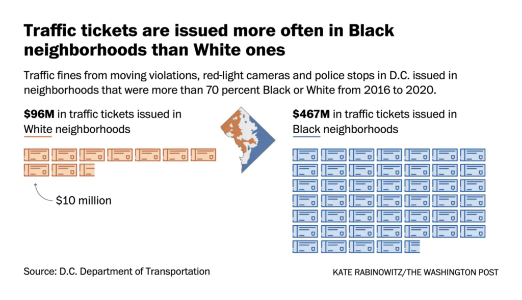
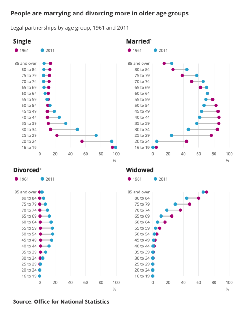
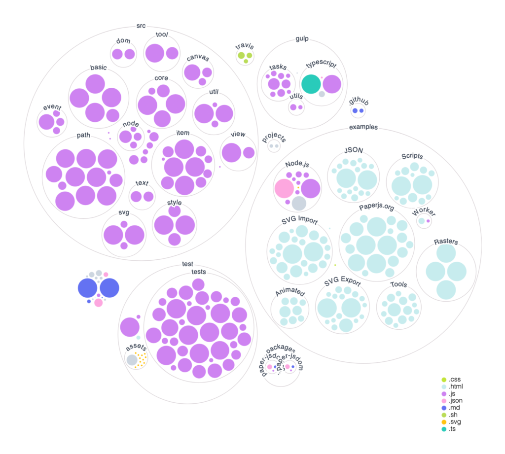
And charts took us from political redistricting to GitHub codebases:
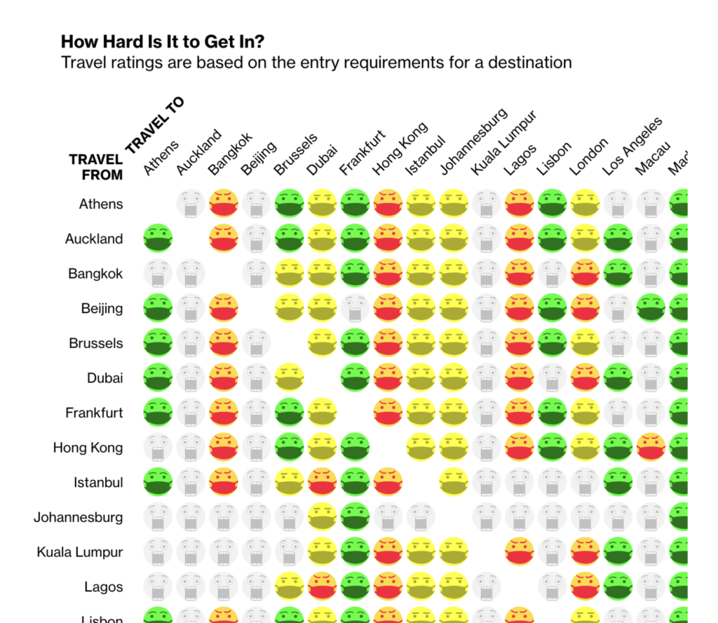
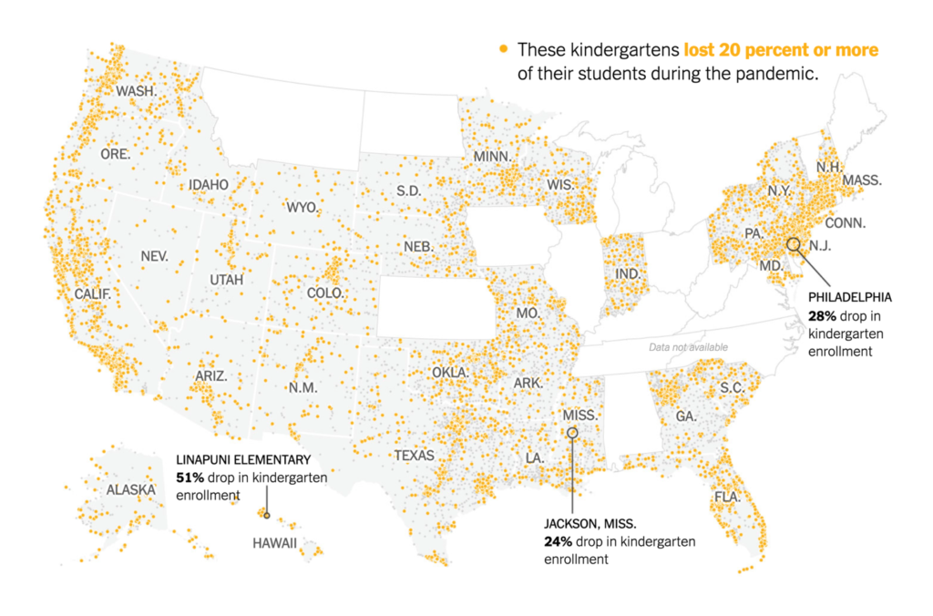
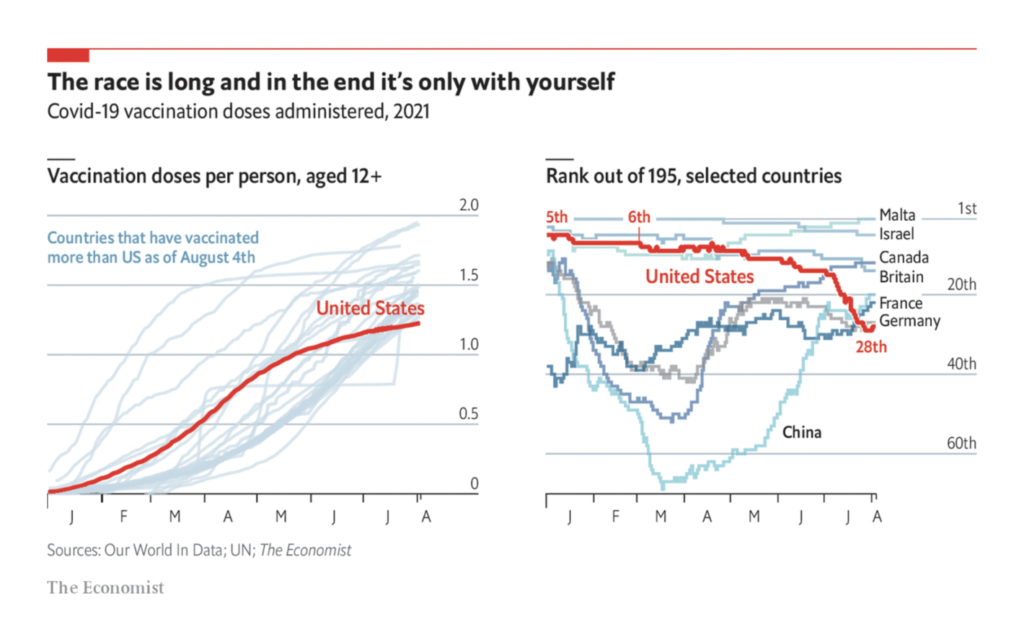
And yes, all this was happening in the midst of a pandemic. Life just still isn’t normal:
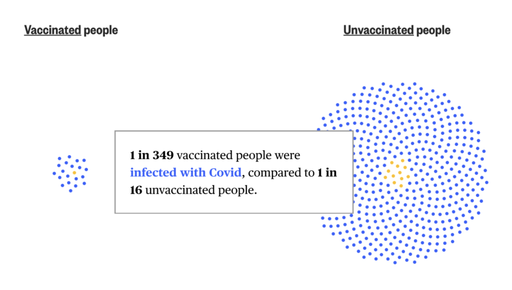
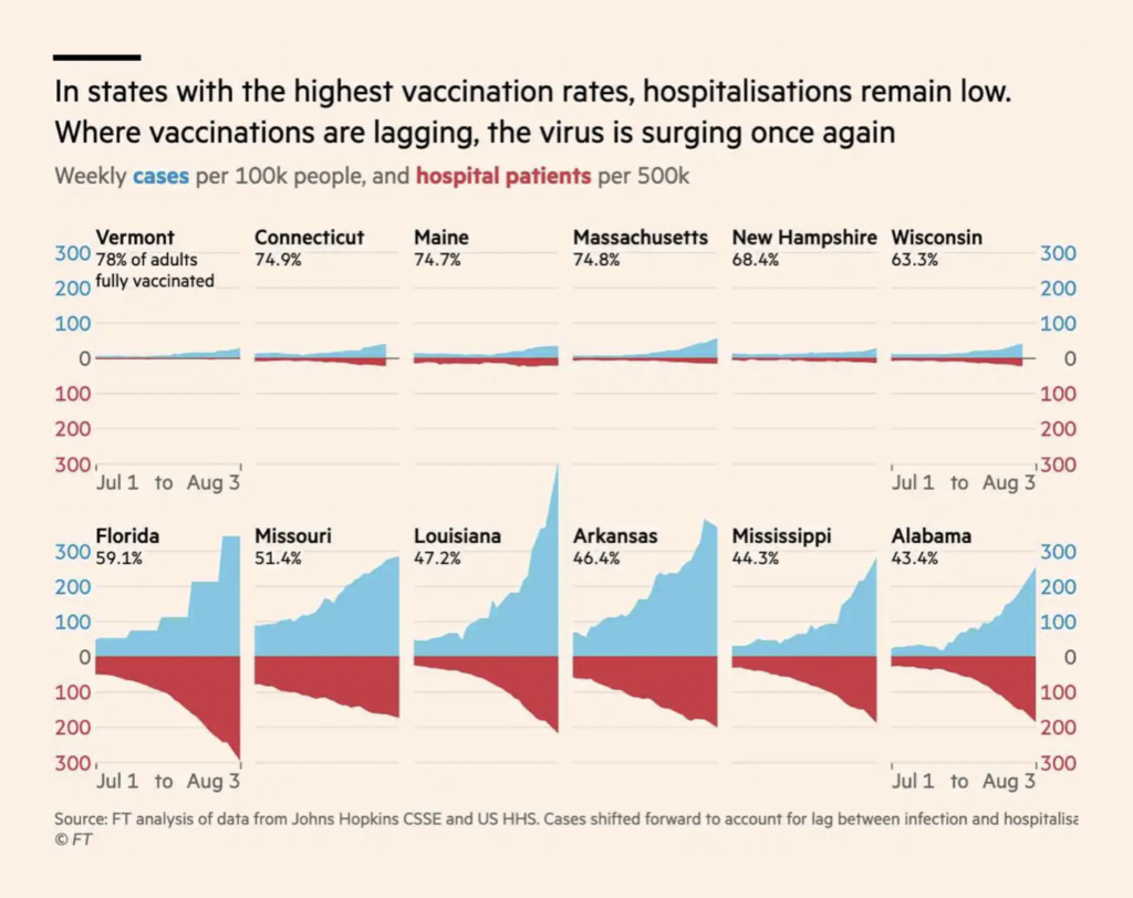
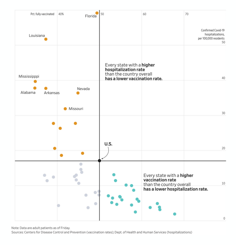
But vaccines do work if only we can distribute them:
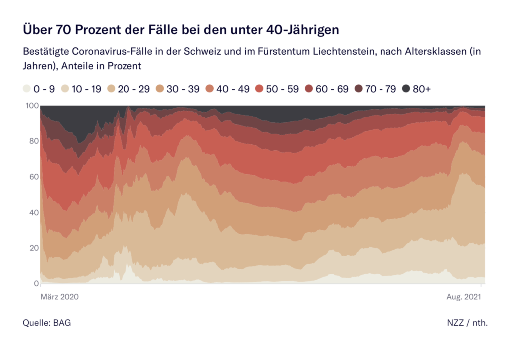
What else we found interesting

Help us make this dispatch better! We’d love to hear which newsletters, blogs, or social media accounts we need to follow to learn about interesting projects, especially from less-covered parts of the world (Asia, South America, Africa). Write us at hello@datawrapper.de or leave a comment below.


Comments