We want to enable everyone to create beautiful charts, maps, and tables. New to data visualization? Or do you have specific questions about us? You'll find all the answers here.
The best of last week’s big and small data visualizations
Lisa Charlotte Muth
Welcome back to the 106th edition of Data Vis Dispatch! Every week, we’ll be publishing a collection of the best small and large data visualizations we find, especially from news organizations — to celebrate data journalism, data visualization, simple charts, elaborate maps, and their creators.
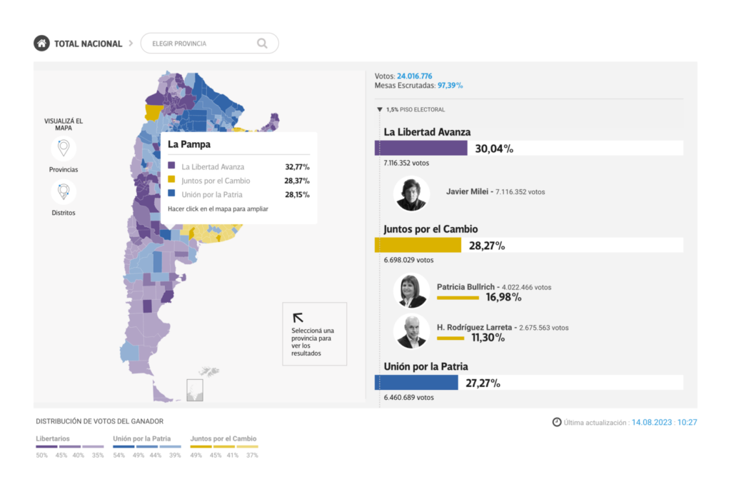
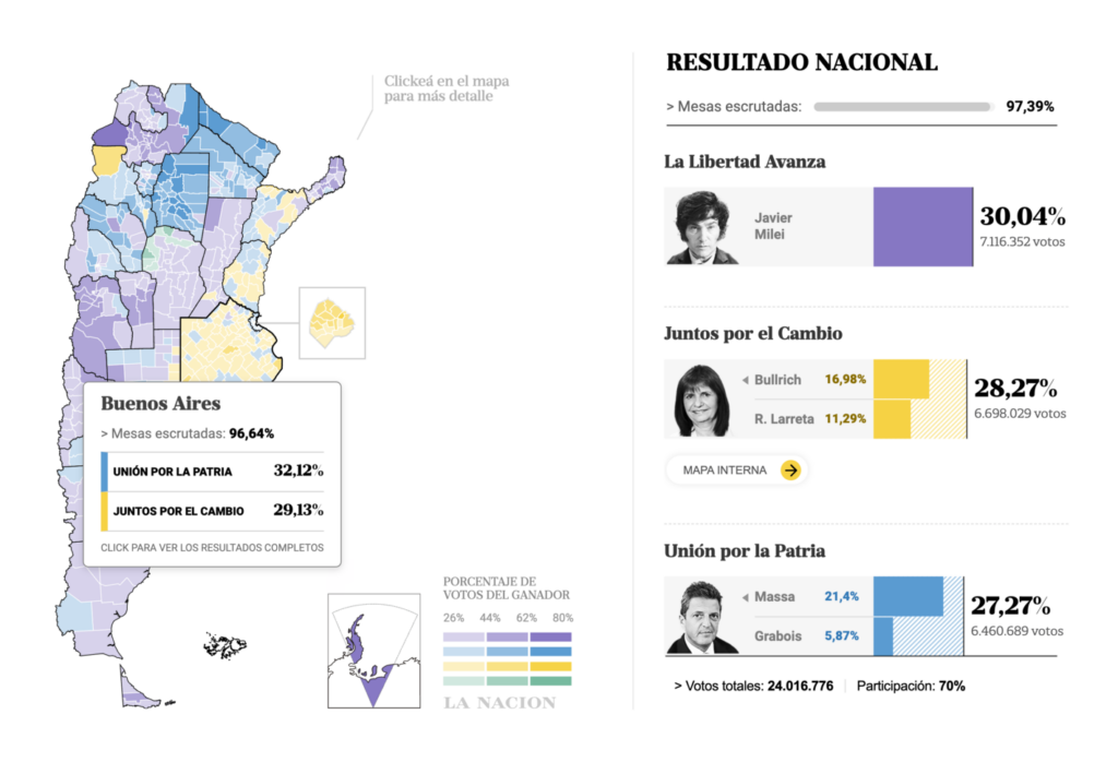
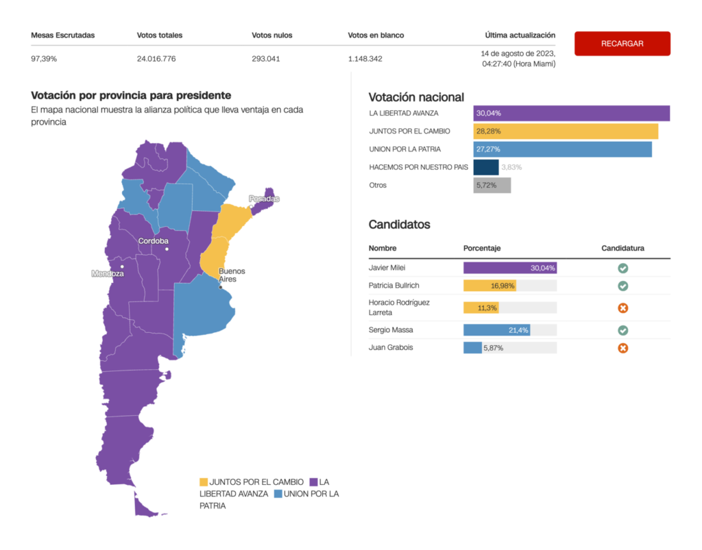
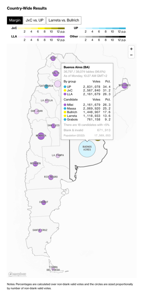
Recurring topics this week include the devastating Hawaiian fires, the energy transition, and Argentina’s open primaries.
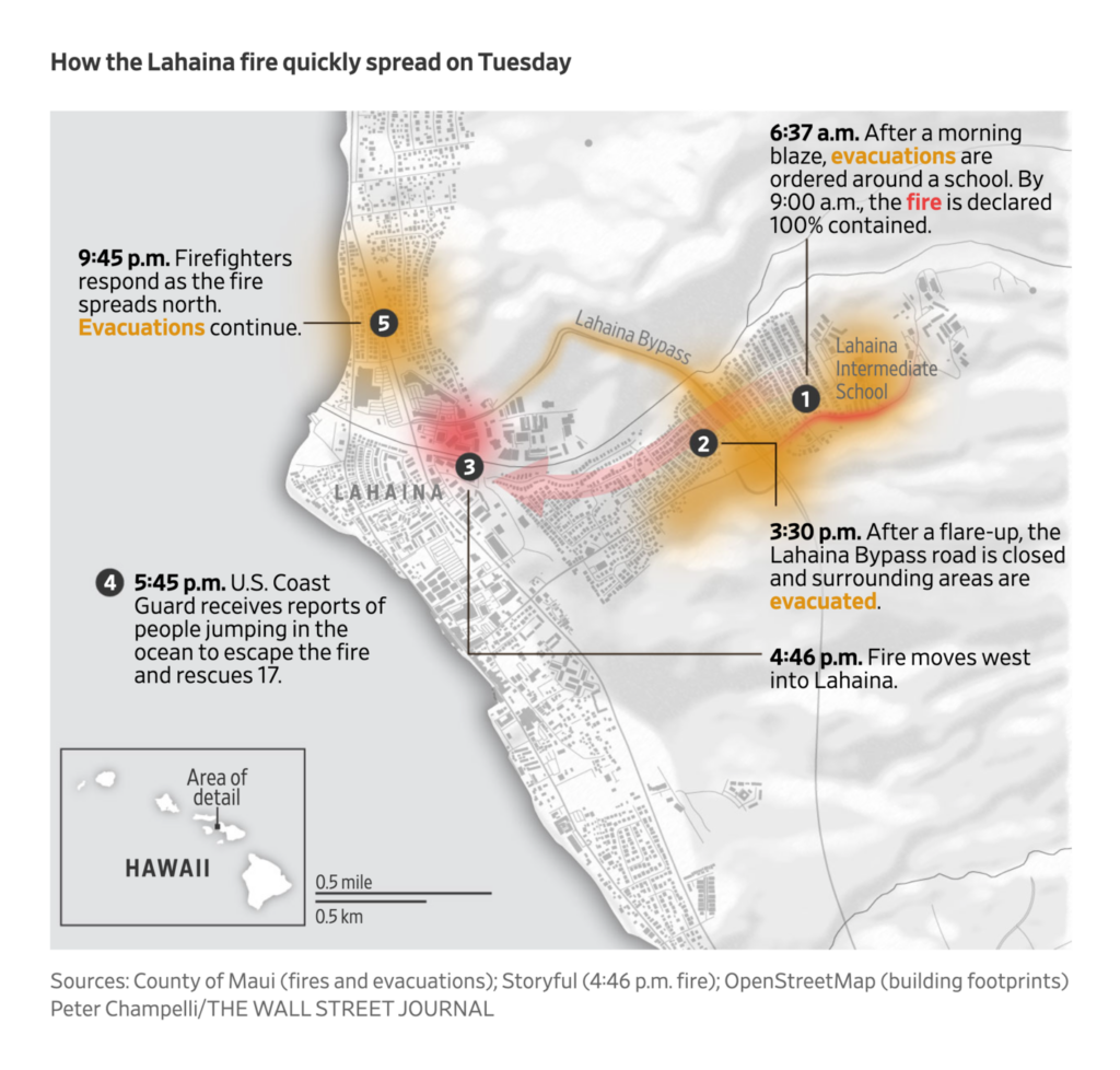
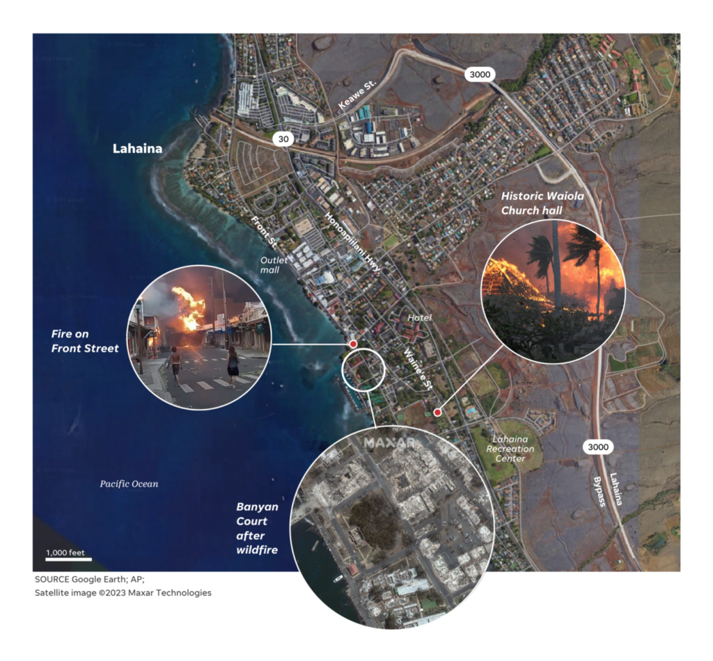
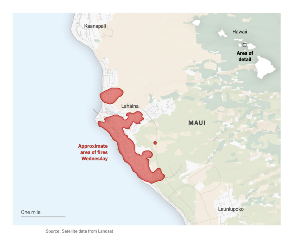
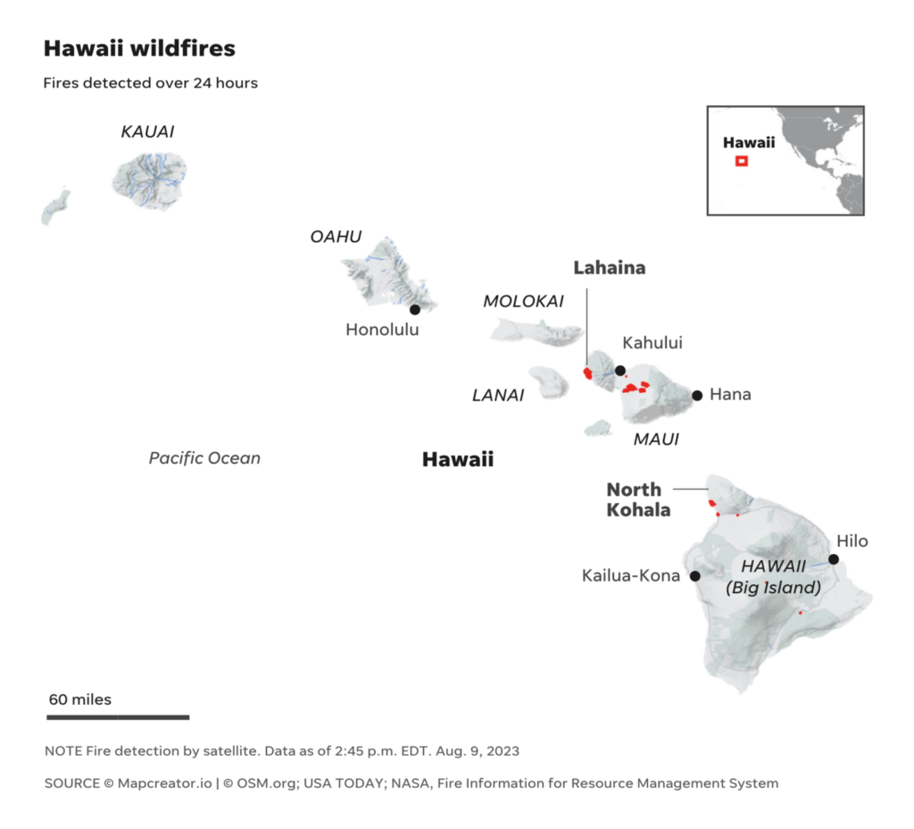
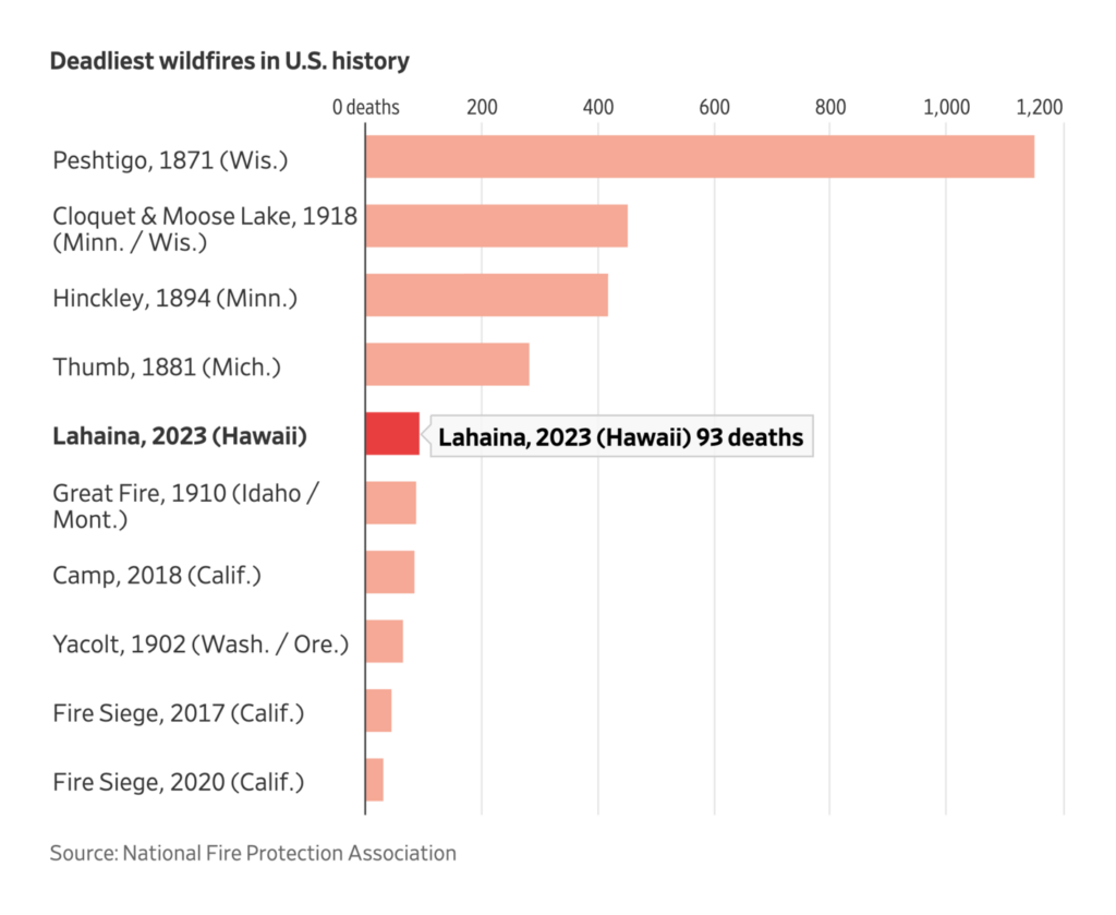
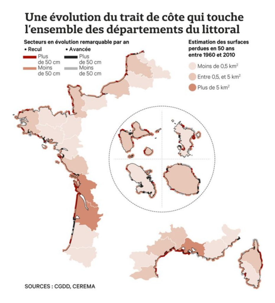
First, the wildfires on Maui, Hawaii. The town of Lahaina was almost completely destroyed, including many historic buildings:
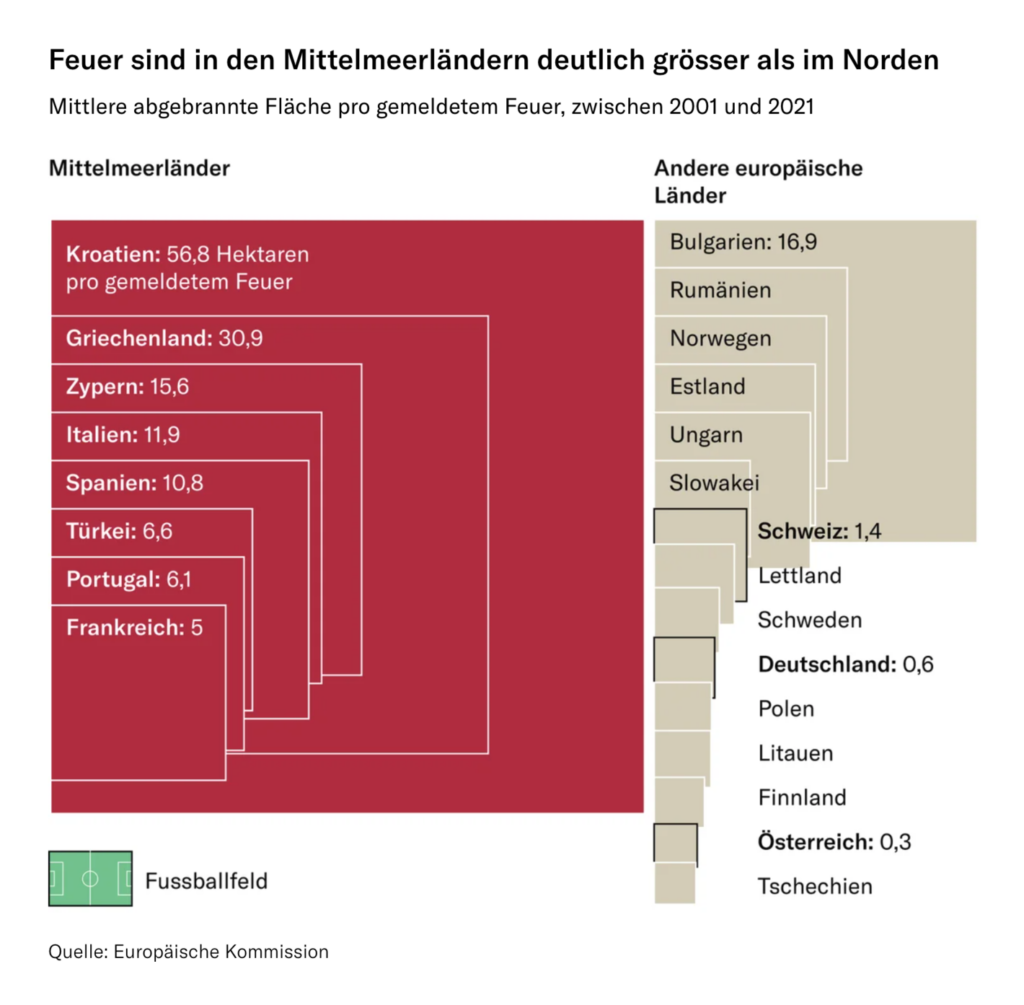
As our latest Dispatches show, wildfires are raging in many parts of the world. The NZZ visualizes that Mediterranean countries have to fight bigger fires than other European countries:
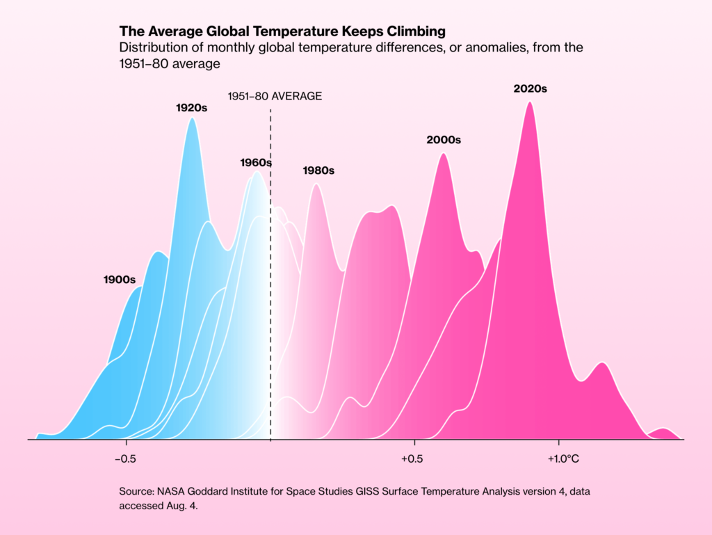
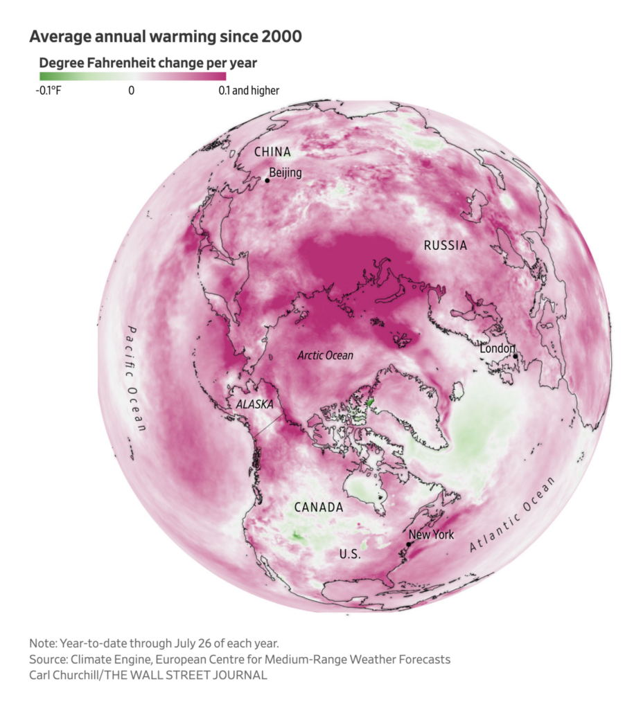
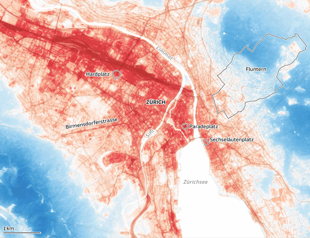
And no surprise here: The cause of more and bigger fires, according to science, is climate change. Bloomberg has some excellent charts showing how higher temperatures are not just a problem in the summer, while the Süddeutsche Zeitung visualizes how hot cities can get at night:
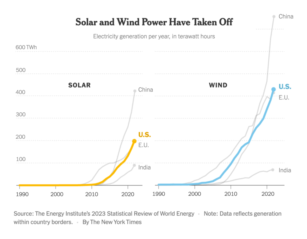
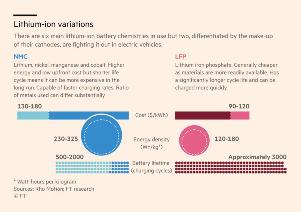
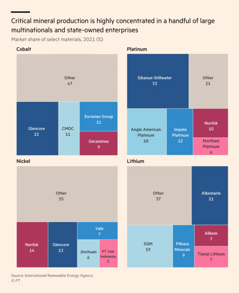
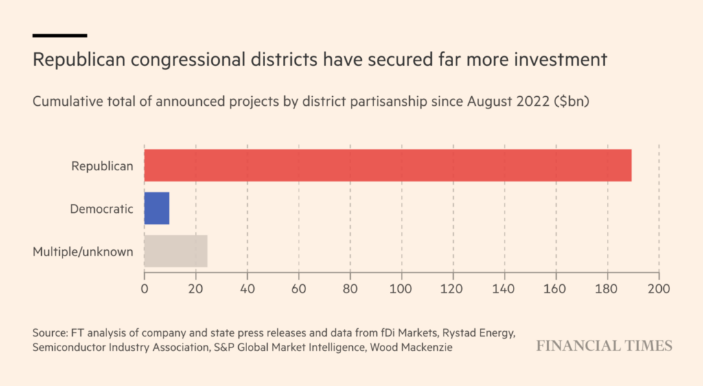
Another consequence: More clean energy; more electric cars. The New York Times and the Financial Times had big stories this week on the energy transition:
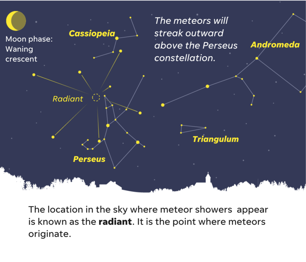
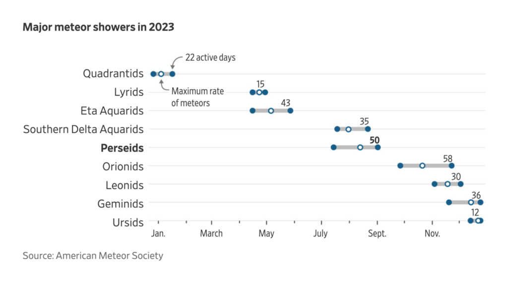
Let’s talk about something positive for a moment: The beautiful Perseid meteor showers were most visible this past weekend! We hope you had crystal clear skies to see them.
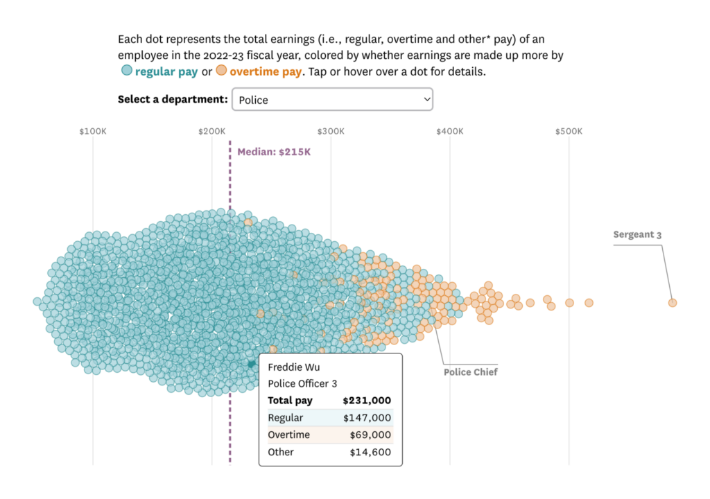
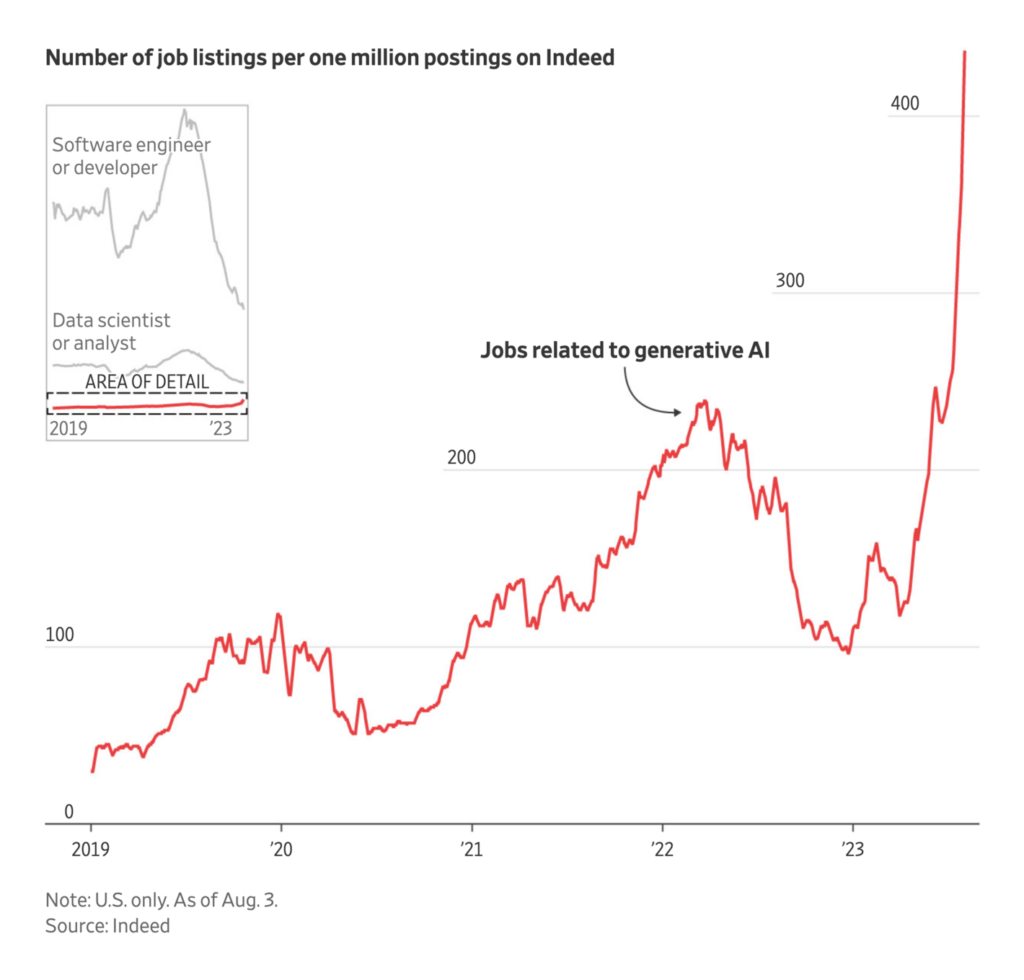
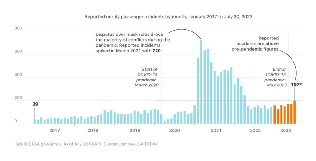
Other visualizations focused on the state of the economy. A job as a policeman in San Francisco or in A.I. seems to help against personal financial problems caused by inflation:
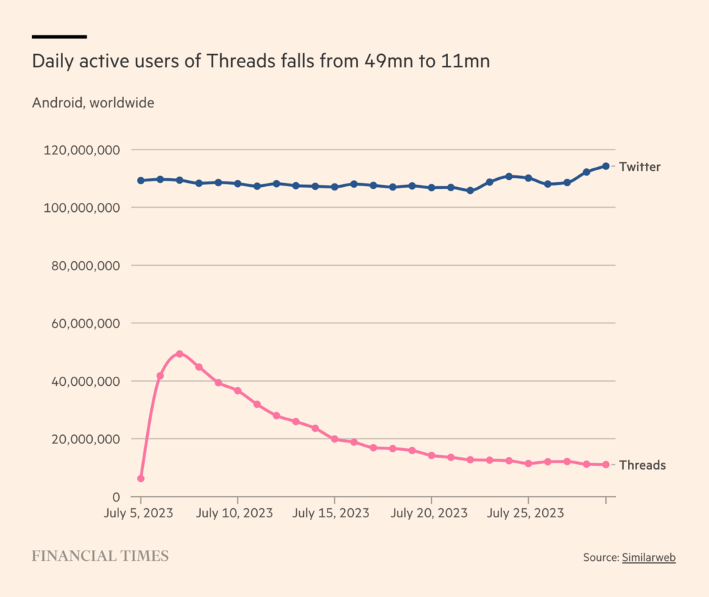
And in our miscellaneous section: Seems like Meta’s Twitter competitor Threads didn’t really take off – unlike subtitles, which are becoming more and more popular:
Help us make this dispatch better! We’d love to hear which newsletters, blogs, or social media accounts we need to follow to learn about interesting projects, especially from less-covered parts of the world (Asia, South America, Africa). Write us at hello@datawrapper.de or leave a comment below.
(she/her, @lisacmuth, @lisacmuth@vis.social) is Datawrapper’s head of communications. She writes about best practices in data visualization and thinks of new ways to excite you about charts and maps. Lisa lives in Berlin.


Comments