This article is brought to you by Datawrapper, a data visualization tool for creating charts, maps, and tables. Learn more.
Data Vis Dispatch, August 2
The best of last week’s big and small data visualizations

Welcome back to the 56th edition of Data Vis Dispatch! Every week, we’ll be publishing a collection of the best small and large data visualizations we find, especially from news organizations — to celebrate data journalism, data visualization, simple charts, elaborate maps, and their creators.
Recurring topics this week include Earth Overshoot Day, social mobility, and floods.
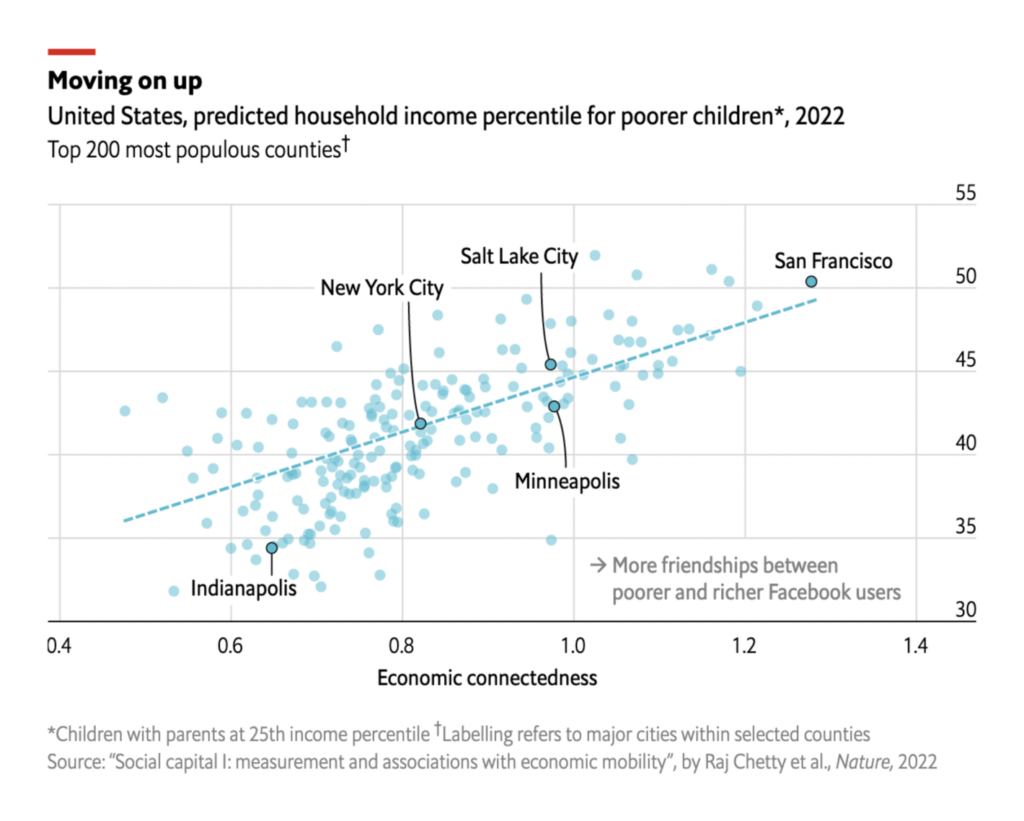
An intriguing study published this week found that poor kids have better social mobility when they grow up in an area where friendships aren’t segregated by class:
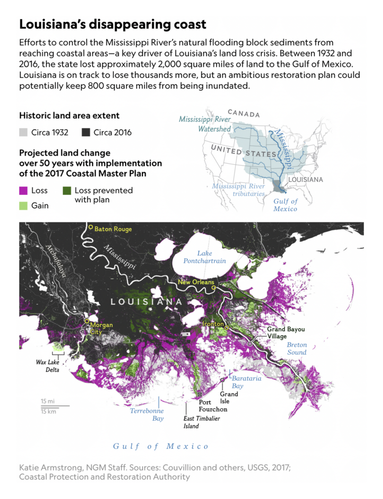
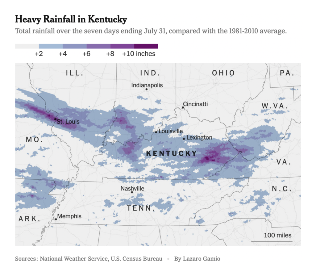
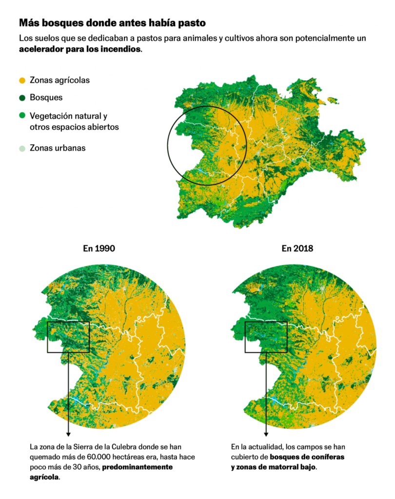
It’s summertime in 2022, so of course we saw maps on flood and fire:

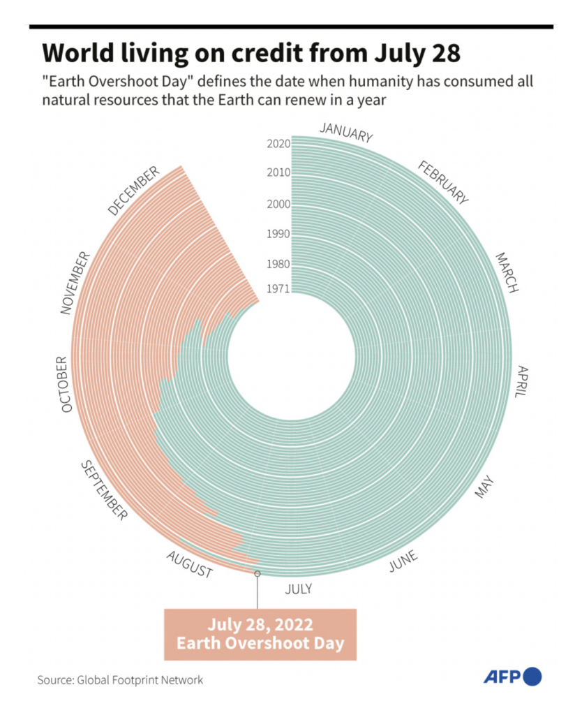
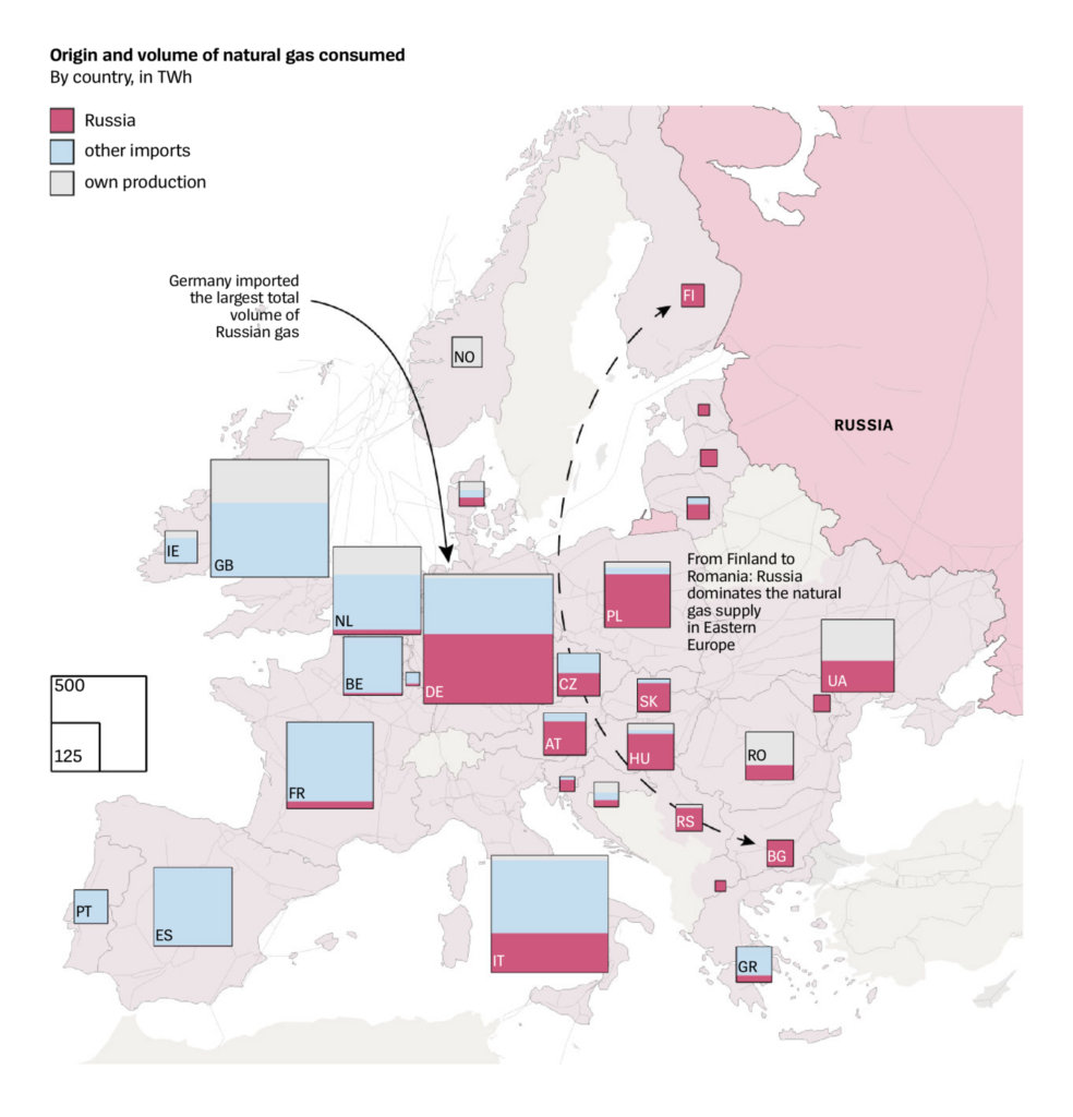
And after another summer of climate disasters, we might be looking at a winter of fossil fuel shortages:
Negotiations in the Senate this week seemed to revive the possibility of major U.S. investment in climate measures:
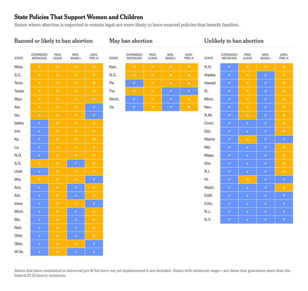
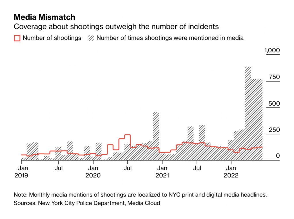
Other political charts (and tables!) showed some gaps between rhetoric and reality:
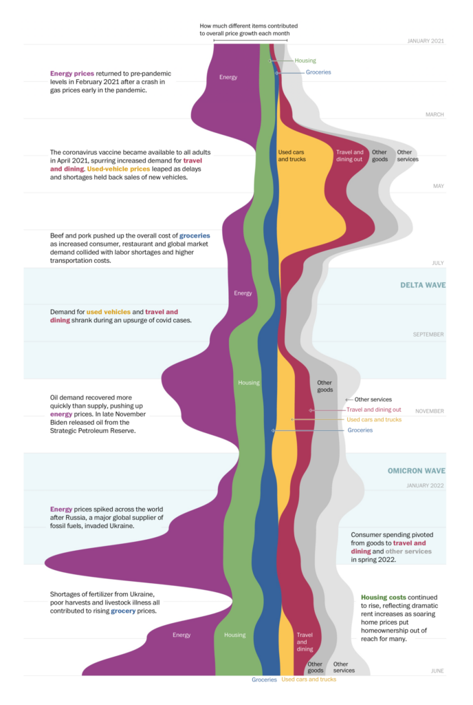
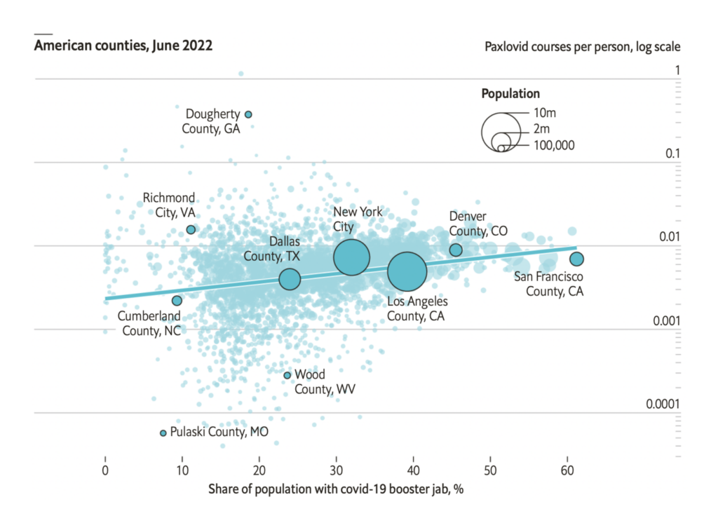
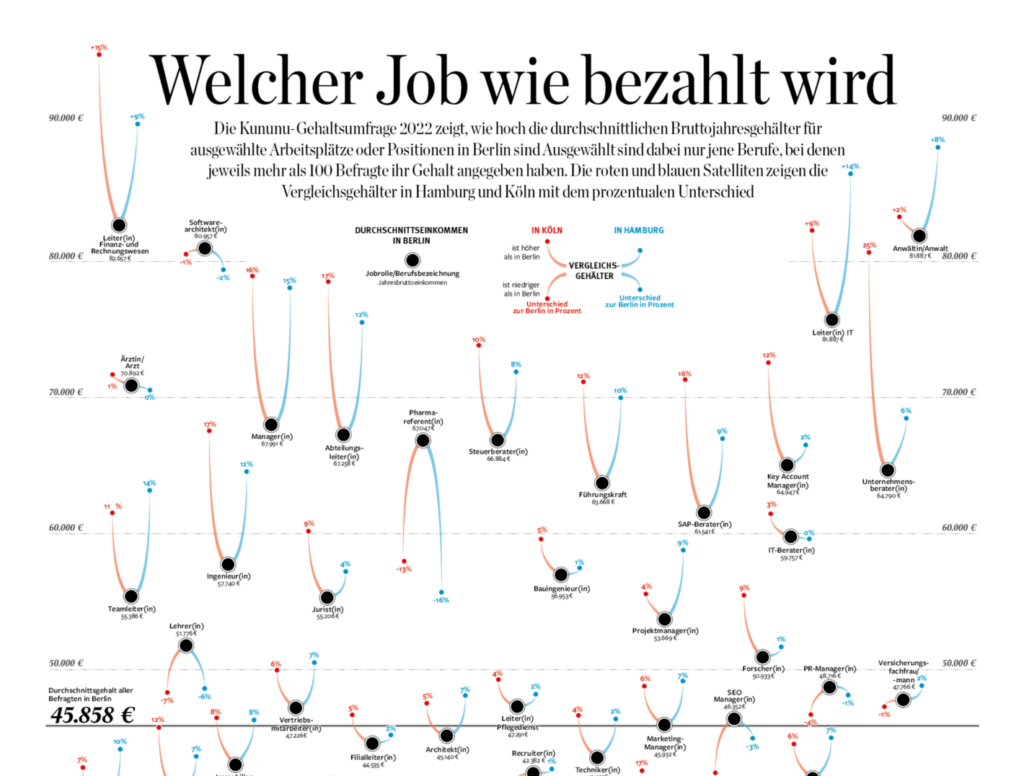
Other charts covered inflation, women’s football, and salary comparisons:

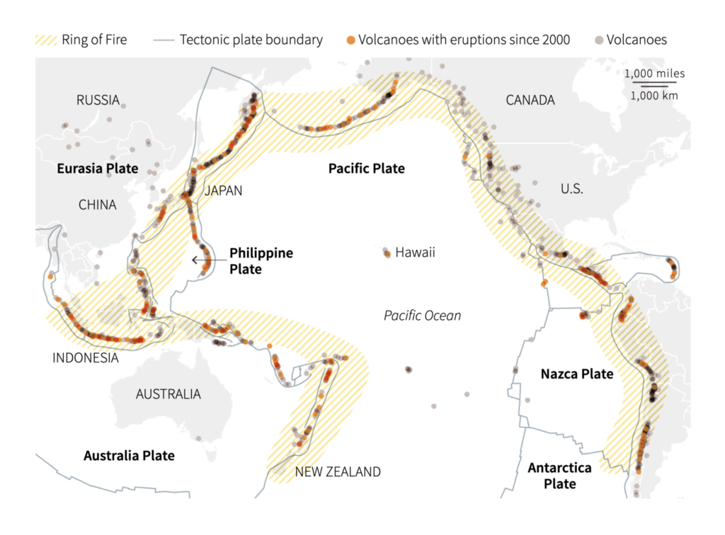
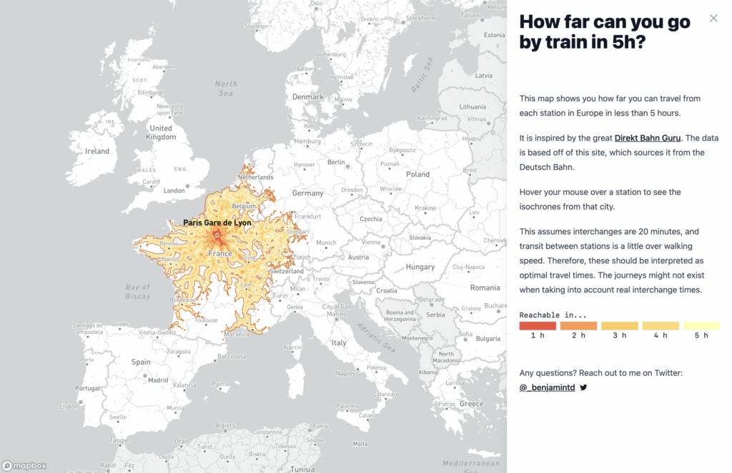
And maps this week looked at volcanoes in the Pacific and train travel in Europe:
What else we found interesting

Applications are open for…
- A data scientist at the Folha de S.Paulo
- A data journalist at WIRED
- A graphics assignment editor at The Washington Post
Help us make this dispatch better! We’d love to hear which newsletters, blogs, or social media accounts we need to follow to learn about interesting projects, especially from less-covered parts of the world (Asia, South America, Africa). Write us at hello@datawrapper.de or leave a comment below.
Want the Dispatch in your inbox every Tuesday? Sign up for our Blog Update newsletter!


Comments