The best of last week’s big and small data visualizations
Vivien Serve
Welcome back to the 156th edition of the Data Vis Dispatch! Every week, we publish a collection of the best small and large data visualizations we find, especially from news organizations — to celebrate data journalism, data visualization, simple charts, elaborate maps, and their creators.
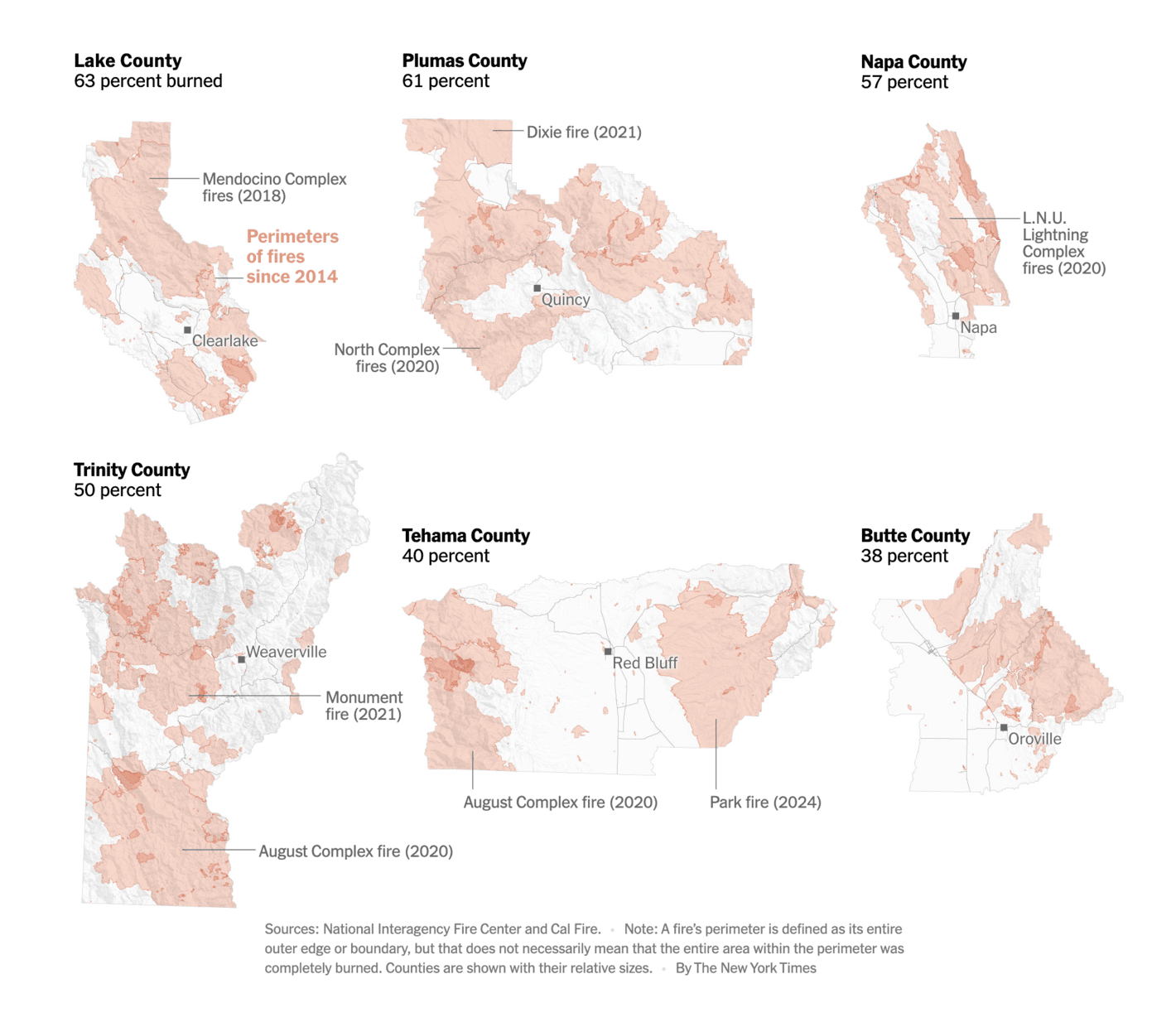
Recurring topics this week include crime, books, and natural disasters.
We love a good bar or column chart, but we love them even more with a pictographic twist:
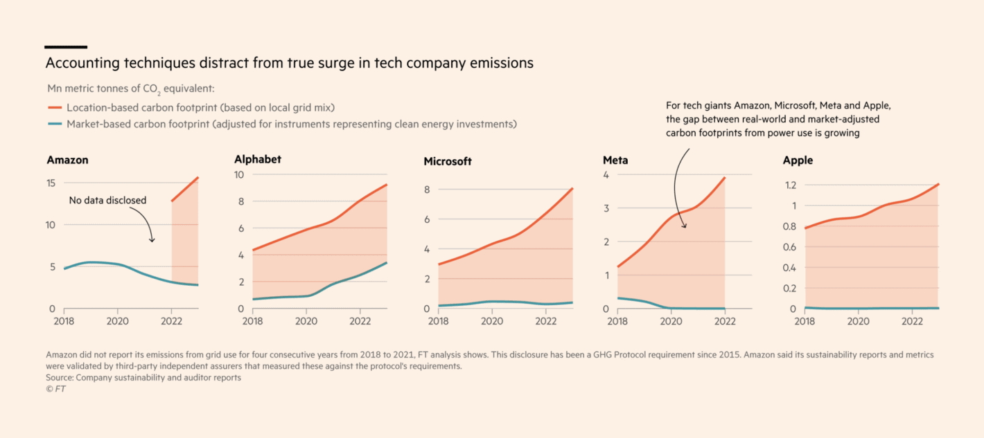
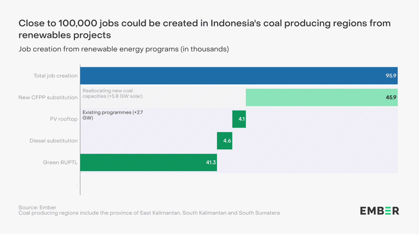
We conclude the environmental section with a look at how technology companies manipulateemissions measures and how renewable energy could create jobs in Indonesia:
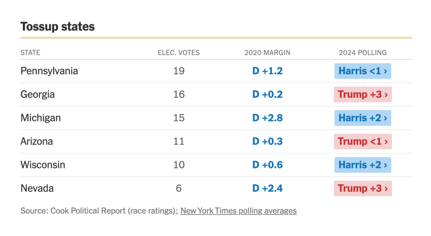
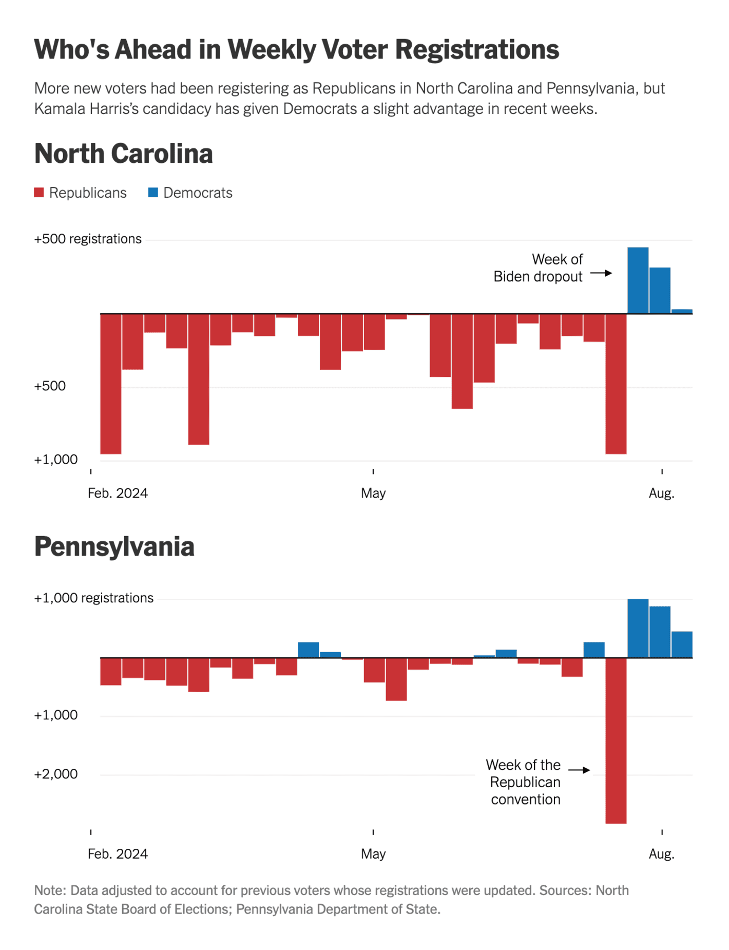
And what we're talking about even more, because there's no getting around it this year: elections. Or, more specifically for today: upcoming elections. Brazil is holding local elections in October and the deadline for candidate registration has come and gone, Harris and Trump are battling for swing states, and Germany is watching potential outcomes of upcoming local elections:
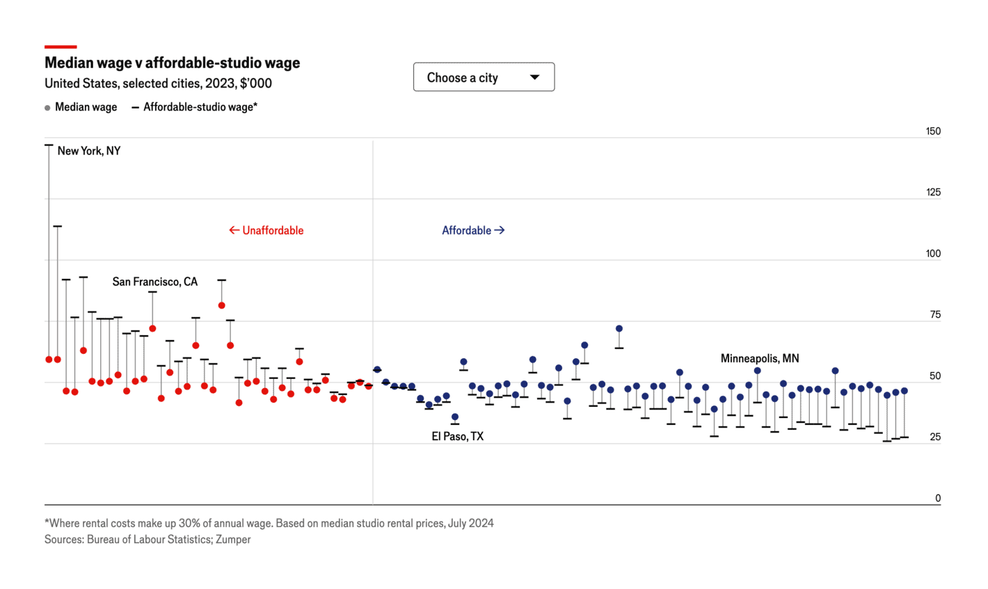
Drum roll for our final piece: If you think cities are growing wider and wider, a great visualization from the Economist this week will prove you wrong:
Help us make this dispatch better! We'd love to hear which newsletters, blogs, or social media accounts we need to follow to learn about interesting projects, especially from less-covered parts of the world (Asia, South America, Africa). Write us at hello@datawrapper.de or leave a comment below.

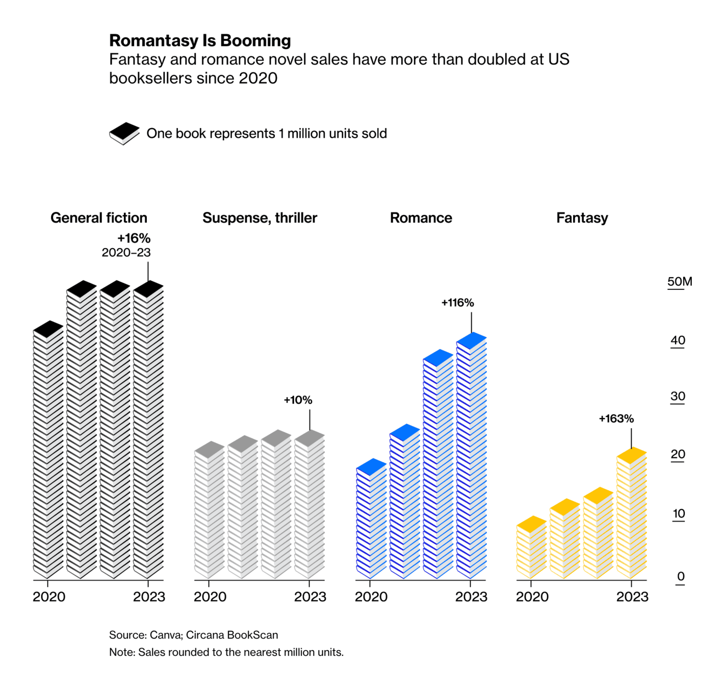
![theeuropeancorrespondent: "With summer in full swing, it's a great time to dive into a good book—though not everyone is equally inclined. [...] Created by Paula Lago," August 17 (<strong><a href="https://www.instagram.com/p/C-wwmI1OZg6/?img_index=2">Instagram Post</a></strong>)](https://datawrapper.de/cdn-cgi/image/quality=85,width=1420,f=auto,fit=cover/https://kirby.datawrapper.de/media/pages/blog/data-vis-dispatch-august-20-2024/f89d7dc95f-1740123226/image28-1.png)
![Gênero e Número: <strong><a href="https://www.generonumero.media/reportagens/creches-pre-escolas-rio/">Creches e pré-escolas integrais falham em atender população negra do Rio de Janeiro</a></strong> [<em>Full-time daycare centers and preschools fail to serve the black population of Rio de Janeiro</em>], August 14](https://datawrapper.de/cdn-cgi/image/quality=85,width=1420,f=auto,fit=cover/https://kirby.datawrapper.de/media/pages/blog/data-vis-dispatch-august-20-2024/271f013346-1740123226/image15-1.png)
![SBS News: <strong><a href="https://mabunews.stibee.com/p/257/">일본에서 곧 대지진이 일어날 수 있다고?</a></strong> [<em>Could a major earthquake hit Japan soon?</em>], August 15](https://datawrapper.de/cdn-cgi/image/quality=85,width=1420,f=auto,fit=cover/https://kirby.datawrapper.de/media/pages/blog/data-vis-dispatch-august-20-2024/20215924d6-1740123226/image4-1.png)
![InfoAmazonia: <strong><a href="https://infoamazonia.org/2024/08/15/nove-em-cada-10-terras-indigenas-da-amazonia-enfrentam-seca-levando-a-falta-de-alimentos-e-agua/">Nove em cada 10 terras indígenas da Amazônia enfrentam seca, levando à falta de alimentos e água</a></strong> [<em>Nine out of 10 indigenous lands in the Amazon face drought, leading to food and water shortages</em>], August 15](https://datawrapper.de/cdn-cgi/image/quality=85,width=1420,f=auto,fit=cover/https://kirby.datawrapper.de/media/pages/blog/data-vis-dispatch-august-20-2024/84fe9d0d44-1740123226/image7-1.png)
![Panorama.ro: <strong><a href="https://panorama.ro/valuri-caldura-viata-dimensiune-incalzire-romania/">Valurile de căldură ne schimbă viața. Cum arată dimensiunea încălzirii care cuprinde și România</a></strong> [<em>Heat waves are changing our lives. How the scale of the warming is spreading to Romania</em>], August 16](https://datawrapper.de/cdn-cgi/image/quality=85,width=1420,f=auto,fit=cover/https://kirby.datawrapper.de/media/pages/blog/data-vis-dispatch-august-20-2024/e6bc1a068d-1740123226/image24.png)
![El Mundo: <strong><a href="https://www.elmundo.es/ciencia-y-salud/medio-ambiente/2024/08/12/66ab302021efa0332e8b4577.html">Consulta el mapa de las playas y puntos de la costa de España en riesgo de desaparecer por la subida del nivel del mar</a></strong> [<em>Check out the map of beaches and coastal areas in Spain at risk of disappearing due to rising sea levels</em>], August 13 <span class="badge">More Maps!</span>](https://datawrapper.de/cdn-cgi/image/quality=85,width=1420,f=auto,fit=cover/https://kirby.datawrapper.de/media/pages/blog/data-vis-dispatch-august-20-2024/3621c6af9e-1740123226/image17-1.png)
![Átlátszó: <strong><a href="https://atlatszo.hu/adat/2024/08/13/budapesten-az-atlagfizetes-harmadat-becsben-csak-a-tizedet-viszi-el-az-alberlet/">Budapesten az átlagfizetés harmadát, Bécsben csak a tizedét viszi el az albérlet</a></strong> [<em>In Budapest, the sublet takes a third of the average salary, in Vienna only a tenth</em>], August 13](https://datawrapper.de/cdn-cgi/image/quality=85,width=1420,f=auto,fit=cover/https://kirby.datawrapper.de/media/pages/blog/data-vis-dispatch-august-20-2024/5050e87c99-1740123226/image3-1.png)
![Folha de S.Paulo: <strong><a href="https://www1.folha.uol.com.br/poder/2024/08/eleicao-deste-ano-tem-queda-de-18-no-numero-de-candidatos-diante-de-2020.shtml">Eleição tem 103 mil candidatos a menos que em 2020, uma queda de 18%</a></strong> [<em>Election has 103 thousand fewer candidates compared to 2020, dropping 18%</em>], August 16](https://datawrapper.de/cdn-cgi/image/quality=85,width=1420,f=auto,fit=cover/https://kirby.datawrapper.de/media/pages/blog/data-vis-dispatch-august-20-2024/21b22cad27-1740123226/image5.png)
![Nexo Jornal: <strong><a href="https://www.nexojornal.com.br/grafico/2024/08/16/perfil-dos-candidatos-nas-eleicoes-municipais-de-2024">Homens predominam entre os candidatos mais velhos em 2024</a></strong> [<em>Men predominate among older candidates in 2024</em>], August 16](https://datawrapper.de/cdn-cgi/image/quality=85,width=1420,f=auto,fit=cover/https://kirby.datawrapper.de/media/pages/blog/data-vis-dispatch-august-20-2024/e5cb7f1be4-1740123226/image16-1.png)

![Der Spiegel: <strong><a href="https://www.spiegel.de/politik/deutschland/landtagswahlen-in-sachsen-thueringen-und-brandenburg-welche-koalitionen-sind-moeglich-a-1d59f29b-915f-476e-84f7-2d28f3a040a7">Wie bleibt Ostdeutschland regierbar?</a></strong> [<em>How can Eastern Germany remain governable?</em>], August 16](https://datawrapper.de/cdn-cgi/image/quality=85,width=1419,f=auto,fit=cover/https://kirby.datawrapper.de/media/pages/blog/data-vis-dispatch-august-20-2024/5fdfb410c7-1740123226/image14-1.png)