Data Vis Dispatch, August 22

The best of last week’s big and small data visualizations

Welcome back to the 107th edition of Data Vis Dispatch! Every week, we’ll be publishing a collection of the best small and large data visualizations we find, especially from news organizations — to celebrate data journalism, data visualization, simple charts, elaborate maps, and their creators.

Recurring topics this week include the FIFA World cup finale, the consequences of climate change, and inflation.

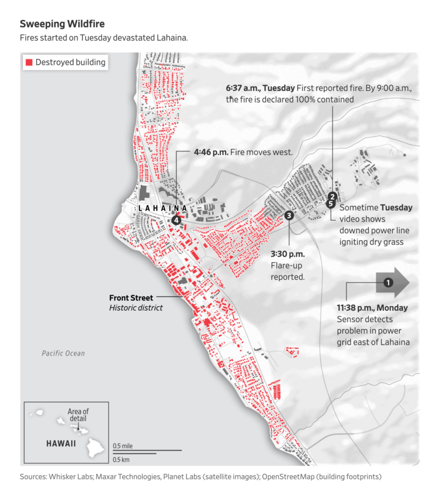
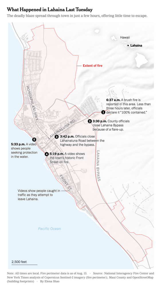
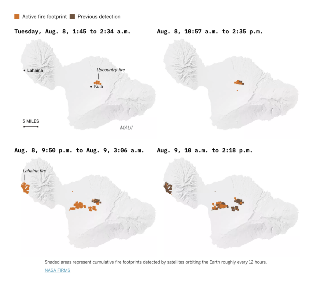
The week began with a closer look at the fire in Lahaina, Hawaii:

Reuters: Earth, wind and fire, August 21
The Wall Street Journal: Hawaiian Electric Knew of Wildfire Threat, but Waited Years to Act, August 17
The New York Times: How Fire Turned Lahaina Into a Death Trap, August 15
Los Angeles Times: How the Maui fires consumed Lahaina, August 16
The Wall Street Journal: Maui Residents Reckon With How Much Tourism They Want—and How Quickly, August 18

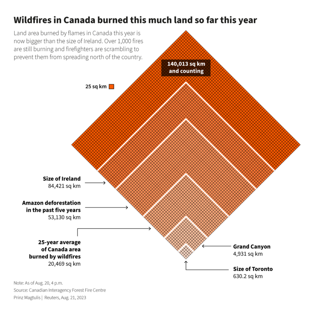
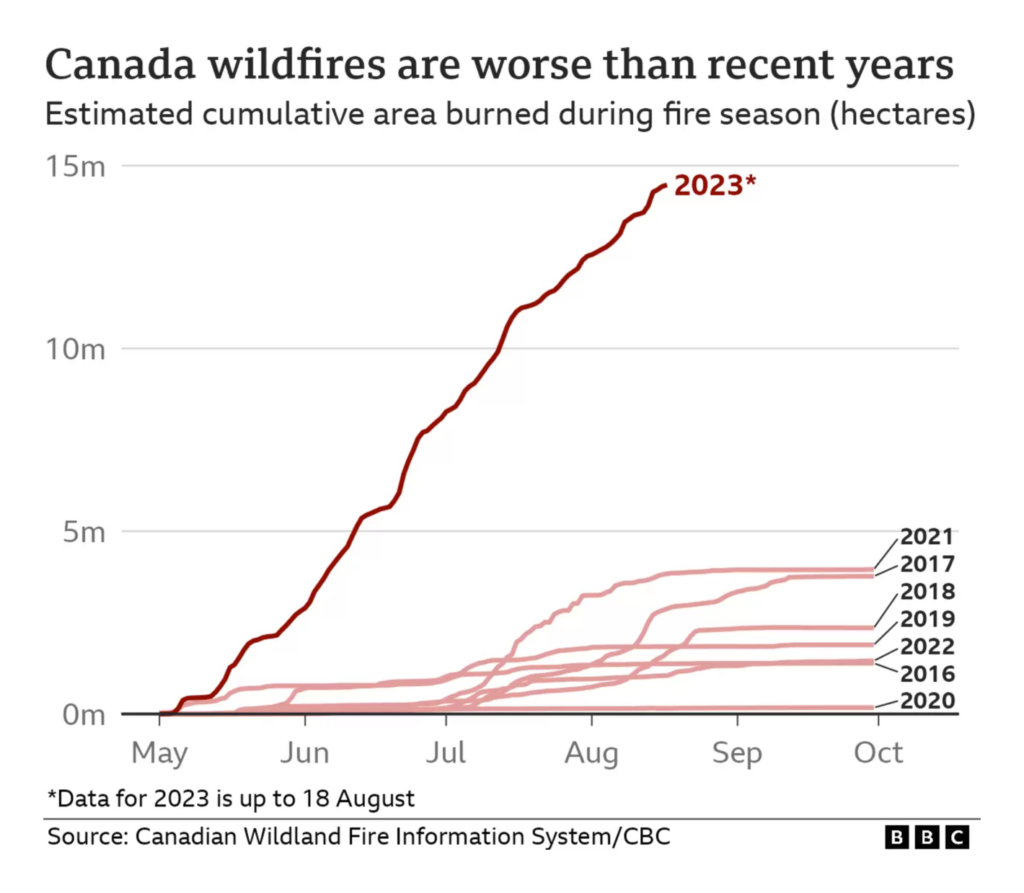
Hawaii hasn’t been the only place burning. Canadian wildfires set sad records:

Prinz Magtulis: “Wildfires blazing across Canada have so far burned a land area much bigger than the size of Ireland. The ongoing destruction is now also nearly three times the scale of deforestation of the Amazon for the past five years,” August 21 (Tweet)
BBC: The numbers behind Canada’s worst wildfires season, August 19

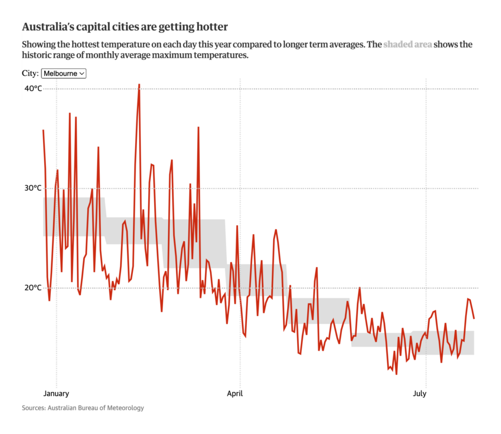
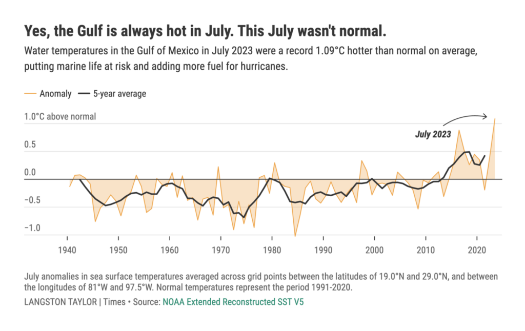
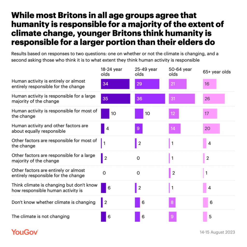
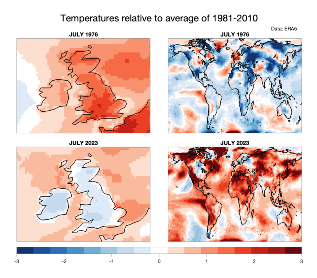
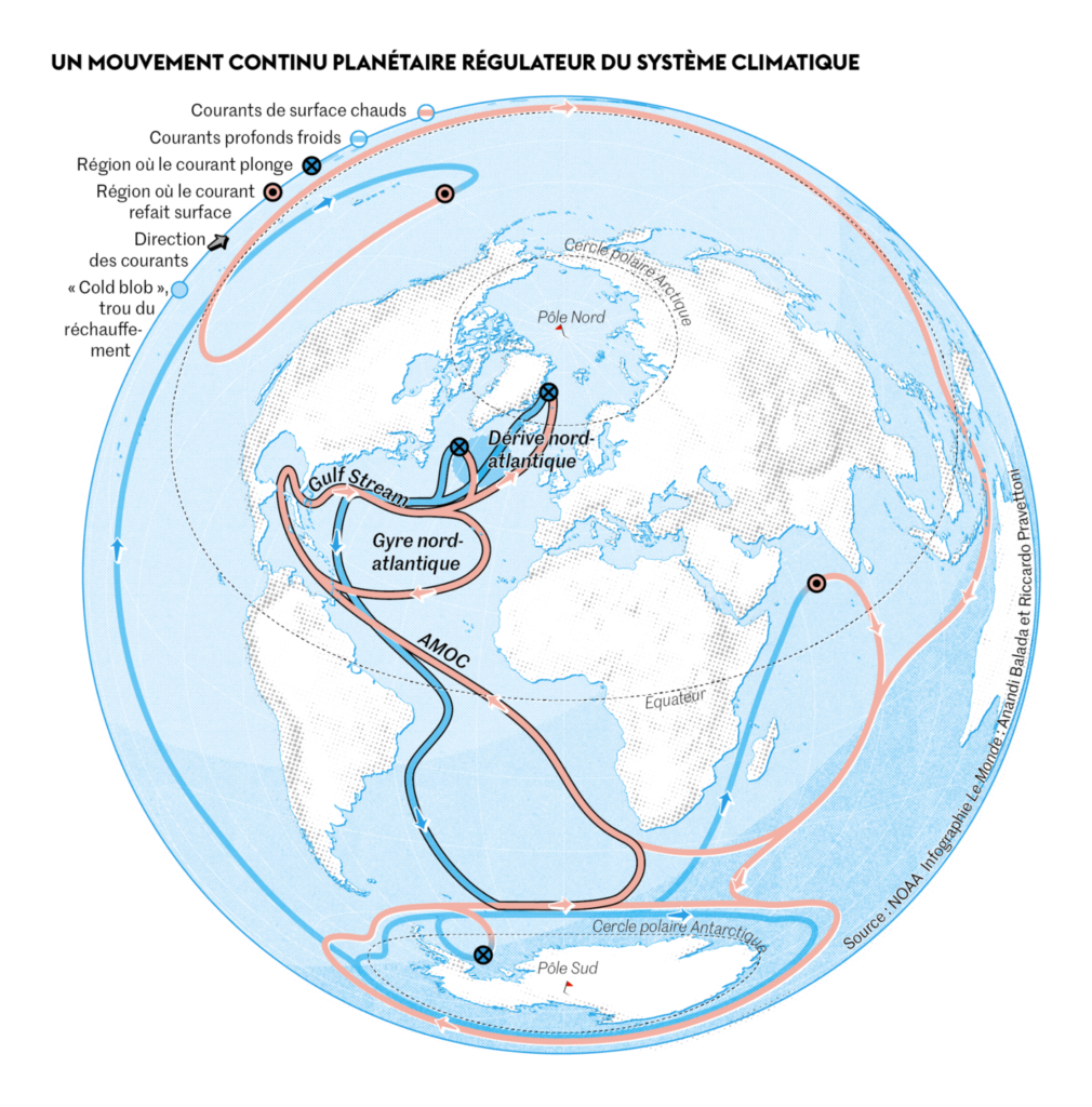
The reason? Climate change. Several newsrooms mapped the heat:

The Guardian: Warm July breaks dozens of longstanding Australian temperature records, August 17
Tampa Bay Times: The Gulf of Mexico is record hot. Here’s what that means for hurricanes, wildlife, August 15
YouGov: To what extent do Britons think human activity is responsible for climate change?, August 18
Ed Hawkins: “Remember: whatever small part of the planet you inhabit, it is not representative of the whole globe. Red = warmer than 1981-2010 average. Blue = cooler than 1981-2010 average. Data: ERA5,” August 17 (Tweet)

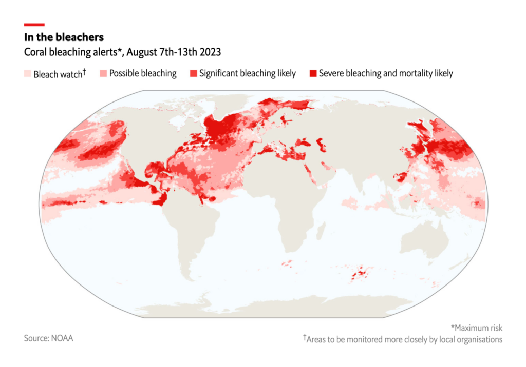
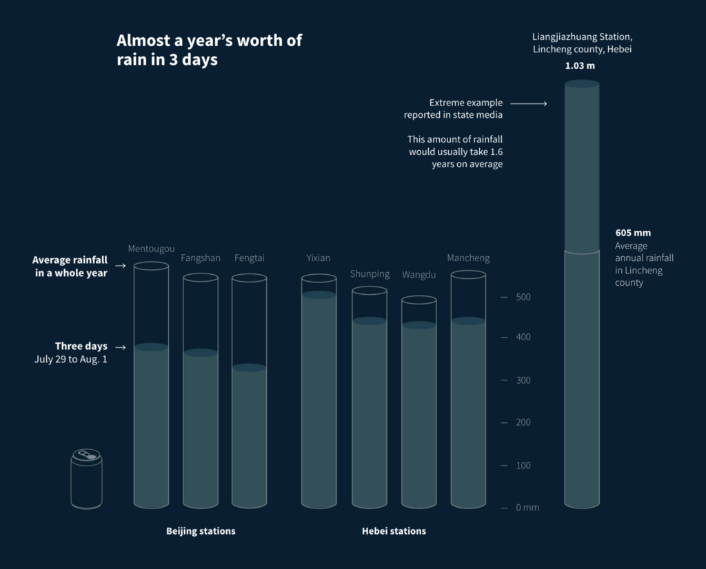
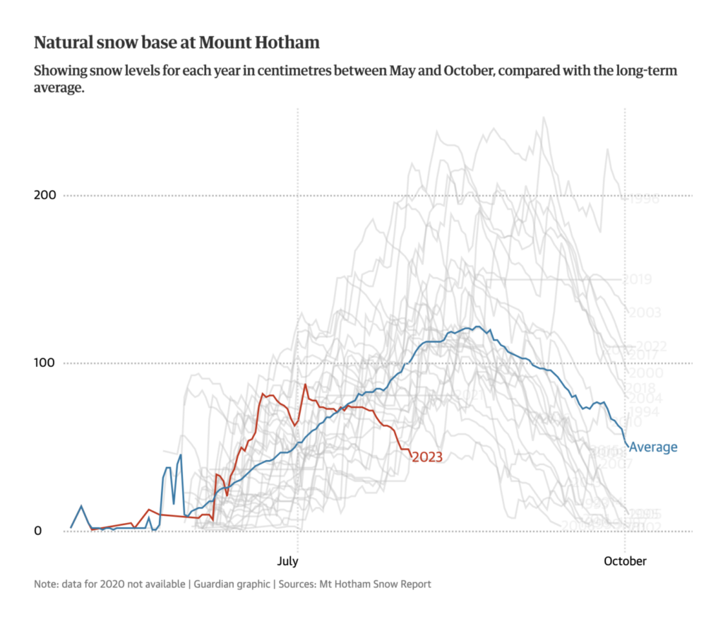
Other consequences of climate change visualized this week included coral bleaching, extreme weather events such as massive rainfall, and too little snow in the current Australian winter:

The Economist: Corals are bleaching and dying earlier in the year than ever before, August 18
Reuters: Beijing’s record rainfall: How heavy was the rain that inundated China’s cities?, August 18
The Guardian: Days numbered for skiers this winter as Australia’s alpine resorts dry up, August 16

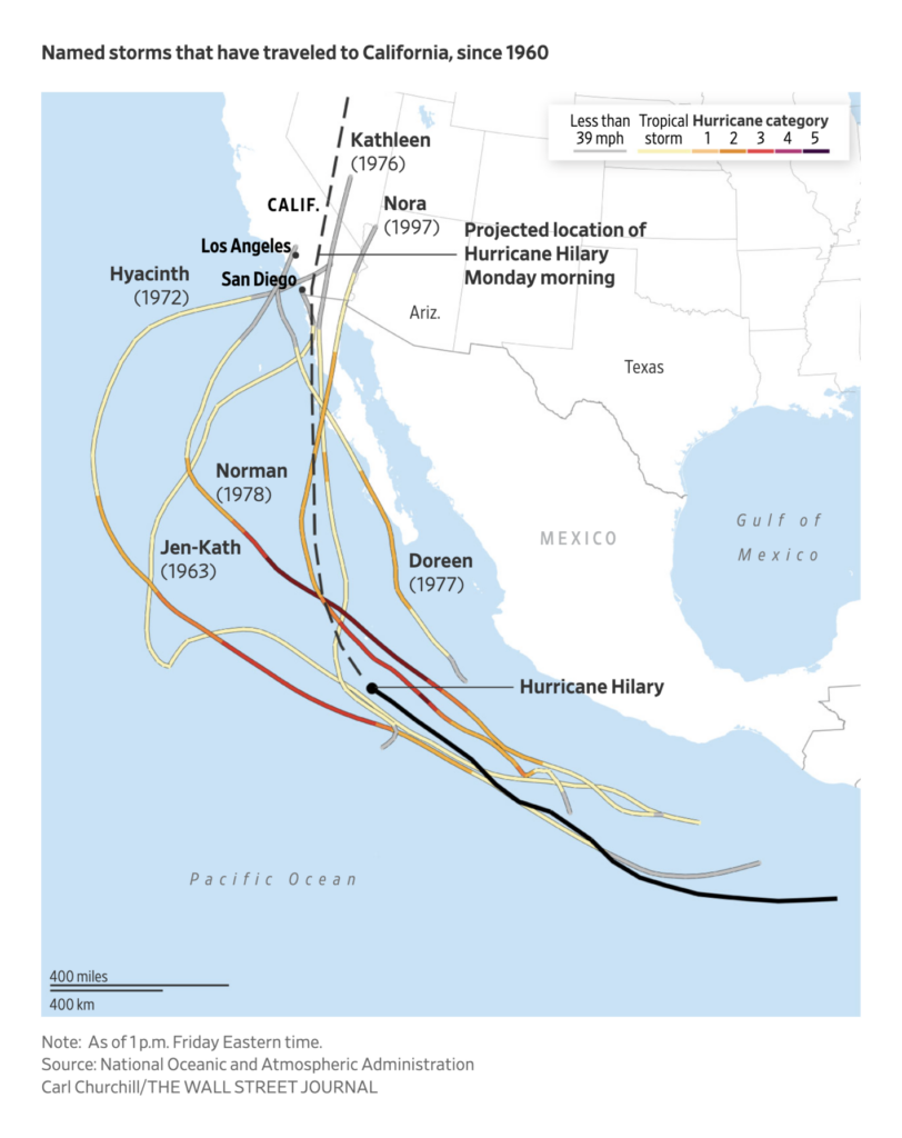
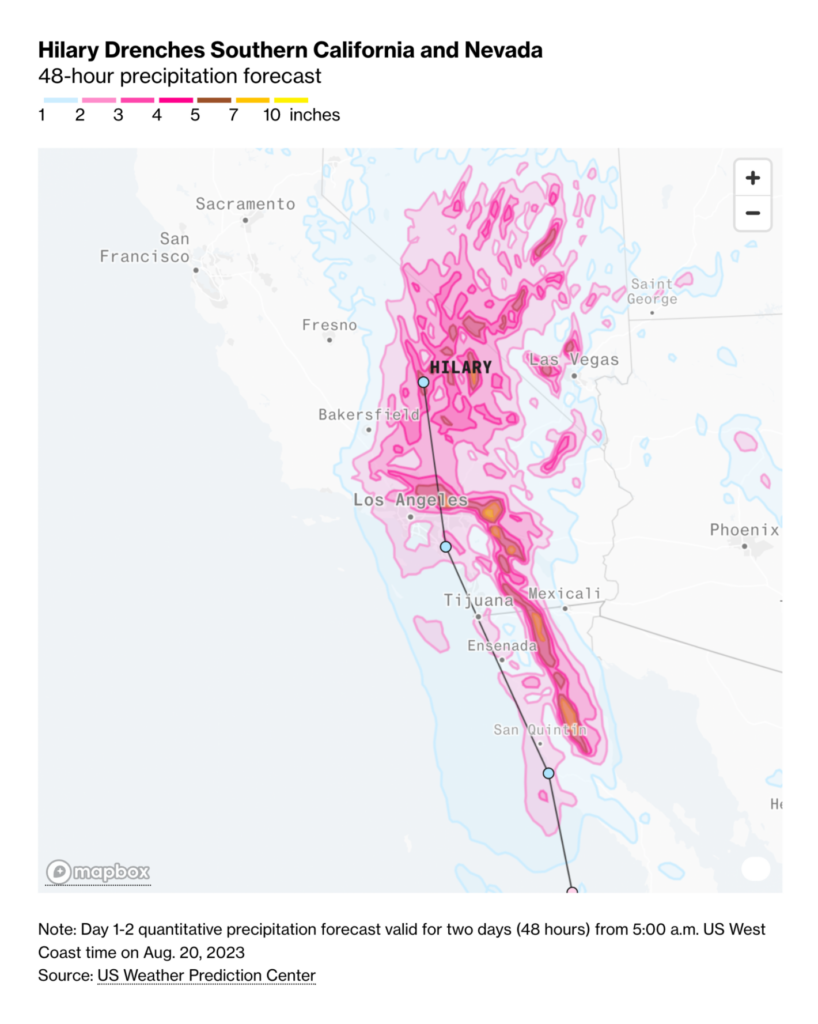
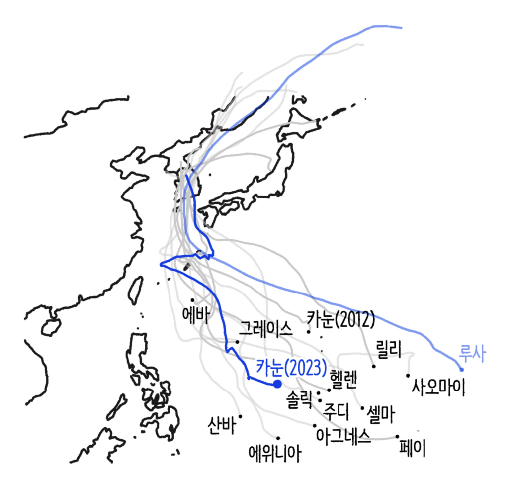
A special focus was on hurricanes and typhoons:

The Wall Street Journal: Tropical Storm Hilary Poses Unusual Threat to Southern California, August 20
Bloomberg: Tracking Hilary’s Latest Path, August 20
Mabu News: 한반도를 관통한 태풍 카눈, August 17

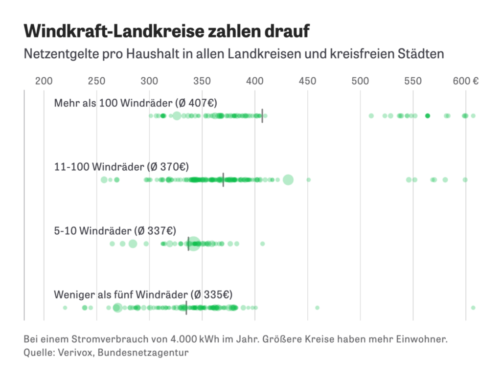
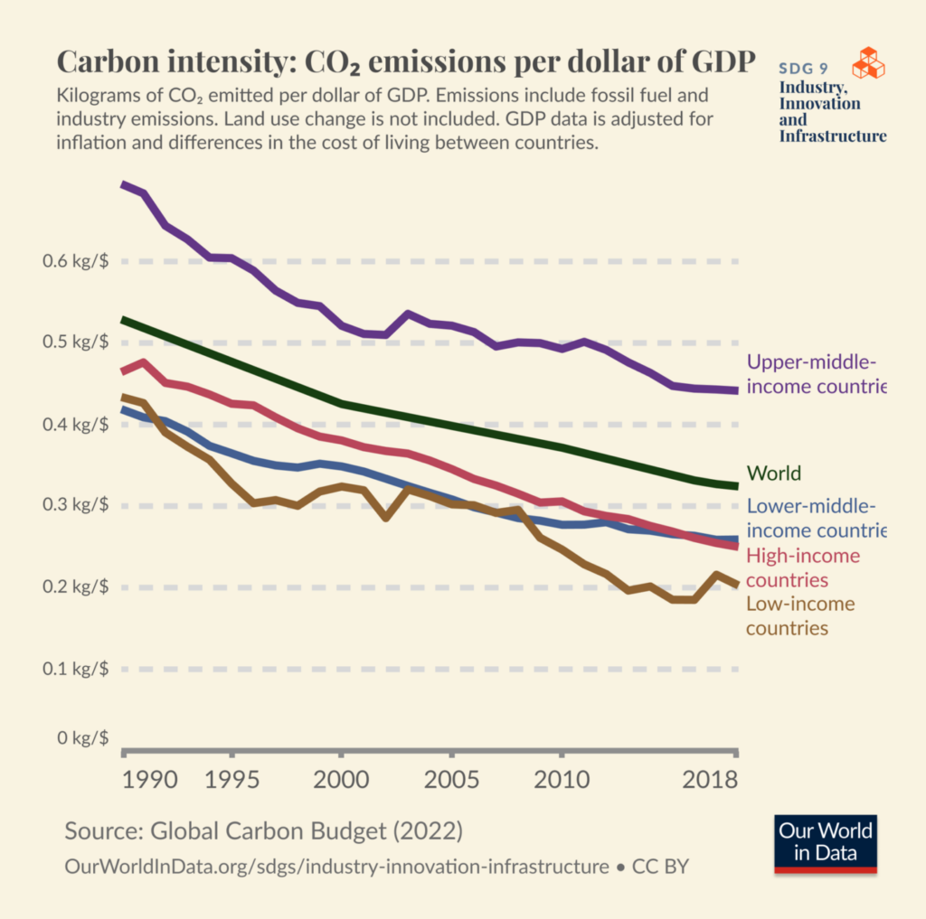
As most weeks, newsrooms visualized aspects of the energy transition as a solution to climate change:

Reuters: The Nuclear Aged, August 22
ZEIT Online: So unfair sind die Stromgebühren in Deutschland verteilt, August 18
Our World in Data: “Trends toward lower carbon intensity mean that countries are producing less CO2 emissions per unit of economic output (here dollar of GDP),” August 17 (Tweet)

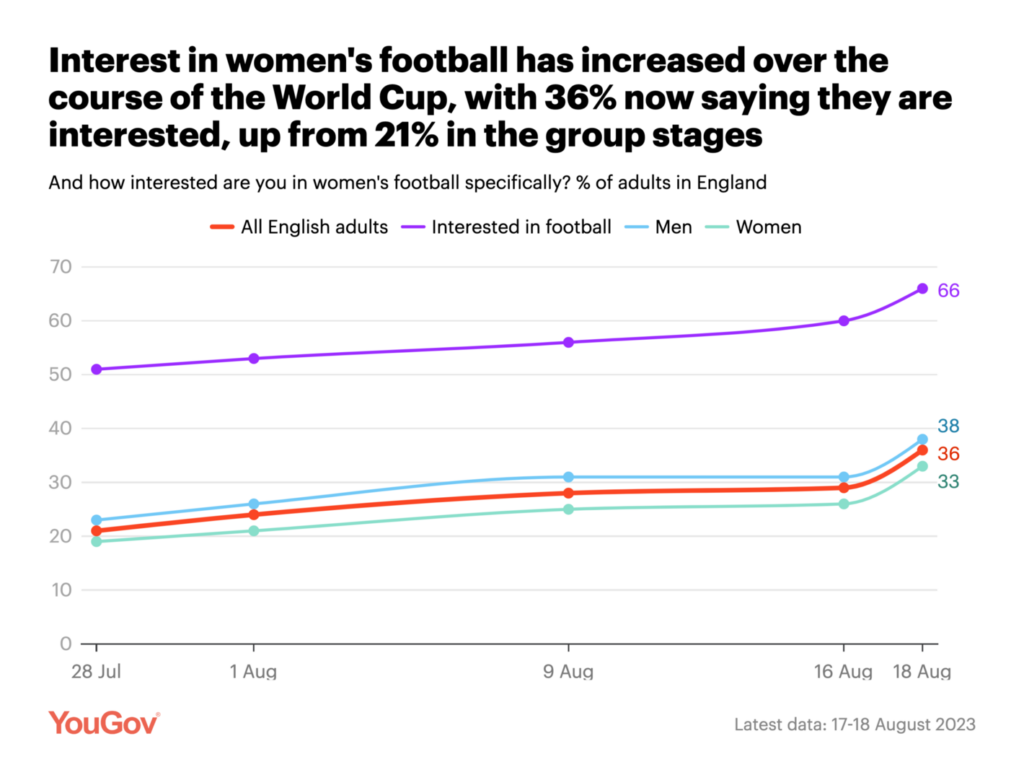
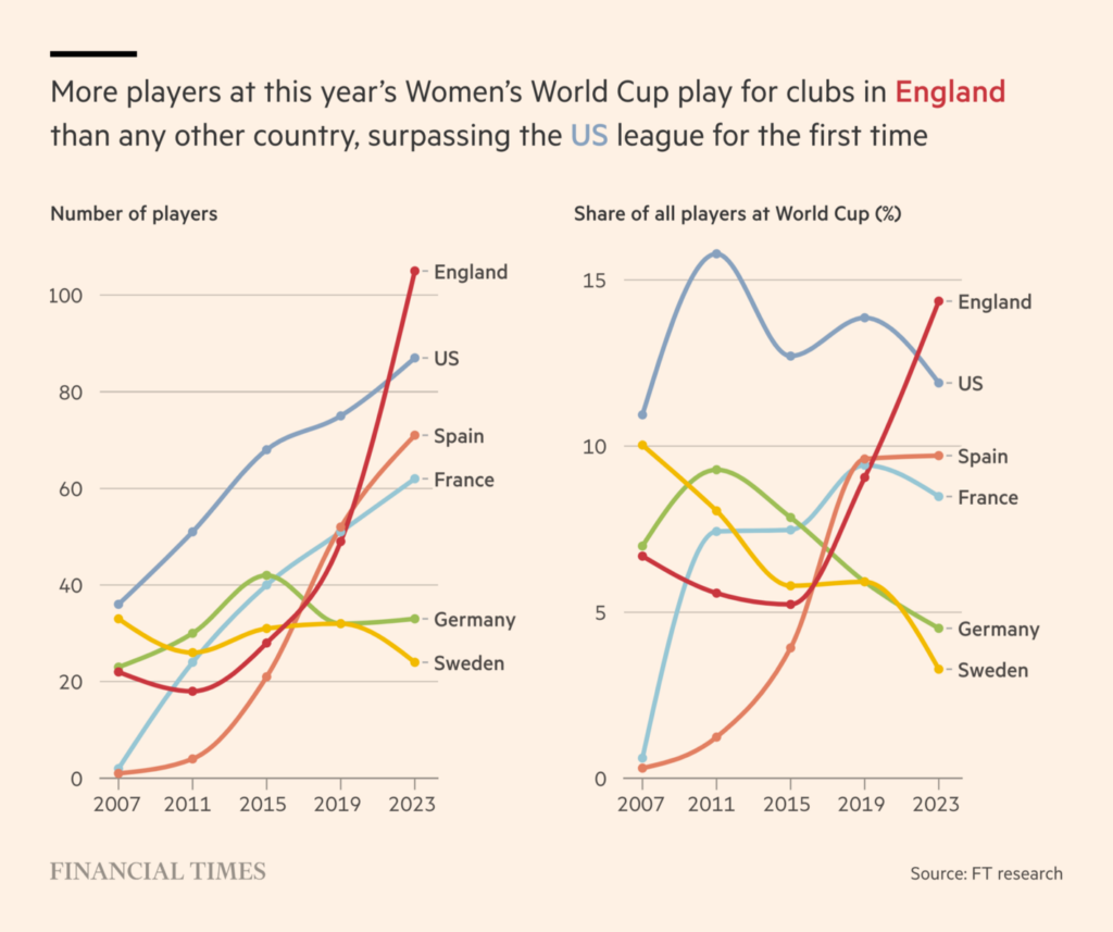
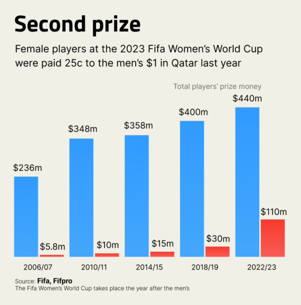
On a lighter note: The finale of the FIFA World Cup happened on Sunday, and people were more interested in it than ever:

YouGov: Four in ten English people intend to watch the 2023 women’s world cup final, August 18
Financial Times: ‘It boils down to money’: England and Spain prepare for Women’s World Cup face-off, August 19
The Outlier: “Players at the 2023 Women’s World Cup will be paid 25c to the $1 their male counterparts received last year. The prize money has increased 2,000% since female players were first paid in 2006,” August 19 (Tweet)
The Guardian: A good run-up and shoot down the middle: what data tells us about penalty kick strategy, August 18

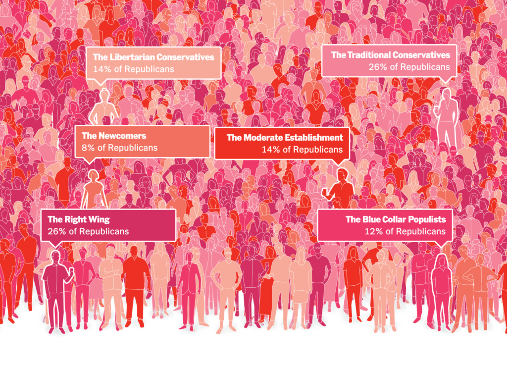
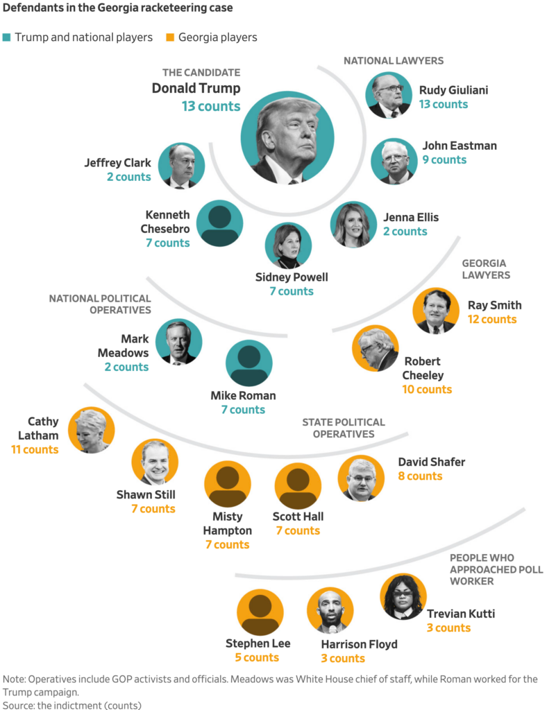
In charts covering politics, we saw a focus on U.S. Republicans and donations to Trump:

The New York Times: The 6 Kinds of Republican Voters, August 17
Financial Times: How Donald Trump’s criminal charges are defining his White House race, August 15
Bloomberg: Who’s Going to Give Trump the Biggest Run for His Money?, August 22
RTVE: Las 350 caras del nuevo Congreso: mayoría de novatos, con estudios universitarios y con más de 50 años, August 17
Reuters: The bills that ban gender transitions, August 19
El País: Así es el cambio generacional en el Congreso: del dominio de los ‘baby boomers’ al estreno de la generación Z, August 17

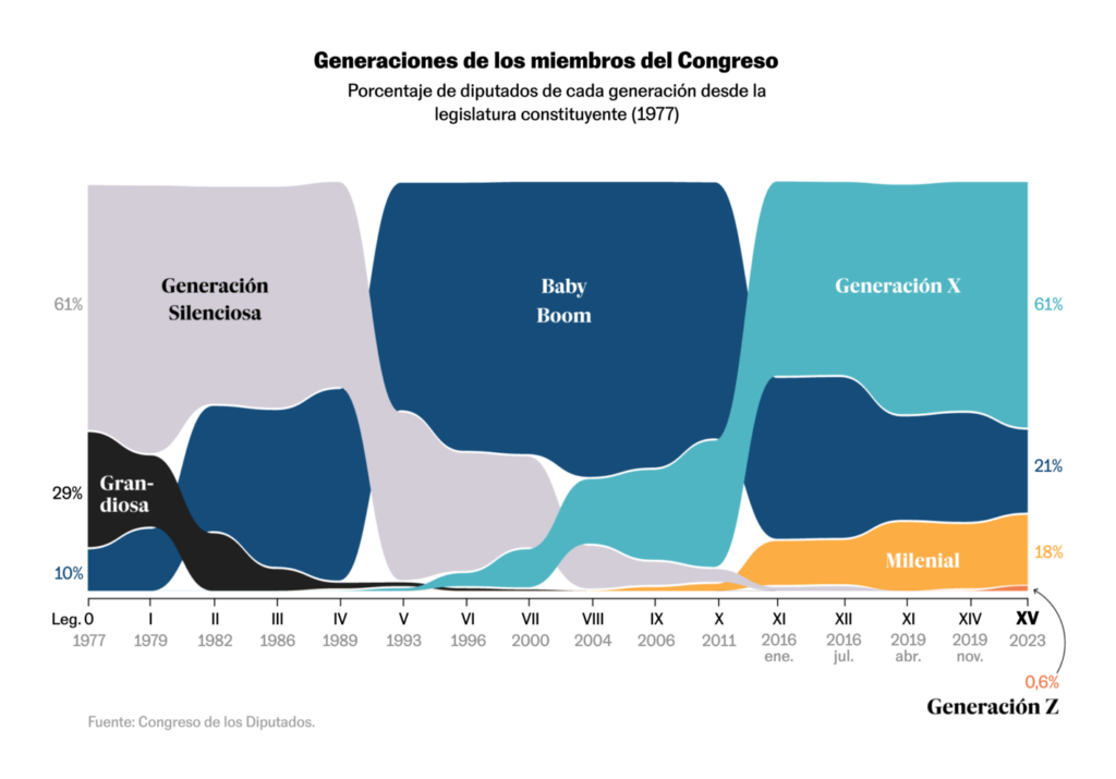
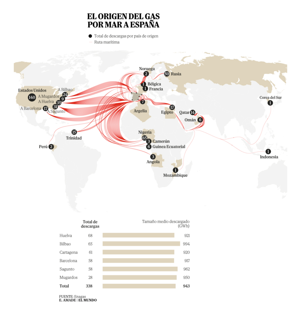
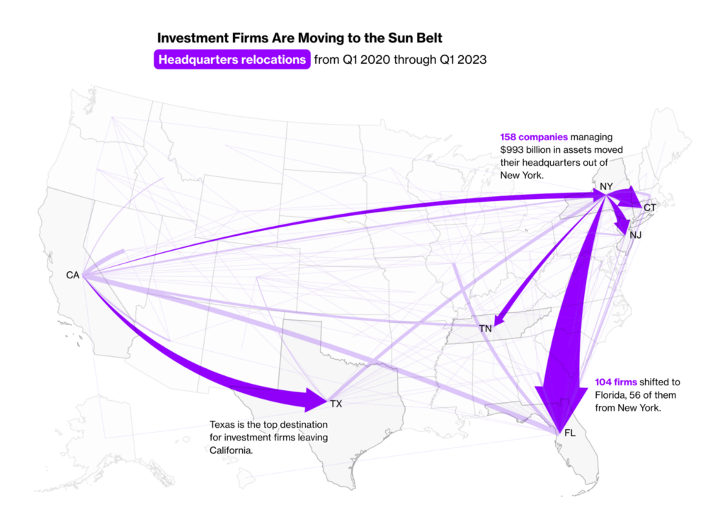
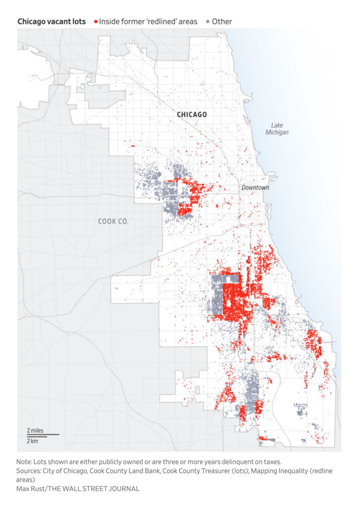
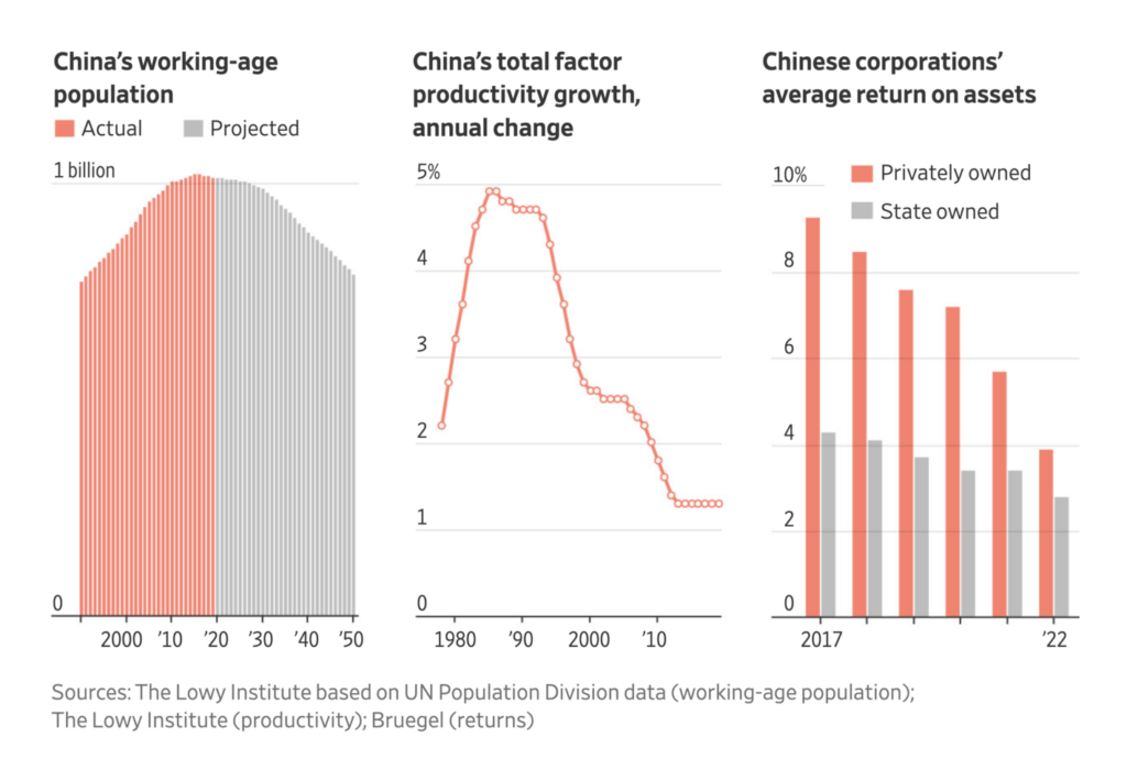
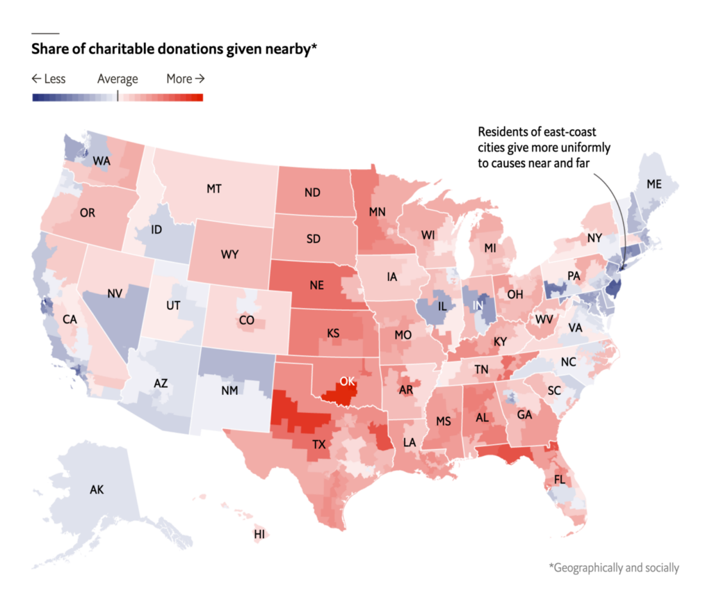
And when it came to economics, we encountered beautiful maps:

El Mundo: El año que la guerra convirtió a España en la gasolinera de Italia y Alemania, August 16
Bloomberg: New York and California Each Lost $1 Trillion When Financial Firms Moved South, August 21
The Wall Street Journal: Too Many Vacant Lots, Not Enough Housing: The U.S. Real-Estate Puzzle, August 17
Financial Times: Is a degree worth it?, August 18
ZEIT Online: So viel kostet es Sie, weniger zu arbeiten, August 22

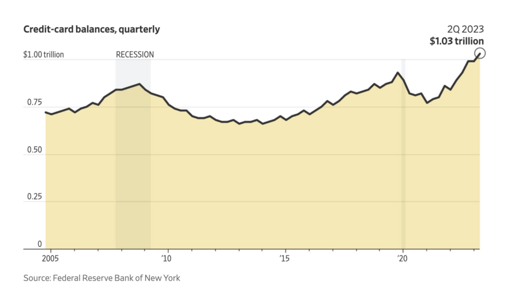
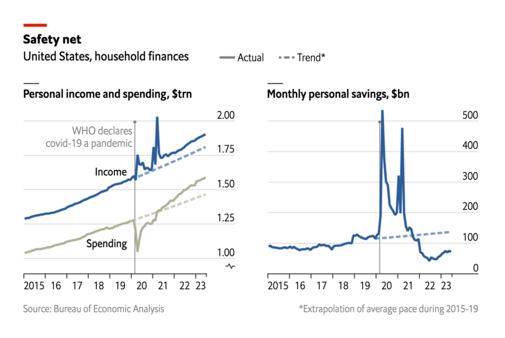
Speaking of economics: visualizations about inflation still show a clear trend. Credit-card balances and rents go up, savings go down:

The Wall Street Journal: Is It Time to Worry About Consumer Debt? What Is Going On in Seven Charts, August 16
The Economist: America’s pandemic savings are running out, August 21
José Luengo-Cabrera: “Argentina: monthly inflation,” August 15 (Tweet)

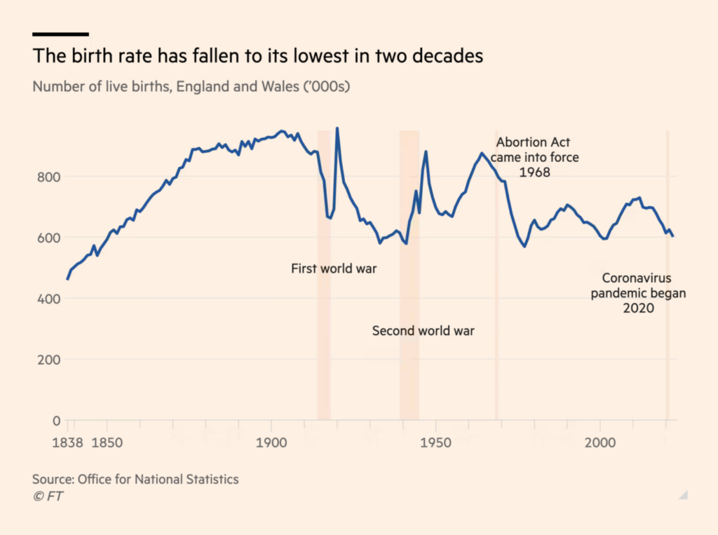
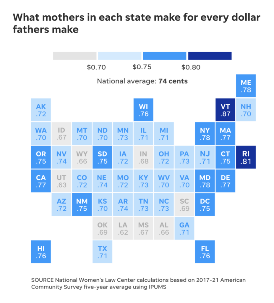
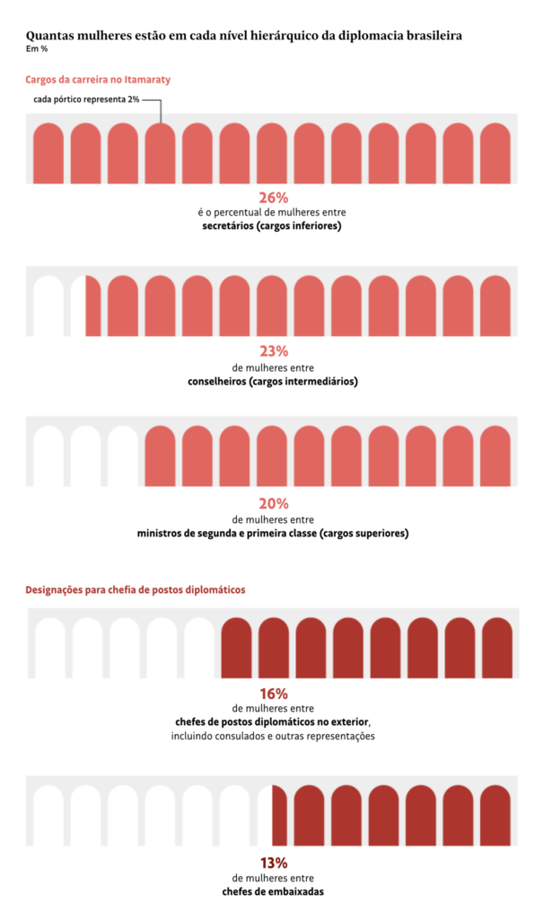
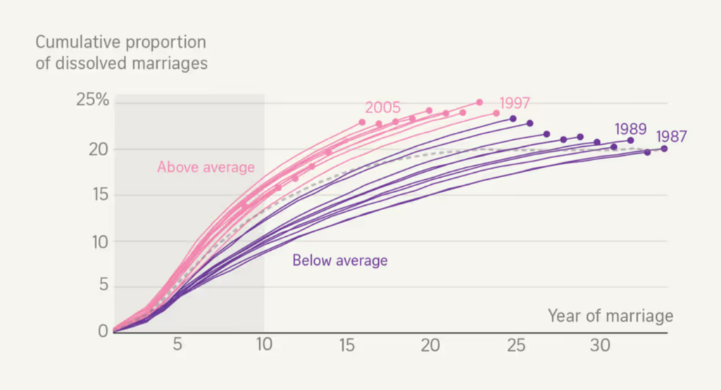
Unusually many charts this week covered the topic of mothers giving birth, and what that means for their careers and their countries’ economies:

Financial Times: Falling birth rate highlights UK’s demographic challenges, August 17
USA Today: This equal pay day for working mothers. The fight for pay equality wages on, August 15
Folha de S.Paulo: Mulheres chefiam só 16% dos postos diplomáticos e apontam ‘teto de vidro’ no Itamaraty, August 17
Luis Armando Moreno: “Recientemente @CONAPO_mx publicó las bases de datos de las nuevas Proyecciones de Población 1950-2070. Tomando el ejemplo de @claudiodanielpc, acá tenemos la evolución de la población de #Sonora de 1970 a 2070,” August 20 (Tweet)
The Wall Street Journal: China’s 40-Year Boom Is Over. What Comes Next?, August 20

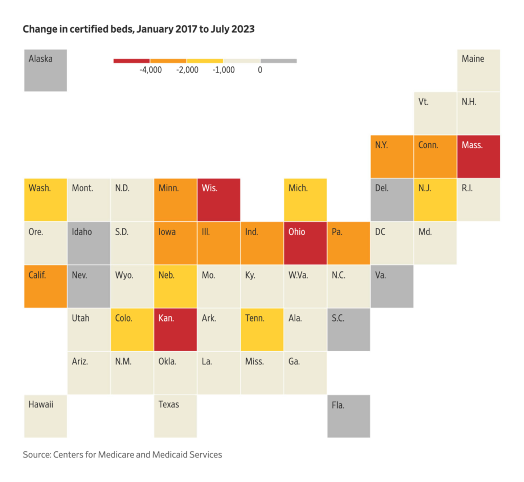
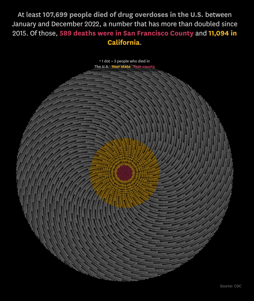
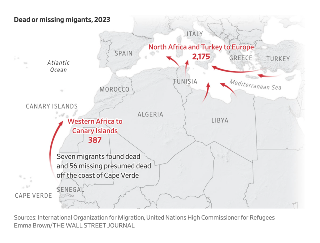
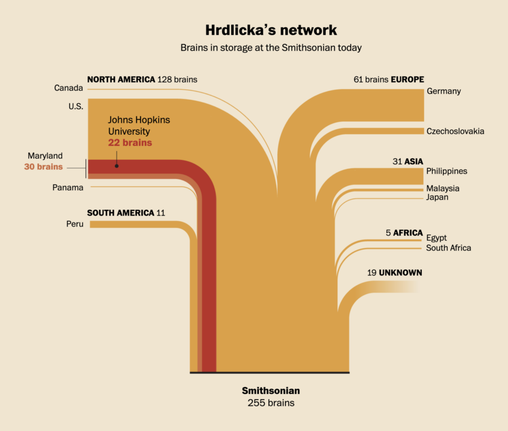
We also saw many visualizations dealing with health and death this week:

The Wall Street Journal: The Upheaval at America’s Disappearing Nursing Homes, in Charts, August 22
San Francisco Chronicle: Tracking U.S. drug overdose deaths, August 21
Axios: All signs point to a late summer COVID wave, August 17
Financial Times: Pink Floyd strike a chord as scientists recreate song from brain activity, August 15
The Wall Street Journal: More Than 60 Feared Dead as Migrant Boat Is Found Adrift After More Than a Month, August 17
The Washington Post: The Smithsonian’s ‘bone doctor’ scavenged thousands of body parts, August 15
The Washington Post: Searching for Maura, August 16

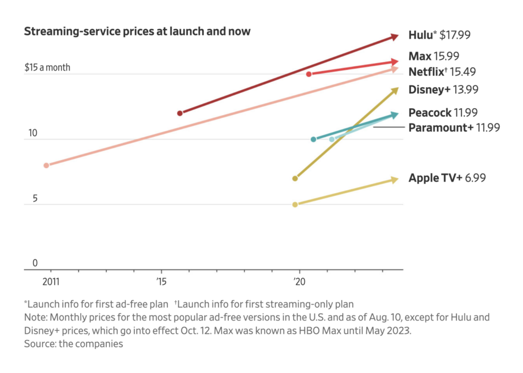
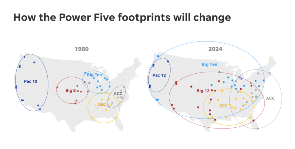
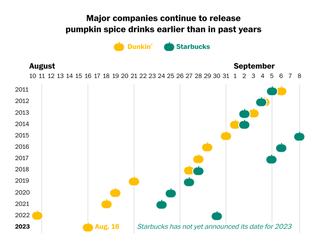
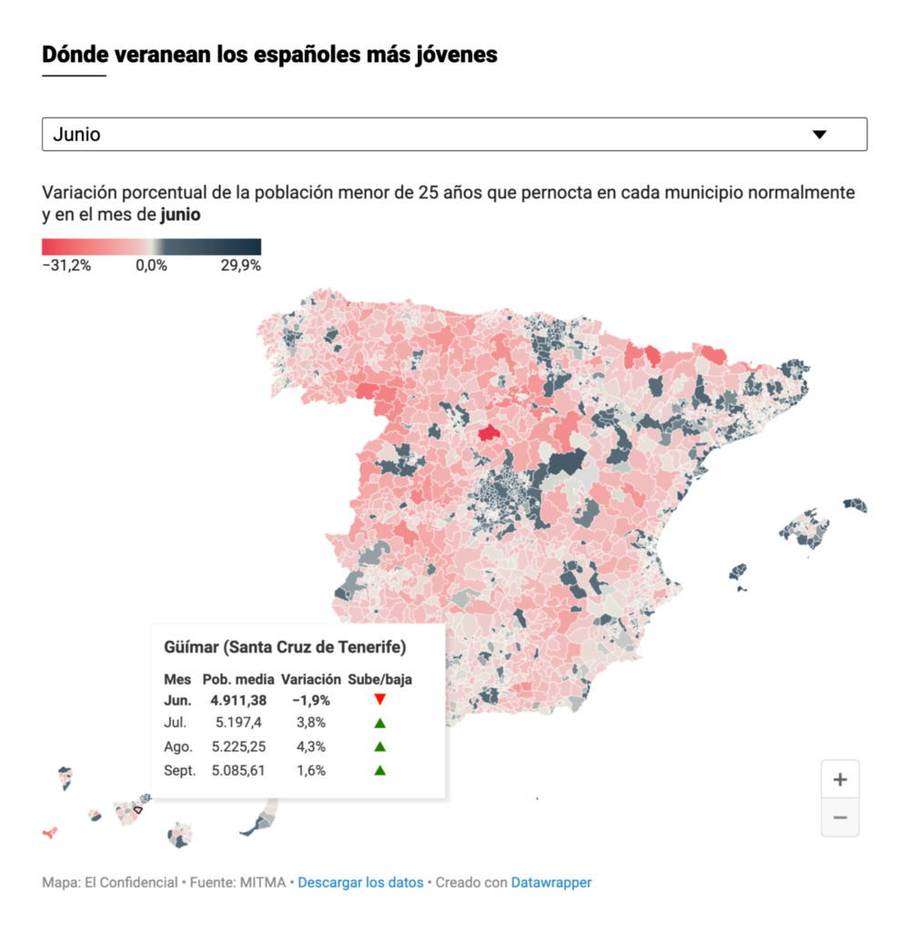
We made it this far, so let’s reward ourselves with some more beautiful maps and charts on Netflix, pumpkins, and college sports in our miscellaneous section:

Le Monde: Histoire du Gulf Stream, courant marin fameux et symbole ambigu de la fragilité des pulsations terrestres, August 20
Le Monde: La folle richesse du courant marin de Humboldt, à l’origine d’une pêche miraculeuse désormais menacée, August 21
The Wall Street Journal: Streamflation Is Here and Media Companies Are Betting You’ll Pay Up, August 15
The New York Times: Airline Close Calls Happen Far More Often Than Previously Known, August 21
USA Today: NCAA conference realignment shook up Big 10, Big 12 and PAC-12. We mapped the impact, August 17
The Washington Post: Waiting for fall weather to enjoy pumpkin spice lattes? You may miss them, August 17
The Economist: What drives people to vote the way they do?, August 17
The Straits Times: Why is a larger share of the more recent ‘I Dos’ going the distance?, August 19
El Confidencial: Cuando llega el calor, este pueblo te enamora: así es la España rural que resucita en verano, August 20

What else we found interesting

The Washington Post: The phone calls from Trump’s team at the core of the Georgia indictment, August 16
The Wall Street Journal: Trump and His Orbit: The Scope of Georgia’s Election Case Explained, August 16
The Wall Street Journal: Next Time You Buy Parmesan, Watch Out for the Microchip, August 17

Help us make this Dispatch better! We’d love to hear which newsletters, blogs, or social media accounts we need to follow to learn about interesting projects, especially from less-covered parts of the world (Asia, South America, Africa). Write us at hello@datawrapper.de or leave a comment below.

Want the Dispatch in your inbox every Tuesday? Sign up for our Blog Update newsletter!

Comments