Data Vis Dispatch, August 24

The best of last week’s big and small data visualizations

Welcome back to the tenth edition of Data Vis Dispatch! Every week, we’ll be publishing a collection of the best small and large data visualizations we find, especially from news organizations — to celebrate data journalism, data visualization, simple charts, elaborate maps, and their creators.

Recurring topics this week include a new wave of COVID cases, the NATO withdrawal from Afghanistan, and your favorite simple charts with some uncommon twists.

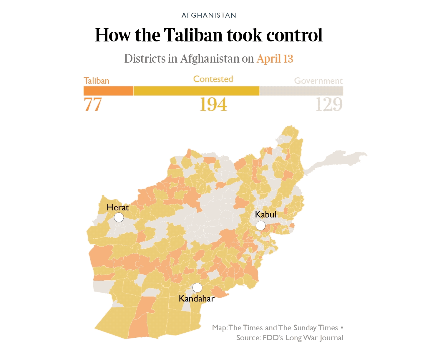
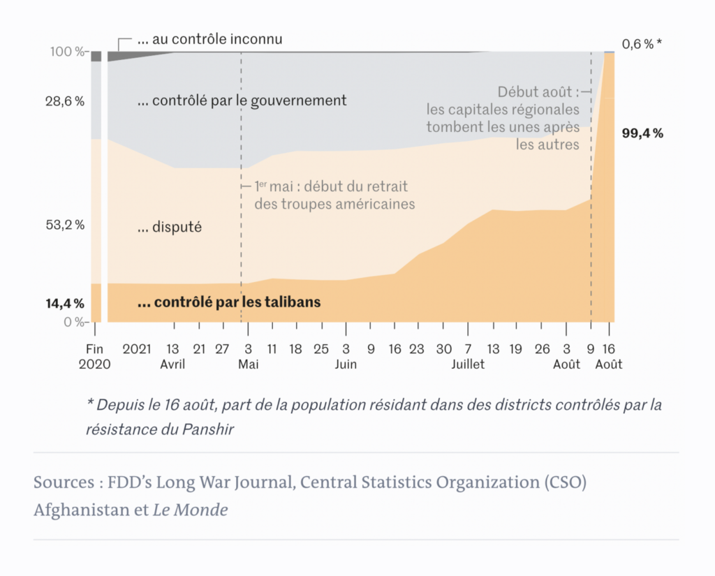
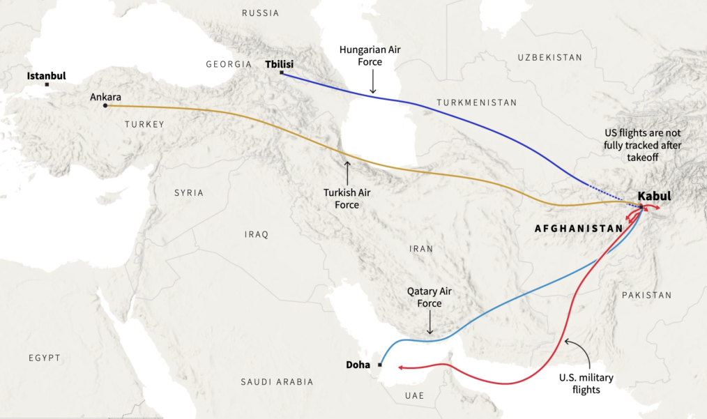
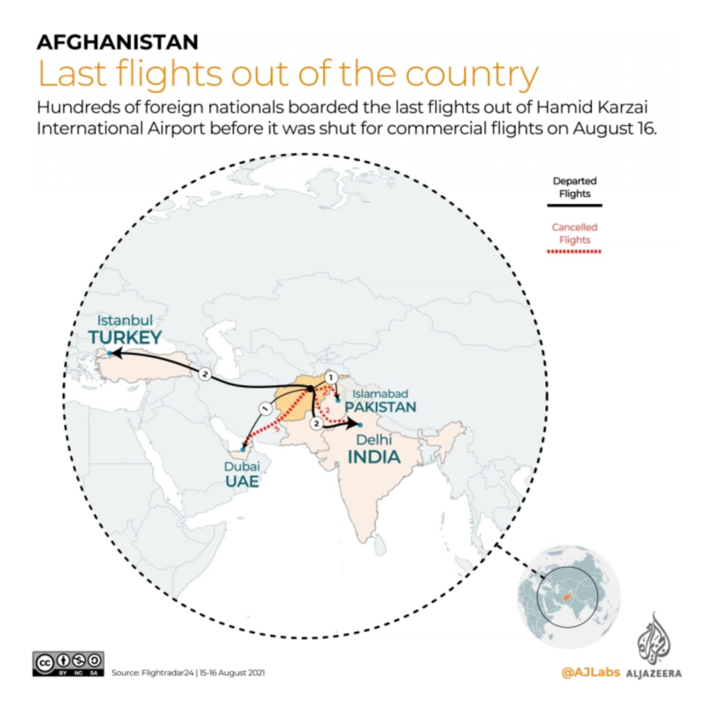
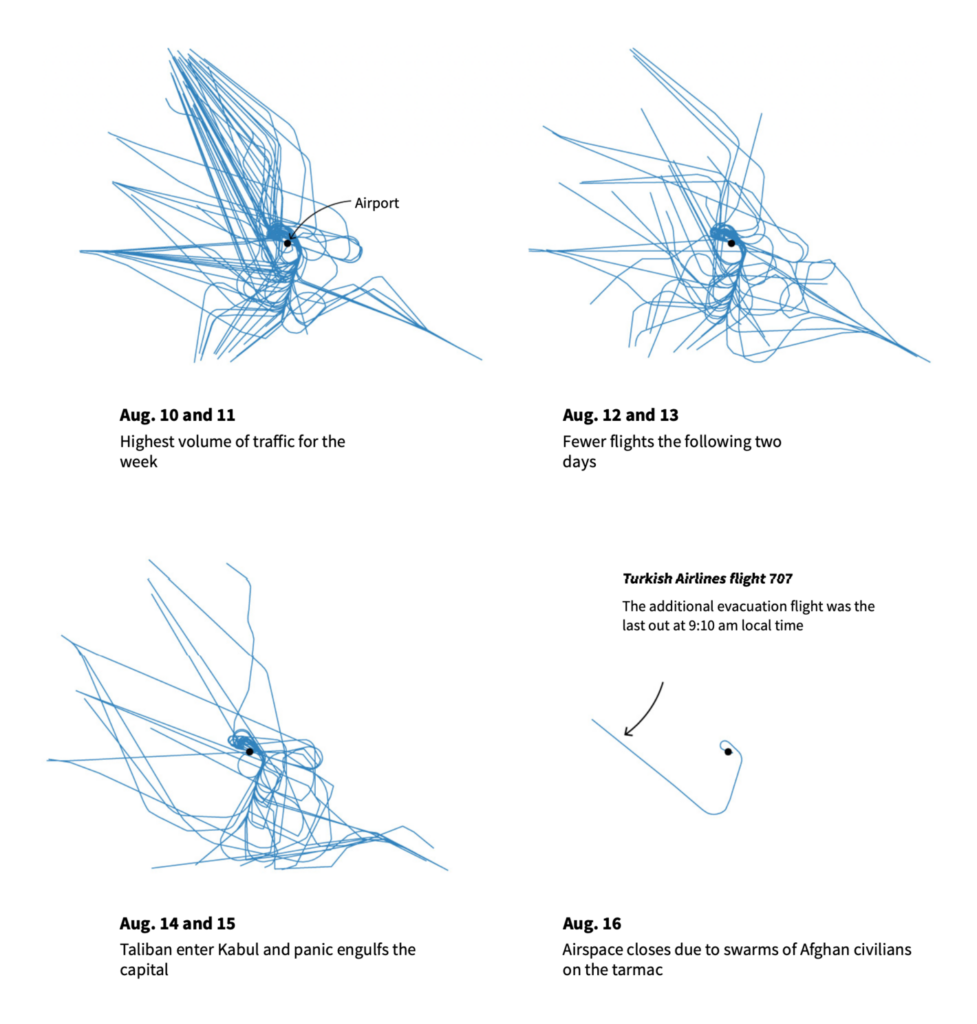
For the second week in a row, Afghanistan was the biggest story in data vis. The entire country is now effectively under Taliban control:

The Times: Afghanistan in maps: how the Taliban took control, August 20
Le Monde: De quelques districts à presque tout l’Afghanistan en quelques semaines : l’offensive des talibans sur une carte, August 18

Both Afghans and foreign nationals rushed to leave the country by air:

Reuters: Chaos in Kabul, August 18
Al Jazeera: Tracking the flights out of Kabul, August 17
Reuters: What’s flying over Kabul?, August 20

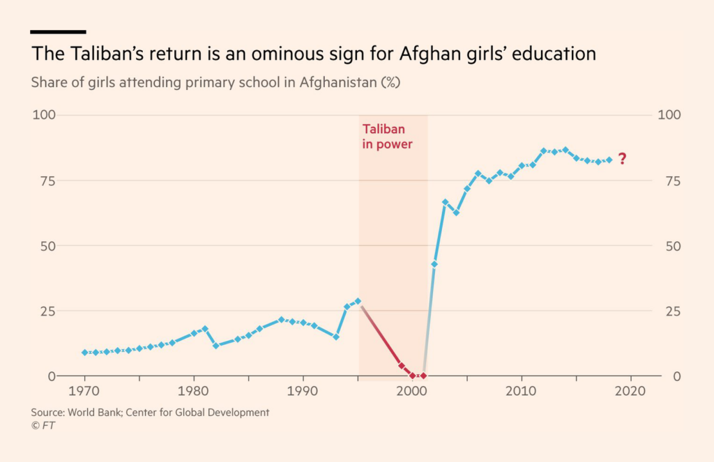
And we looked back at what the past 20 years have actually changed:

Szabad Európa: Afganisztán akkor és most, August 24
John Burn-Murdoch: “Even as someone who works with data every day, it’s rare to see a disrupted time series quite as stark as this. Rates of girls’ education in Afghanistan collapsed to *zero* when Taliban took over in 1996, shattering progress up to that point. The question is what happens next,” August 24 (Tweet)

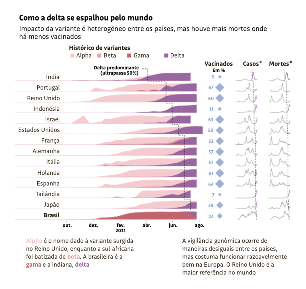
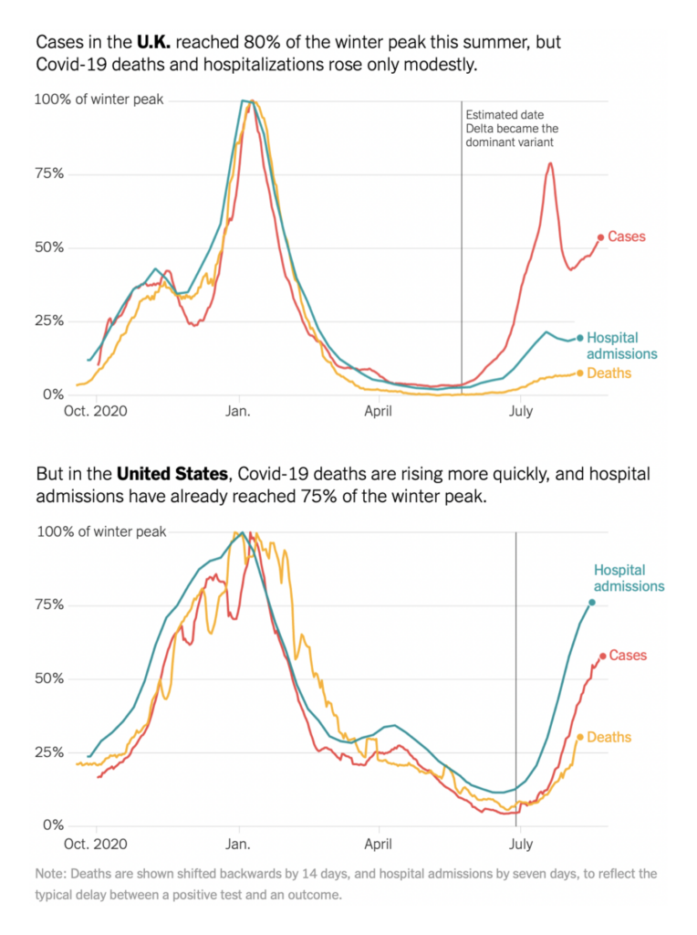
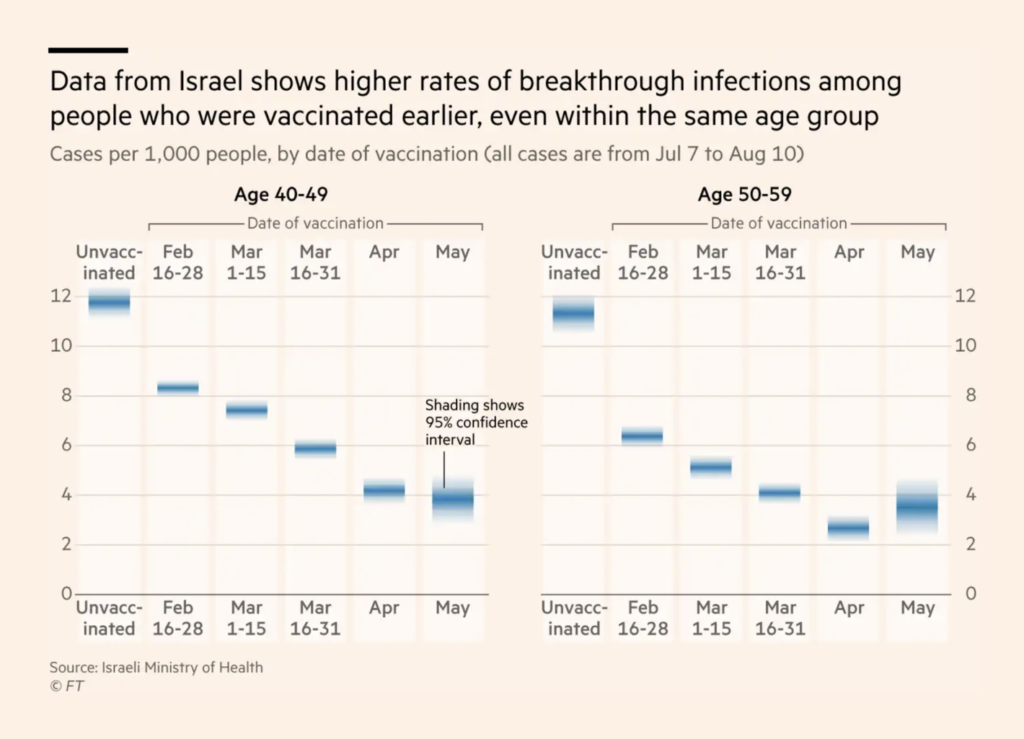
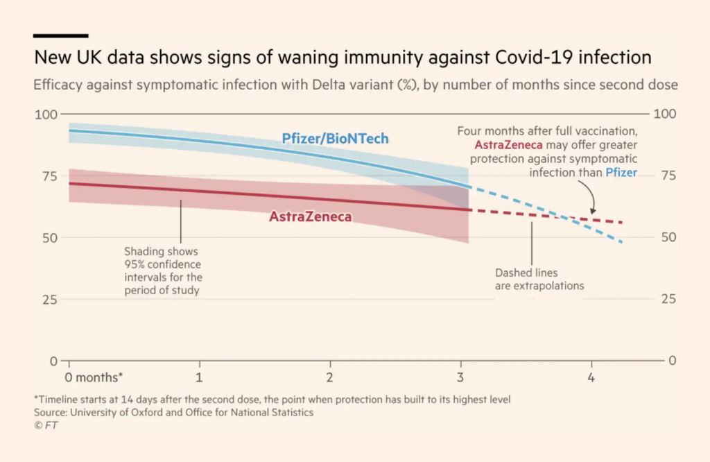
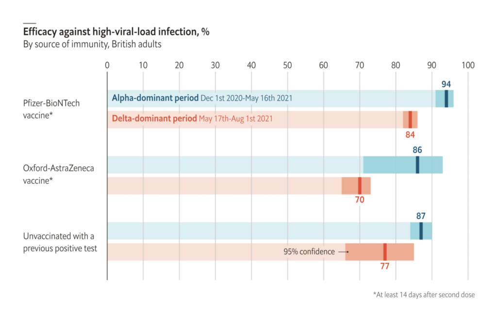
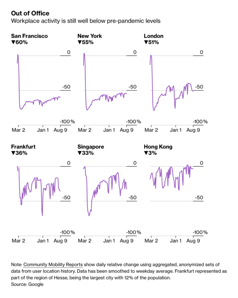
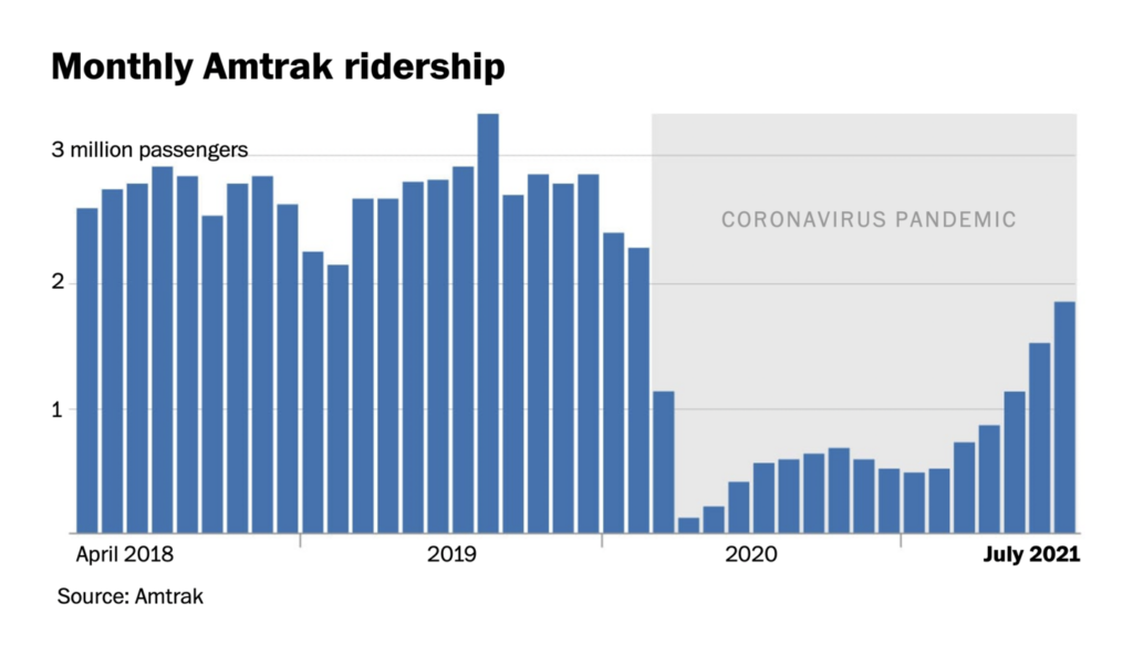
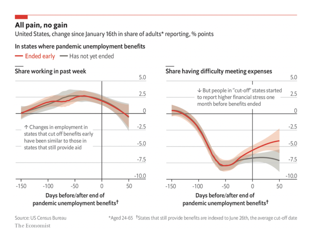
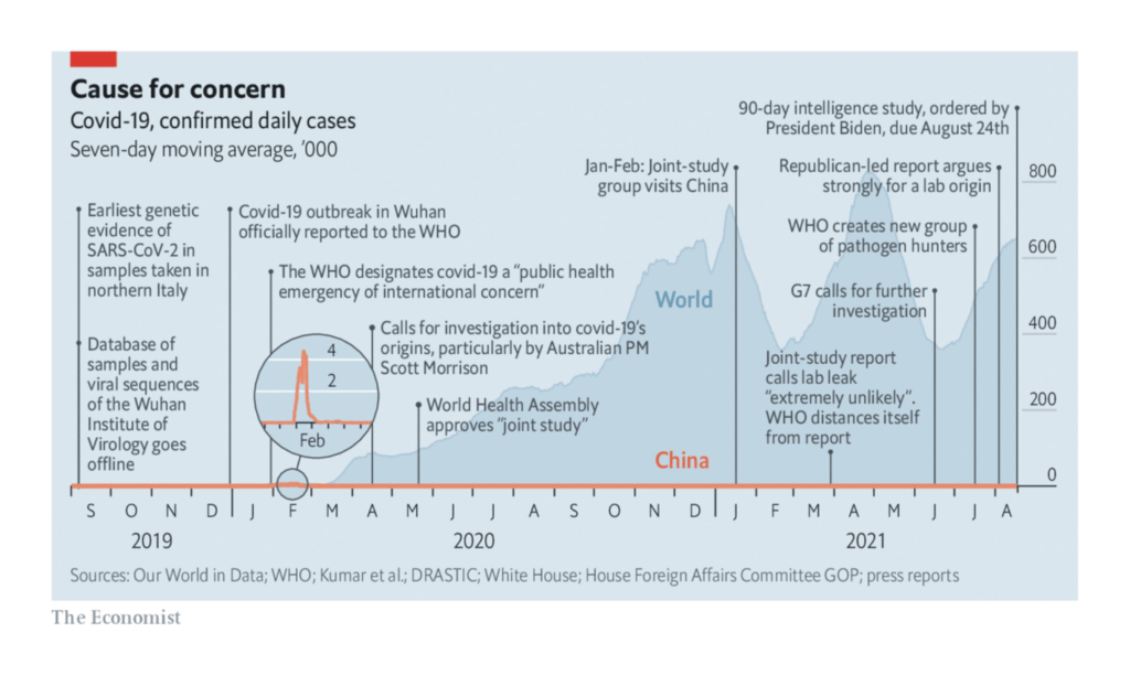
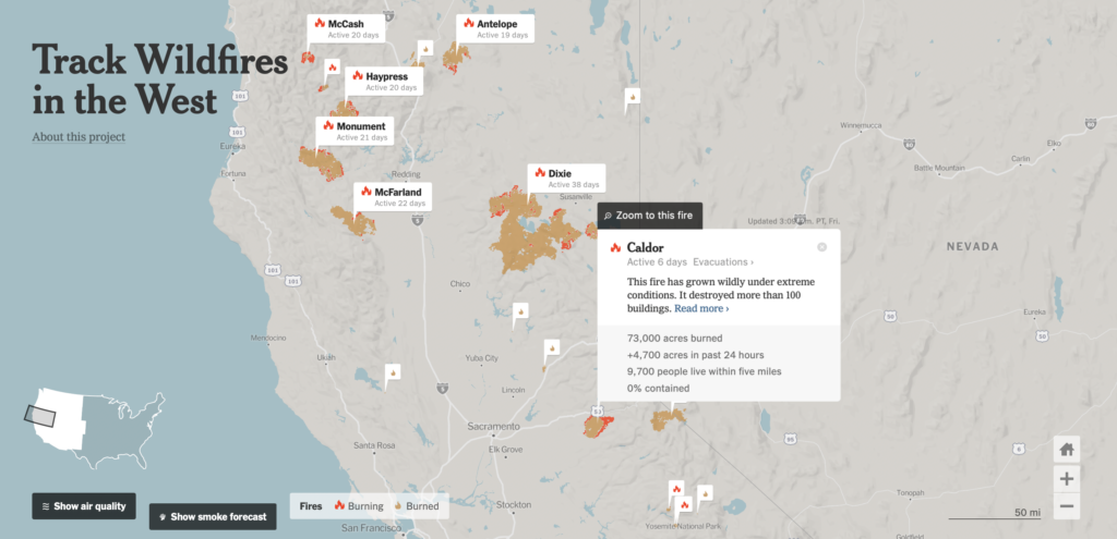
But just because the pandemic hasn’t taken our top spot in recent weeks, don’t be fooled — COVID is roaring back:

Zeit Online: The Severity of the Pandemic in Europe, August 19
The New York Times: American Hospitals Buckle Under Delta, With I.C.U.s Filling Up, August 17
Folha de S.Paulo: Variante delta do coronavírus já assusta mais de 120 países; veja o que se sabe, August 21
Berliner Morgenpost: Welche Altersgruppe ist gerade am stärksten betroffen?, August 17
The New York Times: Many Older Americans Still Aren’t Vaccinated, Making the Delta Wave Deadlier, August 24

In some countries, the newest wave may be helped along by waning vaccine efficacy:

Financial Times: Israel hopes boosters can avert new lockdown as Covid vaccine efficacy fades, August 23
Financial Times: Are vaccines becoming less effective at preventing Covid infection?, August 19
The Economist: Jabs mostly fend off the Delta strain but breakthroughs are infectious, August 21

And we’re still far from a pre-pandemic economic normalcy:

Bloomberg: Surging Delta Cases Reverse the World’s March Back to the Office, August 20
The Washington Post: Train travel collapsed early in the pandemic, but a summer resurgence is offering a boost for Amtrak, August 20
The Economist: So far, ending pandemic unemployment aid has not yielded extra jobs, August 20

With no end in sight, it’s not hard to understand the ongoing interest in investigating the origins of the virus:

The Economist: The world needs a proper investigation into how covid-19 started, August 21

But enough about the news for now! Let’s talk about data vis. Between war, census, and natural disaster, last week was all map all the time:

The New York Times: Inside the Diverse and Growing Asian Population in the U.S., August 21
The New York Times: How Haiti Was Devastated by Two Natural Disasters in Three Days, August 18
Inkyfada: Vivre avec moins de 5 dinars par jour, cartographie de la pauvreté en Tunisie, August 18

This week, meanwhile, it was simple charts’ time to shine:

FlowingData: Daily Routine, 2020, August 19
The Pudding: Ranking the Biggest NBA Finals Carry Jobs, August 17
The Economist: A study on dishonesty was based on fraudulent data, August 20
Financial Times: How changing climate and tastes made red wine stronger, August 21
The New York Times: Hospitals and Insurers Didn’t Want You to See These Prices. Here’s Why, August 22

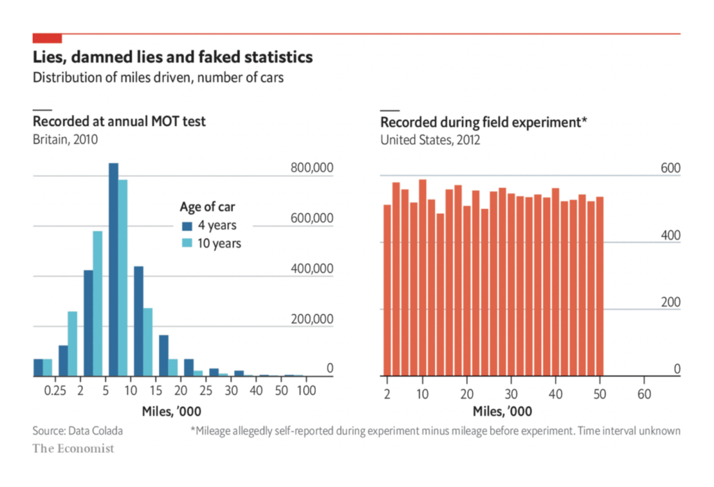
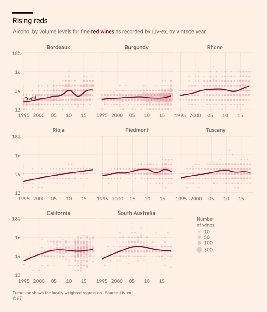
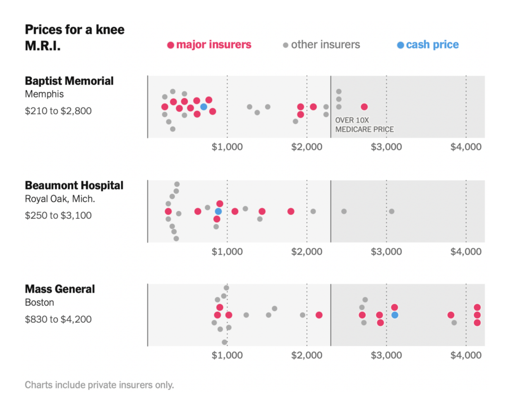
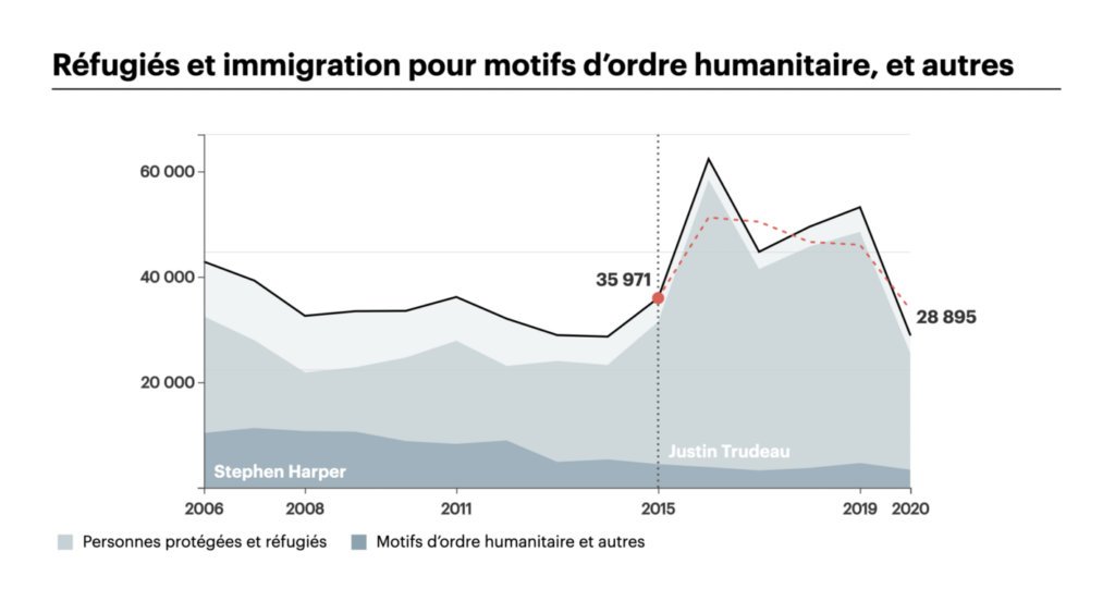
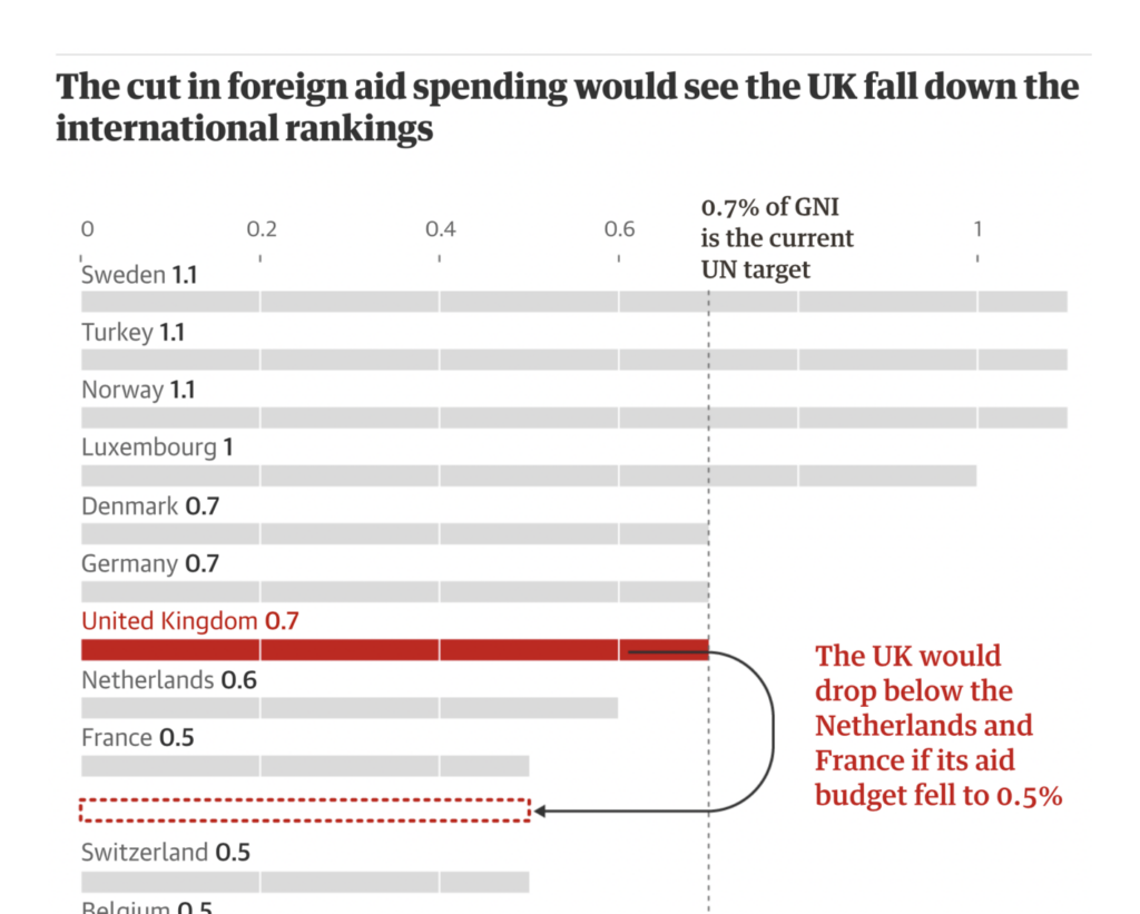
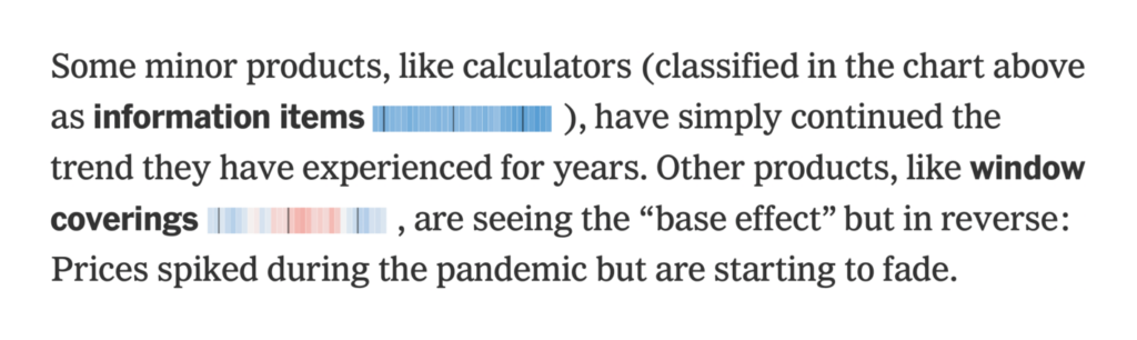
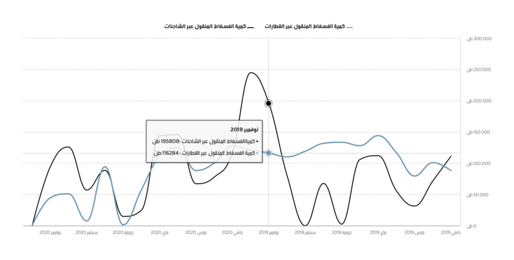
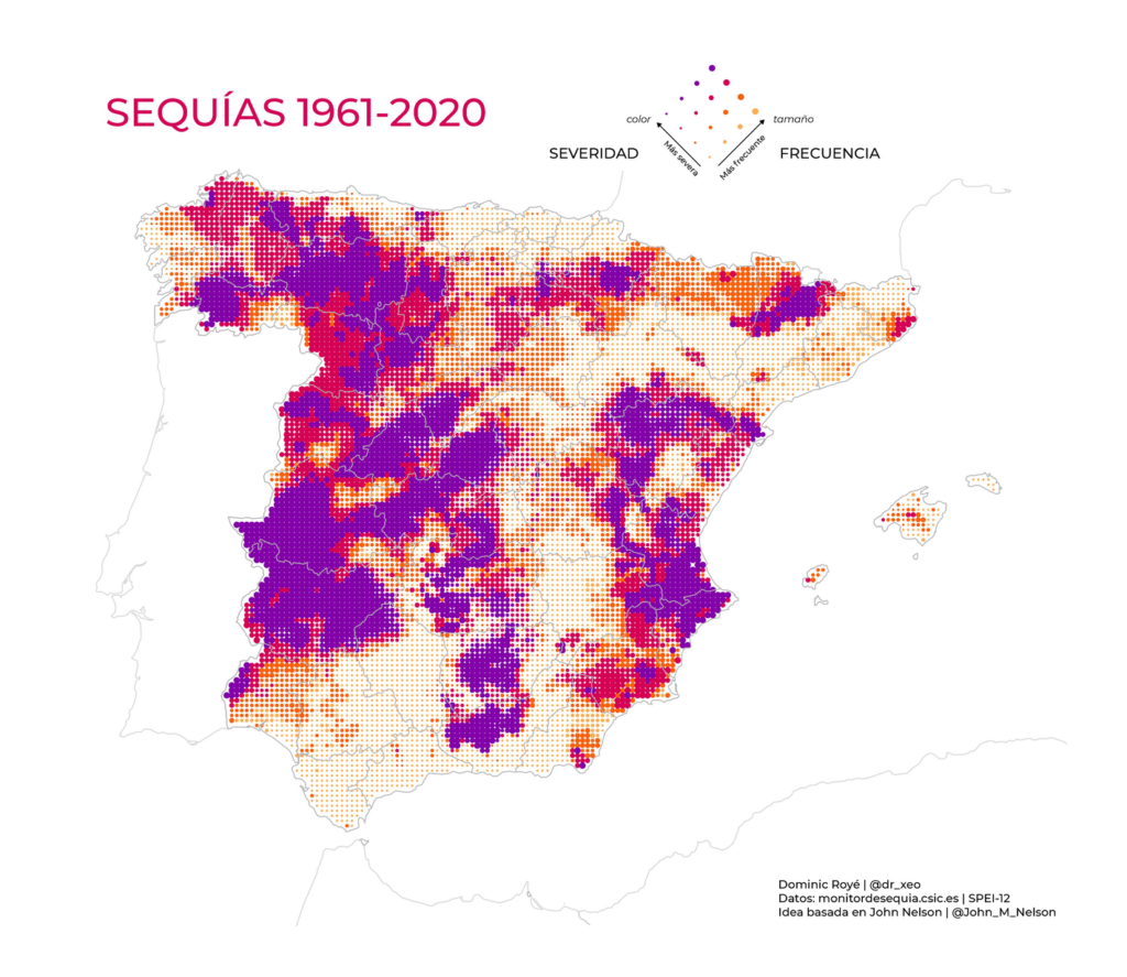
But simple charts can still surprise you with a twist. How about a draw-your-guess interactive element, a “moving” bar to show policy changes, a tiny chart in line with the text, or an Arabic x-axis where time moves from right to left?

Le Devoir: Dessinez vous-même le bilan du gouvernement Trudeau, August 19
The Guardian: ‘Devastating’: how UK’s foreign aid cuts could hurt the world’s poorest, August 23
The New York Times: 179 Reasons You Probably Don’t Need to Panic About Inflation, August 18
Inkyfada: قضية نقل الفسفاط: 16 متهما، 3 عقود وملايين الأطنان غير المنقولة سنويا, August 20

And last but never least… it’s hot out here. And dry. And the dry stuff is burning. And it’s about to get a lot hotter.

Dominic Royé: “Hace tiempo vi un fantástico trabajo de @John_M_Nelson de sequías en EEUU, os recomiendo seguirle, con un mapa bivariado que quería replicar. Datos https://monitordesequia.csic.es ¿Dónde encontramos más sequías en España peninsular y Baleares?,” August 22 (Tweet, Inspiration)
The New York Times: Track Wildfires in the West, August 19
The San Francisco Chronicle: What data shows about Dixie Fire’s rapid growth and how it’s different, August 18
Gregor Aisch/Datawrapper: Days with extreme heat are likely becoming more frequent, August 19
Financial Times: Climate models forecast more frequent extreme heat, August 20

What else we found interesting

Nightingale: Data-Driven Album Covers, August 17
aRtsy: “Today’s artwork generated with #rstats and #ggplot2,” August 22 (Tweet)

Help us make this dispatch better! We’d love to hear which newsletters, blogs, or social media accounts we need to follow to learn about interesting projects, especially from less-covered parts of the world (Asia, South America, Africa). Write us at hello@datawrapper.de or leave a comment below.

Comments