We want to enable everyone to create beautiful charts, maps, and tables. New to data visualization? Or do you have specific questions about us? You'll find all the answers here.
The best of last week’s big and small data visualizations
Vivien Serve
Welcome back to the 157th edition of the Data Vis Dispatch! Every week, we publish a collection of the best small and large data visualizations we find, especially from news organizations — to celebrate data journalism, data visualization, simple charts, elaborate maps, and their creators.
Recurring topics this week include polls, mosquitoes, and air quality.
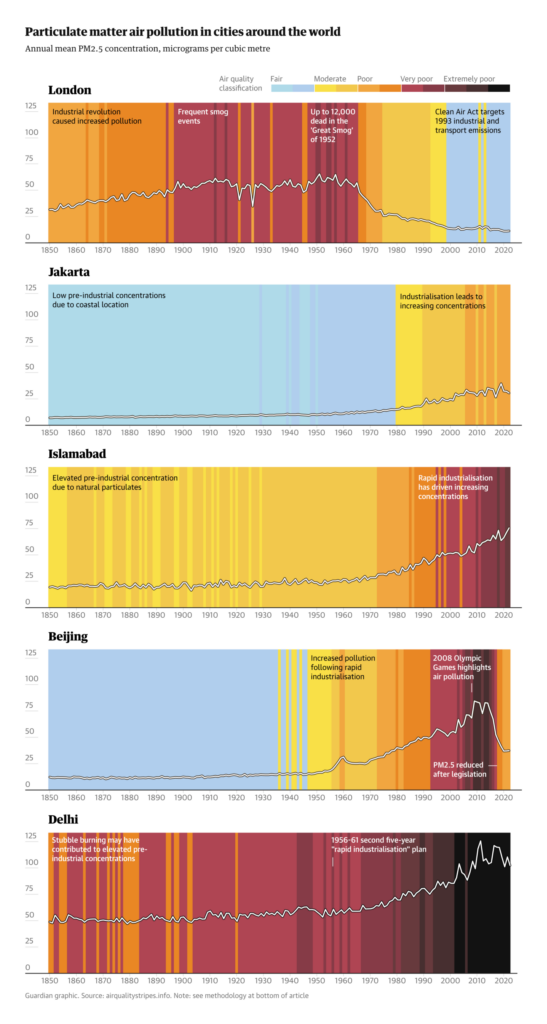
A new way to visualize air pollution inspired by Ed Hawkins’ climate stripes:
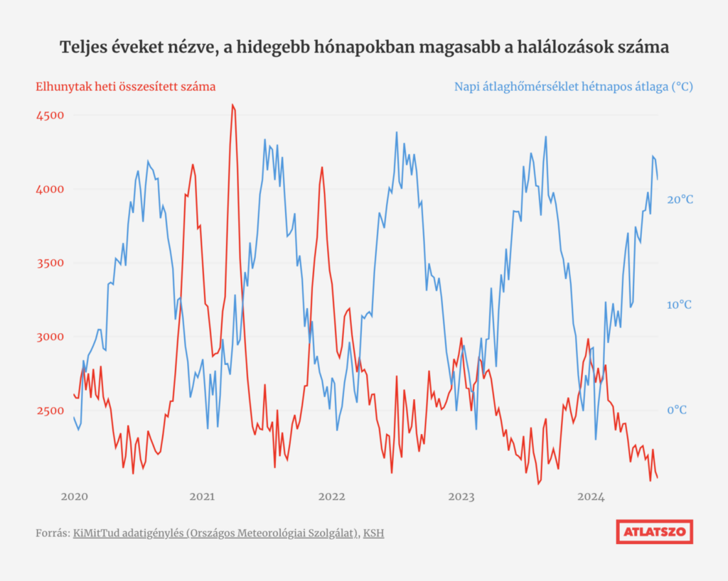
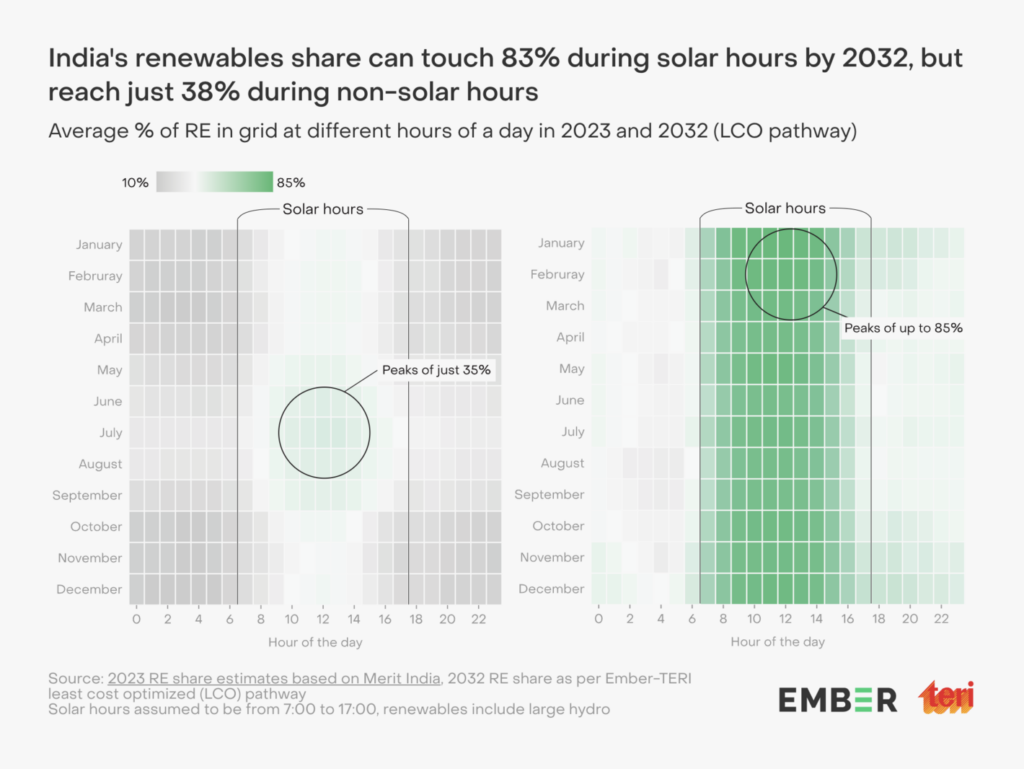
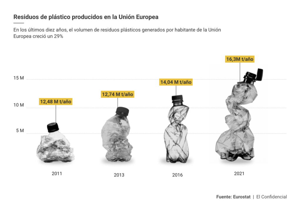
But that’s not all from climate and environment. In the light of the enormous heat of recent weeks, Átlátszó took a look at the death toll caused by extreme weather. Plus, the potential of renewable energy in India and rising plastic pollution:
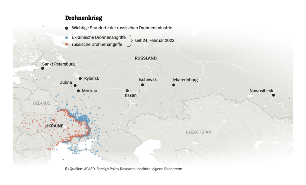
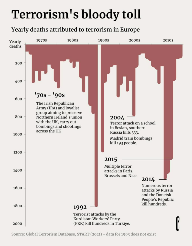
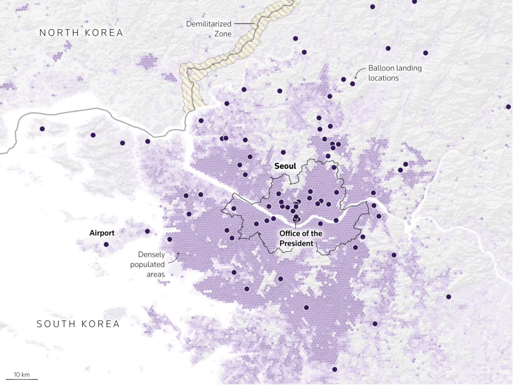
War and death are not only in Russia and Ukraine. We also found data on terrorism and the ongoing Korean conflict:
theeuropeancorrespondent: “[…] Since 1970, more than 20,000 people have been killed and tens of thousands injured in terror attacks across Europe. The impact has been felt across many countries, with Türkiye experiencing a particularly high number of attacks due to its long-standing conflict with the Kurdistan Workers’ Party (PKK), leading to over 7,000 terror incidents in the past 50 years. Credits to Simon Scarr for the design,” August 22 (Instagram Post)Reuters: A torrent of trash, August 23 Stunning Visuals!
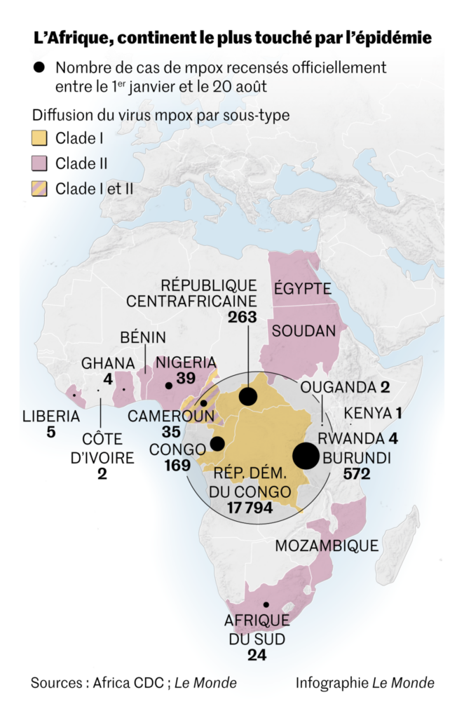
We close the category of bad news with nuclear missiles decades past their projected lifespan and the spread of mpox in Africa:
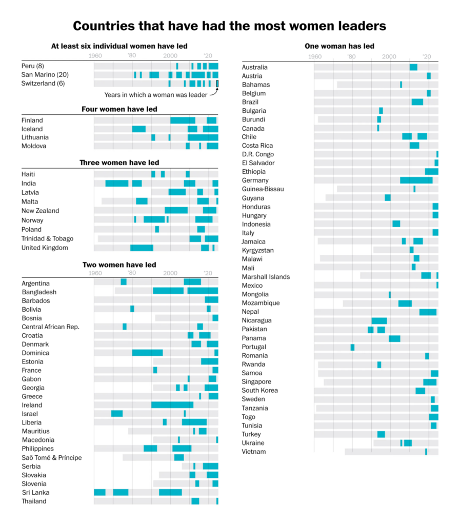
In the broader range of election-related visualizations — Elon Musk’s transformation into a vocal Trump supporter, and women heads of government around the world:
One more thing to evaluate this week: your city (if you live in Vienna, the U.S., or Aberdeen):
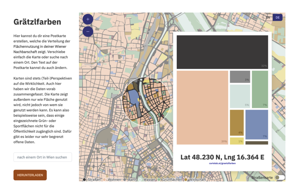
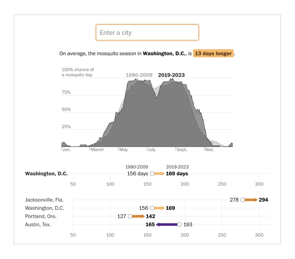
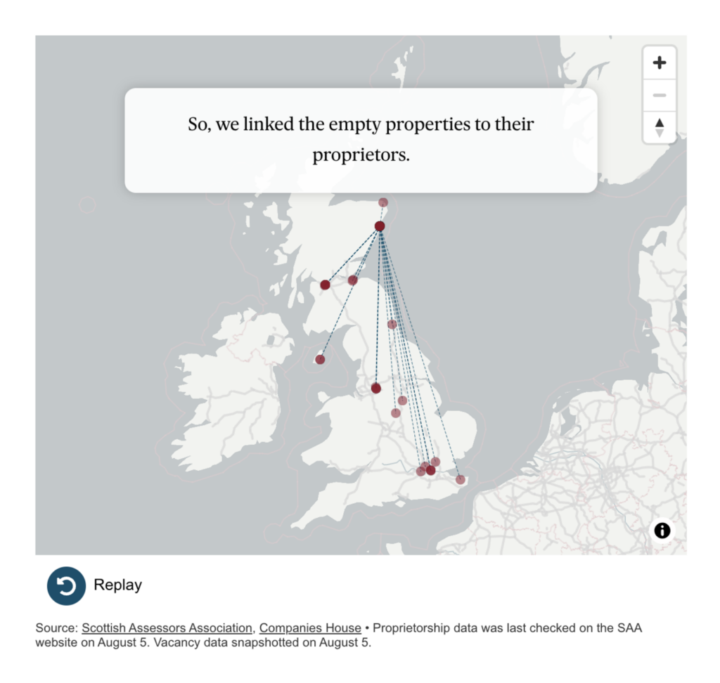
Florian Ledermann: “Explore the distribution of land use in #Vienna with our new Grätzlfarben web map: It is based on the “Kiezcolors” project from ODIS Berlin, which we adapted for Vienna. We also made the code a bit more easily re-usable, so creating your own local Grätzlfarben/Kiezcolors may not be that far off! […] Main credits go to my colleague Ester Scheck who led this project,” August 22 (Mastodon Post, Grätzlfarben)The Washington Post: Where mosquito season is getting longer, August 22 The Press & Journal: Who owns the vacant units on Aberdeen’s Union Street?, August 26
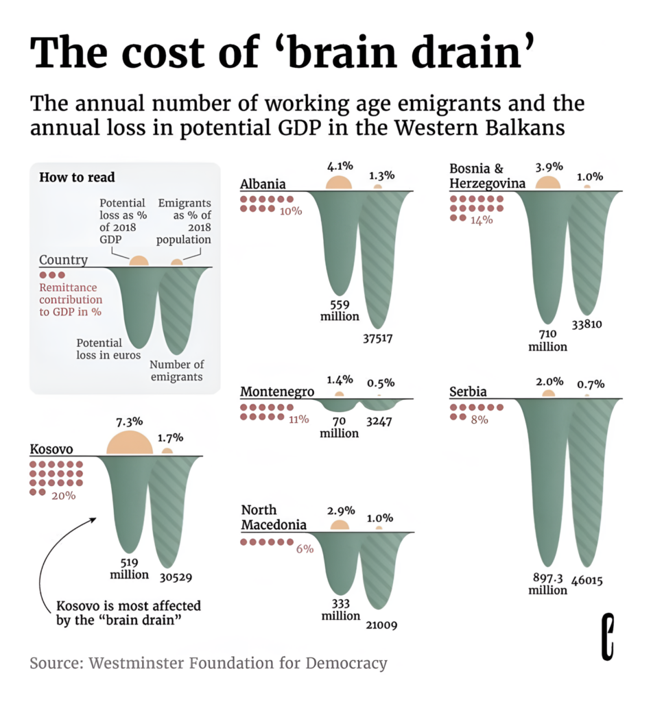
We conclude with the closely related topics of work and migration:
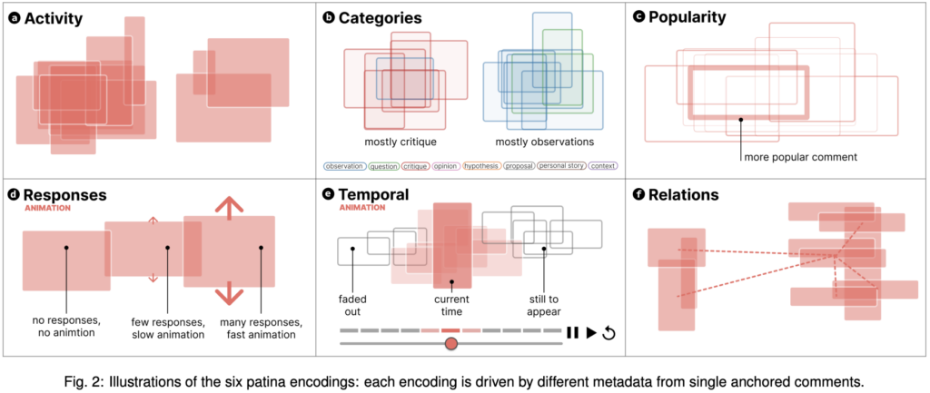
Kris’s n&w account: meat industry olympics […] via @YouTube,” August 22 (Tweet, YouTube Video)The Washington Post: The signs I saw at the DNC and RNC conventions, August 23 derya: “In “Discursive Patinas: Anchoring Discussions in Data Visualizations,” we (Tobias Kauer, @nrchtct, Benjamin Bach) present a new vis technique that visualizes discussions about visualizations, inspired by traces left in the physical world,” August 26 (Mastodon Post, Paper)
Help us make this dispatch better! We’d love to hear which newsletters, blogs, or social media accounts we need to follow to learn about interesting projects, especially from less-covered parts of the world (Asia, South America, Africa). Write us at hello@datawrapper.de or leave a comment below.
(she/her) is a working student on Datawrapper’s Communications team. She creates the Data Vis Dispatch to keep data visualization enthusiasts up to date on exciting new projects. When she’s not working, she studies interface design, and when she’s not studying, she’s planning a festival stage or soldering light installations. Vivien lives in Potsdam.


Comments