Data Vis Dispatch, February 18: German election polls, corruption, and tariffs
February 18th, 2025
9 min
This article is brought to you by Datawrapper, a data visualization tool for creating charts, maps, and tables. Learn more.
The best of last week’s big and small data visualizations
Welcome back to the 105th edition of Data Vis Dispatch! Every week, we’ll be publishing a collection of the best small and large data visualizations we find, especially from news organizations — to celebrate data journalism, data visualization, simple charts, elaborate maps, and their creators.
Recurring topics this week include business, labor, and overheating oceans.
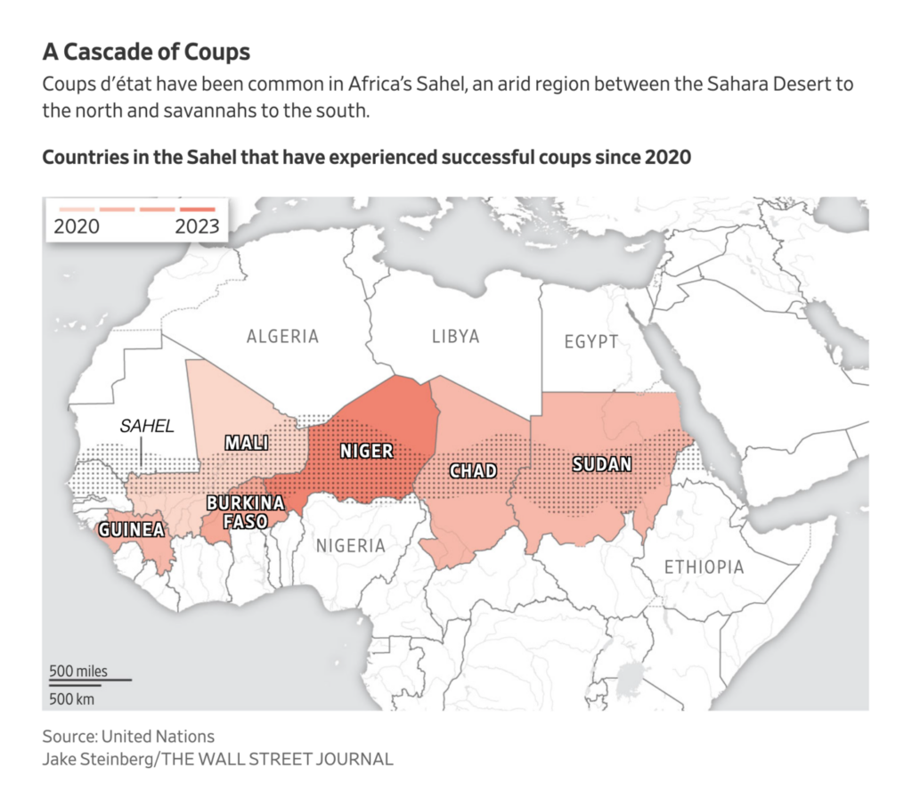
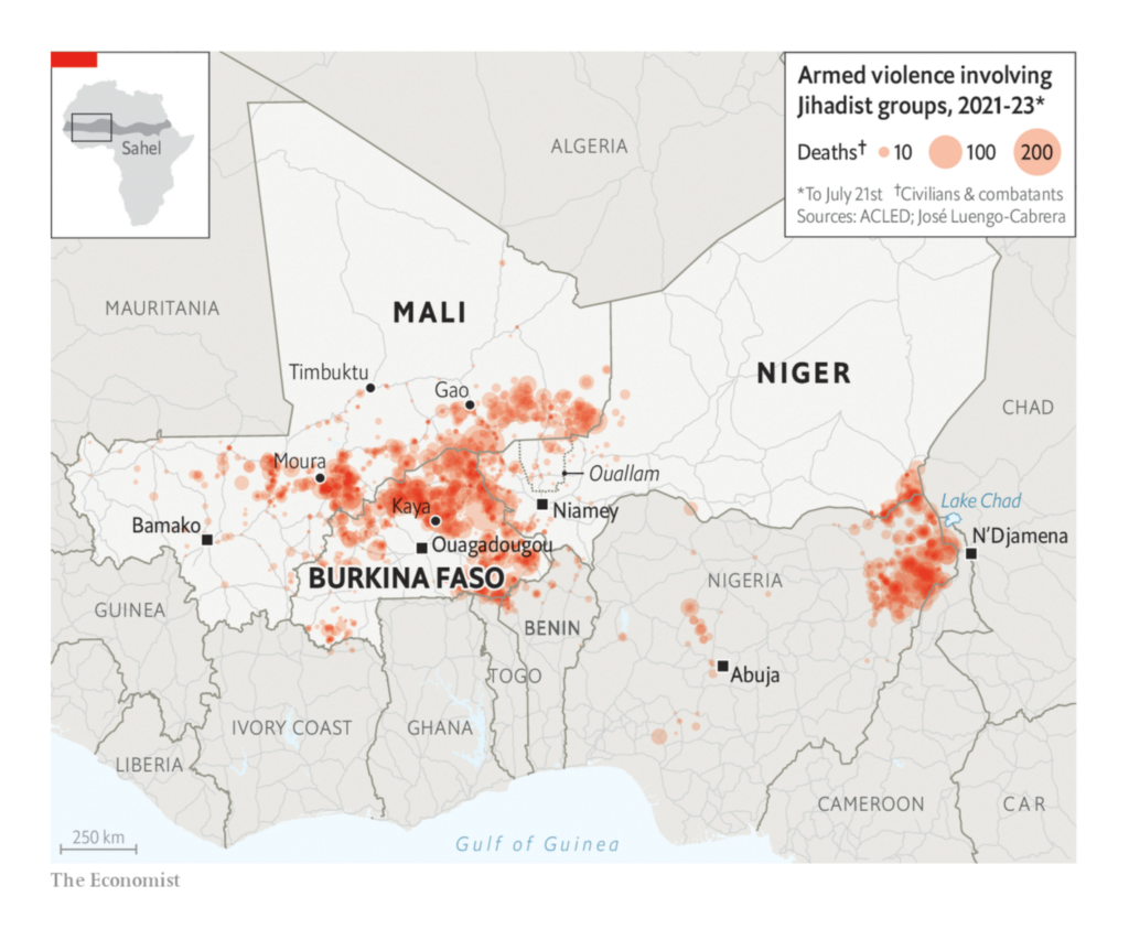
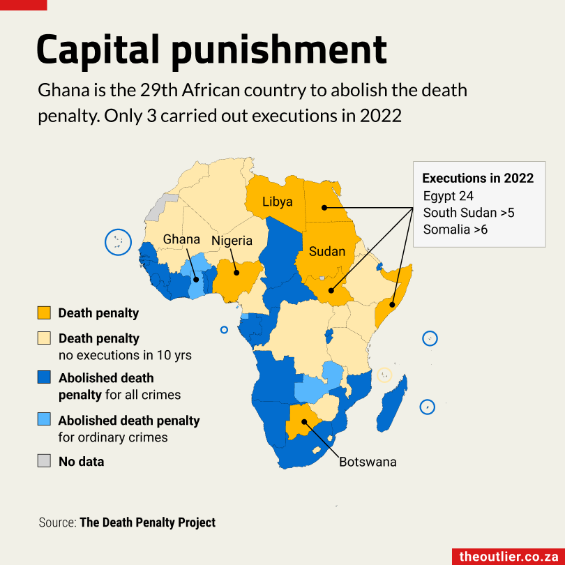
Niger and other countries in the Sahel region were in the spotlight this week:
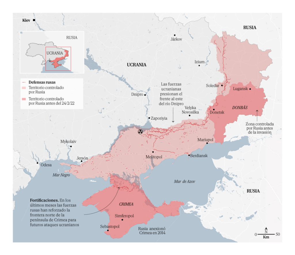
We also saw maps of Russian sanction-dodging and the front line in Ukraine:
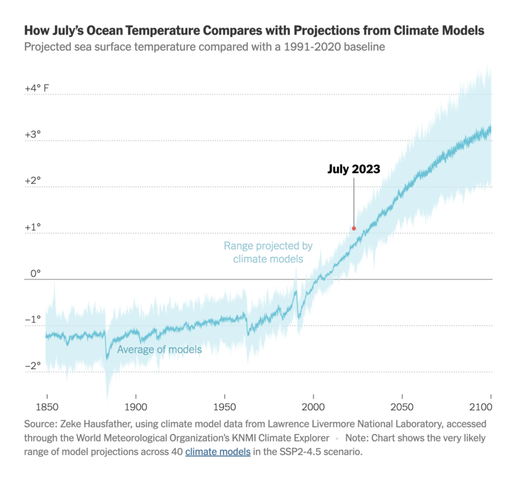
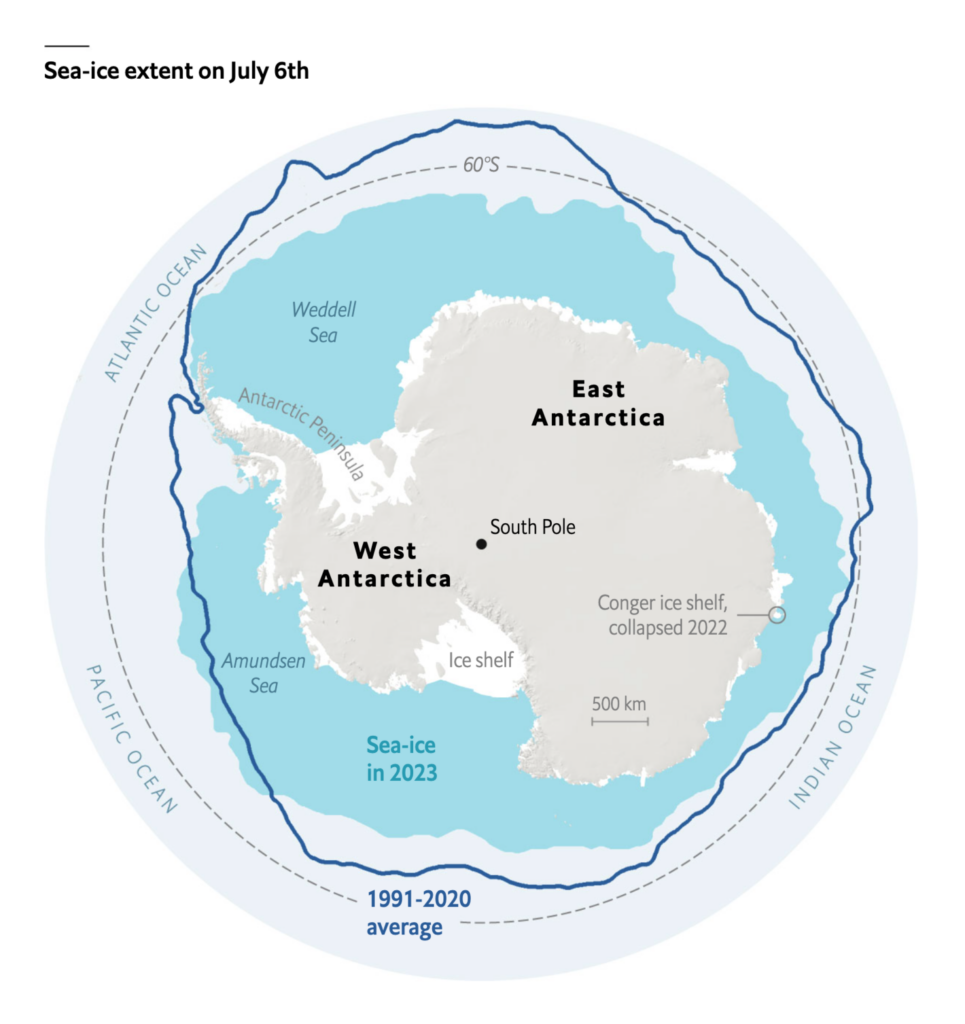
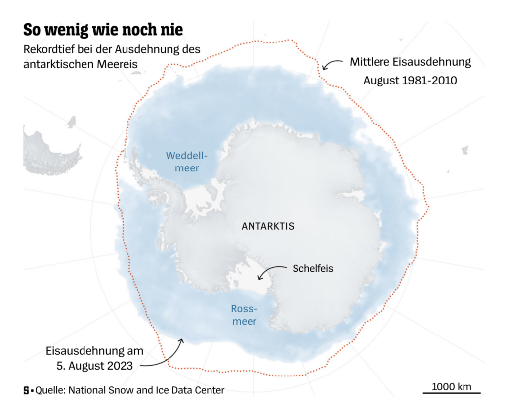
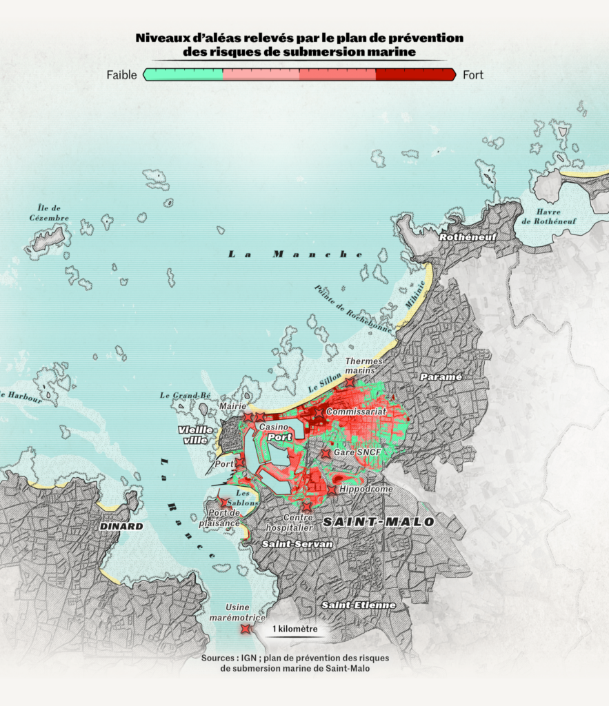
High ocean temperatures are killing coral reefs, shrinking sea ice, and endangering costal cities:
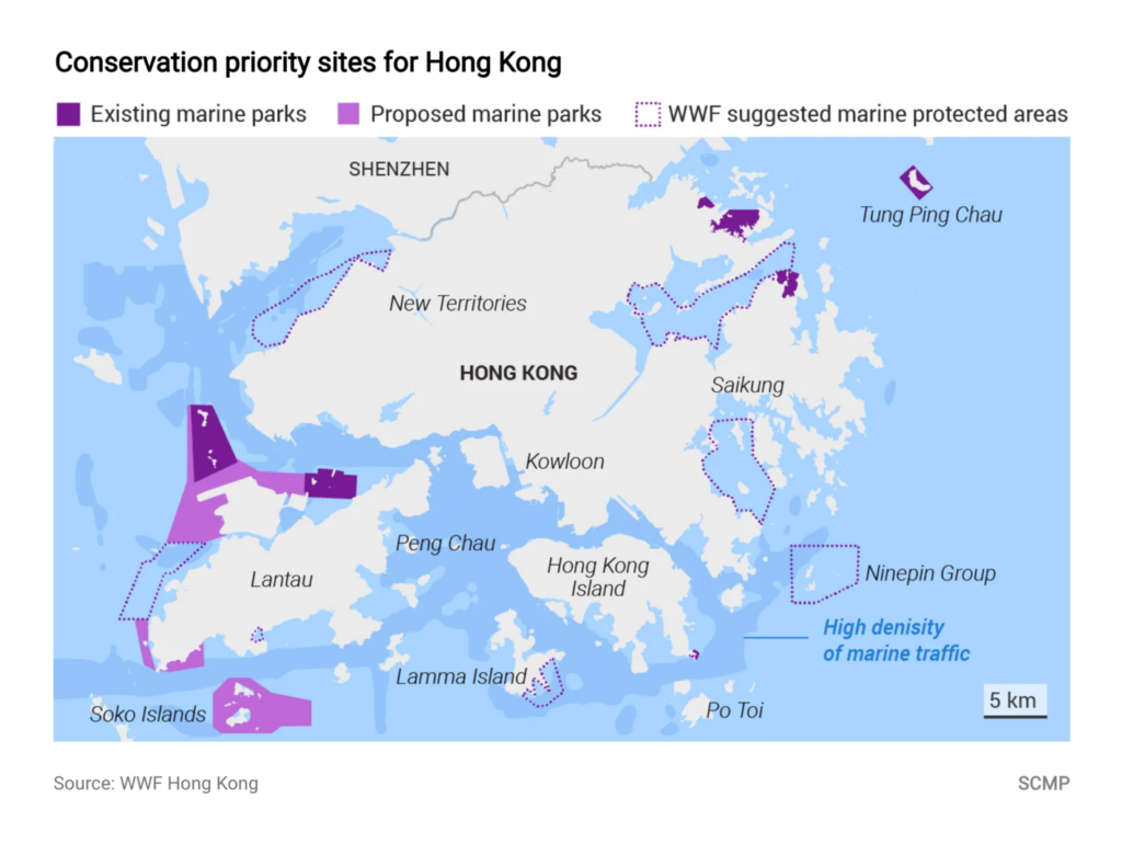
Meanwhile, on land:
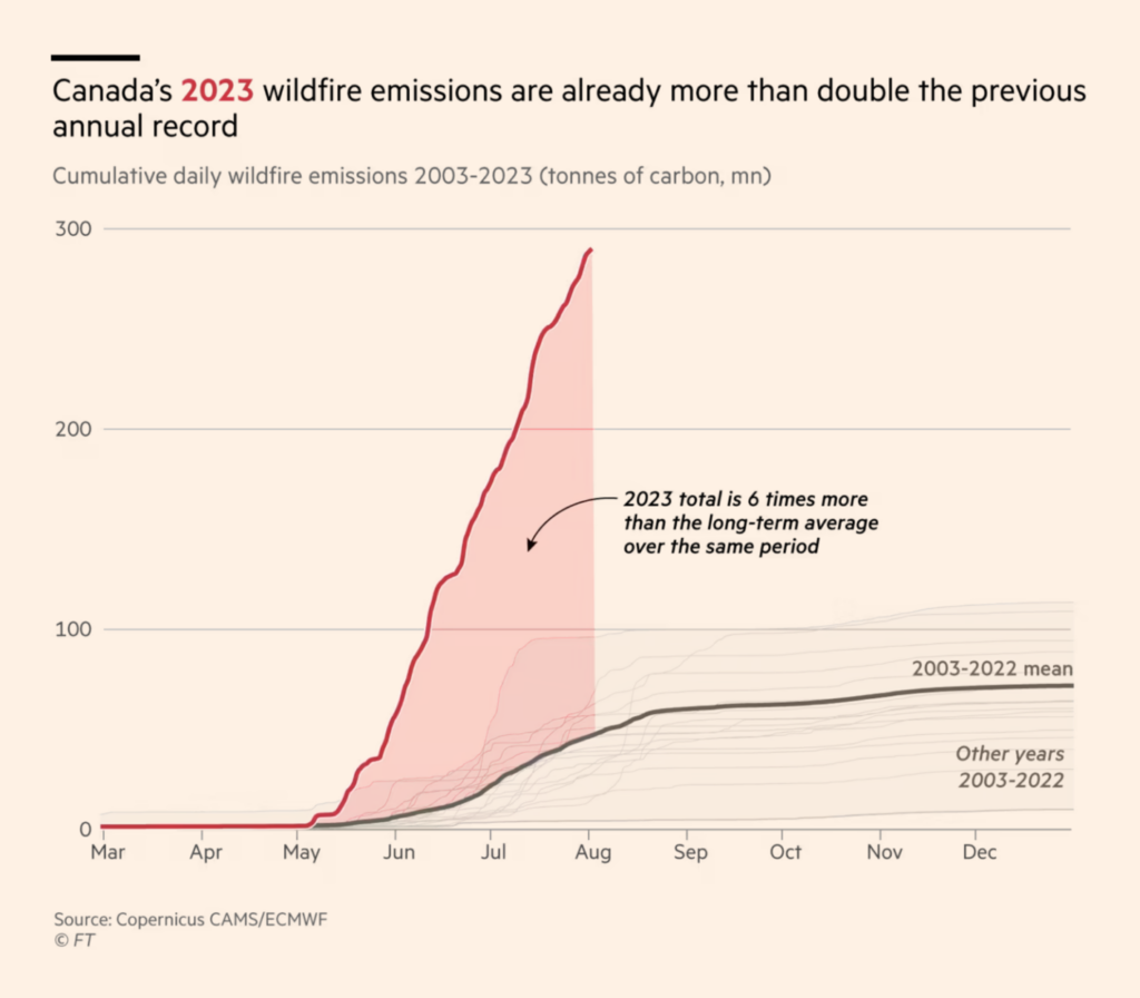
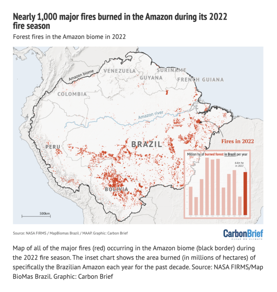
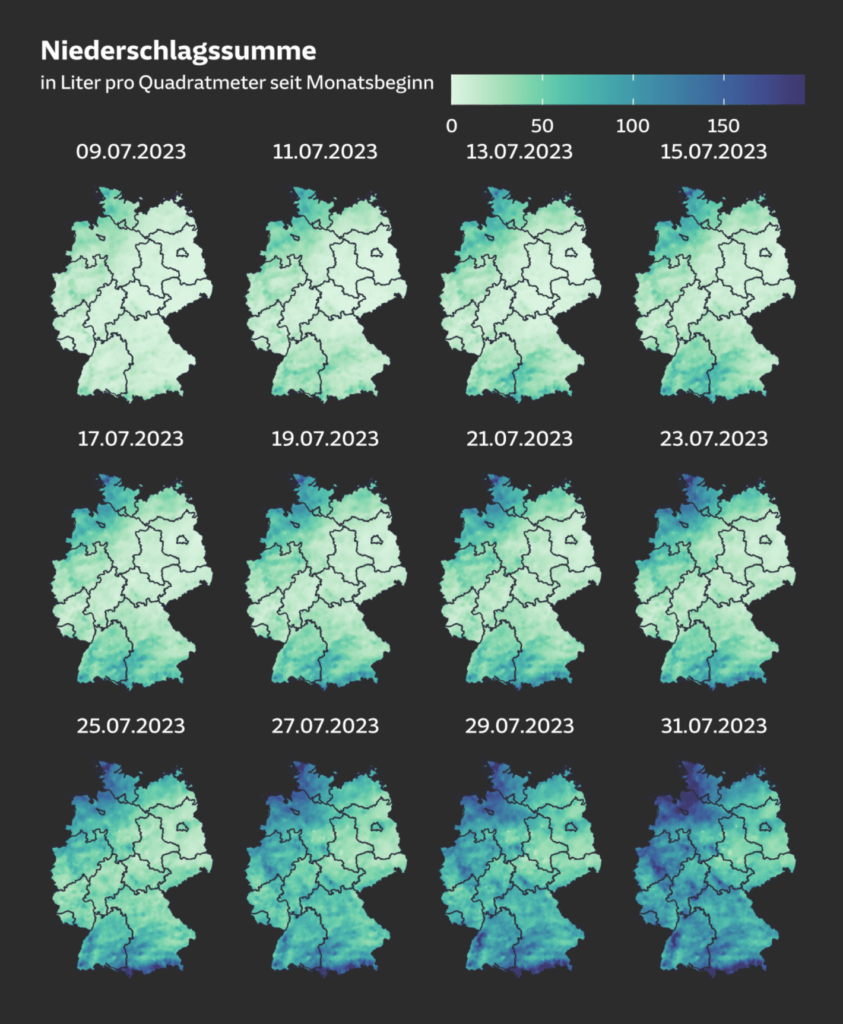
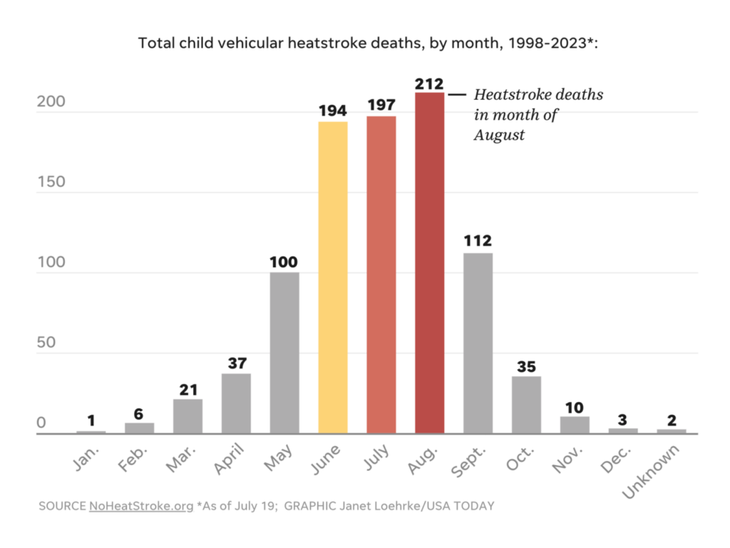
And, yes, we know why:
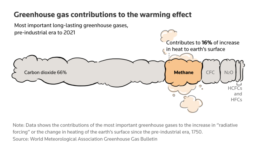
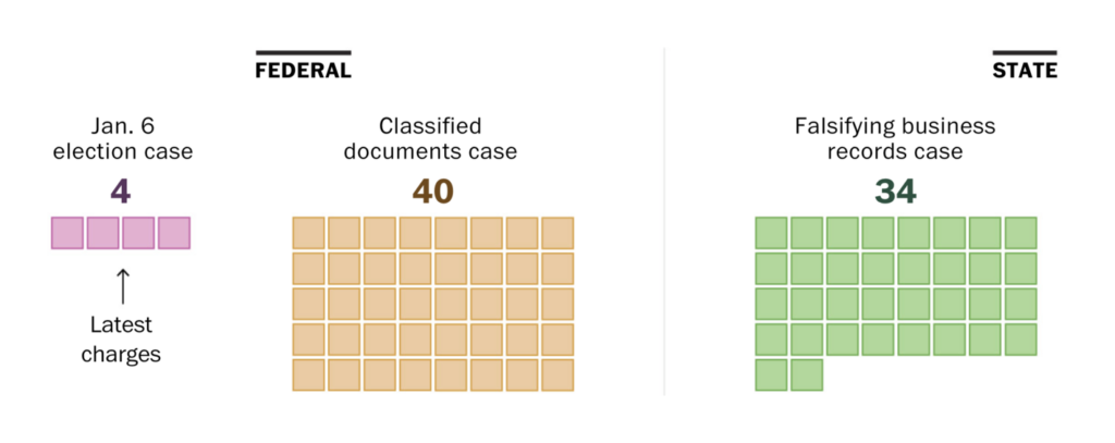
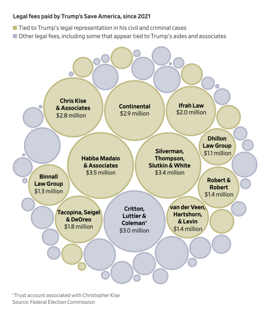
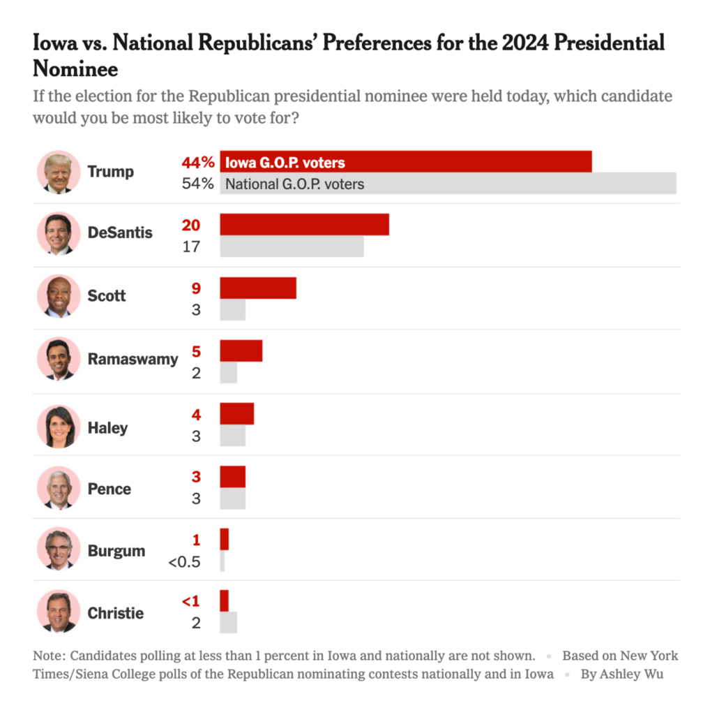
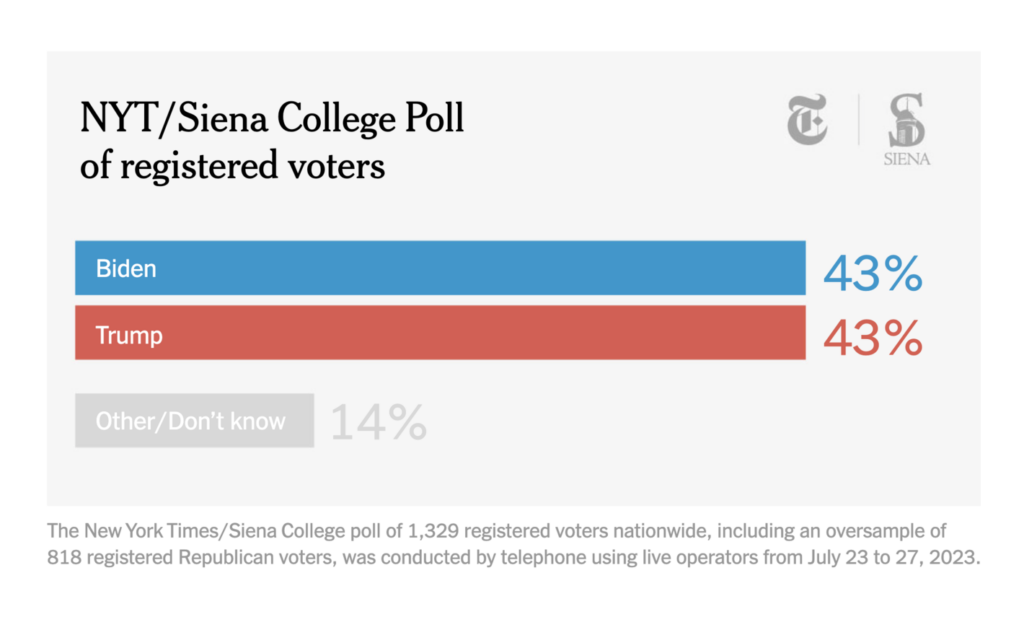
There are four charts in this section — two about 78 charges across three criminal cases faced by former U.S. president Donald Trump, and two about his excellent chances of winning next year’s Republican nomination and decent shot at retaking the presidency:
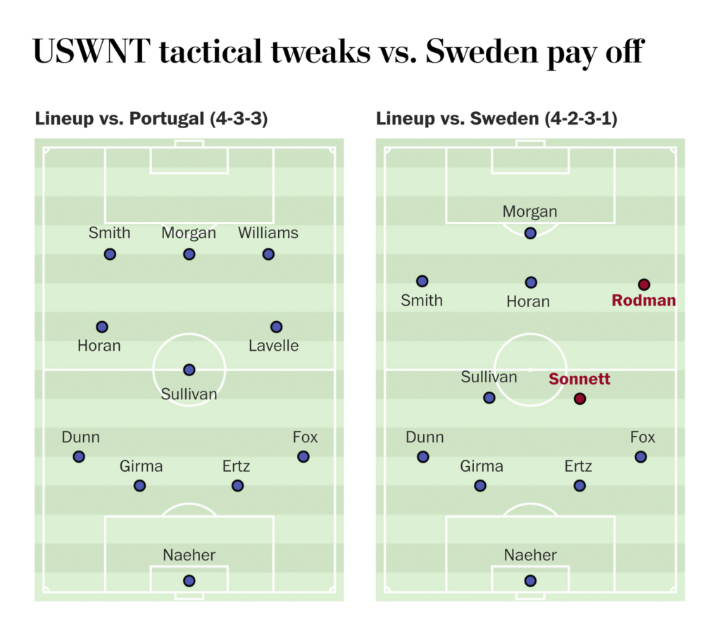
The Women’s World Cup continues!

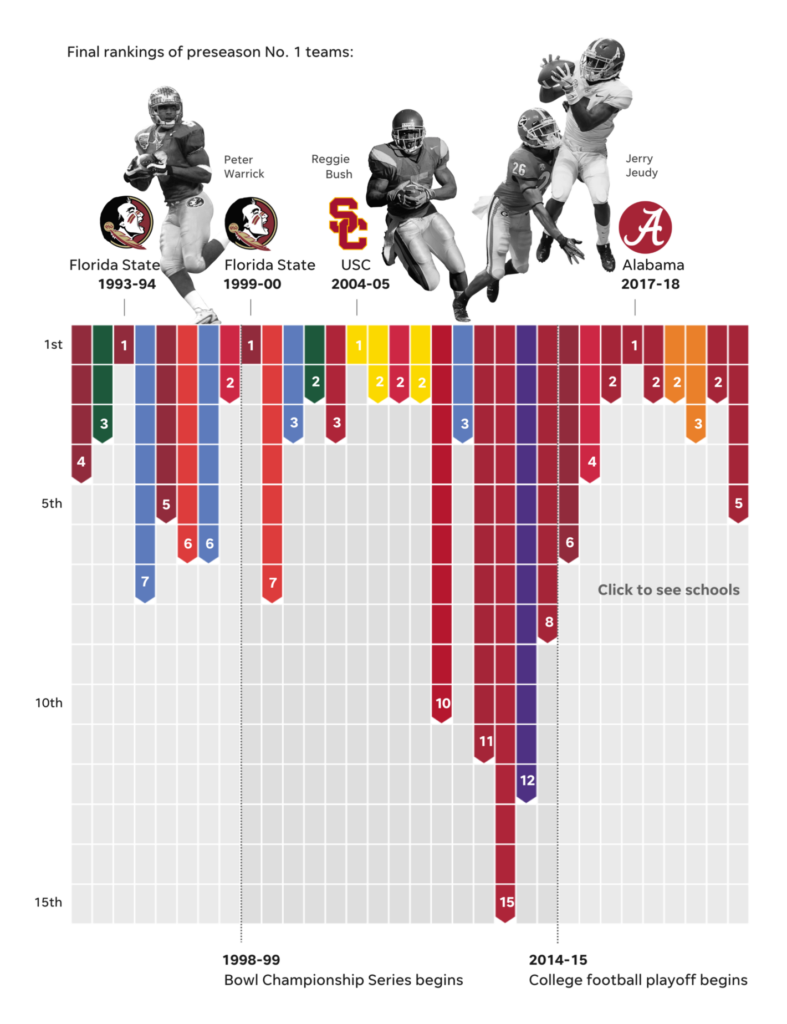
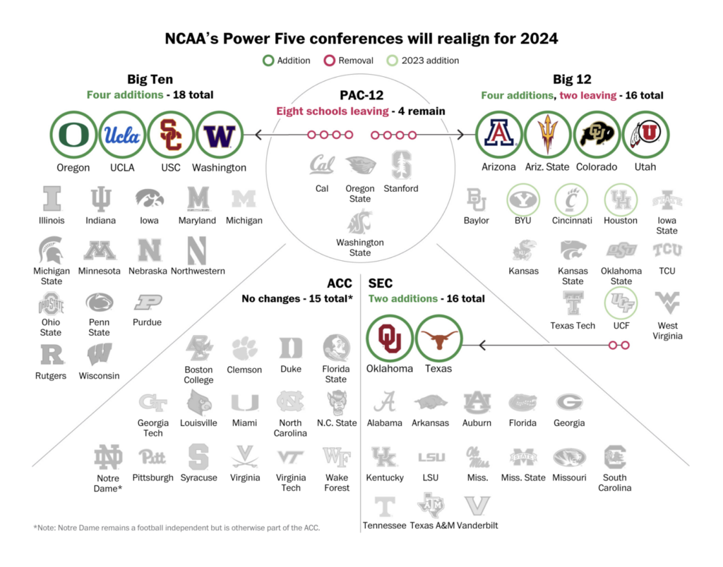
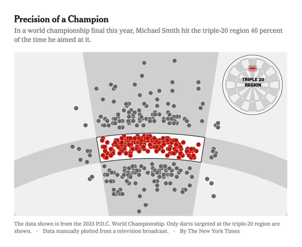
Plus — college sports and the World Darts Championship:
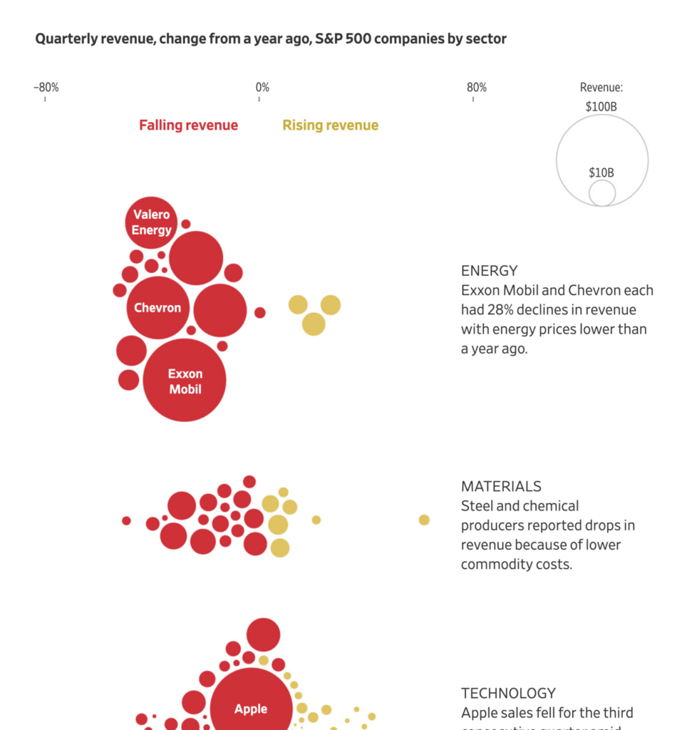
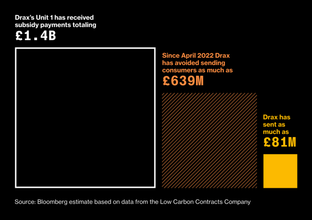
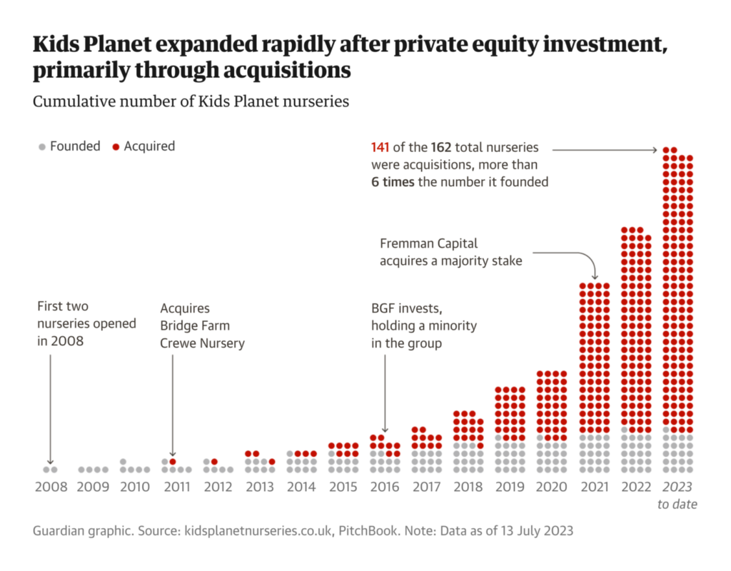
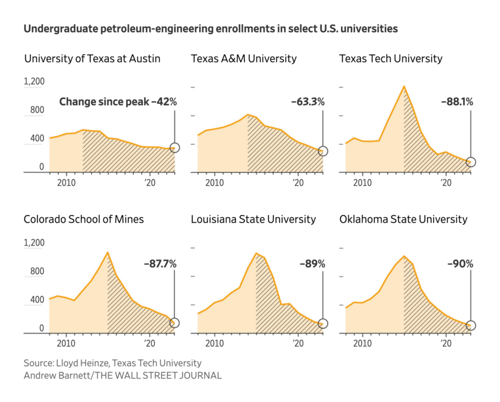
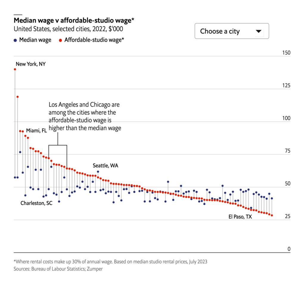
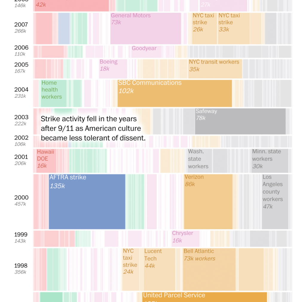
We saw charts on business and labor:
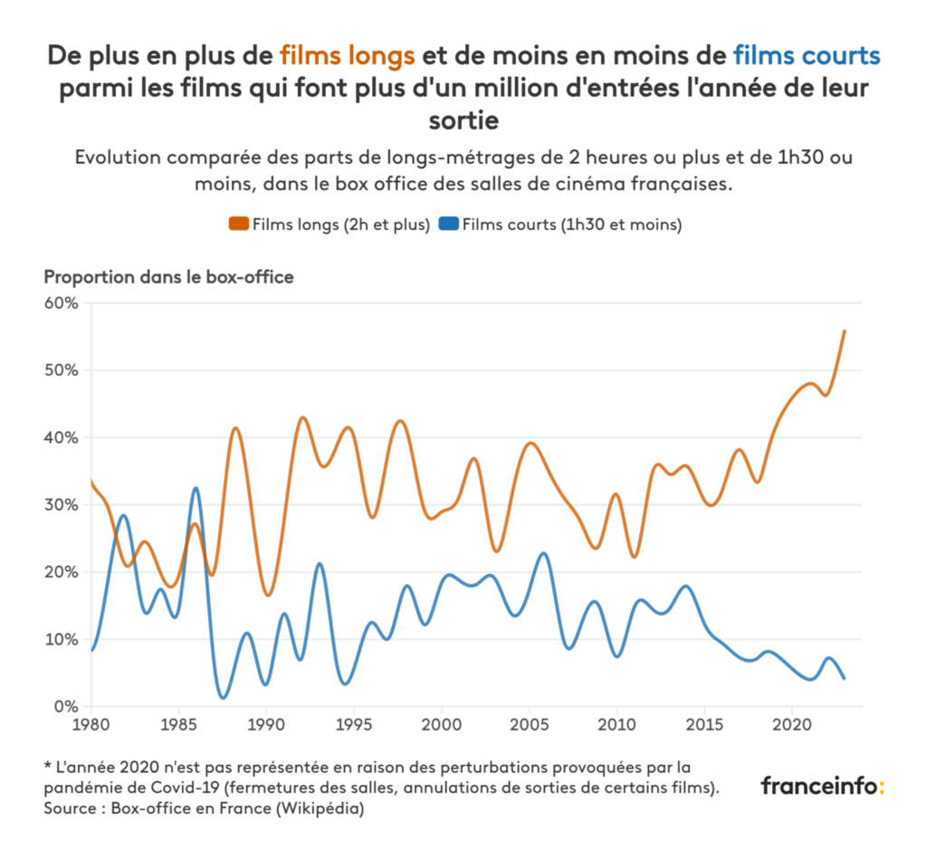
There was data vis at the movies:

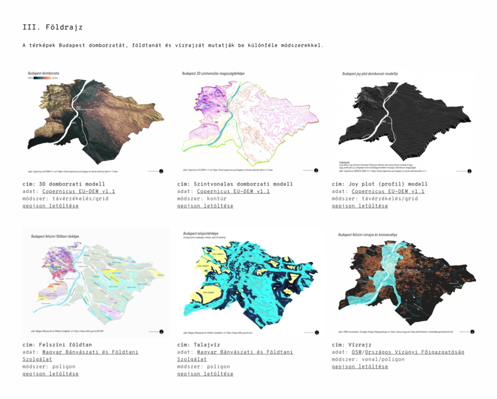
And postcards from Budapest and Singapore:
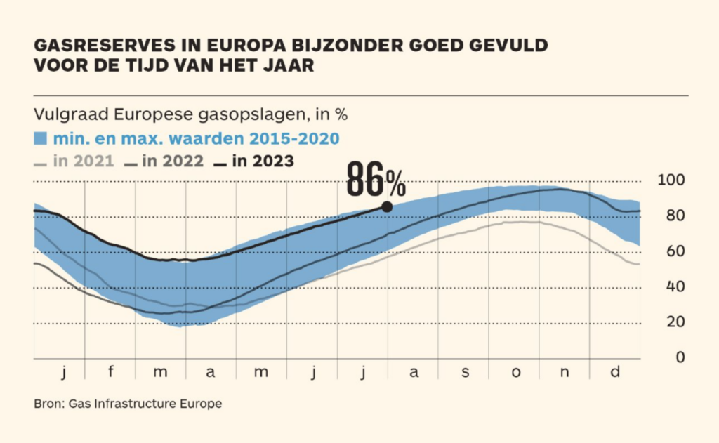
Other charts covered everything from gas reserves to Lyme disease:
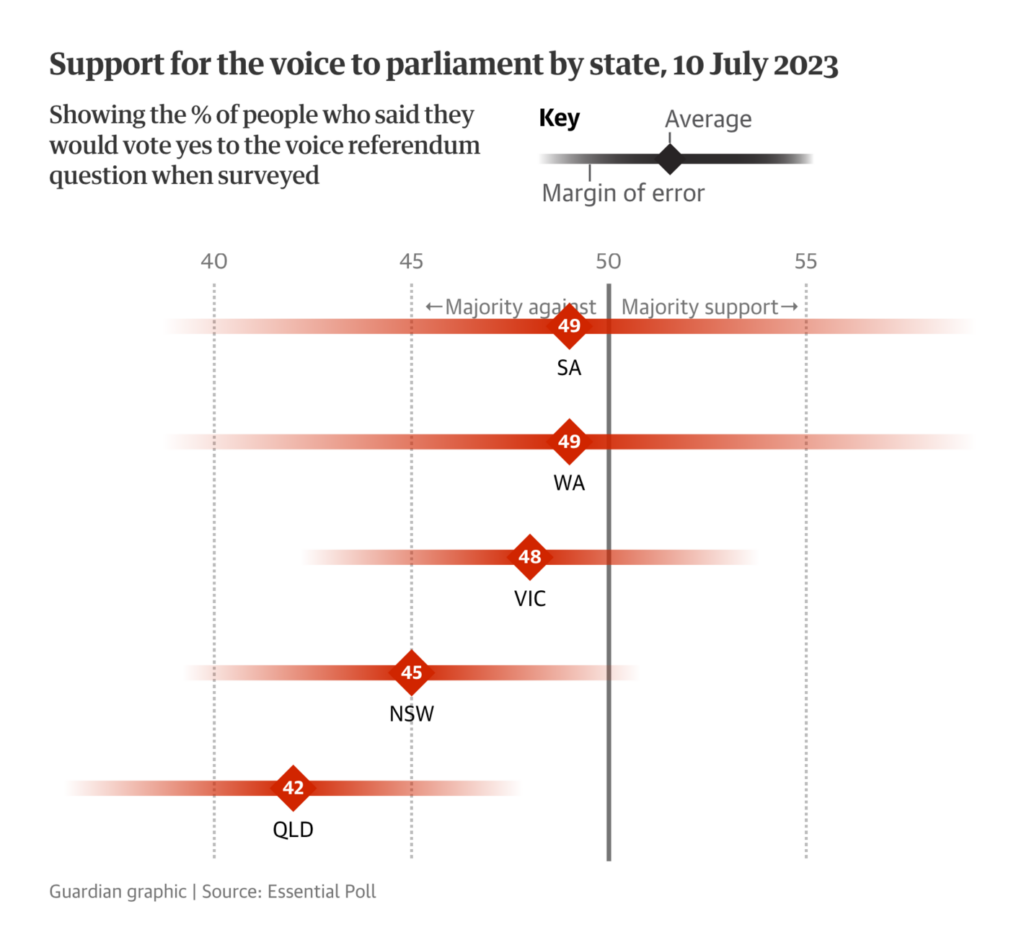
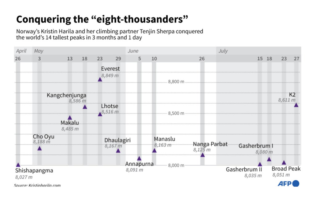

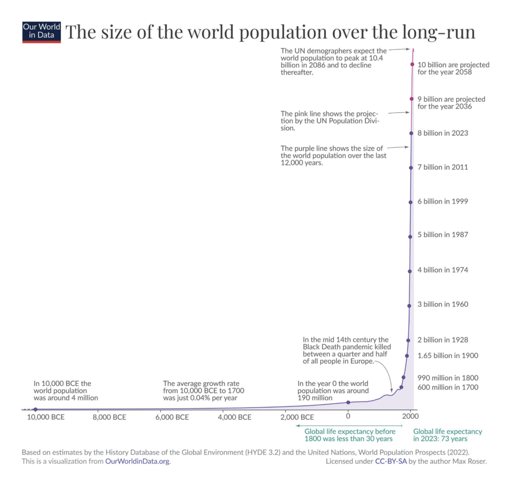
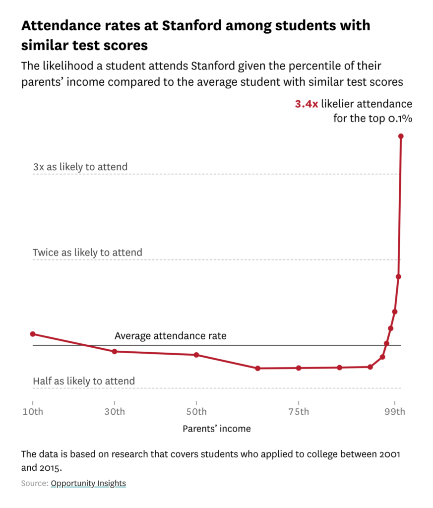
Last but not least, charts with really steep lines:



Applications are open for…
Help us make this dispatch better! We’d love to hear which newsletters, blogs, or social media accounts we need to follow to learn about interesting projects, especially from less-covered parts of the world (Asia, South America, Africa). Write us at hello@datawrapper.de or leave a comment below.
Want the Dispatch in your inbox every Tuesday? Sign up for our Blog Update newsletter!
Comments