This article is brought to you by Datawrapper, a data visualization tool for creating charts, maps, and tables. Learn more.
Data Vis Dispatch, August 9
The best of last week’s big and small data visualizations
Welcome back to the 57th edition of Data Vis Dispatch! Every week, we’ll be publishing a collection of the best small and large data visualizations we find, especially from news organizations — to celebrate data journalism, data visualization, simple charts, elaborate maps, and their creators.
Recurring topics this week include abortion, immigration, and the Taiwan Strait.
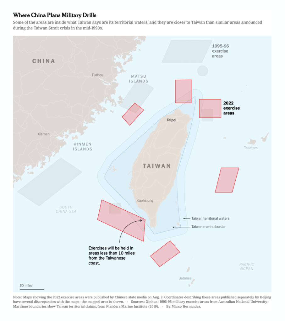
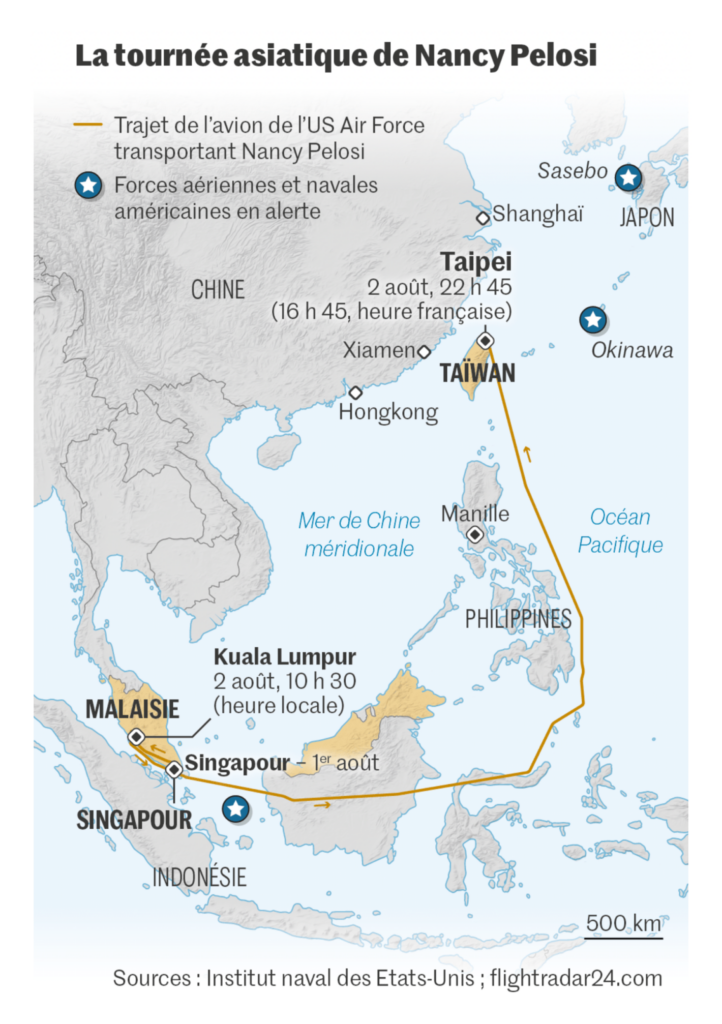
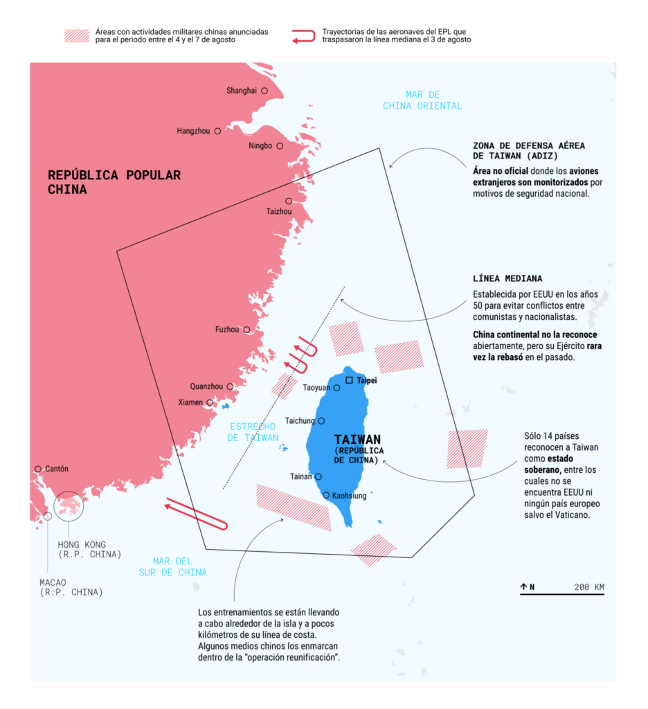
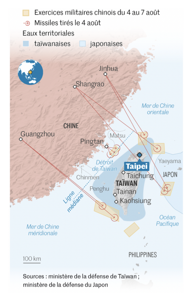
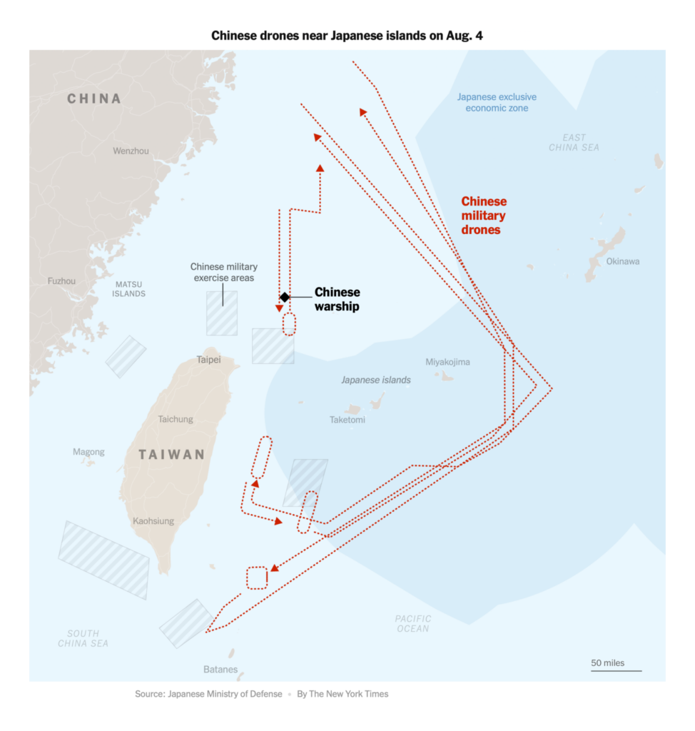
During military exercises this week, China repeatedly crossed the median line of the Taiwan Strait and dropped missiles into Japanese waters:
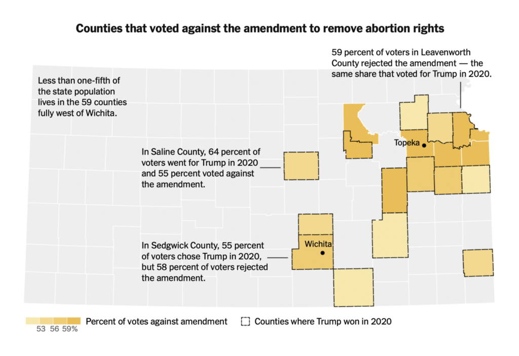
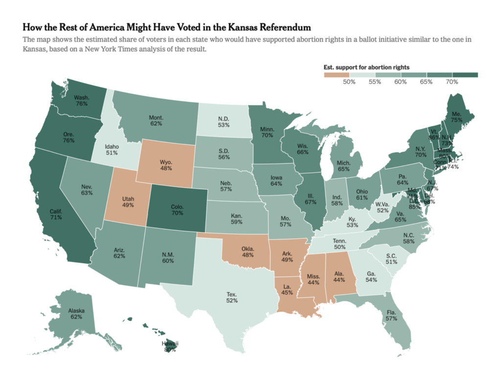
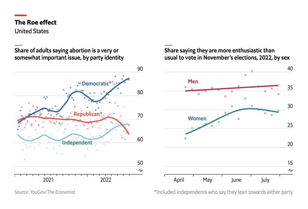
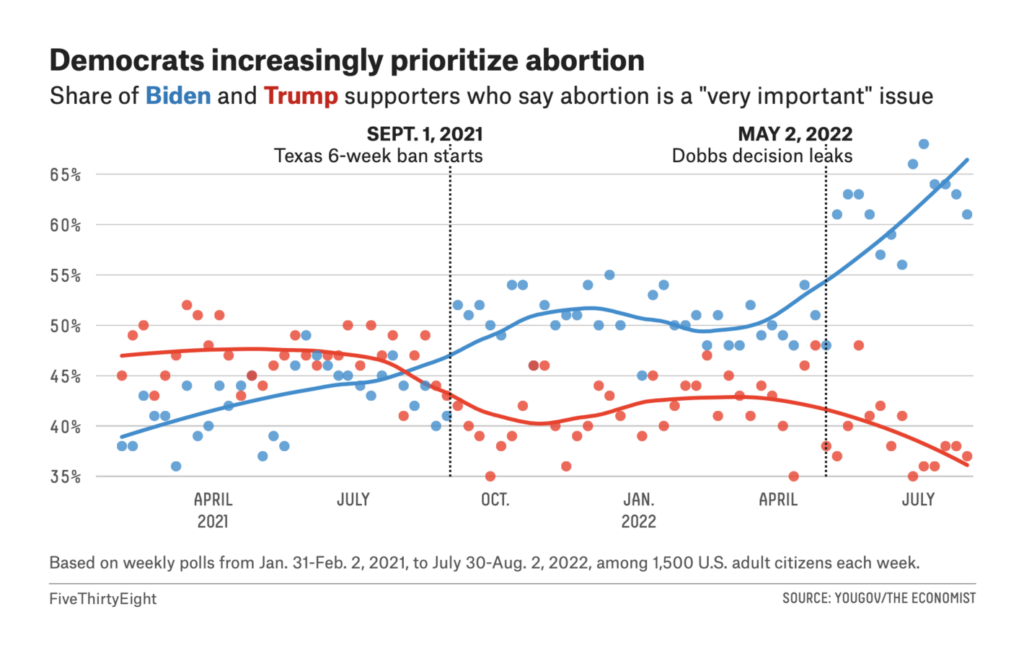
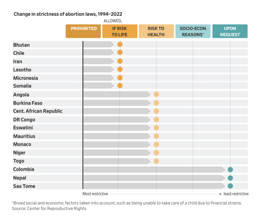
Meanwhile, it was a big week in domestic politics as well. Voters in Kansas decisively rejected an anti-abortion ballot initiative, showing the issue cuts across partisan lines:
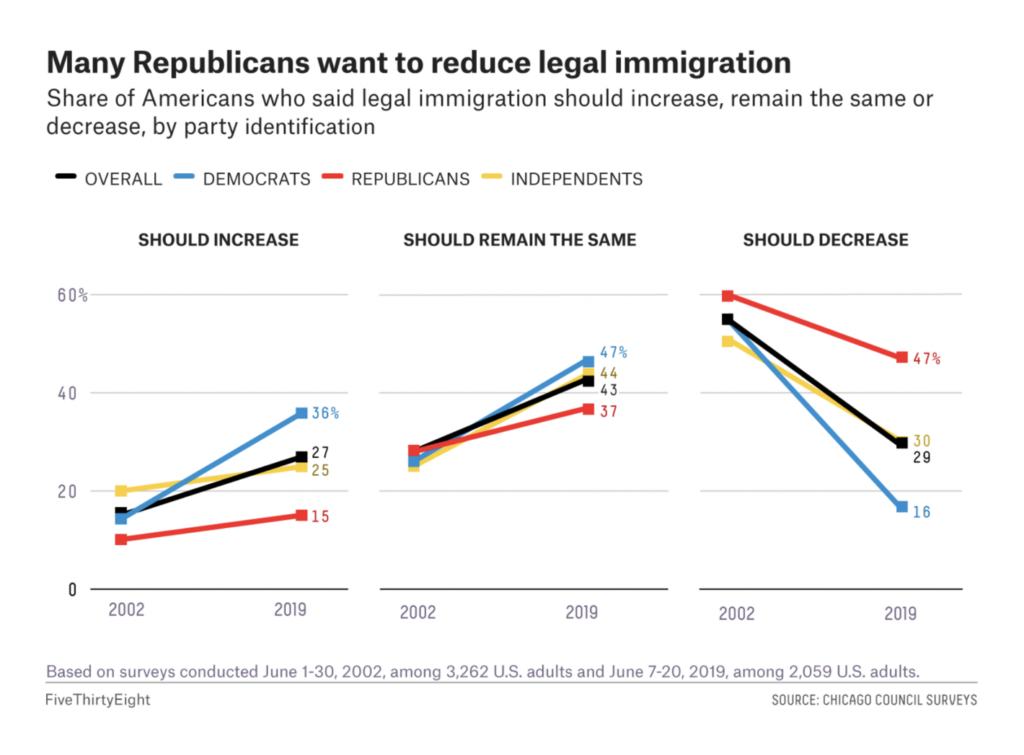
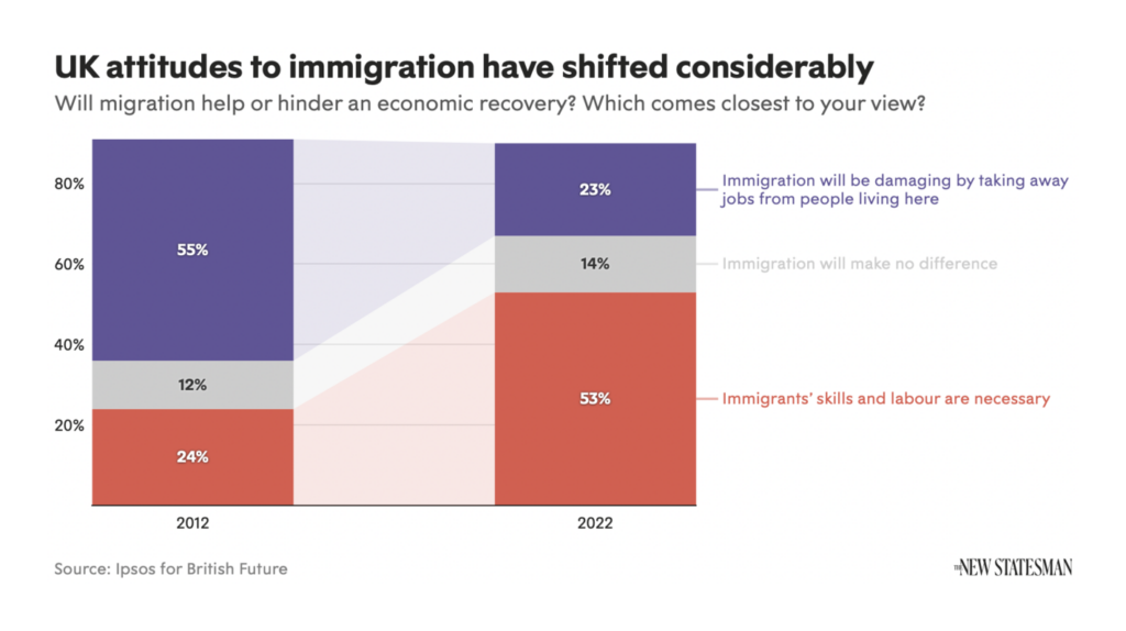
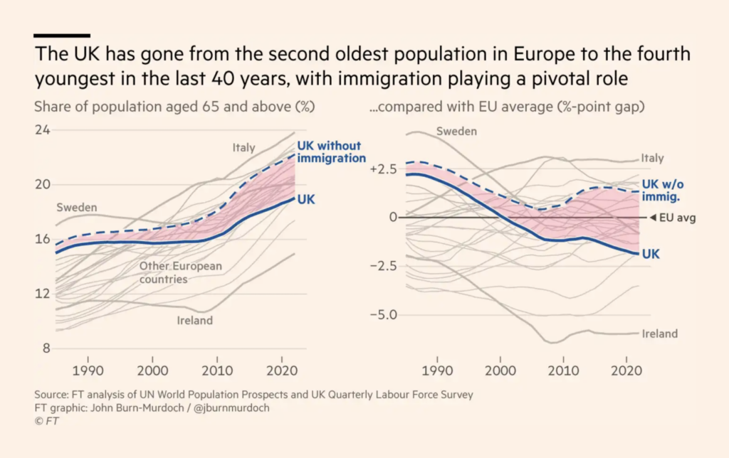
Public opinion on immigration is shifting in the U.S. and U.K.:
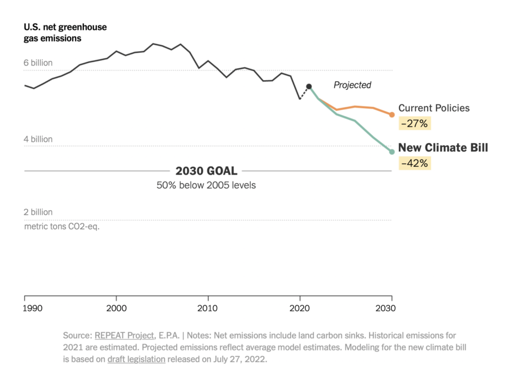
A climate and tax bill passed in the U.S. Senate this weekend would bring the country within striking distance of its emissions goals:
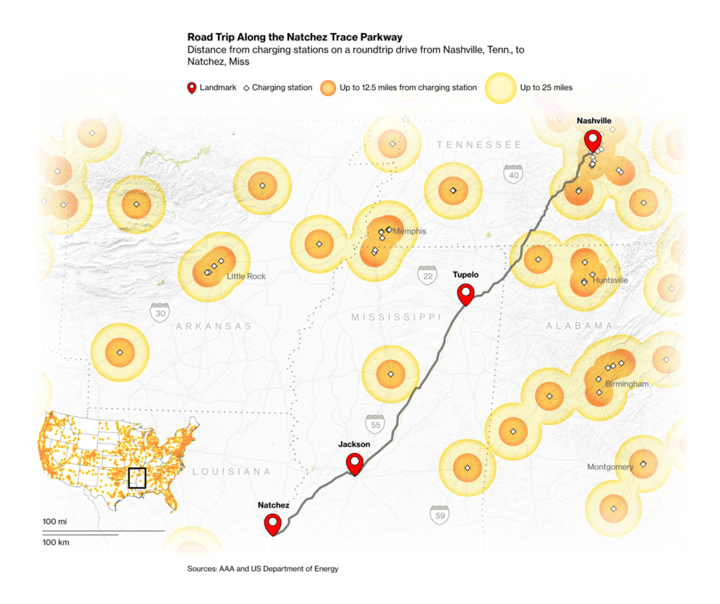
Among other measures, it includes incentives to promote electric cars:
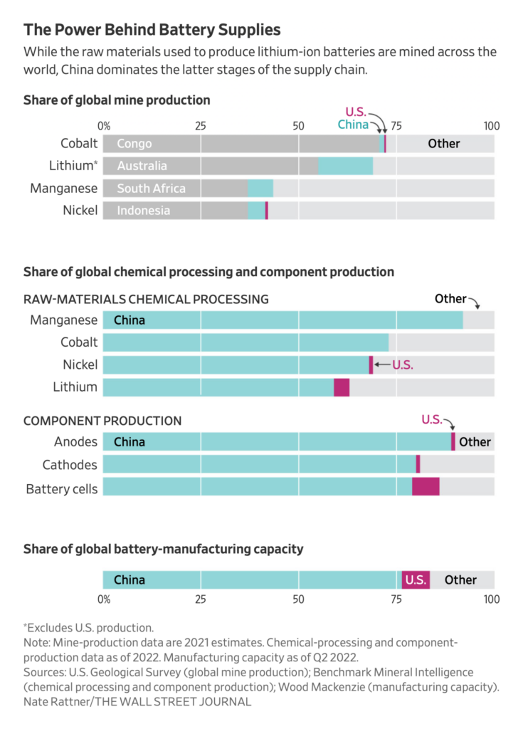
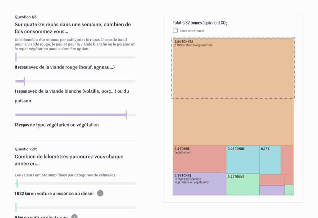
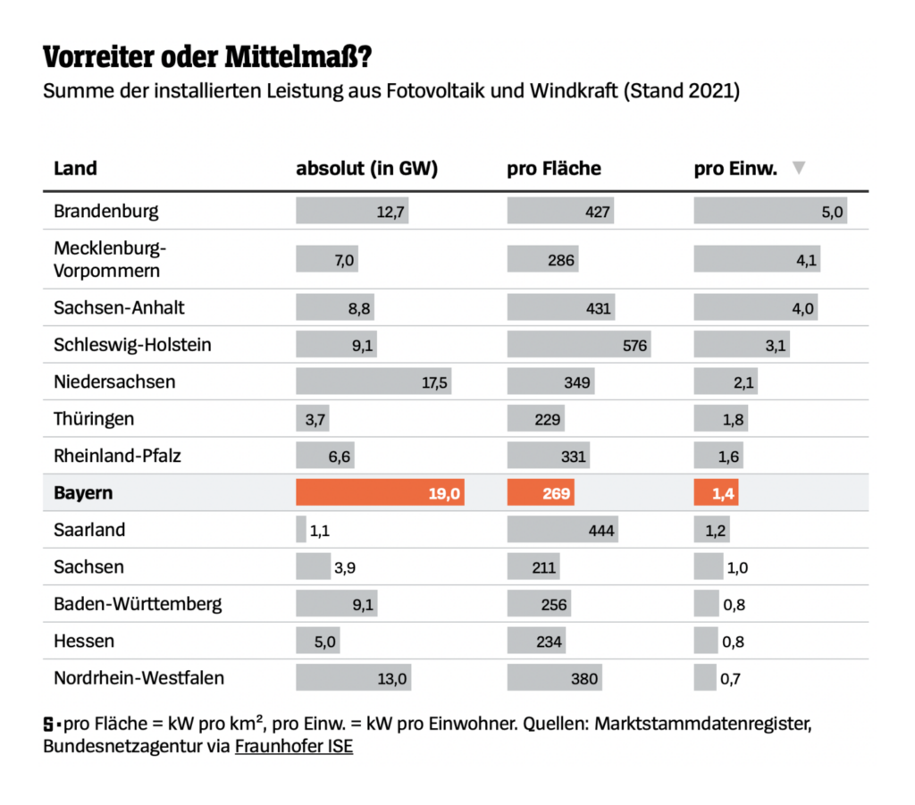
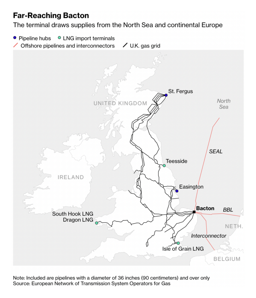
And other energy visualizations focused on personal carbon footprints, renewable sources, and liquified natural gas:
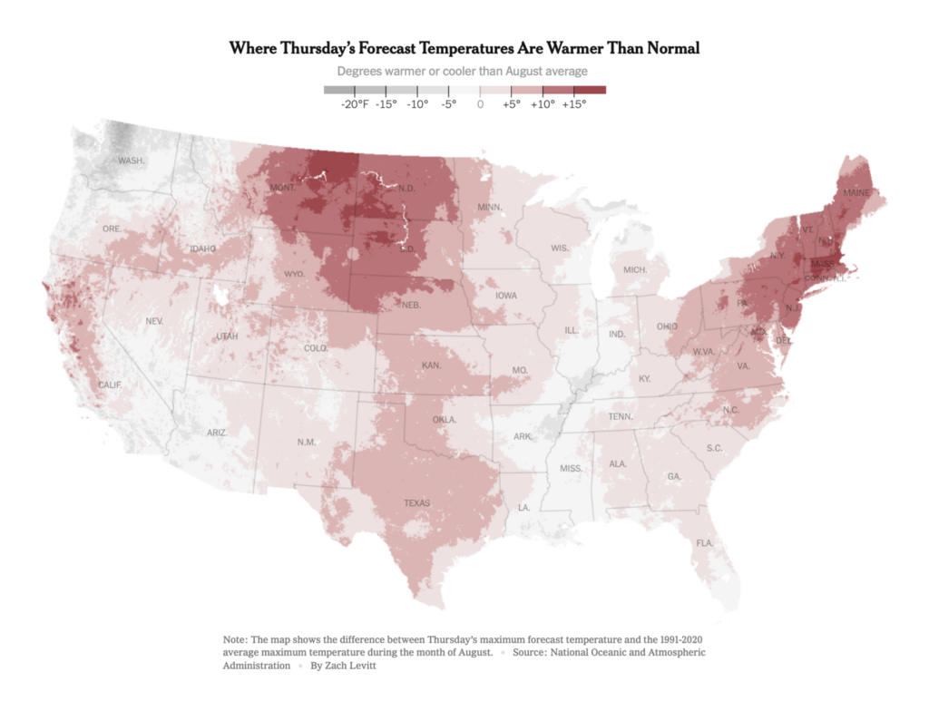
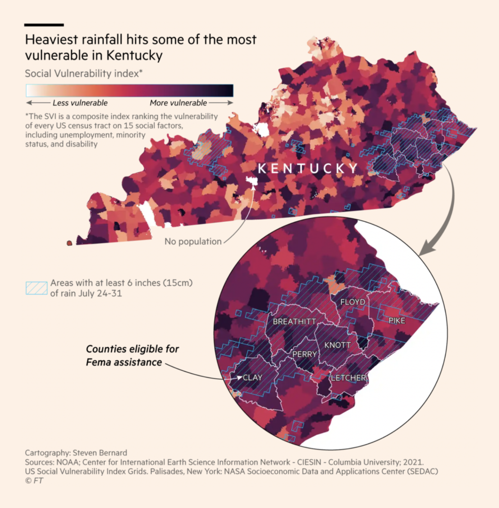
Meanwhile, in concrete climate matters, it was another week of heat, drought, fire, and floods:
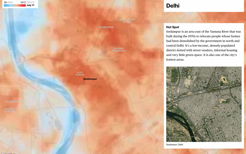
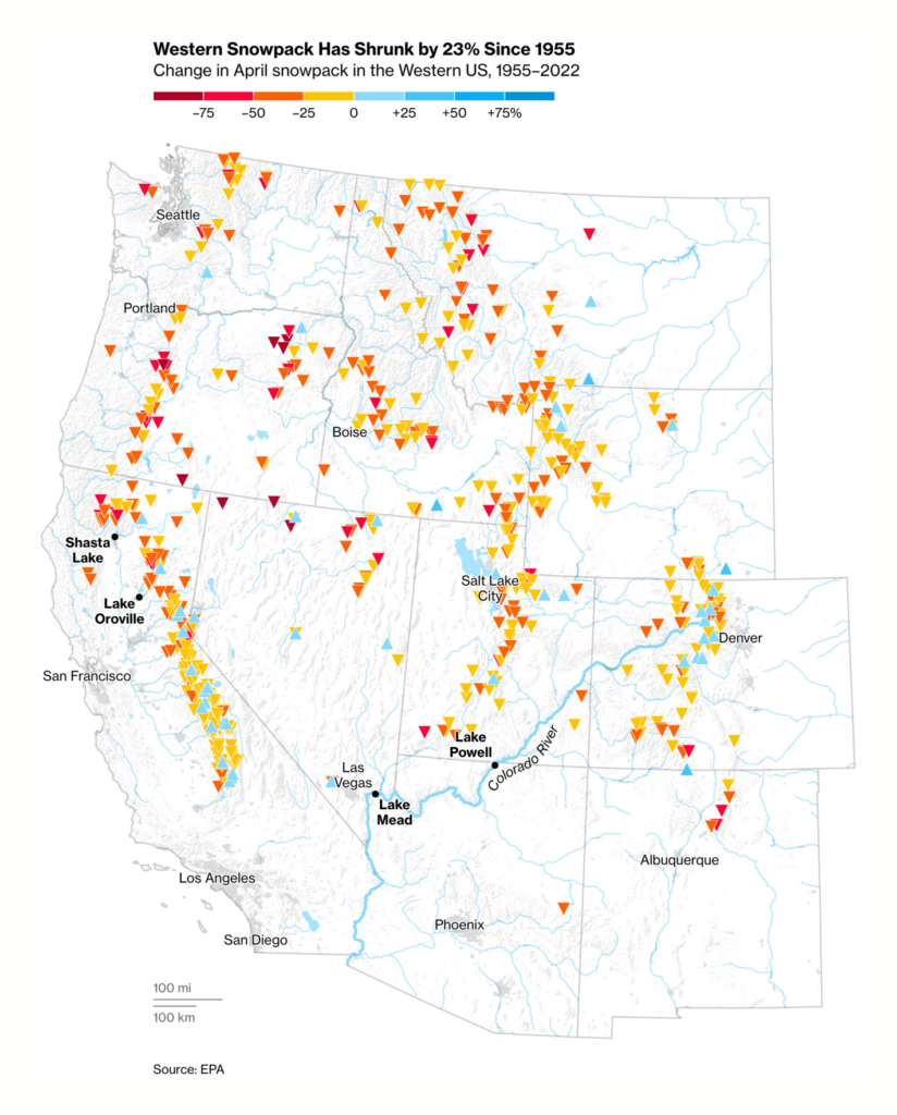
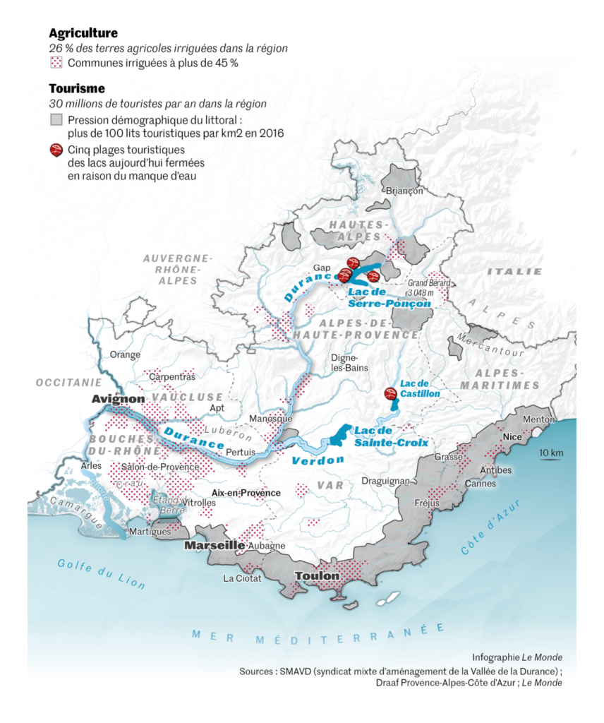
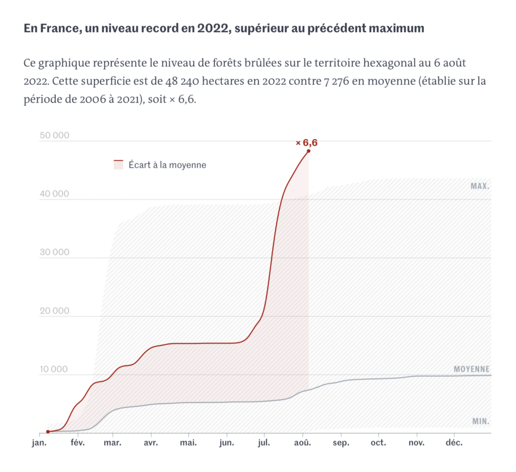
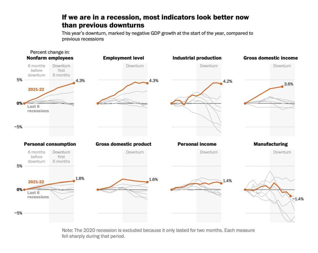
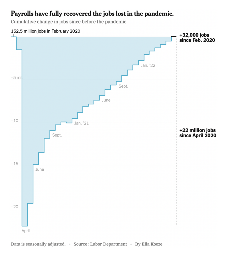
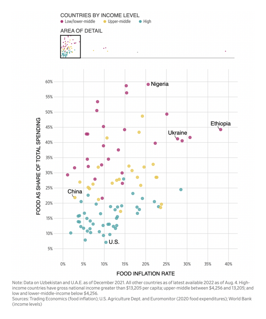
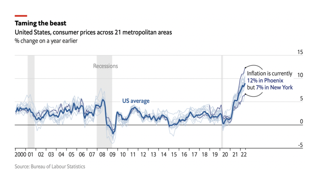
These charts showed a mixed economic outlook, with low unemployment and high inflation:
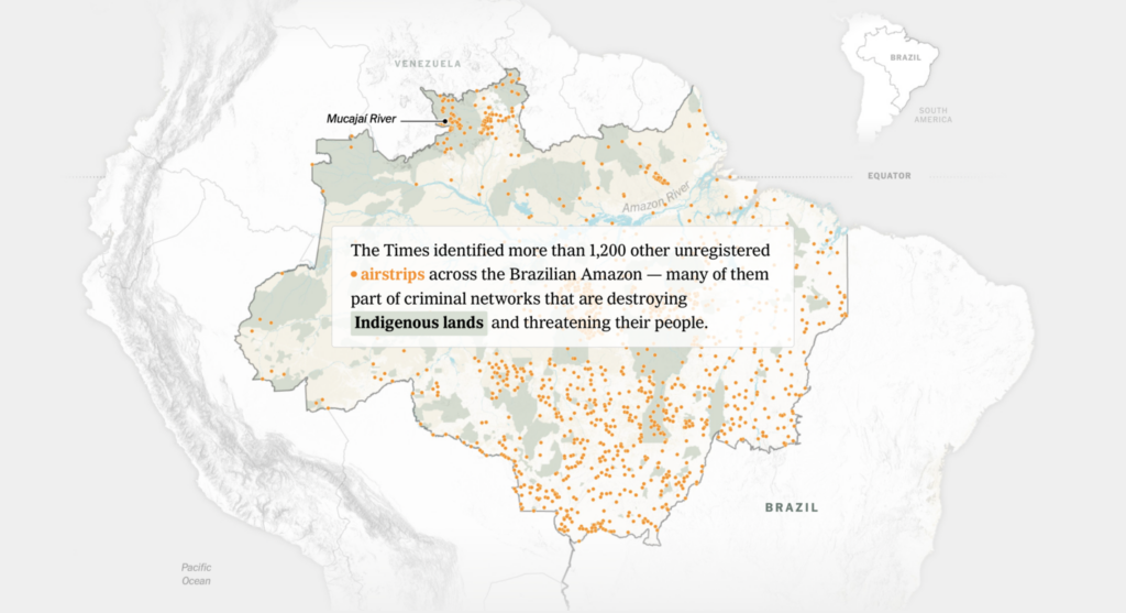
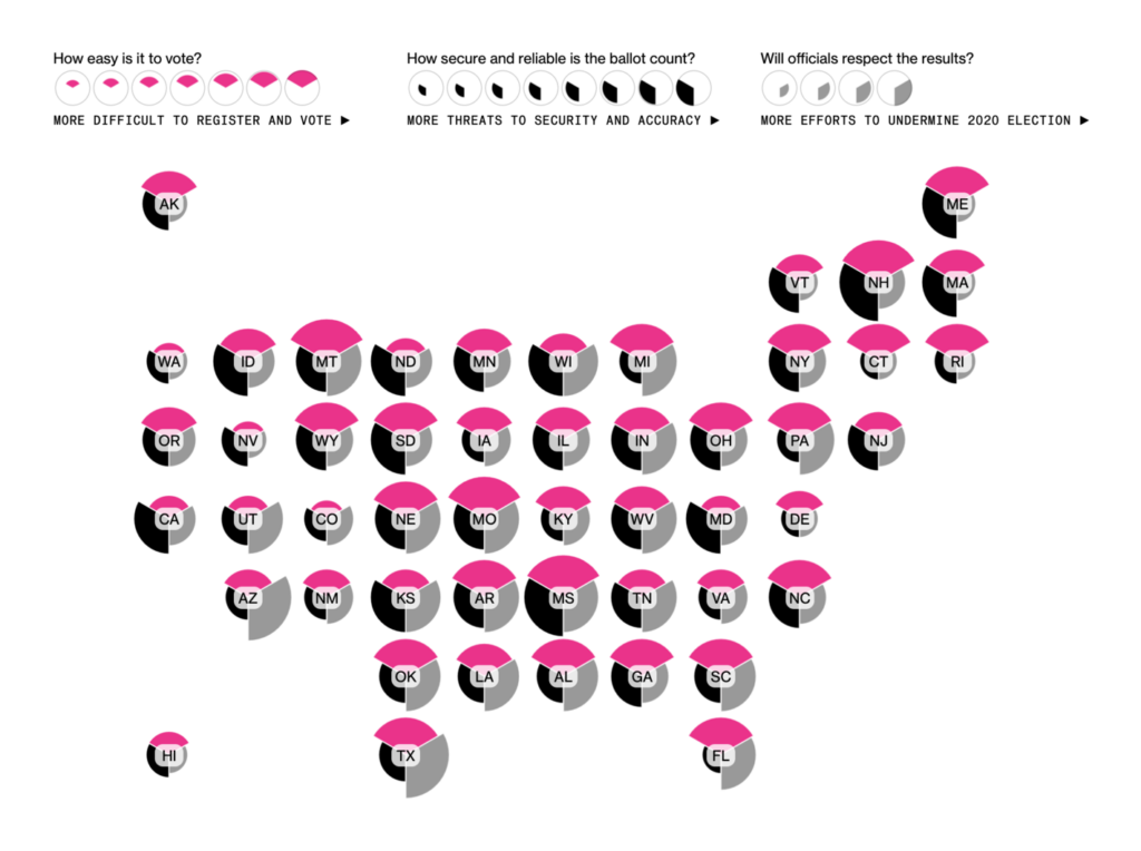
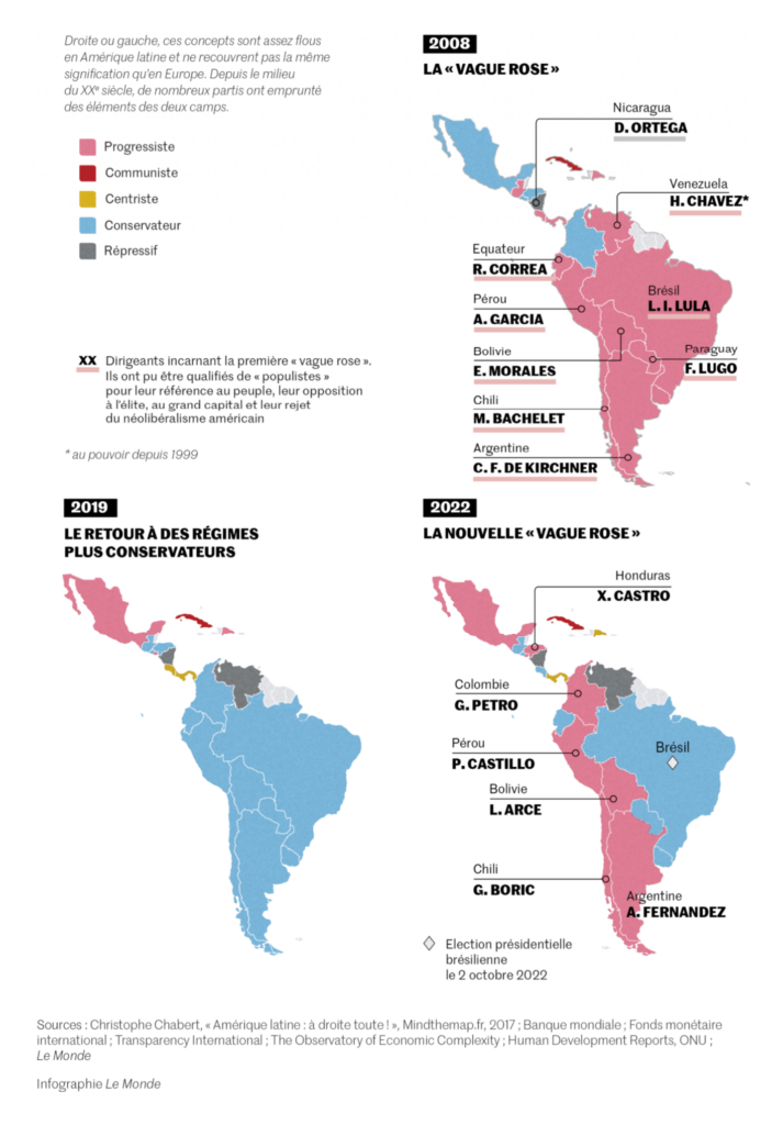
In national elections, we saw maps of voting protections in the U.S. and ideological alignments in Latin America:
These visualizations on the war in Ukraine focused on the role of drones in the fighting, the shipping situation in the Black Sea, and the structure of Russia’s military-industrial complex:

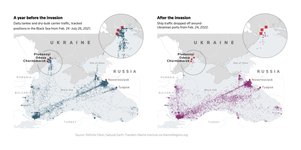
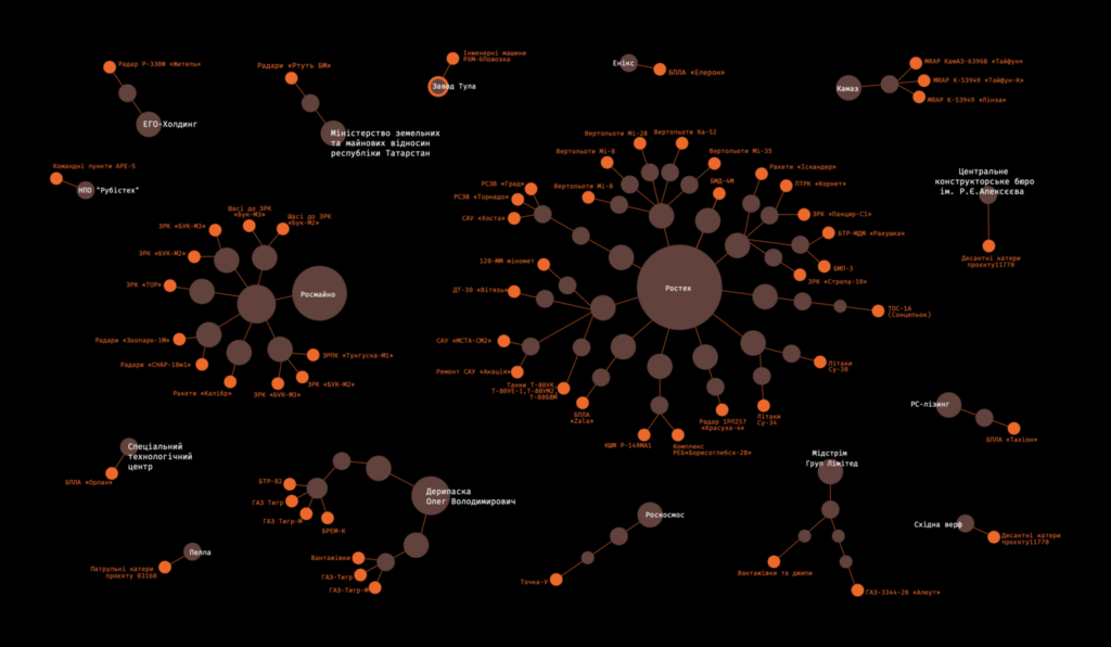
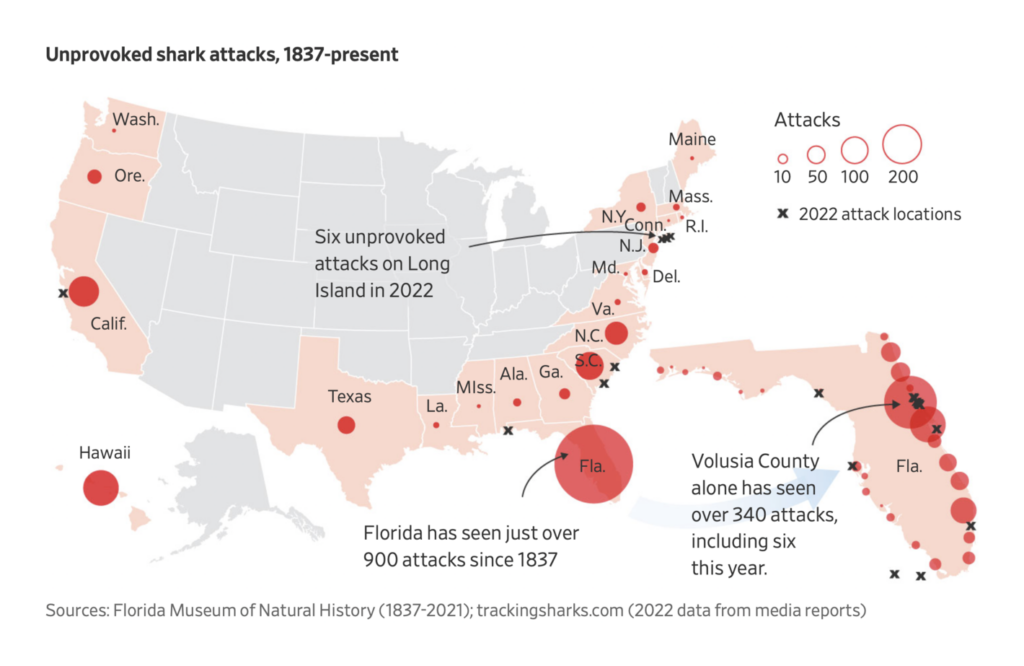
Other maps this week covered gun trafficking, Al-Qaeda, mortgage boycotts, and shark attacks:
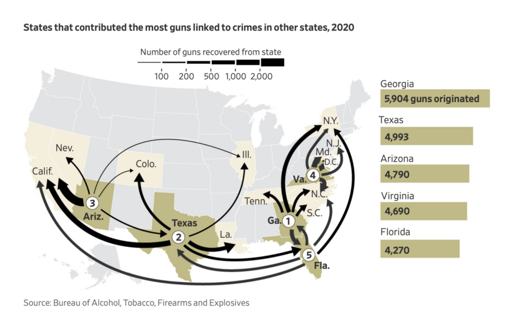
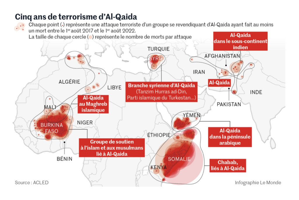

What else we found interesting


Applications are open for…
- A data journalist at La Nación
- Several data reporters at The Washington Post
- An Opinion graphics editor and two Weather graphics editors at The New York Times
Help us make this dispatch better! We’d love to hear which newsletters, blogs, or social media accounts we need to follow to learn about interesting projects, especially from less-covered parts of the world (Asia, South America, Africa). Write us at hello@datawrapper.de or leave a comment below.
Want the Dispatch in your inbox every Tuesday? Sign up for our Blog Update newsletter!


Comments