This article is brought to you by Datawrapper, a data visualization tool for creating charts, maps, and tables. Learn more.
Data Vis Dispatch, COVID Trackers Special
A special collection of COVID-related trackers and dashboards from the past two years

Welcome back to the 37th edition of Data Vis Dispatch! Every week, we normally publish a collection of the best small and large data visualizations we find, especially from news organizations — to celebrate data journalism, data visualization, simple charts, elaborate maps, and their creators.
This week, we’re doing something different. It was in March 2020 that the World Health Organization declared COVID-19 a pandemic, lockdowns were imposed on every continent, and most countries around the world reported their first cases and deaths. Since then we’ve been living through an era unlike any we’d ever seen before. And the role of data journalism in this crisis has also been unprecedented — from heads of state making massive policy decisions to friends deciding whether it’s safe to eat dinner out, it’s fair to say that the world has never relied on good data reporting the way it has in the past two years.
To document the work that’s been done, this week’s Data Vis Dispatch is devoted to trackers and dashboards of data relating to COVID-19. It’s a tribute to every person whose work has contributed to building and maintaining these amazing tools for two long years. It’s a survey of the trends that have emerged as people all over the world try to visualize the same or similar data. And it’s a record for the future of how things were looking in March of 2022.
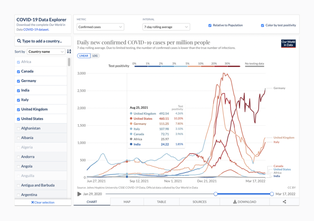
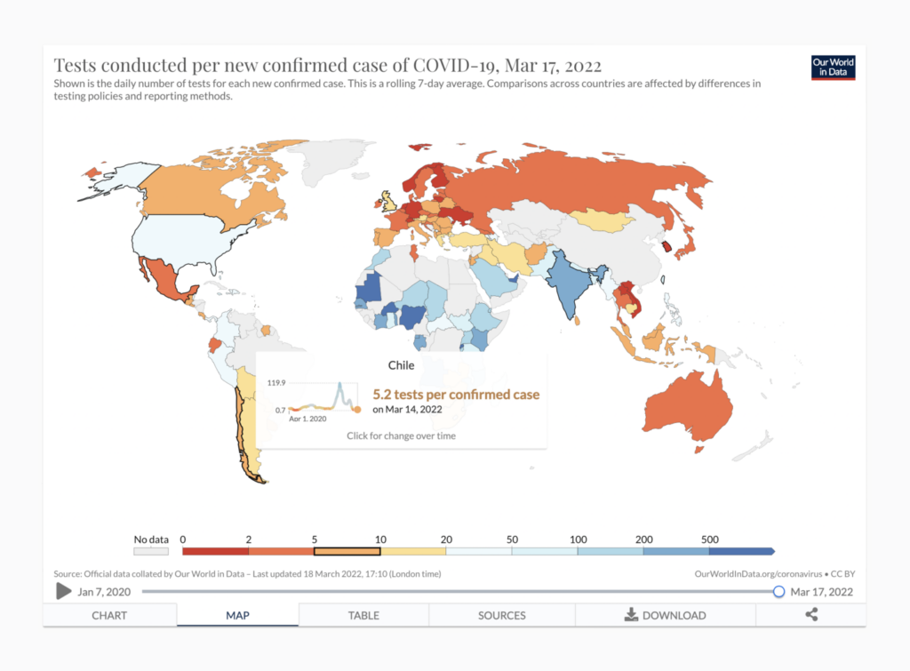
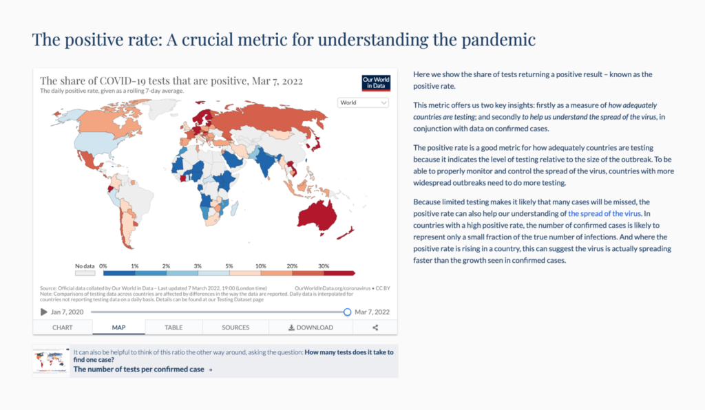
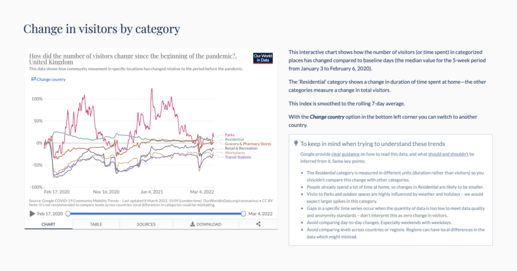
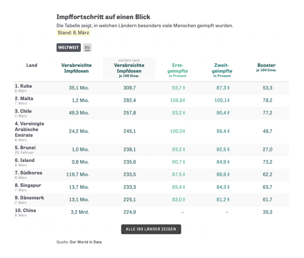
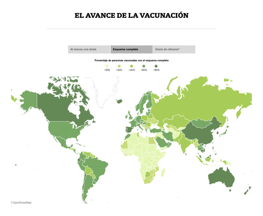
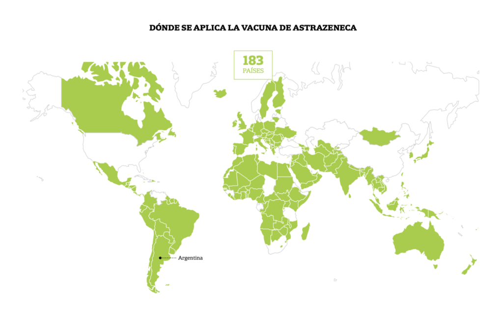
Our World in Data (UK): Coronavirus Pandemic (COVID-19)
Whether you know it or not, there’s almost no doubt you’ve used Our World in Data’s COVID data sets in the past two years — and that’s reason enough to put it first on our list. Their COVID-19 Data Explorer is the most flexible tool featured here, with an incredible array of measures and views. And the underlying data set, which is publicly available, powers many of the visualizations from other newsrooms that you’ll see in this post. These charts also showcase several visualization trends, including Marimekko charts of vaccine distribution and tiny charts in tables.

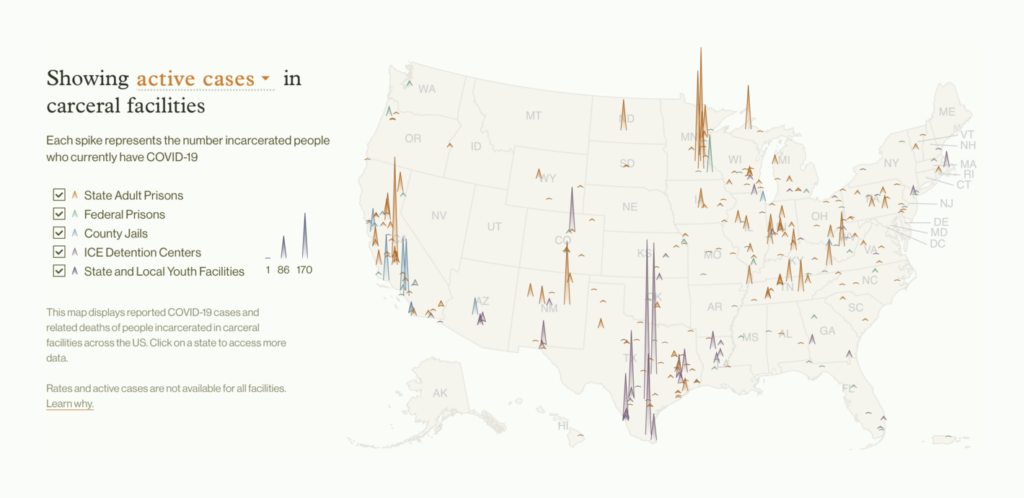
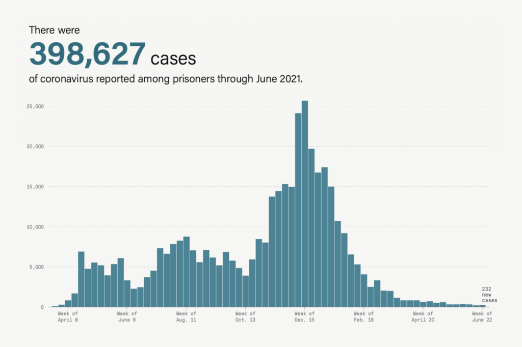
UCLA Law (US): COVID Behind Bars Data Project
Of course, a universal data set isn’t always the goal. Many excellent COVID trackers made it possible to follow the pandemic in highly specific contexts, from your state to your university. Two we particularly admired — one from UCLA Law and one from the Marshall Project — collected data on COVID in U.S. prisons, jails, and detention centers.
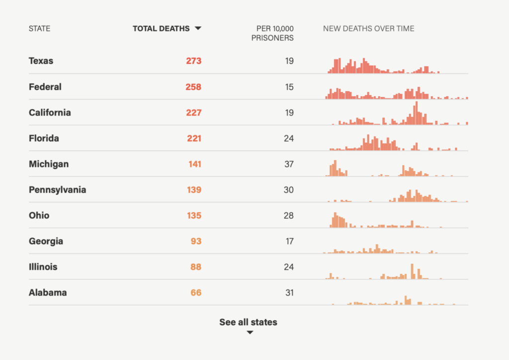
The Marshall Project (US): A State-By-State Look at 15 Months of Coronavirus in Prisons
The tiny bar charts in this table are color coded to indicate their cumulative total, a unique touch.
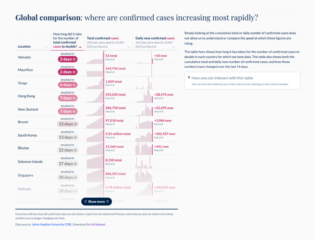
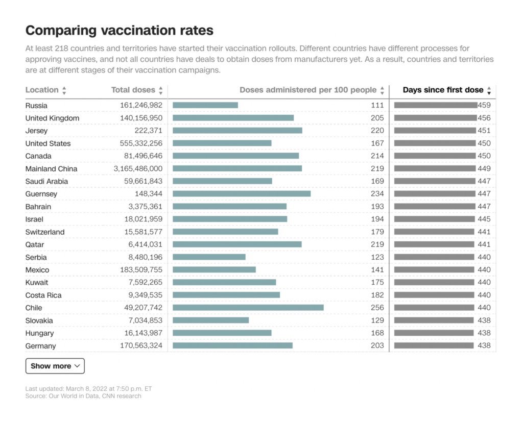
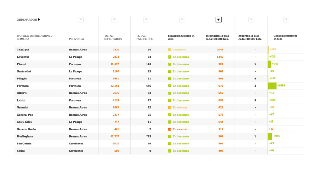
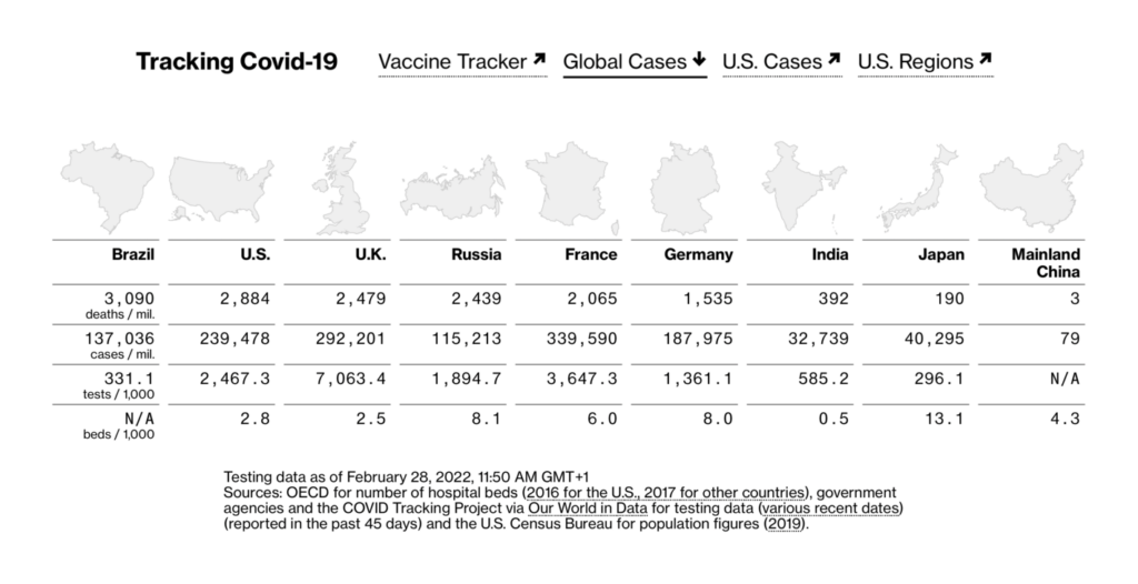
CNN (US): Tracking Covid-19’s global spread
Every COVID tracker has had to grapple with the sheer volume of data that the pandemic produces. Almost every country on earth (not to mention many states, provinces, cities, counties, and more) has been reporting multiple important numbers as often as every day for as long as two straight years. A table can handle as many dimensions of data as you need, and beautiful, complex tables were a consistent feature of the best COVID trackers. Data journalists, including those at CNN, used sparklines, heat maps, and other tiny charts to visualize within tables, and took advantage of searchable and sortable columns to let readers explore on their own.

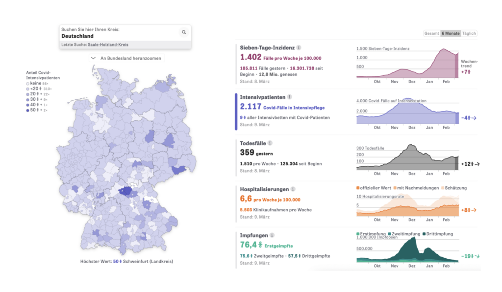
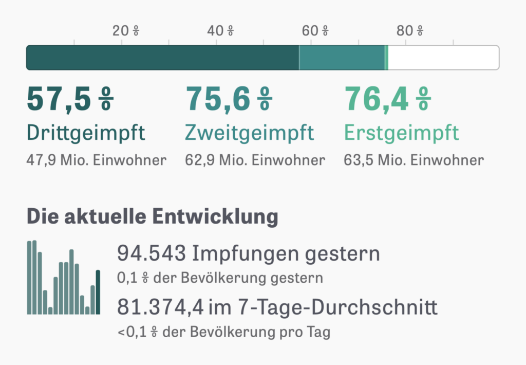
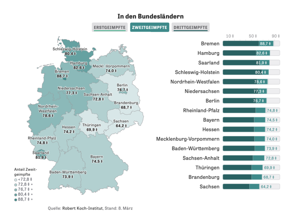
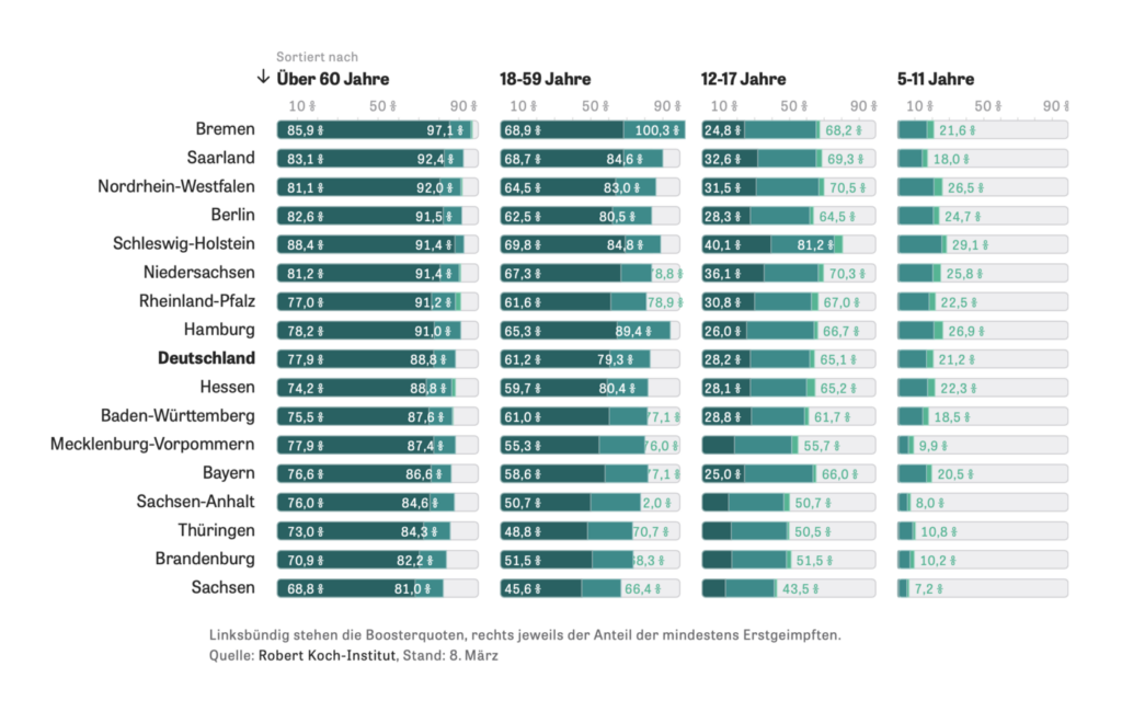
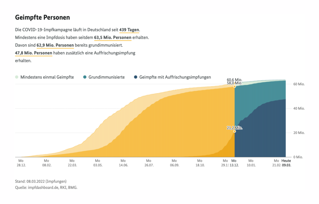
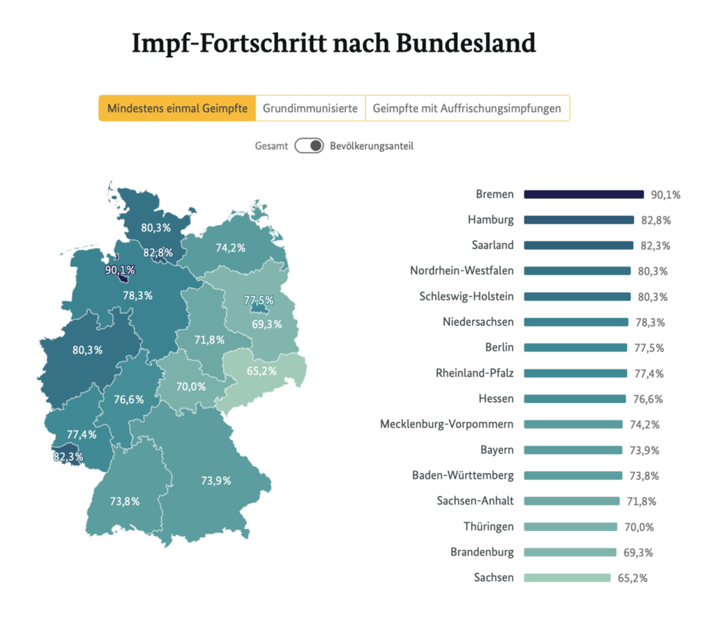
Zeit Online (Germany): Corona-Zahlen in Deutschland; So viele Menschen wurden bereits geimpft
Many newsrooms featured in this post chose to split their coverage into two or more trackers; in the case of Zeit Online, this meant one on general COVID data, including vaccines, and another focusing solely on the vaccination campaign. A consistent use of color — shades of teal for vaccine-related topics — connects the same themes across different trackers.
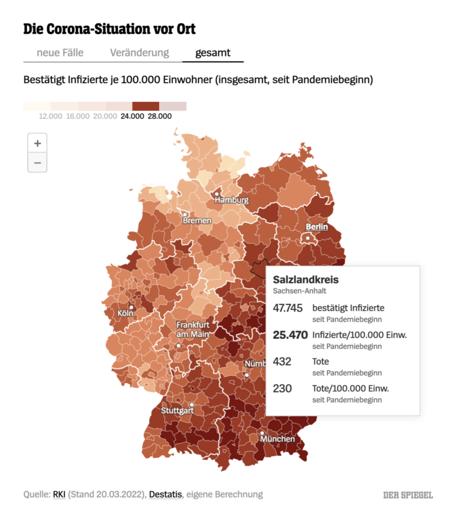
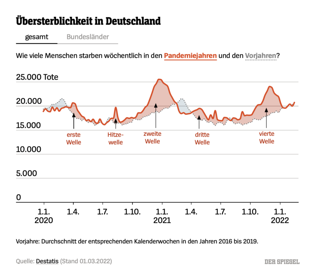
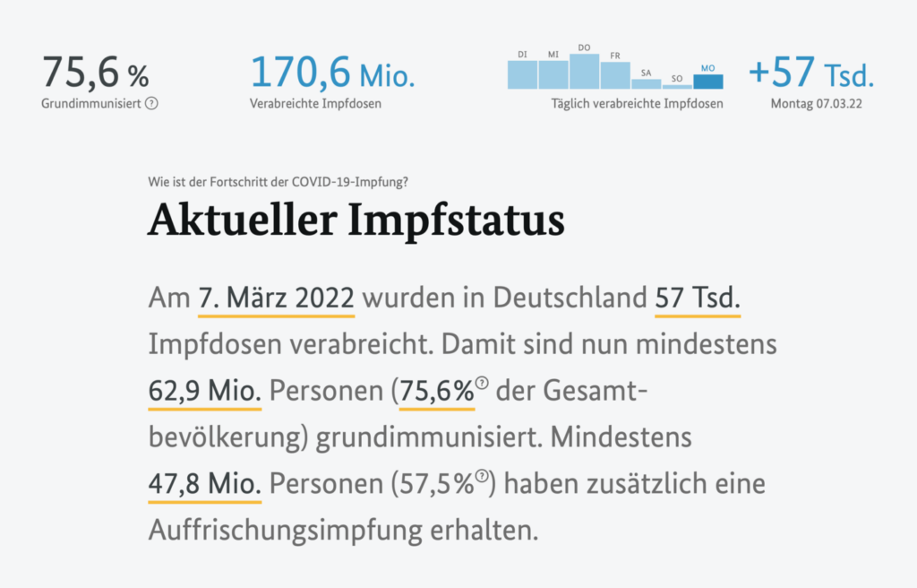
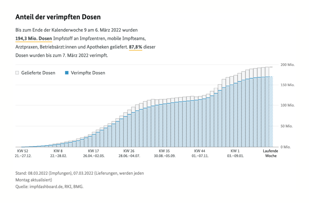
Der Spiegel (Germany): Die wichtigsten Zahlen für Deutschland
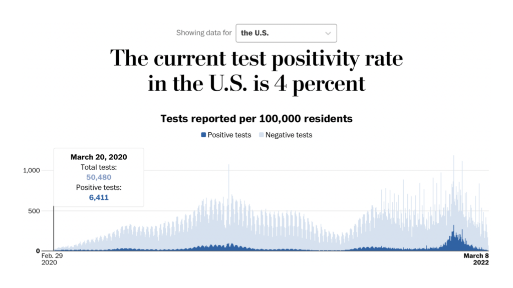
When designing charts for a tracker, there’s no knowing what trends in the data will be most important on any given day in the future. Maybe there will be too little testing, and readers will want to check the positivity rate; maybe there will be a lot of testing, and readers will want to see if capacity has increased. Der Spiegel takes on this challenge by offering several tabbed views for each map and graph, each one presenting a different side of the same topic. And yes, we’ll say it: all of these charts were created with Datawrapper.

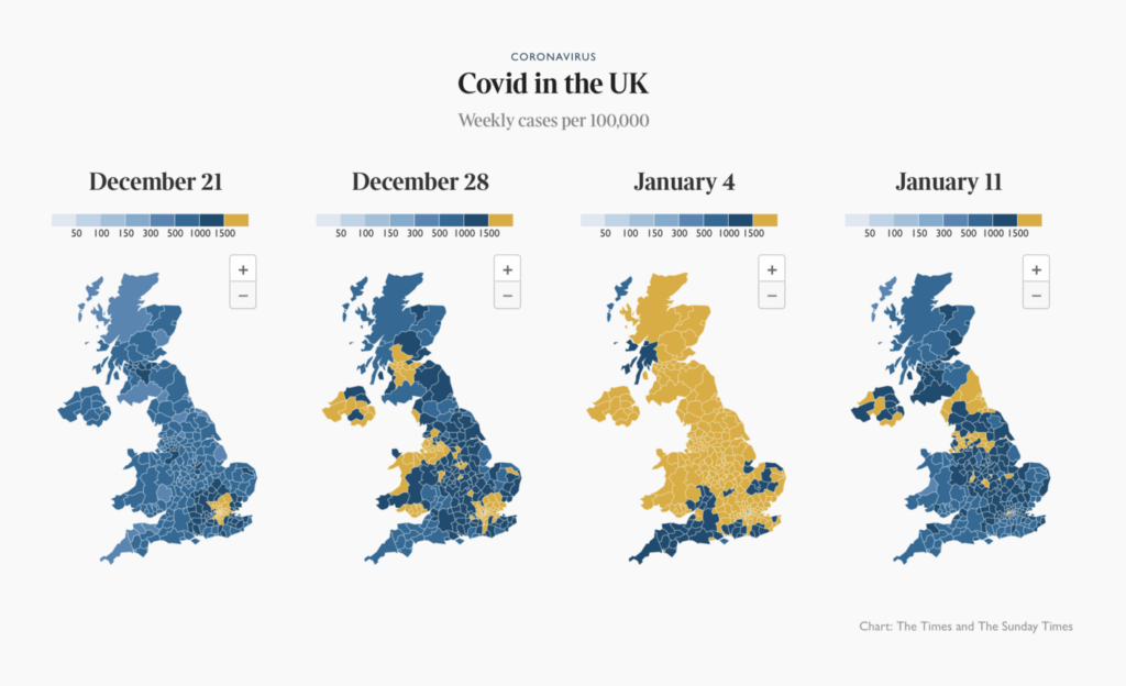
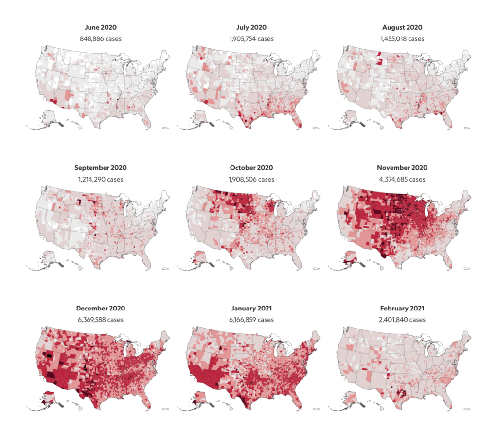
The Times (UK): Coronavirus tracker map UK
Another stylish all-Datawrapper tracker came from The Times. We liked the use of small-multiple maps to show a wave of cases spreading in time and space.


National Geographic (US): Coronavirus in the U.S.: Where cases are growing and declining
Small-multiple maps make an appearance in National Geographic as well. What we really loved here was their “numerical headline,” which summarizes the key numbers and trends right at the top of the page. It’s an idea that you’ll see repeated in many of these trackers, and makes perfect sense for a story where data really was the headline news.
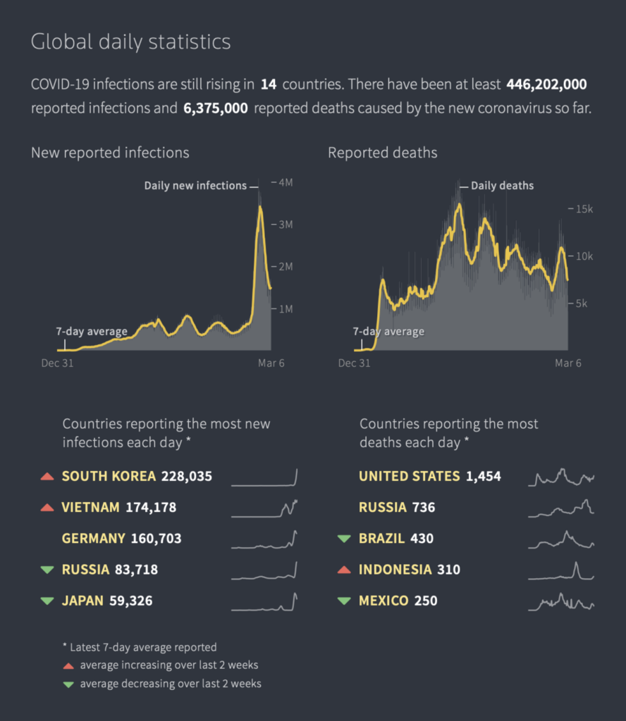
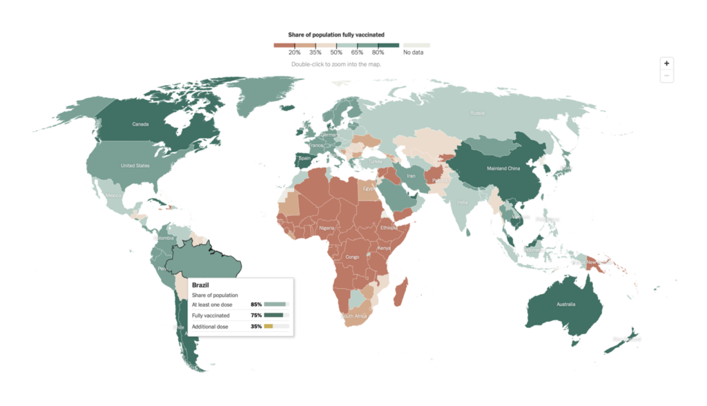
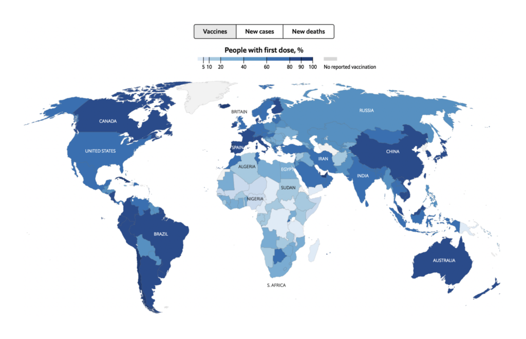
The Guardian (UK): Covid world map: which countries have the most coronavirus vaccinations, cases and deaths?; Covid UK: coronavirus cases, deaths and vaccinations today
The Guardian uses the same technique to great effect, with a headline block that consists entirely of figures.

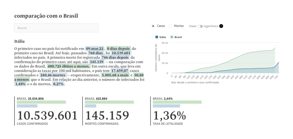
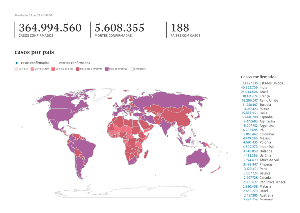
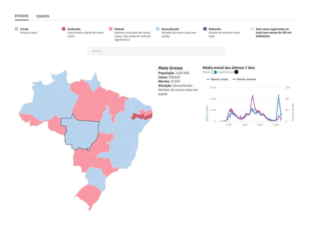
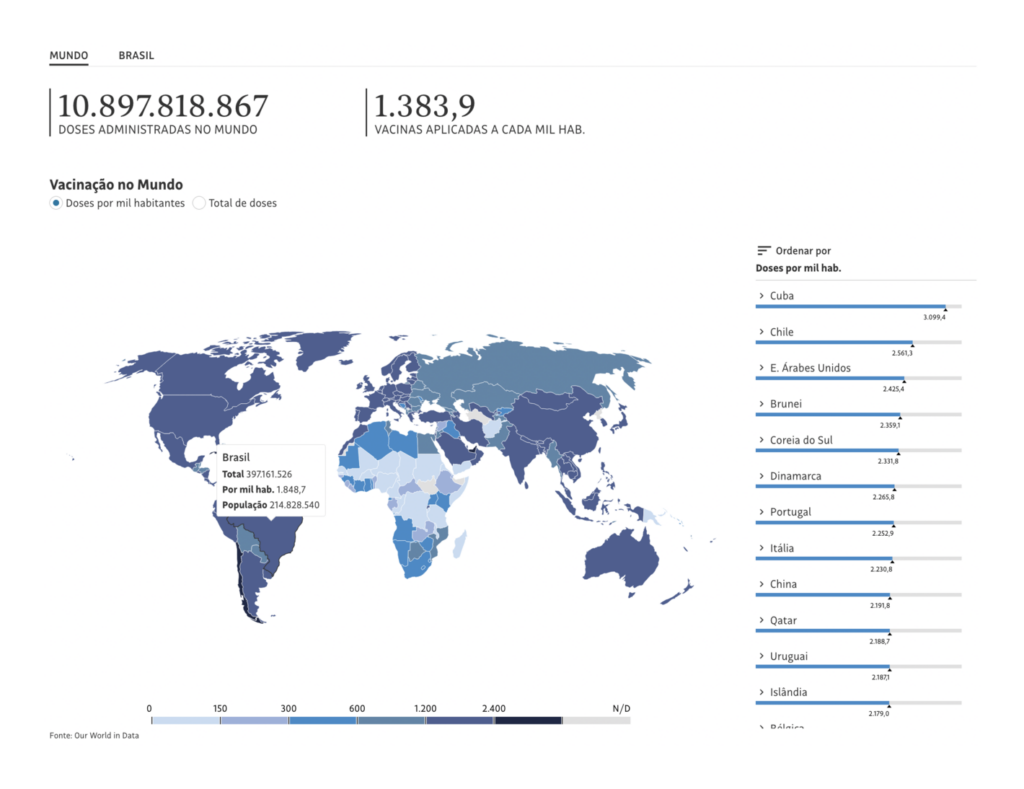
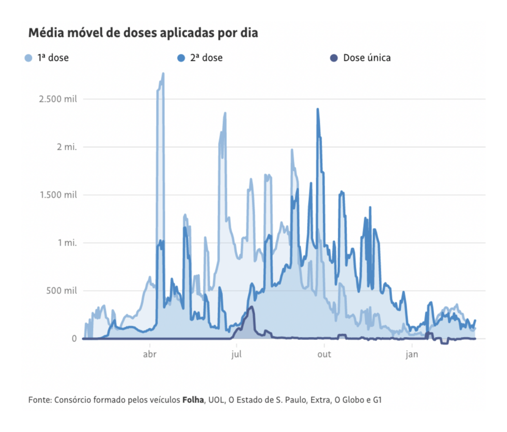
Folha de S.Paulo (Brazil): Monitor do novo coronavírus; Veja como está a vacinação no Brasil
The Folha de S.Paulo takes it a step farther in their country comparison tool, combining headline numbers with tiny bar charts that are color-coded by country to match the data in a summary paragraph. Many trackers took advantage of the ability to embed updated figures directly into the text of an article.
gov.uk (UK): Coronavirus (COVID-19) in the UK
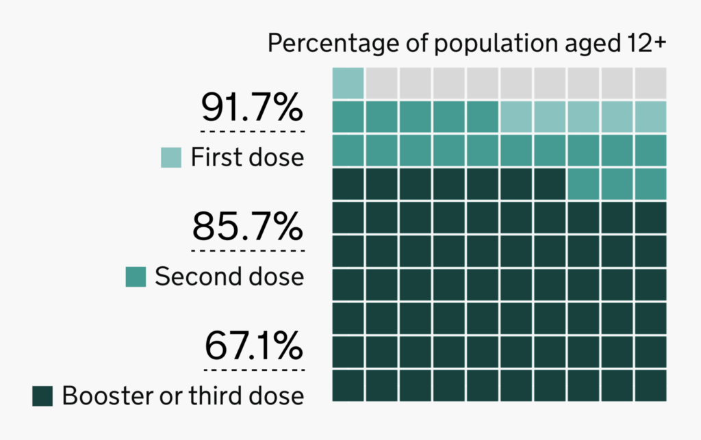
For their headline on vaccination progress, the UK government opts for a simple waffle chart.
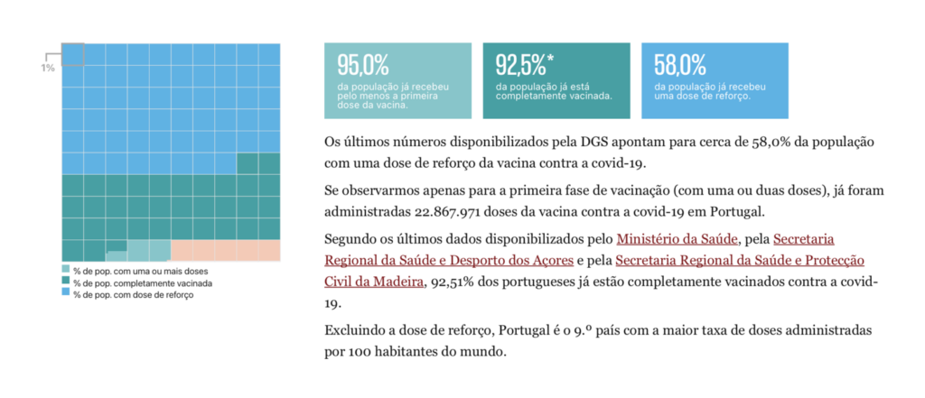
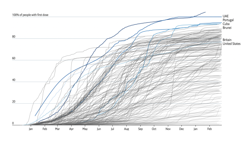
Publico (Portugal): Como está a correr a vacinação da covid-19? Compare Portugal com os outros países
And Publico does the same — though this waffle is accurate down to fractions of a percentage point!
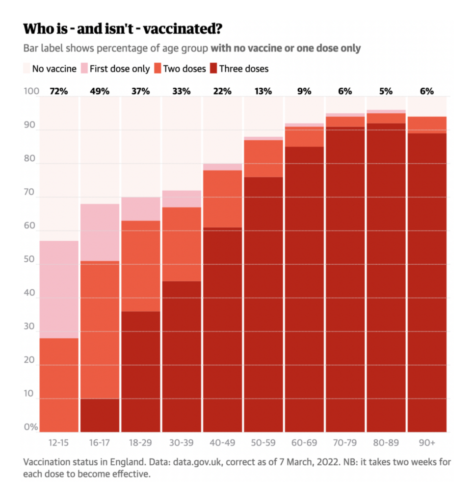
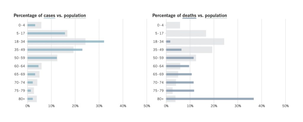
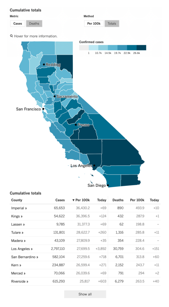
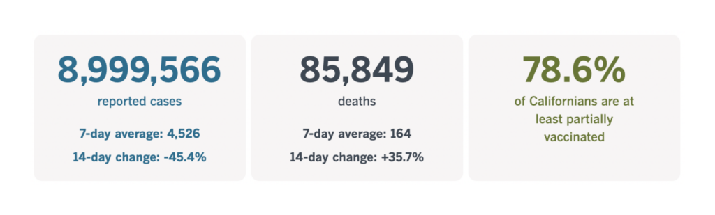
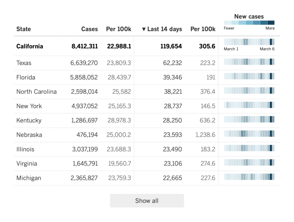
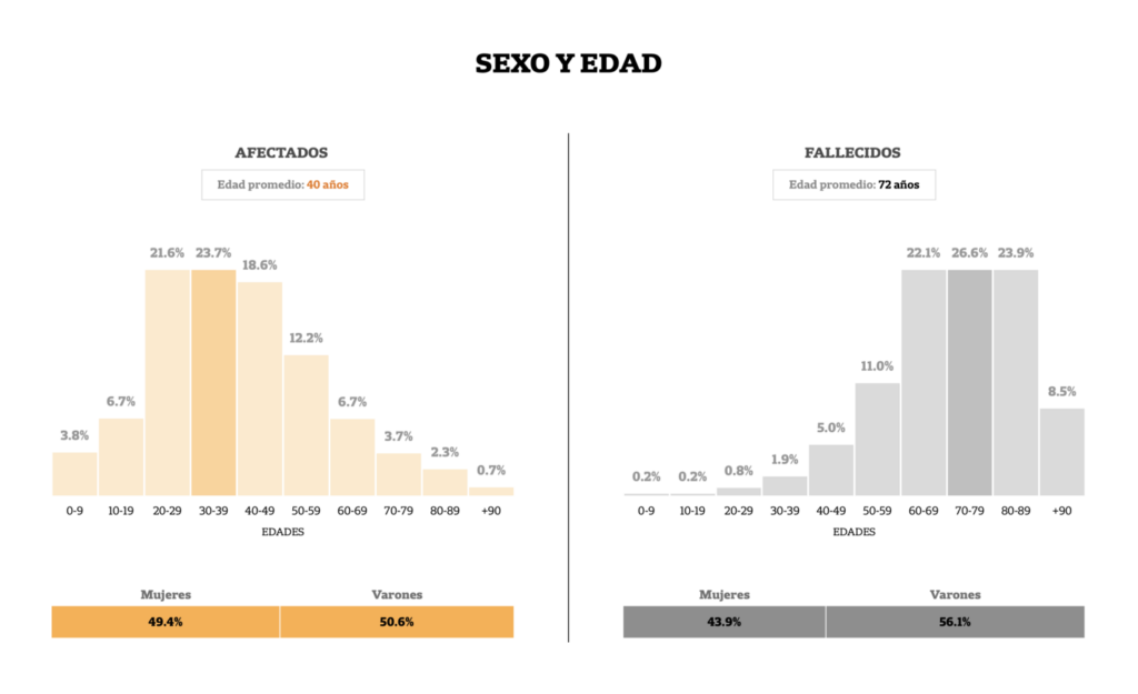
Los Angeles Times (US): Tracking the coronavirus in California
In fact, simple charts had great moments in pretty much every tracker. We thought these bullet bars in the Los Angeles Times were exactly the right choice to show the age skew of COVID cases and deaths.

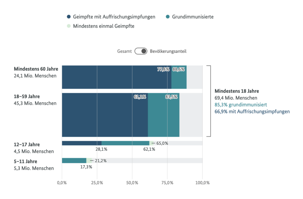
Bundesministerium für Gesundheit (Germany): COVID-19 Impfdashboard
And this Marimekko chart of vaccine progress from the German government is ideal for breaking out very unequally sized age groups.
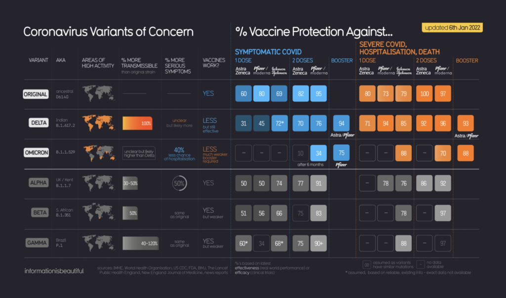
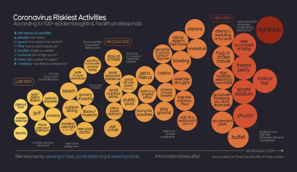
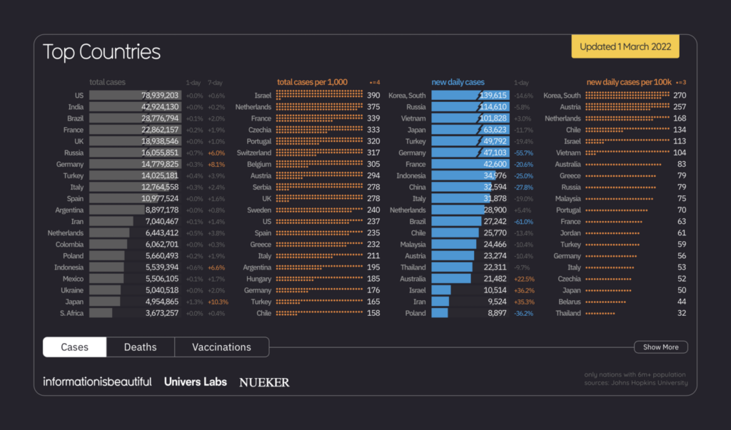
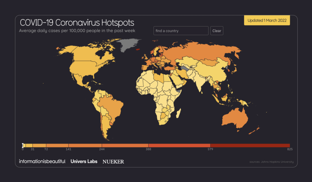
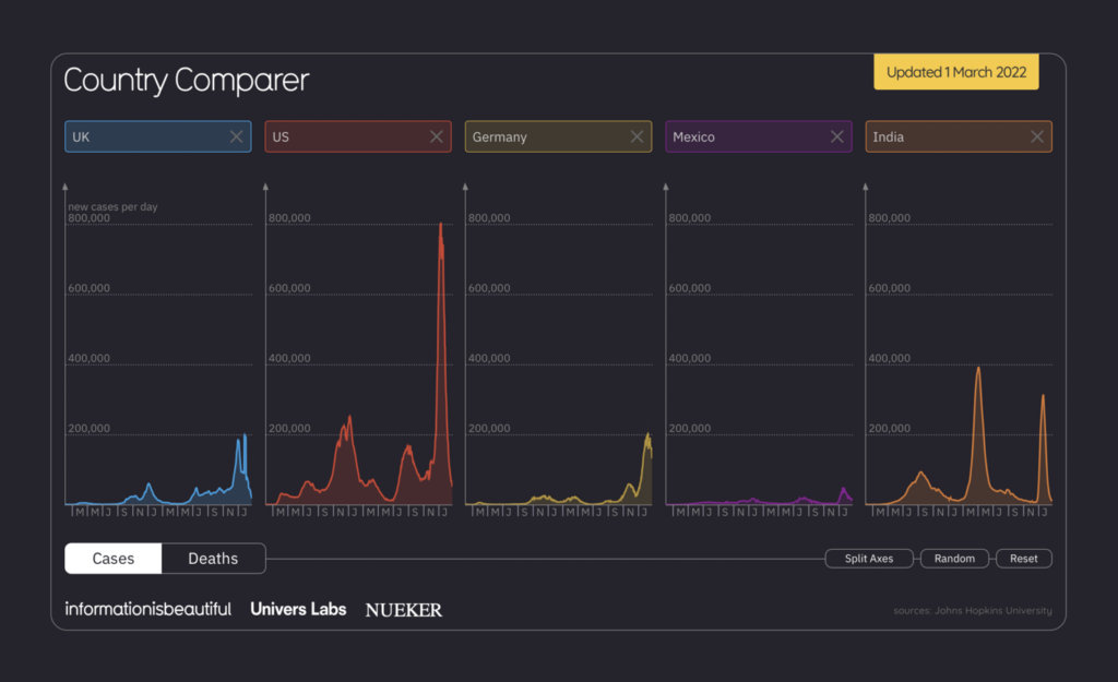
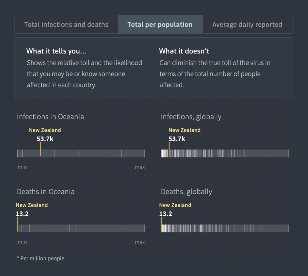
Information is Beautiful (UK): COVID-19 Coronavirus Data Dashboard
But it wasn’t all just bars and lines — we’d hardly know how to categorize this data-packed table and impressionistic activity ranking from Information is Beautiful.
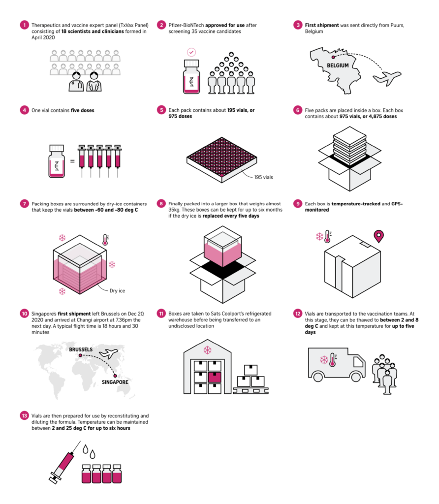
The Straits Times (Singapore): How Covid-19 is spreading across the world
The Straits Times uses illustrations (in the same pink as their charts!) to explain the timeline of vaccine development and delivery.

Reuters (UK): COVID-19 Global tracker
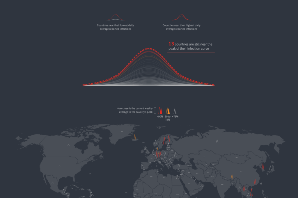
And Reuters’ case tracker featured several cool and innovative chart types. We were especially impressed by their lockdown timelines, which juxtapose case trends with school and workplace closures, and their case peak map.

Reuters (UK): COVID-19 Vaccination Tracker
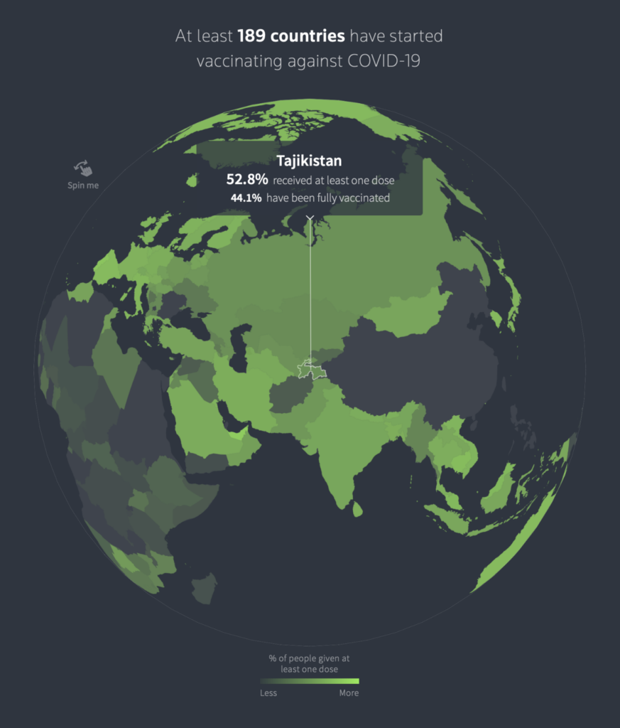
With Reuters’ vaccine tracker, it’s time to talk about color. There’s probably no clearer trend in COVID data vis than the association that’s developed between green and vaccine data. We think there’s two reasons for that. First, uncontrolled spread means that case rate records never hold for long — and with each higher wave, the color scale of case charts needs to be extended. Over the past two years, we’ve blown through yellows, oranges, reds, purples, and browns, which limits the territory for other topics. And second, vaccines represented everyone’s hope for a return to normal life after the pandemic — what better color to show that than a springlike, all-clear green?
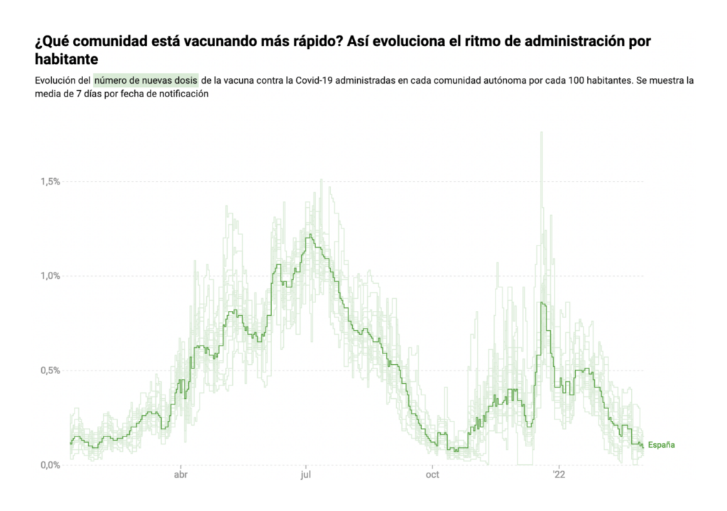
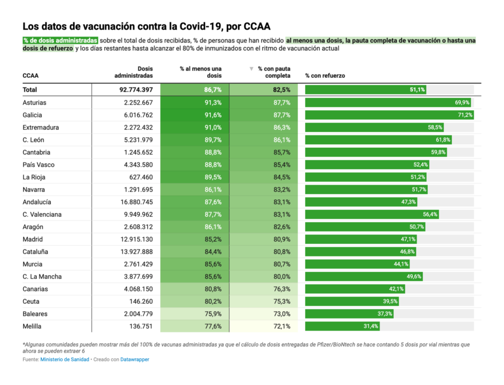
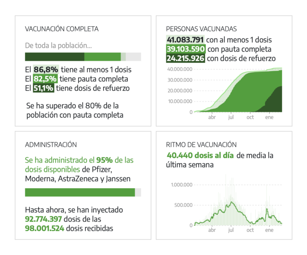
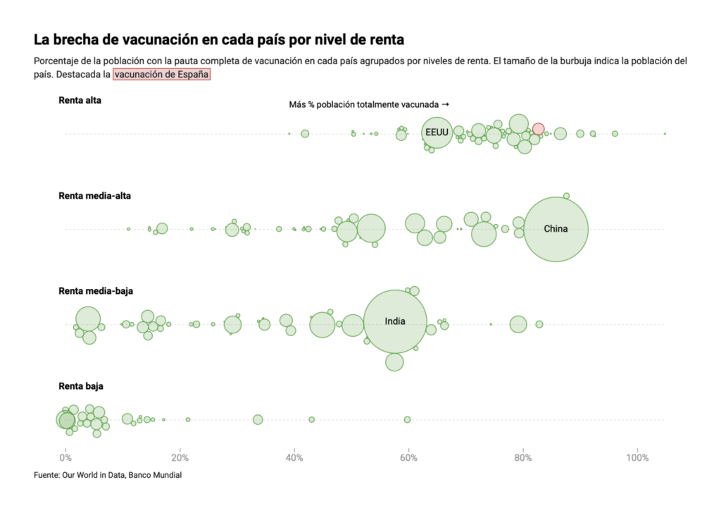
El Diario (Spain): Así avanza la vacunación: mapas y gráficos sobre su evolución en España y el mundo
If you’re skeptical about this trend, look no further than El Diario. We especially liked their line chart comparing vaccination rates in different regions of Spain.
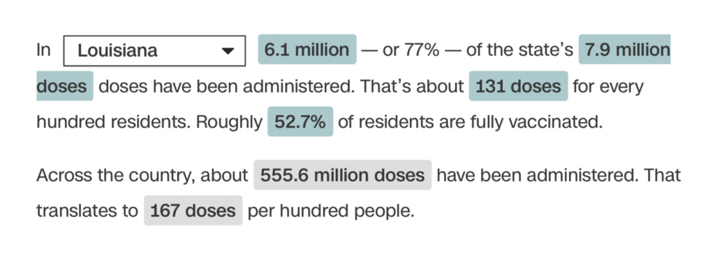
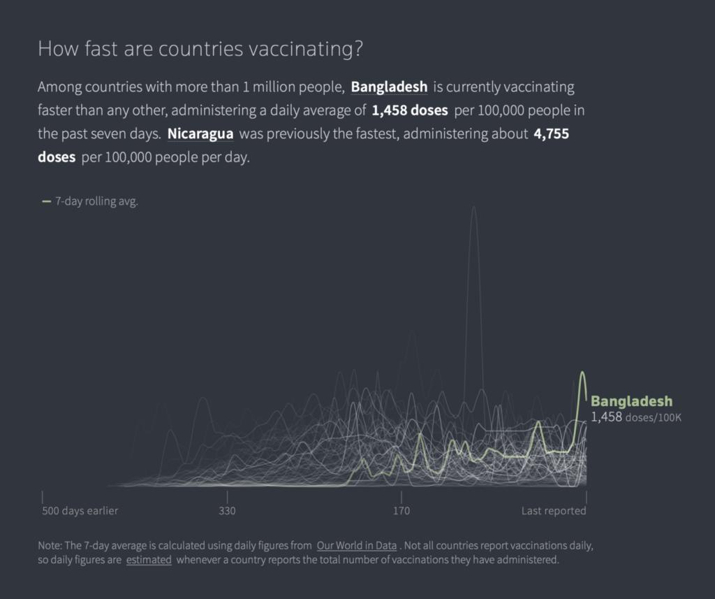
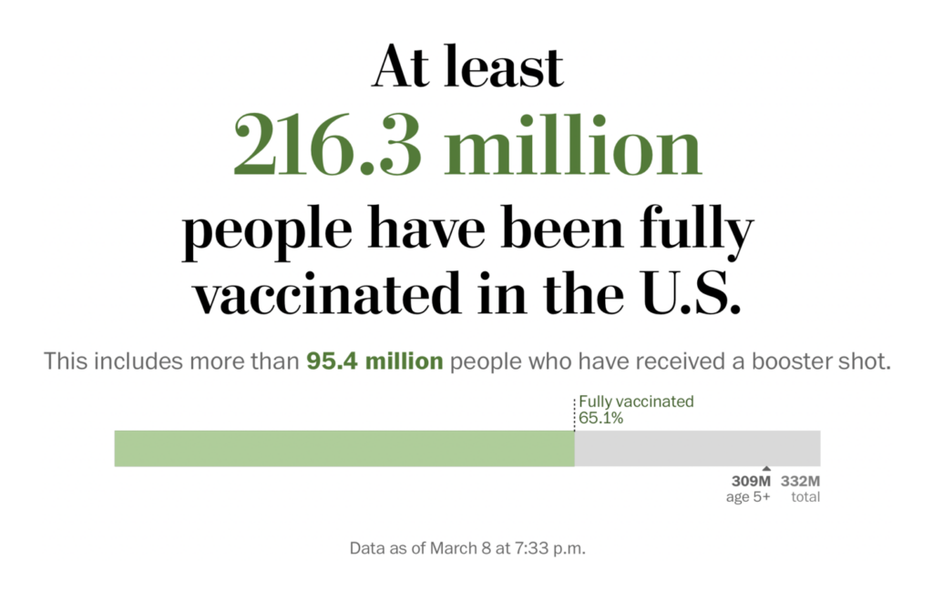
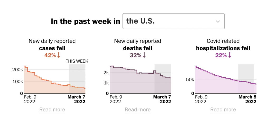
The Washington Post (US): Tracking the covid vaccine
The Washington Post? Green vaccines. The use of embedded numbers directly in headline text is a highlight of all the Post’s trackers, including this one.
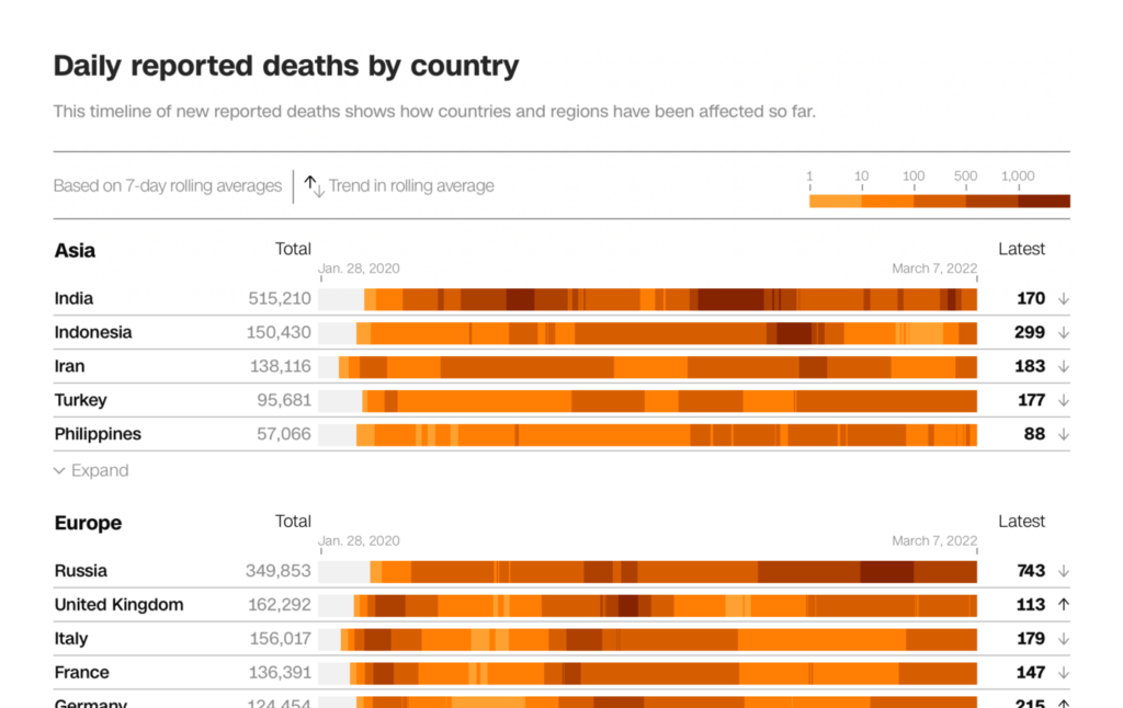
The Washington Post (US): Tracking U.S. covid-19 cases, deaths and other metrics by state
The Post’s case and death trackers, meanwhile, have no green in sight — just beautiful charts and maps (including some great tooltips) in orange and purple.
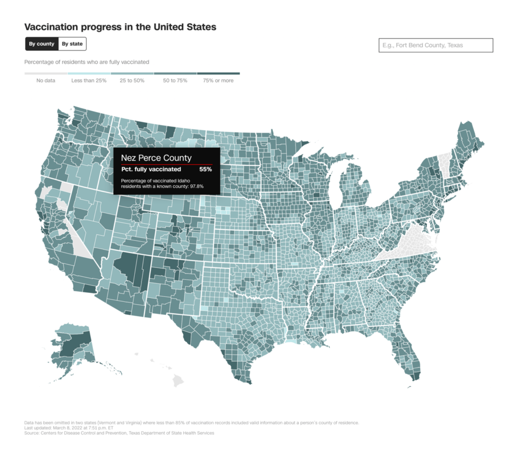
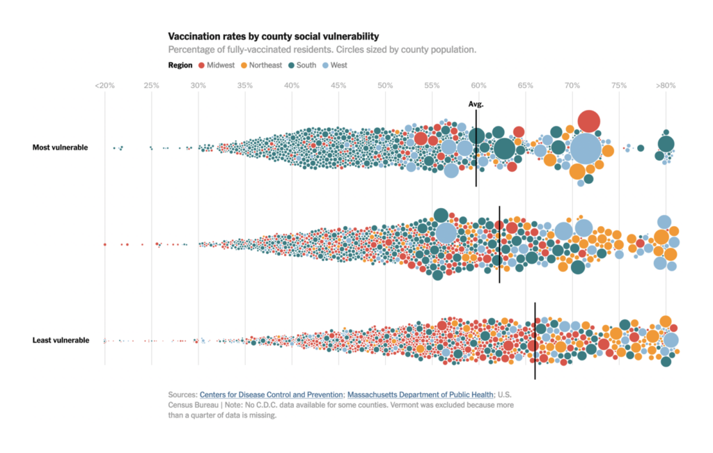
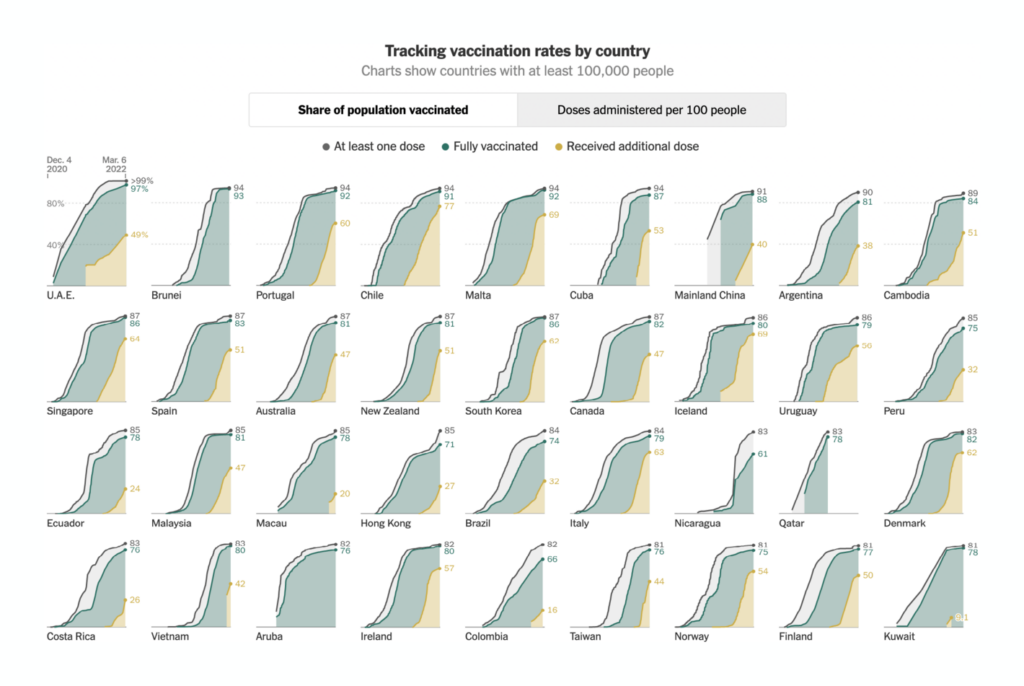
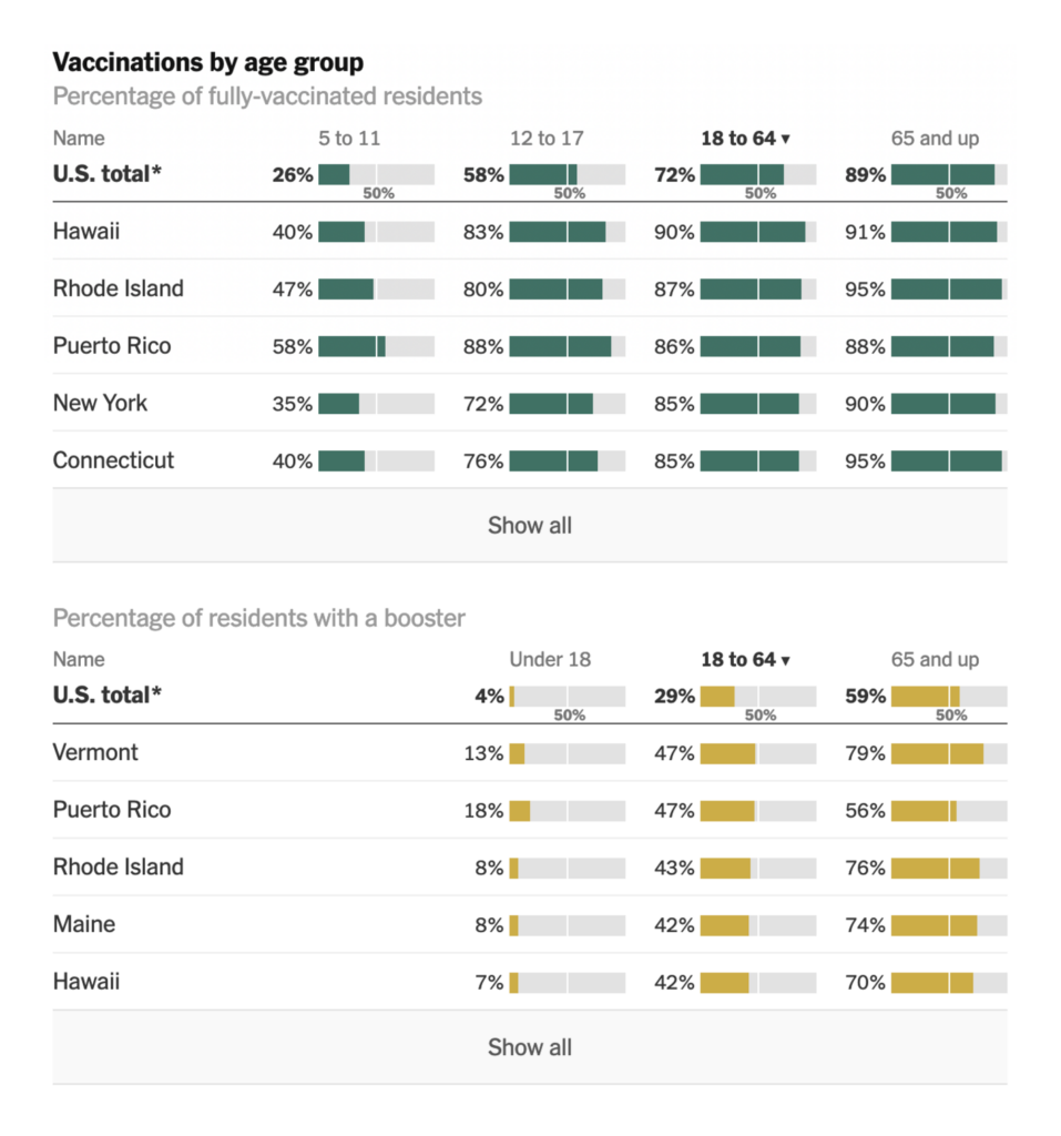
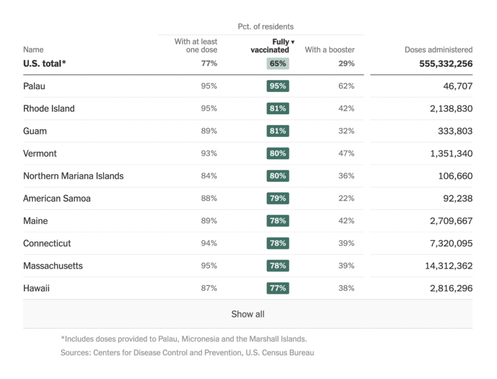
The New York Times (US): See How Vaccinations Are Going in Your County and State; Tracking Coronavirus Vaccinations Around the World
The New York Times gives us another Marimekko vaccine chart. This time, the breakout categories are by geography instead of age.


The New York Times (US): See How Vaccinations Are Going in Your County and State; Tracking Coronavirus Vaccinations Around the World
In fact, the Times’ vaccine tracker hits several visualization trends, including small multiple maps and complex tables with tiny charts — all in beautiful shades of green.


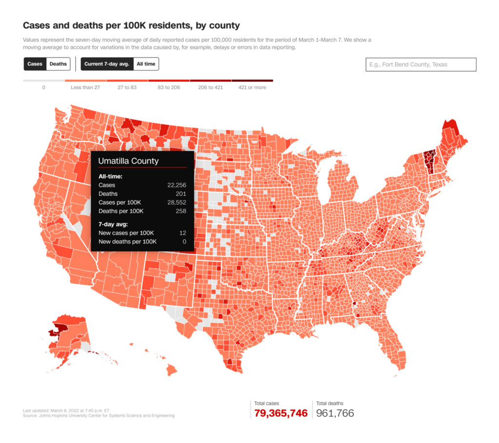
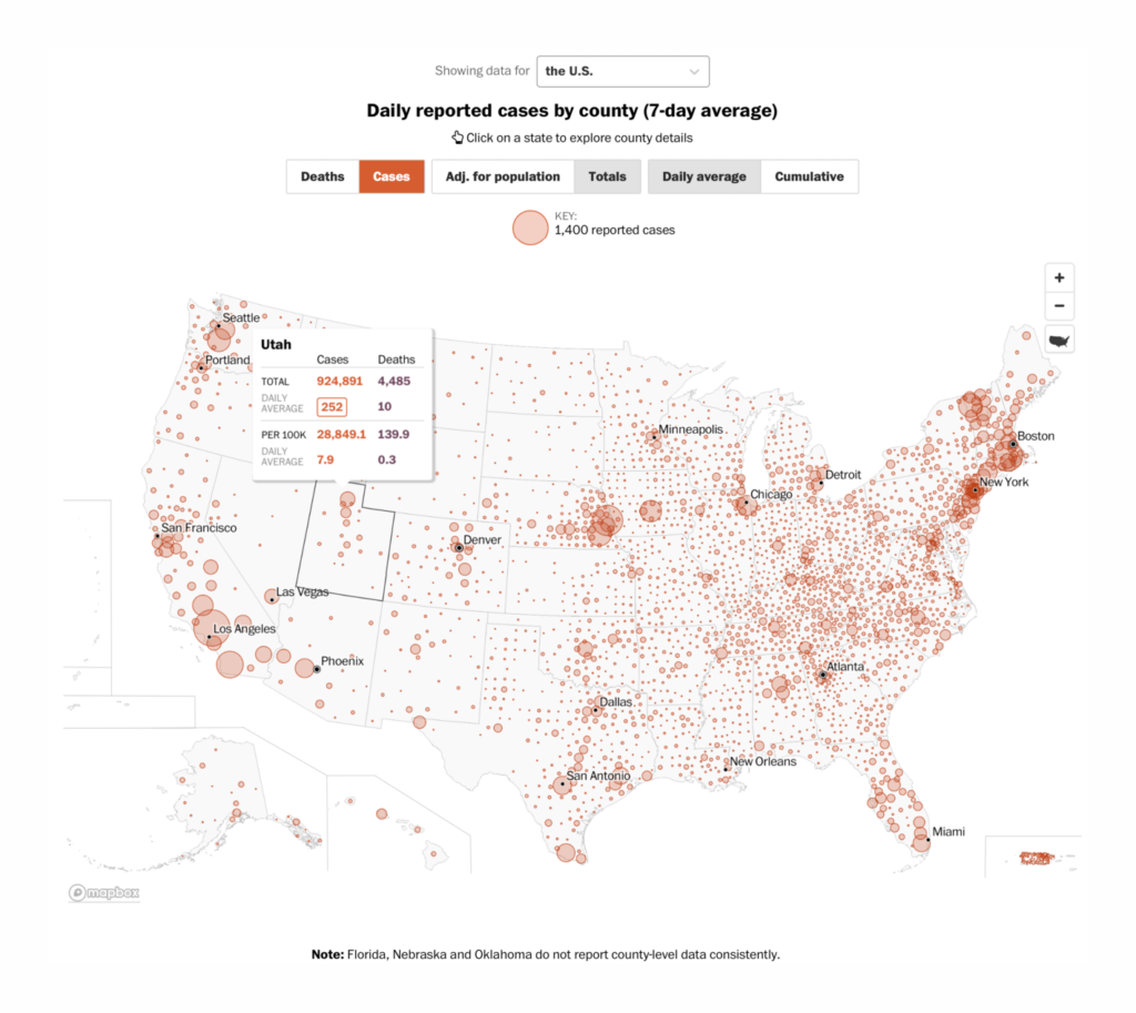
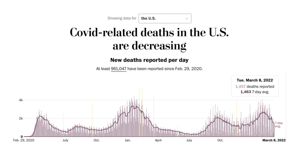
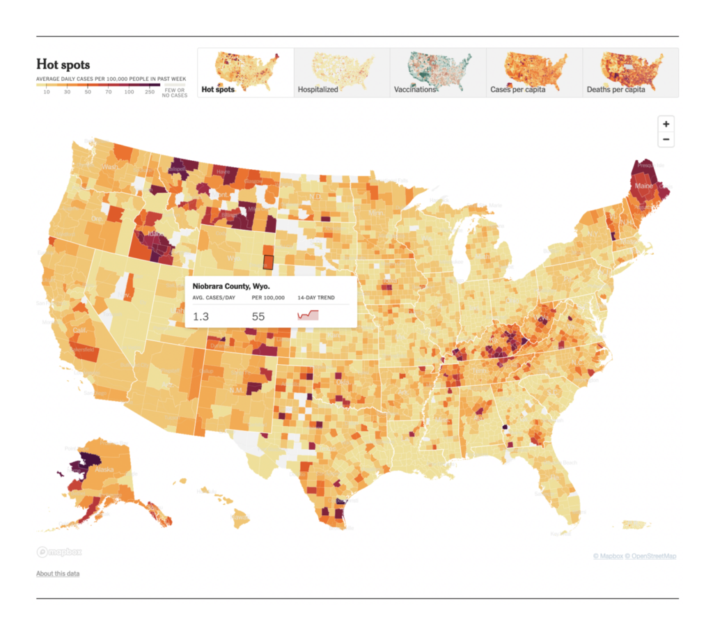
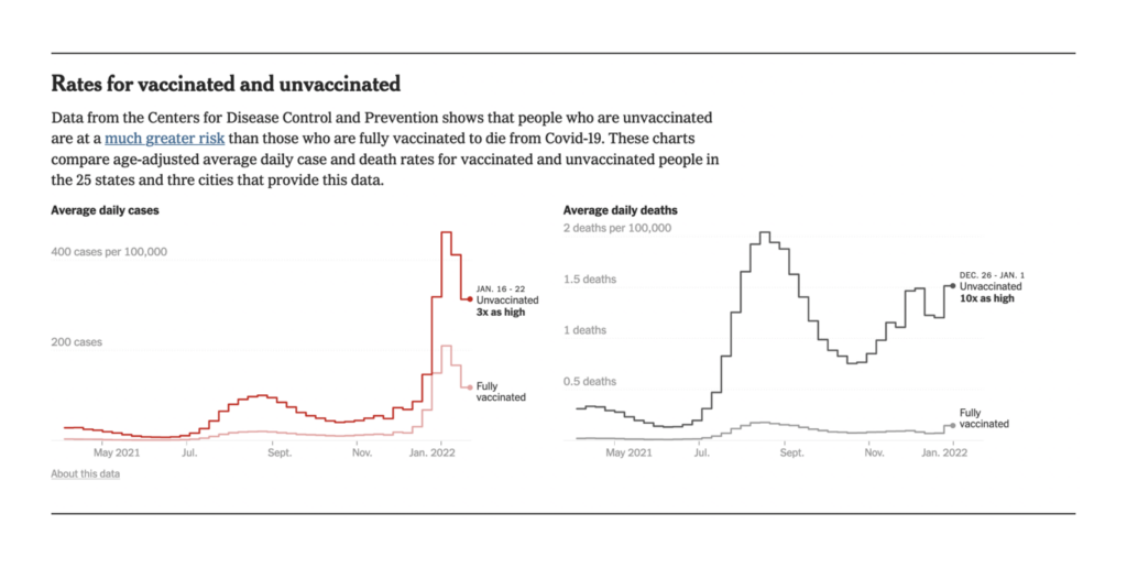
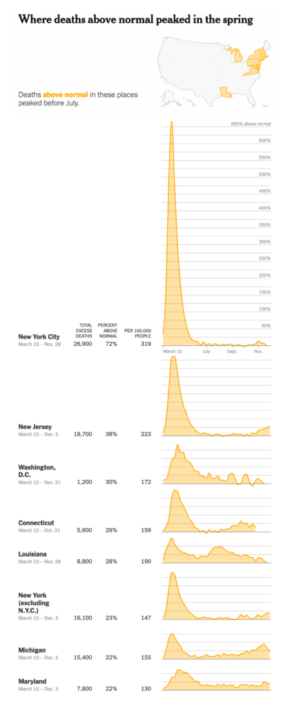
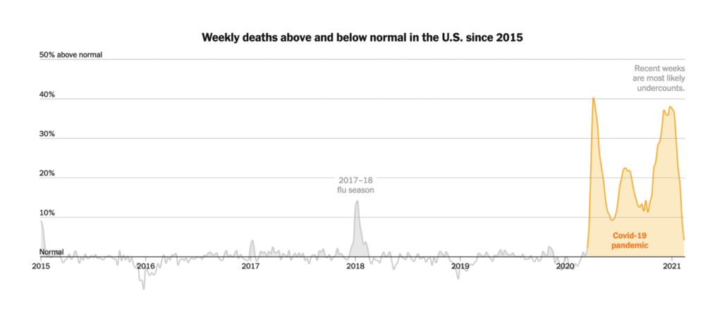
The New York Times (US): Coronavirus in the U.S.: Latest Map and Case Count; Deaths Above Normal: The true toll of the pandemic in the U.S.
There’s pretty much no source that can compare to The New York Times for sheer number of beautiful, detailed, and informative charts on almost every facet of the pandemic. We couldn’t write this post without a shoutout to them for making accessible both basic information, like this map of hot spots in the U.S., and clear analysis, like their breakdown of where and when excess deaths were distributed.
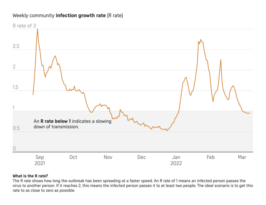
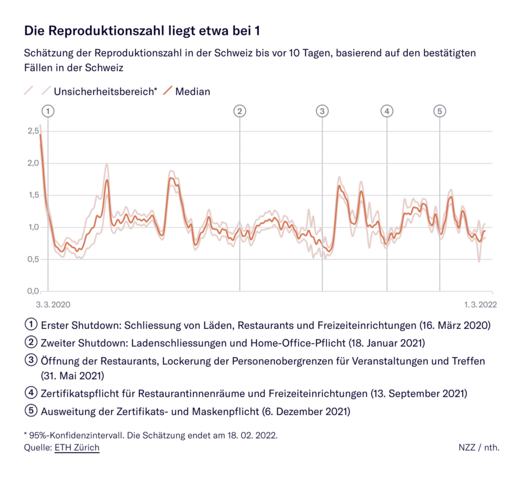
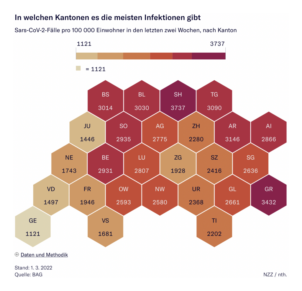
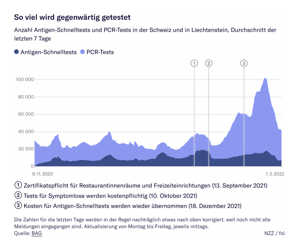
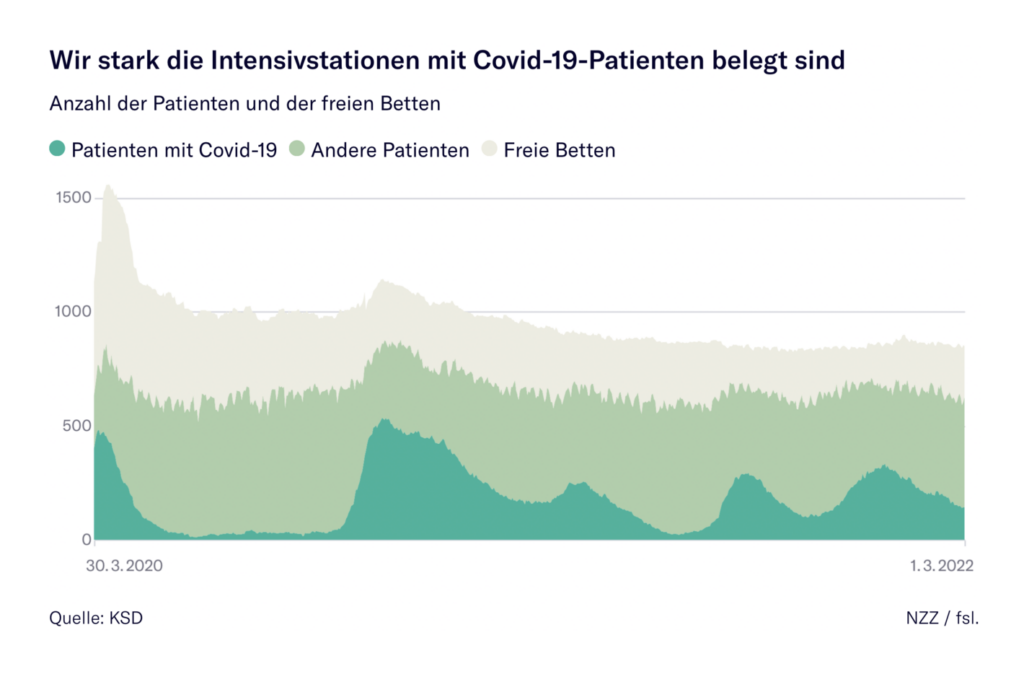
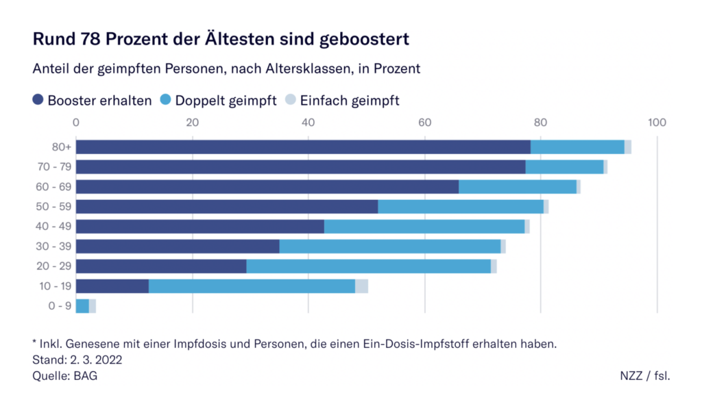
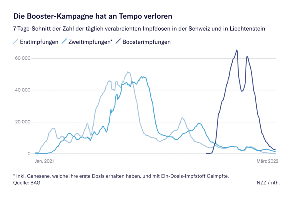
Neue Zürcher Zeitung (Switzerland): Die wichtigsten Daten und Fakten zum Coronavirus in der Schweiz in Grafiken
A few more specific visualization types deserve to be highlighted. We liked how the Neue Zürcher Zeitung overlays a timeline of policy measures on their graph of the virus’s reproduction rate over time.


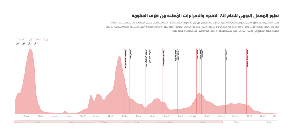
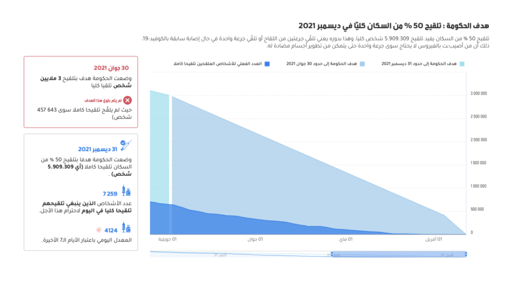
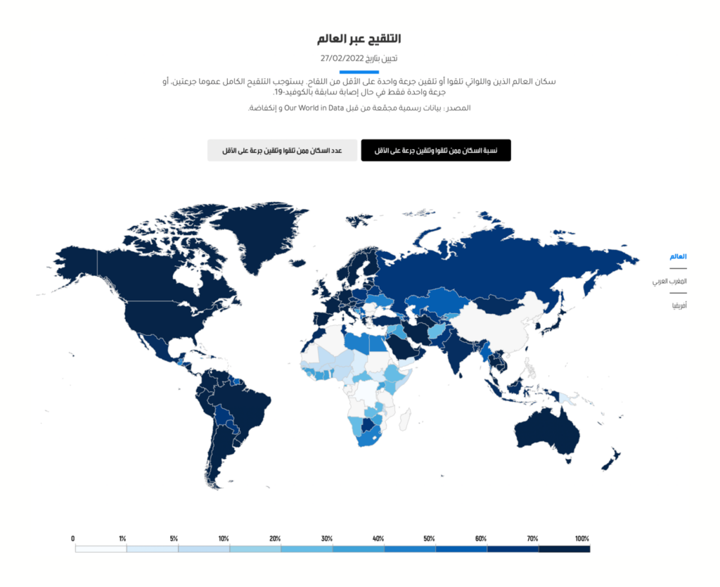
Inkyfada (Tunisia): متابعة بالأرقام لحملة التلقيح ضد كوفيد-19 في تونس ; وباء كوفيد-19 في تونس بالأرقام
And Inkyfada similarly offers a timeline of lockdown measures on top of their case rate chart.

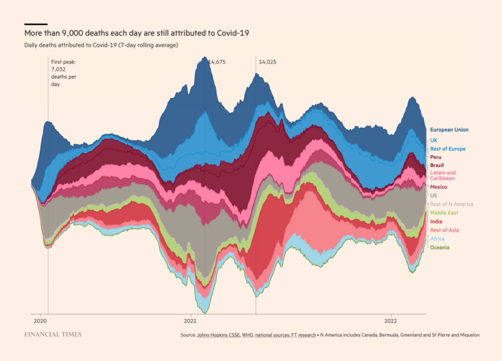
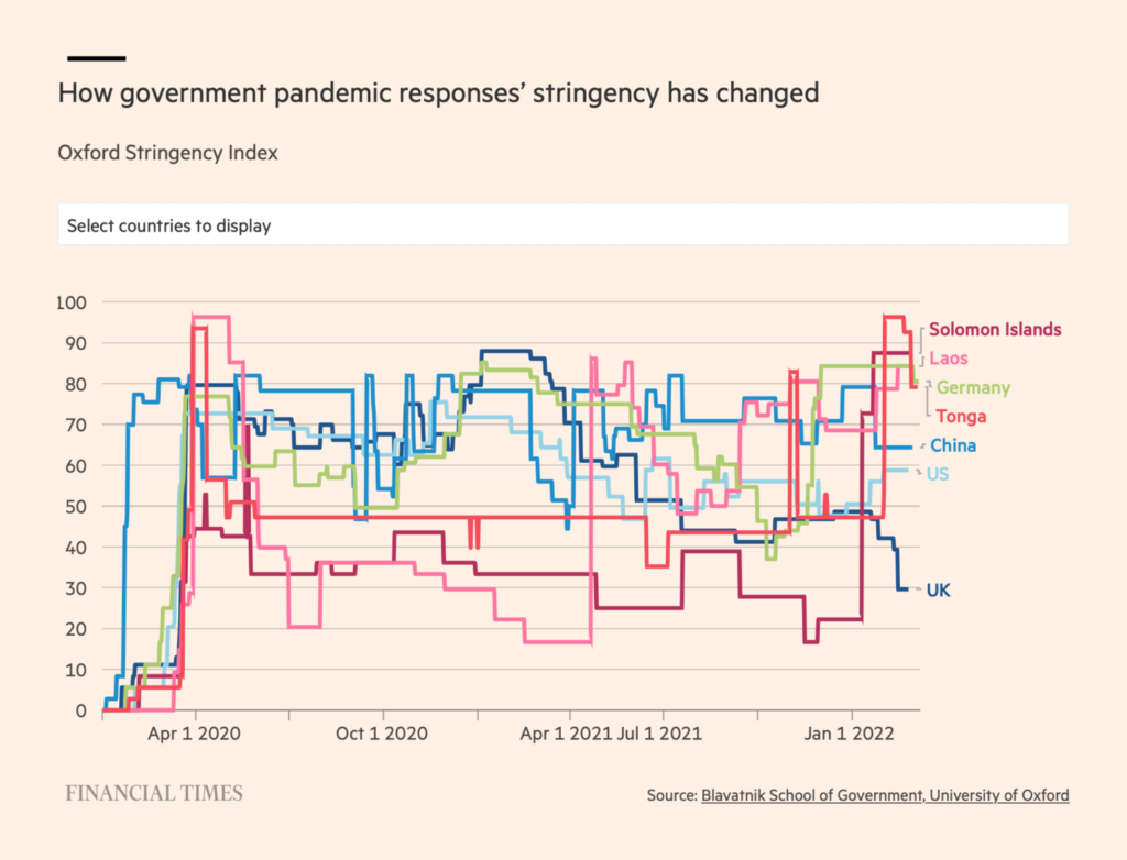
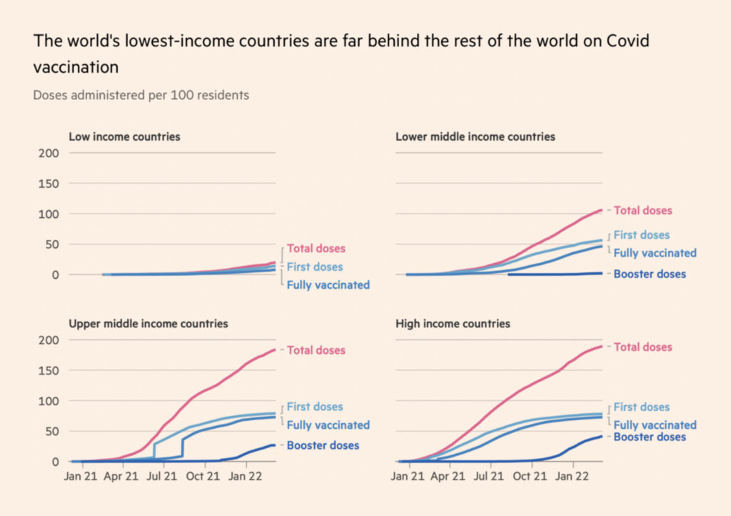
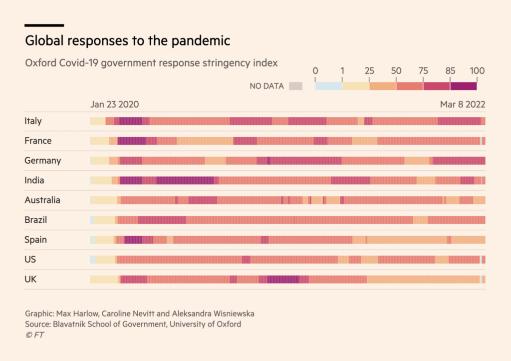
Financial Times (UK): Coronavirus tracker: the latest figures as countries fight the Covid-19 resurgence; Lockdowns compared: tracking governments’ coronavirus responses; Covid-19 vaccine tracker: the global race to vaccinate
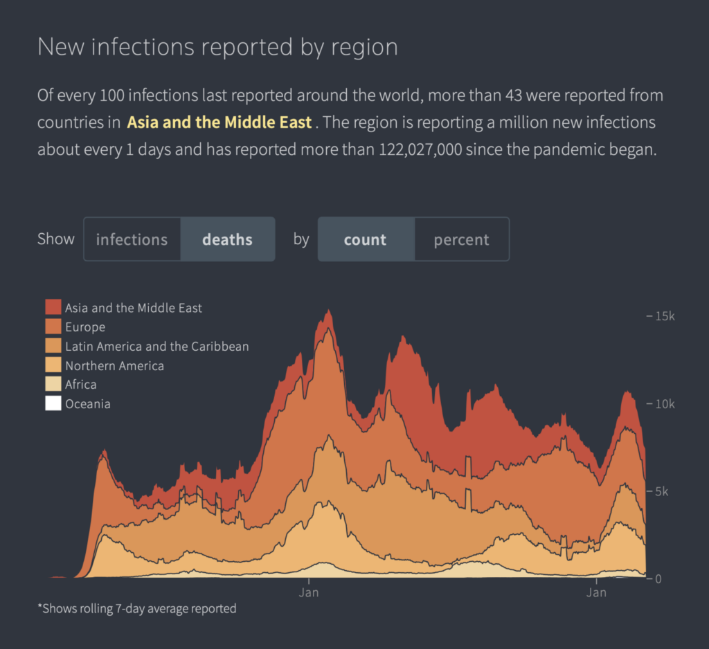
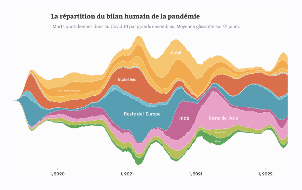
Two stream graphs of deaths by geography caught our attention. The first is from one of the Financial Times’ many COVID trackers (don’t miss their lockdown heatmap either).
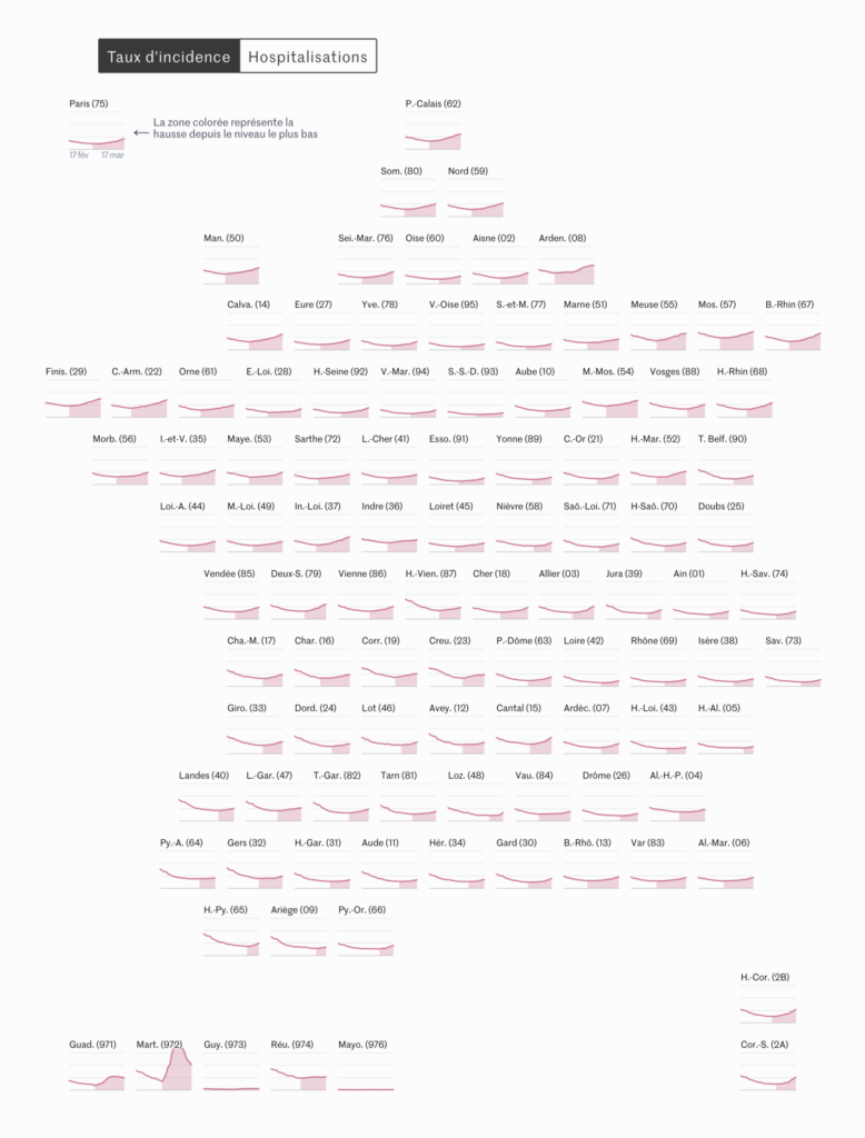
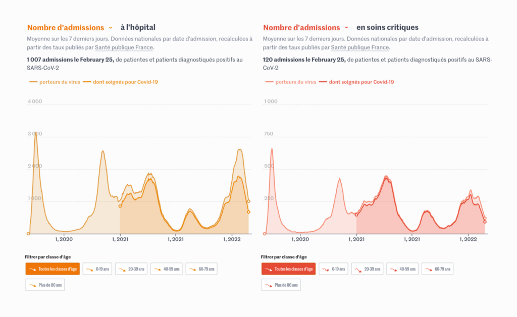
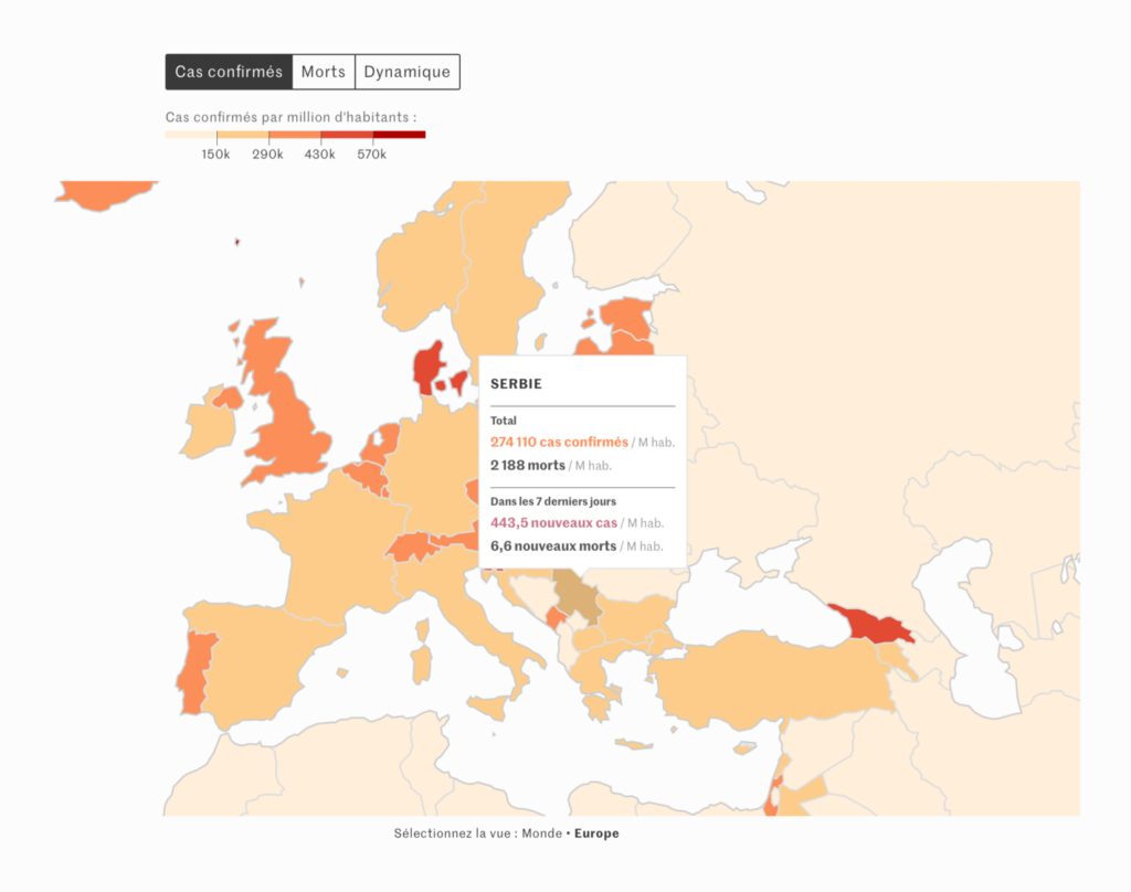
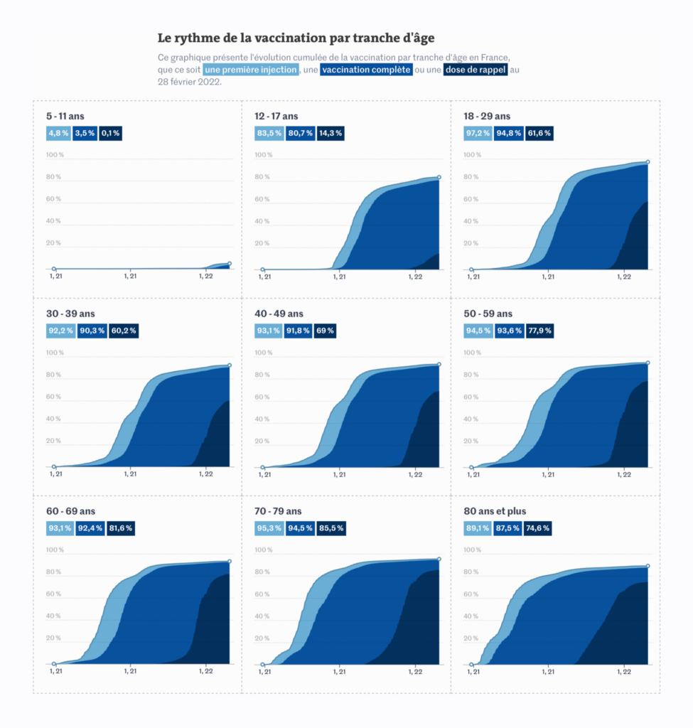
Le Monde (France): Covid-19 : le tableau de bord de l’épidémie
And the second stream graph is from Le Monde. This tracker also used another chart type we’ll return to — the tilemap-style small multiple.
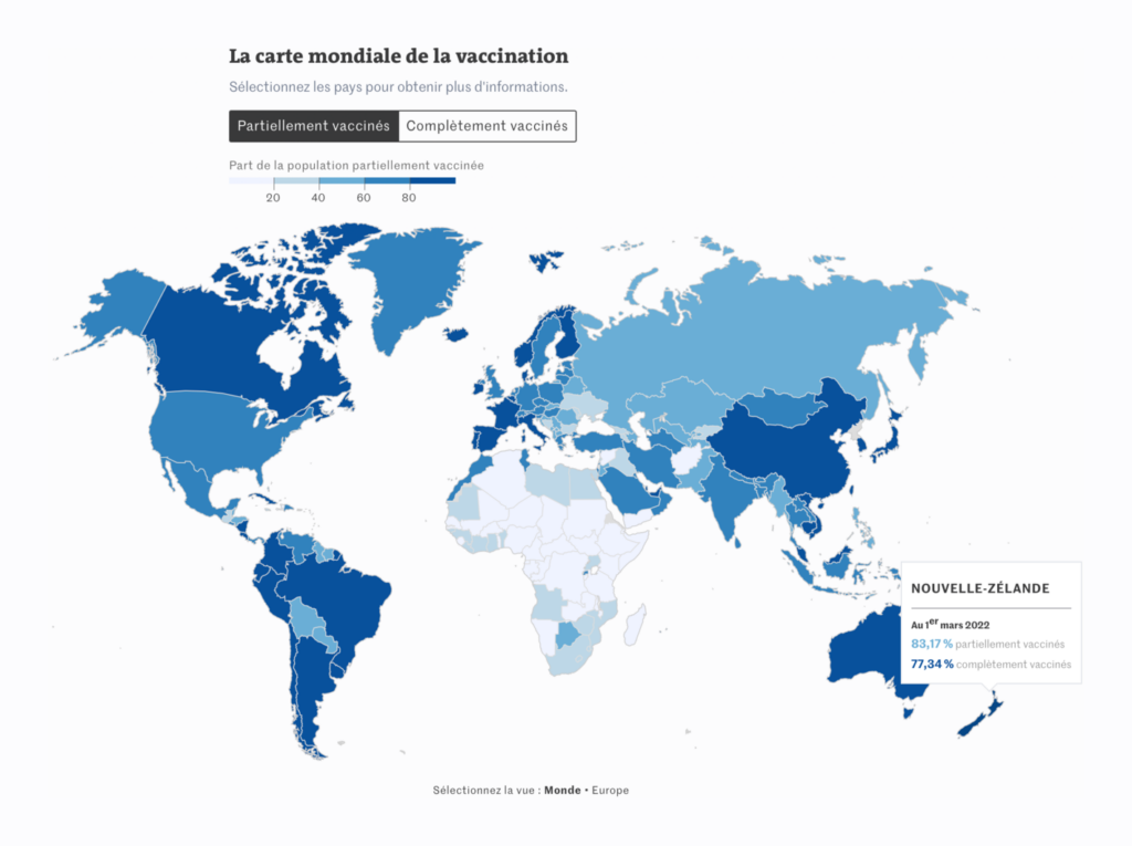
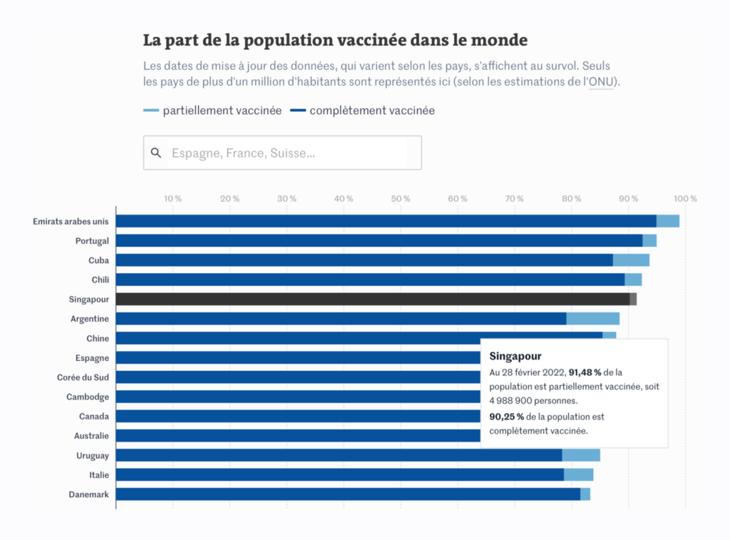
Le Monde (France): Vaccination contre le Covid-19 : le tableau de bord en France et dans le monde
Just to prove it’s possible, Le Monde’s elegant vaccine tracker sticks to blue. You’ll have to click over to the interactive version to appreciate the waffle charts with age group breakdowns that appear as you click on each region of the map.

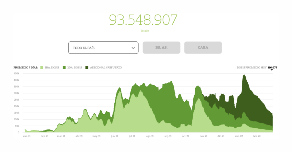
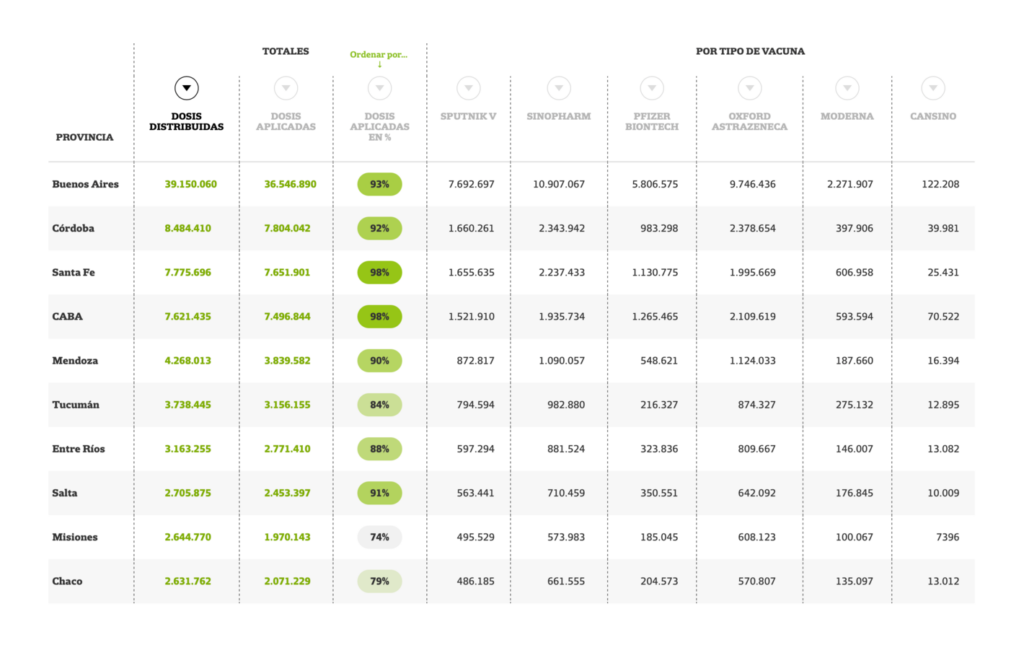
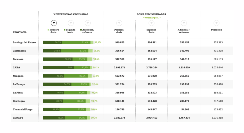
La Nación (Argentina): La vacunación, en tiempo real
But don’t get the wrong idea: green is still the undisputed champion of vaccine trackers. And La Nación is the champion of the tilemap small multiple.

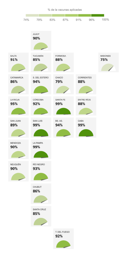
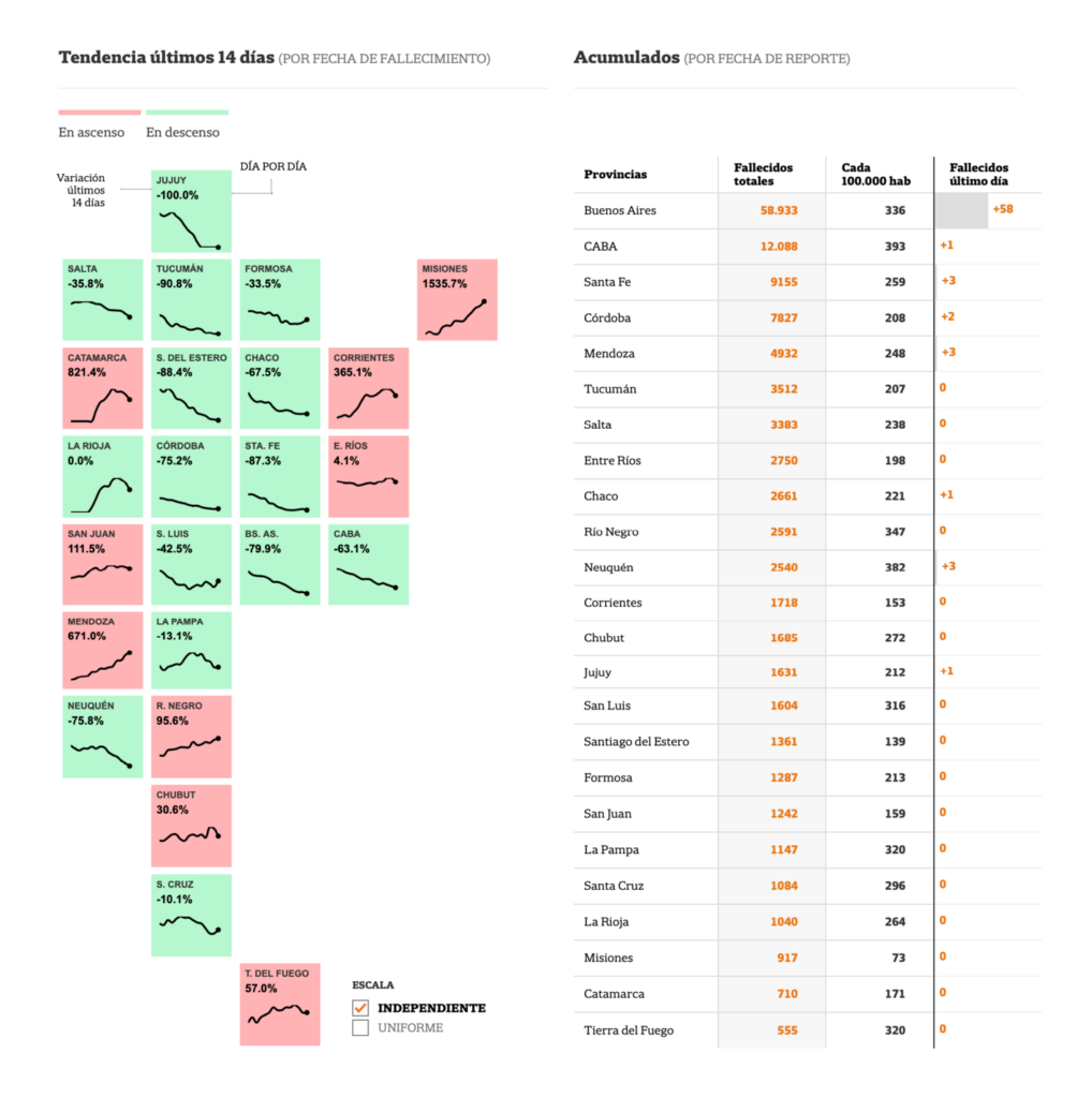
La Nación (Argentina): La evolución de la pandemia
We loved how these tilemaps show several levels of detail for each province — the trend direction, trend line, and exact percent change — while preserving their geographic relationships.
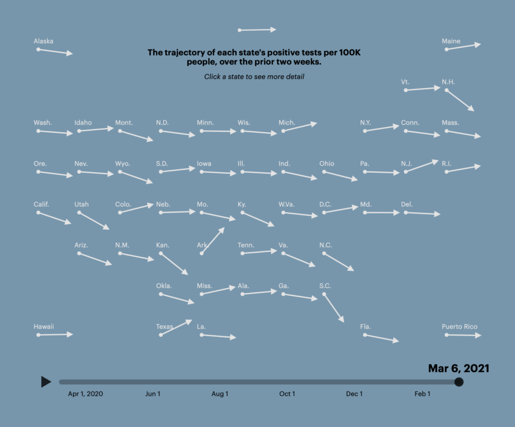
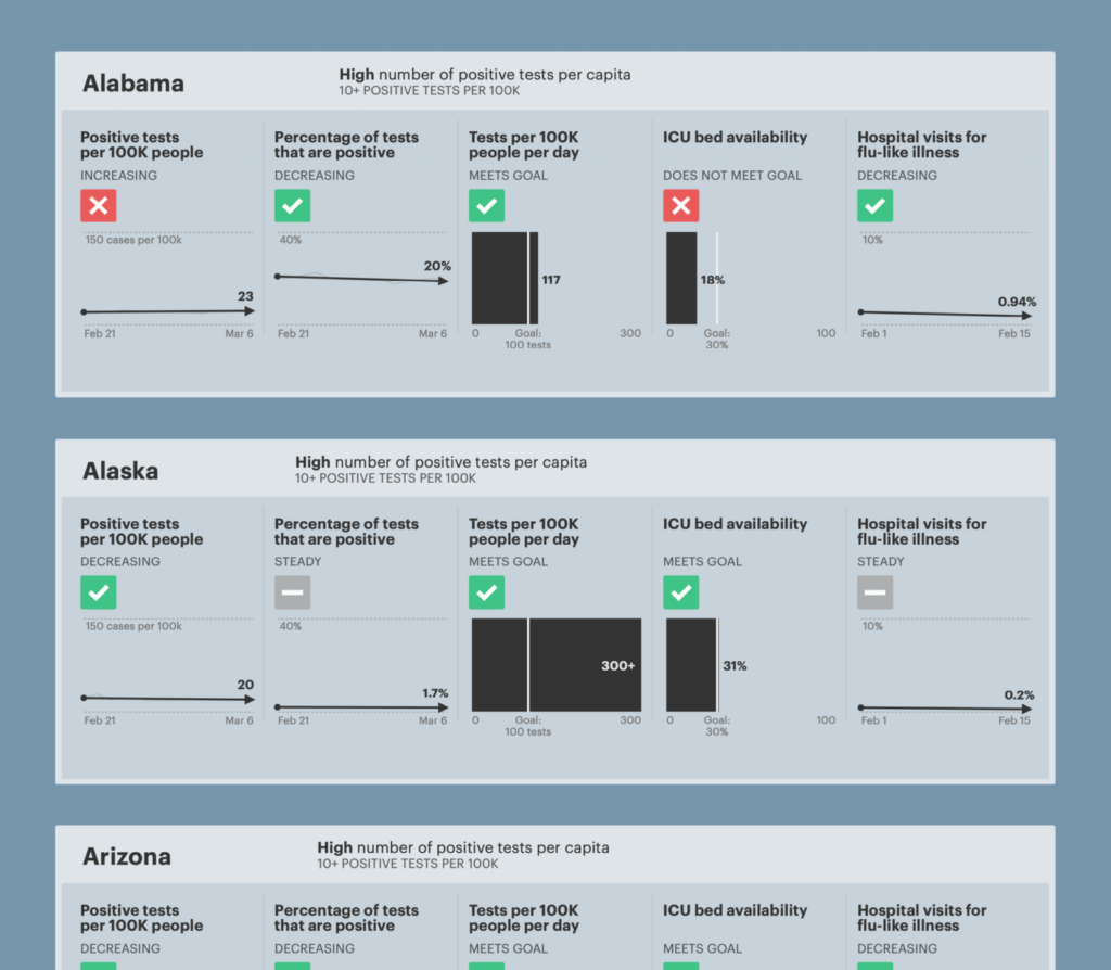
ProPublica (US): States Are Reopening: See How Coronavirus Cases Rise or Fall
A tilemap from ProPublica shows simple current case trajectories, which makes it possible to take in all the U.S. states at a glance. Clicking on any state reveals a table-style summary of where it stands on key measures.
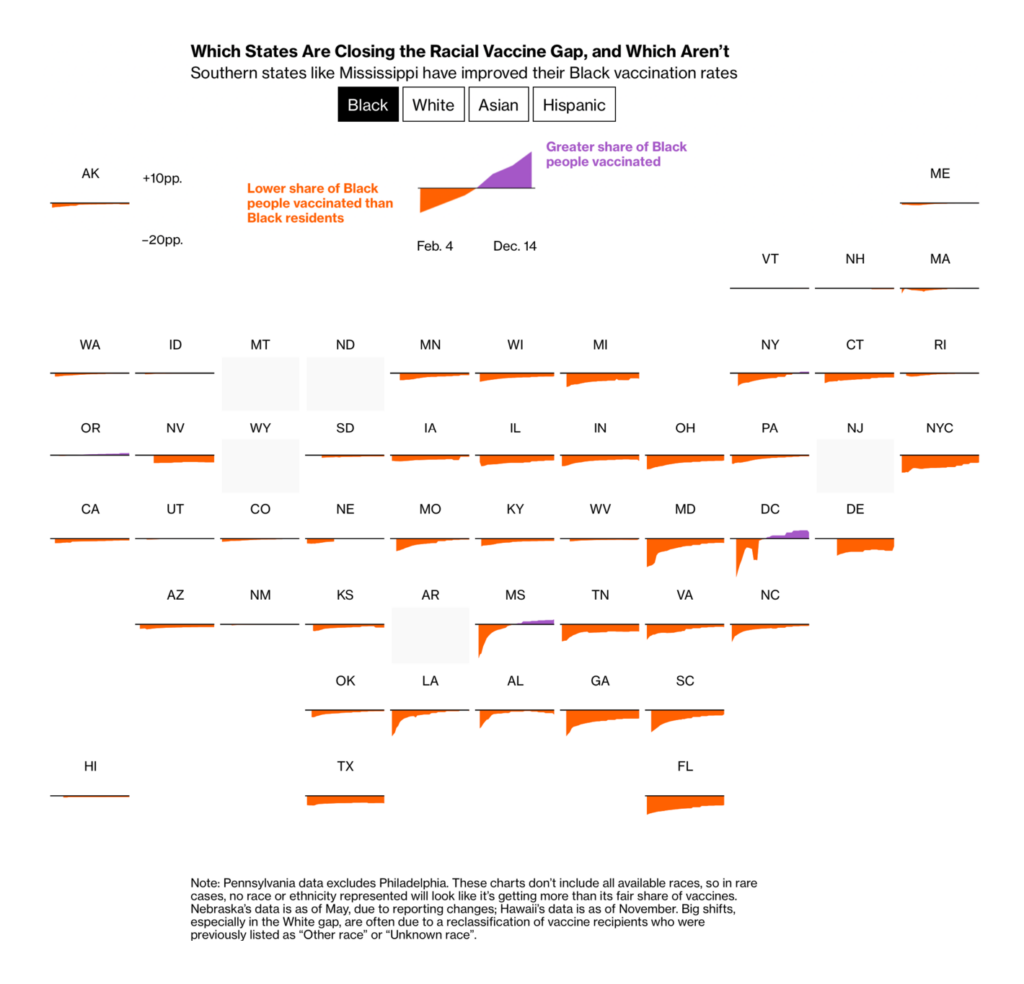
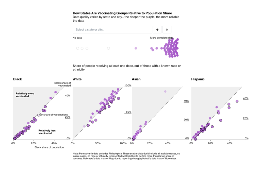
Bloomberg (US): Half of U.S. States Have Big Racial Vaccine Gaps Heading Into Omicron
Bloomberg used tilemap small multiples to explore racial equity in their vaccine gap tracker. We also appreciated the touch of color-coding dots by data completeness in their state-by-state scatterplots.
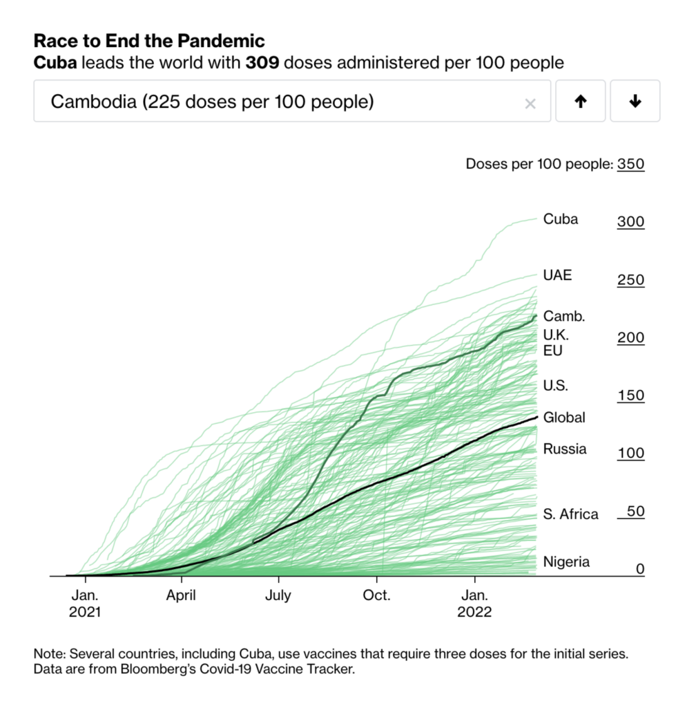
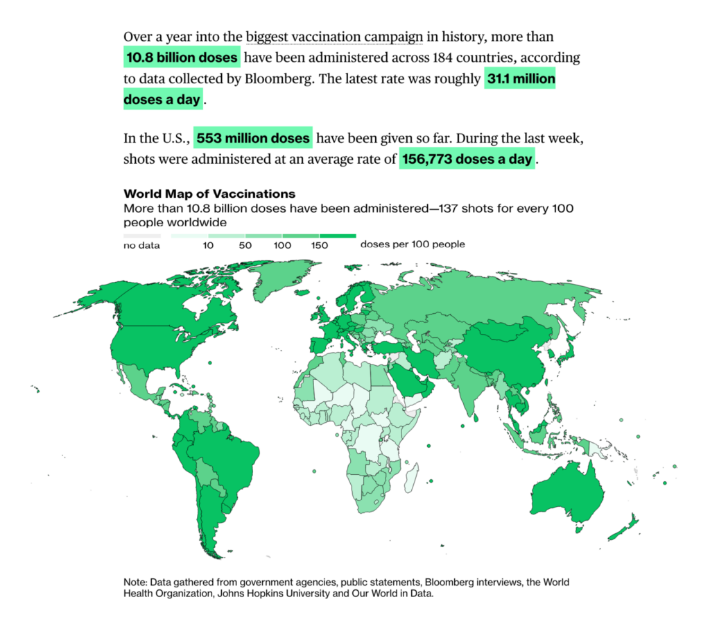
Bloomberg (US): More Than 10.8 Billion Shots Given: Covid-19 Tracker; Mapping the Coronavirus Outbreak Across the World
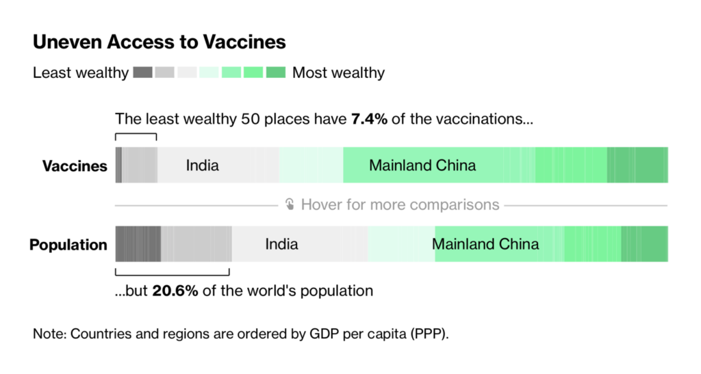
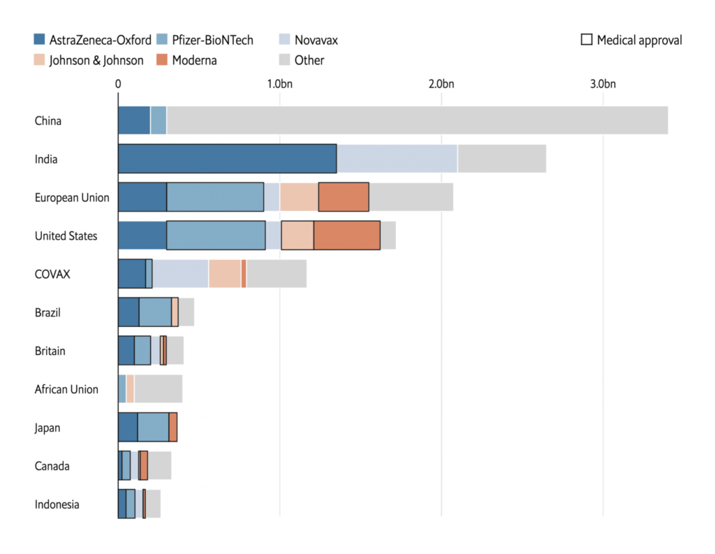
And Bloomberg’s vaccine tracker? Yes, it’s green. And it features a sleek stacked bar chart that highlights the international inequalities in vaccine access.

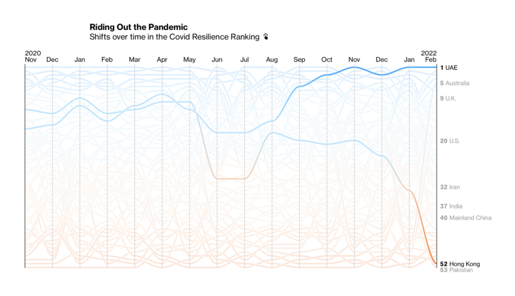
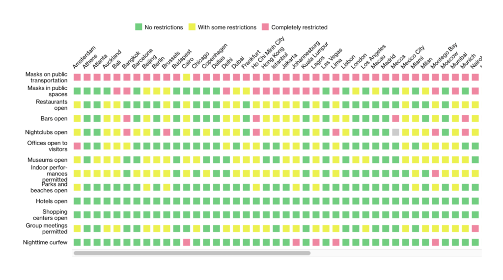
Bloomberg (US): The Covid Resilience Ranking; International Travel During Covid-19
Meanwhile, COVID isn’t “just” a disease or a public health crisis — it’s also defined an entire social and economic era. Several trackers, such as these from Bloomberg, dealt with those aspects of the pandemic as well.
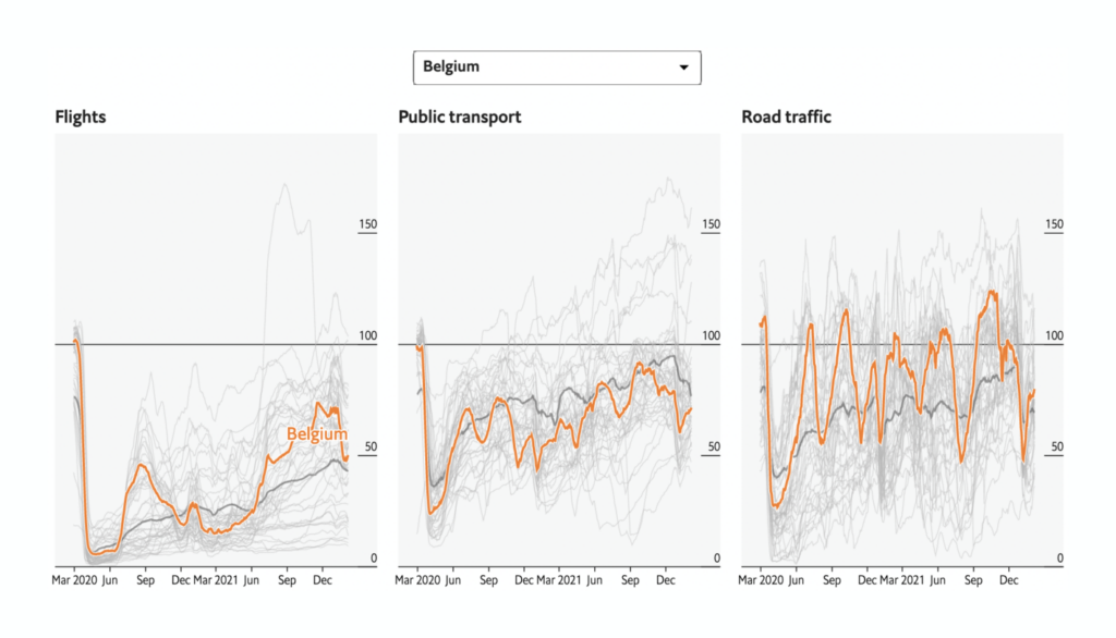
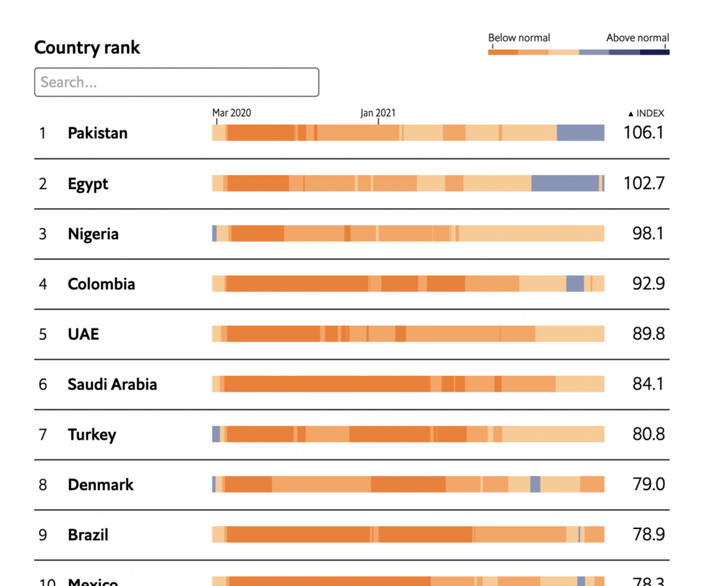
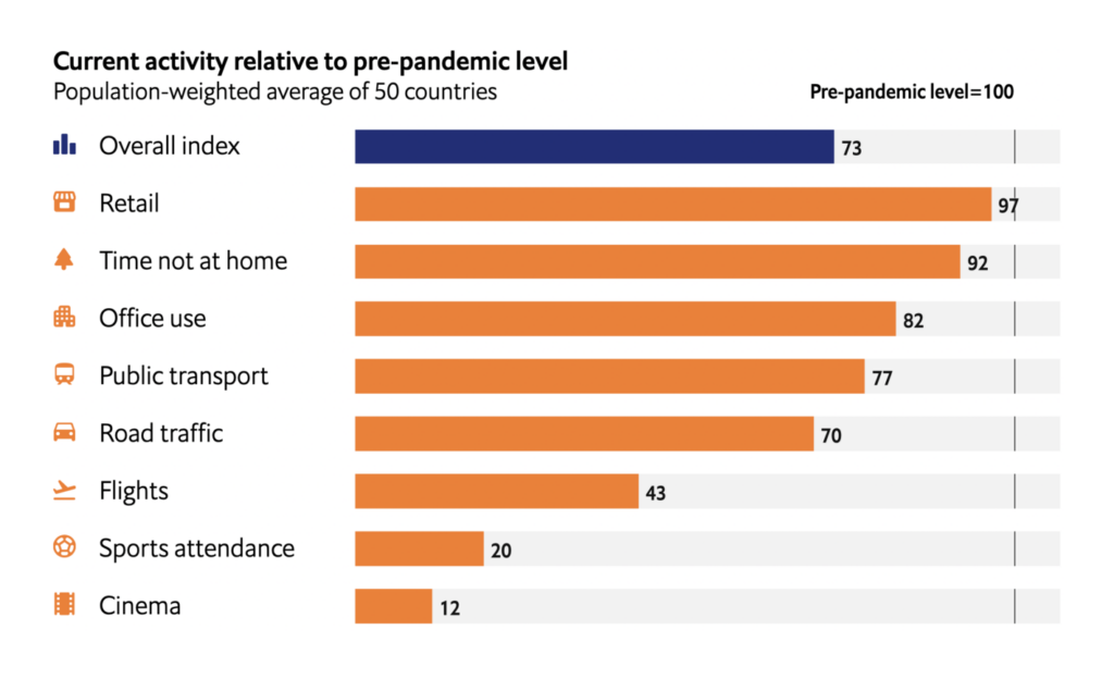
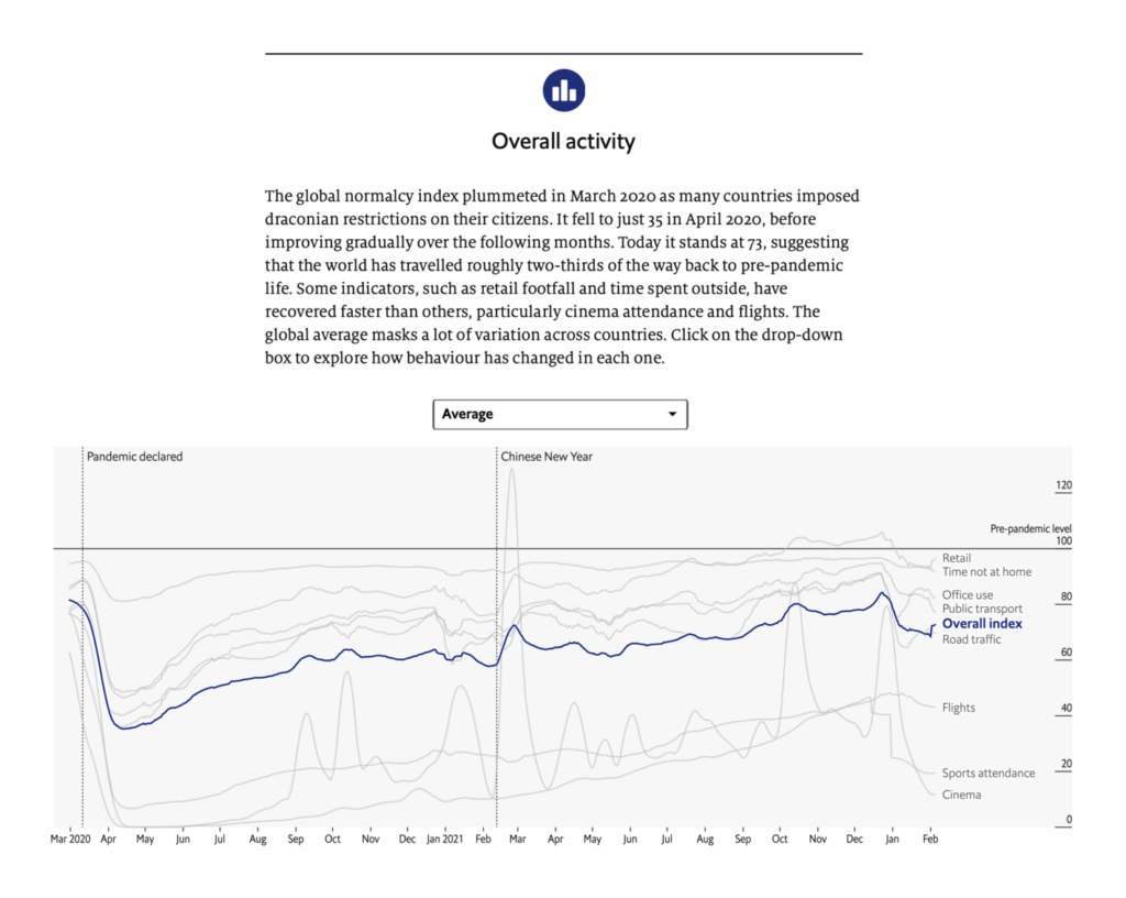
The Economist (UK): The global normalcy index
The Economist’s normalcy index tracked changes in our actual behavior, not just in policy measures like lockdowns.
The Economist (UK): Tracking covid-19 across the world
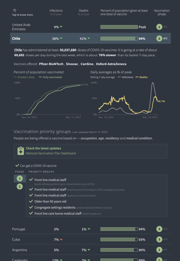
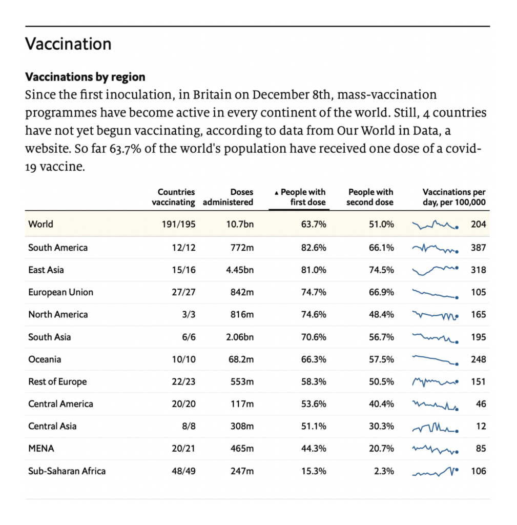
But even for The Economist, it all comes back around to cases, deaths, and vaccines. Their table of vaccine progress by region is a particularly neat example of its type.
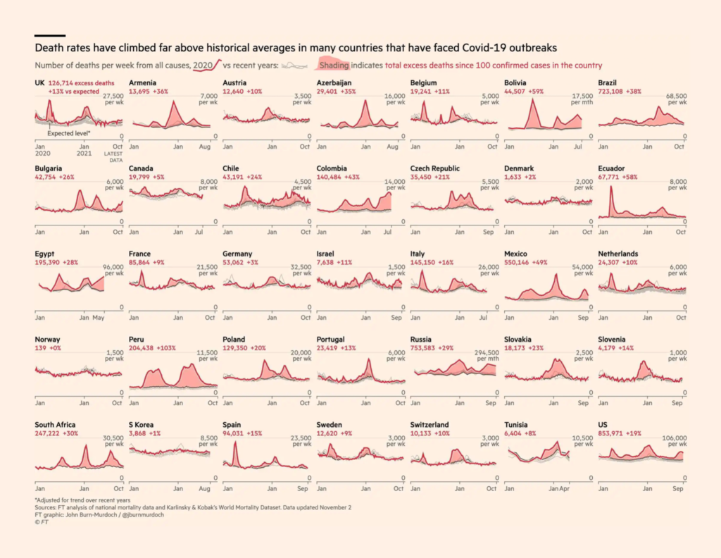
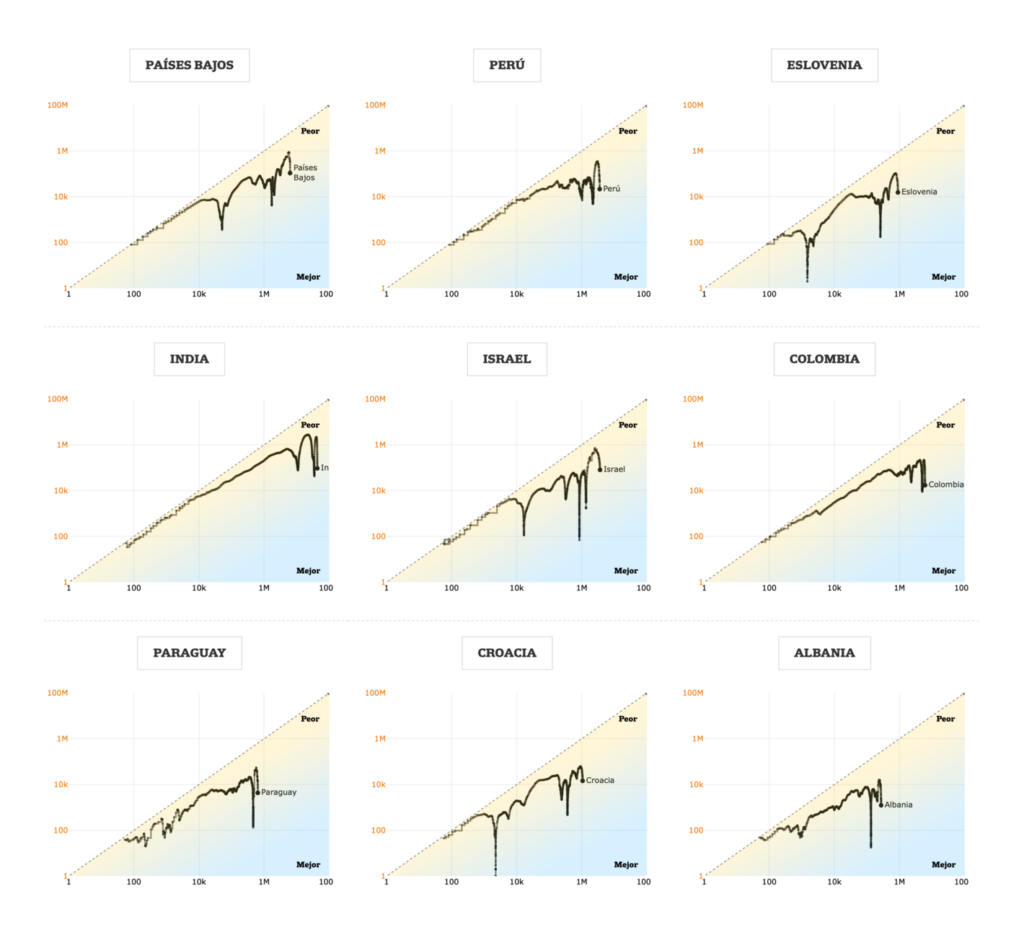
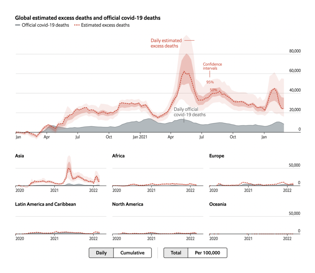
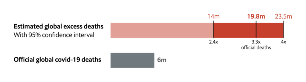
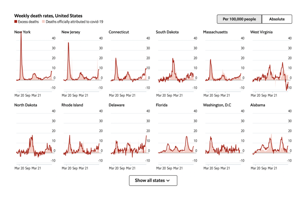
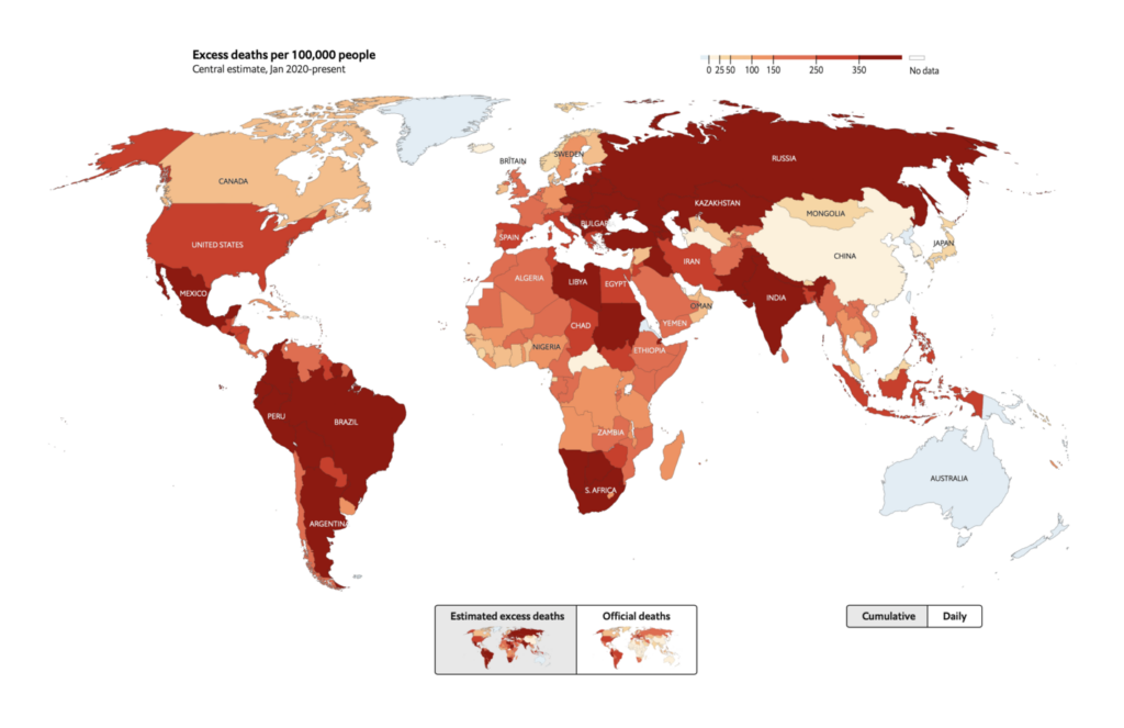
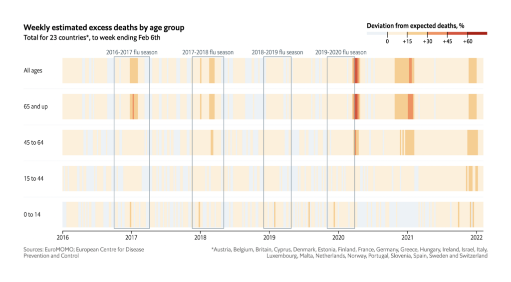
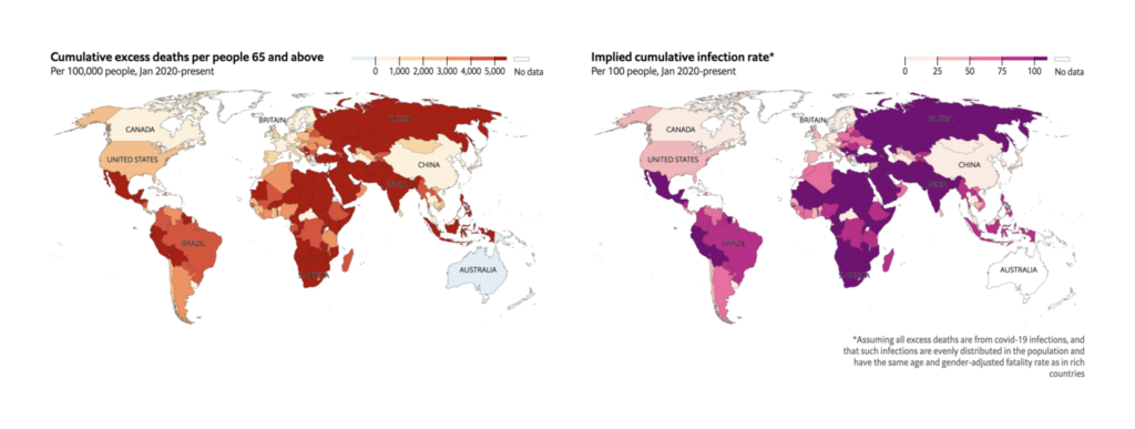
The Economist (UK): The pandemic’s true death toll; Tracking covid-19 excess deaths across countries
The excess deaths tracker in The Economist was one of the most impressive modeling projects we saw, presenting a view of the pandemic that isn’t available from more basic data reporting. Visually, we liked their use of shaded confidence intervals on the line chart and helpful annotations on the historical heatmap.


A big congratulations to everyone whose work makes these trackers possible! Do you know of a beautiful COVID tracker that we’ve overlooked? Write us at hello@datawrapper.de or leave a comment below.


Comments