We want to enable everyone to create beautiful charts, maps, and tables. New to data visualization? Or do you have specific questions about us? You'll find all the answers here.
The best of last week’s big and small data visualizations
Vivien Serve
Welcome back to the 122nd edition of Data Vis Dispatch! Every week, we’ll be publishing a collection of the best small and large data visualizations we find, especially from news organizations — to celebrate data journalism, data visualization, simple charts, elaborate maps, and their creators.
Recurring topics this week include climate, transportation, and local inequalities.
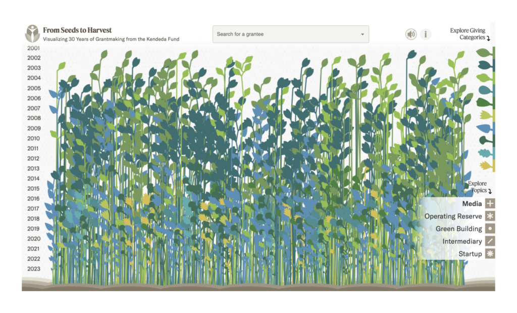
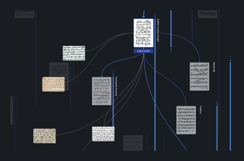
Let’s start this week with two very creative historical visualizations:
Graphicacy: From Seeds to Harvest: Visualizing 30 Years of Giving, December 11 (Article, Project) UCLAB Potsdam: “New project for #typography & #calligraphy fans: we just launched the ARETE visualisation – a visual and interactive history of the Latin alphabet!” December 5 (Mastodon, Project)
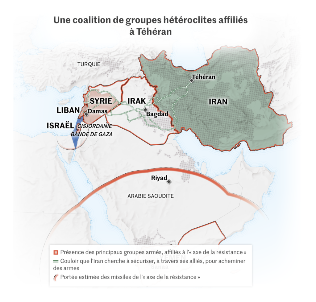
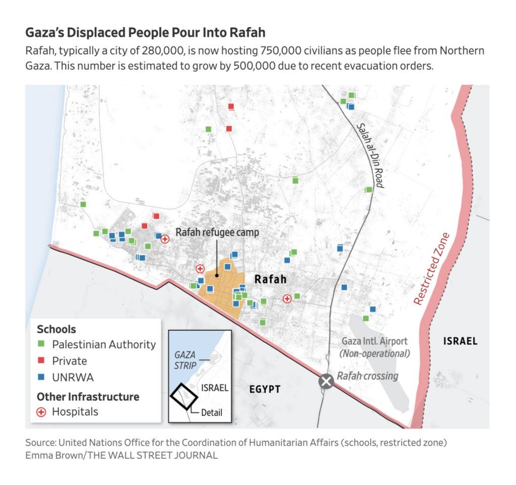
Almost two months have passed since Hamas attacked Israel. These maps of the ongoing war between them cover Iran’s involvement, the humanitarian crisis throughout Gaza, and the resulting flight towards Rafah:
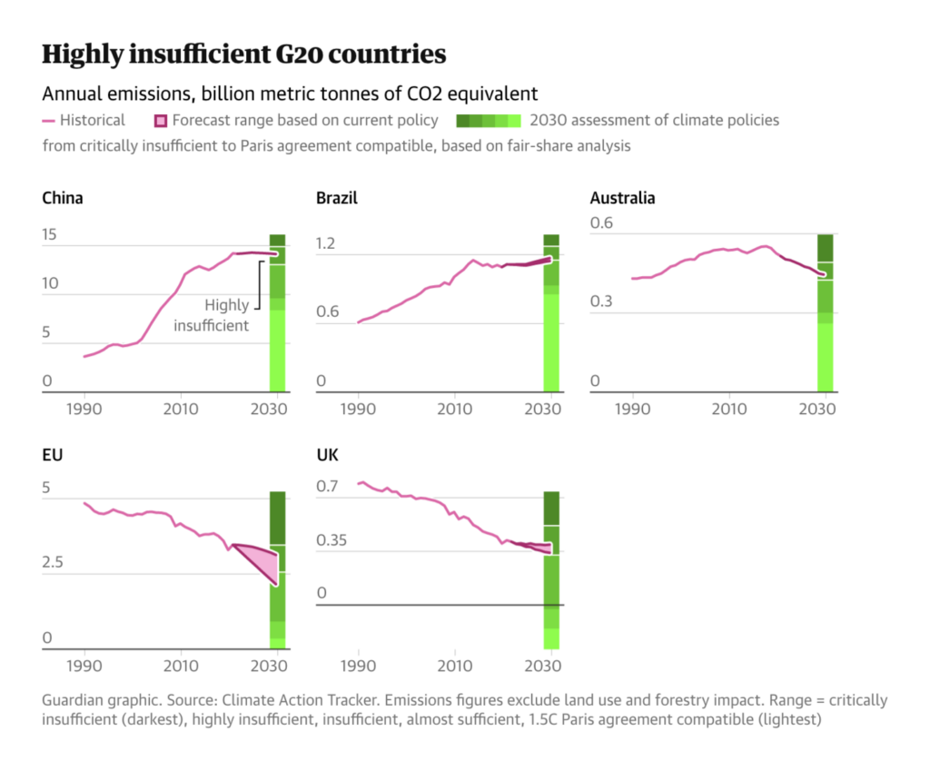
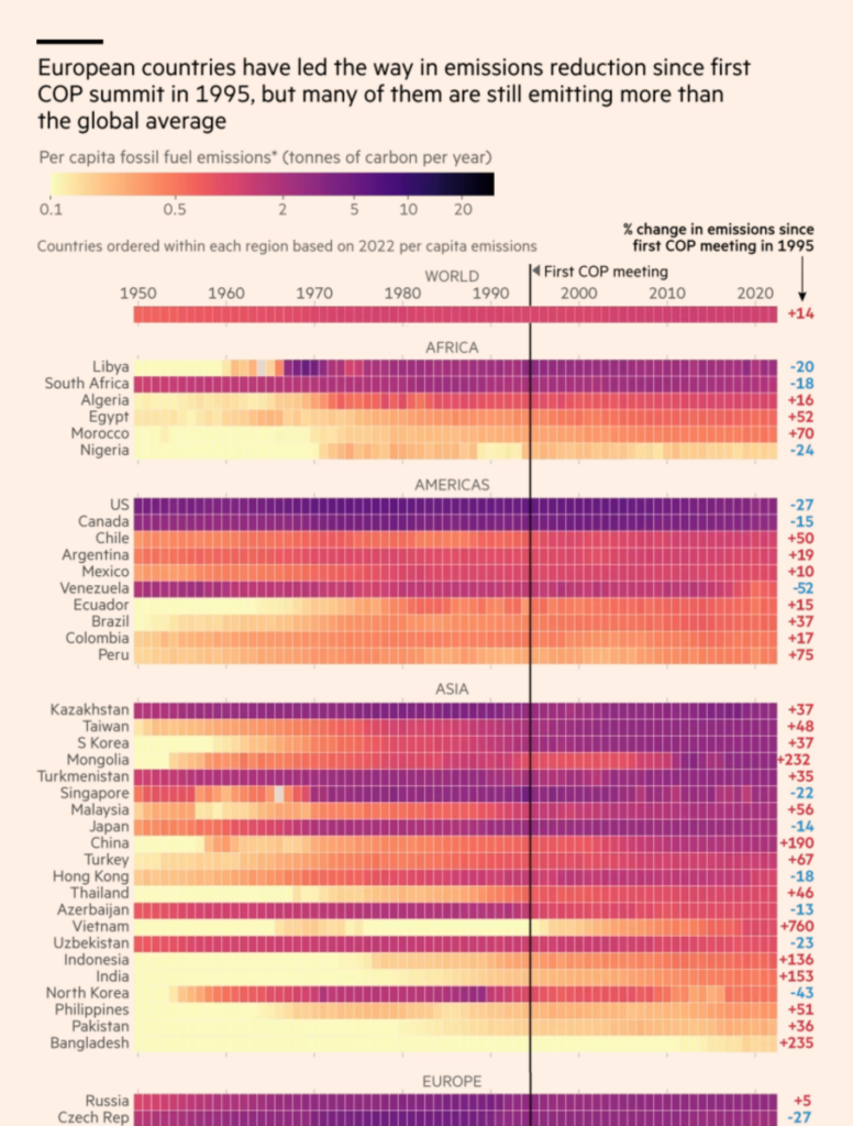
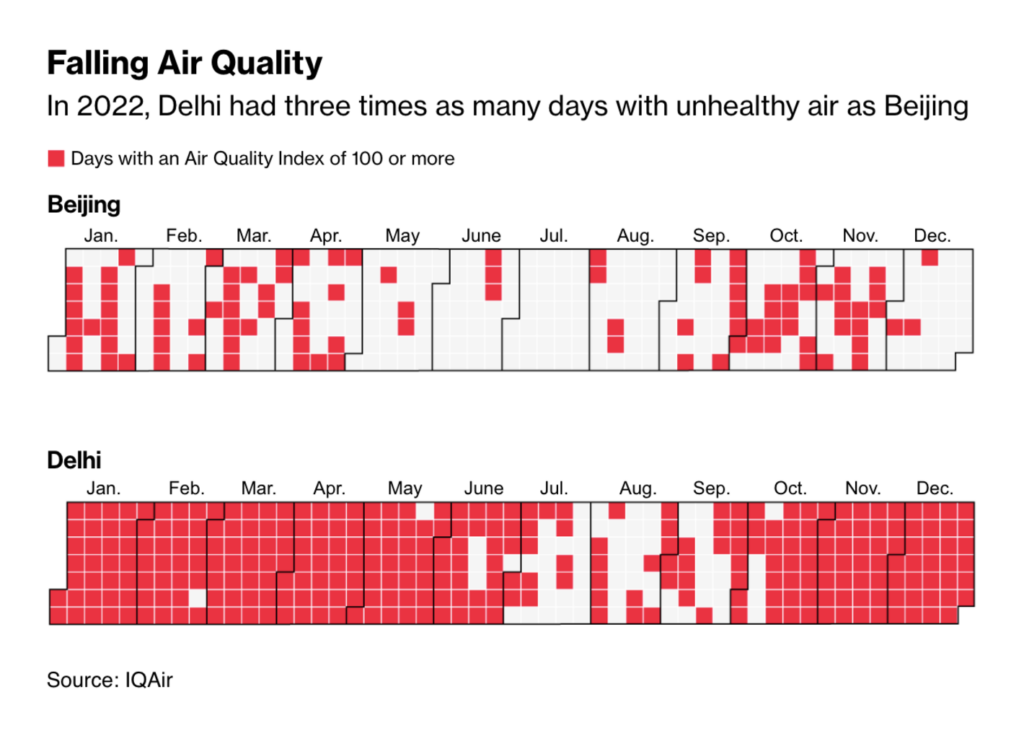
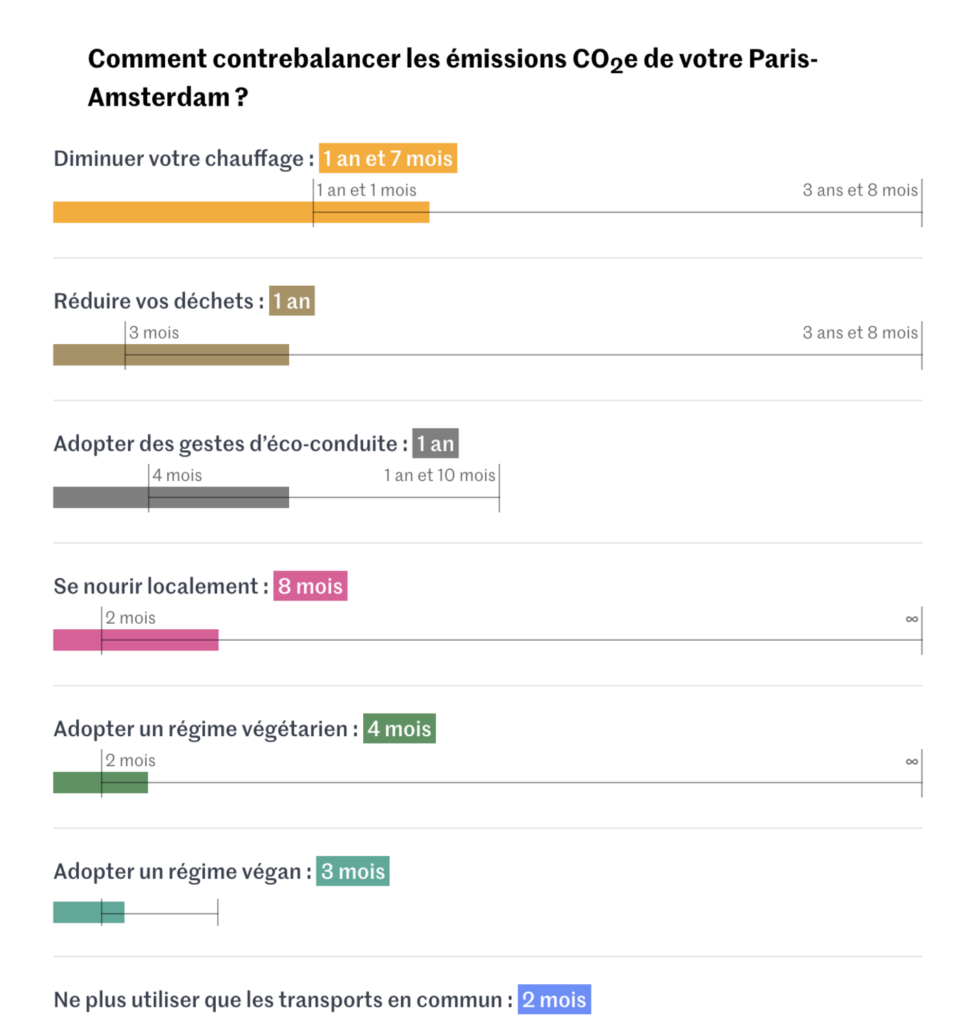
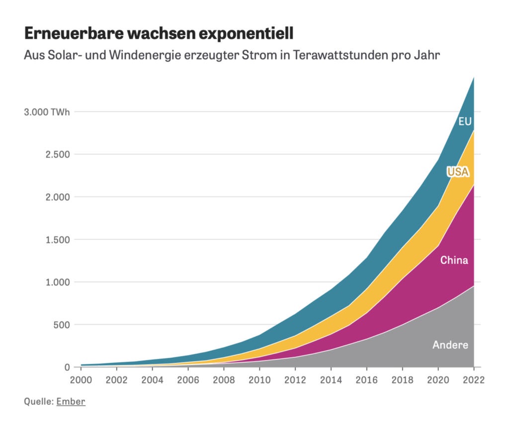
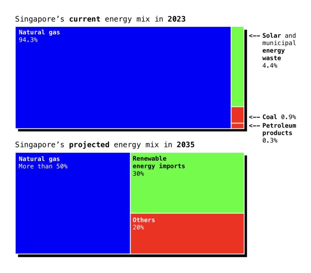
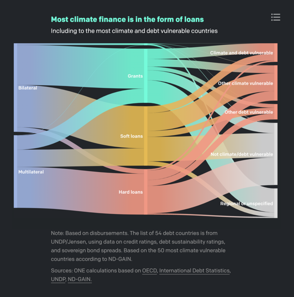
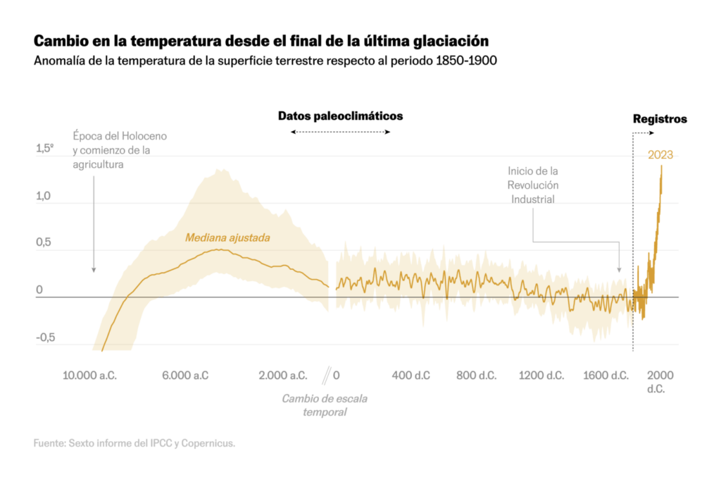
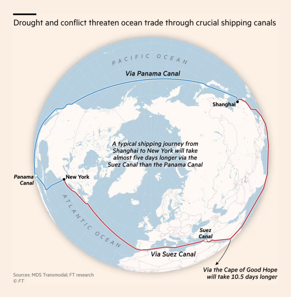
The United Nations Climate Change Conference (COP28) ends today. It was accompanied by dozens of climate visualizations, so prepare for a long list. Among them, one prominent topic: emissions:
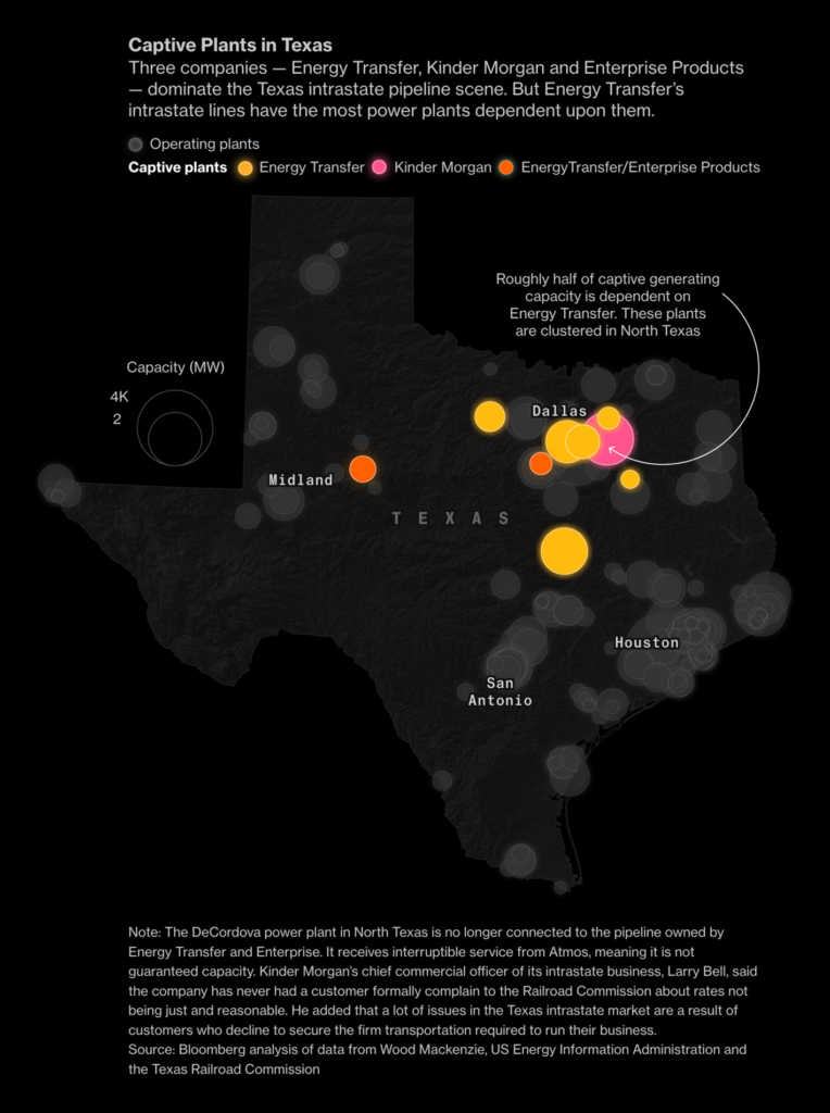
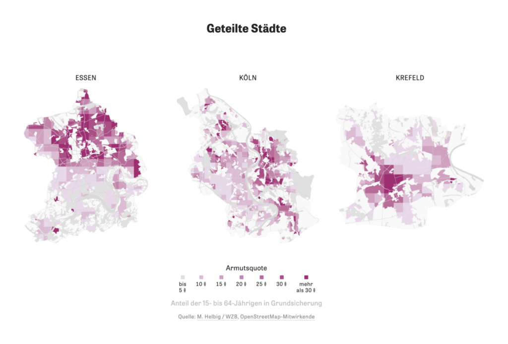
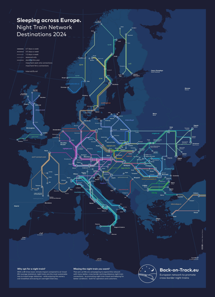
Have you ever walked through different neighborhoods and noticed how the cityscape and lifestyle changes enormously from street to street? That’s not uncommon, as these visualizations show:
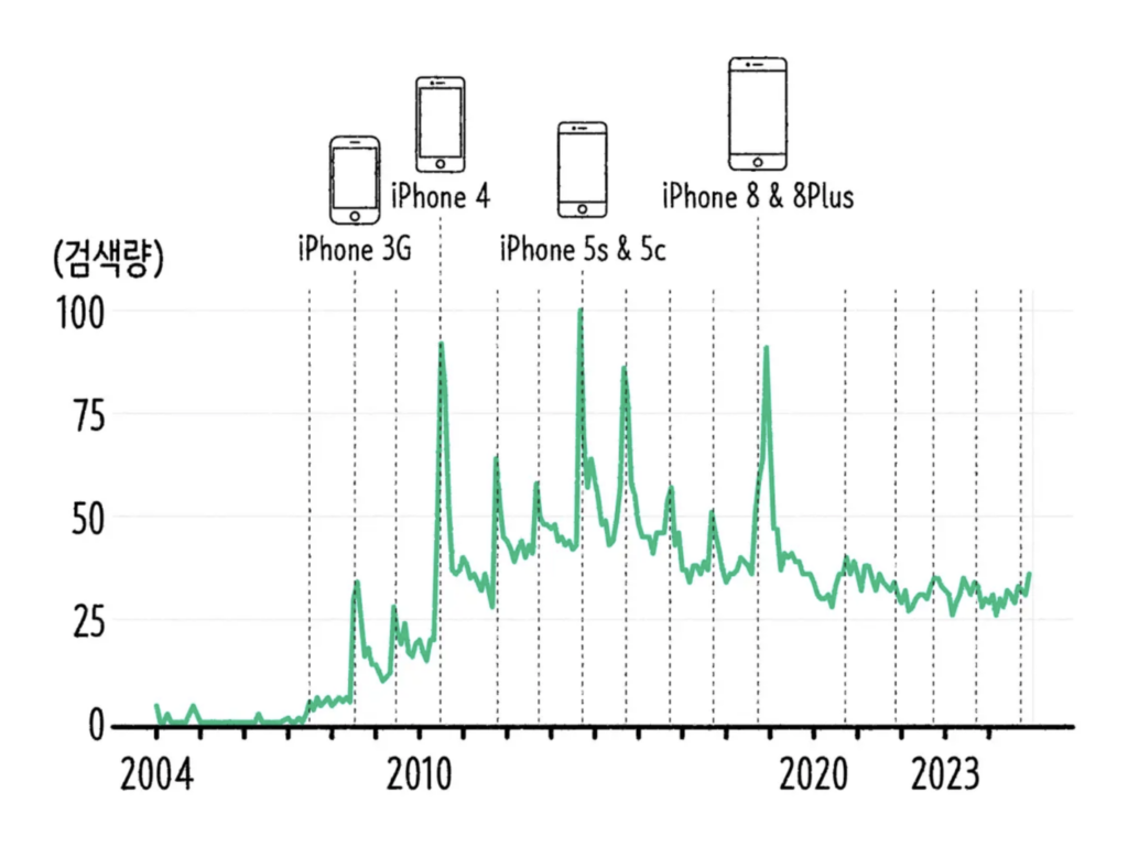
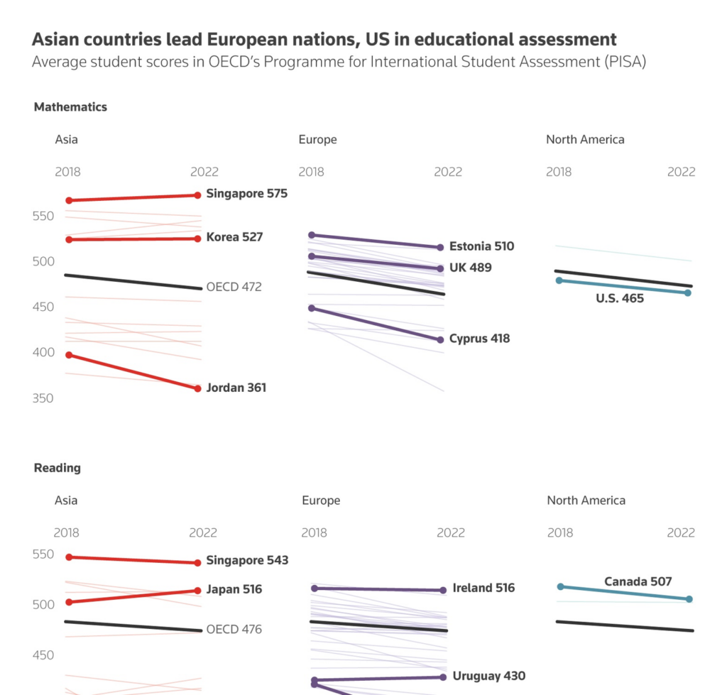
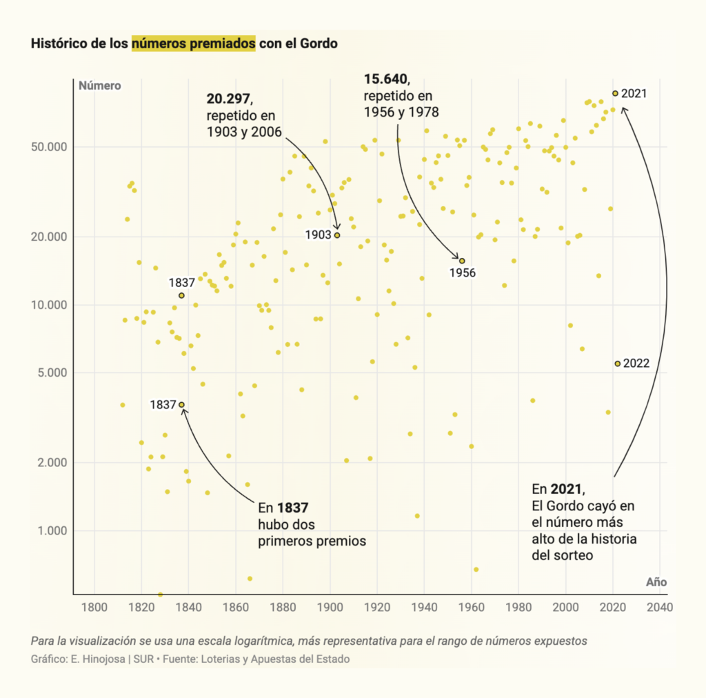
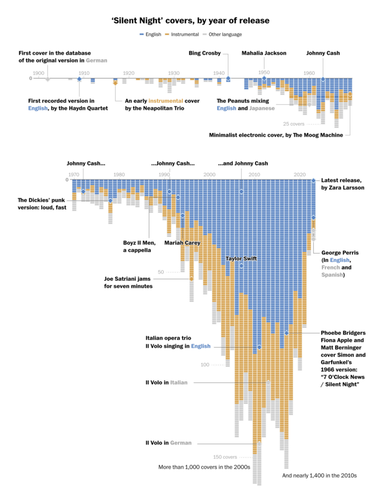
This week’s miscellaneous section posed a lot of questions: Why am I sad when a new iPhone is released? Why can people from Singapore read better than Europeans? What is the best number to pick for the Spanish Christmas lottery? How often has Silent Night been covered? The last one we can answer: 3,700 times.
Help us make this dispatch better! We’d love to hear which newsletters, blogs, or social media accounts we need to follow to learn about interesting projects, especially from less-covered parts of the world (Asia, South America, Africa). Write us at hello@datawrapper.de or leave a comment below.
(she/her) is a working student on Datawrapper’s Communications team. She creates the Data Vis Dispatch to keep data visualization enthusiasts up to date on exciting new projects. When she’s not working, she studies interface design, and when she’s not studying, she’s planning a festival stage or soldering light installations. Vivien lives in Potsdam.


Comments