Data Vis Dispatch, December 12

The best of last week’s big and small data visualizations

Welcome back to the 122nd edition of Data Vis Dispatch! Every week, we’ll be publishing a collection of the best small and large data visualizations we find, especially from news organizations — to celebrate data journalism, data visualization, simple charts, elaborate maps, and their creators.

Recurring topics this week include climate, transportation, and local inequalities.

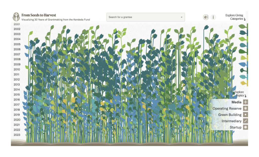
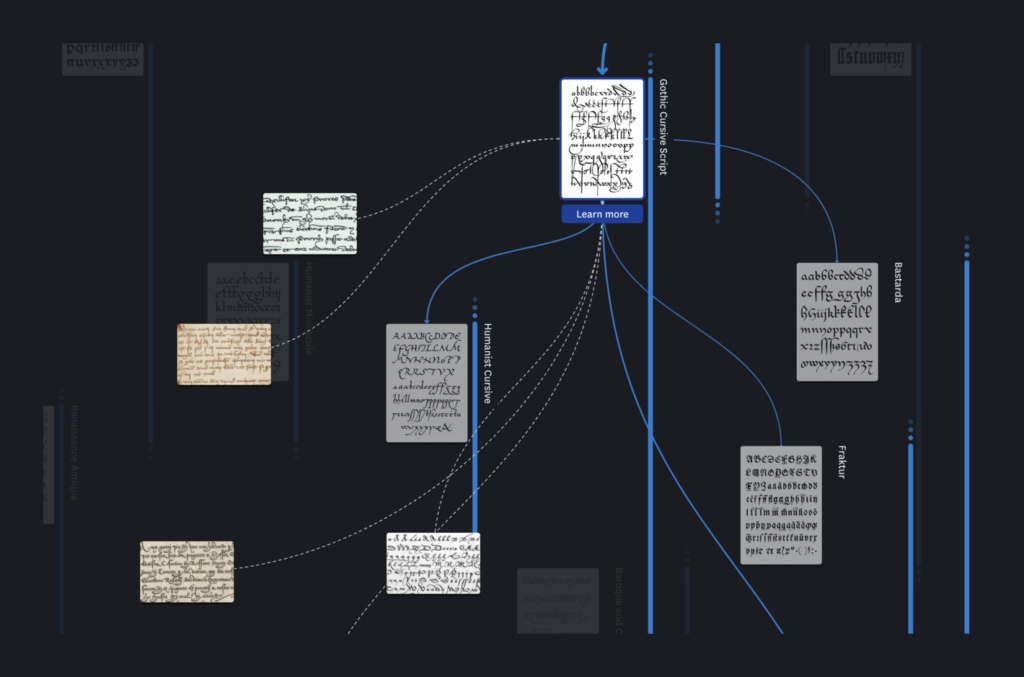
Let’s start this week with two very creative historical visualizations:

Graphicacy: From Seeds to Harvest: Visualizing 30 Years of Giving, December 11 (Article, Project)
UCLAB Potsdam: “New project for #typography & #calligraphy fans: we just launched the ARETE visualisation – a visual and interactive history of the Latin alphabet!” December 5 (Mastodon, Project)

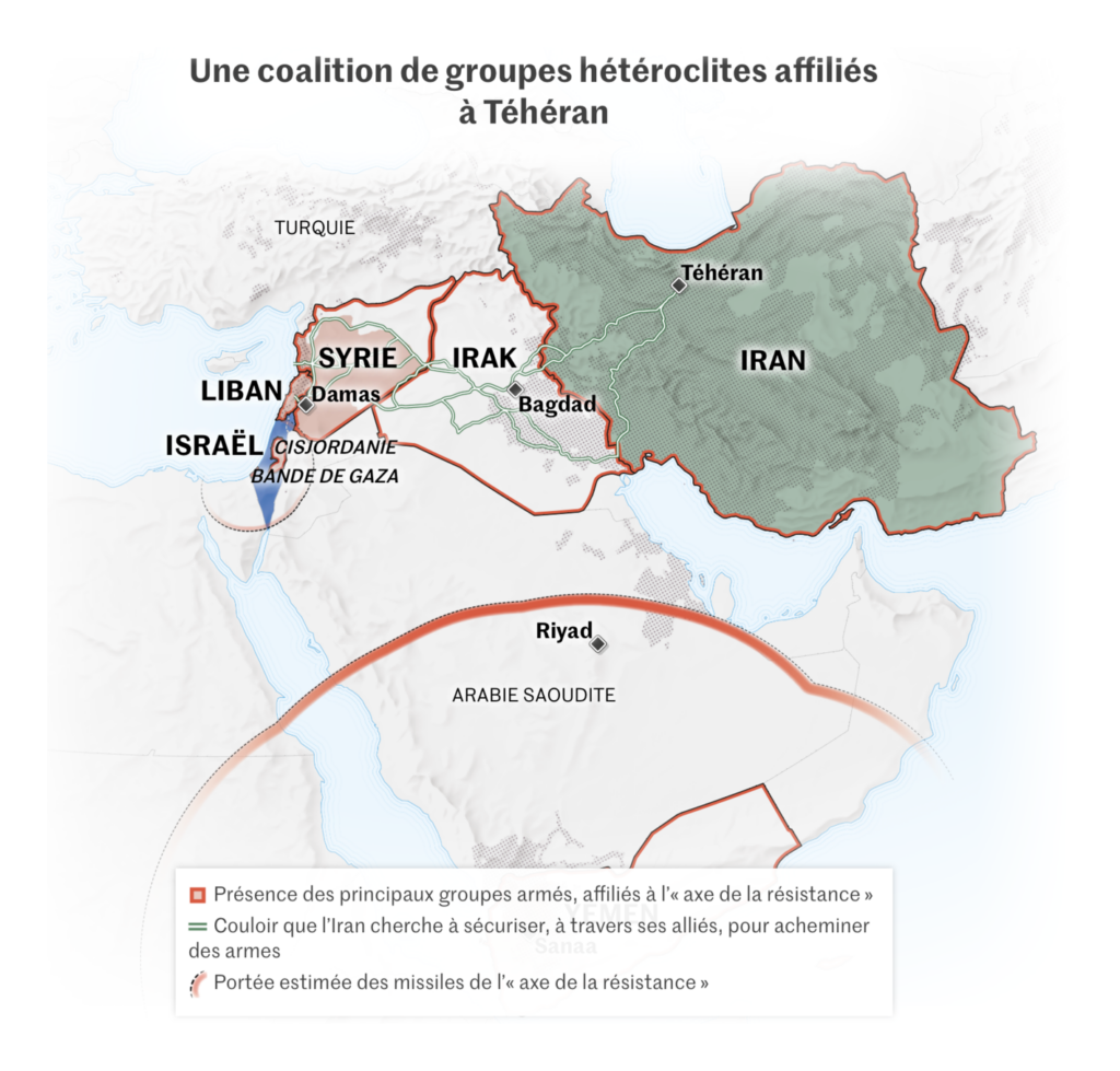
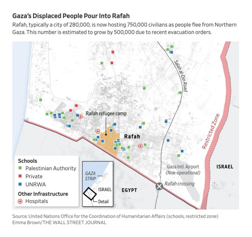
Almost two months have passed since Hamas attacked Israel. These maps of the ongoing war between them cover Iran’s involvement, the humanitarian crisis throughout Gaza, and the resulting flight towards Rafah:

Le Monde: Qu’est-ce que l’« axe de la résistance » promu par l’Iran face à Israël et aux Etats-Unis ?, December 5
The New York Times: “We sleep fearing we might be dead” – 60 days in Gaza, December 5
The Wall Street Journal: The Epicenter of Gaza Humanitarian Crisis Is This Border Town, December 8

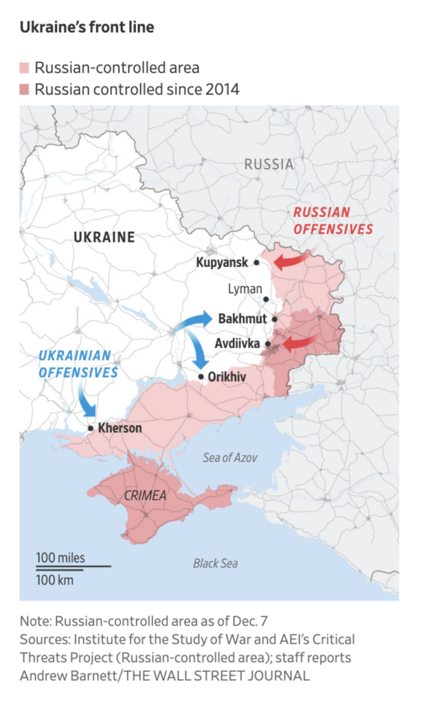
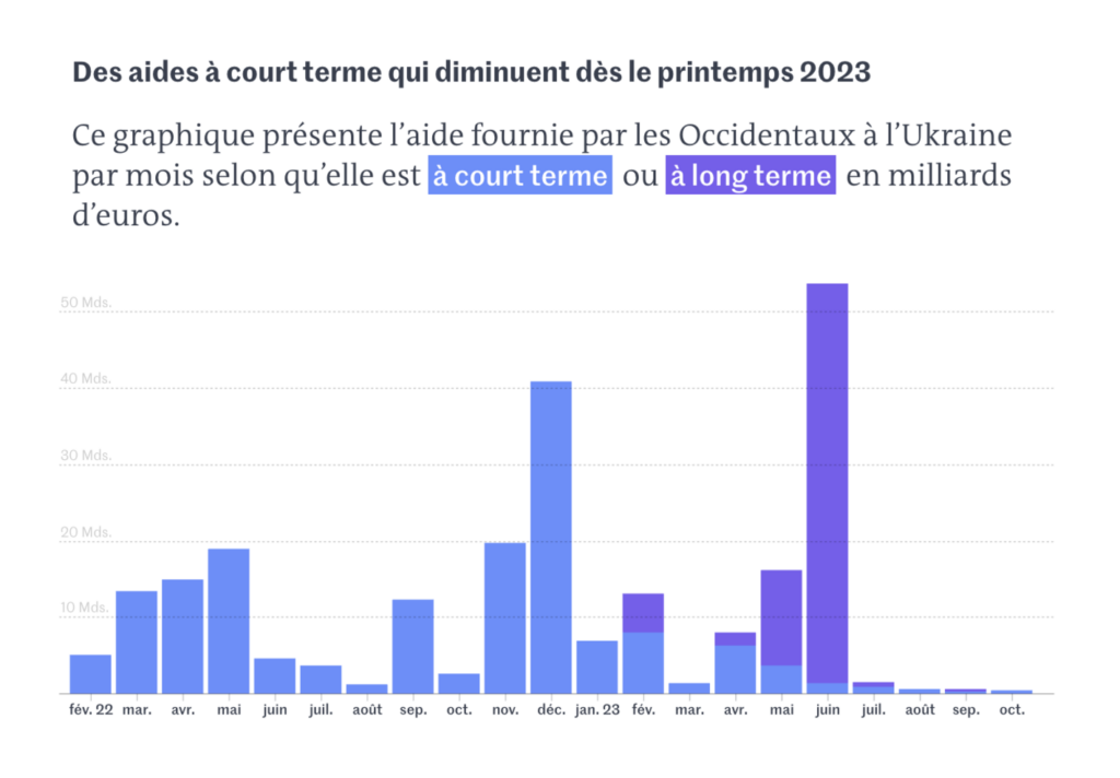
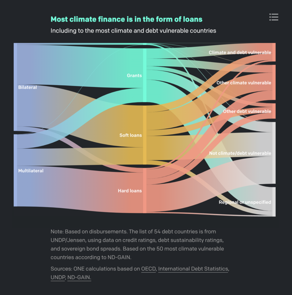
The Ukrainian-Russian war also continues with no end in sight — but aid for Ukraine from around the world may not:

The Wall Street Journal: Troubled by a Resurgent Russia and Bickering Allies, Ukraine Hunkers Down, December 8
Le Monde: L’aide internationale à l’Ukraine au plus bas depuis le début de l’invasion russe, December 7

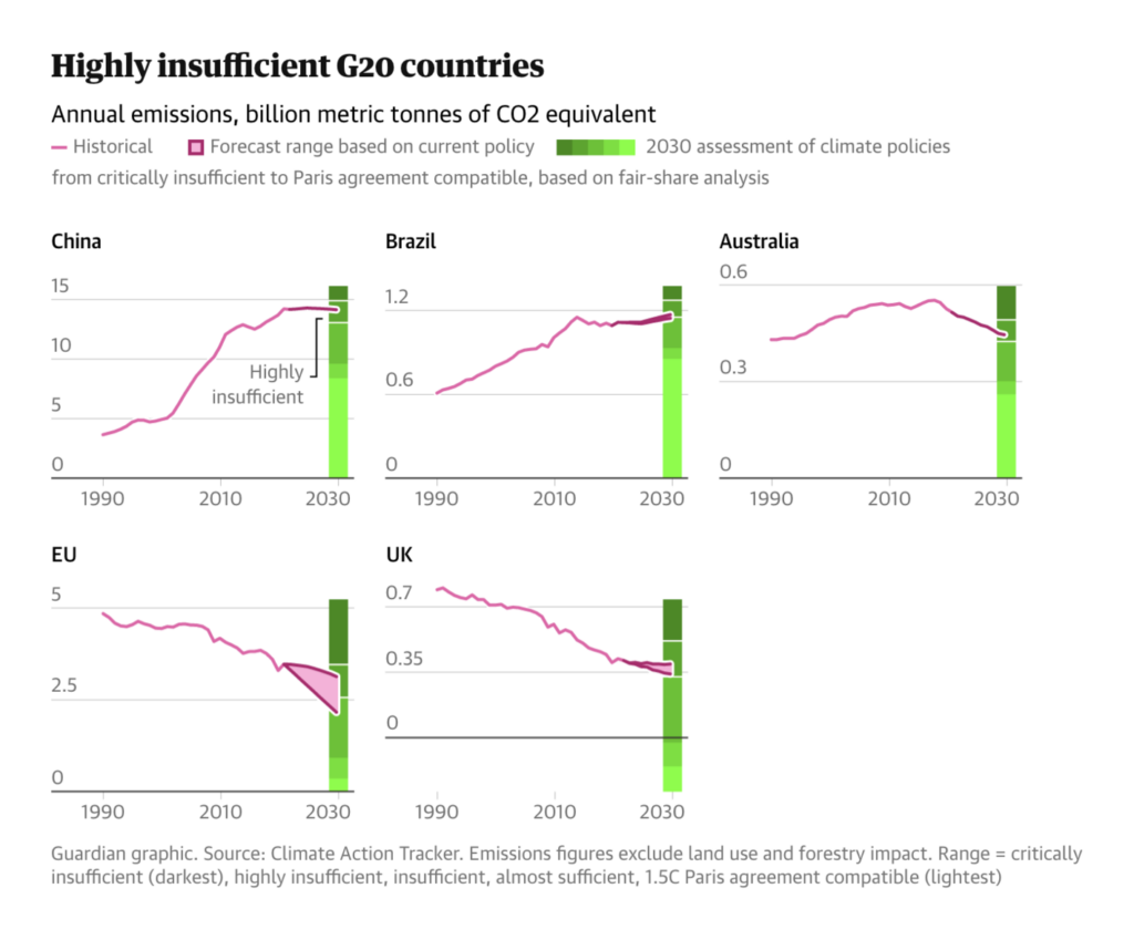
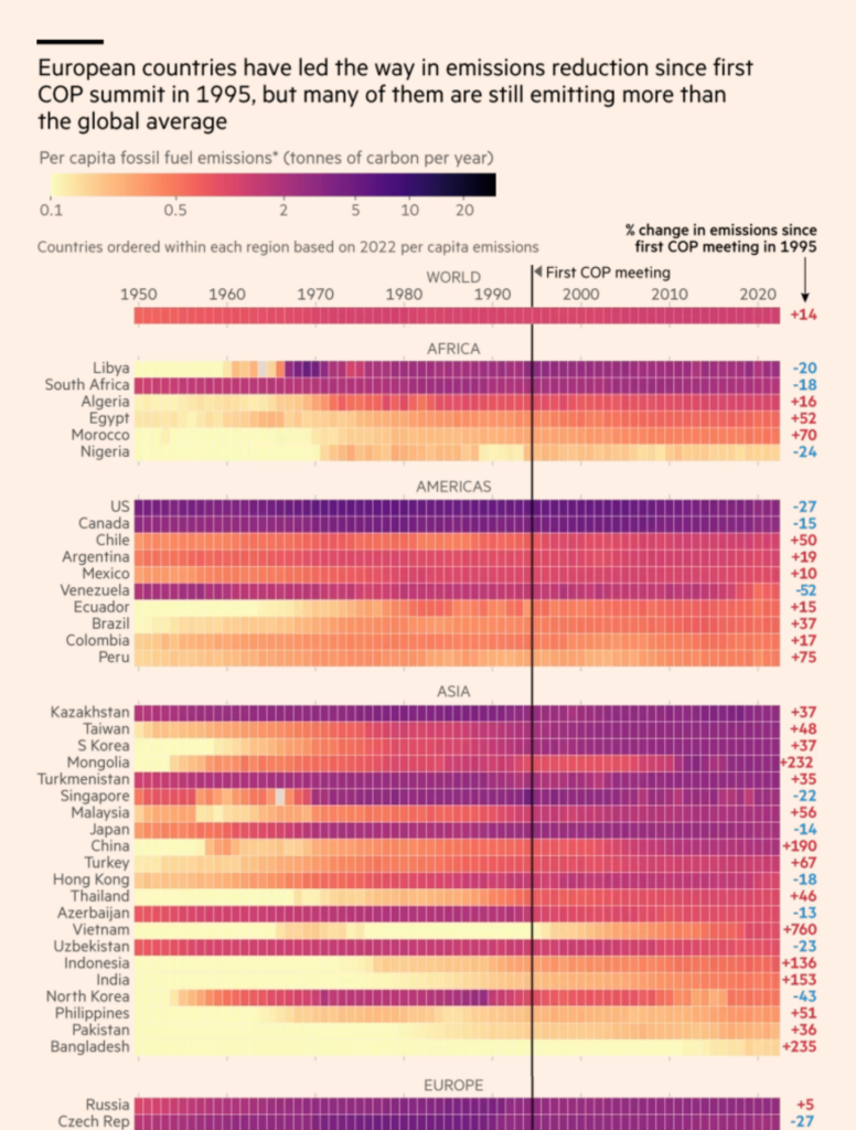
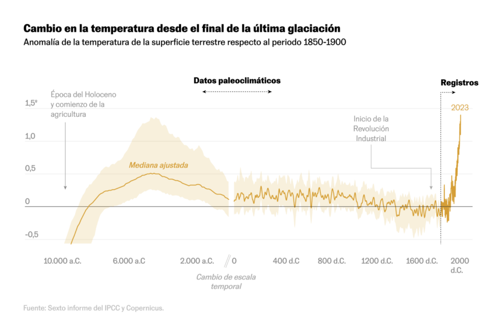
The United Nations Climate Change Conference (COP28) ends today. It was accompanied by dozens of climate visualizations, so prepare for a long list. Among them, one prominent topic: emissions:

The Guardian: Visualised: how all of G20 is missing climate goals — but some nations are closer than others, December 7
Financial Times: Global carbon emissions from fossil fuels to hit record this year, December 7
Bloomberg: How China Cleaned Its Filthy Air While India Continues to Choke, December 6
Le Monde: Vous voulez « compenser » votre vol en avion par des écogestes ? Voici combien de temps cela vous prendra, December 5

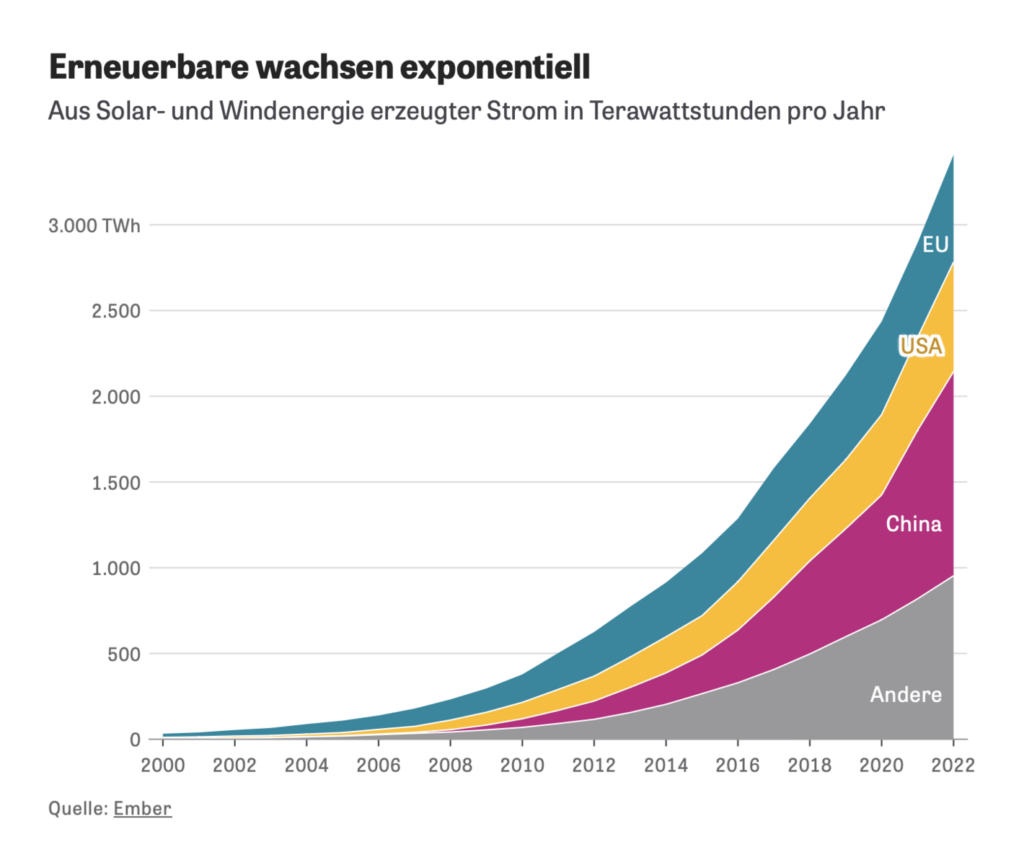
But climate optimism is not dead, as renewable energy sources are growing rapidly:

Zeit Online: Es ist Zeit für Klimaoptimismus, December 5

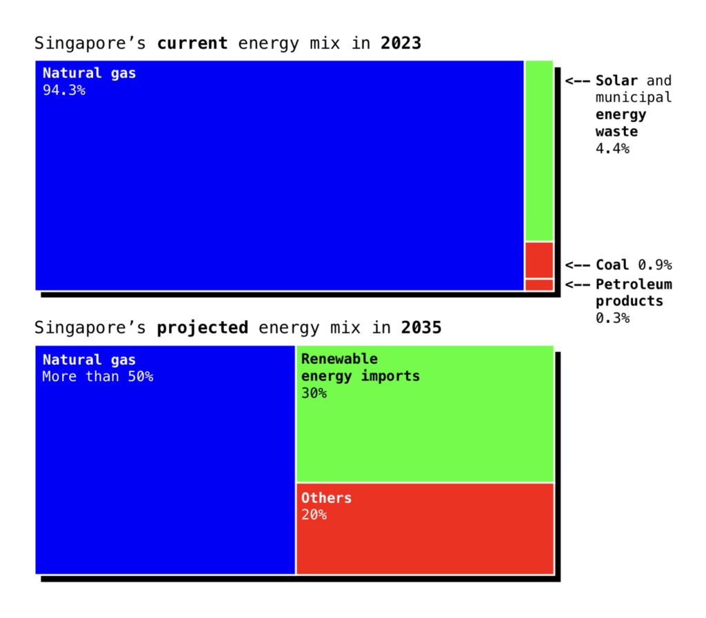
Further visualizations about climate and energy popped up:

Bloomberg: A Pipeline Giant Is Helping to Push Texas’s Power Grid to the Brink, December 5
The Straits Times: Our data problems are getting harder to ignore, December 8

Last up from the climate cluster — some visualizations that dive deep into the measurement of climate problems and solutions:

ONE Data Commons: Climate finance reporting is a mess. Here’s how to fix it, December 8
El País: 2023 es el año más caluroso en milenios: ¿por qué y cómo se mide?, December 6

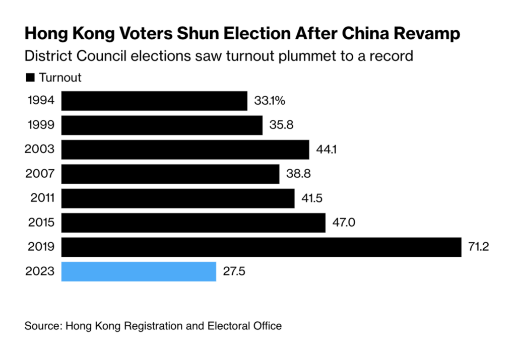
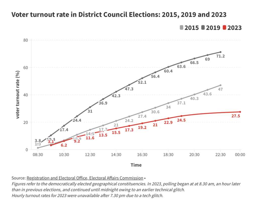
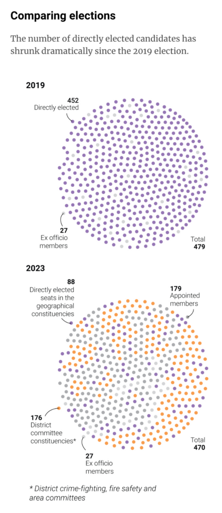
Hong Kong’s District Council elections dominated political visualizations. Voter turnout dropped from 71% to a stunning 27.5%:

Bloomberg: Hong Kong Voter Turnout Hits Record Low After China Purge, December 11
Hong Kong Free Press: Lowest-ever turnout for Hong Kong’s District Council election; 6 arrests during opposition-free polls, December 12
South China Morning Post: Hong Kong’s 2023 district council election, December 10

Have you ever walked through different neighborhoods and noticed how the cityscape and lifestyle changes enormously from street to street? That’s not uncommon, as these visualizations show:

elDiario.es: Segregados por la rueda de la desigualdad: qué tiene que ver tu barrio con tu nivel de estudios, December 10
Zeit Online: Das sind Deutschlands ärmste Stadtteile, December 8

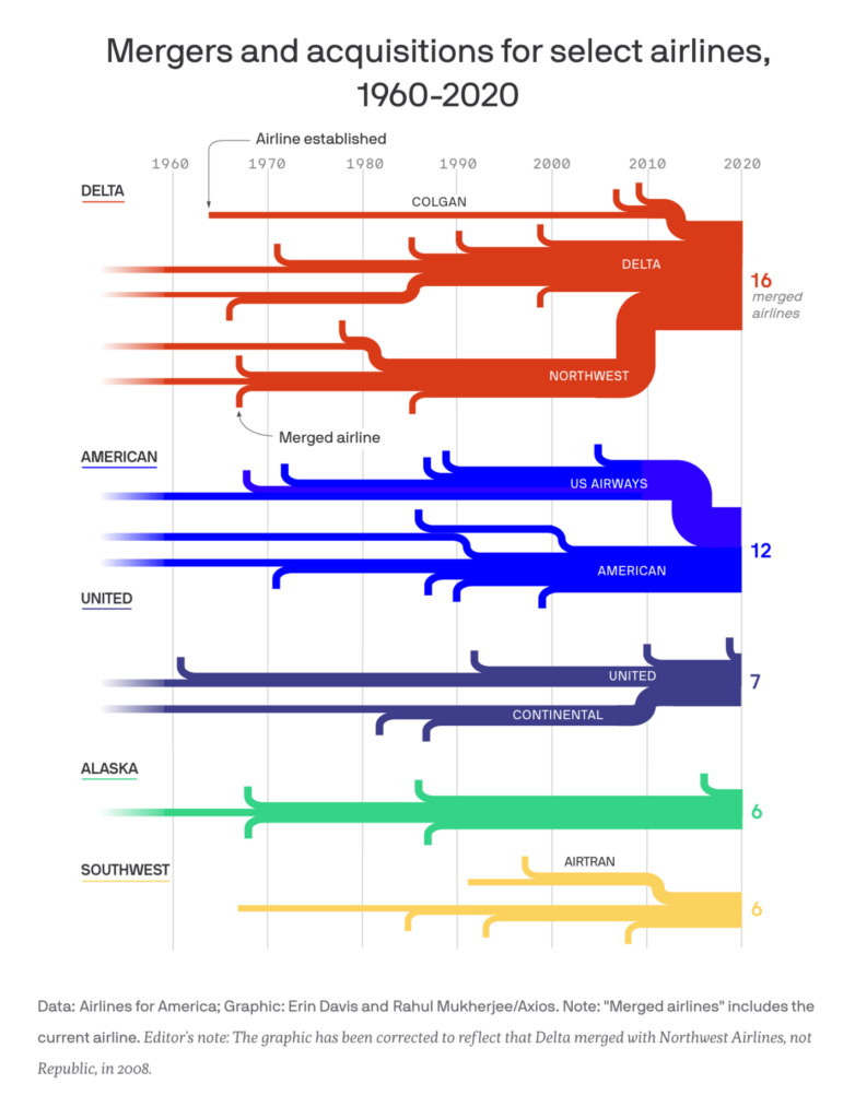
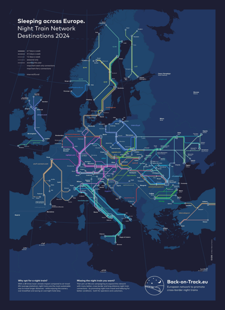
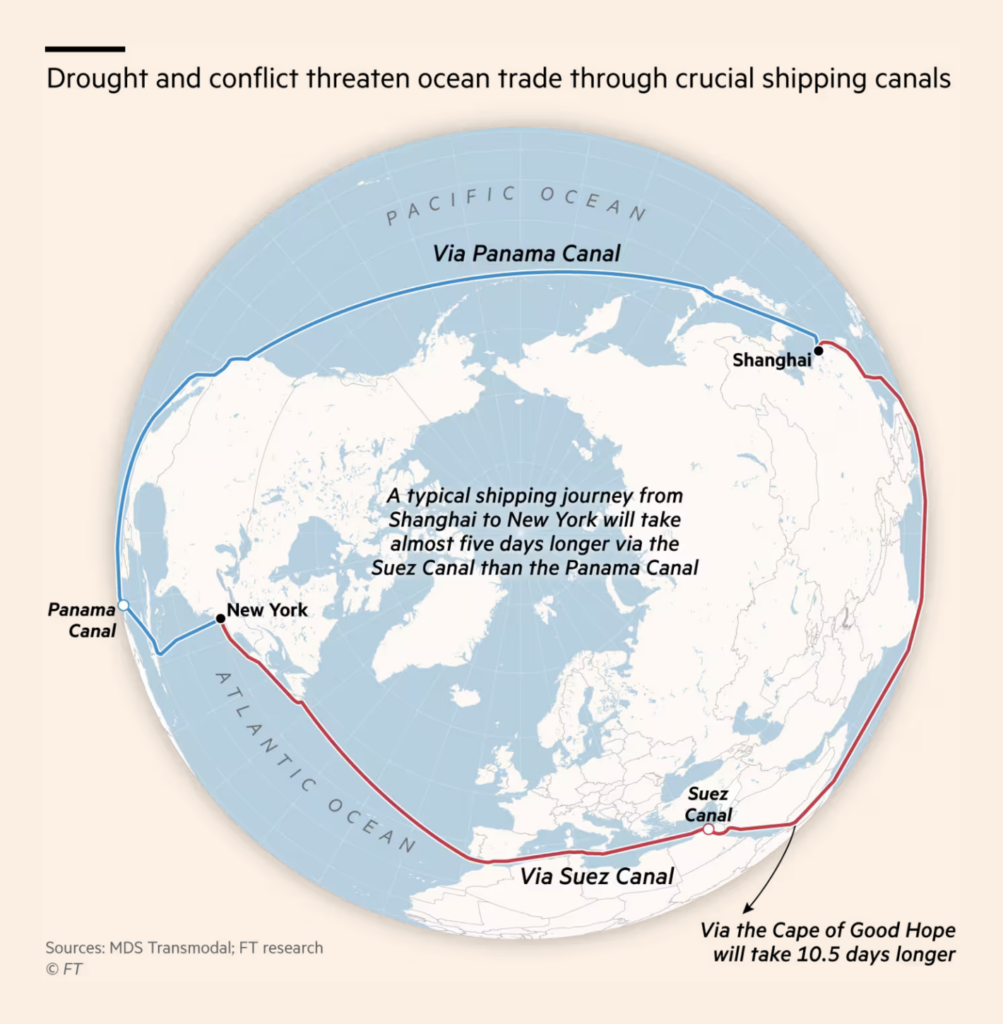
From planes to trains to boats:

Axios: How the “big five” airlines came to dominate the skies, December 8
Back-on-Track.eu: “Here’s our new #nighttrains map for 2024 including the new lines starting today. Anything missing? Any mistakes? Please note we don’t include irregular car-only and cruise trains,” December 10 (Tweet)
Financial Times: Global pre-Christmas trade at risk from twin canal crises, December 8

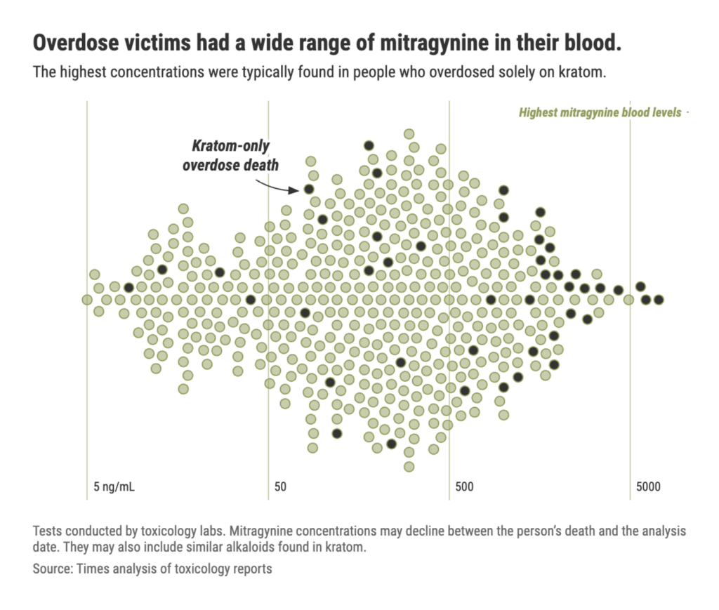
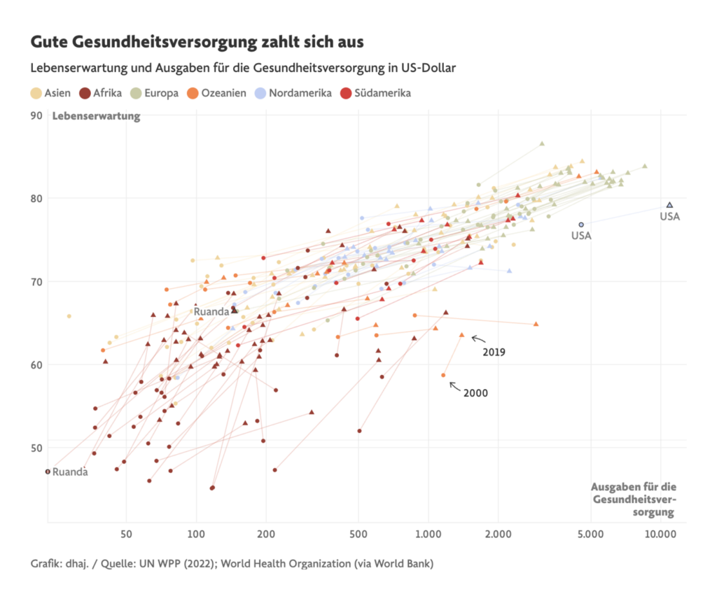
In the health sector this week, we found numbers on overdoses and life expectancy:

Tampa Bay Times: Deadly Dose PART 1: Hundreds died using kratom in Florida. It was touted as safe, December 7
Frankfurter Allgemeine Zeitung: Wie Wissenschaft und Politik unsere Lebensdauer prägen, December 5

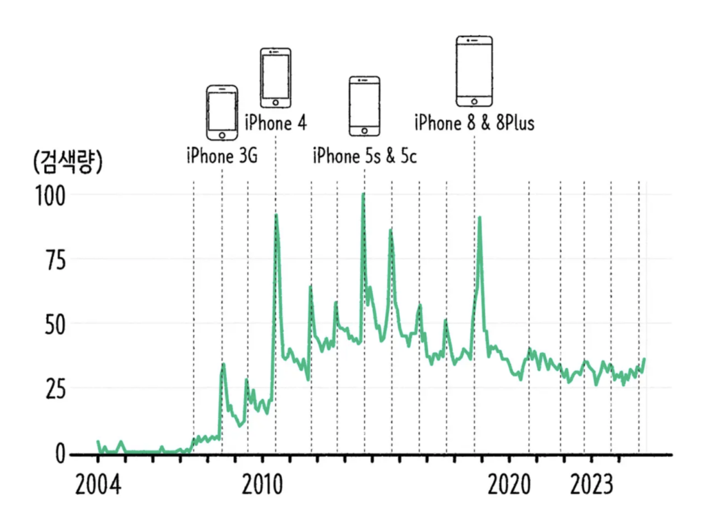
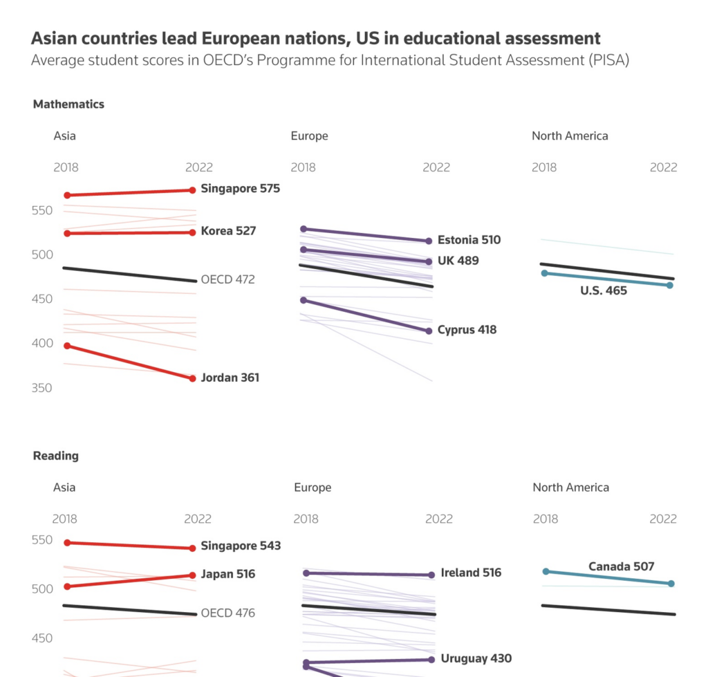
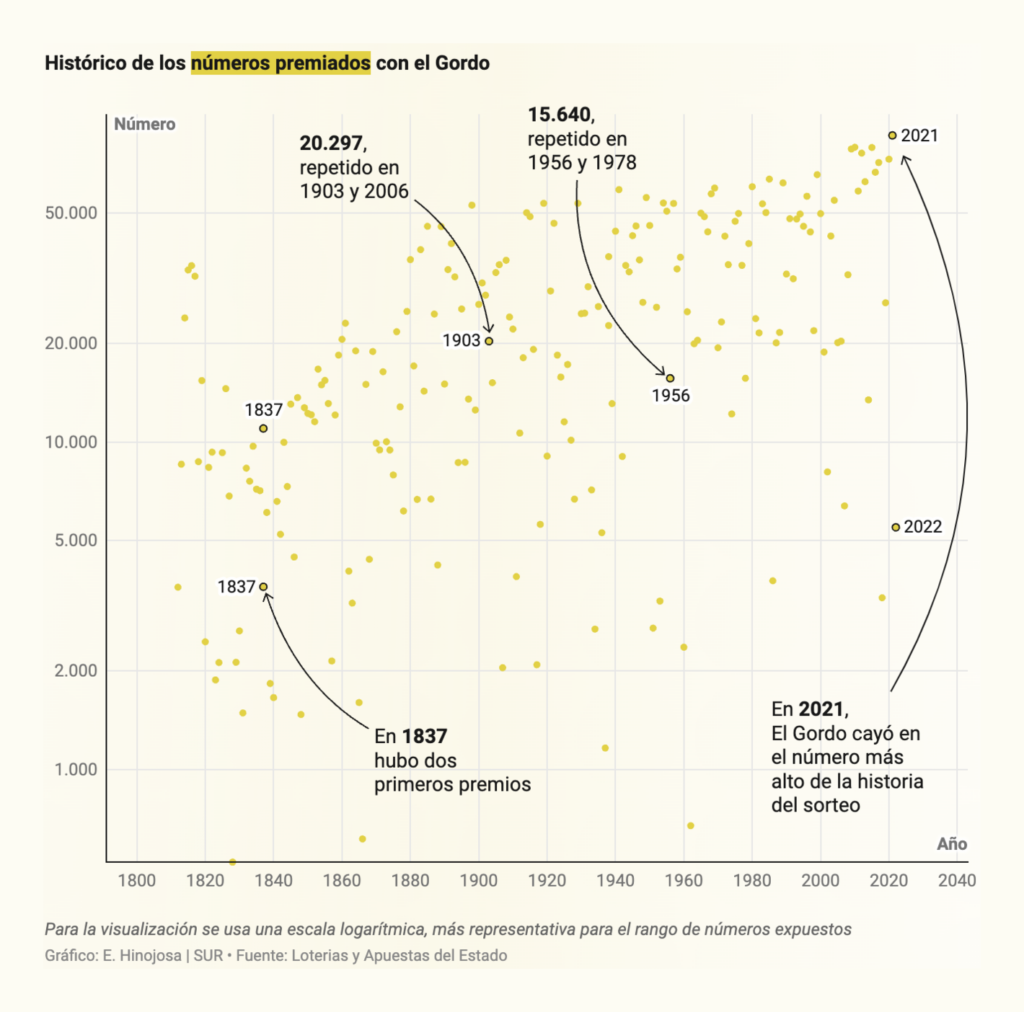
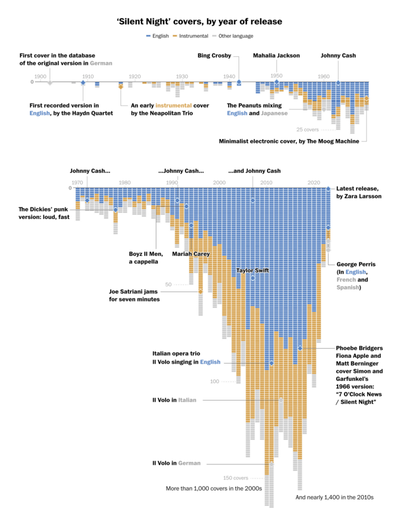
This week’s miscellaneous section posed a lot of questions: Why am I sad when a new iPhone is released? Why can people from Singapore read better than Europeans? What is the best number to pick for the Spanish Christmas lottery? How often has Silent Night been covered? The last one we can answer: 3,700 times.

SBS News: 휴대폰을 몇 년에 한 번씩 바꾸나요?, December 6
Prinz Magtulis: “Asian countries are leading their European counterparts and the U.S. when it comes to math, science and reading, according to the latest PISA results from the @OECD,” December 7 (Tweet)
Diario Sur: La guía definitiva para elegir tu décimo de Lotería de Navidad: los números altos ganan más el Gordo, December 6
The Washington Post: Do you like ‘Silent Night’? There are more than 3,700 covers for you, December 8

What else we found interesting

USA Today: Dec. 7, 1941: America remembers devastating attack on Pearl Harbor, December 7
The New York Times: What’s the Best ‘Wheel of Fortune’ Strategy? Play and Find Out, December 8
The Washington Post: Oldest, tallest, sandiest: Comparing America’s quirky Christmas trees, December 6

Applications are open for…


Help us make this dispatch better! We’d love to hear which newsletters, blogs, or social media accounts we need to follow to learn about interesting projects, especially from less-covered parts of the world (Asia, South America, Africa). Write us at hello@datawrapper.de or leave a comment below.

Want the Dispatch in your inbox every Tuesday? Sign up for our Blog Update newsletter!

Comments