Data Vis Dispatch, January 14: Fire, congestion, and Greenland
January 14th, 2025
11 min
Datawrapper lets you show your data as beautiful charts, maps or tables with a few clicks. Find out more about all the available visualization types.
Our mission is to help everyone communicate with data - from newsrooms to global enterprises, non-profits or public service.
We want to enable everyone to create beautiful charts, maps, and tables. New to data visualization? Or do you have specific questions about us? You'll find all the answers here.
Data vis best practices, news, and examples
250+ articles that explain how to use Datawrapper
Answers to common questions
An exchange place for Datawrapper visualizations
Attend and watch how to use Datawrapper best
Learn about available positions on our team
Our latest small and big improvements
Build your integration with Datawrapper's API
Get in touch with us – we're happy to help
This article is brought to you by Datawrapper, a data visualization tool for creating charts, maps, and tables. Learn more.
The best of last week’s big and small data visualizations
Welcome back to the 72nd edition of Data Vis Dispatch! Every week, we’ll be publishing a collection of the best small and large data visualizations we find, especially from news organizations — to celebrate data journalism, data visualization, simple charts, elaborate maps, and their creators.
Recurring topics this week include biodiversity, energy, and the FIFA World Cup.
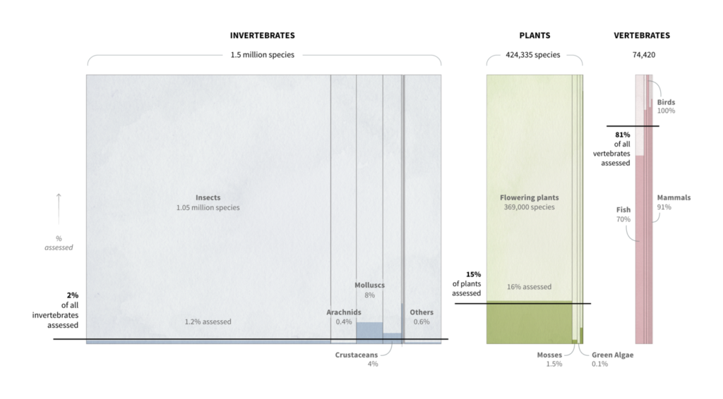
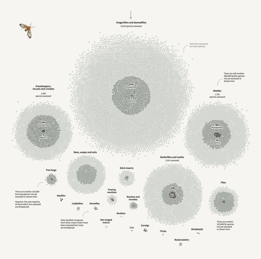
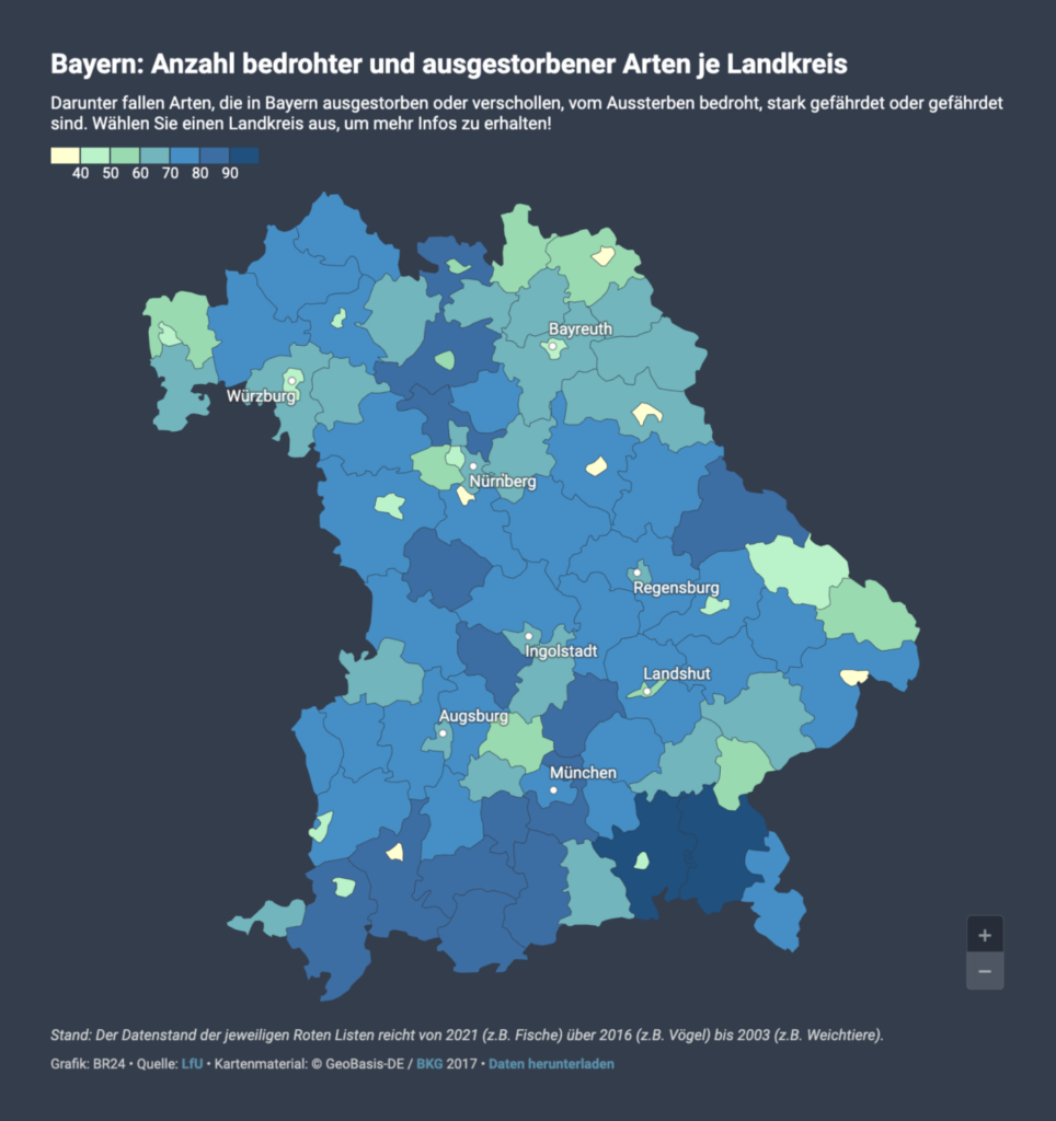
One week into the United Nations Biodiversity Conference, conservation of species has generated headlines and stunning data visualizations, including a series of visual stories produced by Reuters.
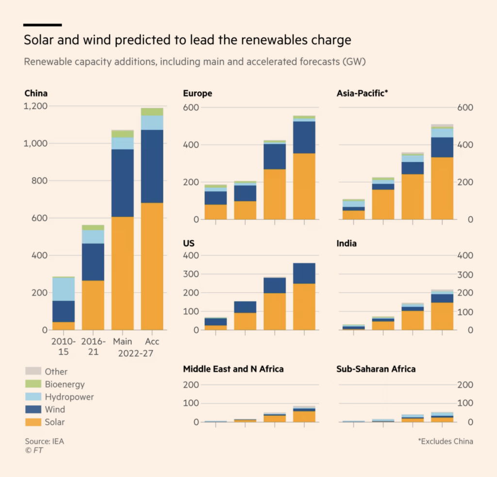
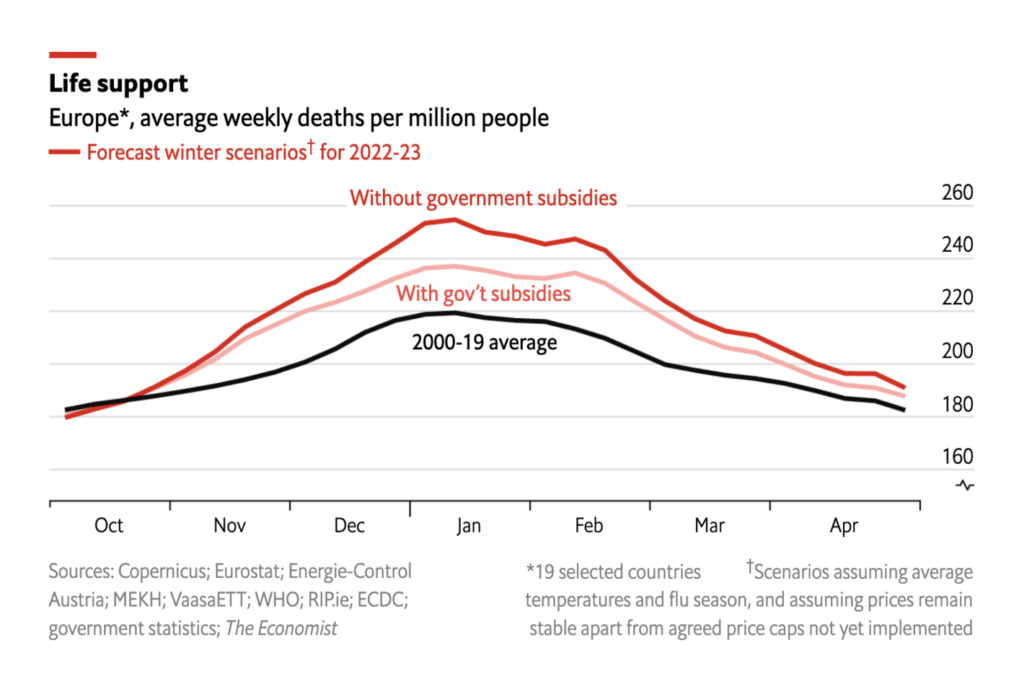
Good news on the energy front: renewable energy should overtake coal by 2025 and government subsidies are likely to save lives in Europe.
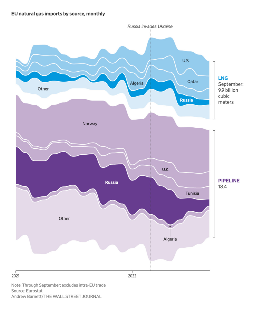
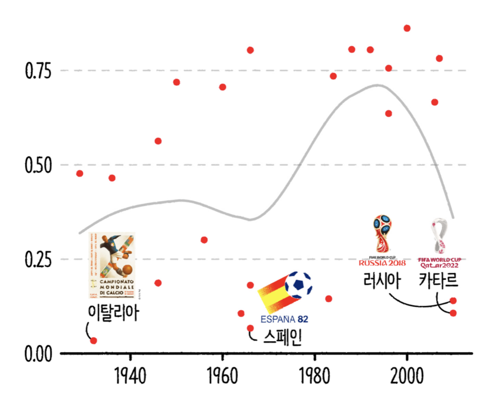
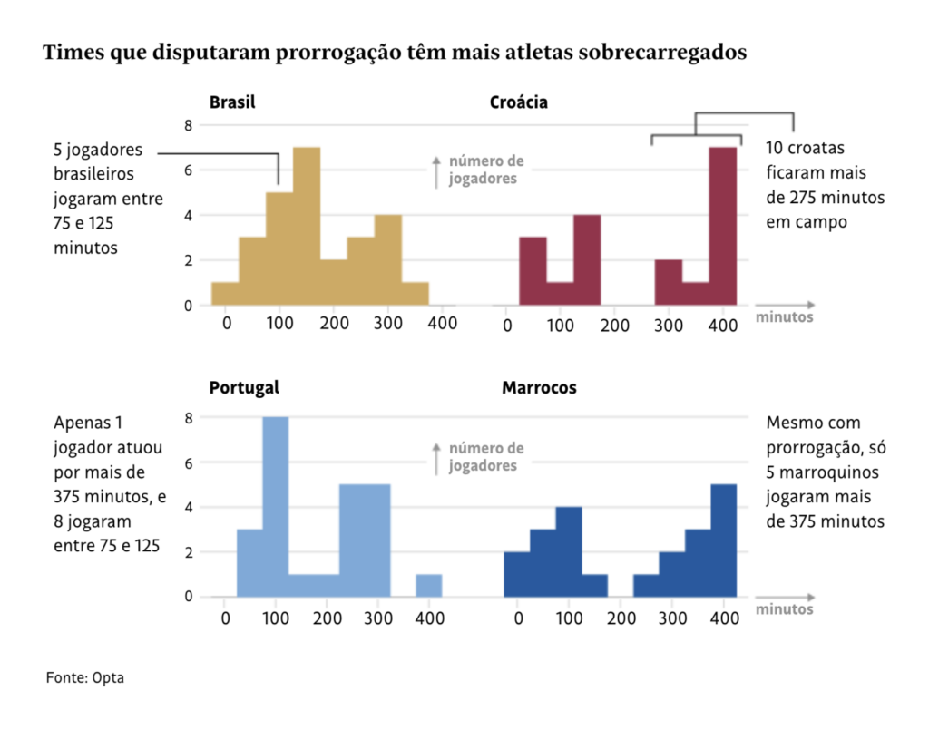
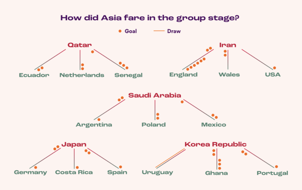
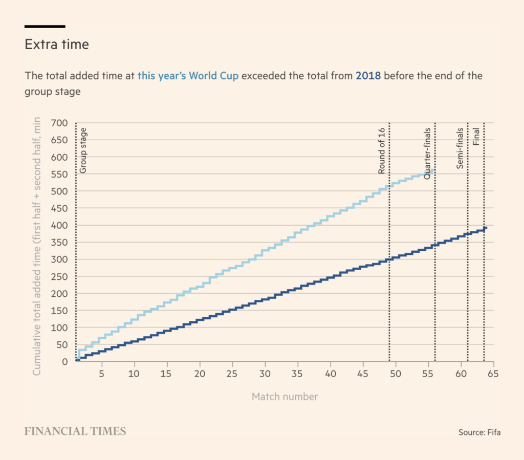
The FIFA World Cup in Qatar is nearing the finals, scheduled for this Sunday. Visual analyses cover democracy scores of organizing countries, past performances of national teams and players, and the duration of the games.


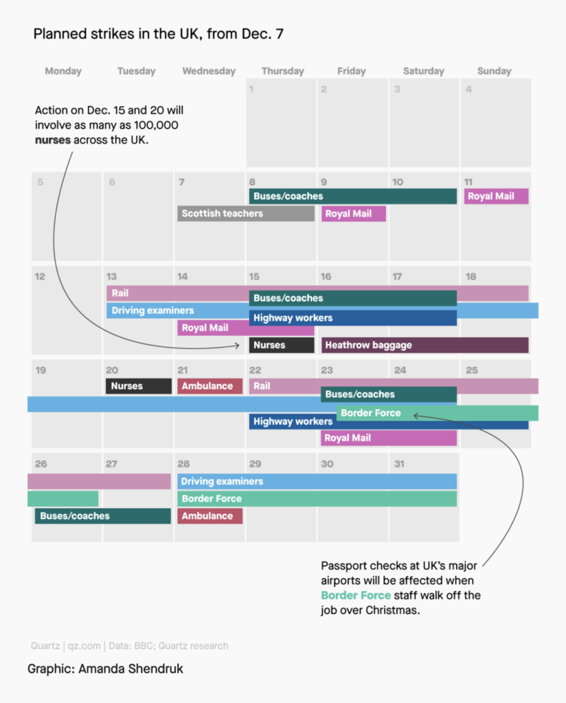
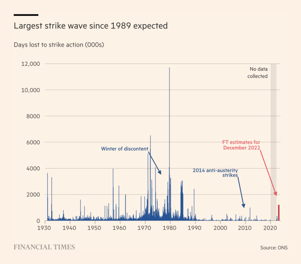
The United Kingdom is expecting strikes in the next few weeks.
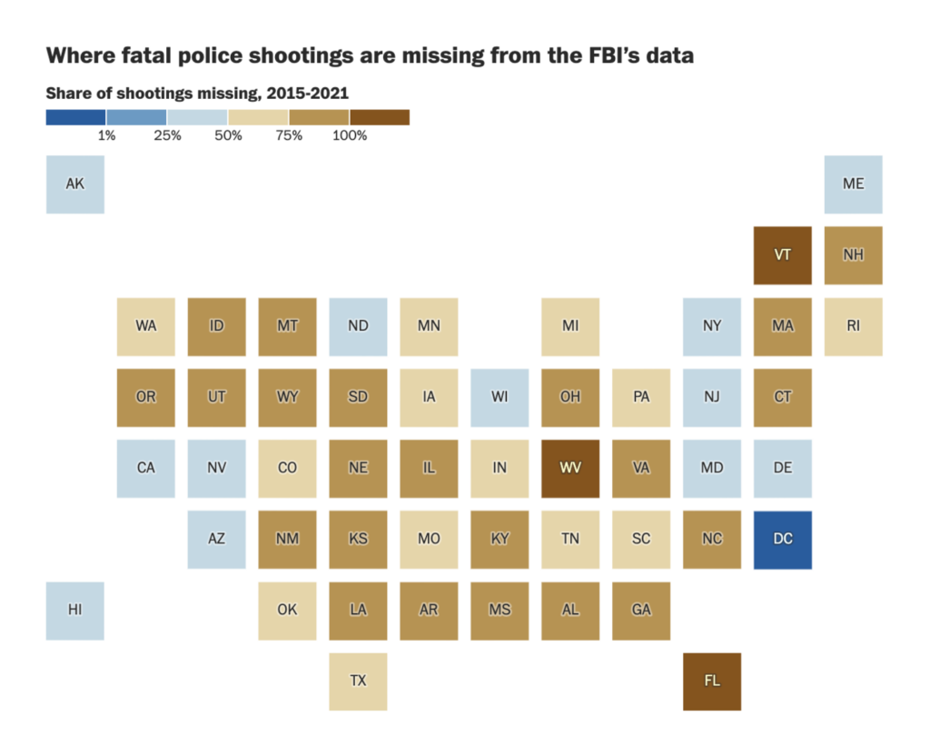
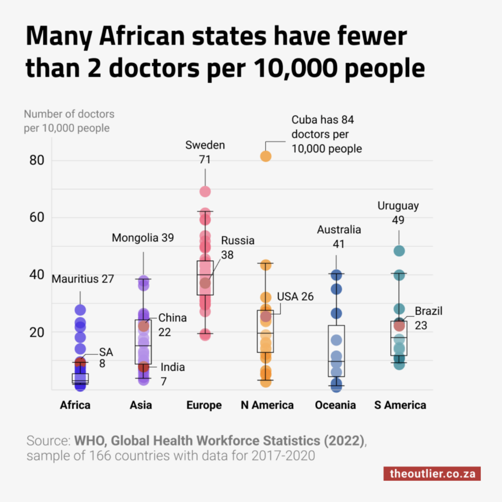
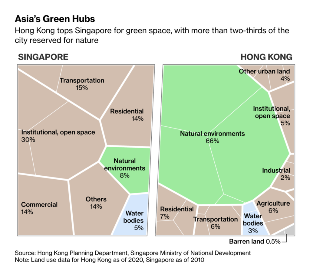
Other notable charts of the week covered unreported shootings in the U.S., low numbers of doctors in Africa, urban green spaces in Asia, modeled coronavirus scenarios in China, and the reach of North Korea’s missiles.


Help us make this dispatch better! We’d love to hear which newsletters, blogs, or social media accounts we need to follow to learn about interesting projects, especially from less-covered parts of the world (Asia, South America, Africa). Write us at hello@datawrapper.de or leave a comment below.
Want the Dispatch in your inbox every Tuesday? Sign up for our Blog Update newsletter!
Comments