We want to enable everyone to create beautiful charts, maps, and tables. New to data visualization? Or do you have specific questions about us? You'll find all the answers here.
The best of last week’s big and small data visualizations
Rose Mintzer-Sweeney
Welcome back to the 26th edition of Data Vis Dispatch! Every week, we’ll be publishing a collection of the best small and large data visualizations we find, especially from news organizations — to celebrate data journalism, data visualization, simple charts, elaborate maps, and their creators.
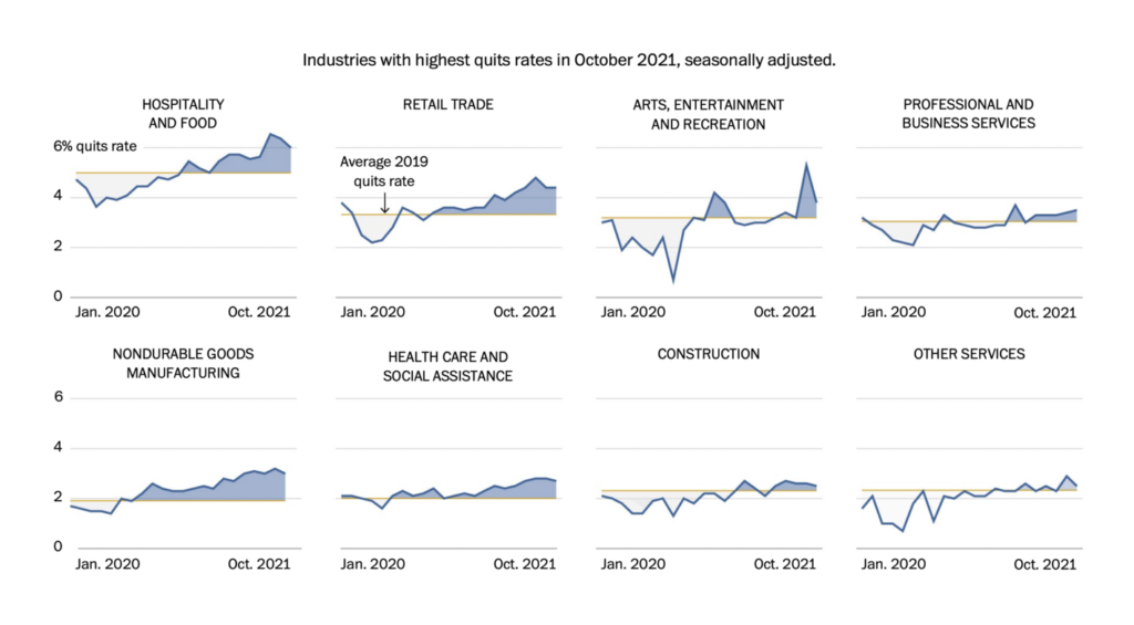
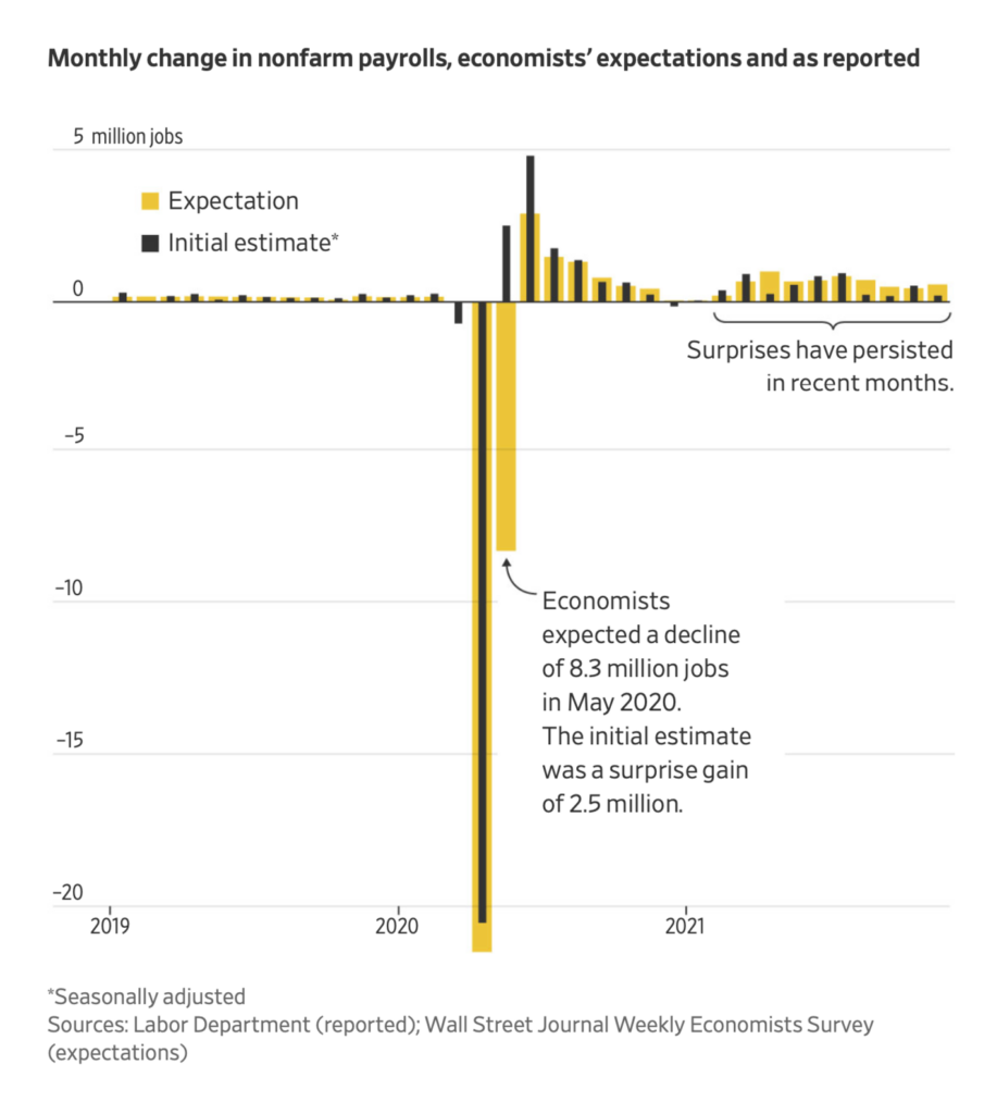
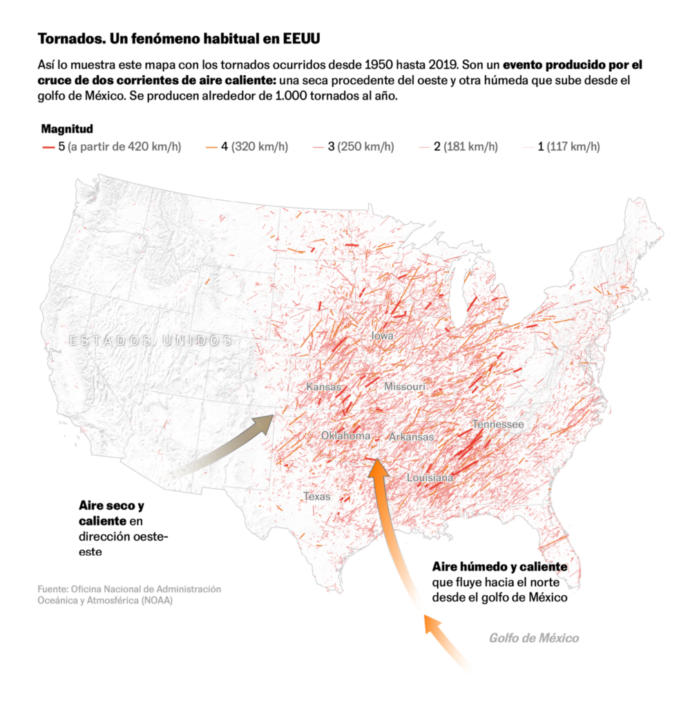
Recurring topics this week include employment, tornadoes, and the omicron variant.
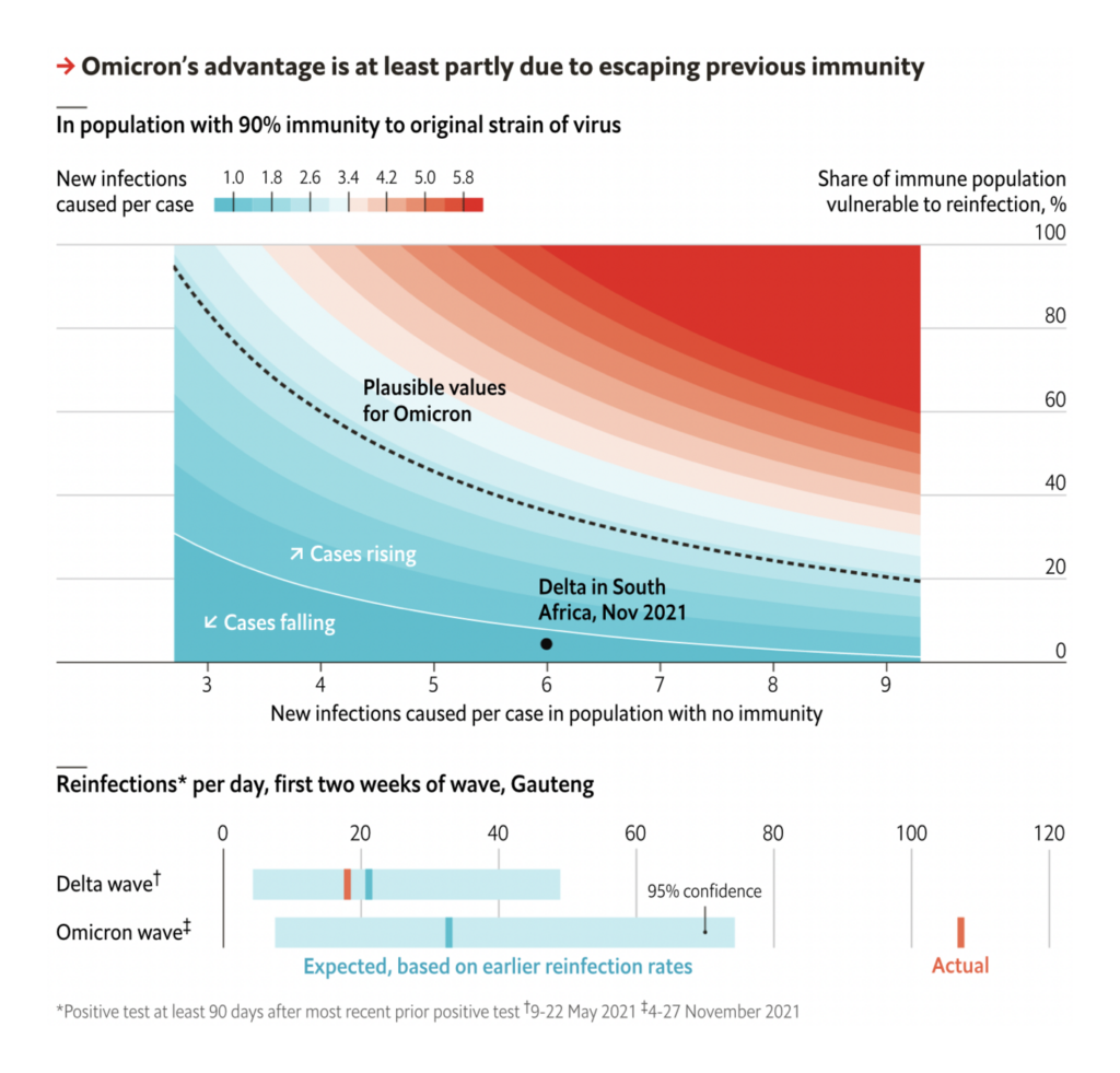
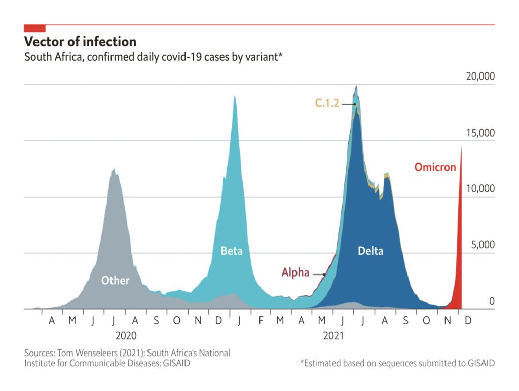
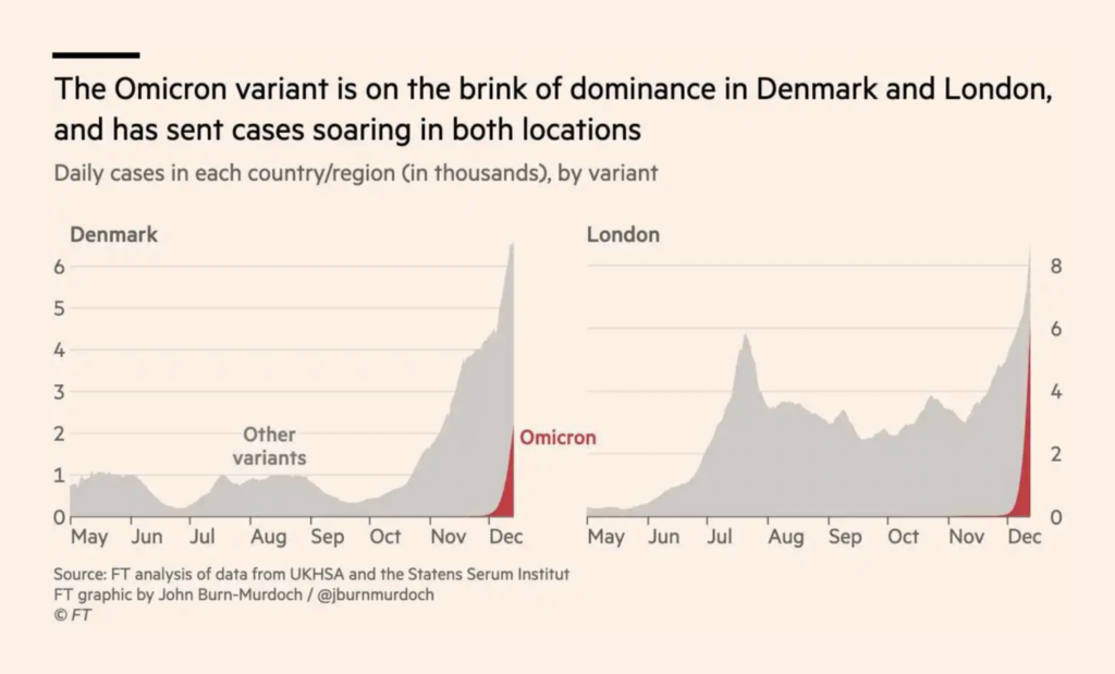
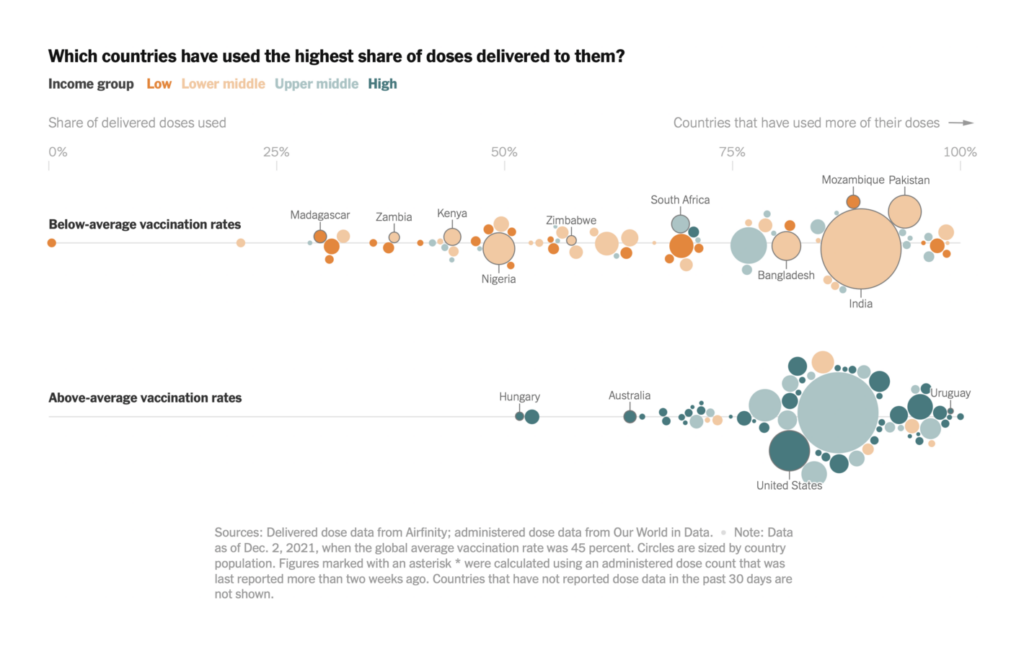
But all right, those weren’t the big stories of this week. That title belongs, again, to the spread of the omicron variant and the efforts to understand what makes it different:
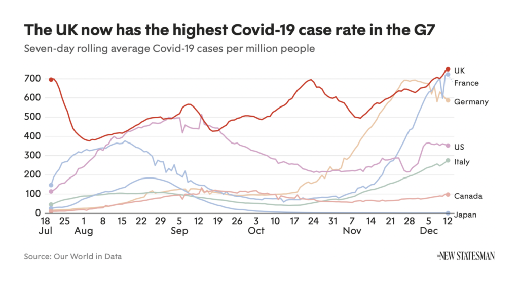
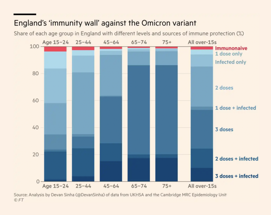
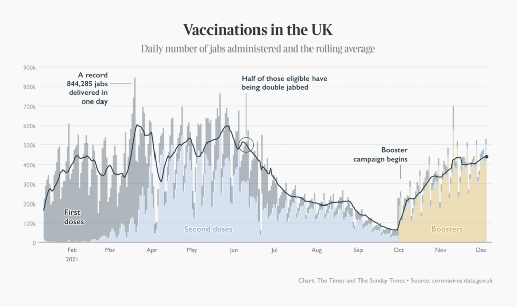
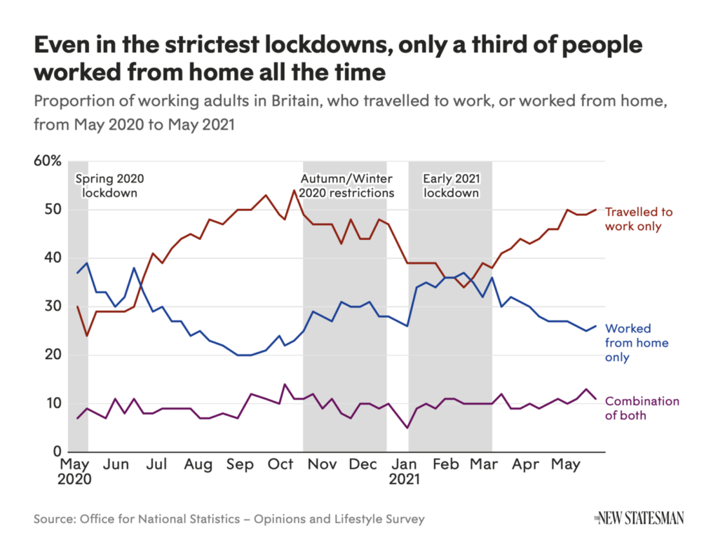
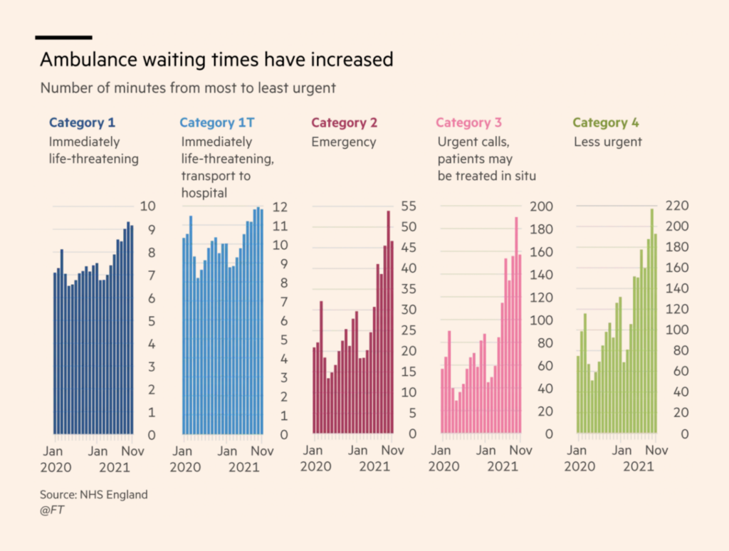
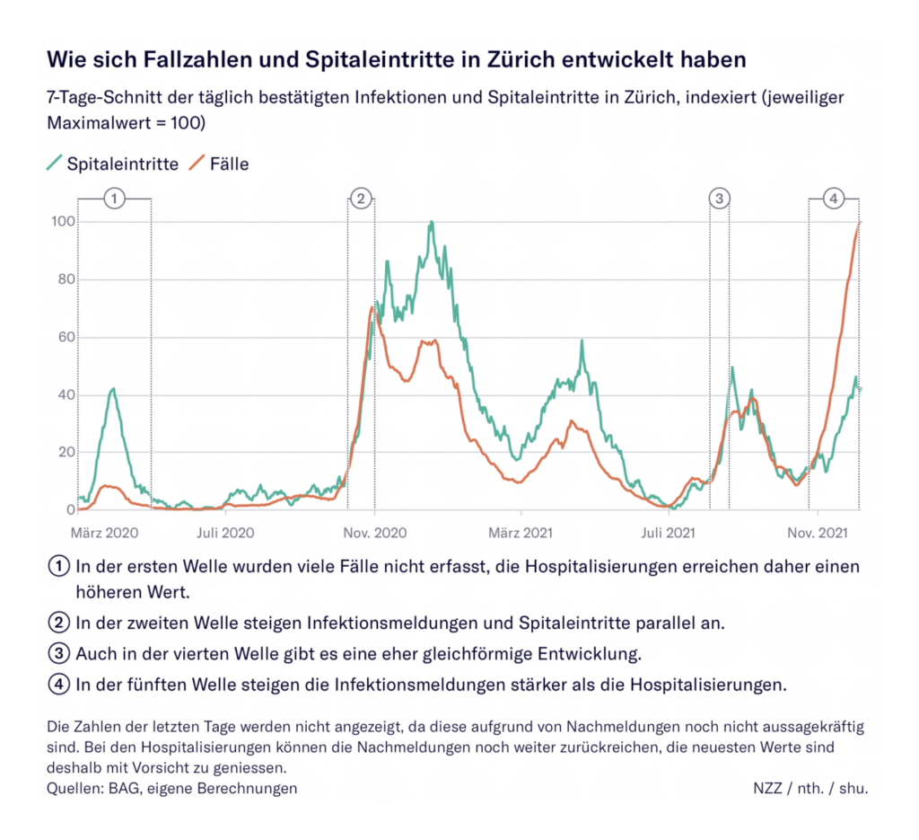
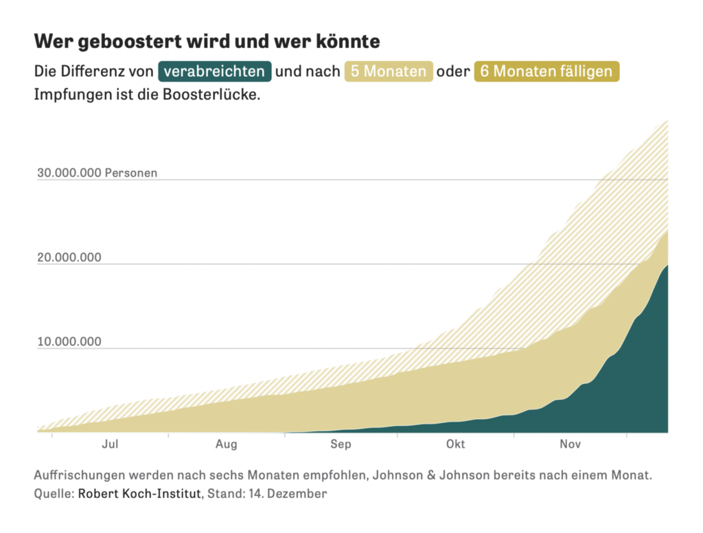
The New Statesman informed us that theUK has regained its dubious title of G7 country with the highest COVID case rate. It remains to be seen how existing immunity, the ongoing booster campaign, and other measures will hold up in the current wave — or how the NHS will make it through the second pandemic winter:
More generally, a new data vis jobs board is now up on the Data Visualization Society’s website
Help us make this dispatch better! We’d love to hear which newsletters, blogs, or social media accounts we need to follow to learn about interesting projects, especially from less-covered parts of the world (Asia, South America, Africa). Write us at hello@datawrapper.de or leave a comment below.
Rose Mintzer-Sweeney
(she/her, @rosemintzers) is a data vis writer on Datawrapper's communications team. She likes words, numbers, pictures, and all possible combinations of the same. Rose lives in Berlin.


Comments