Data Vis Dispatch, February 18: German election polls, corruption, and tariffs
February 18th, 2025
9 min
This article is brought to you by Datawrapper, a data visualization tool for creating charts, maps, and tables. Learn more.
Our team’s favorite visualizations of 2024
Welcome to the last Data Vis Dispatch of 2024! The regular Dispatch will take a few weeks’ holiday pause until after New Year’s, so enjoy this one at your leisure. Today we’re looking back on this year’s 49 published Dispatches, with their incredible variety of featured visualizations. Some were shocking, some were amusing, some were simply beautiful, and all of them made us think about what great data vis can be.
Some, in particular, had a way of sticking with us. So for the end of the year we asked the Datawrapper family: What data vis from the past year are you still thinking about? This week’s Dispatch features the Datawrapper team’s personal favorite visualizations of 2024!
Recurring topics include — well — it’s as diverse as the team is.
This year, The Pudding projects were especially beloved by the Datawrapper team:

Erle
Visualization developer
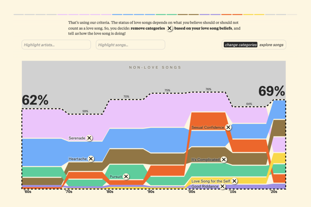
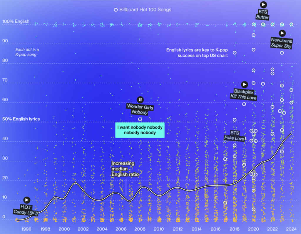
I generally love The Pudding and thought their story “Is the Love Song Dying?” was a great mixture of data exploration and presentation. I love how it took one perspective, turned it on its head in several steps, and finally invited the reader to use the data to draw their own conclusions. It sparked my curiosity and delighted me, which was extra appreciated during a year in which the papers weren’t exactly full of happy news.

Elliot
Visualization developer
I’m a sucker for a good pop culture analysis, and few publications do it better than The Pudding. In “Who killed the world,” Alvin Chang explores how science fiction stories have changed since the 1950s towards more dystopian visions of the future and commentary on modern-day social issues.
What I found particularly interesting about this piece is not necessarily the visualization (a well-executed animated waffle chart!), but the methodology. Chang ran the names of 1,600 films and TV shows through ChatGPT and prompted it to provide a content analysis and summary of each.
It’s wild to think that this kind of subjective evaluation, which previously would take hours of work, can now be automated. (Hopefully with minimal errors; Chang says he spot-checked the results and found that “the model answered similarly to how I would.“)
I’ll leave it to you to decide whether this strange new technology is the stuff of utopia — or dystopia.
One project was even independently chosen by two different people:

Ivan
Visualization developer
One visualization that immediately sprung to mind was “This is a teenager” by Alvin Chang for The Pudding. It’s a “scrollytelling” piece that explores how a person’s background affects their life. The author shows that those who start out in “unfavorable” conditions (being poor, having uninvolved parents) are more likely to struggle and experience adversity in later life.
I really like the way that time progresses as you scroll down the story, stopping to focus on different stages of a person’s life — it made me think of how my own life unfolded, what I experienced at different ages, and what impact my background has had on my life. The author makes the narrative even more relatable by focusing on a single person throughout the story. I admit that I felt a touch of sadness while watching the protagonist’s life unfold. It’s not often that looking at a data visualization makes me feel emotional, so that deserves very high praise from me!

Jona
Design intern
A visualization that stuck with me this year is Alvin Chang’s “This is a teenager,” which sheds light on the entanglement of adverse childhood circumstances with social inequality and U.S. teenagers’ opportunities and well-being later in life. The article’s arguments rely mainly on statistical comparisons, yet the storytelling with a focus on a single person’s experiences, the animated representations of people and the possibility to click any of these people to get an overview of their circumstances at any point in time nonetheless left me with the feeling that this piece is ultimately not about comparing abstract data points, but about the lives of many individual and relatable people.
NASA visualizations were also mentioned twice:

Pascal
App developer
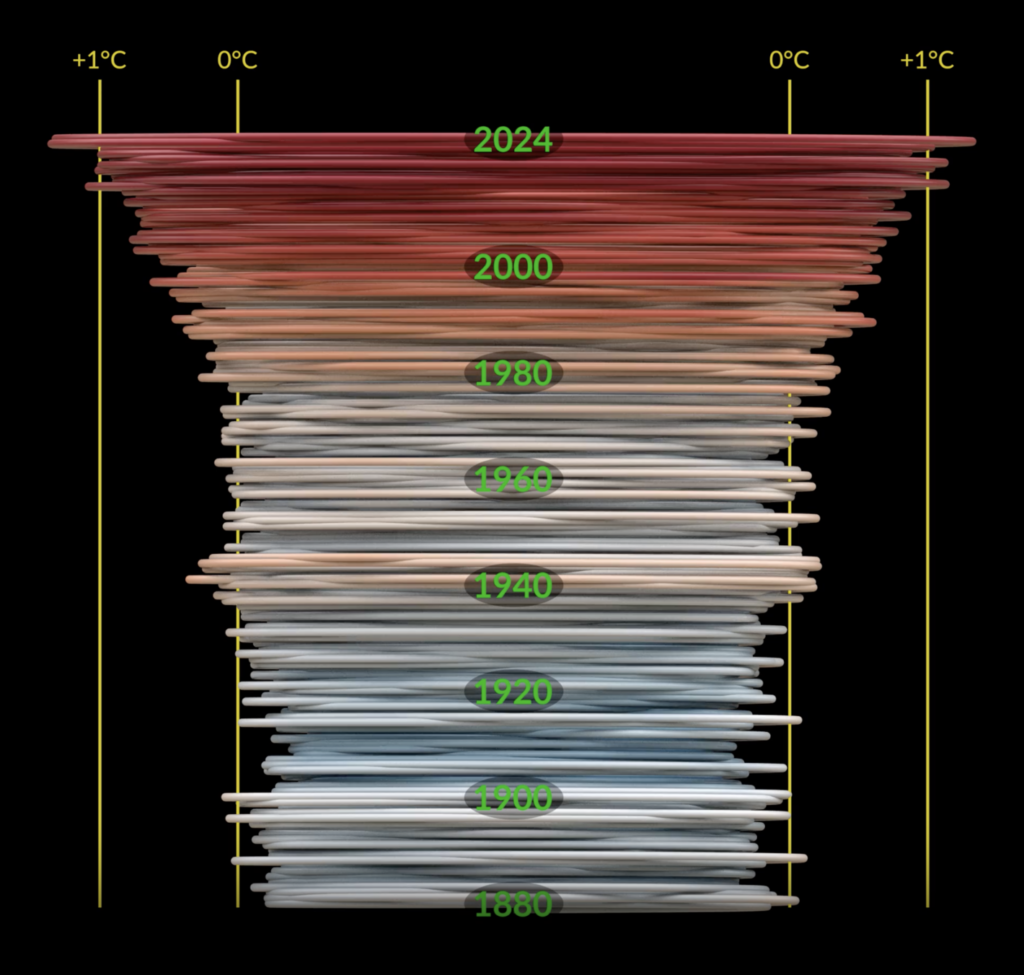
I really don’t like the data the NASA climate spiral shows, but I do find it beautiful from an artistic perspective. I think it does a great job at visualizing just how much the temperatures are spiraling out of control. I think it appeared first in 2023, but it’s updated every year.

Alex
Designer
My top pick: What I really like about this NASA visualization of global carbon dioxide is that it looks like the Earth is breathing, almost like it has a heartbeat. Ironically, of course, this is mostly due to us humans producing so much CO₂.
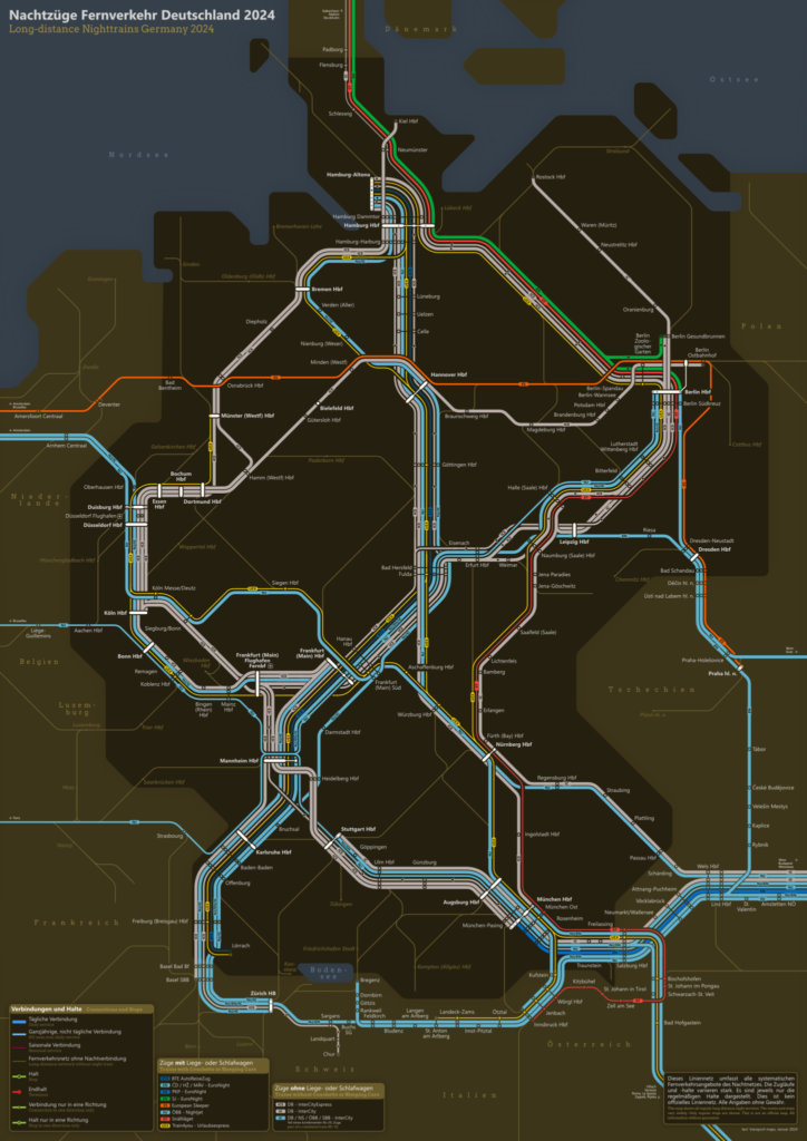
My second honorable mention: As someone who travels a lot by train and always appreciates well-designed maps, I was immediately drawn to this depiction of Germany’s long-distance night trains. The creator also designed a map of Germany’s long-distance trains, but this one stood out to me because of his excellent choice of colors.
But what else did the Datawrapper peeps like?

David
Co-CEO and co-founder
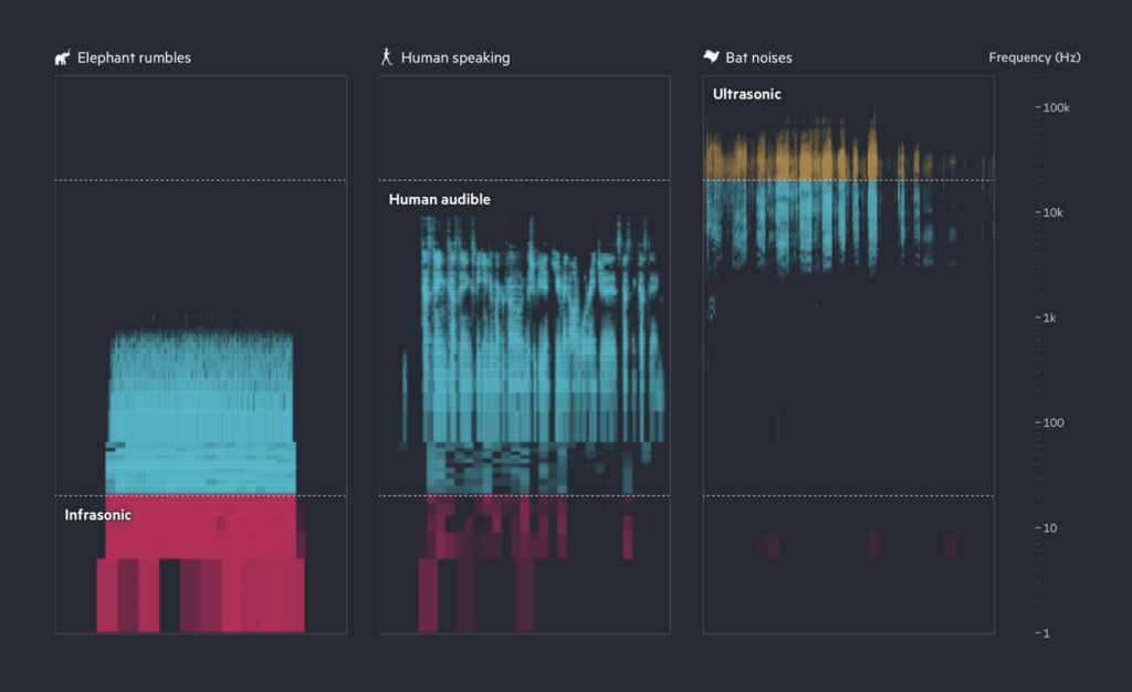
I loved this visual story by the Financial Times about interpreting ambient noise from nature using AI technologies. The underlying tech is very cool, and the visual presentation makes it understandable to follow. It’s also simply fun to hear the different sounds and try to follow along with what the AI comes up with. And somehow animal sounds are a fruitful topic for data visualization — it reminded me of my colleague Marten’s weekly chart about whale songs!
I also liked this seemingly-simple, animated visualization about Olympics results. It’s a topic you see so many visualizations about every time it comes around, and yet this one managed draw me in with its unique style and playful approach to recreating the results. It feels like with every Olympics, there are new approaches to using interactive data visualization for mini-recaps, and this was a really good one.

Elana
Co-CEO and head of visualization
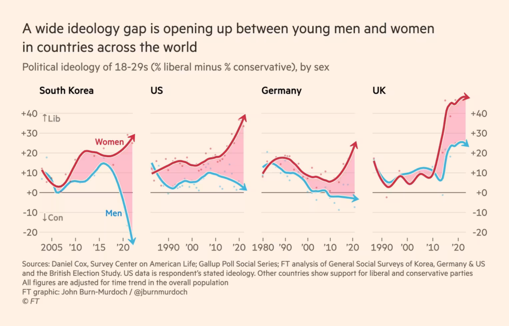
This chart from the Financial Times (specifically by John Burn-Murdoch) showing the political divergence of young men and women is one that really stuck with me this year.
I think there’s no question that the story this chart tells is at once striking and concerning. As charts go, it’s pretty simple, but that makes it all the more powerful as a demonstration of how asking your data the right questions can reveal a compelling story.
For me, 2024’s politics have really been marked with polarization, the difficulty for different groups to understand one another, and ever more fragmented and hyperbolic online echo chambers. These are topics that concern and preoccupy me — this chart sheds a stark light on one of their dimensions, and for that it stuck with me.

Mirko
Co-founder
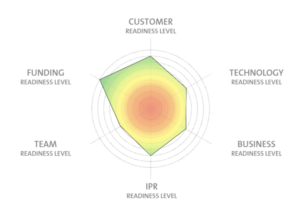
My favorite visualization: KTH Innovation Readiness Levels. At first glance it looks like a simple spider chart, but it’s really a very easy-to-use system to track and monitor the development of a project or a start-up. For me, this approach became an important tool. Moreover, the Innovation Readiness Levels are an example of how we could (and should) move towards using data more and better for planning projects. The categories solve the challenge of having to develop in several directions at the same time and the system is free to use. categories solve the challenge of having to develop in several directions at the same time. The system is free to use.

Gregor
Co-founder
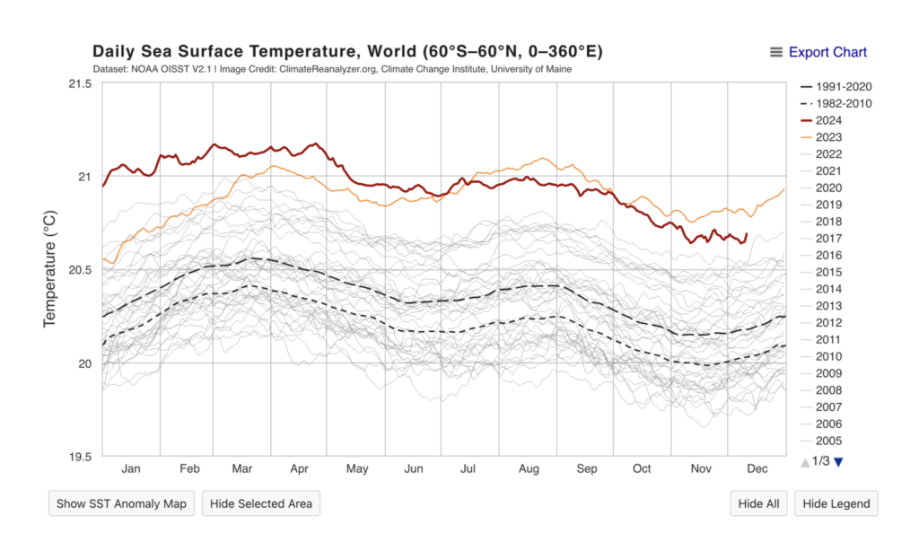
In my opinion the most important visualization this year was unfortunately the Daily Sea Surface Temperature (Anomalies), as published by Copernicus Climate Pulse or in the Climate Reanalyzer of the University of Maine. Hardly any other diagram shows the climate crisis as impressively as this one, and hardly anything has such serious consequences for our lives as the warming of the oceans.


Jack
App developer
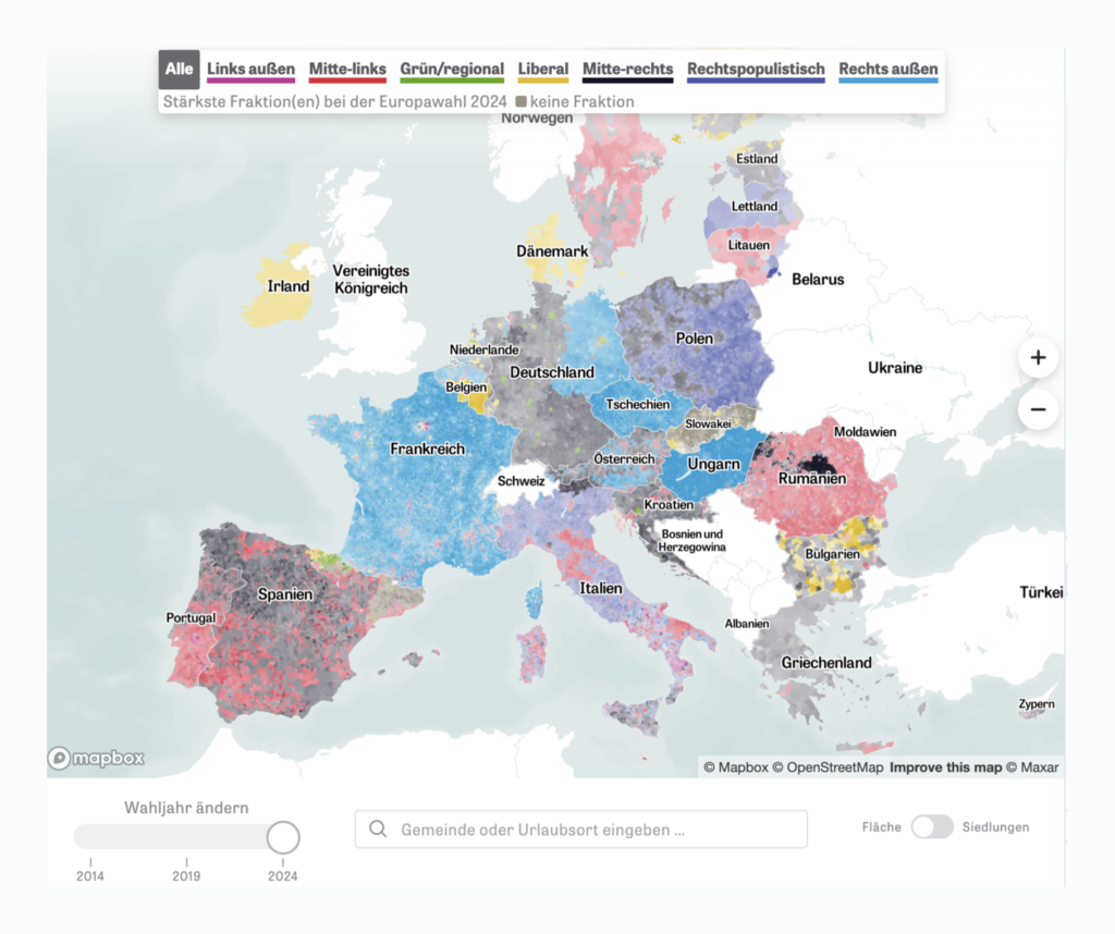
Here are my nominations: First, “Explore Europe’s most detailed electoral map” from Zeit Online. I’m super impressed by the technical stack of this map as well as the sheer amount of data to explore, over time and geography — I spent hours looking through it! I’m not so impressed by what the data says about the direction of European politics though 😬.
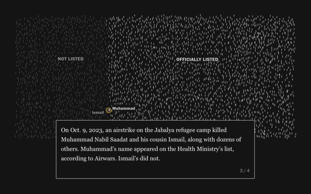
Next up, “Full Of Themselves” by Dominikus Baur and Alice Thudt. I love the design of these charts and the article is a super interesting read! And finally, “Know their names” from Al Jazeera. This is a visualization that made me cry. Despite the very simple technique, this was the most emotionally impactful article I read this year.
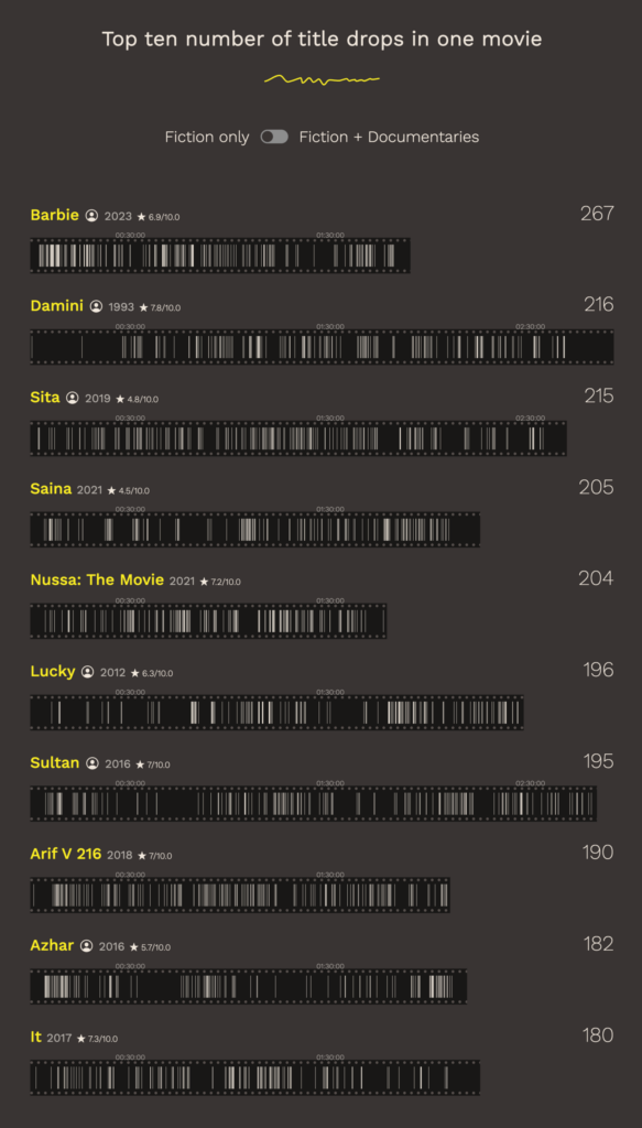
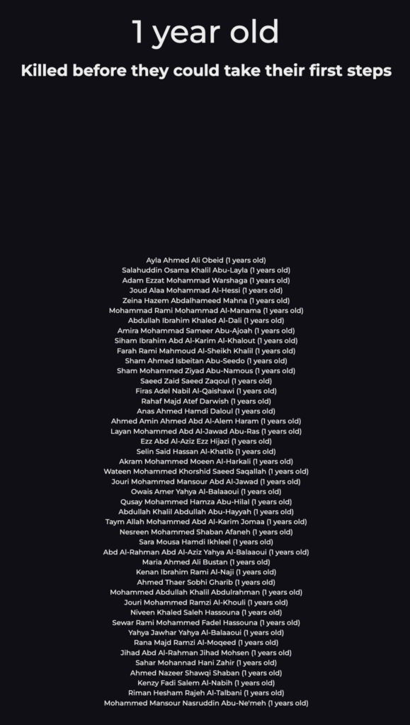

Julian
App developer
My favorite visualization this year has got to be “Relive the Biggest Little Runs in Paris” from The New York Times. I can’t fathom the amount of work that must have gone into it. You can watch it five times, and each time you discover some new detail. I’m not into hurdling at all, but this visualization still managed to fascinate me.

Marten
Head of app development
Working at Datawrapper, I’m blessed with a constant stream of very cool data visualizations from my coworkers via our Weekly Chart series. This year, the story and visualization(s) that particularly stuck with me was this story by my colleague Eleni about how a flower became the “main character” of the late Pleistocene. The story and the visualizations therein really helped me dive into topics that I had very little prior knowledge of — I learned a bunch! And the feature image created by our co-worker Gustav is also beautiful.
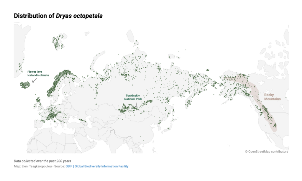
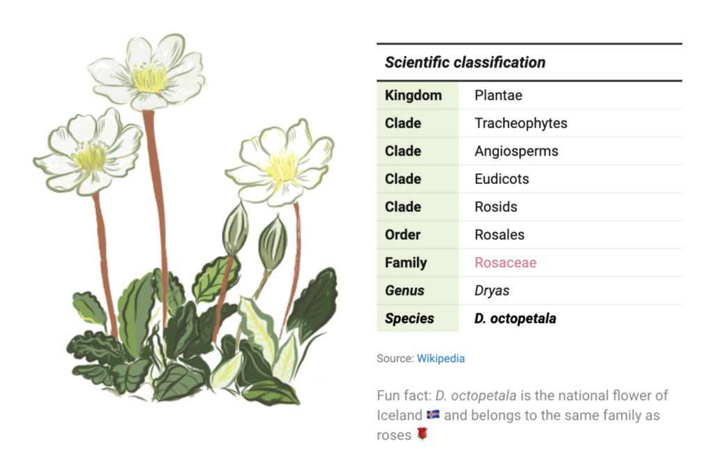


Eleni
Maps
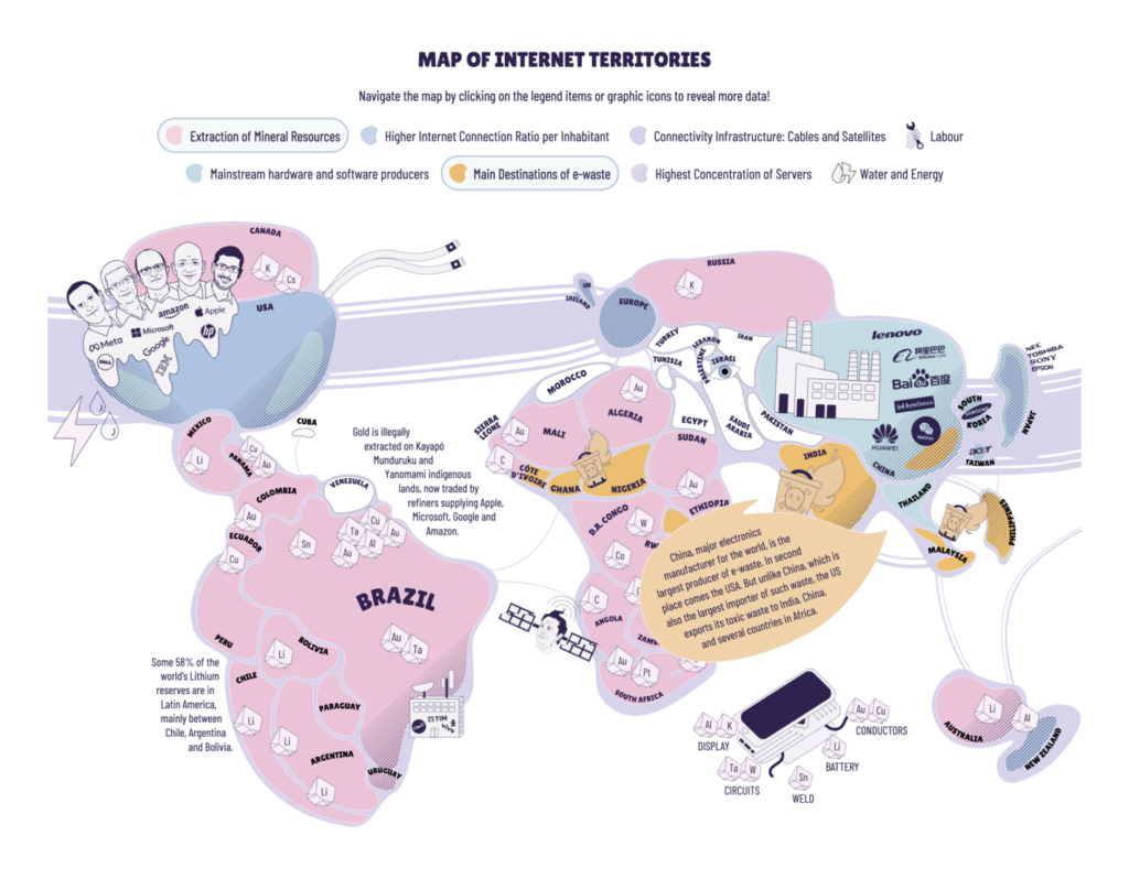
This visualization “Map of Internet Territories,” created by Coding Rights in 2022, is still incredibly relevant today. Designed by a team with intersectional and decolonial feminist approaches, it explores the global structures of the internet. Through a creatively abstract world map, it reveals the physical and geopolitical power dynamics behind digital colonialism.

Luc
Visualization developer
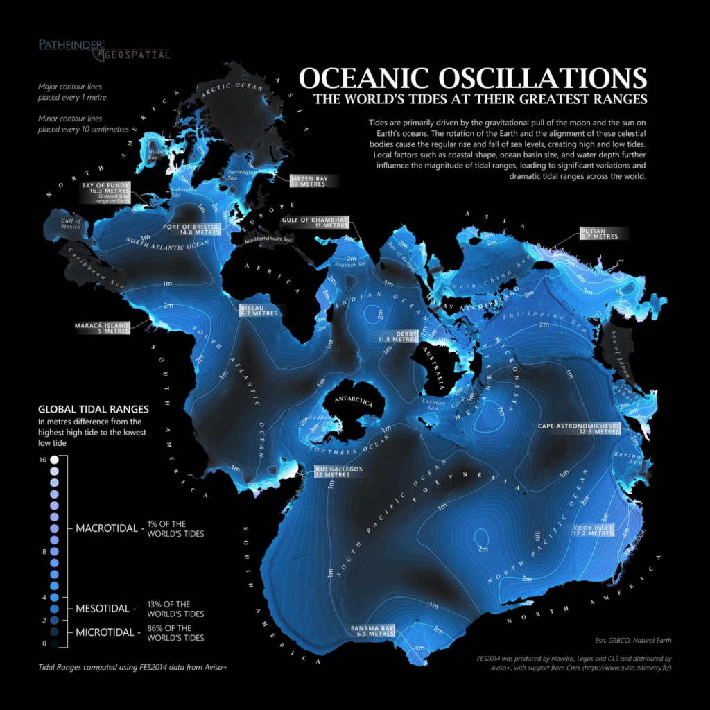
This map of tidal ranges stood out to me as really beautiful, and a wonderful usage of the Spilhaus projection. Putting the oceans at the center of the map is a good reminder that maps and data vis always have a perspective on reality. Try looking for the coastline of America! Growing up on the shores of the English channel, I was often told this is where the greatest tides in the world occur, I’m happy this map confirms it was (almost) true.

Alicia
Designer
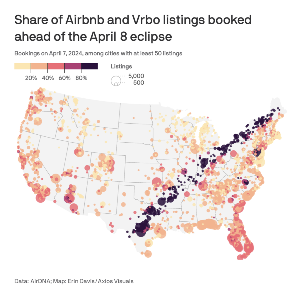
I really liked these maps by Axios and AirDNA depicting the bookings of Airbnbs and other short-term rentals during the solar eclipse in the U.S. back in April. It’s interesting to see that so many people traveled for this event, and the maps do a good job of showing the correlation in a visual way.
Last but not least, some favorites from the blog’s own communications team:

Lisa
Head of communications
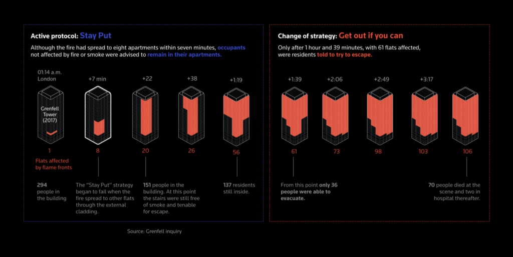
This year I was most amazed not by a single data visualization, but by a newsroom that combines them with sometimes fun, often touching, always beautiful illustrations: Reuters. And it’s not just illustrations, but (satellite) photos, infographics, animation (often triggered by scrolling), 3D — and all to such a high standard. It doesn’t hurt that the charts and maps themselves are gorgeous, too. It’s a joy to get immersed in these consistently great storytelling pieces.
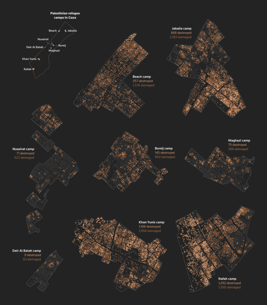
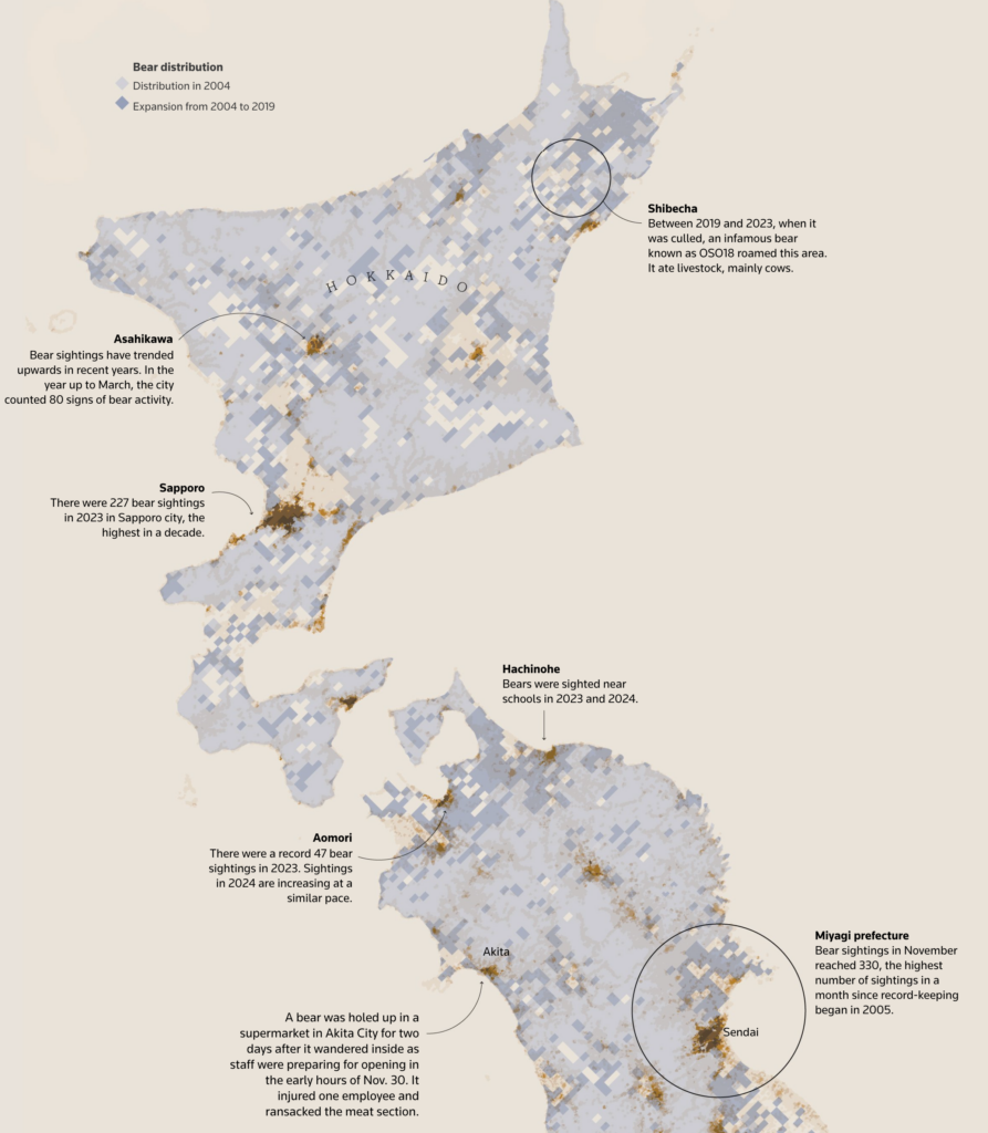
My honorable mentions go to:

Guillermina
Product specialist
This “parallel lives” visualization by Jan Willem Tulp was my favorite Data Vis Dispatch piece! In general, I enjoy timelines a lot! This one in particular caught my attention because it does such a great job putting together figures from different regions and fields — culture, science, leadership — and showing how their lives overlapped. It helps me see history as a connected web rather than isolated moments.

Jonathan
Communications
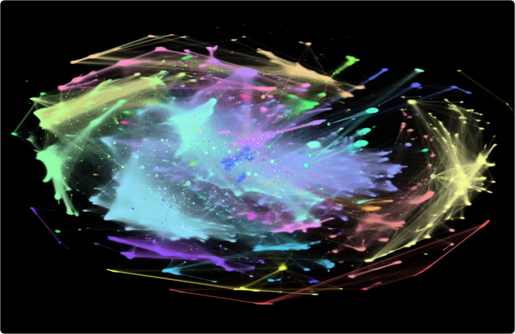
In early 2024, I watched this great video, “I Made a Graph of Wikipedia… This Is What I Found” by coding YouTuber adumb, which I can highly recommend.
It shows a network graph of all Wikipedia articles and the links between them, resulting in a colorful representation of the world’s collective knowledge. Colors represent so-called communities, groups of articles more strongly linked to each other than to the rest of the site. Another neat idea from the video has to do with degrees of separation —when looking at Wikipedia, it only takes four degrees of separation (started randomly from the article for Pluto) to reach nearly three million articles, which is over half of the site’s catalogue.

Rose
Communications
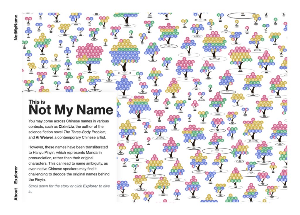
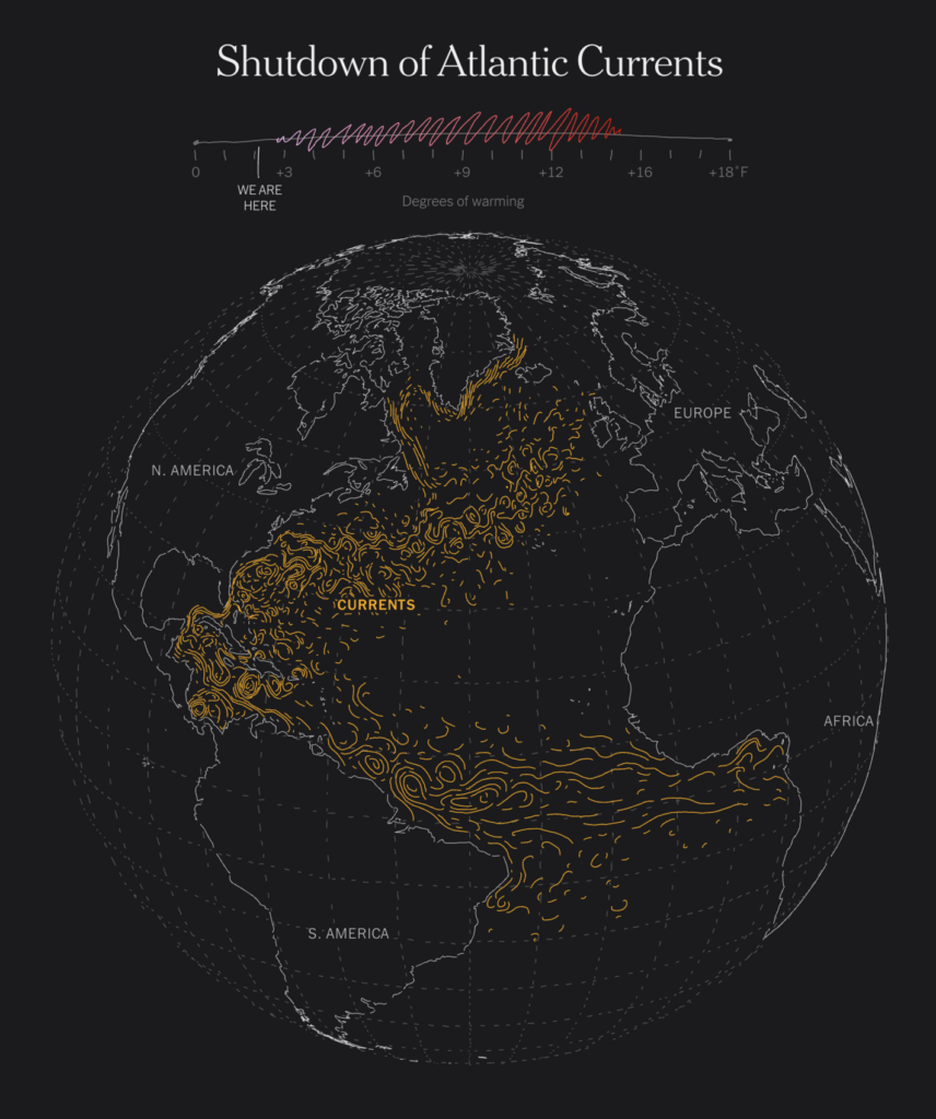
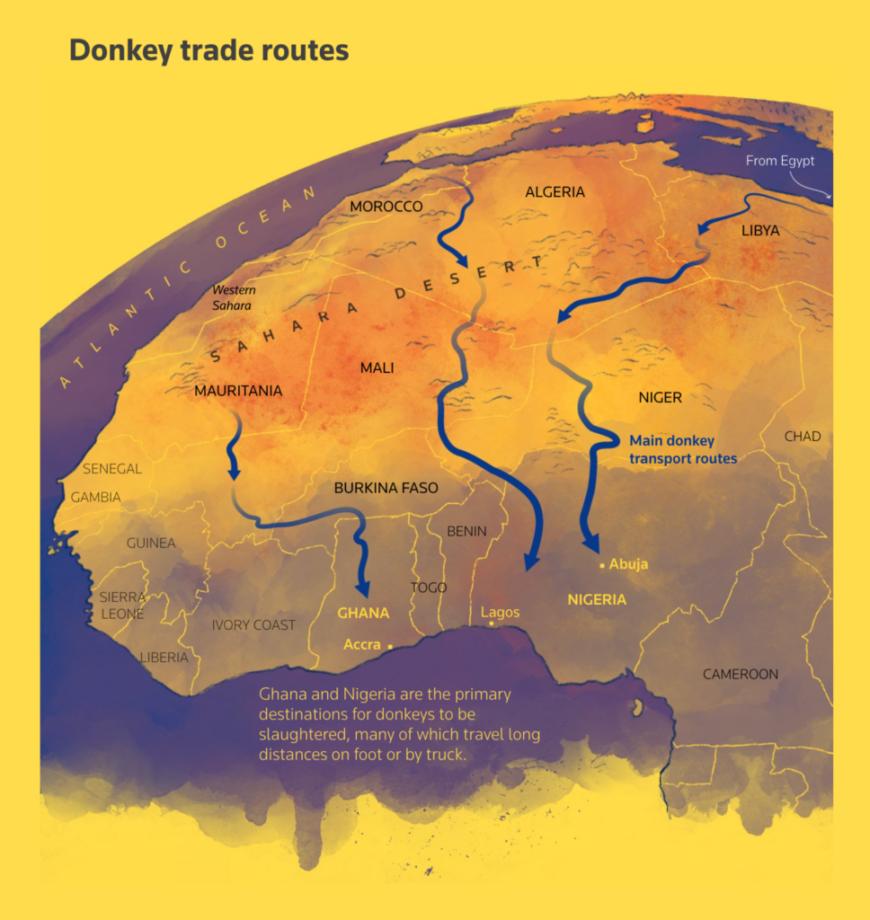
There’s a lot of ugliness in the world, which makes for a lot of ugliness in the news. But ugly realities can still become elegant visualizations — here are four that struck me this year as being simply especially beautiful:
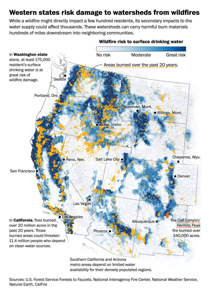

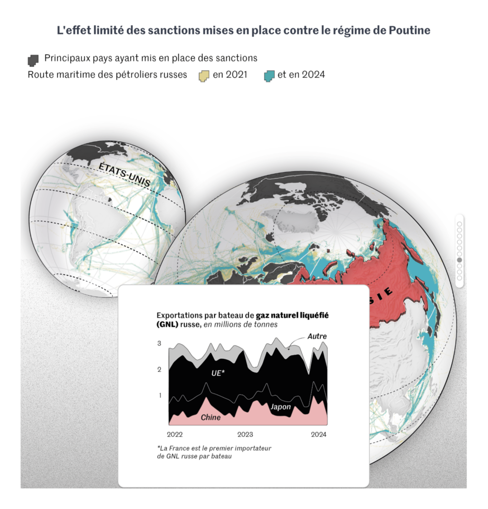
This year had several major stories that we saw covered over and over again. A few honorable mentions go to pieces that took a creative or novel data angle on one of these general topics:
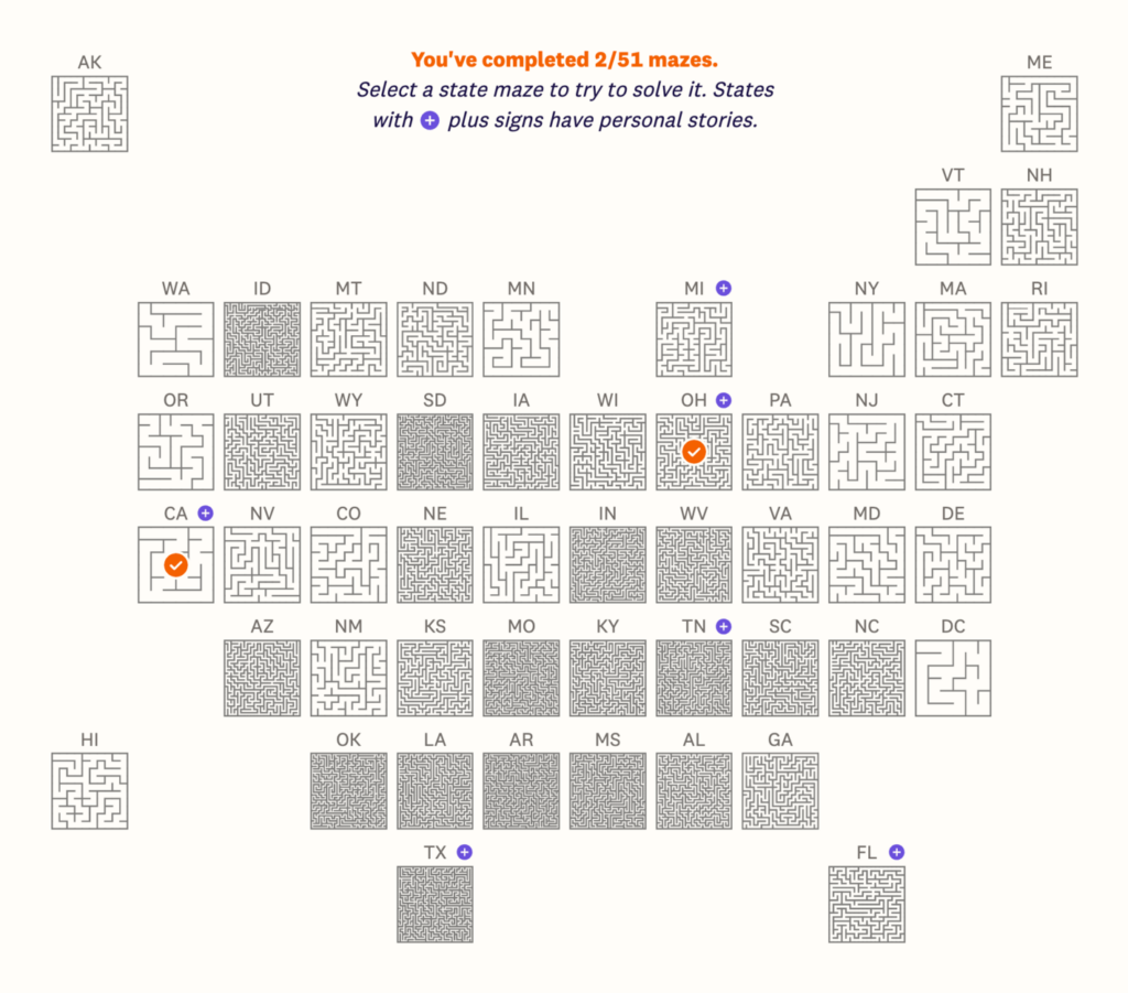
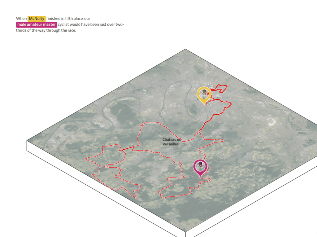
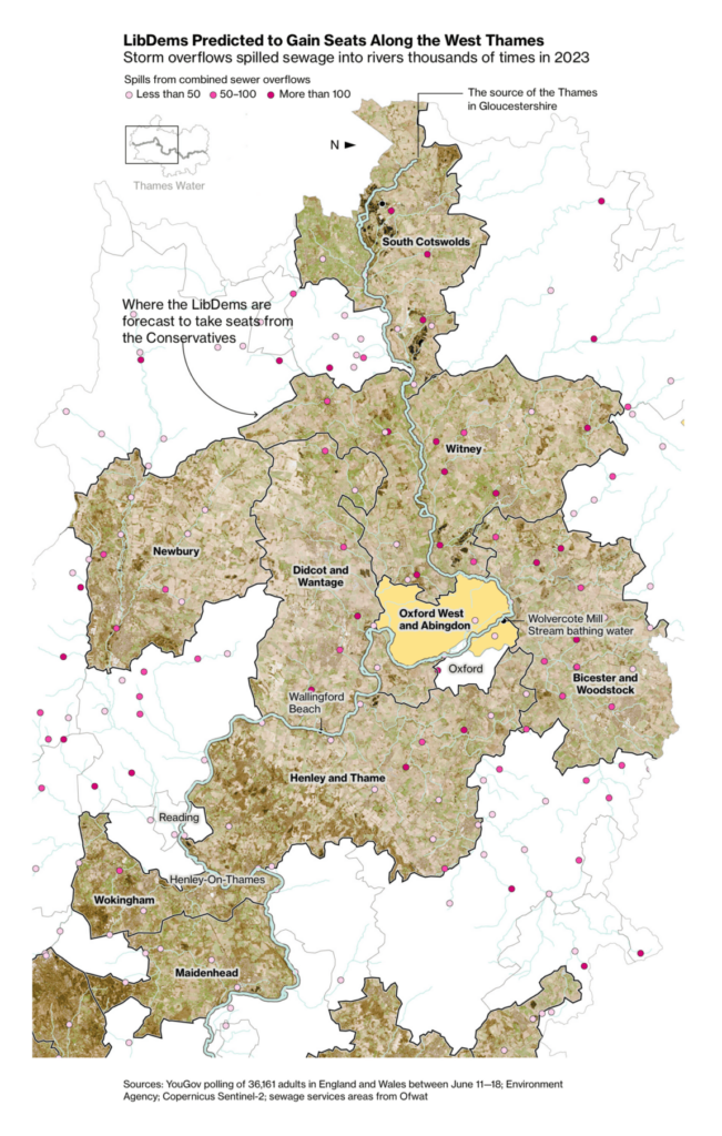
And one that I found especially effective in pushing the limits of the available data to tell an urgent story:

Vivien
Communications
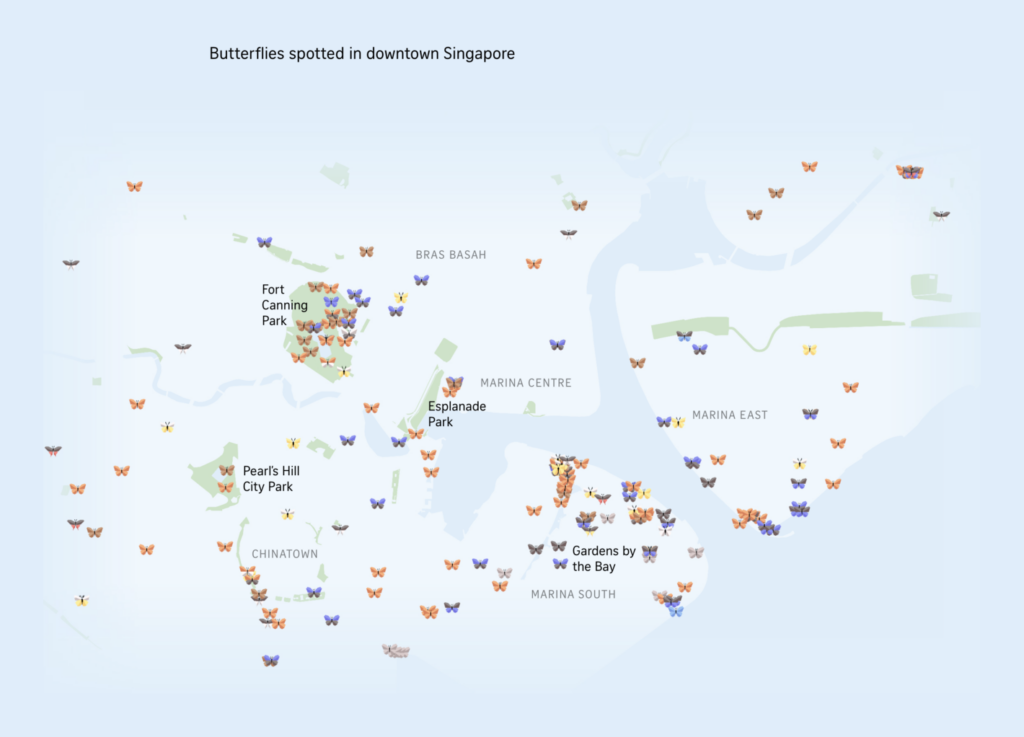
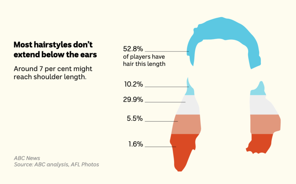
Phew, what a challenge! After all, 1481 charts, maps, and other visualizations (I counted) appeared in the Data Vis Dispatches I wrote over the course of the past year. But I’ve decided that my honorable mentions will go to two visualizations that I didn’t include this year, or that I can’t include because we’re doing this special issue today:
For anyone who wants to use the holidays to look for a new career. Applications are open for…
Help us make this dispatch better! We’d love to hear which newsletters, blogs, or social media accounts we need to follow to learn about interesting projects, especially from less-covered parts of the world (Asia, South America, Africa). Write us at hello@datawrapper.de or leave a comment below.
Want the Dispatch in your inbox every Tuesday? Sign up for our Blog Update newsletter!
Comments