This article is brought to you by Datawrapper, a data visualization tool for creating charts, maps, and tables. Learn more.
Data Vis Dispatch, December 19
Our team’s favorite visualizations of 2023

Welcome to the last Data Vis Dispatch of 2023! The Dispatch will take a few weeks’ holiday pause until after New Year’s, so enjoy this one at your leisure. Today we’re looking back on this year’s 48 published Dispatches, with their incredible variety of featured visualizations. Some were shocking, some were amusing, some were simply beautiful, and all of them made us think about what great data vis can be.
Some, in particular, had a way of sticking with us. So for the end of the year we asked our colleagues: What data vis from the past year are you still thinking about? This week’s Dispatch features the Datawrapper team’s personal favorite visualizations of 2023!
Recurring topics include — well — it’s as diverse as the team is.
Let’s start with one visualization that was independently chosen by two different people:

Luc
Visualization developer
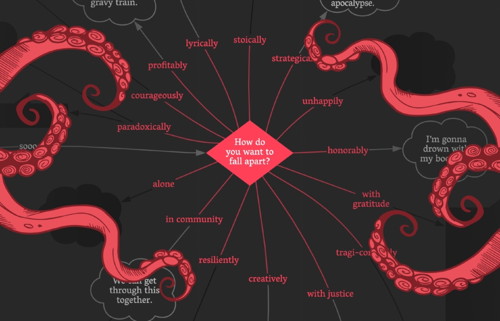
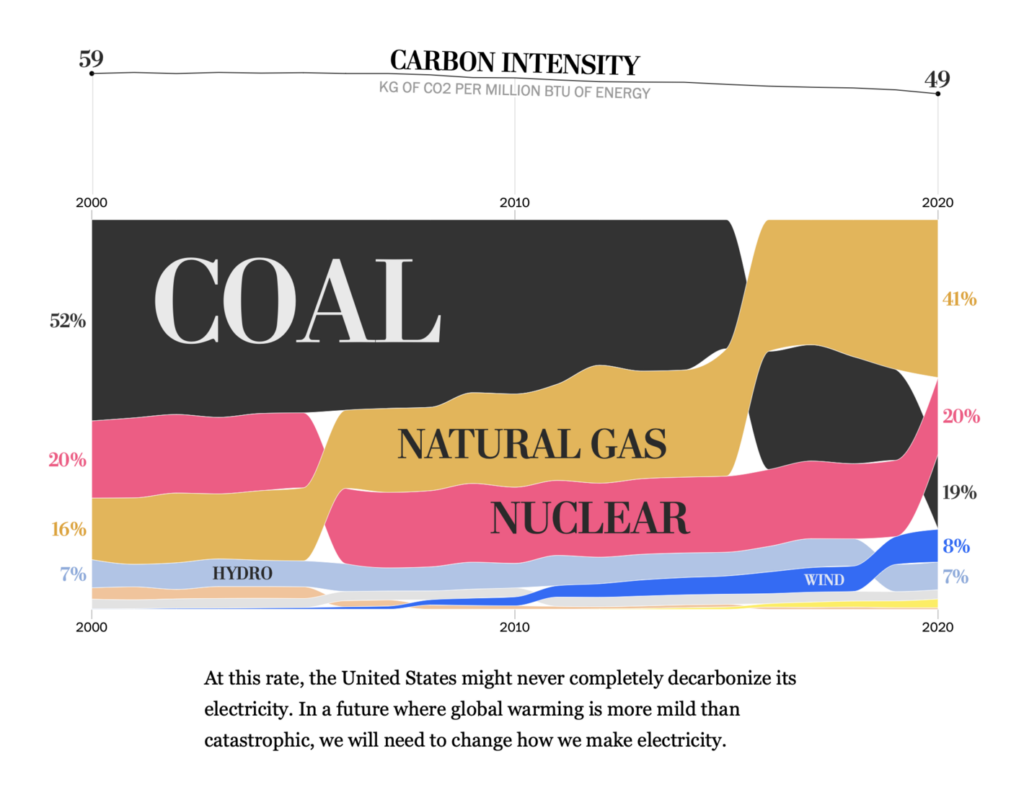
For me, it will be this interactive flow chart, “I want a better catastrophe.” I find it very difficult to innovate in visualizations of climate change (we’ve seen them all, and they are all a bit depressing). Placing the user at the center of the narration, and offering some moderate optimism makes this visualization stand out I think.

Gregor
Co-founder
In my opinion, it’s both a fantastic (and very well-researched) print flowchart and an excellent implementation for desktop and mobile. The narrative is hugely important, but the interface also allows you to explore the chart on your own. Simply ten out of ten, especially on such a complex and crucial topic as our difficulty confronting the consequences and causes of climate change.

Lisa
Head of communications
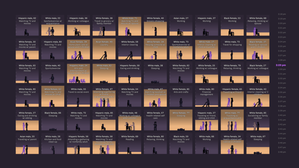
My favorite article driven by data visualizations was Alvin Chang’s “24 hours in an invisible epidemic,” from September. None of the charts stand out individually as amazing visuals, but the storytelling of the whole piece makes it so worth a read. It’s calm, it’s touching, it’s thought-provoking. Probably part of what spoke to me was the topic of loneliness versus happiness: “How much time do I spend with family and friends, and would it make me happy or stressed to see them more often?” is something I as an introverted person asked myself quite often when I was on parental leave in the first half of this year.
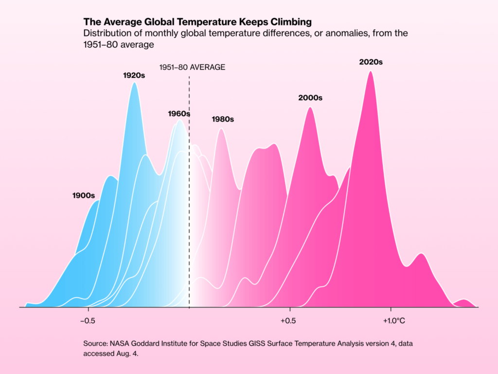
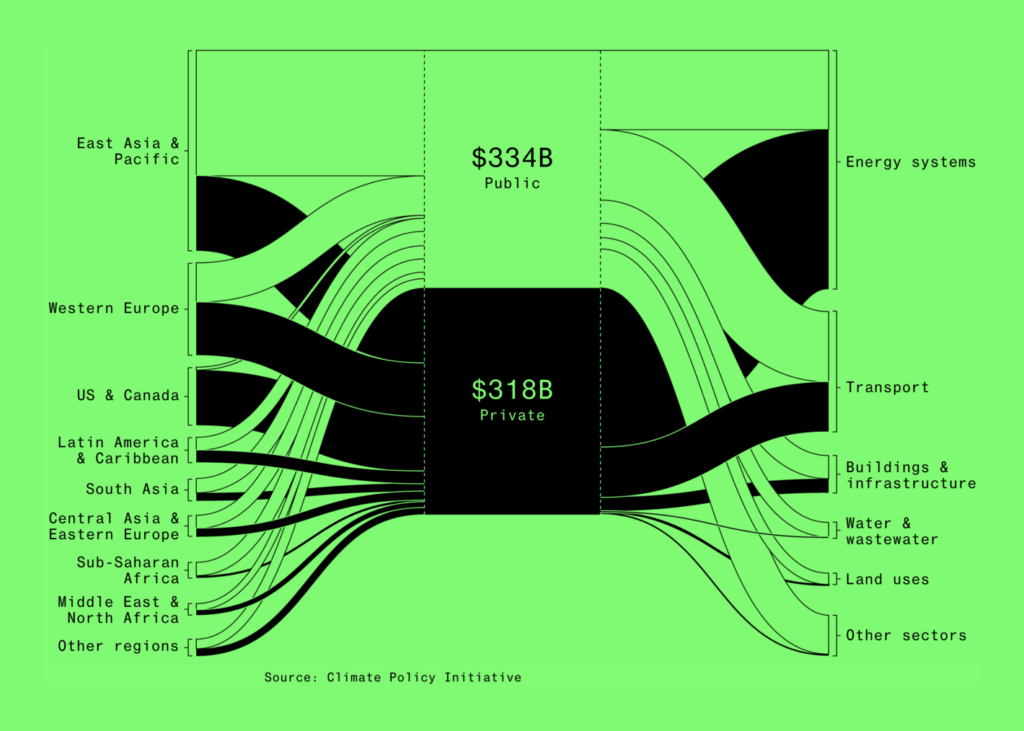
My award for “organization with the best data visualizations” goes out to Bloomberg this year. I love their distinctive, bold style with a lot of pure black, neon colors, thick strokes, big numbers. They also created a lot of graphics on the climate and energy transition this year, topics that I personally find interesting. Here’s the 2023 recap from their graphics team.

Elana
Co-CEO and head of visualization
Actually, I count a recent visualization as one of my favorites. It’s the personal essay “1374 days,” which I like because it manages to be very personal and moving. The combination of digital with hand drawn and illustrative elements is very effective and really makes you feel the burden that Georgia felt. I also really like the visual aspect of how the paint strokes draw themselves as you scroll.

David
Co-CEO and co-founder
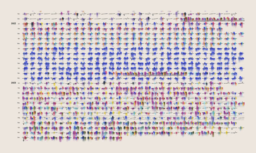
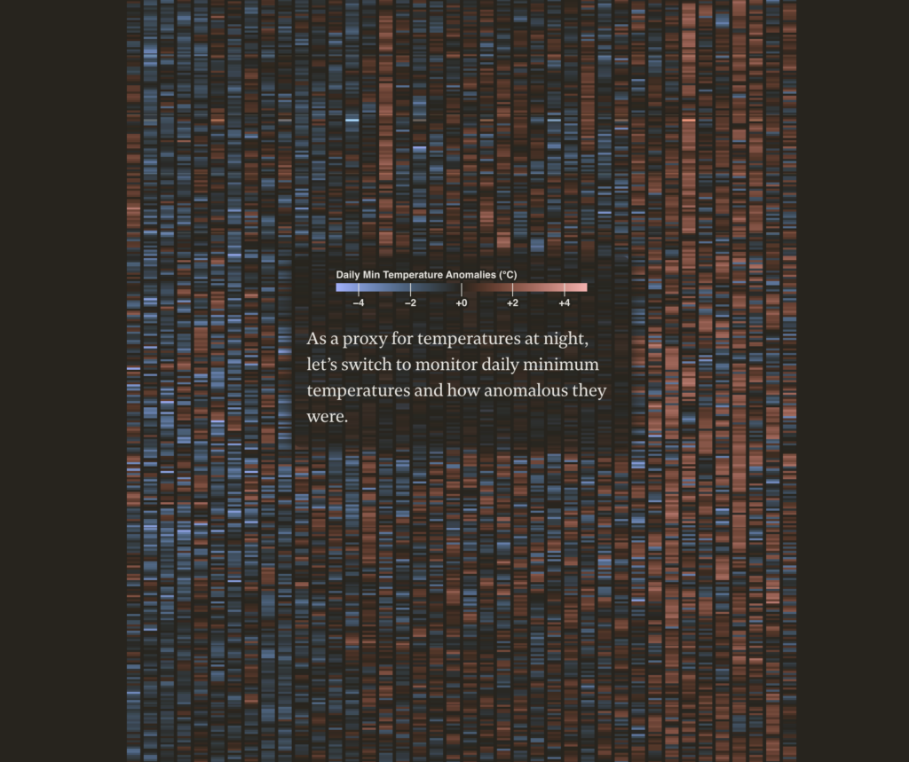
One visualization I liked from the past year was the Straits Times’ “Sleepless in Singapore.” I loved how immersive the story is, and how the light-on-dark color scheme and the clear narrative captures the situation it’s describing. Needless to say, the visualizations itself are also great, very reduced but impactful. Even though I’ve never been to Singapore, I could feel the heat!
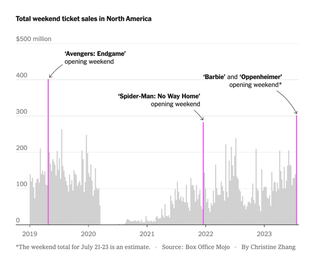
This next one is a simple chart, but one I kept looking at: The box office time series combined with selected highlights and annotations tell a clear story, without needing to use many words or elements.

Guillermina
Product specialist
I liked this vis on New York’s air quality the most. I feel that people usually associate data vis with a graph or map displaying numerical values — but they’re not necessary for a great visualization. Some, like this one, convey insight and information about the state of New York’s air through photos.


Rose
Communications
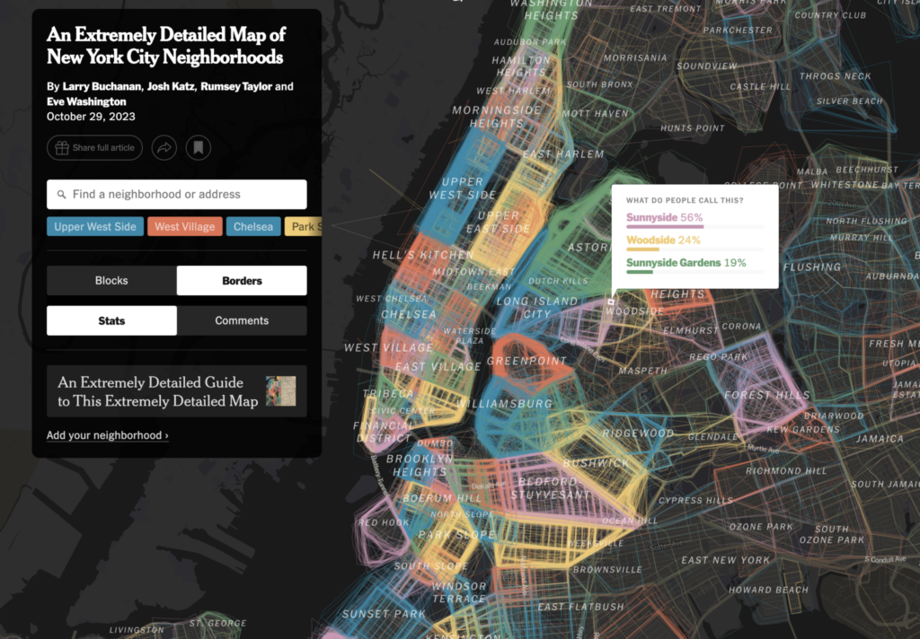
My favorite visualization of 2023 was this collaborative map of the neighborhoods of New York City, by Larry Buchanan, Josh Katz, Rumsey Taylor and Eve Washington for the New York Times. It goes right for of one of the biggest challenges of mapmaking in general: Almost nothing, especially nothing involving people, actually sticks to hard borders or mutually exclusive territories. This project embraces the fact that what it’s mapping is nothing more than a social consensus — something New Yorkers aren’t exactly known for — and the overlaps, disagreements, and blind spots are a huge part of what makes the final product so delightful. I also loved the integration of contributors’ commentary, and the colors and design are just beautiful.
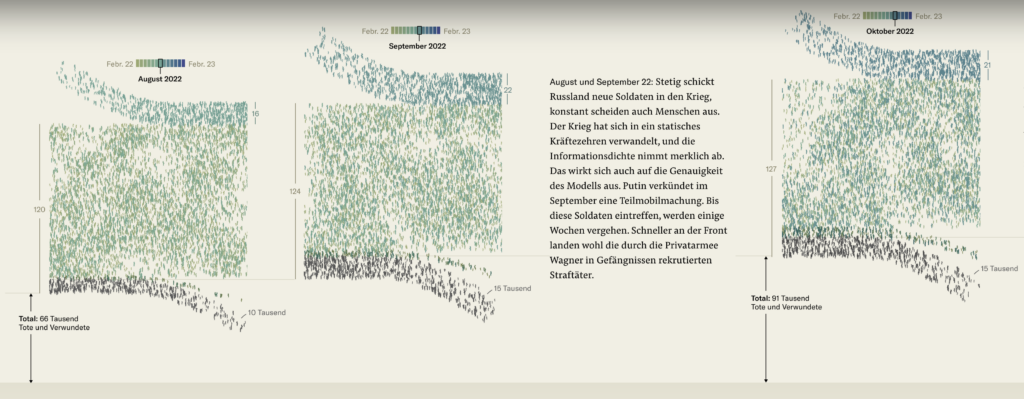
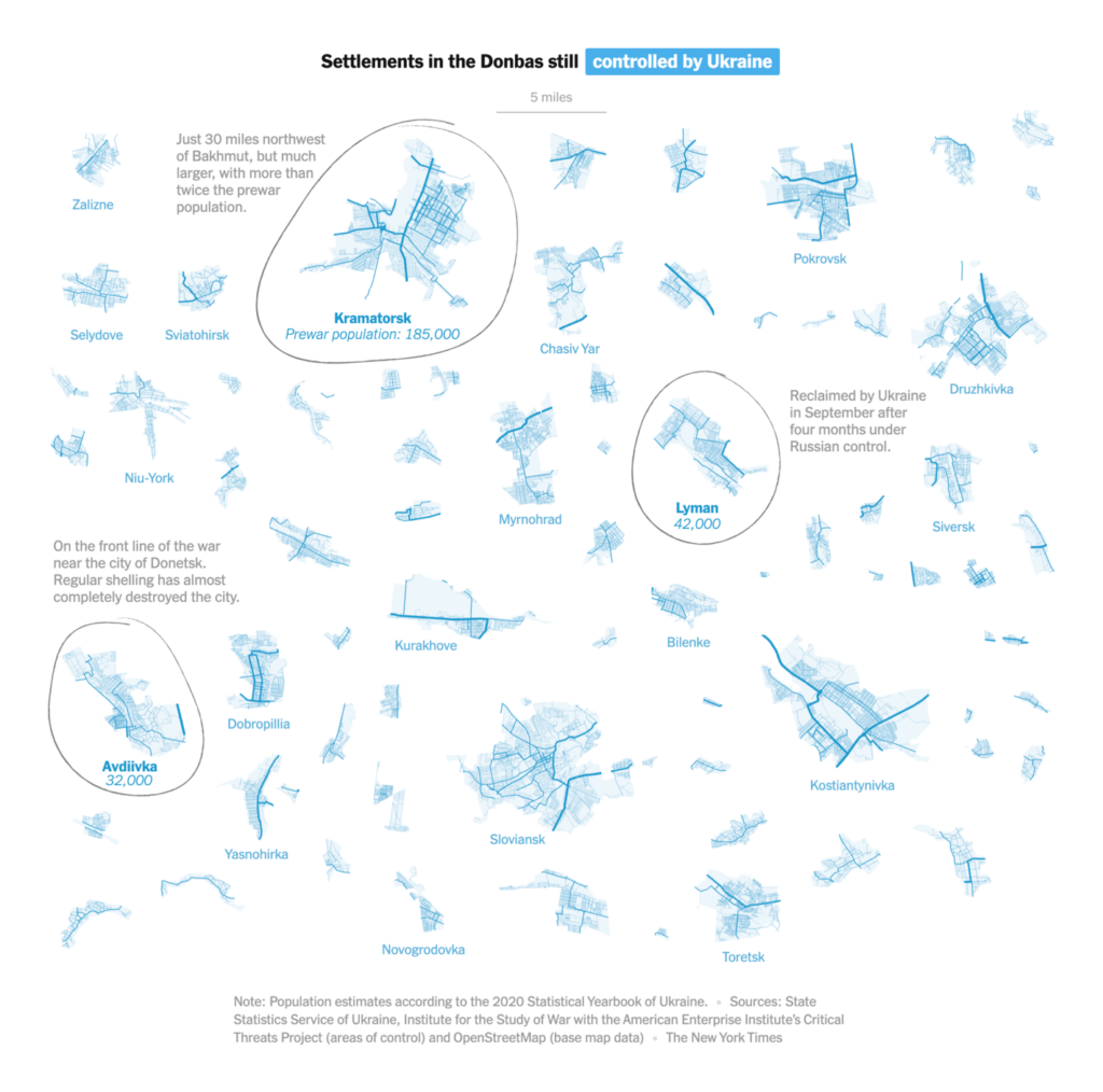
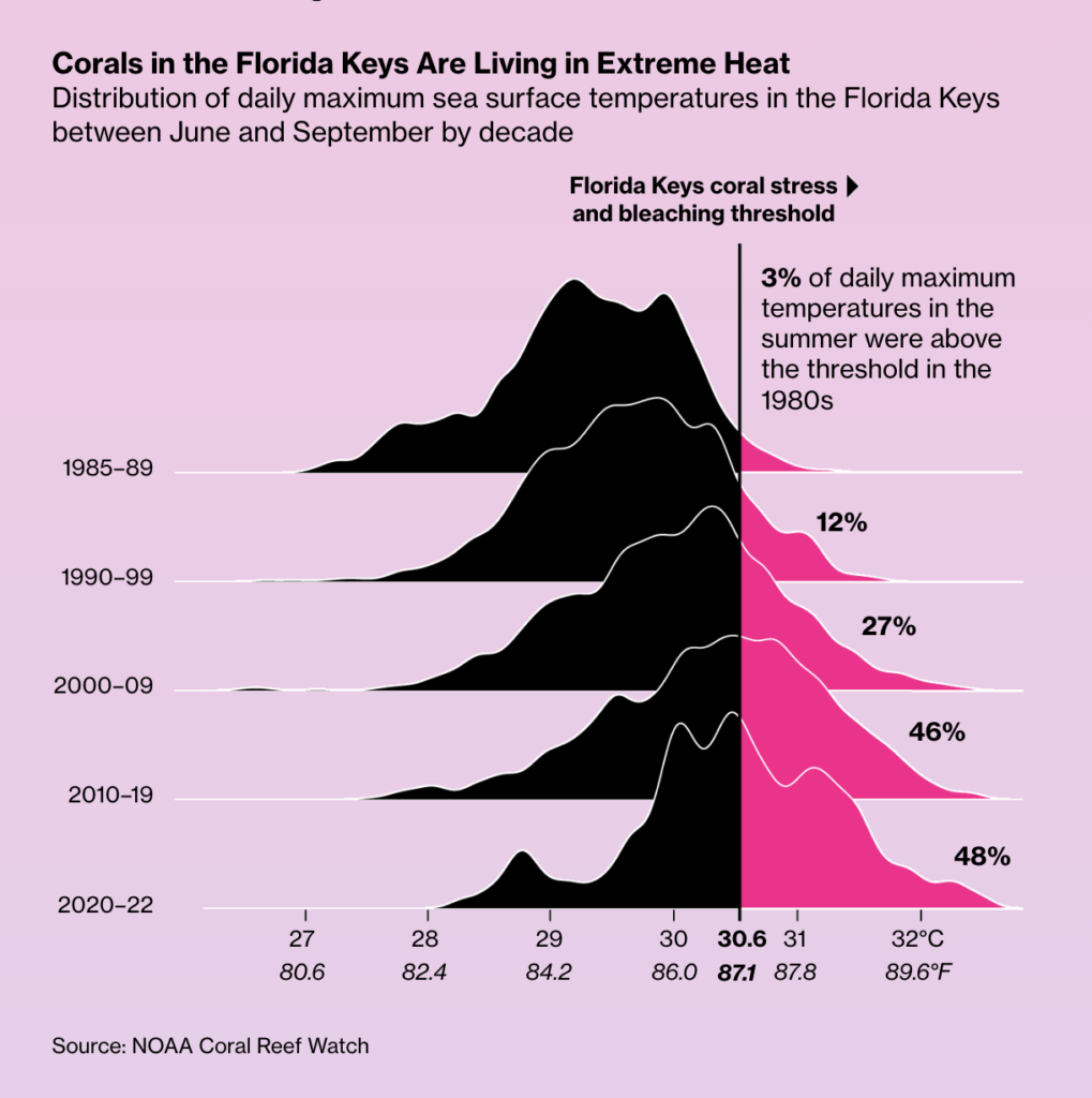
There are so many visualizations I could have written about, so I want to include honorable mentions for a few more from this year: beautiful static charts from the Washington Post and the Economist; projects on war casualties from the Neue Zürcher Zeitung and Der Spiegel; maps from Zeit Online and the New York Times; and numerical explanations from the Washington Post and Bloomberg.

Ivan
Visualization developer
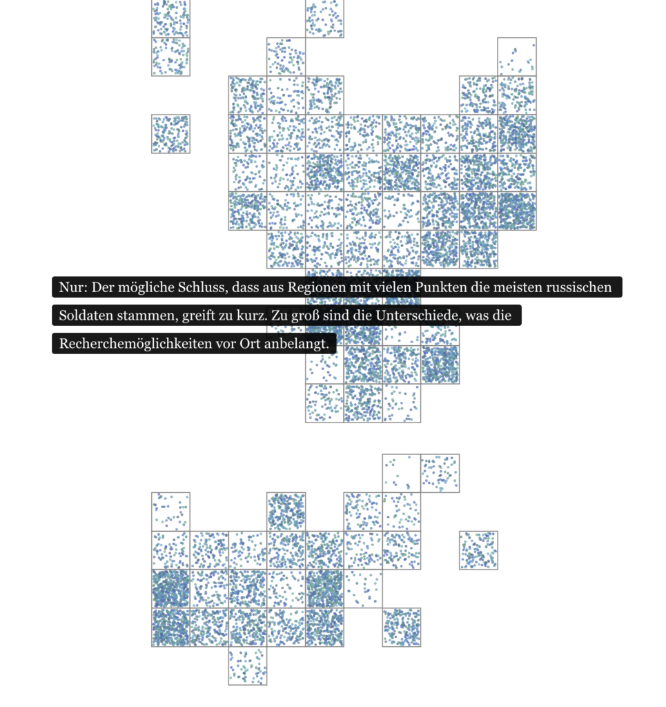
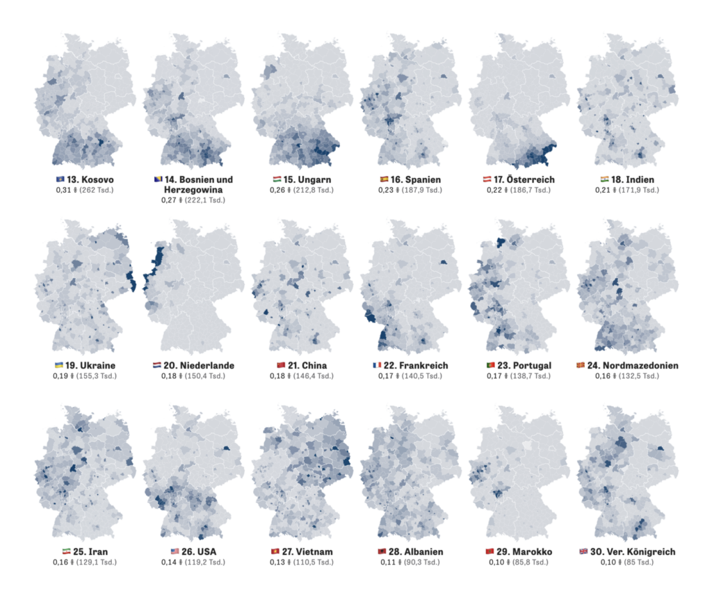
I really enjoyed this Zeit Online article about immigration to Germany. Immigration is such a loaded topic these days and there’s a lot of negativity and sensationalism being thrown about; I liked how this article sticks to a neutral framing and just states the facts about what patterns of immigration Germany has experienced over the years. It clearly shows that there’s been a lot of immigration in previous decades, so it’s not a new phenomenon and we should all be less alarmist about it. I also found it fascinating to see how different immigrant communities have formed in different regions and think about the historical reasons why, like how more people with Vietnamese roots live in the former East Germany due to alliances between Vietnam, the Soviet Union, and the GDR. Finally, as an immigrant myself, it’s just interesting to see where other immigrants have come from.

Toni
App developer
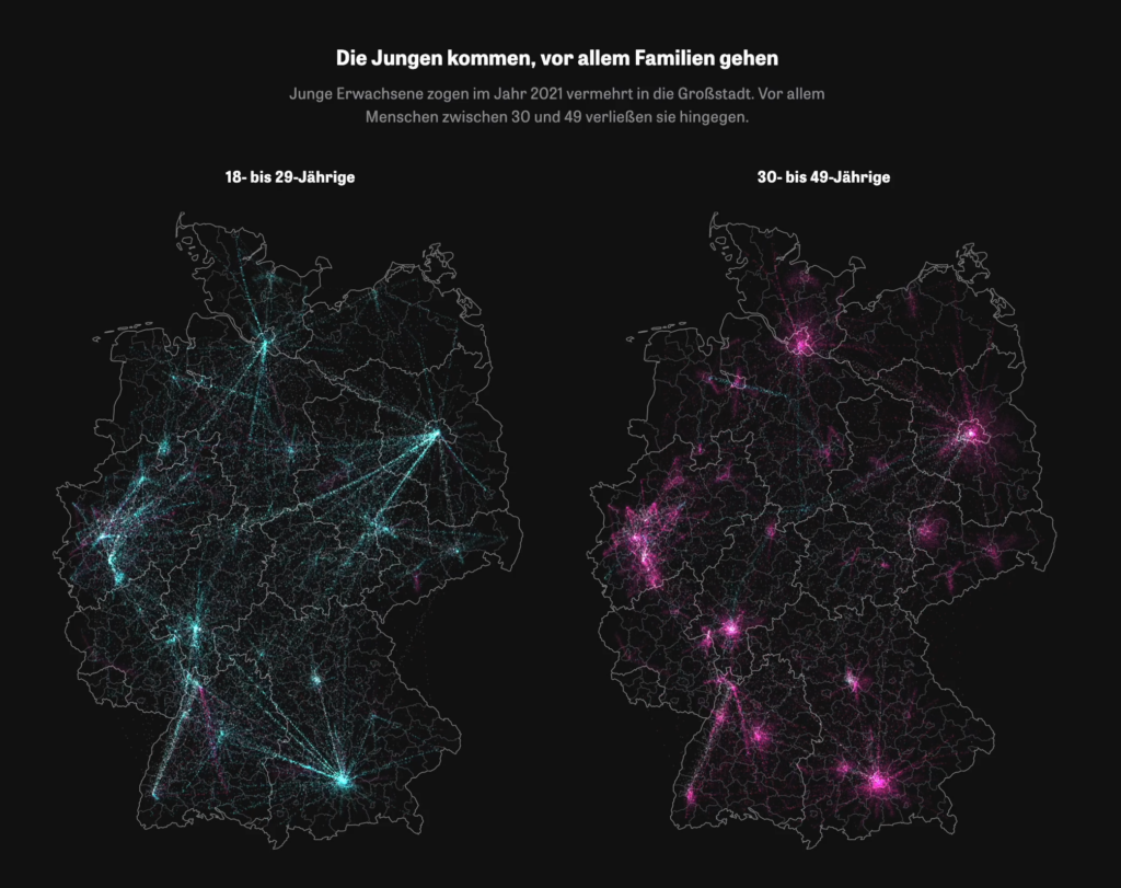
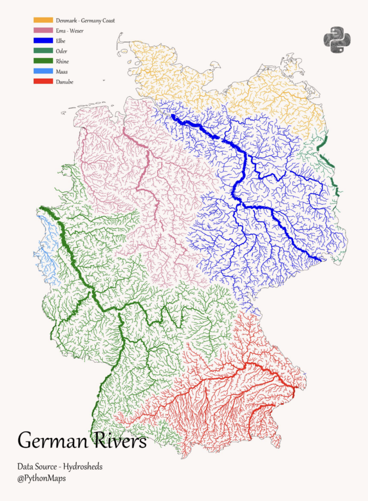
I went through my Twitter likes and found this river map. I liked it because it was new for me to see the country divided into different river regions like this. I come from the Lower Rhine region and never realized that the river stretches its “arms” so far east into the country.

Marten
Head of app development
I really enjoyed this Weekly Chart from Toni because it really summed up the “theme” of the past year in development for me, which was a lot about refactoring.

Mirko
Co-founder
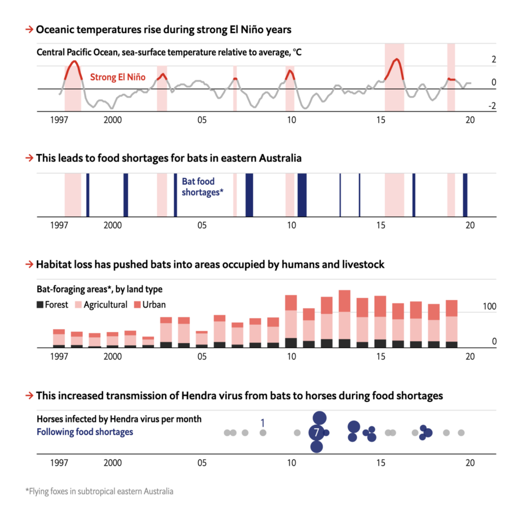
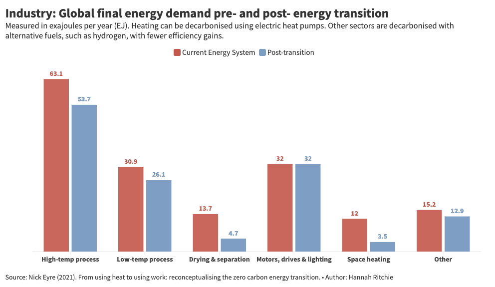
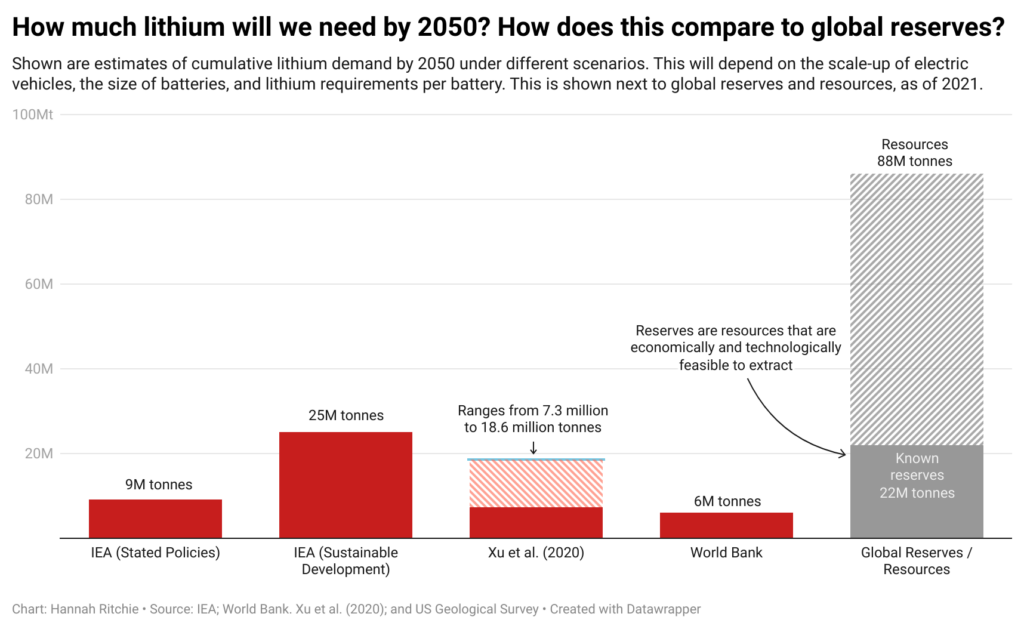
My contribution is the data newsletter "Sustainability By Numbers." This newsletter does the hard work of digging into sustainability data. Each issue goes a step further to add knowledge about progress and barriers to sustainability. "Sustainability by the numbers” is edited by Hannah Ritchie, and its output, depth, and critical engagement with relevant issues are simply incredible. I am grateful to have such an excellent source of information. Hannah is deputy editor and senior researcher at Our World in Data and a researcher at Oxford University.

Alex
Designer
Phew, that's a tough choice! So I'll throw two visualizations into the mix.
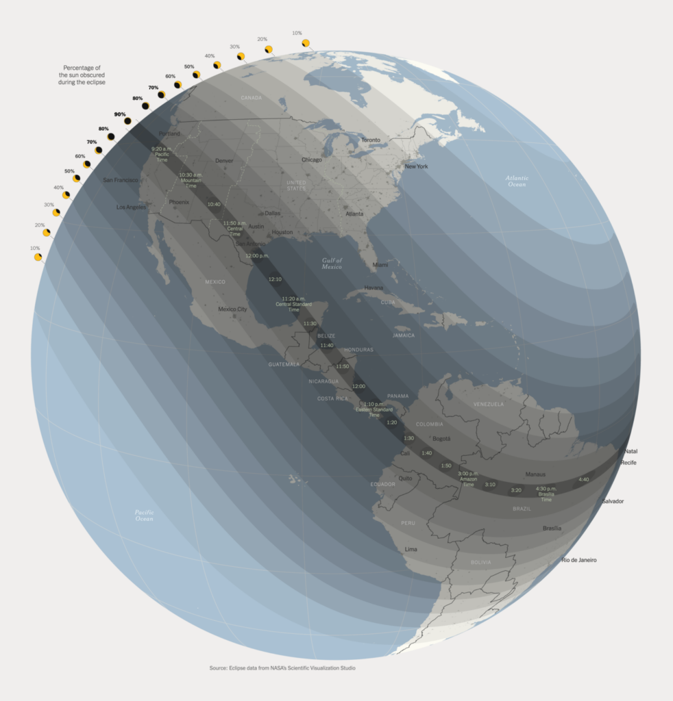
First, this one about October's solar eclipse is awesome! I find the phenomenon itself fascinating and beautiful, and the visualization itself is so well done and cool! Unfortunately, I've only seen a total solar eclipse with my own eyes once, as a child.
The second one is about Germany's railway network. I like the presentation and the interactive aspect: You can scroll through time and zoom in on your own region if you want. I travel a lot by train, so this topic is very personal to me.

Vivien
Communications
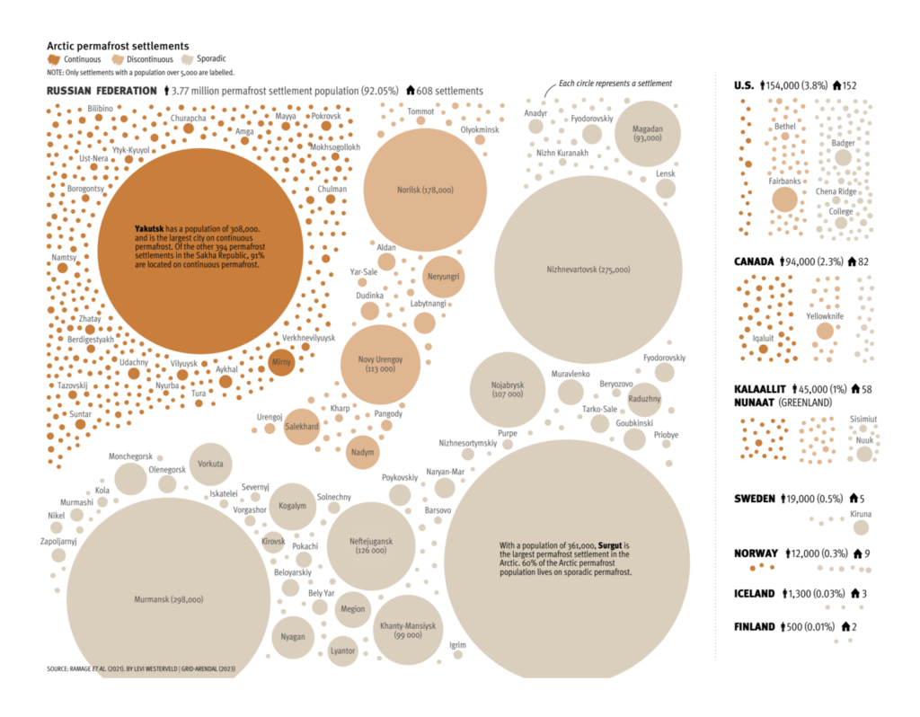
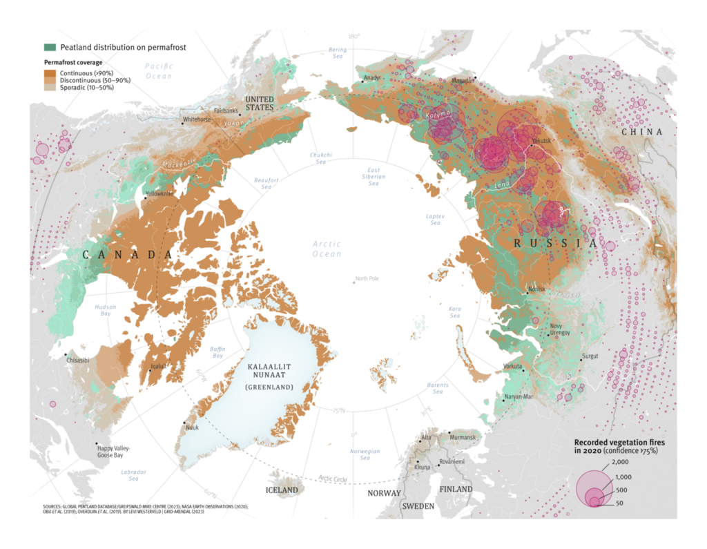
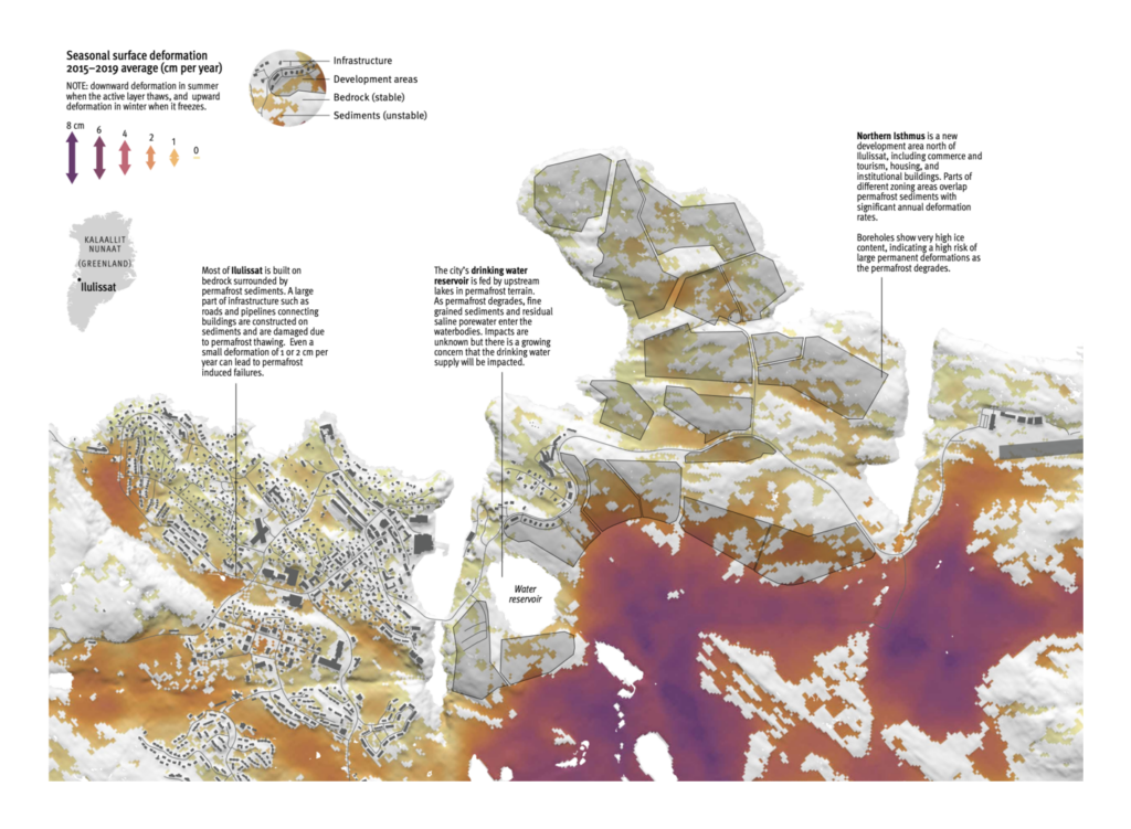
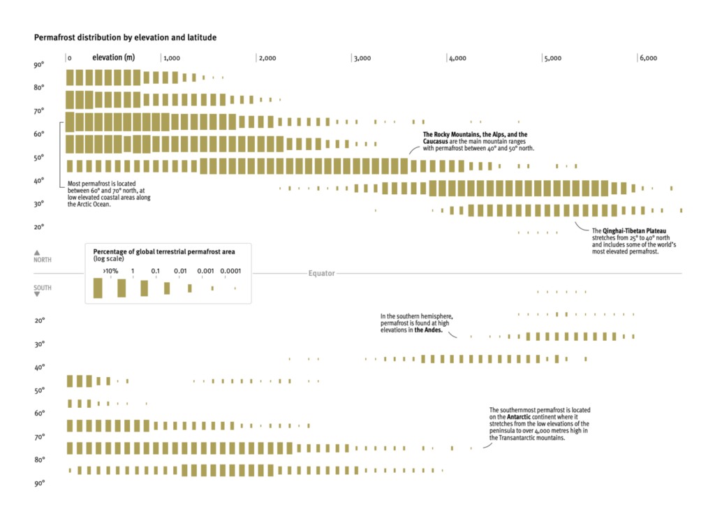
Since I started curating the Dispatch about three months ago, my favorite set of visualizations has been from the Arctic Permafrost Atlas. I remember spending hours looking through this incredible work and could hardly decide which section to pick for the Dispatch. Not only are they visually stunning, but the creative use of interesting data makes for a beautiful and understandable picture of what is happening in the Arctic permafrost region. We chose the visualization of permafrost distribution by rating and latitude because of its special visual encoding. But I will take this opportunity to show some of the atlas's other incredible charts and maps.
What else we found interesting
For anyone who wants to use the holidays to look for a new career. Applications are open for…
- Our favorite: a senior data visualization developer at Datawrapper ✨
- A data journalism designer and data journalism developer at Handelsblatt Media Group
Help us make this dispatch better! We'd love to hear which newsletters, blogs, or social media accounts we need to follow to learn about interesting projects, especially from less-covered parts of the world (Asia, South America, Africa). Write us at hello@datawrapper.de or leave a comment below.
Want the Dispatch in your inbox every Tuesday? Sign up for our Blog Update newsletter!


Comments