Data Vis Dispatch, January 14: Fire, congestion, and Greenland
January 14th, 2025
11 min
Datawrapper lets you show your data as beautiful charts, maps or tables with a few clicks. Find out more about all the available visualization types.
Our mission is to help everyone communicate with data - from newsrooms to global enterprises, non-profits or public service.
We want to enable everyone to create beautiful charts, maps, and tables. New to data visualization? Or do you have specific questions about us? You'll find all the answers here.
Data vis best practices, news, and examples
250+ articles that explain how to use Datawrapper
Answers to common questions
An exchange place for Datawrapper visualizations
Attend and watch how to use Datawrapper best
Learn about available positions on our team
Our latest small and big improvements
Build your integration with Datawrapper's API
Get in touch with us – we're happy to help
This article is brought to you by Datawrapper, a data visualization tool for creating charts, maps, and tables. Learn more.
The best of last week’s big and small data visualizations
Welcome back to the 73rd edition of Data Vis Dispatch! Every week, we’ll be publishing a collection of the best small and large data visualizations we find, especially from news organizations — to celebrate data journalism, data visualization, simple charts, elaborate maps, and their creators.
Recurring topics this week include the FIFA World Cup Final, the war in Ukraine, and a snowy Christmas.
The FIFA World Cup in Qatar ended with Argentina’s win in the final match against France on Sunday. The last week of the tournament brought plenty of football-filled data vis, with a spotlight on the winning team’s captain Lionel Messi.
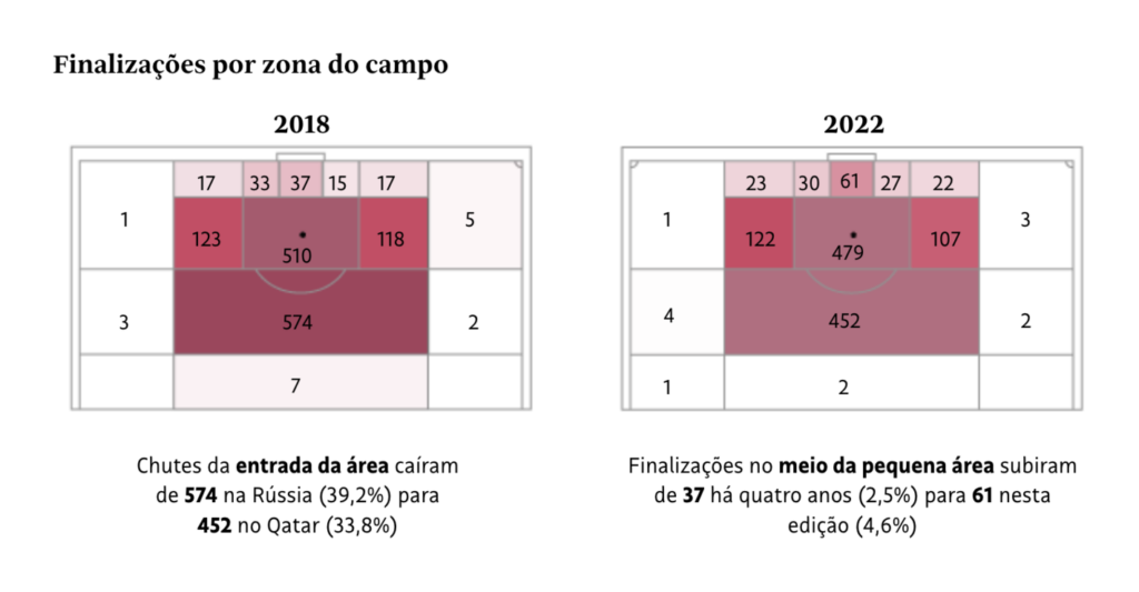
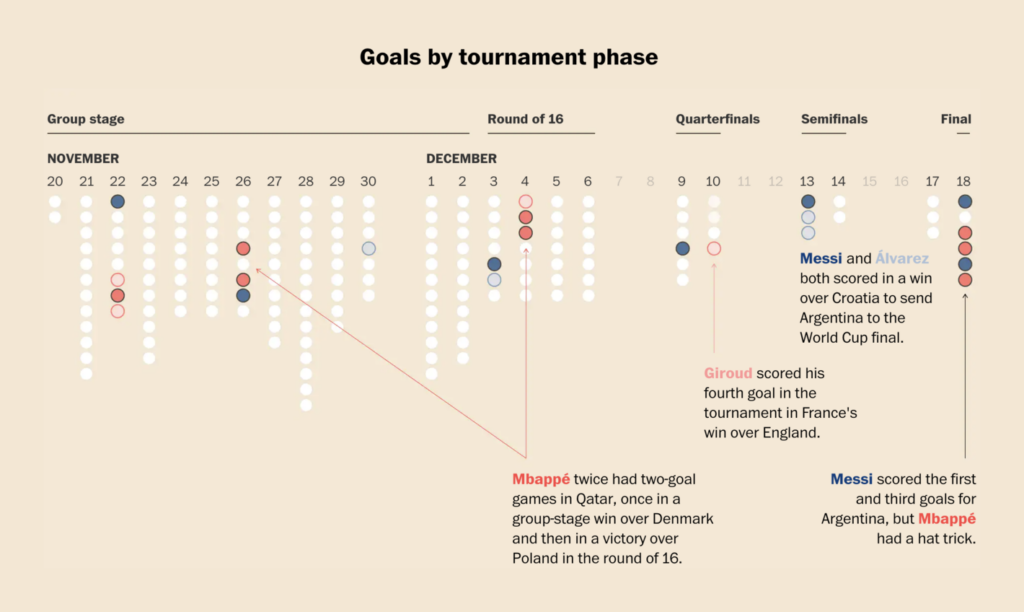
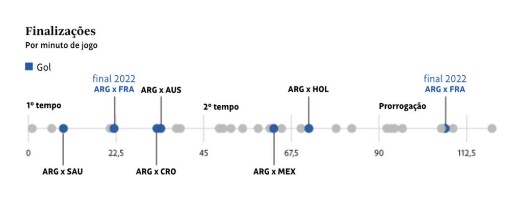
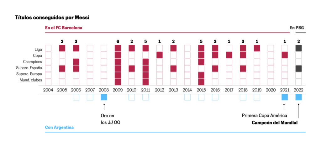
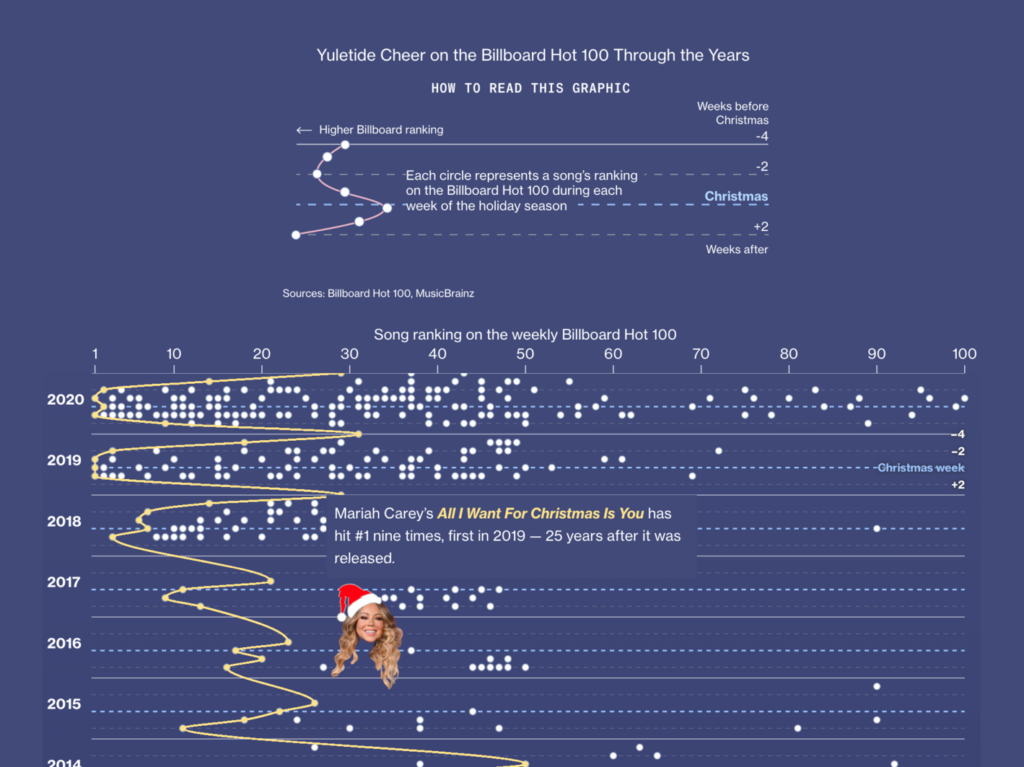
With Christmas time around the corner, many newsrooms have looked at the likelihood of snow during the holiday season. Bloomberg went in a different direction and explored the popularity of Christmas-themed songs.
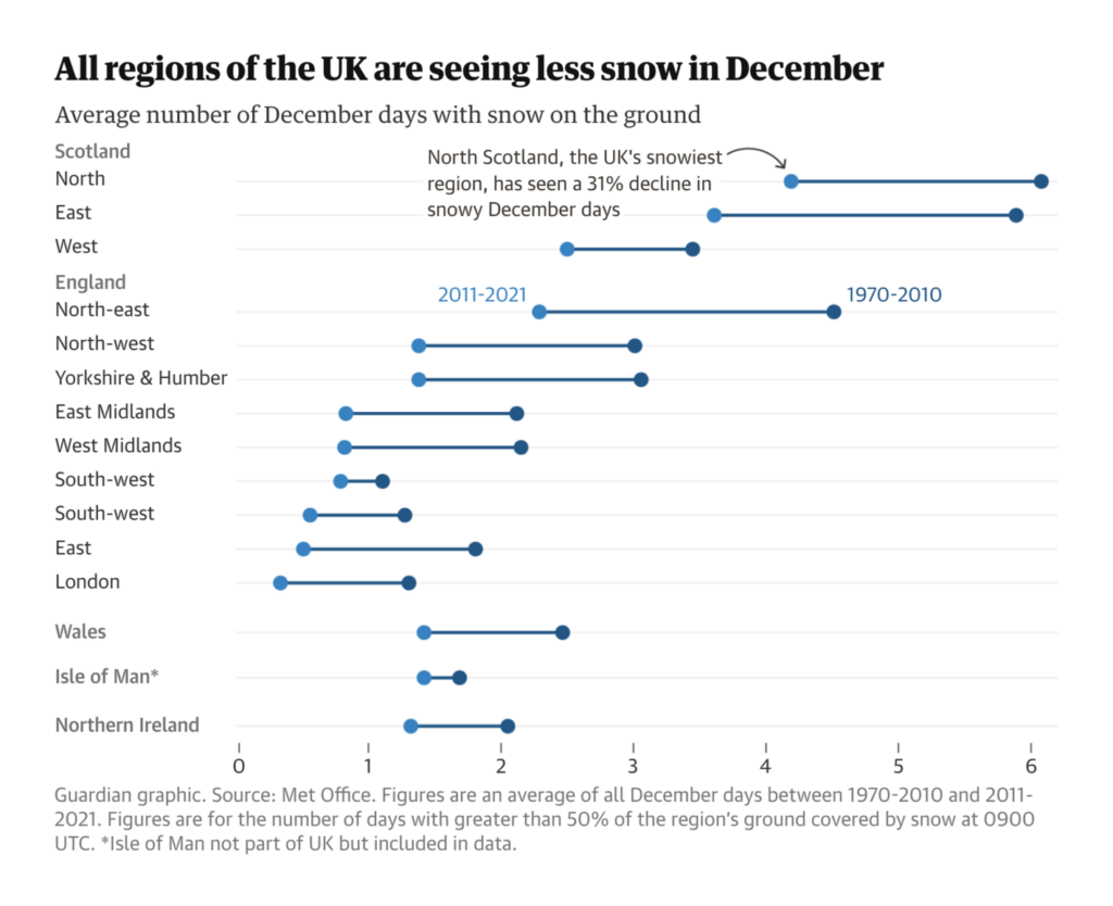
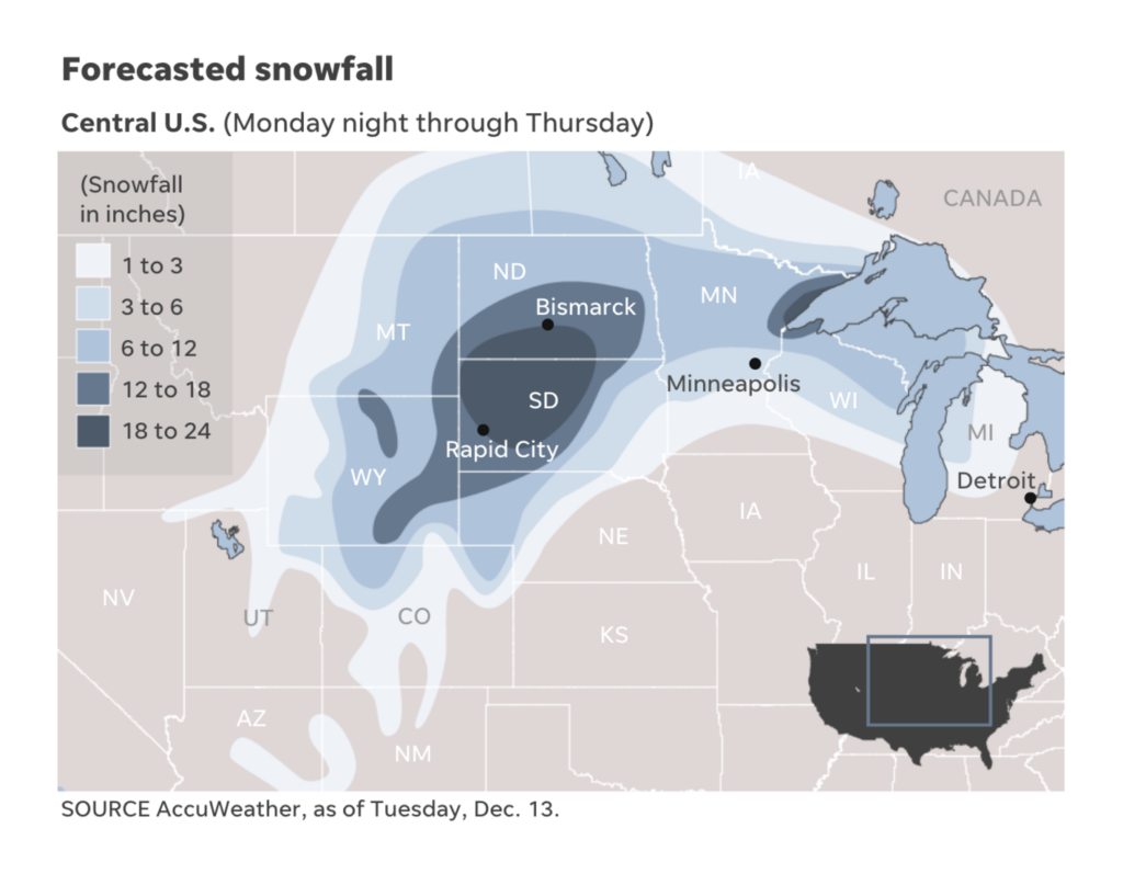
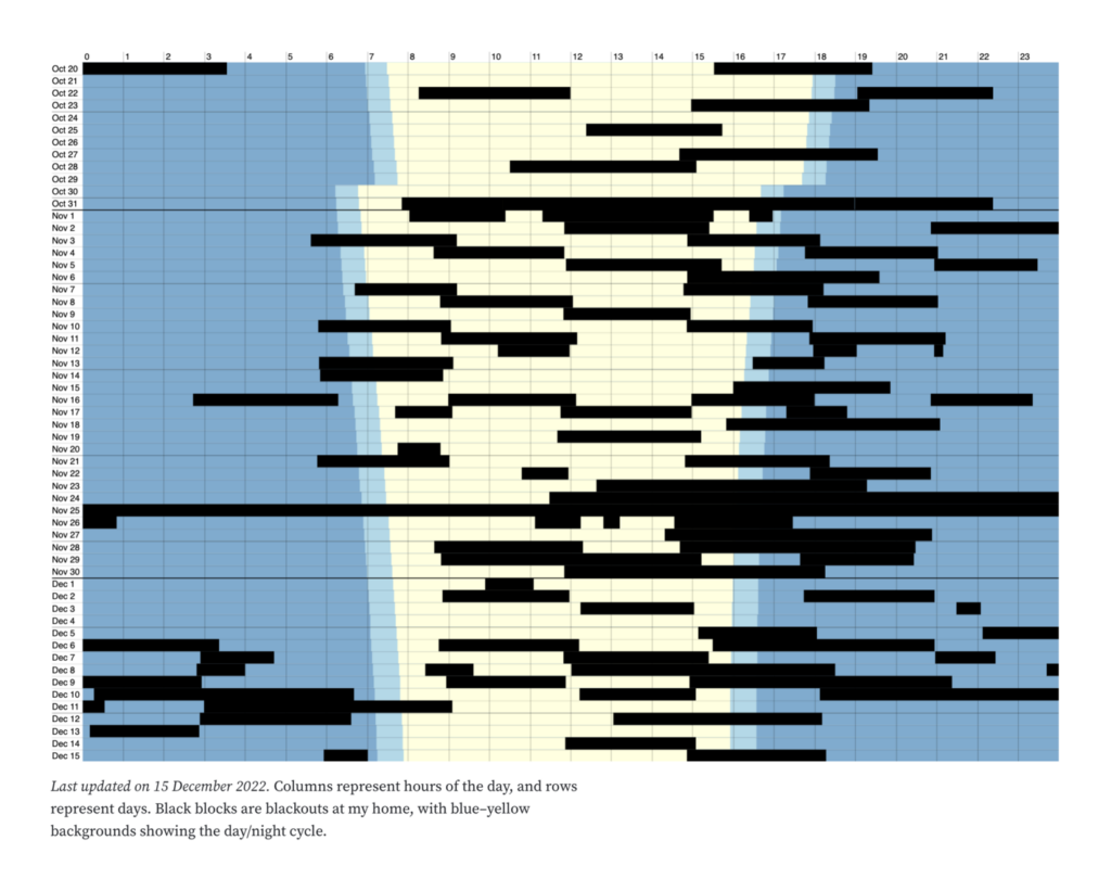
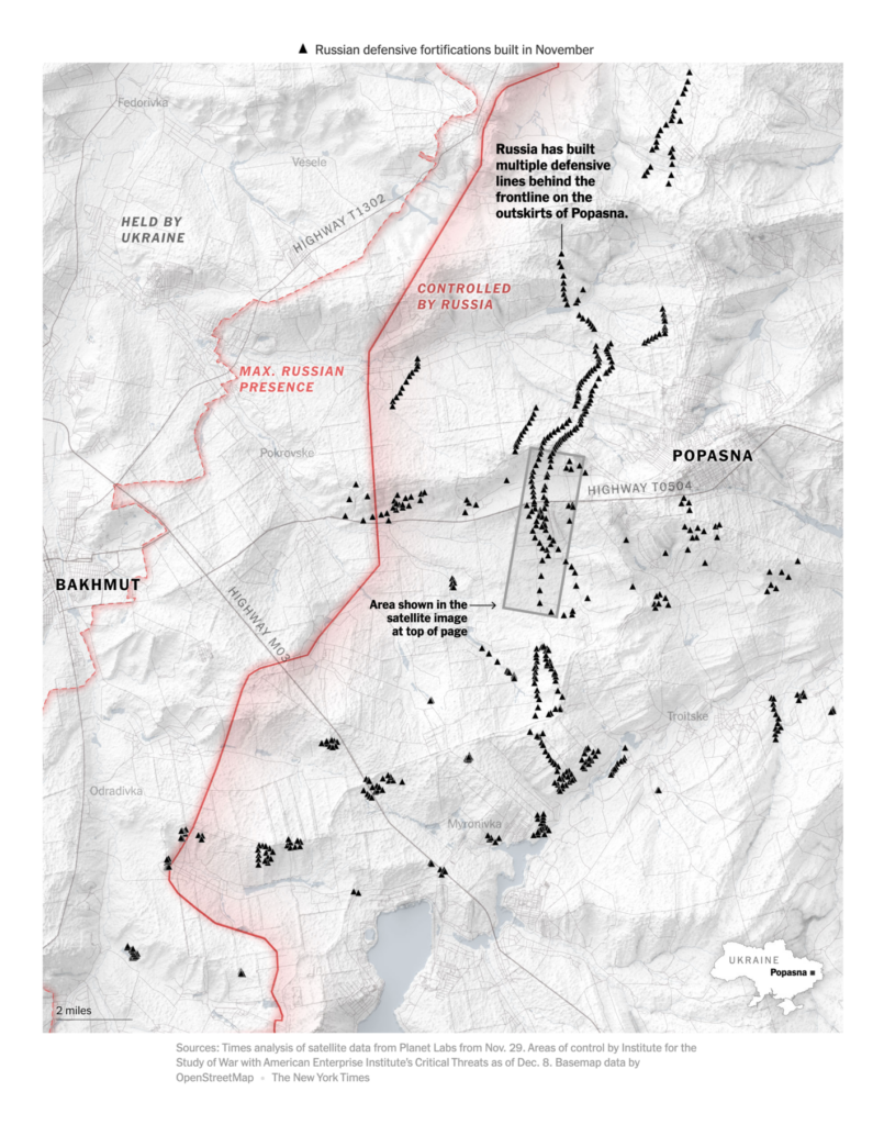
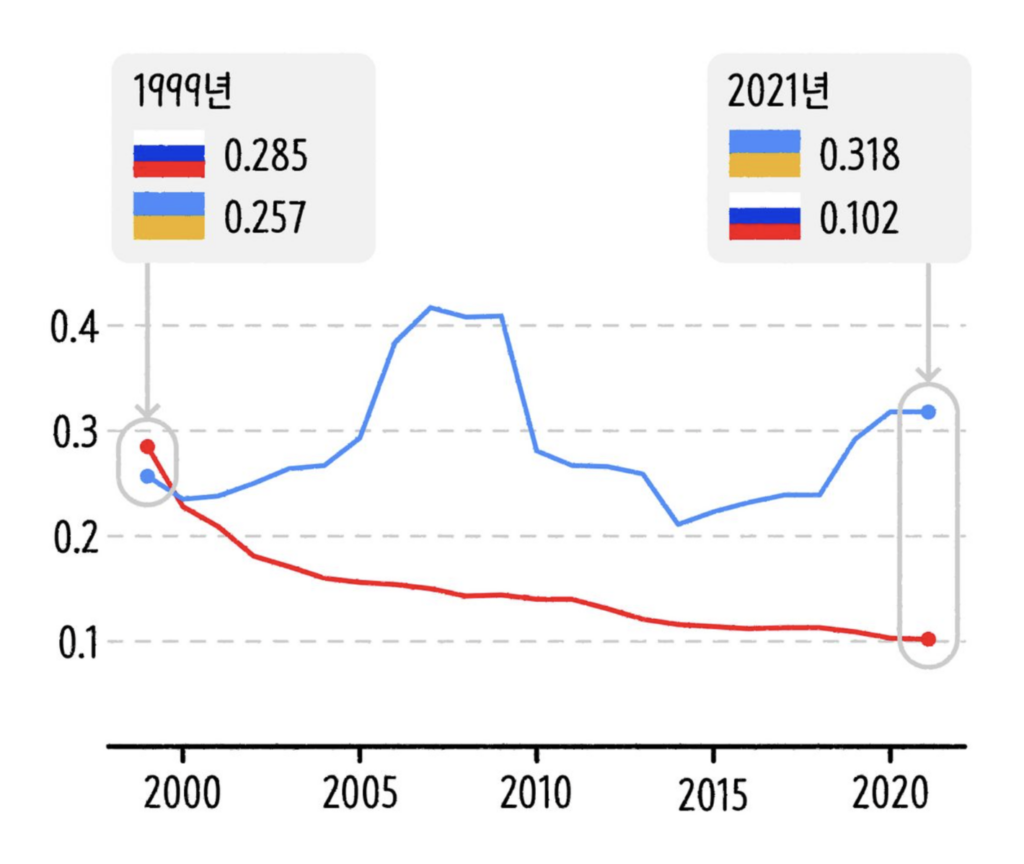
In Ukraine, the war continues despite the cold. As the Russian army builds trenches, Kyiv faces frequent blackouts. Other related charts cover economic impacts and changing trends in political freedom.


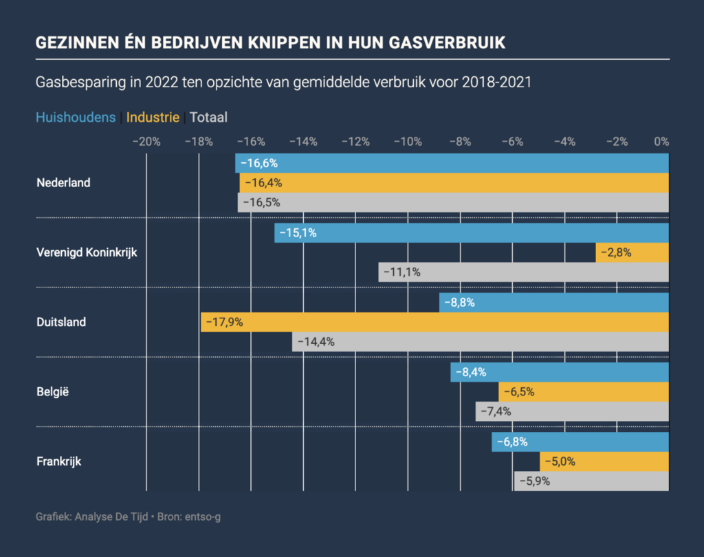
Europe is learning to limit its gas consumption.
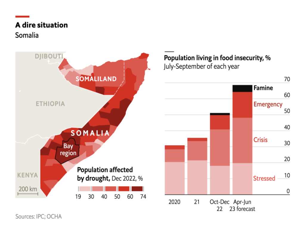
The war in Ukraine is causing trouble outside of Europe too. It’s one of the main contributing factors to the escalating food crisis in Africa.

Above-average temperatures cause concern in France, while Germany explores the link between flu outbreaks and air quality.
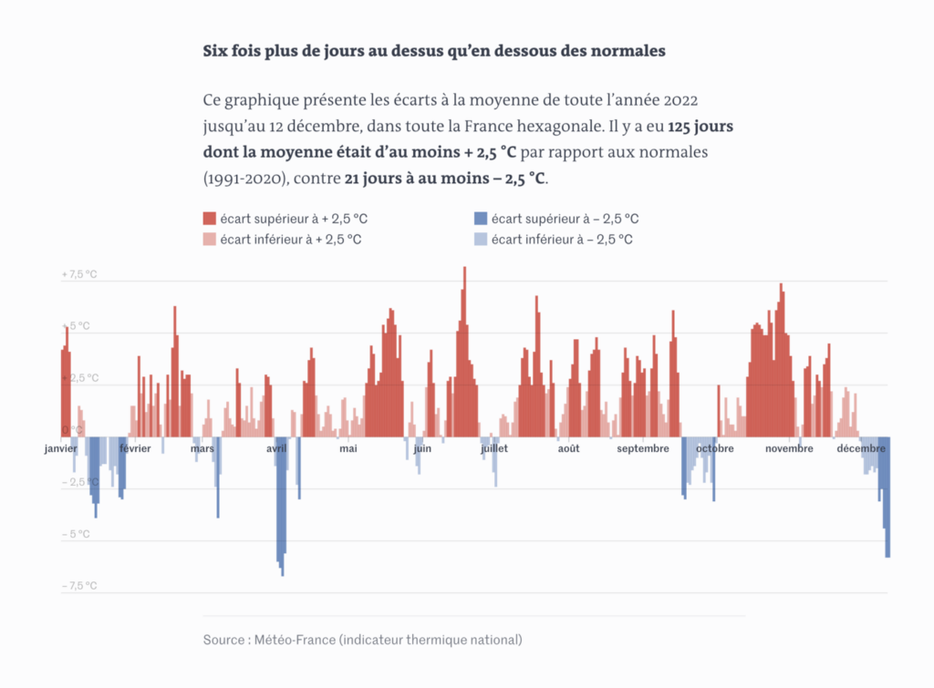
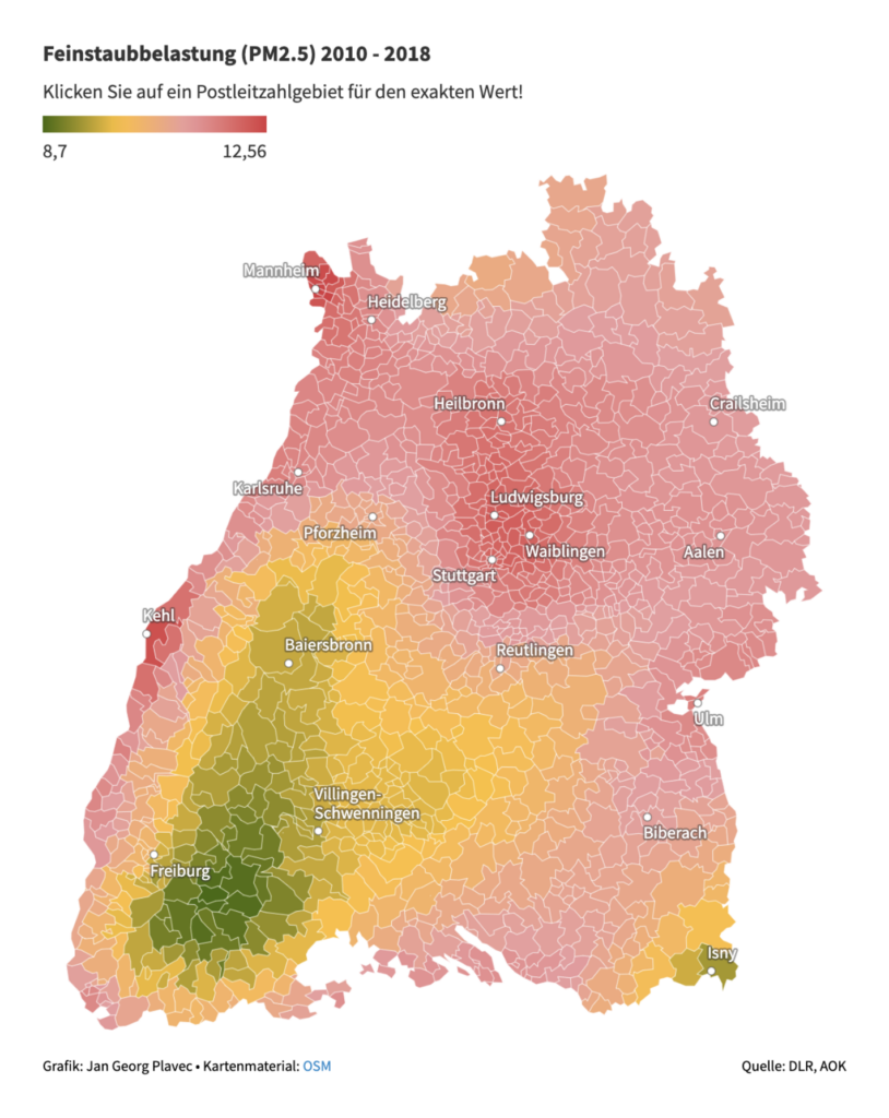
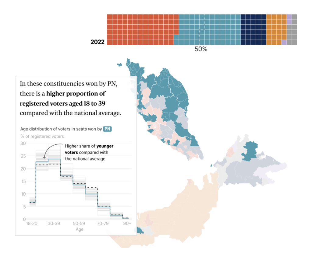
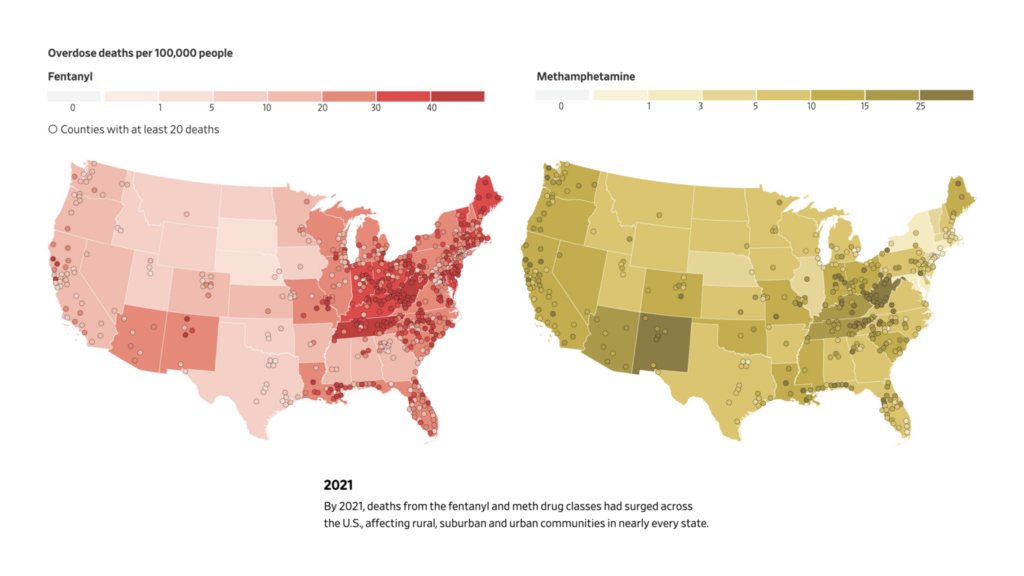
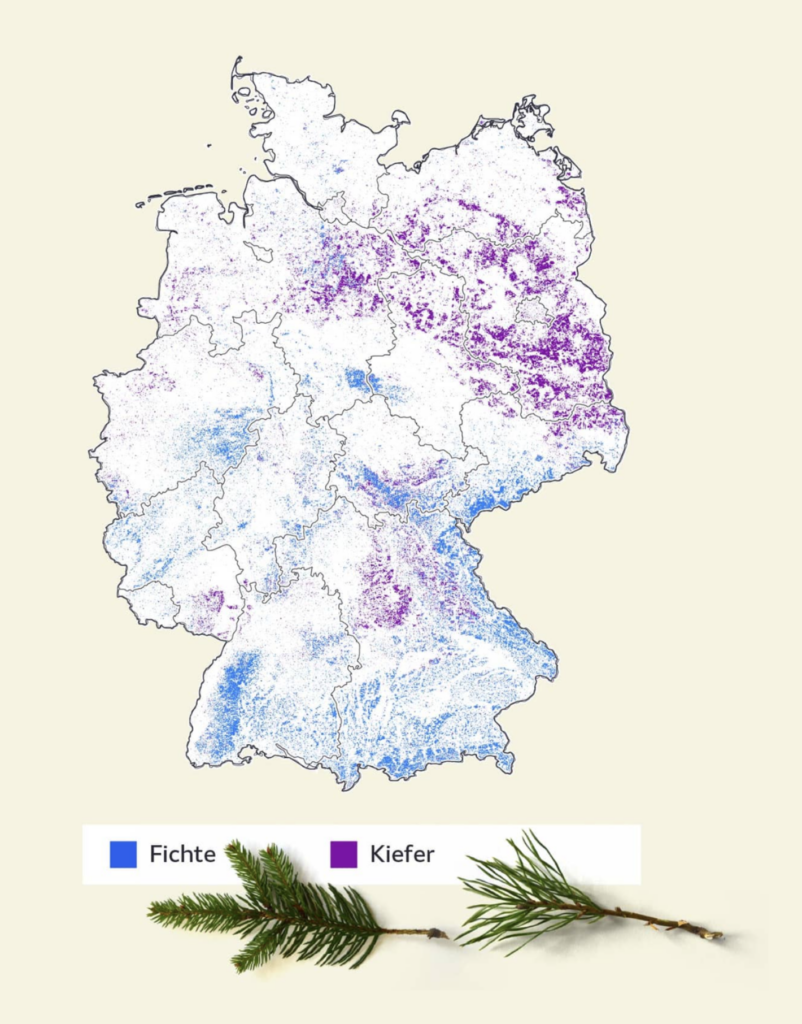
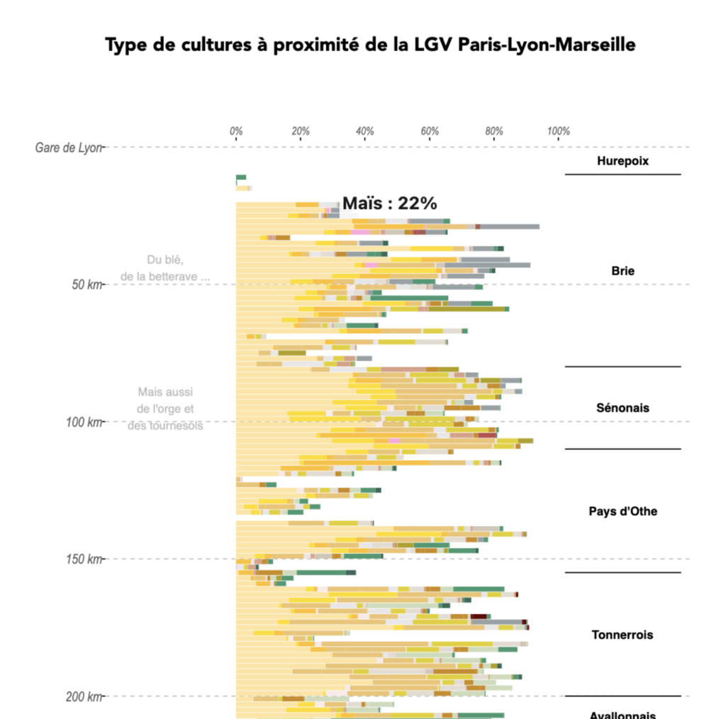
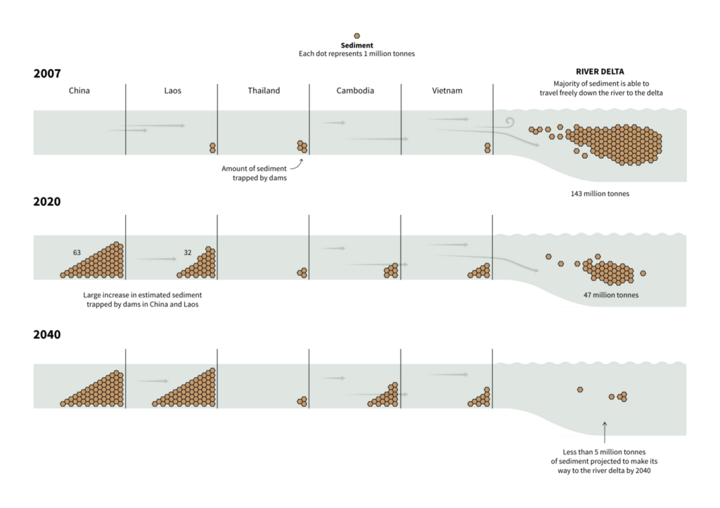
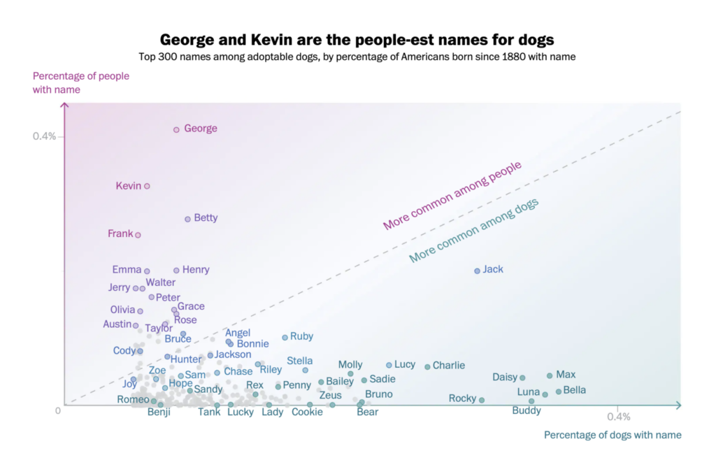
Other notable data vis of the week covered divisions in the Malaysian government, the rise of synthetic opioids in the U.S., the imbalance of German forests, crops grown along French railways, the effects of dams on the Mekong river, and finally, the most popular human names for dogs.

Help us make this dispatch better! We’d love to hear which newsletters, blogs, or social media accounts we need to follow to learn about interesting projects, especially from less-covered parts of the world (Asia, South America, Africa). Write us at hello@datawrapper.de or leave a comment below.
Want the Dispatch in your inbox every Tuesday? Sign up for our Blog Update newsletter!
Comments