Data Vis Dispatch, January 14: Fire, congestion, and Greenland
January 14th, 2025
11 min
This article is brought to you by Datawrapper, a data visualization tool for creating charts, maps, and tables. Learn more.
The best of last week’s big and small data visualizations
Welcome back to the 74th edition of Data Vis Dispatch! Every week, we’ll be publishing a collection of the best small and large data visualizations we find, especially from news organizations — to celebrate data journalism, data visualization, simple charts, elaborate maps, and their creators.
Recurring topics this week include snowfall, a cold snap, and 2022 in review.
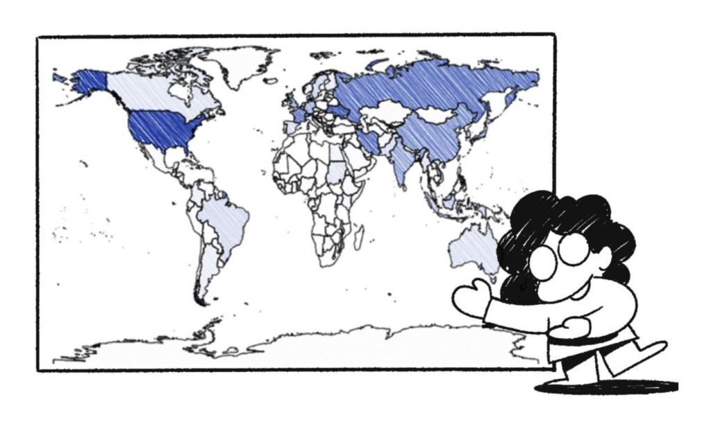
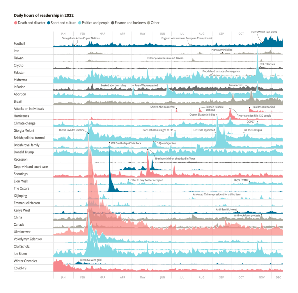
This is the last Dispatch of 2022! Several newsrooms looked back on their work from the past year:


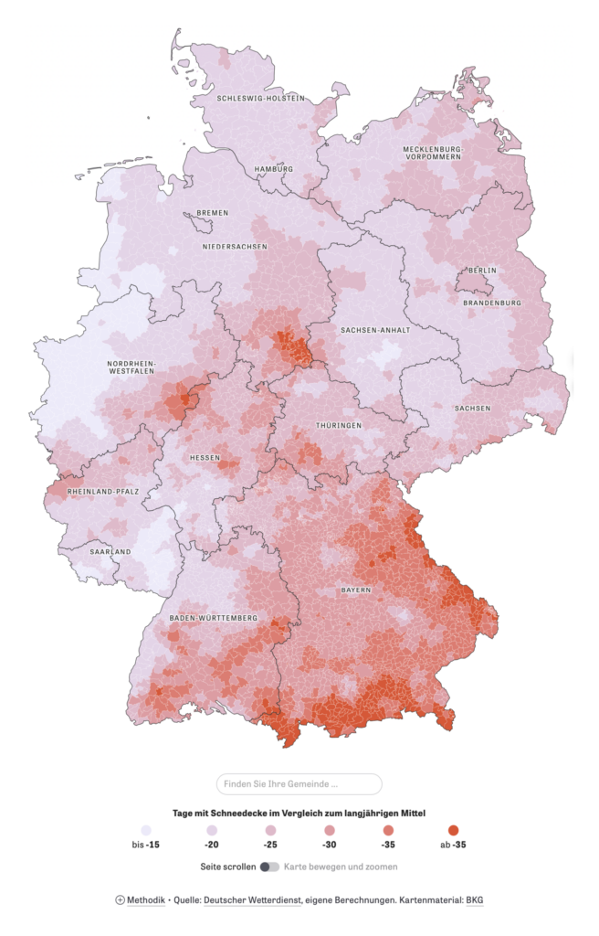
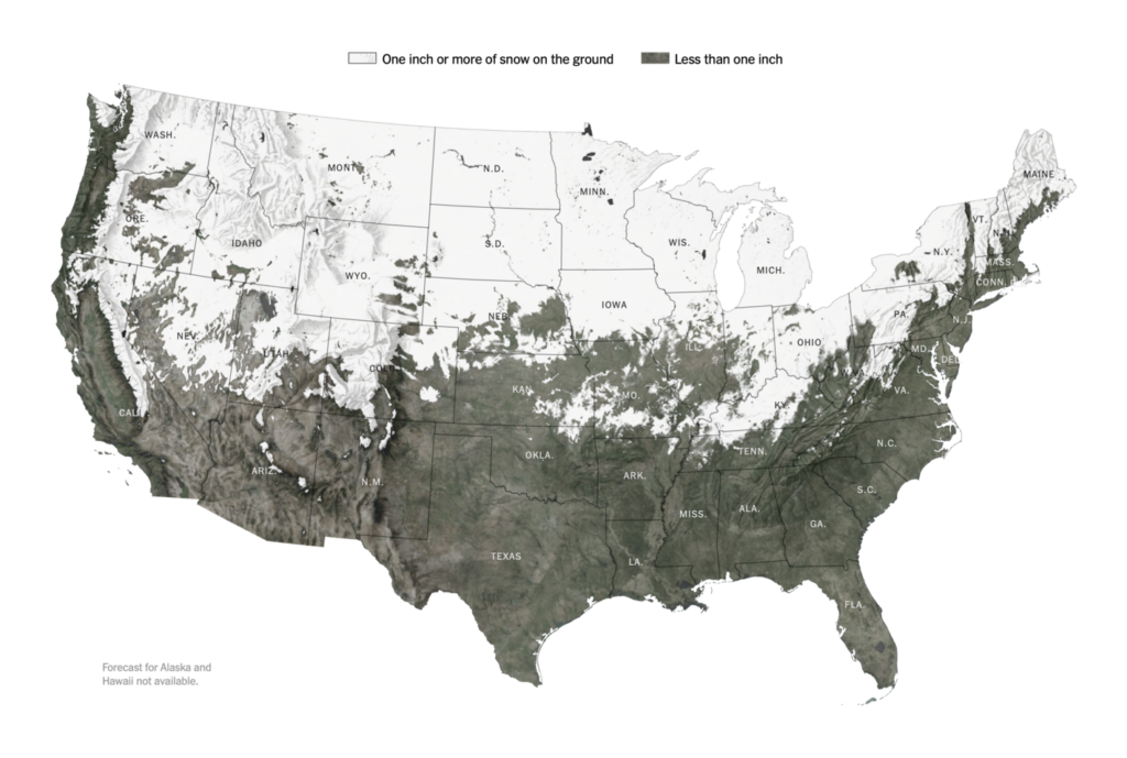
Another year-end preoccupation: snow, especially snow on Christmas.
Of course, winter isn’t just about snow — it’s also cold and dark:


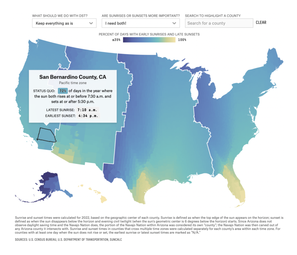
Plus, The New York Times looked back on the 10th anniversary of their “Snow Fall” visual story:
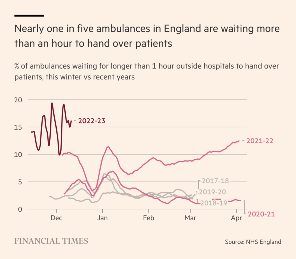
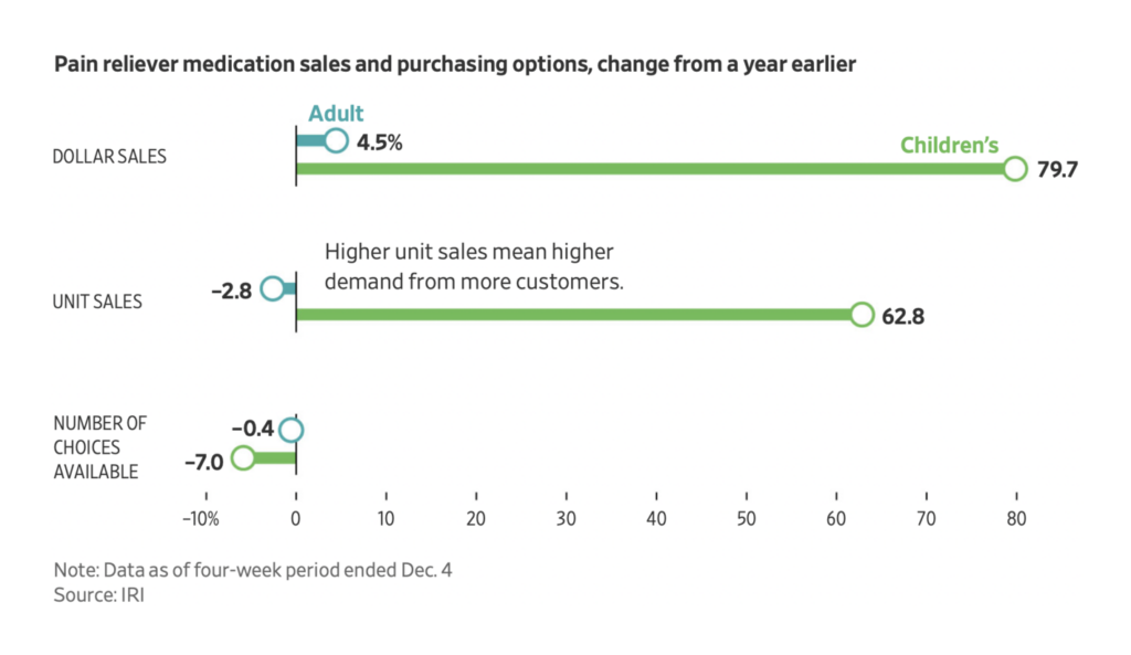
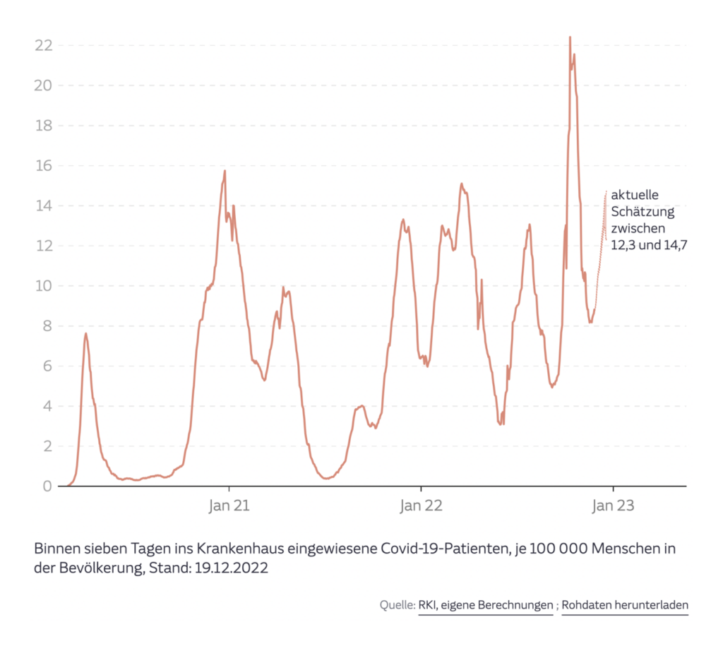
Meanwhile, the winter season is bringing several country’s healthcare systems to a breaking point:
Several charts looked at inequality and low wages:
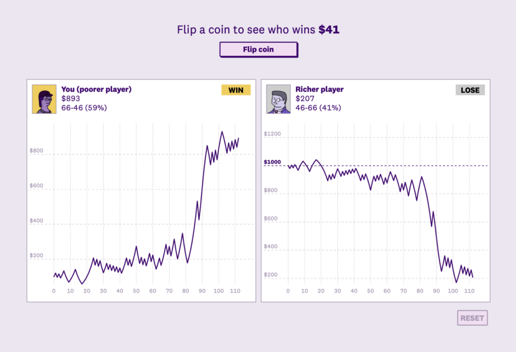
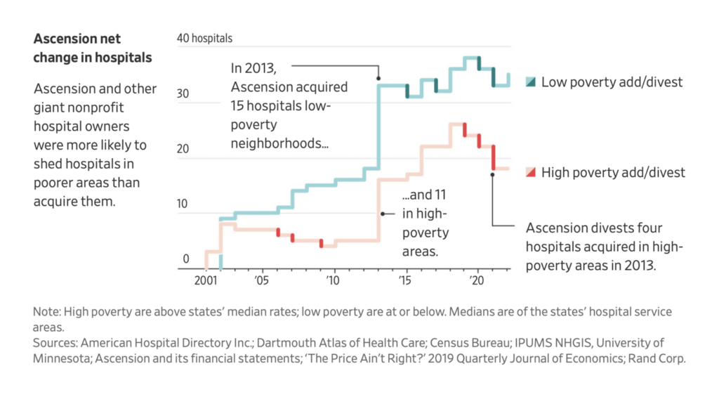
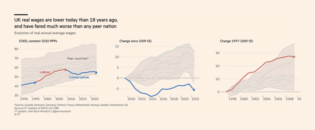
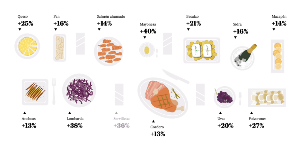
Two illustrations focused specifically on rising food prices:

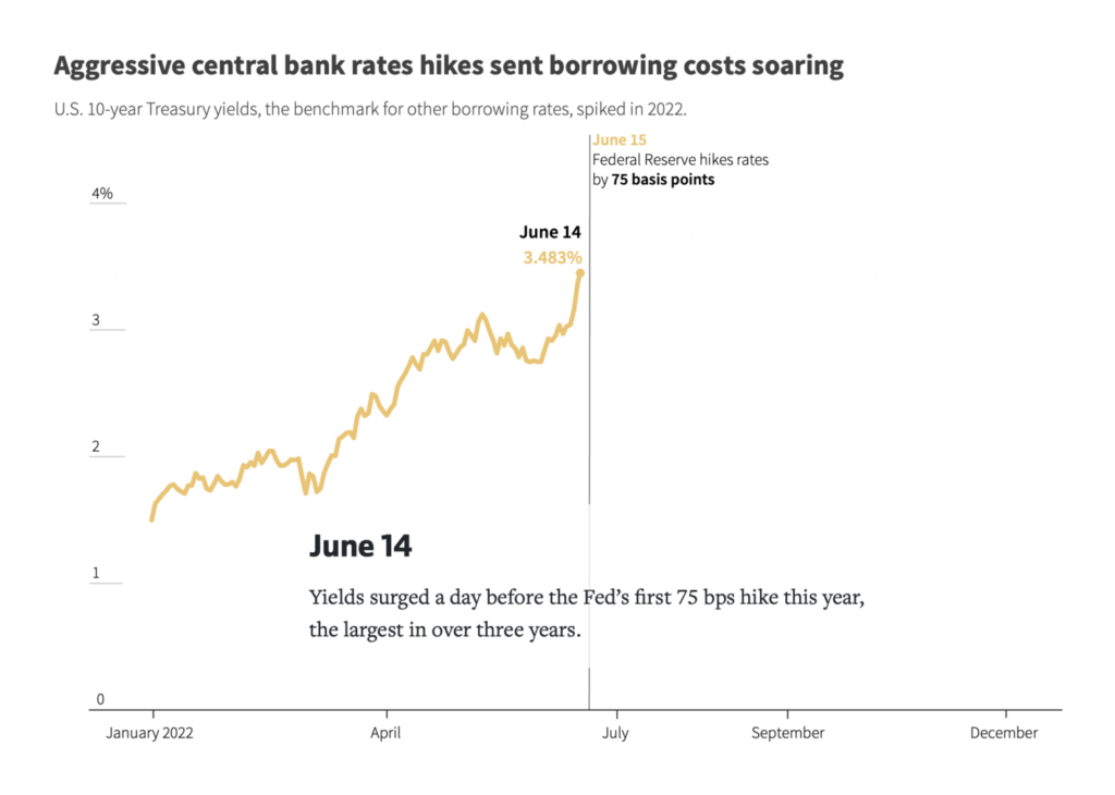
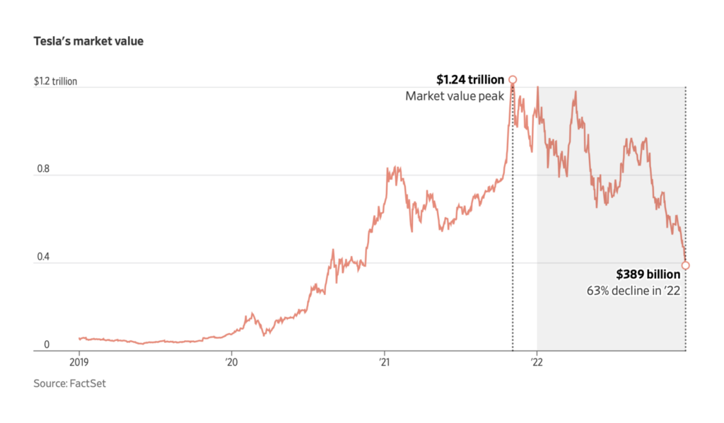
Other end-of-year economic stories included high interest rates and the collapse of cryptocurrencies:

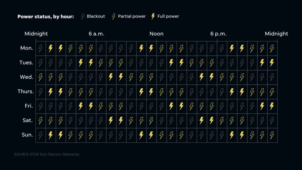
Millions of Ukrainians are without heat or power after Russian attacks on their infrastructure:
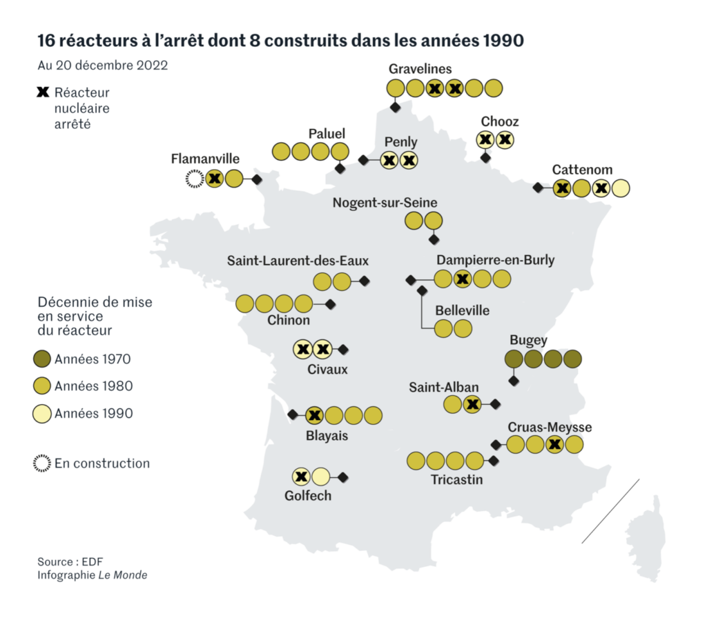
Meanwhile, western Europe continues to close nuclear power plants and Russia looks for new trade routes around sanctions:

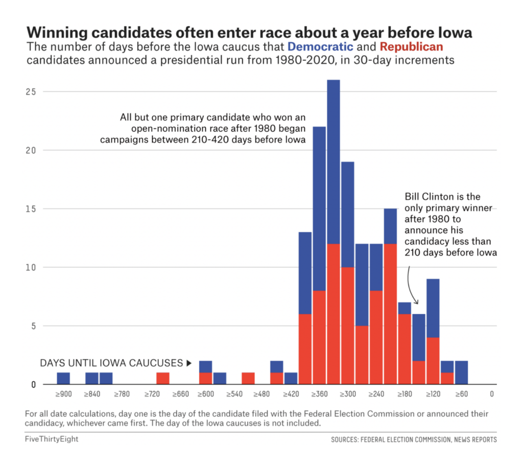
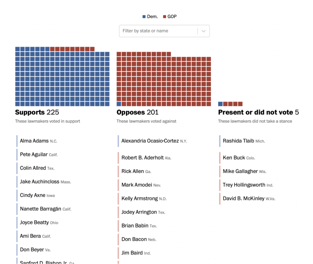
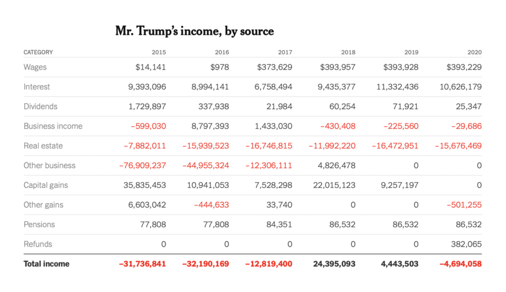
With midterms barely behind us, U.S. political charts are already starting to look ahead to the 2024 presidential race:

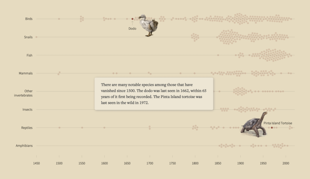
This week served up several angles on plant and animal diversity:
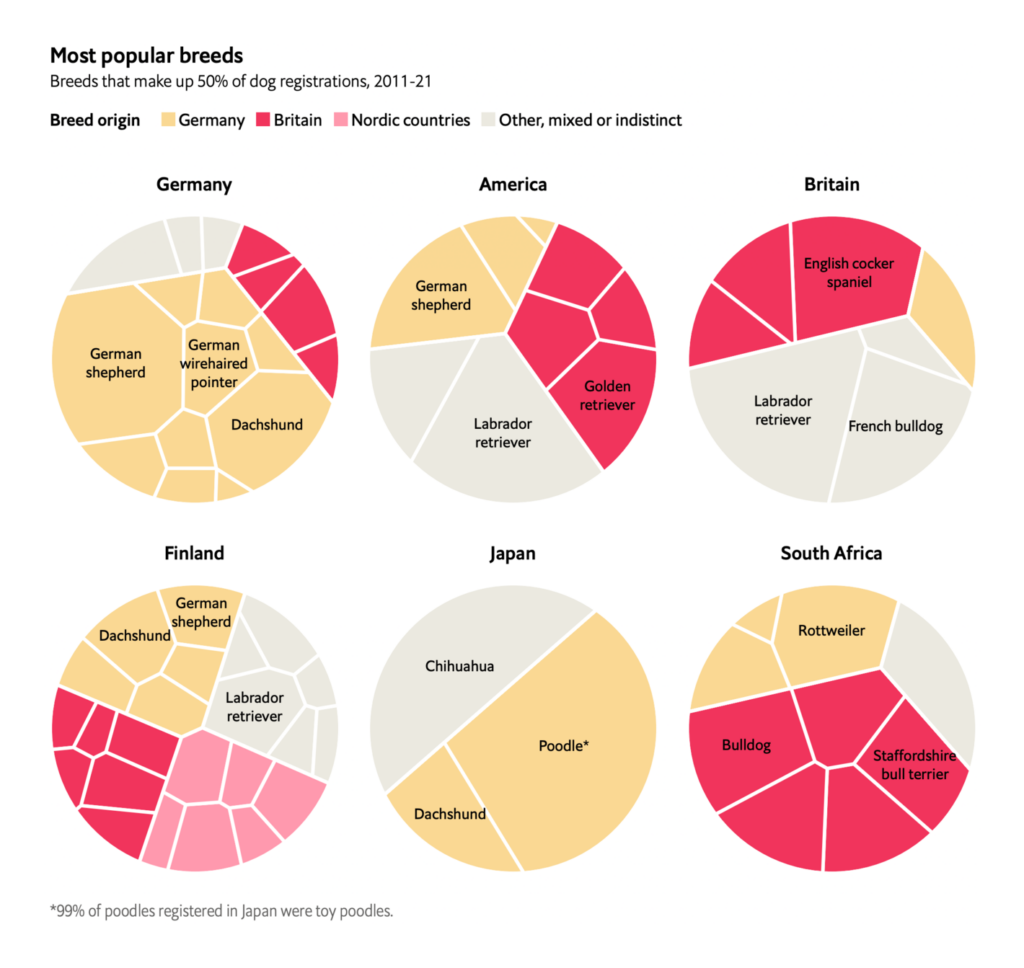
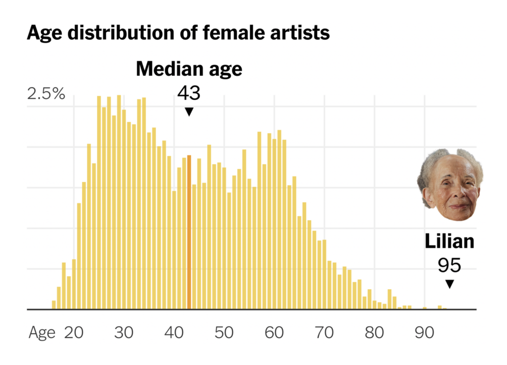
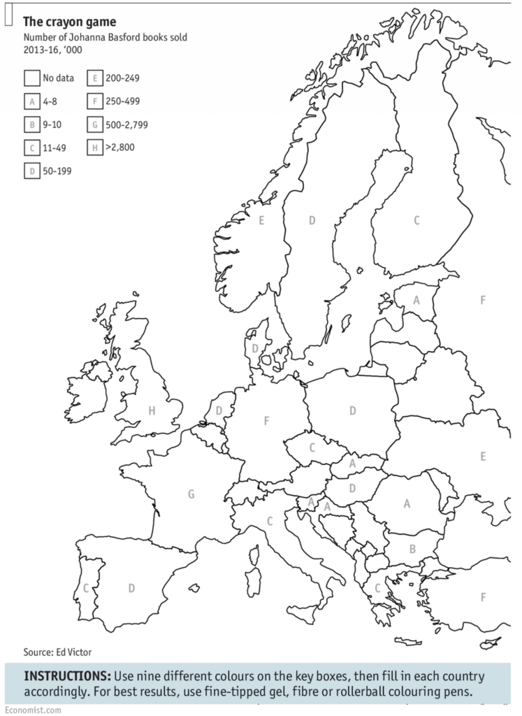
And other charts covered everything from the music of 2022 to impressively long careers:

Help us make this dispatch better! We’d love to hear which newsletters, blogs, or social media accounts we need to follow to learn about interesting projects, especially from less-covered parts of the world (Asia, South America, Africa). Write us at hello@datawrapper.de or leave a comment below.
Want the Dispatch in your inbox every Tuesday? Sign up for our Blog Update newsletter!
Comments