We want to enable everyone to create beautiful charts, maps, and tables. New to data visualization? Or do you have specific questions about us? You'll find all the answers here.
The best of last week’s big and small data visualizations
Vivien Serve
Welcome back to the 171st edition of the Data Vis Dispatch! Every week, we publish a collection of the best small and large data visualizations we find, especially from news organizations — to celebrate data journalism, data visualization, simple charts, elaborate maps, and their creators.
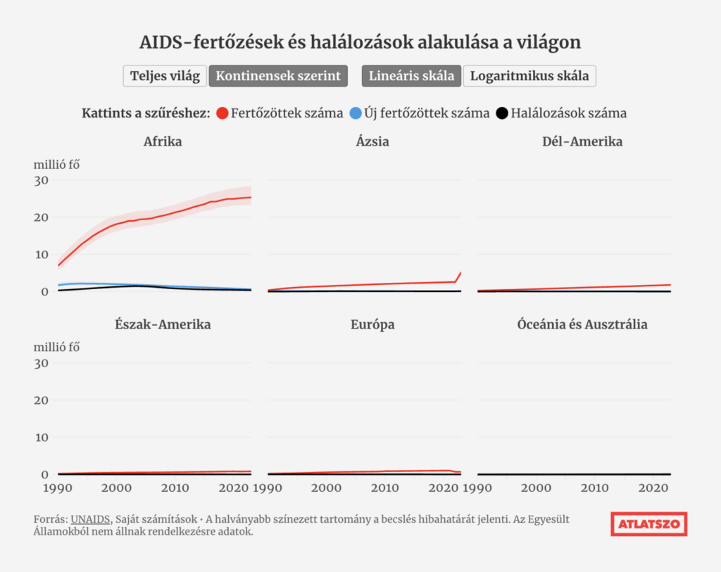
Recurring topics this week include car exports, World Aids Day, and blue.
For the last time this year, it’s the #30DayMapChallenge! Luckily, it says goodbye with a couple of playful visualizations:
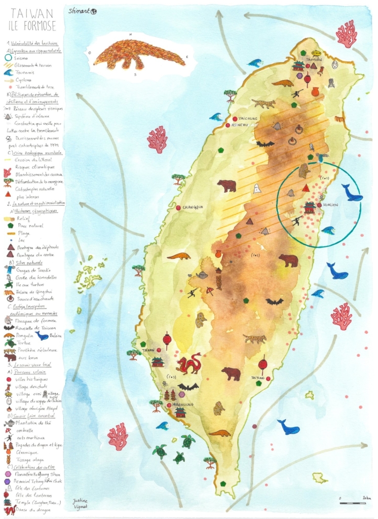
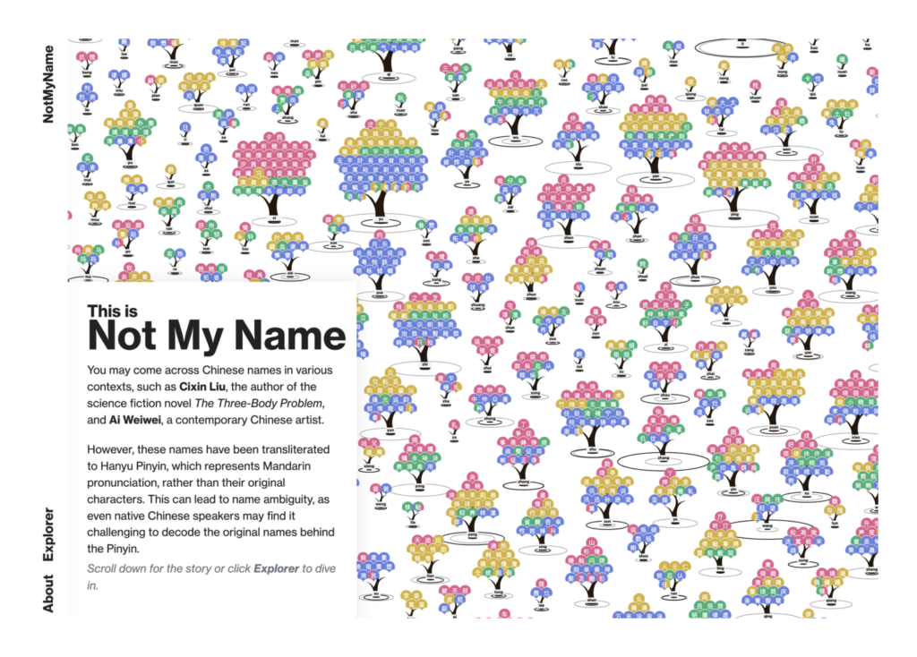
Atlas Guo: “#Day 26 (Map Projection) – Continued: Since I already got fan-shape #ginkgo leaves, why not make a conic projection map, which naturally has a fan shape? Here comes a topographic map of North America, using Albers equal area projection,” November 28 (Bluesky) Justine Vignat: “30eme jour du #30DayMapChallenge avec comme thème : #final #map. A la decouverte de Taïwan,” [Chart title: Discovering Taiwan] December 1 (Tweet)Julian Hoffmann Anton: “Explore Gaudi’s World – A Tribute to Barcelona. For the #30DayMapChallenge, I experimented with the theme ‘Typography’ or ‘Micro(soft) map’ and couldn’t resist making it playfully of course, resulting in a creative cityscape map,” November 28 (Bluesky) sensefromdata: “To celebrate the final day of the #30DayMapChallenge, I present ‘The final map’ – the star-shaped Berghaus projection in cookie form! If you have access to a printer, the STL is on Thingiverse […],” December 1 (Bluesky)
… and a couple of blue ones:
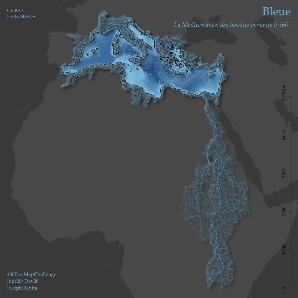
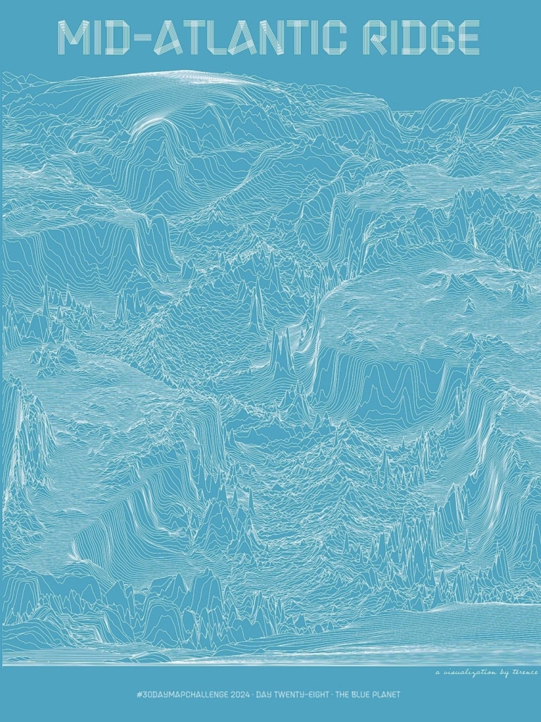
Joseph Benita: “Jour28/ Day28 – Planète bleue / Bonne journée de la Méditerranée,” November 28 (Bluesky) Terence: “Day 28 · The blue planet. I’ve shared the Mid-Atlantic Ridge in shaded relief. And I’ve shared it in hexagons. Now see it in lines. #ggplot2 adventures, an #rstats tale,” November 28 (Mastodon)
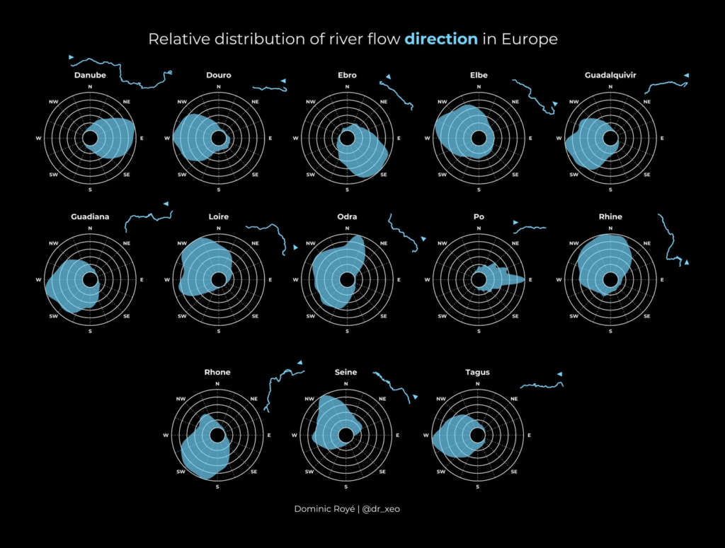
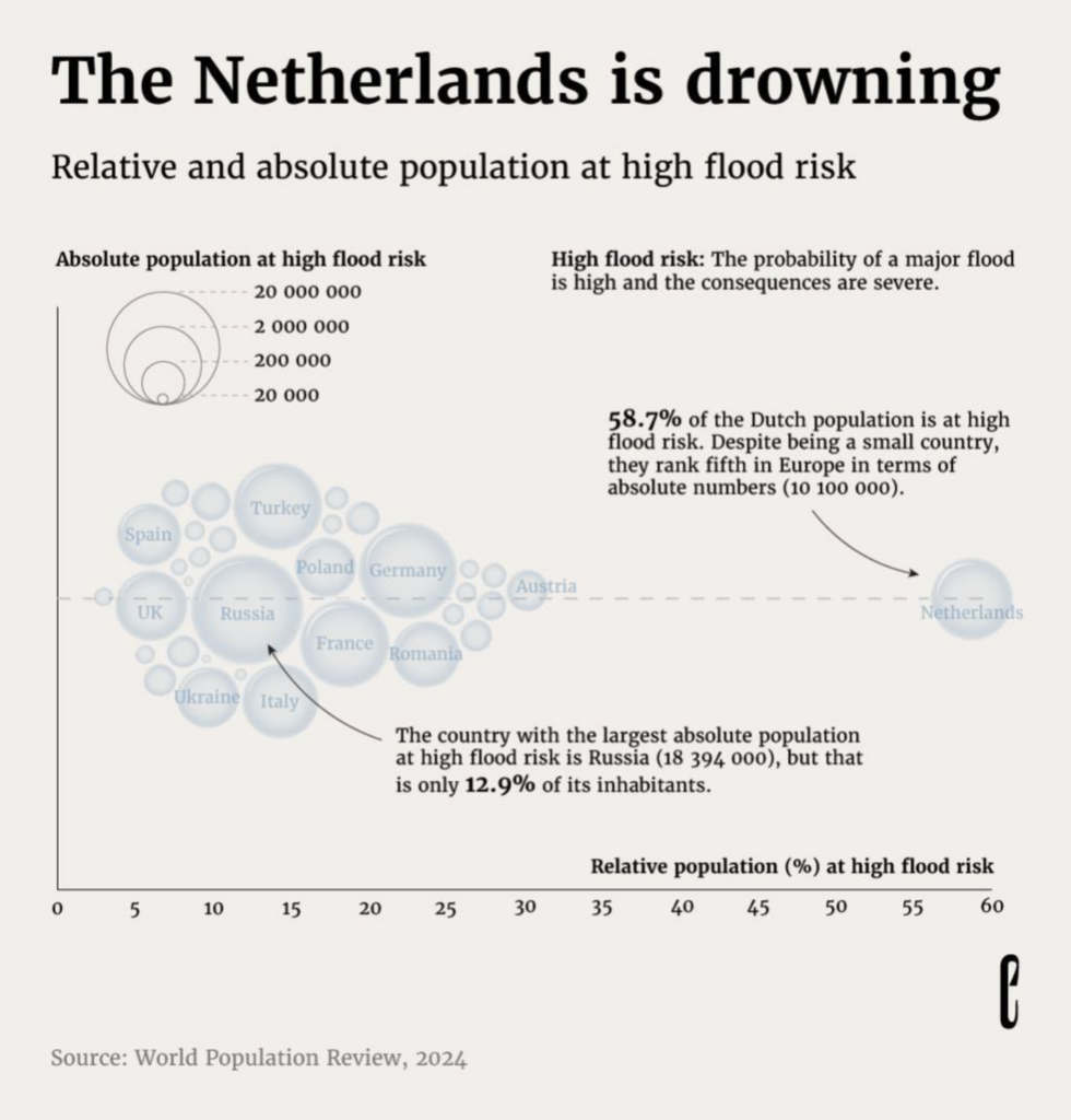
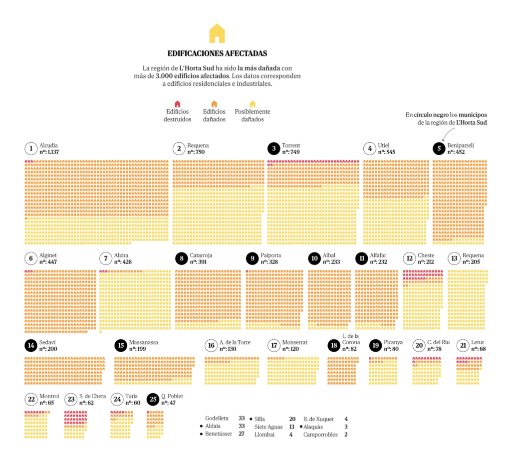
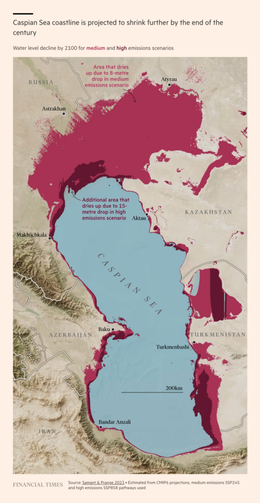
Continuing in the blue theme — water flowing, flooding, and missing:
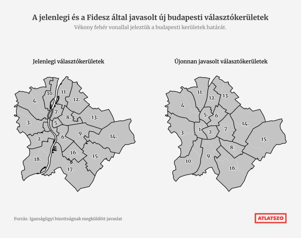
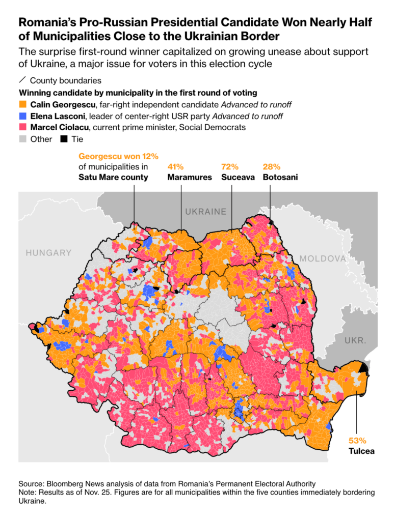
What would a Data Vis Dispatch in 2024 be without election-related visualizations? Hungary’s ruling Fidesz party proposed a redrawing of Budapest’s constituencies, and the first round of Romania’s elections turned out surprisingly pro-Russian:
Help us make this dispatch better! We’d love to hear which newsletters, blogs, or social media accounts we need to follow to learn about interesting projects, especially from less-covered parts of the world (Asia, South America, Africa). Write us at hello@datawrapper.de or leave a comment below.
(she/her) is a working student on Datawrapper’s Communications team. She creates the Data Vis Dispatch to keep data visualization enthusiasts up to date on exciting new projects. When she’s not working, she studies interface design, and when she’s not studying, she’s planning a festival stage or soldering light installations. Vivien lives in Potsdam.


Comments