Data Vis Dispatch, January 14: Fire, congestion, and Greenland
January 14th, 2025
11 min
Datawrapper lets you show your data as beautiful charts, maps or tables with a few clicks. Find out more about all the available visualization types.
Our mission is to help everyone communicate with data - from newsrooms to global enterprises, non-profits or public service.
We want to enable everyone to create beautiful charts, maps, and tables. New to data visualization? Or do you have specific questions about us? You'll find all the answers here.
Data vis best practices, news, and examples
250+ articles that explain how to use Datawrapper
Answers to common questions
An exchange place for Datawrapper visualizations
Attend and watch how to use Datawrapper best
Learn about available positions on our team
Our latest small and big improvements
Build your integration with Datawrapper's API
Get in touch with us – we're happy to help
This article is brought to you by Datawrapper, a data visualization tool for creating charts, maps, and tables. Learn more.
List of lists of the best data visualizations of 2024
Happy New Year! While our regular Data Vis Dispatch is still on holiday break, we’ve collected plenty of lists highlighting the best data visualizations of 2024. They celebrate data journalism, data visualization, simple charts, elaborate maps, and their creators from the past year, as we like to do it. We’ve gathered them all in one place for you to explore.
Recurring topics include — well — you have to go through the lists for that.
First up: existing lists of the best data visualizations of 2024, created by organizations and individuals to highlight outstanding charts, maps, and data journalism from the past year:
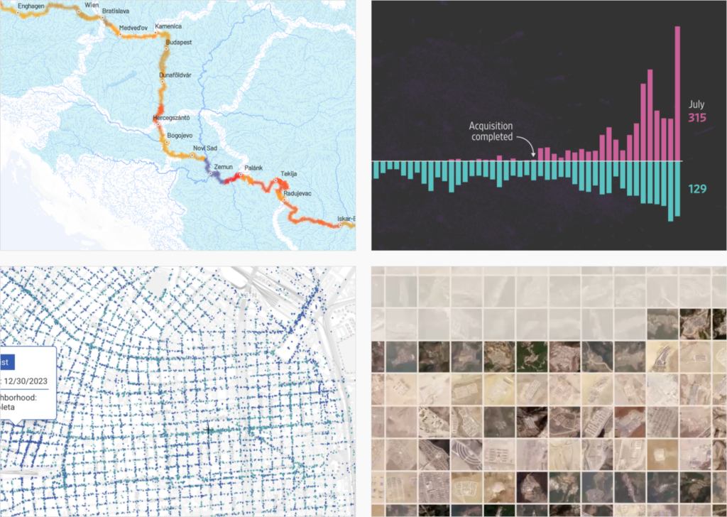
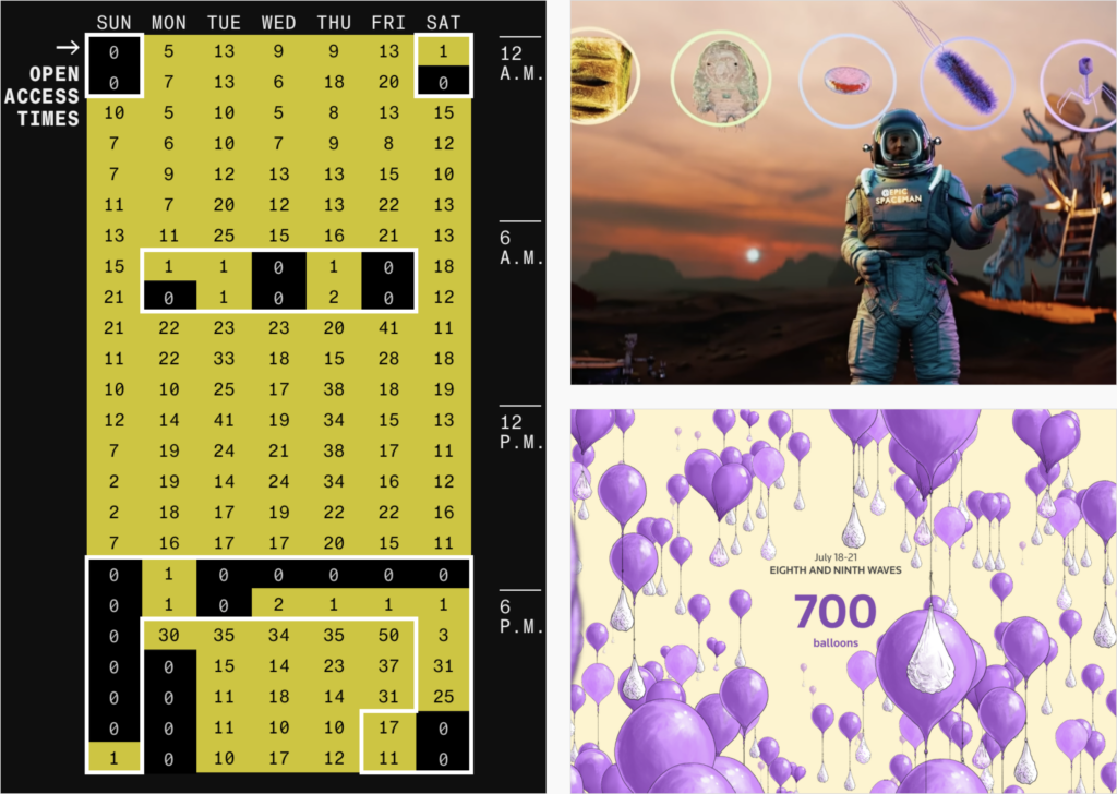
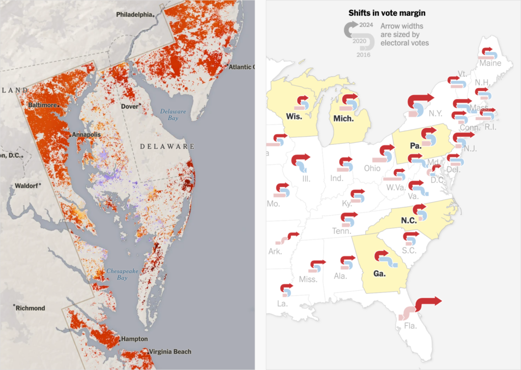
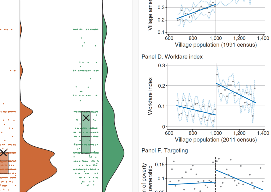
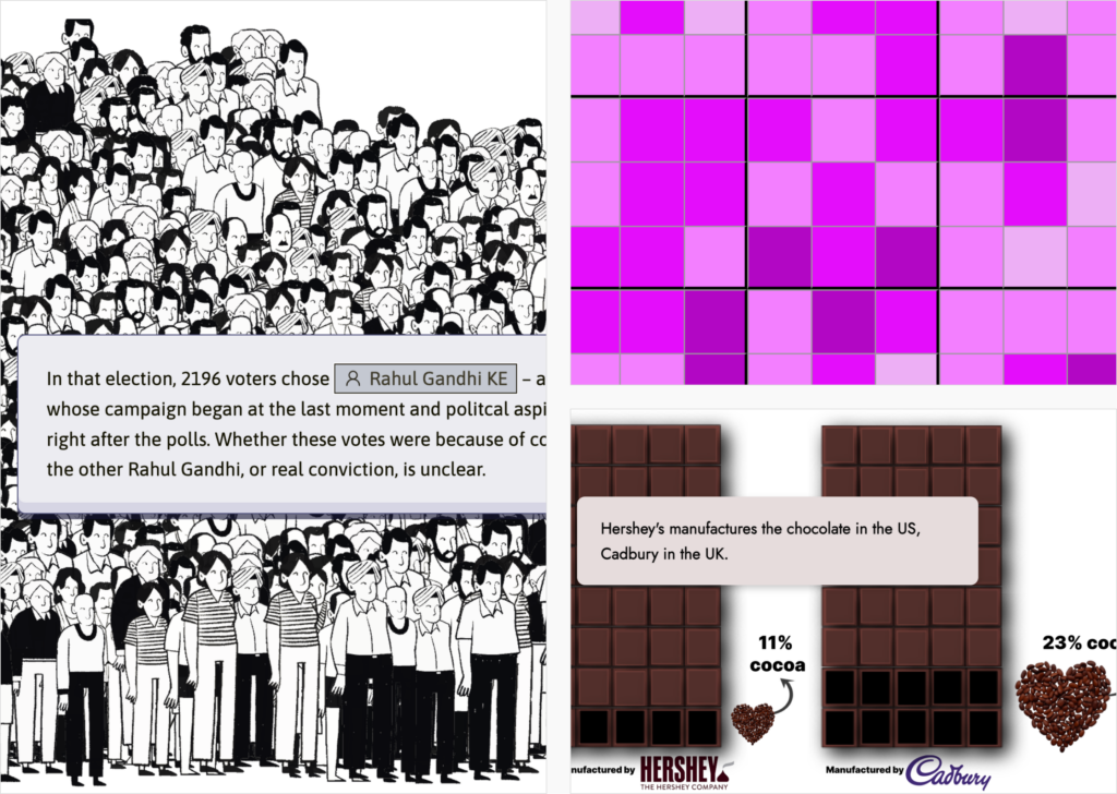
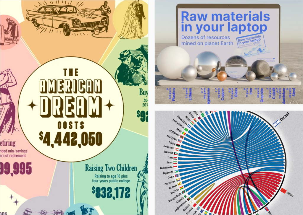
The Pudding Cup and Visual Capitalist crowned their favorite data visualizations of 2024 with awards:
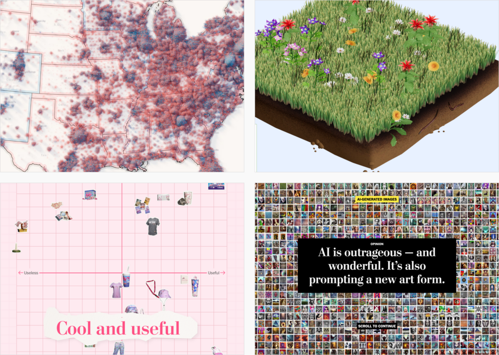
Many newsrooms, companies, and individuals presented portfolios of their own visualizations from the past year:
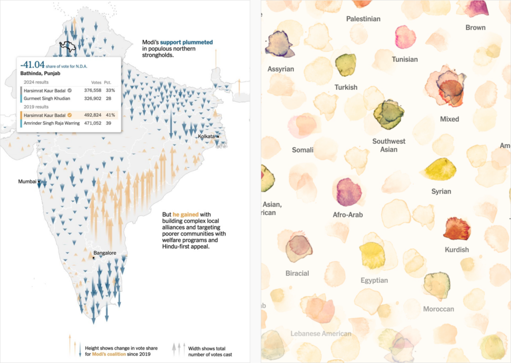
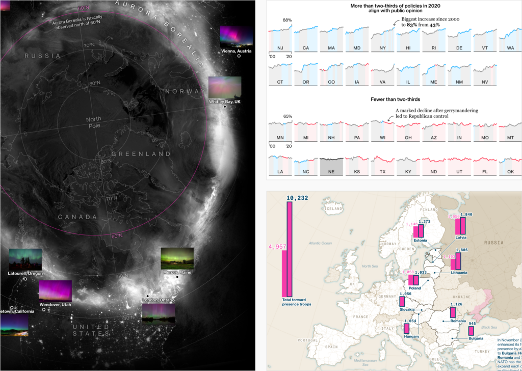
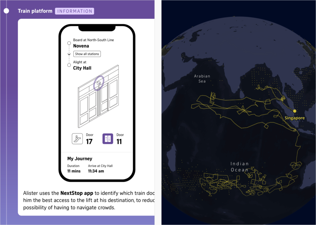
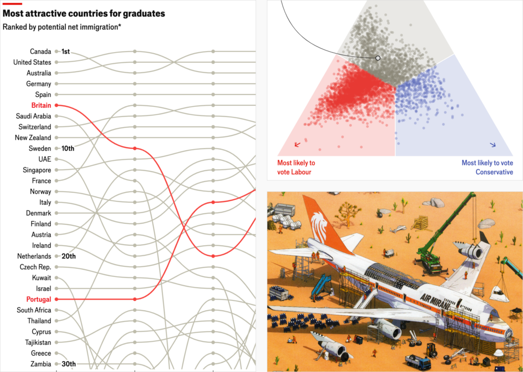
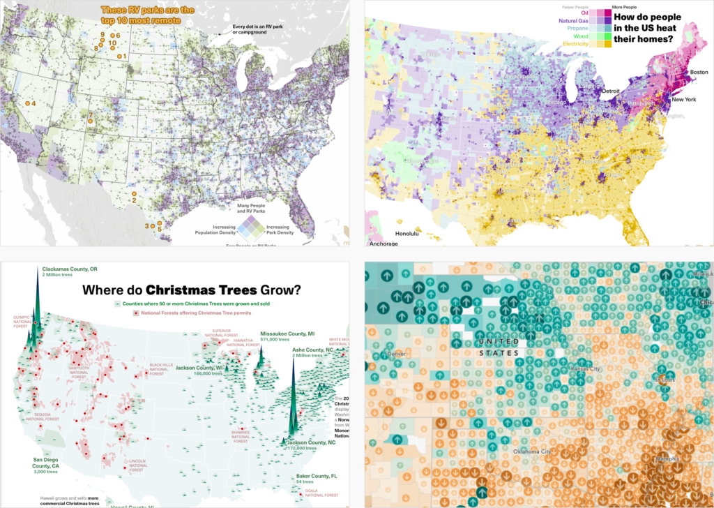
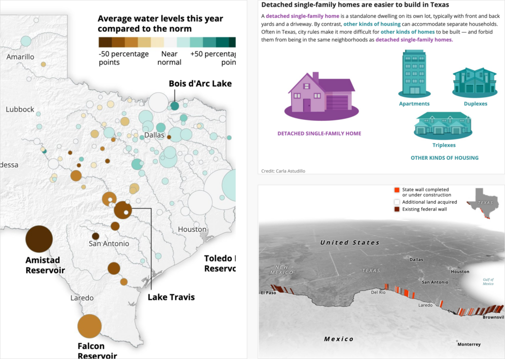
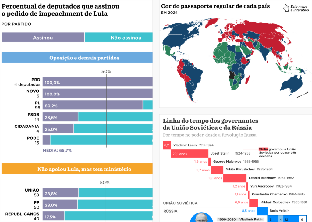
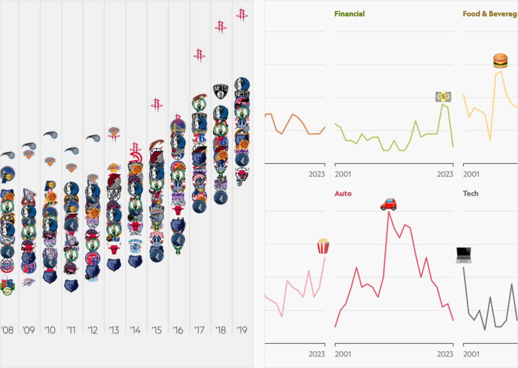
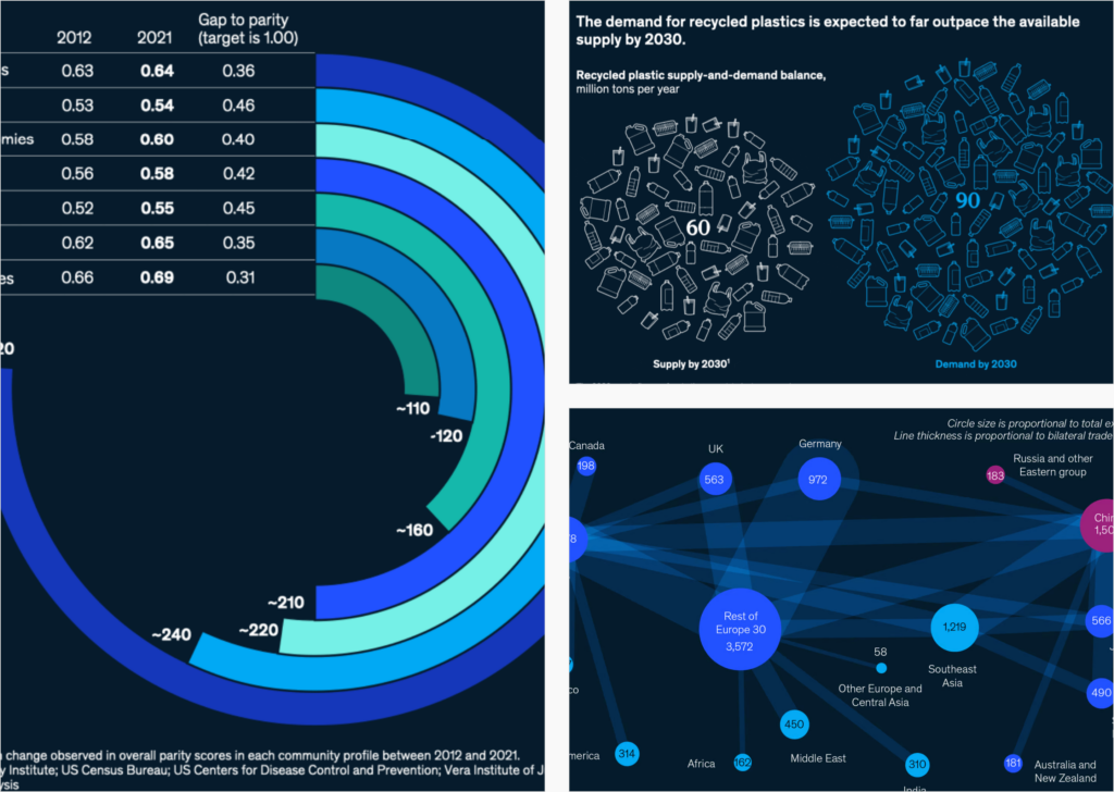
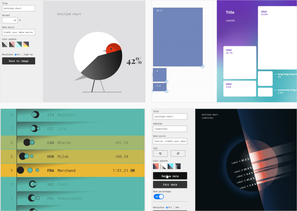
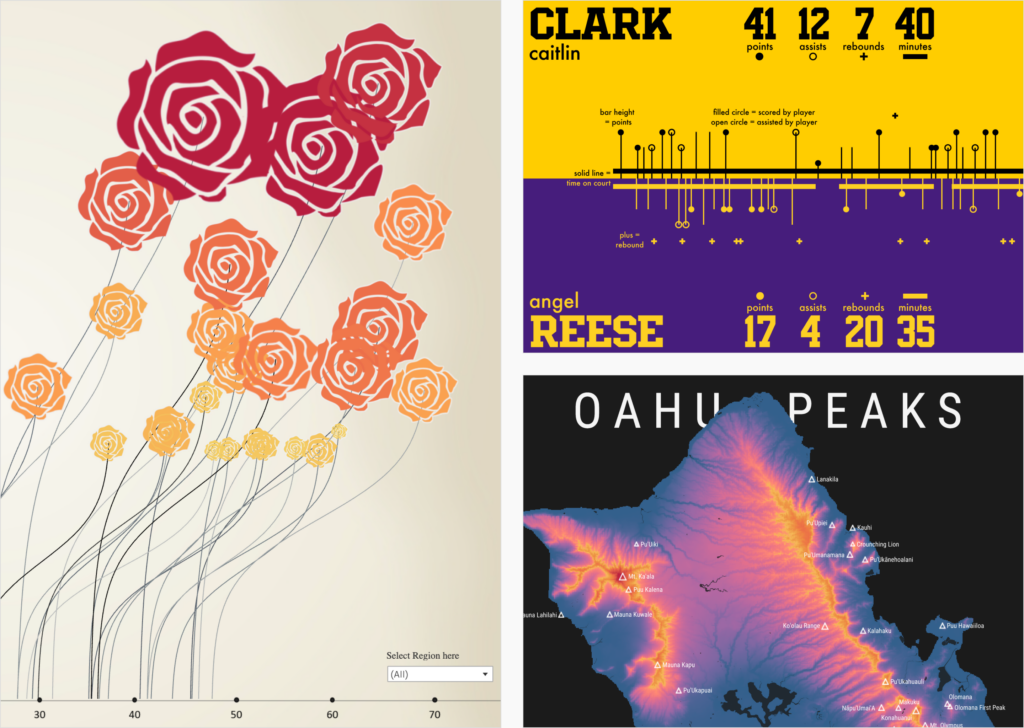
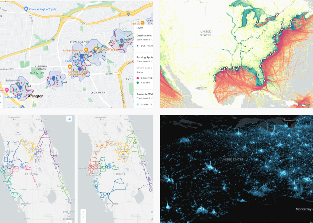
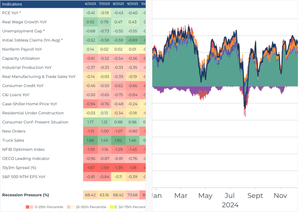
Other lists focus on visualizations that help explain (data journalism in) 2024:
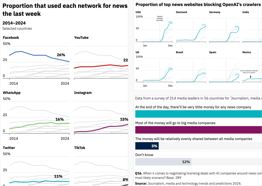
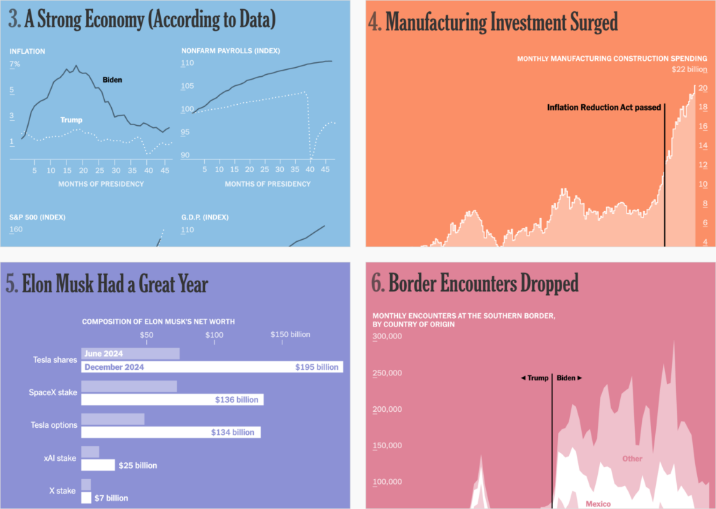
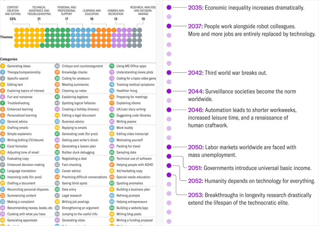
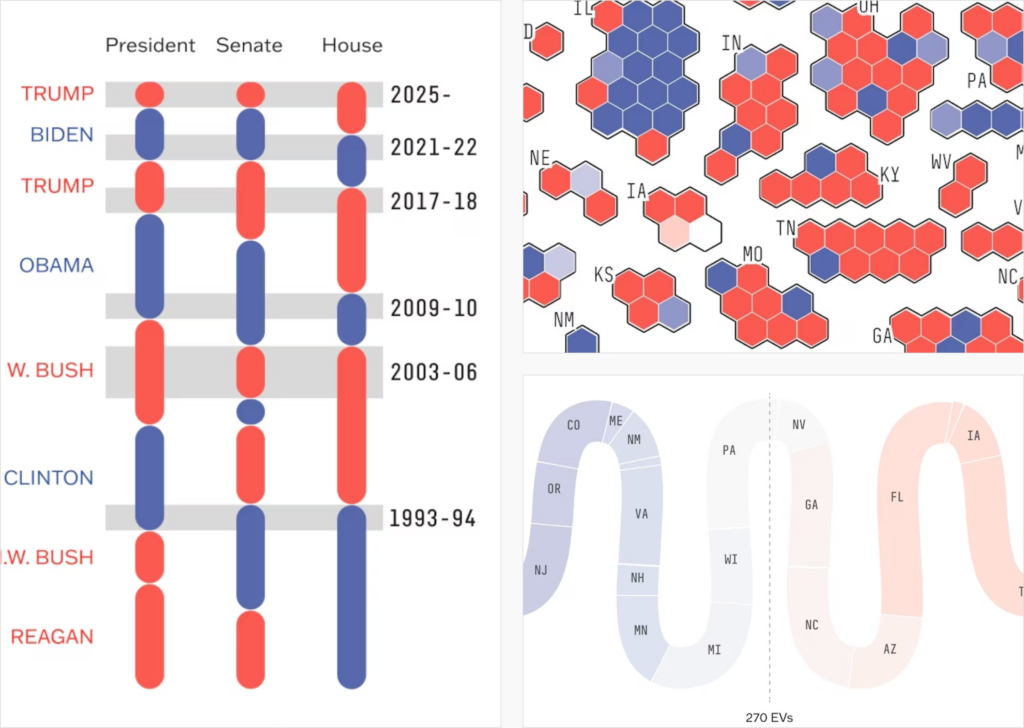
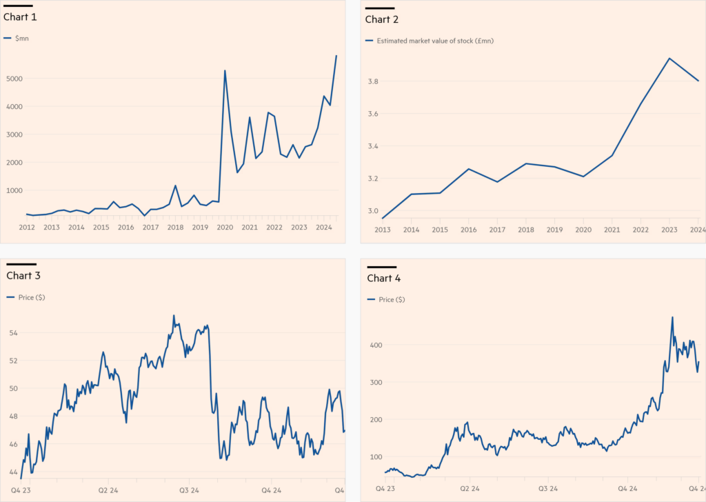
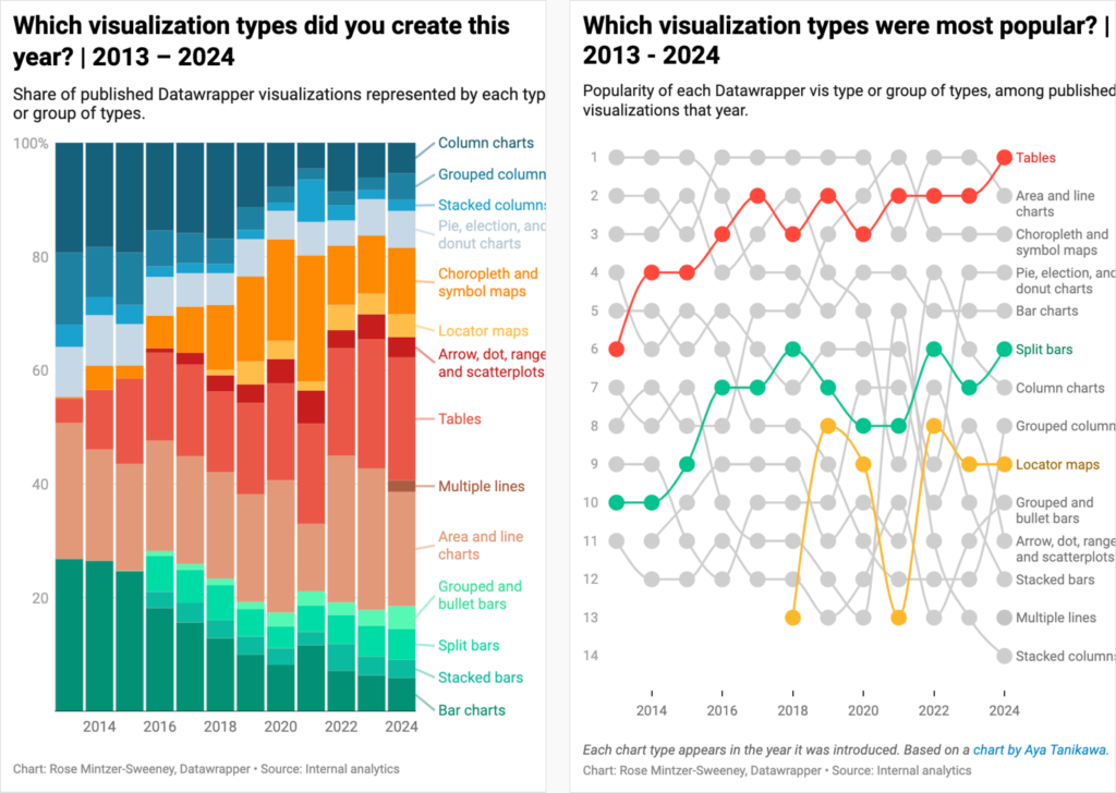
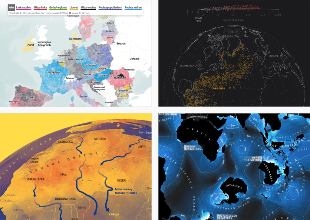
Finally, we at Datawrapper haven’t been lazy either and have written two articles looking back at 2024. What visualizations did Datawrapper users create? What were our own favorite news visualizations? And with that: Happy New Year!
Submissions are open for…
Help us make this dispatch better! We’d love to hear which newsletters, blogs, or social media accounts we need to follow to learn about interesting projects, especially from less-covered parts of the world (Asia, South America, Africa). Write us at hello@datawrapper.de or leave a comment below.
Want the Dispatch in your inbox every Tuesday? Sign up for our Blog Update newsletter!
Comments