We want to enable everyone to create beautiful charts, maps, and tables. New to data visualization? Or do you have specific questions about us? You'll find all the answers here.
The best of last week’s big and small data visualizations
Veronika Halamková
Welcome back to the 71st edition of Data Vis Dispatch! Every week, we’ll be publishing a collection of the best small and large data visualizations we find, especially from news organizations — to celebrate data journalism, data visualization, simple charts, elaborate maps, and their creators.
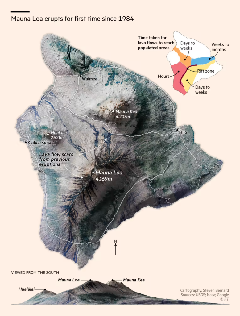
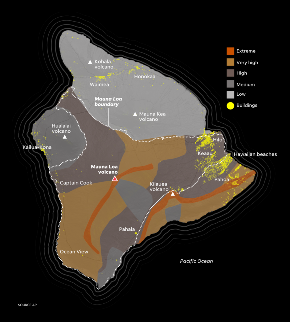
Recurring topics this week include the U.S. Senate runoff election in Georgia, the eruption of Mauna Loa in Hawaii, the cost of living crisis, and the final days of the #30DayMapChallenge.
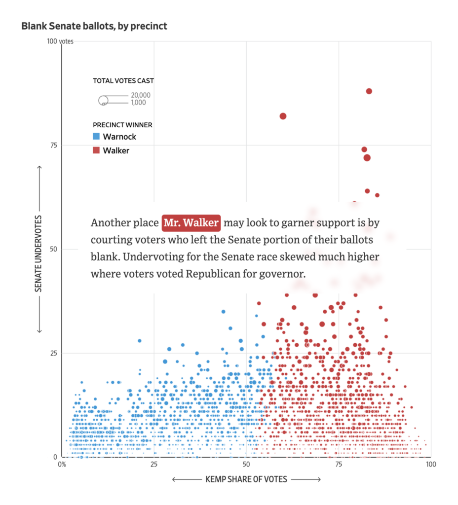
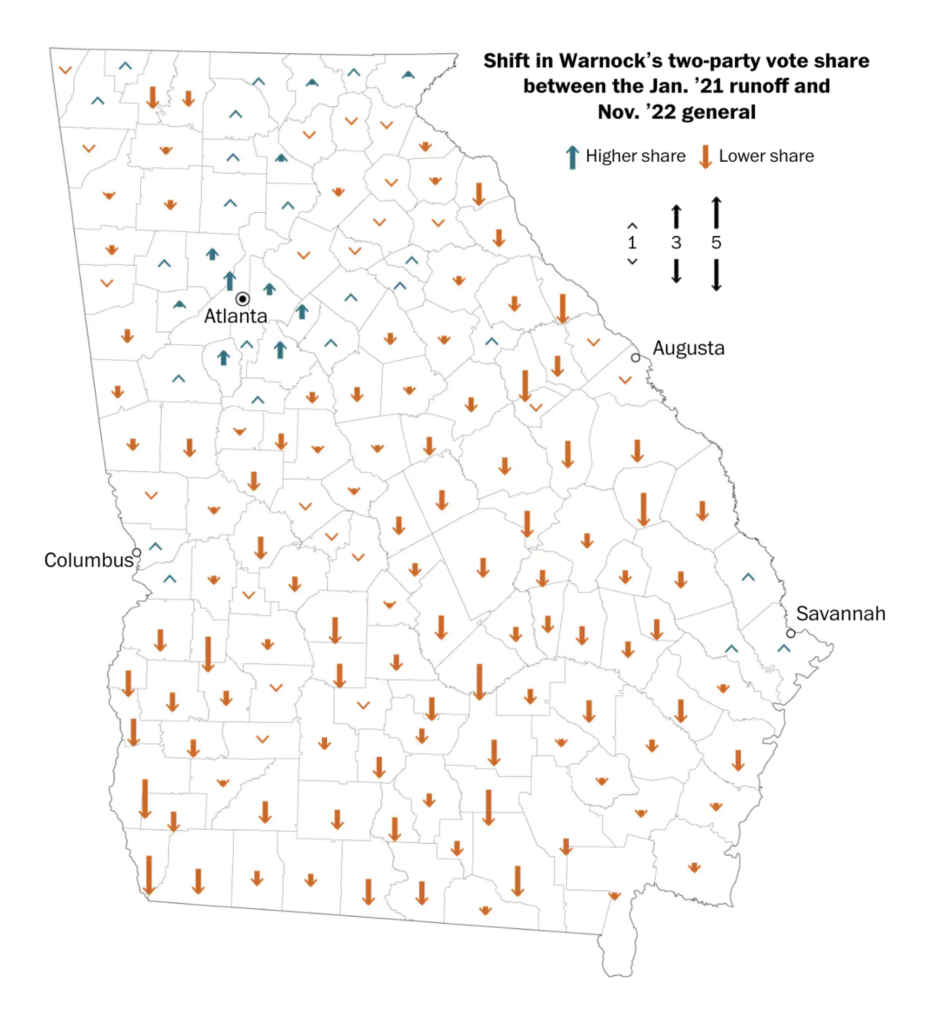
Today Georgia will cast its votes in the long-awaited runoff election for the U.S. Senate.
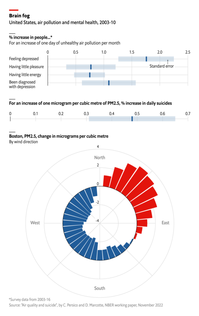
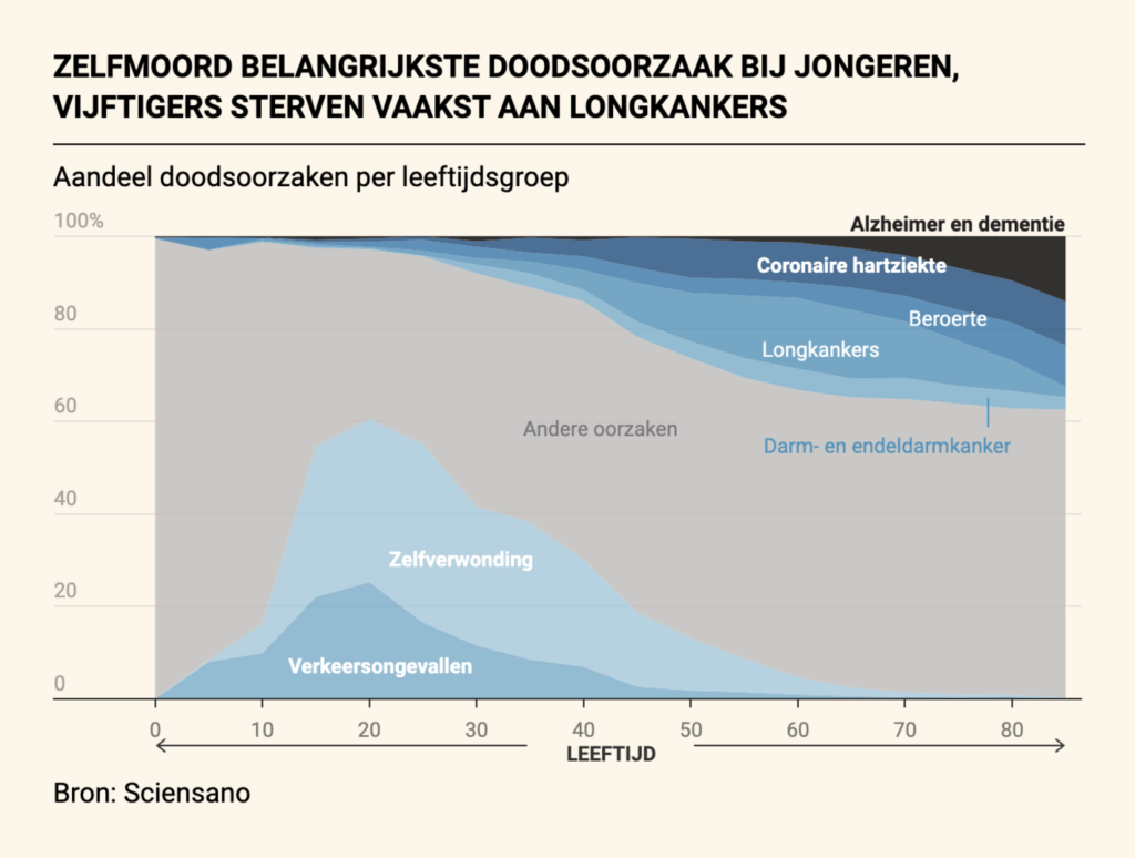
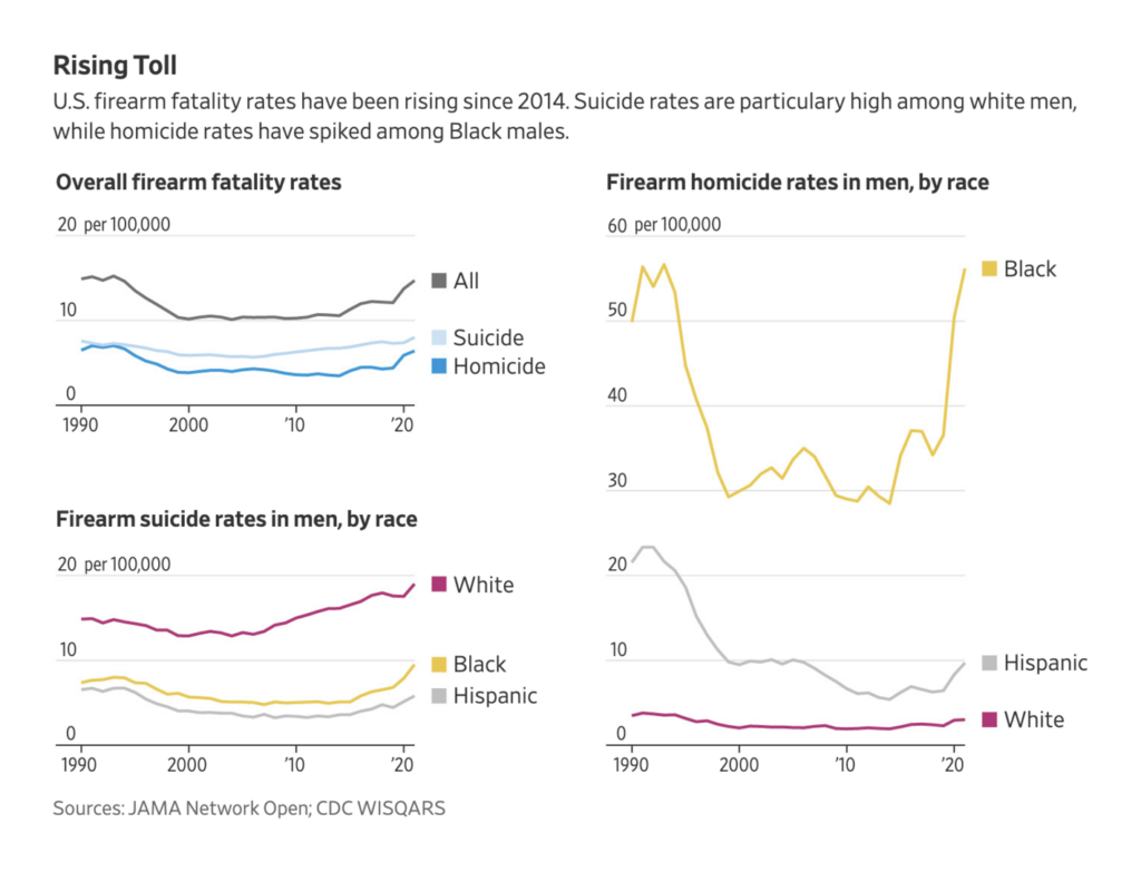
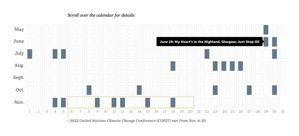
Air pollution might be a contributing factor in depression and suicide rates, already an important issue among young people in Belgium and white men in the U.S.
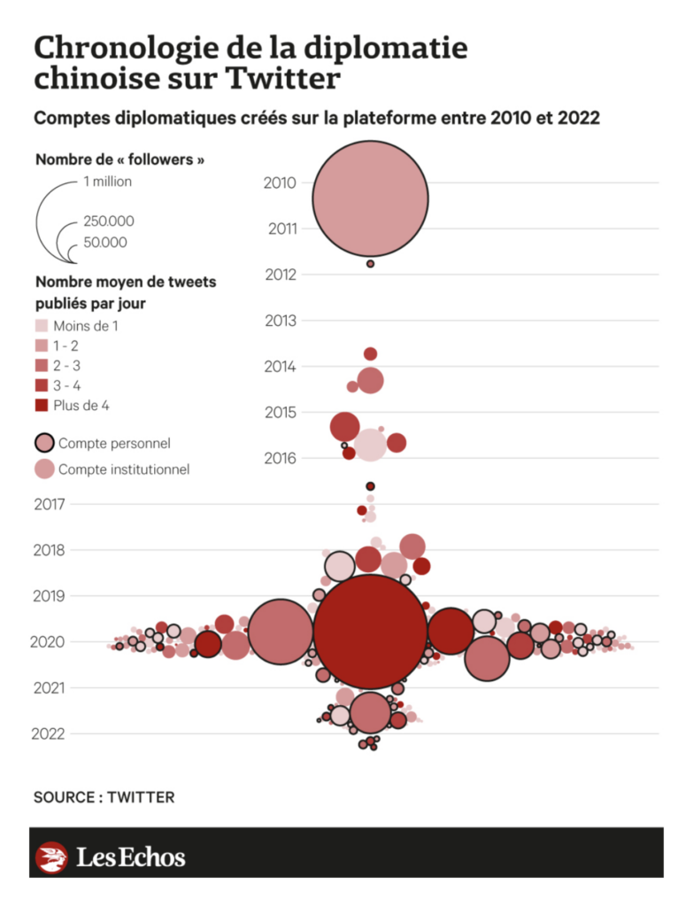
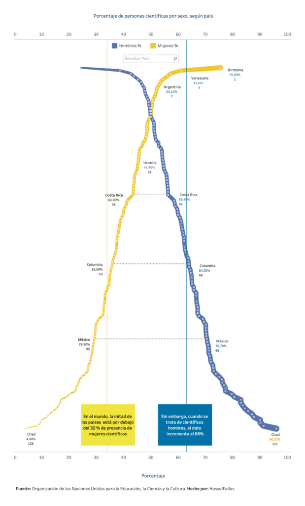
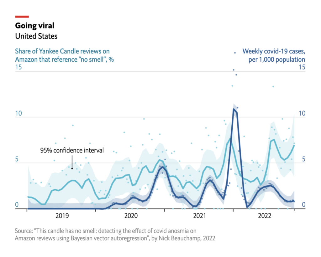
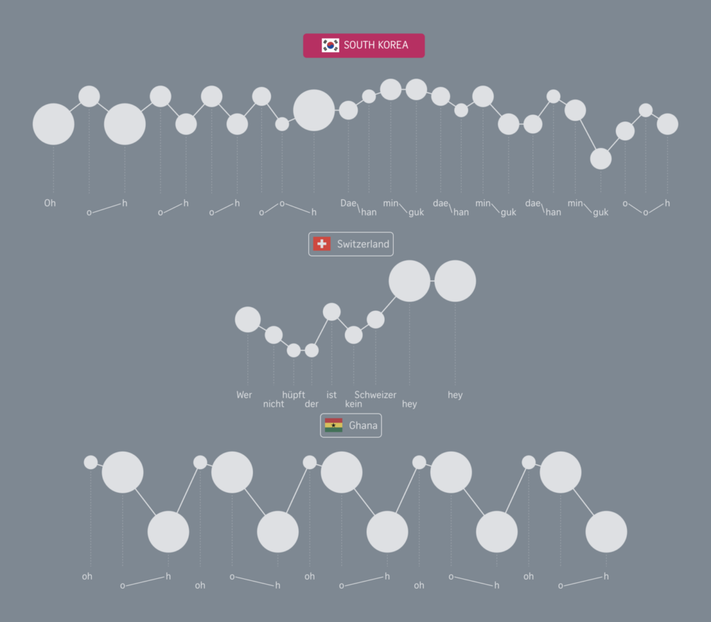
Other charts of the week covered China’s Twitter diplomacy, population trends in Spain, the proportion of male and female scientists around the world, and a surprising link between coronavirus cases and negative candle reviews.
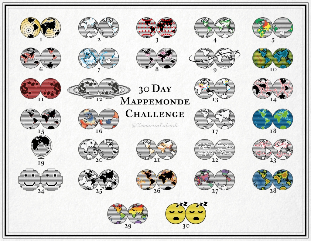
Finally, it’s time to wrap up the #30DayMapChallenge.
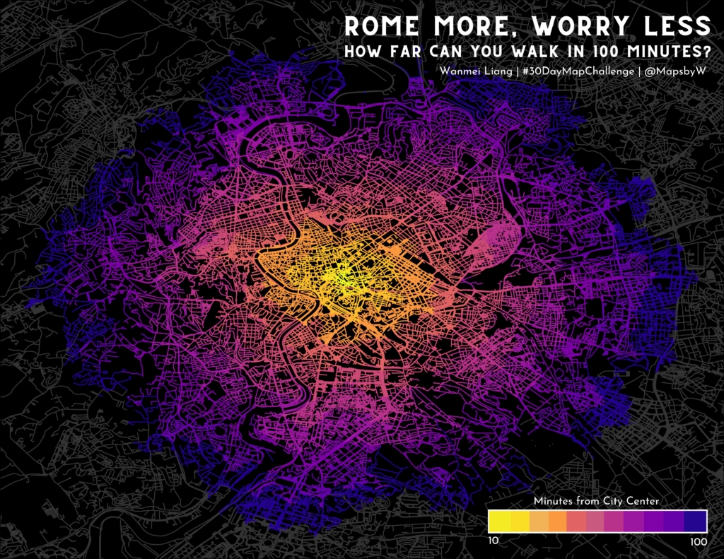
Xemartin Laborde: “30DayMapChallenge / Jour 30, Remix : Une mappemonde crevée (des indicatrices de fatigue). 🌍🌎🤪😴#30DayMappemondeChallenge. Thread récapitulatif à venir très vite 🌐🌐3⃣0⃣…” December 1 (Tweet)GISphere: “#GISphere #30DayMapChallenge Some updates for Day 28, combining Chinese traditional art / poems with GIS terrains. [Part1] Author: Guo Jiale Northwest Ecological Environment Resources Research Institute of China Academy of Sciences Email: jiale.guo@foxmail.com,” November 30 (Tweet)Lisa Hornung: “Couldn’t get enough of playing around with ridge-map – a great library to make beautiful elevation maps in python. Late submission to #30DayMapChallenge Day30 Remix shows my home town in Germany. Will def get some printed for friends,” December 3 (Tweet)Wanmei L: “#30daymapchallenge | Day 29: Out of Comfort Zone For today’s theme, I switched over to QGIS (I usually use ArcPro), used the QNEAT3 plugin and an API to generate isochrones. Also, I walked 19 miles in 1 day in Rome back in 2016, that was a lot of walking! #gischat,” November 29 (Tweet)Wendy Shijia: “🎉 End of #30DayMapChallenge day30: Remix – globe and hair. Thanks to @Julian_H0ffmann for the inspiration!!! I’ve added some very subtle dynamics on top of it. Tool: #blender’s ParticleSystem Wishlist: a physical version of this someday!” December 2 (Tweet)
Help us make this dispatch better! We’d love to hear which newsletters, blogs, or social media accounts we need to follow to learn about interesting projects, especially from less-covered parts of the world (Asia, South America, Africa). Write us at hello@datawrapper.de or leave a comment below.
(she/her, @v_halamkova) was a data vis writer in the Communications team between 2022 and 2023. She lives in Berlin and created and wrote beautiful data visualizations. Before Datawrapper, she worked in the data team at Tortoise Media.


Comments