Data Vis Dispatch, December 6

The best of last week’s big and small data visualizations

Welcome back to the 71st edition of Data Vis Dispatch! Every week, we’ll be publishing a collection of the best small and large data visualizations we find, especially from news organizations — to celebrate data journalism, data visualization, simple charts, elaborate maps, and their creators.

Recurring topics this week include the U.S. Senate runoff election in Georgia, the eruption of Mauna Loa in Hawaii, the cost of living crisis, and the final days of the #30DayMapChallenge.

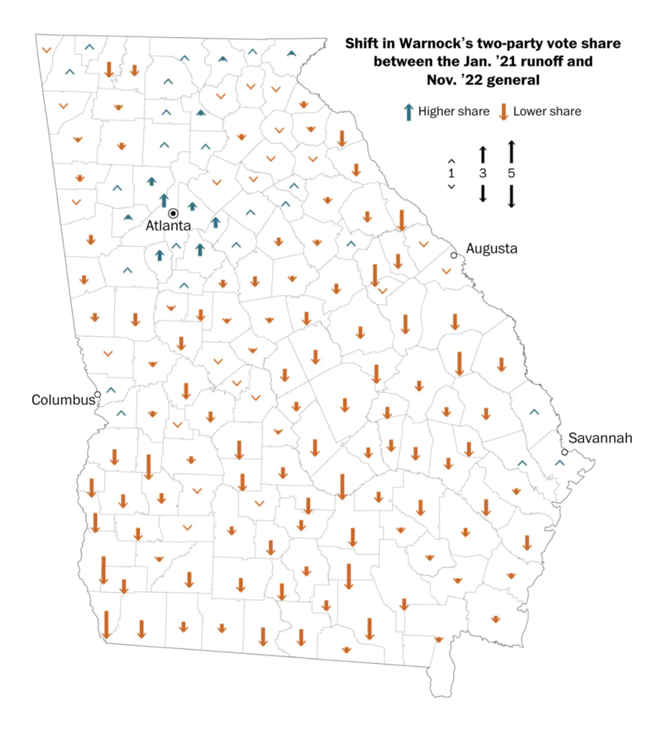
Today Georgia will cast its votes in the long-awaited runoff election for the U.S. Senate.

The New York Times: These Georgia Precincts Were Red. Then Blue. Now They Are Purple, December 2
The Wall Street Journal: In Georgia’s Runoff Election, Midterm Turnout and Blank Ballots Might Reveal Who Has the Edge, December 4
The Washington Post: What Georgia’s past two Senate contests tell us about the runoff, December 5

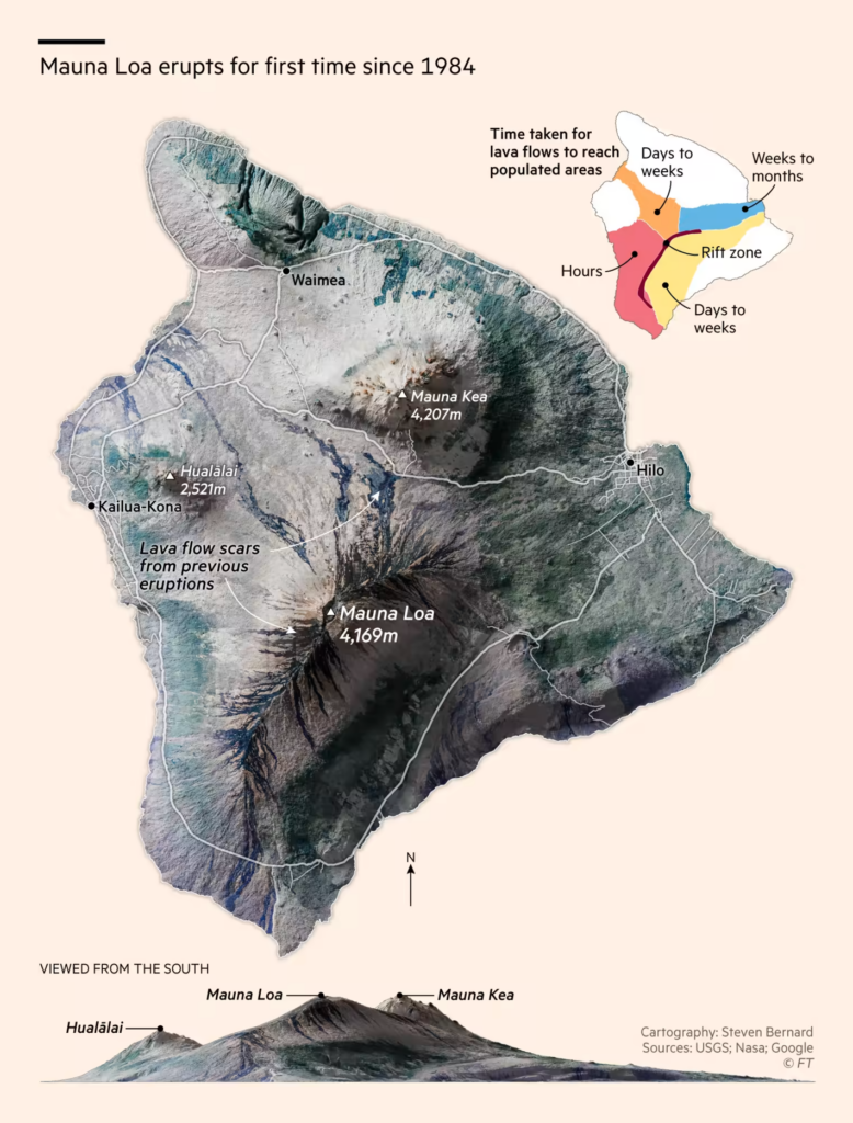
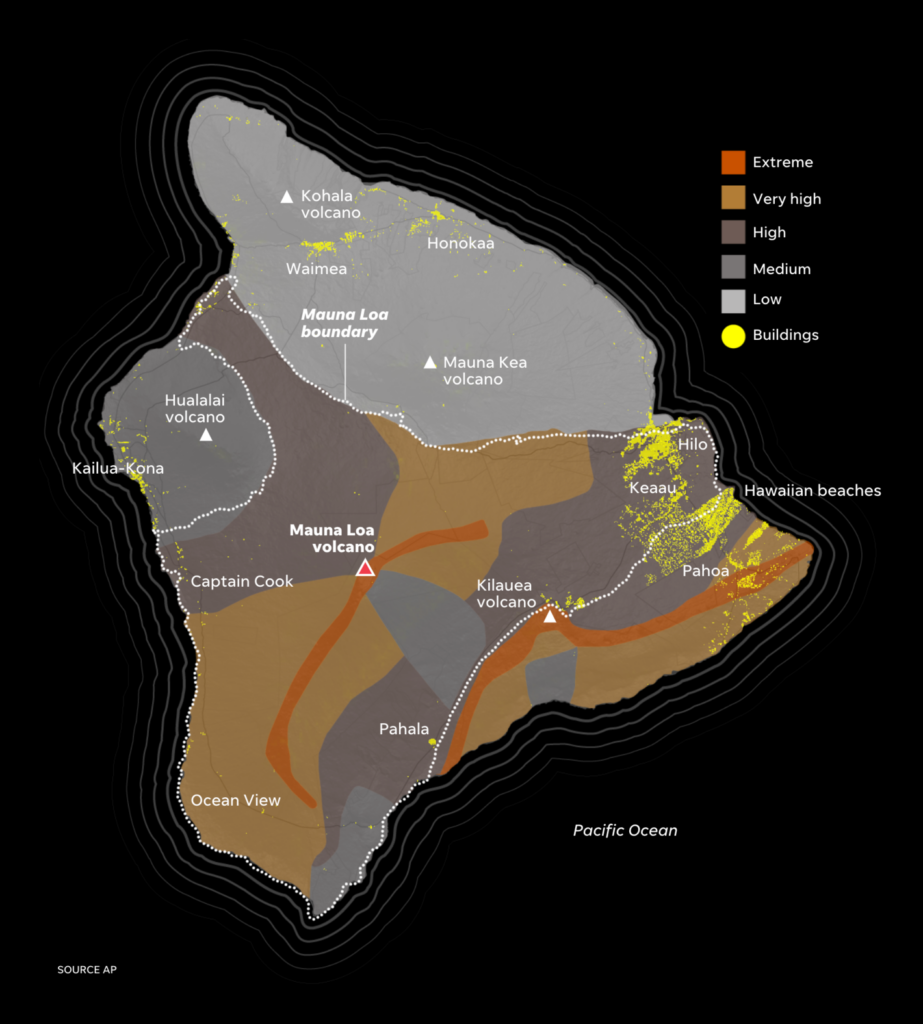
The eruption of Mauna Loa, a volcano in Hawaii, drew the attention of scientists, journalists, and tourists alike.

The Financial Times: Mauna Loa eruption provides unique research opportunity for volcanologists, December 2
USA Today: Mauna Loa eruption: How the world’s largest volcano is springing to life (again) in Hawaii, November 29
The Washington Post: As lava flows from Mauna Loa, crowds flock to spectacle, December 3

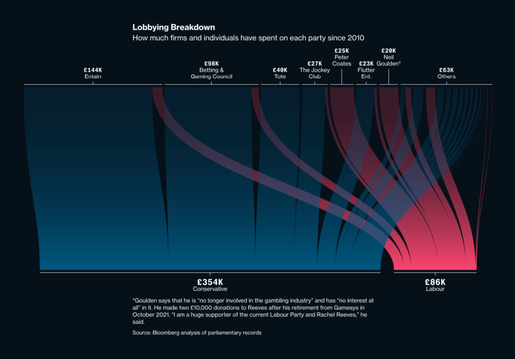
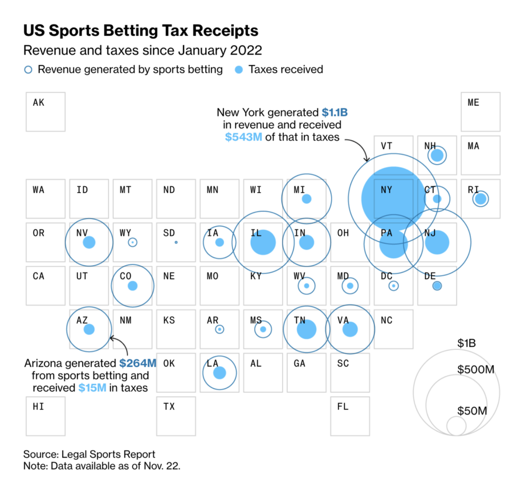
The sports betting lobby is a hot topic in both the U.K. and the U.S.

Bloomberg: Britain Opened the Door to Online Gambling. Now It’s Living With the Consequences, December 1
Bloomberg: How an Arizona Lobbying Frenzy Helped Sports App Bookies Write Their Own Rules, December 2

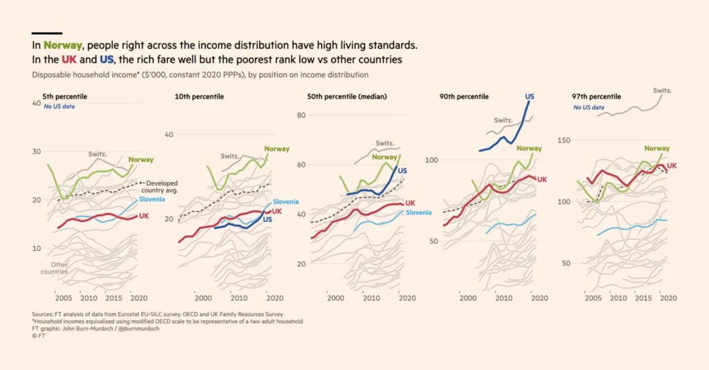
The cost of living crisis reveals differences between cities, countries, and even generations.

The Economist: The world’s most, and least, expensive cities, November 30
The Financial Times: Britain is two countries when it comes to energy, November 29
The Washington Post: Millennials shut out of the housing market, again, November 30

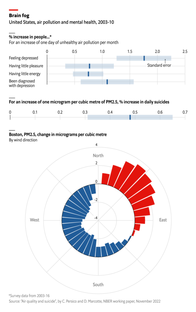
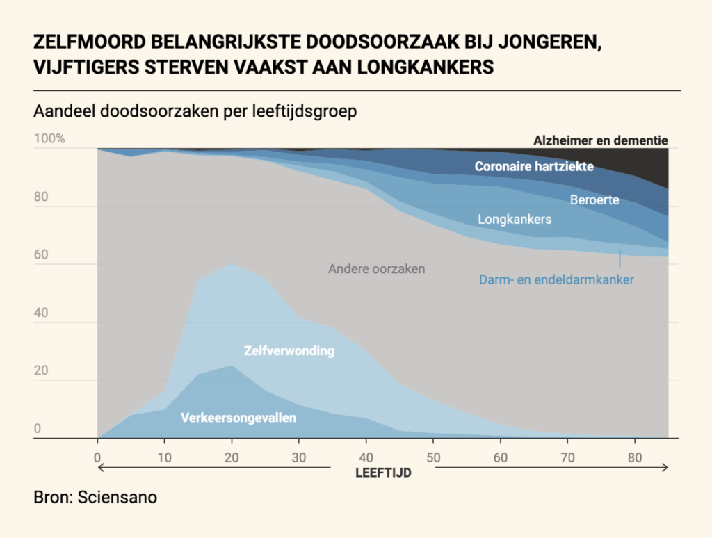
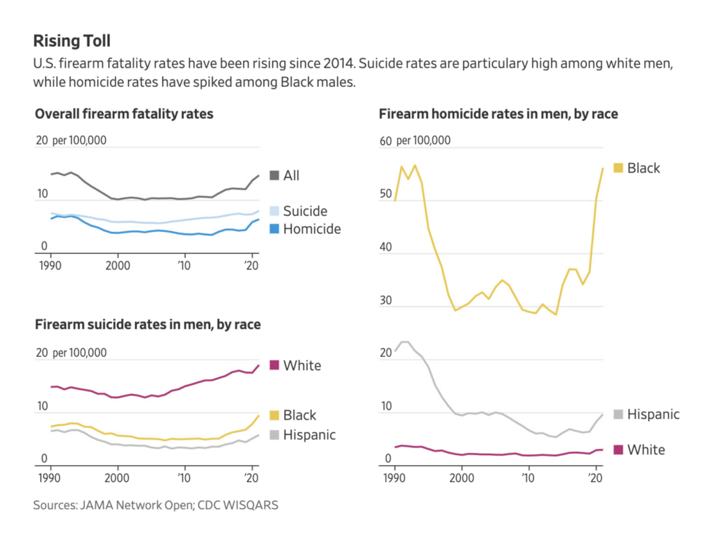
Air pollution might be a contributing factor in depression and suicide rates, already an important issue among young people in Belgium and white men in the U.S.

The Economist: Air pollution can drive people to kill themselves, November 29
De Tijd: Betere screening en gezonder leven halen sterftecijfers naar beneden, December 2
The Wall Street Journal: Gun Death Rate Nears Three-Decade High, With Men at Most Risk, November 29

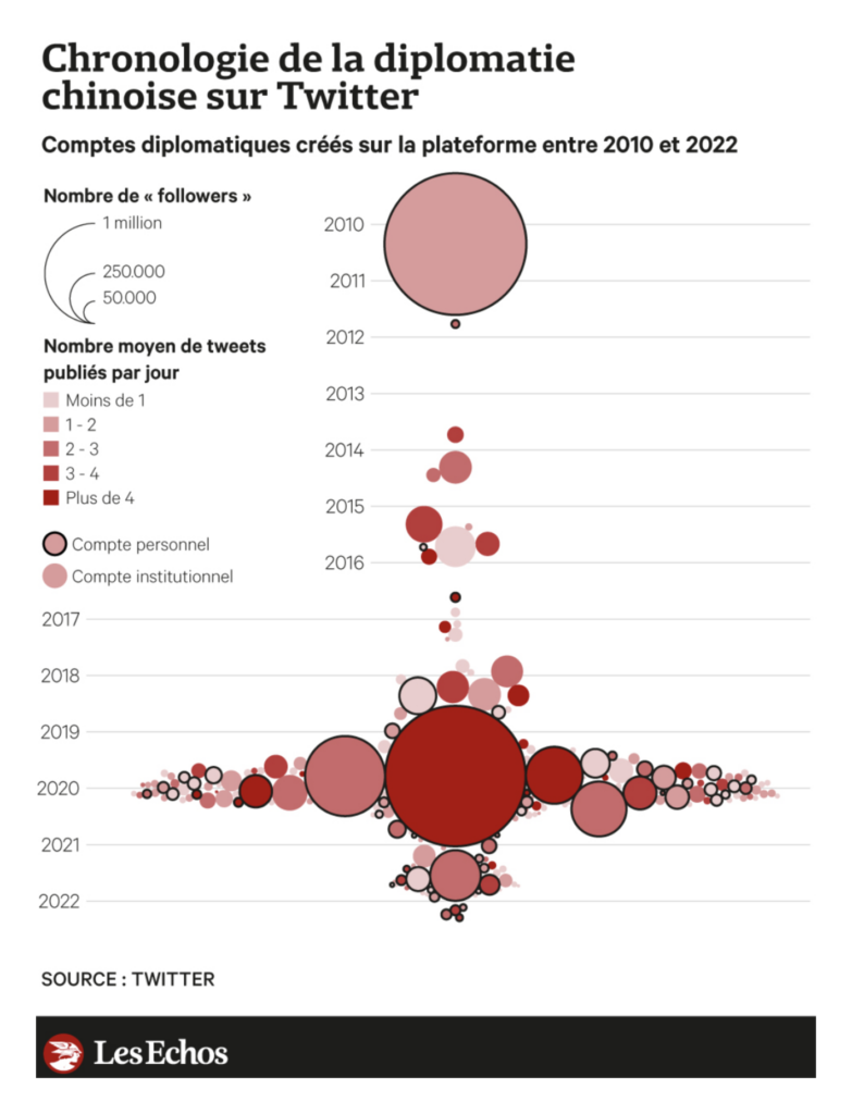
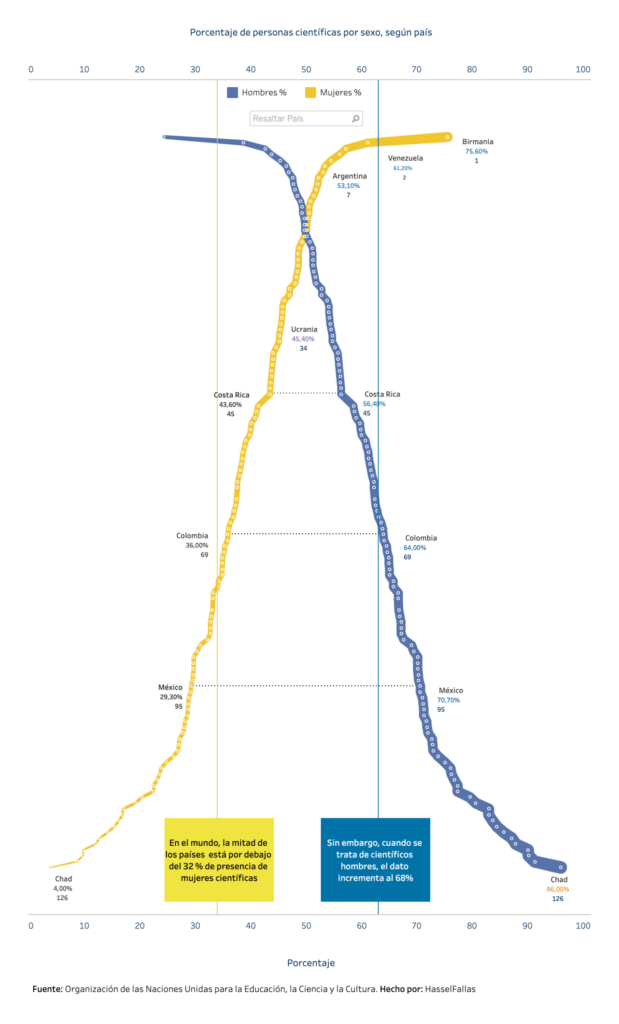
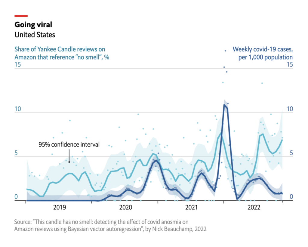
Other charts of the week covered China’s Twitter diplomacy, population trends in Spain, the proportion of male and female scientists around the world, and a surprising link between coronavirus cases and negative candle reviews.

LesEchos: La répression chinoise se joue aussi sur Twitter, December 1
elDiario.es: España prefiere la costa: así ha cambiado la población de cada provincia desde 1900, November 30
La Data Cuenta: La científica del año en Costa Rica cuenta cómo derribó barreras e hizo su carrera en cambio climático, November 29
The Economist: As mass testing ends, how will covid waves be tracked?, December 2

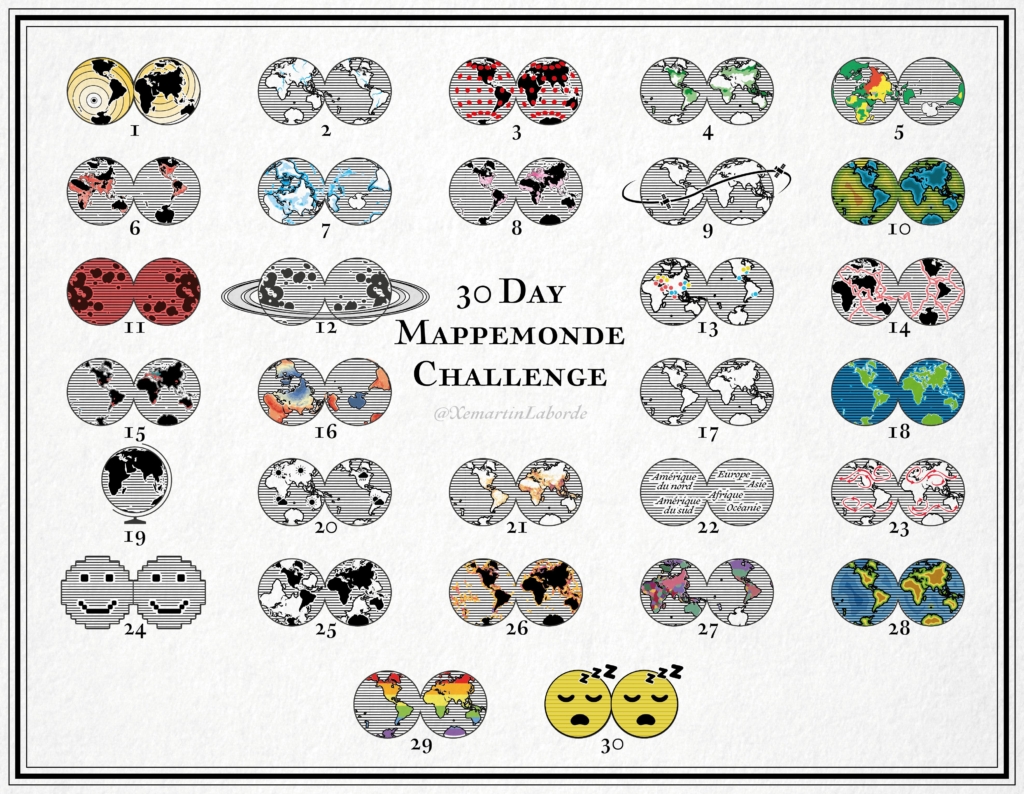
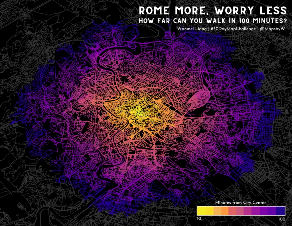
Finally, it’s time to wrap up the #30DayMapChallenge.

Xemartin Laborde: “30DayMapChallenge / Jour 30, Remix : Une mappemonde crevée (des indicatrices de fatigue). 🌍🌎🤪😴#30DayMappemondeChallenge. Thread récapitulatif à venir très vite 🌐🌐3⃣0⃣…” December 1 (Tweet)
GISphere: “#GISphere #30DayMapChallenge Some updates for Day 28, combining Chinese traditional art / poems with GIS terrains. [Part1] Author: Guo Jiale Northwest Ecological Environment Resources Research Institute of China Academy of Sciences Email: jiale.guo@foxmail.com,” November 30 (Tweet)
Lisa Hornung: “Couldn’t get enough of playing around with ridge-map – a great library to make beautiful elevation maps in python. Late submission to #30DayMapChallenge Day30 Remix shows my home town in Germany. Will def get some printed for friends,” December 3 (Tweet)
Wanmei L: “#30daymapchallenge | Day 29: Out of Comfort Zone For today’s theme, I switched over to QGIS (I usually use ArcPro), used the QNEAT3 plugin and an API to generate isochrones. Also, I walked 19 miles in 1 day in Rome back in 2016, that was a lot of walking! #gischat,” November 29 (Tweet)
Wendy Shijia: “🎉 End of #30DayMapChallenge day30: Remix – globe and hair. Thanks to @Julian_H0ffmann for the inspiration!!! I’ve added some very subtle dynamics on top of it. Tool: #blender’s ParticleSystem Wishlist: a physical version of this someday!” December 2 (Tweet)

What else we found interesting

LA NACION: Balance de la primera ronda, December 2
The Straits Times: Sounds of the stadium: The anatomy of a World Cup chant, December 1
USA Today: From Mona Lisa to The Scream: Climate activists protest by defacing art, November 30
The Guardian: Navigating the NHS: How patients are affected by delays, December 2

Help us make this dispatch better! We’d love to hear which newsletters, blogs, or social media accounts we need to follow to learn about interesting projects, especially from less-covered parts of the world (Asia, South America, Africa). Write us at hello@datawrapper.de or leave a comment below.

Want the Dispatch in your inbox every Tuesday? Sign up for our Blog Update newsletter!

Comments